Logos are relevant because they can fully represent your company and make it recognizable. For example, familiar logos like the Apple logo doesn't just represent the brand; users now see it as a symbol of privacy and exclusivity.
Similarly, your business logo should stick in people's memory and make them think deeply about your product or service every time they see it. Interesting logo may represent brand facts.
Designing the perfect logo is a challenge that can be simpler when you realize that some of the most famous logos have exciting facts. Moreover, these sometimes hidden logo facts and their hidden meaning can provide cool logo ideas so that you can design your remarkable business logo. Here are 15 interesting facts about logos you didn't know.
1. The Tostitos Logo Features Two Friends Dipping the Product in Salsa
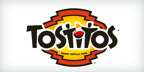
The "t's" on the word illustrate friends eating a chip and dipping it in salsa, which is the dot on the "i." Due to its subtlety, this illustration may go unnoticed, but you can't miss it. With this simple artistic maneuver, the Tostitos brand showed it's more than a snack. This simple snack can engender communion among friends.
The lesson here is that cool company logos don't need to come from drastic ideas. Additionally, clever or funny company logos like this is good for business. Noted, Tostitos!
2. The logos of these 4 tech giants are well known and instantly recognized globally due to the sheer worth of these companies.
But it's for a surprisingly different reason that these most famous logos gain the recognition they enjoy. All 4 interesting logos are simple in design, thus conveying unmissable messages. This message ranges from exclusivity (Apple) to inclusivity (Google and Microsoft) and customer satisfaction (Amazon).
The most popular logos teach us that simplicity is best in logo design.
3. The Old Twitter Logo Only Cost $15
Today, a professional logo design could cost about $5,000, but Twitter bought its initial bird's image from iStockphoto for $15! The artist received about $6 from the sale. After Twitter's popularity, its logo redesign is worth approximately $100,000! The redesign is only a simplified version of the same bird! Talk about logo-flipping, eh?
Fun facts logo don't always cost an arm and a leg. However, if you are starting a new business, you must look for deals that will deliver quality yet save you precious costs.
4. The Peacock’s Feathers on the NBC Mean Something
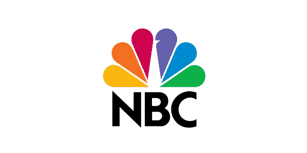
Most people notice the peacock on the NBC logo, but did you know that each one of its feathers symbolizes a division of the network? These divisions are News, Sports, Entertainment, Stations, Networks, and Productions. They are each represented by one of the logo's 6 colors.
Yes, some cool logo designs have symbols that reveal facts about brands.
5. The BBC's New Logo Costs $1.8 Million
When the BBC decided it was time to get rid of their old 1997 logo for a modern look, they discovered that such an upgrade would cost $1.8 million! As a result, the BBC has one of the most expensive redesigns of this era. The new logo uses the type Gill Sans Script created by Eric Gill, one of the leading sculptors of the original BBC building in London back in 1932. Indeed, it takes a true master to make complex things simple.
If you need to splurge on a logo design like the BBC, make sure it's worth it.
6. The Original Pepsi Cola Logo Was a Copycat of Coca-Cola's Design
Pepsi once tried to sell out through mimicry and underhand tacticsFinally, in 1989, Pepsi did a similar logo design to its arch-rival. Such cutthroat competition is not unheard of among these two, even though it has been less pronounced recently.
This kind of mimicry still exists regarding logo design and can give you apparent advantages. But be on the lookout for a possible boomerang! You're much safer being original.
7. Sony VAIO Has a Hidden Message in Its Logo
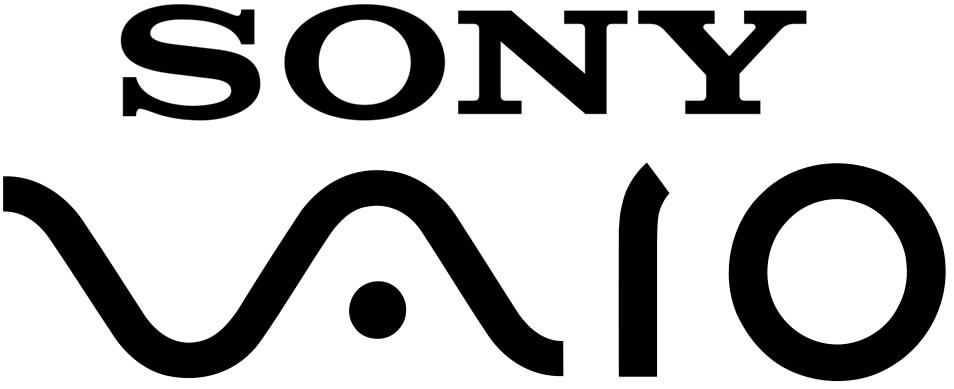
The VAIO logo is a stylish representation of the VAIO word, but the VA letters represent the waves that create the analog signal. The IO is a binary symbol representing two possible outcomes, on and off or input and output. Isn't that cool?
8. There’s a Bear on Toblerone's Logo
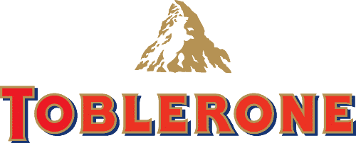
Great use of the negative space makes possible the inclusion of a bear in the middle of the mountain in the Toblerone logo. The chocolate is originally from Bern, Switzerland, also known as "The City of Bears." Hence the bear reference in its logo is a tribute to their origin.
9. 8 year-olds can already Identify and Match a Logo with its Brand
In a study made in the Netherlands, 100% of 8 years old kids could put together some of the most recognizable logos with their representative brand.
Is your logo recognizable to 8-year-olds? You just may have another unicorn!
10. Greek Mythology Is Behind Starbucks' Logo
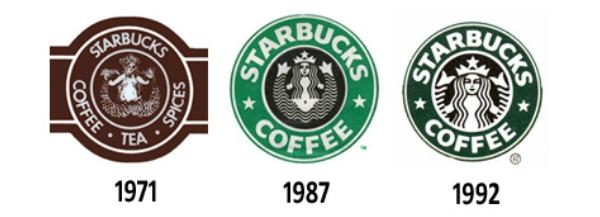
The famous logo represents a siren with two tails; the idea was to capture a part of Seattle's seaport roots, where the company was born in 1971. In the past few years, this logo has seen significant changes, but they've never left behind the basic concept of the mermaid with two tails, only changing a few elements to keep it fresh. So you can say Starbucks was trying to allure customers with their beverages, as sirens do in Greek mythology with their voices.
11. Nike Swoosh was Supposed to Represent Wings

The company, Blue Ribbon Sports, snowballed and made the owners consider changing the name to something more attractive but more straightforward. Founders of the brand, track, and field coach Bill Bowerman and medium-distance runner Phil Knight opted for Nike, the name of the Greek goddess of victory. In 1971, graphic design student Carolyn Davidson based the concept for Nike's logo (the swoosh) on the goddess's wings, representing speed. Nowadays, it's become so recognizable that they decided to use the symbol alone.
12. Early Logos Represented Makers of the Product
The first logo ever created was in the 1800s. Logos used to be nothing but a mark, symbol, or branding that identified the product's sellers or makers. However, logos have noticed a revolution as brands today tell exciting stories and share their values via a logo.
13. The Bell System Logo Is Still Used and Owned By Many Companies

The resulting companies from the breakup of Bell IP Holdings obtained the rights to use the redesigned Bell logo. Saul Bass did this redesign. Nowadays, many of the remaining companies still use the Bell logo in one way or another. For example, Verizon uses it on its trucks, payphones, and Cincinnati Bell on bills and vehicles. At the same time, Bellsouth used the logo and name until its merger with AT&T in 2006.
Now you know why these brands have a familiar ring to them.
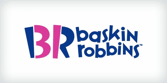
14. There's a Number 31 on the Baskin Robbins Logo
Figure “31” represents the original 31 ice cream flavors that the company sold when it started.
15. Nickelodeon's most recognizable Logos From 1984 - 2009 Were Created After the Slime
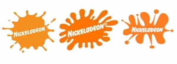
This network used different variations of its orange splash logo from 1984 - 2009, representing the slime used on the TV show "You can't do that on TV." The original CTV series changed networks in 1982 and became an instant hit in Canada for this channel.
Bonus Fact:
The Yellow Arrow in Amazon's Logo is NOT Just a Smile
The orange smile at this logo indicates that Amazon sells everything from A to Z. They're amazing like that. Although somewhat speculative, Amazon may be referring to its namesake and the world’s largest river, the Amazon, with a curved orange line from A - Z. Such rich symbolisms only help further solidify the company’s values. Talk about cool logos! Albeit simple, much thought goes into designing some of the world’s most popular logos.


 Emma Davis


