
12 Modern Wedding Seating Chart Ideas


Sofia is our design and templates voice, built from the knowledge of our production team, with over 20 years in printing.
Why a Seating Chart Earns Its Spot at the Reception Door
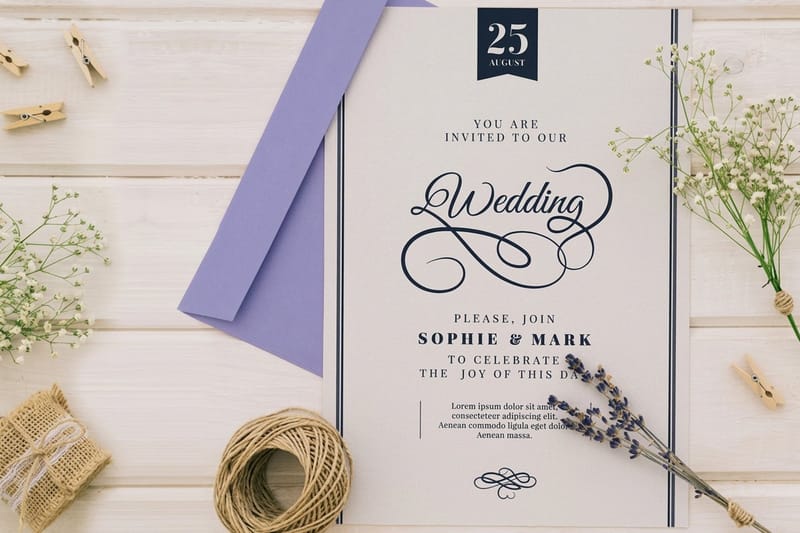
A seating chart is the one piece of wedding stationery that has a job to do in the first ninety seconds of the reception. Everything else in the suite is read at home, on a couch, weeks in advance. This sign is read standing up, in dim light, by someone holding a drink and a clutch and looking for their name.
That single constraint is why the chart deserves its own design decision rather than a shrunk copy of the invitation. It needs bigger type, a clearer order and a surface that will not curl on an easel by the time the dancing starts.
The twelve ideas below are grouped into four styles: minimal, eco, statement and themed. Each one is described as a thing you can print, not a mood board, so you can take it straight to a file and an order. Where a specific format matters, the product that fits it is named alongside the idea.
What a good chart does in ten seconds
A guest should find their own name, read a table number and step away without asking anyone a question. If two people have to lean in at the same time, the type is too small or the columns are too narrow.
Where it belongs in the room
Put it after the welcome sign and before the bar, at eye height, with clear floor on both sides so a queue can split. A chart pinned behind the gift table becomes a bottleneck within minutes.
What it saves you
One printed board covers every guest at once. That is one file to proof, one delivery to track and no box of tiny cards to alphabetize the night before the wedding.
Shop the day
Wedding printing collection
Invitations, signage, programs and place cards for the day, gathered on one page.
Minimal Seating Chart Ideas for a Clean Modern Look
Minimal does not mean plain. It means the layout is doing the work instead of the ornament, so the only things competing for attention are names and numbers. Pull the typeface straight from your invitation suite and the chart will read as part of the family without repeating a single flourish.
If you have not locked your type yet, start there. A suite printed on Flat Wedding Invitations puts the real printed type in your hand to hold against the chart layout.
- 1. Single column, alphabetical. One tall list, last names bolded, table number right aligned. It looks like a well set page and it is the fastest chart to scan.
- 2. Grid of table cards on one board. Twelve to twenty small boxes, one per table, each with a heading and four to ten names. Reads like a modern menu and prints beautifully at 24 by 36 inches.
- 3. Monochrome with a single accent rule. Black type on warm white, one thin colored line under each heading, nothing else. Borrow the accent from your wedding monogram so the palette stays honest.
The trap with minimal charts is generosity with white space at the expense of type size. Give the names the size first and let the white space take what is left.
Print picks
Three wedding formats that set your chart’s look
Live prices, ready to customize with your type, color and paper.
 Flat Wedding Invitations 25 for $19.77 Three sizes, 4.25 x 5.5, 5 x 7 or 6 x 6 inches, on 20 paper stocks.
 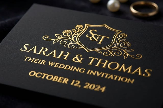 Embossed Wedding Invitations 100 for $220.20 16pt laminated cards up to 11 x 17 inches, with embossing as an added option.
 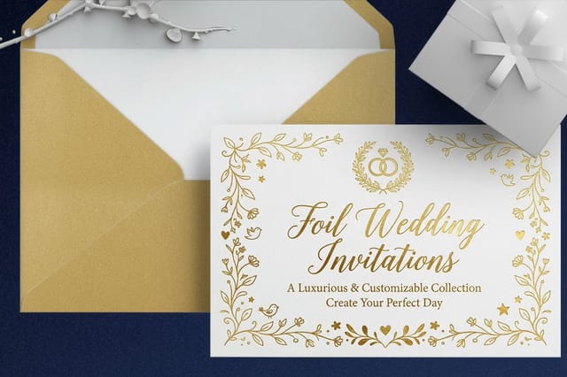 Foil Wedding Invitations 500 for $421.91 Gold foil by default, or one of six other foil colors, on 16pt silk laminated stock.
 Eco and Natural Seating Chart Ideas
For a garden or outdoor reception the natural look is mostly a paper decision rather than a design one. Uncoated and recycled stocks absorb ink slightly, which softens the type and kills the glare that ruins photos of a glossy board.
- 4. Kraft-look background, dark ink. A warm brown paper texture printed as the background, with deep green or charcoal type, on 32# bright white uncoated paper mounted to foam board so the edges stay crisp.
- 5. Pressed botanical border. A thin illustrated frame of the greenery in your bouquet, drawn once and repeated at each corner. Keep the center completely clear for names.
- 6. Wood tone panel with a printed insert. A borrowed or rented wooden frame holding a printed panel you actually own. You keep the print afterward and you are not paying for hand lettering on a surface you have to return.
One practical warning about the natural route: uncoated paper is thirstier, so pale inks lose contrast. Test your lightest color on the real stock before you commit, and if the sample looks washed out, go a shade darker rather than a point larger.
Statement Seating Charts That Anchor the Entrance
A statement chart is the one guests photograph. It works when the venue gives you a wall, an archway or a wide landing that can carry something oversized without blocking traffic. Scale is the entire idea, so commit to it or skip the category.
- 7. Oversized single panel, four feet tall. One board, enormous type, names in three or four columns. It reads from across the room and doubles as the backdrop for the entrance photo.
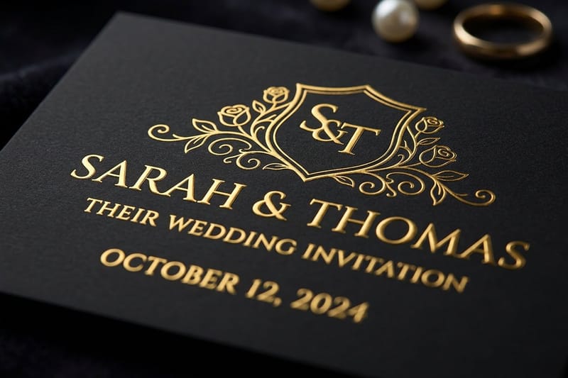
- 8. Embossed header panel. A header with your names and date, printed on Embossed Wedding Invitations up to 11 x 17 inches with the embossing option added, and fixed above a clean printed list. The texture carries the luxury and the list stays perfectly readable.
- 9. Foil accented headings. Foil comes on invitation-size pieces up to 5 x 7 inches, so mount foil-stamped table cards on the board, with guest names in flat ink. Under warm reception lighting the numbers glint and the eye jumps table to table on its own.
Themed Seating Chart Ideas With a Story to Tell
Themed charts swap table numbers for something meaningful, which is charming right up until a guest cannot find their table. The rule that saves every themed chart is simple: keep the theme in the heading and keep a plain number somewhere on the same line.
- 10. Places you have traveled together. Each table named for a city, with a small number in parentheses. Matching table numbers on the tables themselves are not optional here.
- 11. A printed timeline of your relationship. Tables ordered by year, each heading a date that means something. Guests read the whole thing while they wait, which is the point.
- 12. Vinyl records, book spines or ticket stubs. One illustrated motif repeated per table, drawn flat rather than photographed so it prints sharp at any size.
Themed charts also give you a reason to carry an idea backward through the suite: the same motif can open on your save the dates months earlier.
Quantity and price
Flat wedding invitation pricing and specs
Real configurator numbers. The more you print in one run, the lower the unit cost.
| Quantity | Price Per Unit | Total |
|---|---|---|
| 25 | 79.1¢ | $19.77 |
| 50 | 50.5¢ | $25.27 |
| 100 | 42.8¢ | $42.84 |
| 200 | 25.8¢ | $51.62 |
| 300 | 20.1¢ | $60.42 |
| 400 | 17.3¢ | $69.20 |
Choosing the Printed Format Your Chart Will Live On
Every idea above has to become a physical object standing in a room for five hours. Picking the wrong surface is how a beautiful design ends up sagging on an easel by the first dance.
Foam board is light, rigid and easel friendly: the print is mounted on 3/16 inch foam, white or black, and the paper is 10.4 mil semi gloss, 10.4 mil high gloss or 32# bright white uncoated. A paper poster with no board behind it works only if you frame it or fix it flat to a wall.
Match the finish to the lighting
- Candlelit indoor venue. The 32# uncoated paper. Gloss will mirror every flame and every phone flash.
- Bright outdoor daylight. Uncoated or semi gloss, with high contrast type. Pale ink disappears in full sun.
- Dim ballroom with spotlights. Uncoated board with an embossed or foil-stamped header card fixed on top, so the accent does the sparkling instead of the whole surface.
Premium finish
Embossed wedding invitations
Silk, gloss or velvet laminated 16pt stock; embossing, foil and spot UV are options you add.
Layout Rules That Keep the Line Moving
Legibility on a seating chart is measured in feet, not points. Set the guest names first, print a single test page at full size, tape it up and walk backward until you cannot read it. If that distance is under six feet, everything goes up a size.
Column count matters as much as type size. Three or four columns on a wide board let several guests read at once without shoulder to shoulder crowding. One long column looks elegant on screen and creates a queue in real life.
- Names. Full first and last name for every guest, including plus ones. No initials, no nicknames the family will not recognize.
- Numbers. Bold, right aligned and repeated on the table itself so the two halves of the system agree.
- Margins. Leave a generous border. A chart trimmed tight to the type looks cramped and risks losing a line at the edge.
If you are also printing place cards for the tables, build both from the same spreadsheet so every name is spelled the same way on the card and on the chart.
Add the sparkle
Foil wedding invitations
Foil table cards up to 5 x 7 inches, the piece behind idea 9.
Alphabetical, By Table, or By Guest Group
The three organizing systems are not interchangeable, and choosing the wrong one is a design problem that no typeface can fix. Each one serves a different size and shape of wedding.
Alphabetical by last name is the safest choice for most receptions. A guest arrives knowing only their own name, so a list they can search without knowing anything else always wins. Table order asks guests to scan every table until they spot themselves, which is fine at fifty people and painful at two hundred.
- Alphabetical by last name. The pick above about eighty guests. Fastest to scan, hardest to lay out attractively.
- Grouped by table. For a smaller list. Looks like a beautiful grid, works only when the eye can cover the whole board at once.
- Grouped by side or family. Best for small family weddings where guests already know which group they belong to. Rarely the right call for a mixed guest list.
Whichever you pick, keep the same logic on your ceremony programs so guests are not learning two systems in one evening.
Compare finishes
Popular wedding print, side by side
Stock, finish, size, quantity, turnaround and price compared across the suite.
| Flat Wedding Invitations | 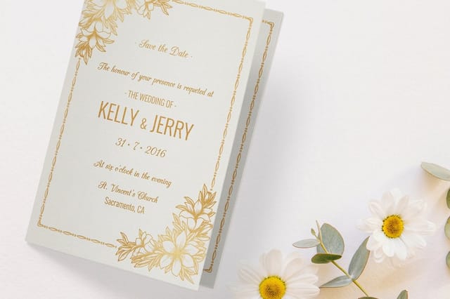 Folded Wedding Invitations | 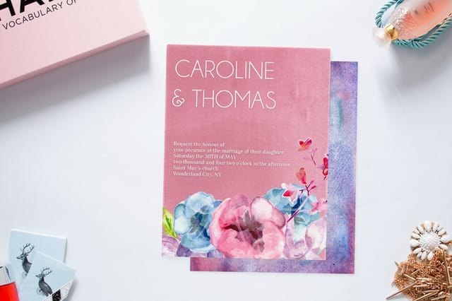 Velvet Wedding Invitations | 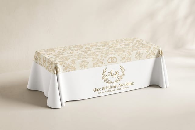 Wedding Table Covers | |
|---|---|---|---|---|
| Min price | $19.77 | $38.22 | $251.36 | $225.00 |
| Paper / stock | 14pt Gloss Cover | 14pt Gloss Cover | 16 Point Soft Velvet Laminated | 9oz Premium Polyester |
| Finish | Standard Finish | Standard Finish | - | - |
| Size | 4.25" x 5.5" | 8.5" x 5.5" fold to 4.25" x 5.5" | 4.25" x 5.5" | 84" x 126.5" (6ft Table) |
| Default qty | 25 | 25 | 500 | 1 |
| Turnaround | 3 business days | 5 business days | 7 business days | 4 business days |
| Rating | ||||
| View & customize | View & customize | View & customize | View & customize |
Printing the Chart Without a Last Minute Panic
The seating chart is usually the last thing designed because it is the last thing decided. Final headcounts move within days of the wedding, which means the file you are proofing is genuinely not final until very late in the process.
Build for that. Design the layout early with placeholder names, lock the type, colors and margins, then swap in the real list at the end. When the layout is already approved, a name change is a five minute edit rather than a redesign. Setting up your file against a print ready template removes the rest of the guesswork on bleed and safe margins.
A working timeline
- Eight weeks out. Choose the style and format, order the invitation suite so you have real color to match.
- Three weeks out. Build the layout with placeholder names, proof the type size at full scale on a wall.
- Ten days out. Drop in the final list, proofread every name twice against the RSVP spreadsheet.
- One week out. Place the order and have it shipped to whoever is setting up the venue, not to a hotel you check into the day before.
Start fast
Flat invitation blank press file
A print-ready blank press file for the flat invitation, so the suite starts at the right size.
Wally sorts your seating chart out
Pick the style, then pick the format it has to live on
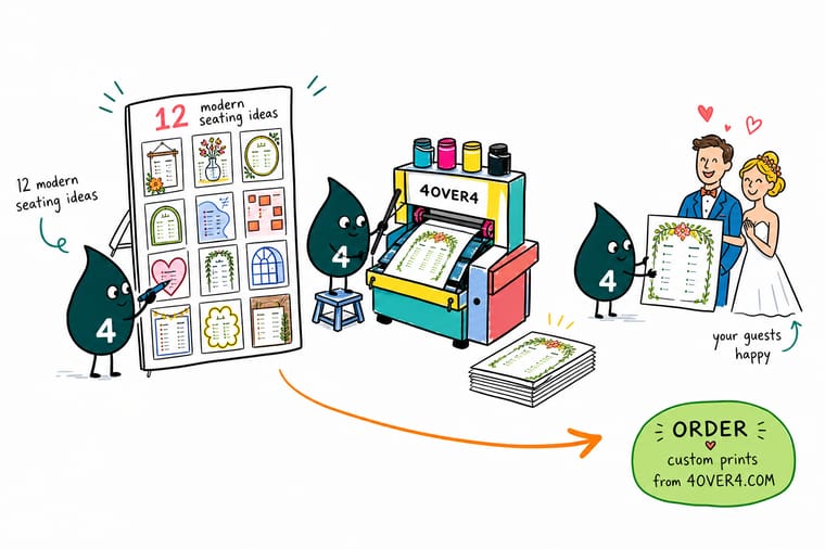
Stuck between four styles? Start with the room. Garden reception, go kraft and botanical. Ballroom with spotlights, go oversized with a foil or embossed header. Small restaurant, a table grid reads perfectly. Then count your guests: above eighty names, list them alphabetically by last name no matter which style you chose. Lock your type and margins early, drop the final headcount in last, and print the chart with the rest of the suite.
Design your wedding print →Seating Chart Takeaways Worth Keeping
Explore more
More wedding print to plan alongside the chart
Invitation suites, save the date and monogram ideas, a foam board guide, and place card and program comparisons.
Collection Wedding Printing Collection Invitations, signs, programs and place cards in one place. Product Flat Wedding Invitations Flat cards in runs from 25 up, in three sizes. Product Embossed Wedding Invitations Silk, gloss or velvet laminated cards with optional embossing. 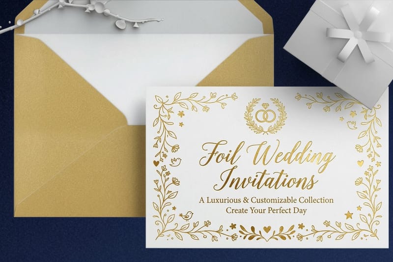 Product Foil Wedding Invitations Foil on the front, the back or both sides.
 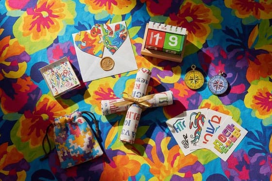 Article Cool Save the Date Ideas Set the theme months before the chart is designed.
 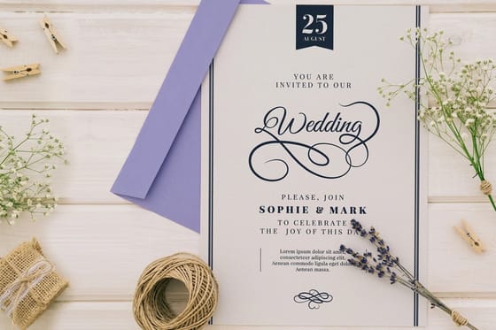 Article Wedding Monogram Ideas One mark that ties the suite and the signage together.
  Guide How to Order Foam Board Sizes, stock and file setup for a mounted board.
 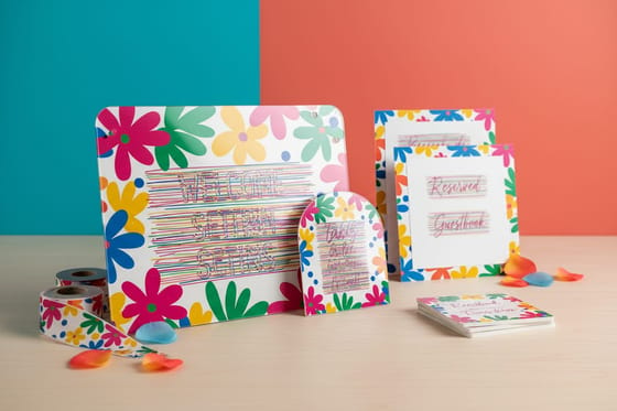 Alternative Wedding Signs Compared Welcome and ceremony signage, side by side.
  Alternative Place Cards Compared The card that has to agree with your chart. Alternative Ceremony Programs Compared Program printing options and what they cost.
  Alternative Wedding Printing Compared Invitations, signs and stationery from two printers, compared.
 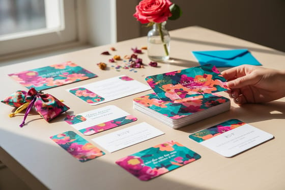 Alternative Wedding Invitations Compared Paper, finish and price across two printers.
 Ready to print a seating chart guests can read at a glance?
Pick one style, set the names before anything else, and print the board on foam core so it stands on its easel through the last dance.
Wedding Seating Chart Questions, Answered
Can I mix two seating chart styles on one board?
Keep one style per board. A botanical border around a foil header around a themed table list gives the eye three places to start and no clear place to find a name. If you love two ideas, give the second one its own piece, such as the welcome sign or the table numbers, and keep the chart itself plain.
What makes a wedding seating chart modern rather than traditional?
Modern charts are built around readability instead of decoration. That usually means a clean sans or a high contrast serif at generous size, plenty of margin and a single accent color instead of a full illustrated frame. Traditional charts lean on scrollwork, script lettering and table by table grouping. The practical difference guests notice is speed: a modern chart is built to be read standing up in dim light in a few seconds.
How do I choose the right seating chart idea for my wedding?
Start with the room, not the mood board. An outdoor garden reception suits a kraft-look background and botanical borders. A ballroom with spotlights suits an oversized panel with a foil or embossed header. A small restaurant reception suits a table grid you can take in at a glance. A wall or archway at the entrance is the only place an oversized statement panel can stand without blocking the line.
What does a printed wedding seating chart cost and how is the price set?
The price is set by the board size, the paper and the options you add, such as black foam core or gloss lamination, never by how detailed the design is: an elaborate layout costs the same to print as a plain one. Pick the size and paper on the foam core page to see the live price before you commit.
What sizes, stocks and finishes work best for a seating chart?
An 18 by 24 inch board suits up to about eighty guests, and 24 by 36 inches handles a larger list comfortably. Beyond the fixed sizes, wedding foam core takes any size up to 46 by 90 inches, and 3 mil gloss lamination is an option if the board will be handled. More board options sit in our foam board printing range.
