
15 Iconic Food Brand Mascots and the Design Lessons They Teach


Sofia is our design and templates voice, built from the knowledge of our production team, with over 20 years in printing.
What a Food Mascot Really Does for a Growing Brand
A food mascot is a face doing the work of a paragraph, and it has to hold up in print at every size you order: on a 2 x 3.5 in food truck business card, at full size on a flyer next to the menu, and on a sign read from half a block away. A hungry person walking past a row of trucks or scanning a crowded shelf gives you a fraction of a second, and a character registers in that fraction while a name, a tagline, and an ingredient list are still loading. The fifteen mascots below do that job without asking to be read, and each one comes with the design lesson you can print on your own pieces.
The other reason to build one is durability. Logos get modernized every few years, packaging gets refreshed every season, but a well-drawn character can be redrawn a dozen times and still be the same friend. That continuity is worth more to a small food brand than any single clever layout.
Look at the lineup below and one pattern repeats: almost every mascot that survived was simple enough to be scribbled from memory. A tiger head, a green silhouette, a top hat with a monocle. If a customer can draw a rough version of your character on a napkin, you have something that will survive being shrunk onto a business card, blown up onto a truck panel, embroidered on an apron, and squeezed into a social avatar. If they cannot, you have an illustration, and illustrations get replaced.
It gives the shelf a face
Packaging is a wall of rectangles competing with other rectangles. A face breaks the pattern because human eyes hunt for eyes. That is why a character beats an abstract mark on a crowded shelf even when the abstract mark is objectively better drawn.
It carries tone that copy cannot
You can write "family friendly" on a package and nobody believes it. Draw a grandmother with flour on her hands and the same claim lands instantly. A mascot delivers personality before a single word is processed.
It survives shrinking
The real test of a mascot is a loyalty card, a coffee sleeve, and a sticker under two inches wide. A strong silhouette holds at any of those sizes, which is exactly why simple characters outlive detailed ones.
It buys you repetition
One appearance is a drawing. Two hundred appearances across menus, cups, cards, and signs is a brand asset. A mascot is the cheapest way to make every printed piece you own look like it came from the same company.
Print the character
Food truck signs
The largest surface you own, and the one that proves whether your silhouette really works.

15 Iconic Food Mascots and the One Trait Each Owns
These are the characters most Americans can describe with their eyes closed. Read them as a design library rather than a nostalgia list, because each one solves a specific problem you will face when you draw your own. Notice how few of them rely on detail, and how many rely on a single strong idea repeated for decades.
The trait in bold is the thing worth stealing. Not the drawing style, not the era, just the design decision underneath it that still works today.
- Mr. Peanut, Planters. A legume in a top hat, monocle, and cane, born from a 1916 schoolboy contest. The lesson is costume as character: three accessories turned a nut into a gentleman, and the silhouette has been readable ever since.
- Colonel Sanders, KFC. A real founder reduced to a line drawing of a white suit, string tie, and goatee. The lesson is that a founder can become a mark when you strip the photograph down to five or six lines anyone can recognize.
- Tony the Tiger, Frosted Flakes. Introduced in 1952 and refined for decades. The lesson is one emotion, held forever: Tony is confidence, and he has never once been drawn hesitant.
- Ronald McDonald, McDonald's. Launched in 1963 and built for live appearances, not just print. The lesson is design for the real world, because a mascot that can walk into a room does work no logo ever will.
- Buzz the Bee, Honey Nut Cheerios. A bee makes the honey claim without a single word of copy. The lesson is let the character carry the ingredient so the package does not have to argue.
- Cap'n Crunch, Quaker. A naval captain with an oversized hat and an eyebrow that does most of the acting. The lesson is exaggerate one feature and let it become the identifier.
- Miss Chiquita, Chiquita. Started as a dancing banana wearing a fruit hat before becoming a woman. The lesson is a mascot can evolve as long as the pose, the hat, and the palette stay recognizable.
- Jolly Green Giant, Green Giant. Introduced in 1928 and later given a valley to live in. The lesson is own a color so completely that the color alone starts to mean you.
- Quaker Man, Quaker Oats. Registered in 1877, and today reduced to a face inside an oval. The lesson is simplify with every redraw: the mark got quieter and stronger at the same time.
- Chester Cheetah, Cheetos. Arrived in 1986 with sunglasses and an attitude. The lesson is a mascot can be cool rather than kind, which is the only way to reach an audience that resists cute.
- The Keebler Elves. A cast of bakers working inside a hollow tree. The lesson is build a world, not just a face, because a setting gives you unlimited scenes to advertise from.
- Kool-Aid Man. A grinning pitcher who arrives by destroying the wall. The lesson is give the character one unmistakable action and people will remember the action longer than the product.
- Snap, Crackle and Pop, Rice Krispies. Three elves named after the sound the cereal makes. The lesson is turn the product experience into the character, which is the tightest possible link between mascot and item.
- The Trix Rabbit. Introduced in 1959 and permanently denied the cereal. The lesson is a running conflict creates loyalty, because an unresolved story keeps an audience emotionally invested.
- Mr. Owl, Tootsie Pops. Star of the 1970 spot that asked how many licks it takes. The lesson is one perfect question beats a hundred claims, and a mascot can be the one who asks it.
Fourteen of those fifteen would still read clearly at the size of a coffee sleeve. That is not a coincidence, and it is the single most useful filter you can apply to your own sketches. If you are still naming the business itself, our list of food truck name ideas pairs well with this stage, because the name and the character should be designed in the same week.
Print picks
Three formats that put a mascot to work
Live prices, ready to customize with your character and your menu.
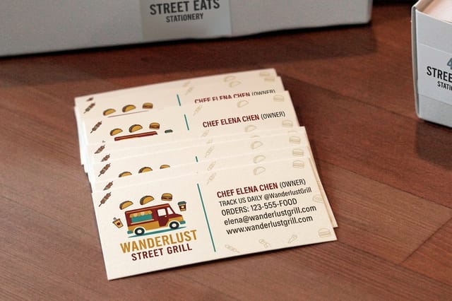 Food Truck Business Cards 100 for $17.57 Hand your mascot to every customer who asks where you park next.
 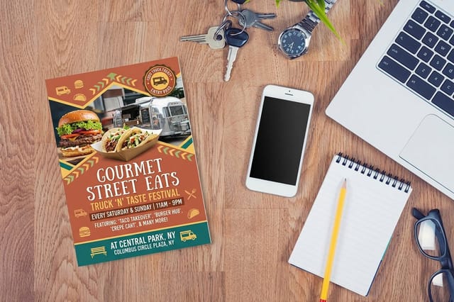 Food Truck Flyers 50 for $39.54 Full-size room for the character, the menu, and the weekly schedule.
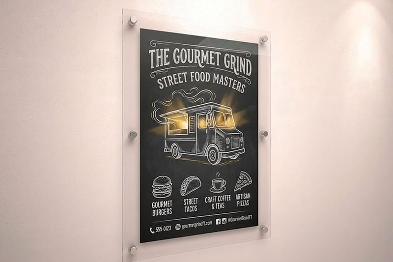
 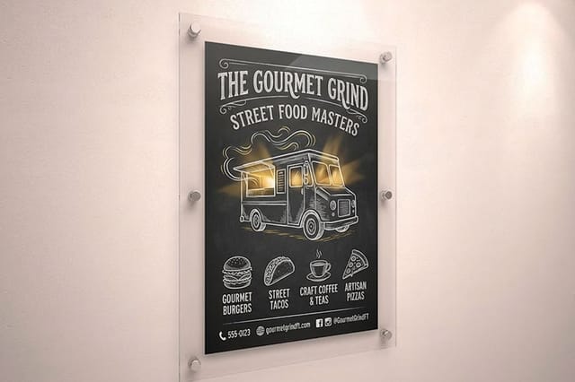 Food Truck Signs $25 each The big format where a bold silhouette earns its keep from a distance.
 Five Design Lessons the Great Food Mascots Teach
Strip the nostalgia away and the whole lineup reduces to five rules. None of them require an illustration budget, and every one of them is testable before you spend a dollar on printing.
Lesson 1: keep the silhouette simple
Fill your character in solid black and look at the shape. If you can still tell what it is, the design will hold up on a sign, an embroidered hat, a one-color stamp, and a favicon. Tony the Tiger, the Jolly Green Giant, and Mr. Peanut all pass this test instantly. Detail is what you add after the silhouette works, never before. The same discipline applies to your wordmark, and the fundamentals in our logo design best practices guide translate directly to characters.
Lesson 2: let one personality trait dominate
A mascot that is friendly and cool and wise and funny is a mascot with no personality at all. Pick one adjective and draw only that. Chester Cheetah is cool. Buzz is eager. The Trix Rabbit is desperate. When you sit down to write a caption or pose a new drawing, that single adjective tells you exactly what the character would do.
Lesson 3: use color to claim territory
Green Giant took green. Cheetos took orange. A small food brand can do the same thing at a local scale, because you are not competing with every brand on earth, only with the six trucks and four cafes near you. Look at what your neighbors use, then take the loudest color they left on the table and use it everywhere without exception.
Lesson 4: consistency is what builds the trust
The mascot must be the same character on the menu, the cup, the card, and the window. Draw a small set of approved poses, save them as vector files, and refuse to redraw the character from scratch for each new piece. Inconsistency reads as carelessness, and in food, carelessness reads as a kitchen you would rather not think about.
Lesson 5: give the character something to want
A face is memorable. A face with a goal is a story. The rabbit wants the cereal, the owl wants to answer the question, the elves want to bake in secret. Give your character a small, repeatable desire and you will never run out of things to post, print, or say. This is the difference between a drawing you commission once and an asset that keeps producing marketing for years.
Mascot Mistakes That Quietly Cost Food Brands
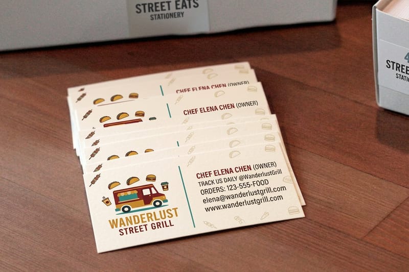
Most failed mascots are not badly drawn. They fail on the practical side, in the gap between the artwork the designer delivered and the way it actually gets used every day. The five below are the ones that most often force a redraw.
Every one of these is cheap to fix in the sketch stage and expensive to fix after you have printed a thousand cups. Read them before you approve final artwork, not after.
- Too much detail for the real sizes. Feathers, fur texture, and gradient shading disappear the moment the character lands on a loyalty card or a small sticker, leaving a gray smudge where a face should be.
- No one-color version. Sooner or later you will need the mascot stamped, embroidered, etched, or foiled. If a flat single-color version does not exist, someone will invent one badly, and it will not look like your character.
- A character that does not match the food. A cartoon animal on a premium charcuterie label creates a mismatch customers feel without being able to name. The mascot has to sit at the same price point as the product.
- Borrowed style. Drawing a character that reads as a near copy of a famous mascot buys you instant familiarity and permanent forgettability, plus a legal conversation nobody wants.
- Living only in one file. A mascot that exists as a single flat image with no vector master, no transparent background, and no print-resolution export will slowly degrade as staff resize screenshots of it for years.
How to Create a Mascot for Your Own Food Brand
You do not need an agency for this. You need a clear brief, a few rounds of ugly sketches, and the discipline to stop adding detail. Work through the steps below in order and you will end the week with a character your customers can describe to a friend.
Step 1: write the one-sentence brief
Fill in the blanks: my mascot is a [noun] who is [one adjective] and always [one action]. If you cannot complete that sentence, no amount of drawing will rescue the character. Keep the noun close to your food, your city, or your origin story, because those are the associations you actually want to own.
Step 2: sketch twenty thumbnails at postage-stamp size
Draw small on purpose. Working at one inch forces simple shapes and kills detail before it starts. Twenty rough thumbnails in half an hour beats one polished drawing in a week, because you are looking for the shape, not the finish.
Step 3: black out the survivors
Take your best three, fill them solid black, and show them to someone who has never seen your brand. The one they identify fastest is the one to develop. Everything else is a preference argument you can safely skip.
Step 4: build the character sheet
Draw the winner in three or four poses, in full color, in one color, and in a version with no text. Save vector masters plus high-resolution exports. This sheet is what you hand to a printer, a sign maker, or a new hire, and it is what keeps the character consistent when you are not in the room.
Step 5: lock the color and the type
Choose one dominant brand color, one supporting color, and a headline typeface that suits the character's personality. Write the values down. Our walkthrough on custom logo design for your brand covers how to document this so it survives contact with real production.
Step 6: print a small test run before anything else
Screens lie about color, weight, and how small type sits next to artwork. Order one short run, hold it in your hand, and fix what the screen hid. It is the cheapest insurance in the entire process.
Quantity and price
Food truck flyer pricing and specs
Real configurator numbers. The more you print, the less each flyer costs.
| Quantity | Price Per Unit | Total |
|---|---|---|
| 50 | 79.1¢ | $39.54 |
| 100 | 57.1¢ | $57.11 |
| 200 | 37.3¢ | $74.69 |
| 300 | 28.6¢ | $85.68 |
| 400 | 24.4¢ | $97.76 |
| 500 | 21.8¢ | $108.75 |

Color and Contrast That Survive the Press
A mascot that glows on a monitor can land dull and muddy on paper, and food brands feel this more than most because appetite lives in color. Screens emit light and paper reflects it, so the vivid orange you approved at midnight can print closer to rust if nobody checked.
None of this requires a color science degree. It requires five habits, applied every time you send artwork out. If the mascot will also appear on wrappers or containers, our custom food packaging design guide covers how the same artwork behaves once it wraps around a three-dimensional surface.
- Build in CMYK from the start. Converting a bright RGB file at the last minute is how a signature color quietly changes. Design in the space you will print in.
- Keep the mascot off busy backgrounds. A character needs breathing room to read. Photography behind a face fights the face and usually wins.
- Test contrast in grayscale. Convert the whole layout to gray. If the character melts into the background, the color version is running on hue alone and will fail on some substrates.
- Watch small dark details on dark stock. Outlines, eyes, and mouth lines close up when ink sits on a saturated field. Thicken those lines or reverse them out.
- Give color the same treatment on uncoated stock. Uncoated paper absorbs more ink and reads softer, so a mascot that pops on gloss may need a slightly bolder build on natural stock.
Stock and finish
Food truck business cards
Coating and stock decide whether a mascot pops or goes flat, so check the options before you order.
Where Your Mascot Should Show Up First
Repetition is the mechanism, so the question is not whether to print the character but where to put it first when the budget is finite. Start with the pieces a customer touches during a normal visit, then expand outward to the pieces that bring new people in.
The order below is what tends to pay back fastest for a food business, whether you run a truck, a stall, a bakery, or a small packaged line. A real example of this playing out on shelf is in our custom label case study.
- The menu. Every customer reads it, so the character gets guaranteed impressions. Our custom menu card tutorial walks through layout and sizing.
- Business cards. The piece people put in a pocket and find again later. A face is easier to recognize again than a plain wordmark.
- Signage. The mascot at its largest, doing the work of pulling someone across a street or a parking lot.
- Wrappers and packaging. The character rides home with the food. Our printed food wrappers guide covers stock and food-contact considerations.
- Stickers. The cheapest way to multiply appearances, and customers apply them for free. There are more angles in ten ways to use logo stickers.
Start here
The piece customers keep
A card is the smallest, cheapest place to test whether your character survives at real size.
Testing a Mascot Before You Print at Scale
A mascot is a long commitment, so spend a few days validating it against the same conditions it will face in the wild. These checks cost almost nothing and catch the problems that only appear after the invoice is paid.
Run all five. If your character clears every one, you can order in volume with confidence instead of hope.
- The napkin test. Show the mascot for three seconds, then ask someone to draw it. What they reproduce is what the public will actually remember, and anything missing from their sketch is detail you can delete.
- The thumbnail test. Shrink it to the size of a social avatar. If the face turns to mush, the character will not survive small print either.
- The distance test. Print it letter size, tape it up, and walk twenty feet back. This is roughly how a sign reads from a sidewalk.
- The photocopy test. Copy it twice in black and white. Degradation reveals whether the design is carried by shape or propped up by color.
- The adjective test. Ask five people for one word to describe the character. If you hear five different words, the personality is not landing and the drawing needs to commit harder.
Compare formats
Popular business cards, side by side
A mascot on cards at 100 for $17.57, on flyers at 50 for $39.54, priced side by side.
 free business cards |  Standard Business Cards |  3D Lenticular Business Cards |  Metallic Foil Business Cards | |
|---|---|---|---|---|
| Min price | Free | $17.57 | $690.88 | $222.13 |
| Paper / stock | 14pt Gloss Cover | 14pt Gloss Cover | 31pt Lenticular Lens | 16 Point Silk Laminated |
| Finish | - | Standard Finish | - | - |
| Size | 2" x 3.5" | 2" x 3.5" | 2" x 3.5" - Vertical | 2" x 3.5" |
| Default qty | 200 | 100 | 500 | 500 |
| Turnaround | 5 business days | 3 business days | 22 business days | 7 business days |
| Rating | ||||
| View & customize | View & customize | View & customize | View & customize |
Getting Mascot Artwork Print Ready
The gap between a finished character and a clean printed piece is a handful of file details. Get them right once, save the settings, and every future order goes out without a preflight email.
Start from a correctly sized layout rather than guessing at dimensions, then place your vector mascot inside it. Working from an exact-size template removes the two most common problems in one move, which are wrong trim size and artwork that stops short of the edge.
The four file rules that prevent reprints
- Vector master, always. Keep the character as vector artwork so it scales from a sticker to a truck panel without softening.
- Bleed and safety. Extend background color past the trim line and keep the mascot's face and any text well inside the safety margin, because trimming has tolerance.
- Raster art at print resolution. If part of the character is painted rather than drawn, place it at full print resolution at final size, not upscaled from a web export.
- Outline your type. Convert the wordmark and any hand-lettered elements to outlines so the letterforms cannot substitute themselves on another machine.
Start fast
Templates and print-ready blanks
Free layouts plus exact-size blanks so your mascot lands inside the trim on the first try.

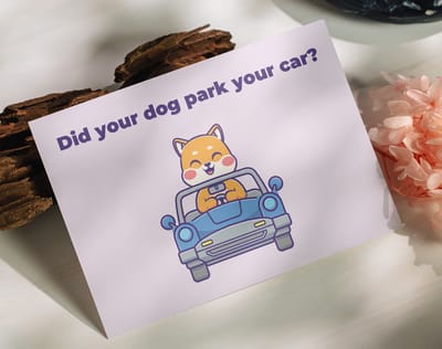






Wally helps your mascot make it off the sketchpad
Simple shape first, then print it everywhere
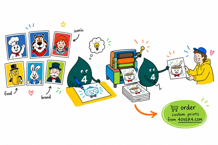
Fill your character in solid black and check whether the shape still reads. If it does, you have a mascot that will hold on a card, a flyer, and a sign. Next, lock one color and one personality trait, build a small sheet of approved poses, and order a short test run so you can see the artwork on paper before you commit to volume. Start with the piece customers put in their pocket.
Order food truck business cards →Turning a Sketch Into a Brand People Recognize
Explore more
More ways to build a food brand with print
Food truck cards at 100 for $17.57, flyers and signs, food packaging and wrappers, menu cards, logo stickers, and 100 food truck name ideas.
Product Food Truck Business Cards Your character in the pocket of everyone who asks. 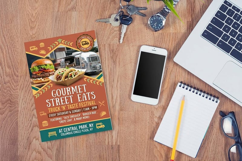 Product Food Truck Flyers Full-size space for the mascot, menu, and schedule. Product Food Truck Signs The big format where a bold silhouette pays off.
  Guide Logo Design Best Practices Rules that keep a mark readable at every size.
 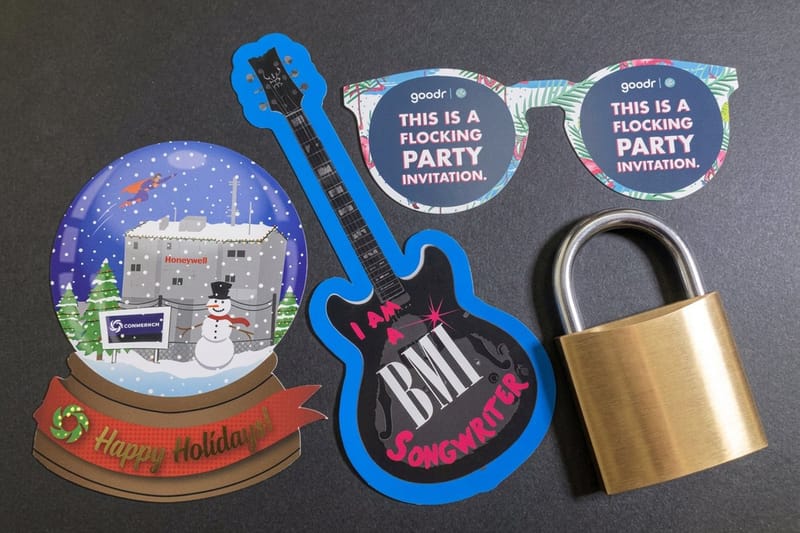 Guide Custom Food Packaging Design Take the mascot from flat art to a real container.
 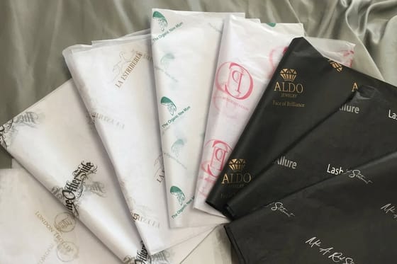 Guide Custom Printed Food Wrappers Wrapper stock and layout for character artwork.
  Guide DIY Custom Menu Cards Design the piece every single customer reads.
  Article Custom Logo Design for Your Brand Document color, type, and usage so it survives production.
  Article Ten Ways to Use Logo Stickers The cheapest way to multiply mascot appearances.
  Article 100 Food Truck Name Ideas Name and character are best designed together.
  Case study Standing Out With Custom Labels How one food brand won shelf attention with artwork.
 Keep reading
Guides that pair with mascot design
The practical walkthroughs behind logos, packaging, wrappers, and menus.
Guide Logo Design Best Practices The fundamentals that apply to characters and wordmarks alike. Guide Designing Custom Food Packaging How mascot artwork behaves once it wraps a real container. Guide Custom Printed Food Wrappers Stock, ink, and layout for wrappers that carry your character. Guide Make Custom Menu Cards Put the mascot on the piece every customer reads. Ready to put your character in front of hungry people?
Lock the silhouette, pick one color, then print the mascot on the pieces customers actually touch. Cards for the pocket, flyers for the menu, signs for the street.
Food mascot questions, answered
What makes a food mascot iconic instead of forgettable?
Three things, and none of them are drawing skill. First, a silhouette simple enough that a customer could sketch it from memory. Second, a single dominant personality trait that never changes from one drawing to the next. Third, sheer repetition across every surface the brand owns. Tony the Tiger, the Jolly Green Giant, and Mr. Peanut all pass those three tests, which is why they survived decades of redraws. Start from the same fundamentals covered in our logo design best practices guide and apply them to a character instead of a wordmark.
How do I choose the right mascot style for my food brand?
Match the character to the price point and the audience, not to your personal taste. A playful cartoon animal suits a family taco truck and undercuts a small-batch charcuterie label, where a restrained line-drawn figure or a hand-lettered founder portrait fits better. Write your one-sentence brief first, noun plus adjective plus action, then sketch only within that. If the character and the food would not sit comfortably at the same table, the style is wrong no matter how good the illustration is.
How much does it cost to print my mascot on cards, flyers, and signs?
Food Truck Business Cards start at 100 for $17.57, a single 11 x 17 Food Truck Sign costs $25, and Food Truck Flyers start at 50 for $39.54, with the per-piece cost dropping as quantity rises because setup is spread across the run. Configure any of the three on its product page to see live pricing for your exact size, stock, finish, and turnaround before you commit. Most food brands start with a short card run to check color in hand, then order signage and flyers once the artwork is confirmed on paper.
What sizes, stocks, and finishes work best for mascot artwork?
For characters, contrast matters more than luxury. Gloss and UV coatings make bright mascot colors pop, which suits bold cartoon styles and food photography. Matte and uncoated stocks soften color and suit muted, hand-drawn, or artisanal characters, and they take pen ink if staff write on them. Heavier stocks resist the grease and moisture that come with food service. On signs, go bigger than feels necessary and keep the mascot clear of edges, because a character that reads at twenty feet is doing the job a small one cannot.
How long does printing and shipping take once my artwork is ready?
Turnaround depends on the product, the quantity, and the finish you select, and every option shows its production time on the product page before you check out. Signage and large-format pieces generally need more production time than cards and flyers. Build in a buffer for one short proof run so you can hold the mascot in your hand, check the color against your screen, and correct anything before the full order goes to press. That single extra step is what keeps a launch date from slipping.
