
Cloud Dancer, Pantone Color of the Year 2026, in Print


Emma is our prepress and print production voice, built from the knowledge of our production team, with over 20 years in printing.
What the Pantone Color of the Year Actually Decides
Every December the Pantone Color Institute names one shade the Color of the Year, and for 2026 that shade is Cloud Dancer, PANTONE 11-4201. It is a soft, faintly warm white, the color of unbleached cotton in daylight rather than the blue white of copier paper. The pick is a forecast, not a rule, but it moves fast into packaging, wedding stationery, retail displays and brand refreshes within a season.
The choice matters to anyone who prints because a Color of the Year sets the palette everyone else builds around. Designers pair it, retailers merchandise against it, and clients start asking for it by name. Knowing the exact build, and knowing where that build breaks on press, is the difference between a piece that looks current and one that looks slightly off.
Cloud Dancer is a harder brief than a saturated pick. A bold color is a mixing problem you can solve with ink. A near white is a substrate problem. Ninety percent of the work happens when you choose the paper, the coating and the light the piece will sit in, and only the last ten percent happens in the ink ducts.
Where the number comes from
The 11-4201 code is a Pantone Fashion, Home and Interiors reference, the TCX system used for textiles and product design, not the Pantone Matching System chip a printer pulls off a fan deck. That is the first practical trap. Ask a press operator for 11-4201 and the answer is a shrug, because the coated and uncoated PMS libraries use different numbers entirely.
What to hand your printer instead
Give a target you can both hold. Either a paper swatch you have approved, or the closest PMS chip checked under a D50 light booth, or a printed proof on the exact stock. Screen values are a starting point for layout, never a contract for color.
Print the color
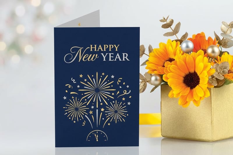
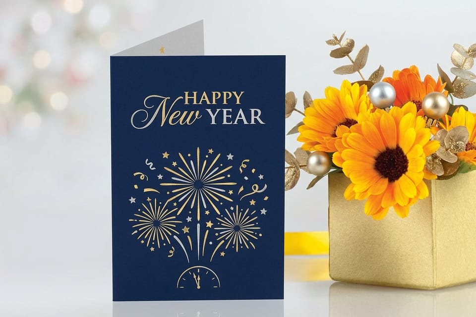
New Year greeting cards
The closest fit for a Cloud Dancer palette, warm white ground with one accent.
Why Cloud Dancer for 2026
Read the last decade of picks and the pattern is a pendulum. Loud years follow quiet ones, and the choice usually answers whatever the culture is tired of. For print, a near white pick changes the order of decisions: choose the stock first and the ink second, because a 14pt or 18pt cream uncoated cover carries Cloud Dancer with no ink on it at all. After a long run of high saturation, dopamine brights and maximal packaging, a plain warm white is the reset. It reads as breathing room, and breathing room is what crowded shelves and crowded feeds are short of.
There is a second reason that shows up in production. Brands under pressure to trim material and ink have an obvious lever, and a white ground gives it to them. A design that lives on unprinted stock uses less coverage, dries faster, and recycles more cleanly than a flood coat of dark ink. A trend that is also cheaper to run tends to stick around.
The third reason is legibility across mediums. Cloud Dancer holds up as a background on a phone screen, on a folded card, on a fabric tag and on a banner at ten feet. That is rare. Saturated colors of the year usually need a companion neutral to be usable at all, and this one starts as the companion, which makes it unusually easy to adopt.
For print buyers the takeaway is simple. You do not need a special ink to join the 2026 palette. You need a stock with the right undertone, a finish that keeps it soft rather than glassy, and one accent color with enough contrast to keep the piece from disappearing.
Print picks
Three formats built for a pale 2026 palette
Live starting prices, each one chosen for how it handles a near white design.
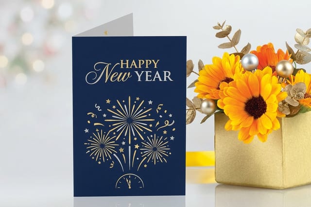 New Year Greeting Cards 50 for $56.02 A quiet white front with one warm accent reads expensive and prints clean.
 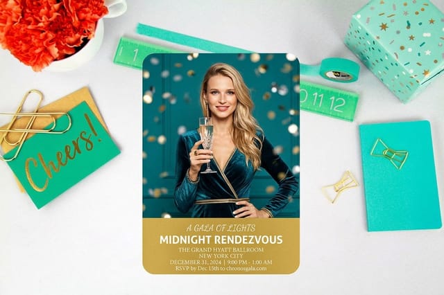 New Year Invitations 25 for $19.77 Let the stock carry Cloud Dancer and spend your ink on the type instead.
  2 Sided Blockout Banners $108.75 each The blockout core stops backlight from turning a soft white into gray.
 Cloud Dancer Hex, RGB and the CMYK Conversion Problem
The working values are hex #F0EEE9, RGB 240, 238, 233, and a CMYK build that lands around 4C 4M 7Y 0K in a US Web Coated profile. Treat that CMYK figure as an estimate, because every conversion shifts with the profile, the stock and the press. Two shops with the same file will hand you two slightly different whites.
Here is the part most conversion charts skip. A four percent tint of anything is inside the range where a press can drop the dot entirely or double it, which means your delicate warm white can print as bare paper on one sheet and as a faint pink cast on the next. Tints under about five percent are unstable by nature, not by mistake.
Three ways to get Cloud Dancer on paper
- Use the paper. Choose a natural or warm white uncoated stock and print nothing there. This is the most reliable Cloud Dancer you will ever get, and it costs no ink.
- Use a spot ink. A mixed spot color holds a pale tone far more evenly than a four percent CMYK tint, which is why packaging work leans on spot for delicate neutrals.
- Use contrast instead of tint. Print a deep accent and let the unprinted areas read as the color. The eye judges a white by what sits next to it, so the accent does the work.
If you must build it in CMYK, drop black to zero and keep the cyan and magenta equal so any dot gain shifts the color evenly rather than pulling it green or pink. Then proof it on the real stock. A conversion that looks perfect on a coated proof can go chalky the moment it hits an uncoated sheet.
Quantity and price
New Year greeting card pricing and specs
Real configurator numbers, because run size moves the invoice far more than color does.
| Quantity | Price Per Unit | Total |
|---|---|---|
| 50 | $1.12 | $56.02 |
| 100 | 78.0¢ | $77.99 |
| 200 | 50.0¢ | $99.95 |
| 300 | 40.6¢ | $121.92 |
| 400 | 36.0¢ | $143.89 |
| 500 | 33.2¢ | $165.86 |

Five Color Palettes Featuring Cloud Dancer

A near white needs a partner. These five combinations are built so the accent carries the contrast and Cloud Dancer carries the space, which is the ratio that keeps a pale palette from looking unfinished. Each swatch row below shows the hex values in print order, lightest first.
1. Gallery. Cloud Dancer, charcoal and antique brass. The default for premium stationery and menus.
2. Orchard. Cloud Dancer with sage and a deep forest anchor. Reads calm and natural without going beige.
3. Kiln. Cloud Dancer, warm sand, terracotta and ink blue. The most forgiving of the five under mixed lighting.
4. Midnight Gold. Cloud Dancer, slate, gold and navy. Built for New Year events, galas and anniversaries.
5. Petal. Cloud Dancer, cream, blush and plum gray. A wedding palette that photographs well in daylight.
Use one accent at full strength and keep the rest quiet. If two colors in a palette are fighting for attention, the white stops reading as a deliberate choice and starts reading as empty space, which is the single most common failure with a pale scheme.
Compare finishes
Popular greeting cards, side by side
Stock, finish, size, quantity and turnaround for the formats a pale palette suits best.
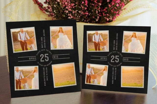 Save the Date Cards | 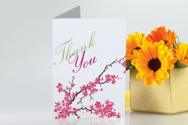 Greeting Cards | 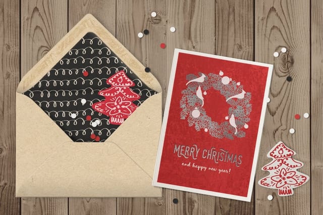 Velvet Greeting Cards | 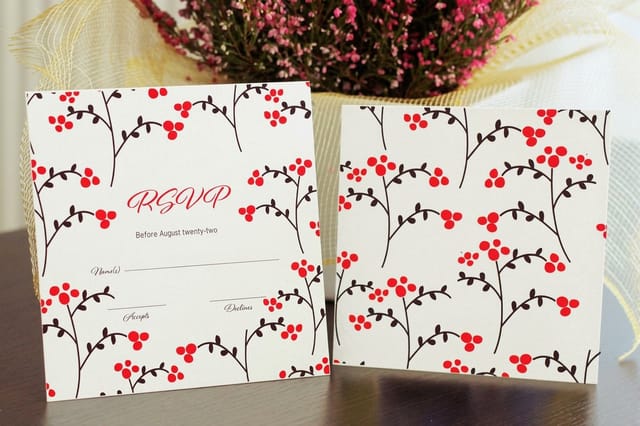 Response Cards | |
|---|---|---|---|---|
| Min price | $19.77 | $56.02 | $617.67 | $19.77 |
| Paper / stock | 14pt Gloss Cover | 14pt Gloss Cover | 16 Point Soft Velvet Laminated | 14pt Gloss Cover |
| Finish | Standard Finish | Standard Finish | - | Standard Finish |
| Size | 4.25" x 5.5" | 8.5" x 5.5" fold to 4.25" x 5.5" | 10" x 7" scored to 5" x 7" | 4.25" x 5.5" |
| Default qty | 25 | 50 | 500 | 25 |
| Turnaround | 5 business days | 5 business days | 7 business days | 3 business days |
| Rating | ||||
| View & customize | View & customize | View & customize | View & customize |
Choosing Stock and Finish So the White Stays Warm
Paper has an undertone, and that undertone will overrule your file. Bright white sheets are loaded with optical brightening agents that fluoresce under daylight and push everything cool and blue. Print Cloud Dancer artwork on one of those and the warmth disappears, no matter how carefully you built the tint.
Ask for a natural white or warm white stock instead, then confirm it in two lighting conditions, one daylight and one indoor. A neutral that survives both is a neutral you can trust in a mailbox, a lobby and a photograph.
- Uncoated. The closest natural match. Ink sinks slightly, the surface stays matte, and the sheet itself carries the color.
- Matte or dull coated. Keeps the softness while protecting the surface. Best when the piece will be handled repeatedly.
- Soft touch. Adds a suede feel that reinforces the quiet mood, and it deepens the accent color at the same time.
- Gloss. Fights the concept. Specular highlights read as bright white and flatten the warmth out of the palette.
One more production note. If the design uses large unprinted areas, specify a heavier caliper than you normally would. Light stock with little ink coverage feels flimsy in the hand, and a color that is meant to signal calm confidence should not arrive floppy.
Stock and finish
New Year invitation specs
Check the paper options before you commit, since the sheet decides how warm the white reads.

Print-Ready Products in the 2026 Color
The fastest way to put Cloud Dancer to work is on a piece that already wants a pale ground. New Year stationery is the obvious fit, since the color and the calendar arrived together, but the logic carries into anything where a light field and a single strong accent do the job.
Large format is where a soft white gets tricky. Any single layer vinyl held up in a window turns translucent, and a warm white lit from behind goes gray and blotchy. A blockout construction with an opaque core solves it, which is why a pale banner design belongs on a two sided blockout material rather than a standard single layer print.
For smaller runs, remember that quantity drives unit price far more than color does. Cloud Dancer costs nothing extra to print. Doubling your quantity is what moves the number on the invoice, so decide the run size before you agonize over the tint.
Large format
Blockout banners for pale designs
An opaque core between two printed faces, so daylight behind the banner never turns your warm white into gray.
What Printing in Cloud Dancer Costs and How Prices Are Set
Pricing on a custom print job comes from five inputs, and color is the smallest of them. Size, quantity, stock, finishing and turnaround set the number: New Year invitations run $19.77 for 25 or $42.84 for 100 in 3 business days, and folded New Year greeting cards $56.02 for 50 in 5 business days. A pale palette can even lower cost slightly by using less coverage, though most short run digital and offset pricing already bundles ink into the sheet rate.
The one line item that can change with a color decision is spot ink. Asking for a mixed spot instead of a CMYK build adds a plate or a setup on some presses, which is worth it for a brand standard and rarely worth it for a one time event piece. Start with the stock, add spot only if a proof tells you the build is not holding.
Turnaround is the other lever. Rush production compresses the schedule but not the physics, so if you want a proof on the actual stock before the run, build two extra days into your calendar. That proof is the cheapest insurance available on a delicate neutral.
By the numbers
Why color rarely changes your quote
Where 4OVER4.COM stands after two decades of production work.
- 10B+ Cards and print products, printed since 1999.
- 150,000+ Businesses served, across every industry.
- 60+ Paper types, coated, uncoated and specialty.
- 99.8% On-time delivery, tracked orders.
Getting the Files Right Before You Upload
Set the document color mode to CMYK from the start so you are seeing a print preview, not an RGB fantasy. Turn on overprint preview, then look at your pale areas specifically. Any tint under five percent should be flagged in your own review, either bumped above the threshold or converted to plain unprinted stock.
Check the edges next. A design that relies on a white field still needs bleed, because a pale piece trimmed slightly off shows a hairline of a different white and the whole effect collapses. Extend the background a full eighth of an inch past the trim and keep live text well inside the safe area.
A short pre-flight list
- Embed or outline every font, and keep small type in a single ink so it stays sharp.
- Flatten transparency effects over pale backgrounds, since soft shadows on near white are where banding shows first.
- Name your accent color consistently across every file in the campaign so nothing drifts between the card and the banner.
- Export at 300 dpi for small format and follow the size chart for large format, where a lower resolution is normal and correct.
Start from a print-ready layout rather than an empty canvas. Working from a template that already carries the right trim, bleed and safe area removes the most common cause of a reprint, which is a beautiful file built to the wrong dimensions.
Start fast
Templates and print-ready blanks
Correct trim, bleed and safe area from the first click, which removes the most common cause of a reprint.

Deeper Reading on Pantone and CMYK Matching
Cloud Dancer is one color. The skills it demands, reading a spot reference such as the 11-4201 TCX code, converting it to a build near 4C 4M 7Y 0K, and proofing it on the uncoated stock it will print on, apply to every color you will ever specify. These walkthroughs cover the mechanics step by step.
Go deeper
Pantone and CMYK matching guides
Four walkthroughs that cover conversion, spot inks and holding a color across a run.
Guide How to Match Pantone to CMYK The matching workflow, from chip to press sheet. Guide Pantone to CMYK for Printing What shifts in conversion and how to control it. Guide Convert Spot to CMYK in Illustrator The exact clicks, plus the settings people miss. Guide Two Color Spot Printing Why a pale neutral holds better as a spot ink. Wally explains the 2026 color of the year
Cloud Dancer is a paper decision before it is an ink decision
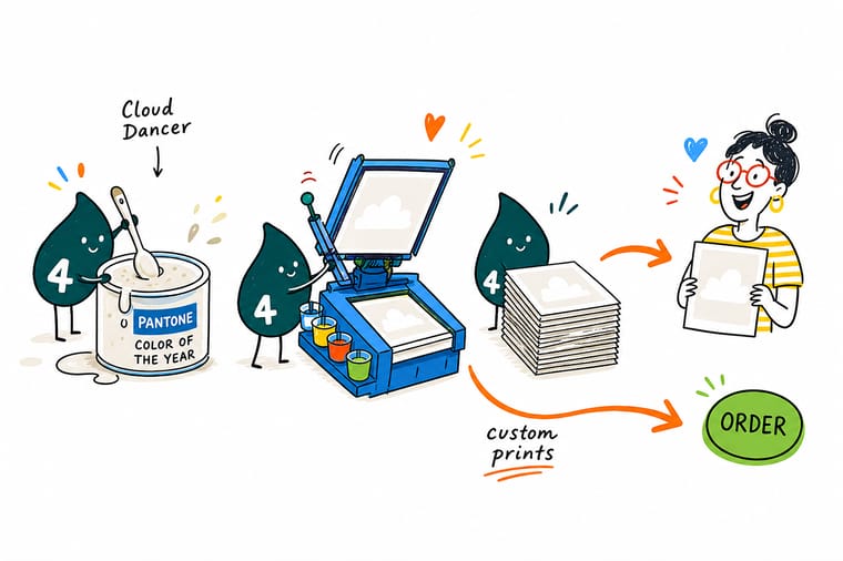
A near white cannot really be mixed, it has to be chosen. Pick a natural white stock, keep the finish matte or soft touch, drop black out of the build, and let one accent color carry all the contrast. Then look at a proof on the real sheet in daylight and indoor light, because optical brighteners are what turn a warm white cold. Do that and your 2026 palette lands the way it looks on screen.
Print in the 2026 color →Making a Quiet Color Look Intentional
A pale palette succeeds on discipline. One accent, one finish, generous margins and a stock with the right undertone will do more for a Cloud Dancer piece than any clever effect. The pieces that fail are the ones that treat white as the absence of a decision rather than the decision itself, and you can see it instantly: the layout drifts, the type floats, and the whole thing reads unfinished instead of calm.
Explore more
More color and print resources across 4OVER4.COM
New Year greeting cards run 50 for $56.02 and take 5 business days, two more than the invitations.
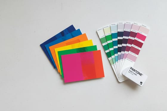 Benefit Pantone Spot Color Printing Mixed spot inks for colors CMYK cannot hold.
 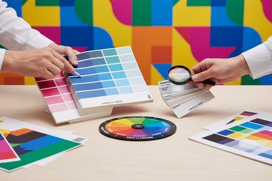 Guide Match Pantone to CMYK Chip to press sheet without the guesswork. Guide Pantone to CMYK for Printing Control the shift instead of discovering it late.
  Guide Convert Spot Color in Illustrator A clean conversion, step by step.
  Guide Two Color Spot Printing Big impact on a two ink budget.
  Article What Card Colors Signal The meaning buyers read into your palette.
  Article Logo Sticker Promotions Ten ways to put a new palette in people’s hands. Product New Year Greeting Cards A warm white front with one confident accent. Product New Year Invitations Let the stock carry the color of the year.
  Product 2 Sided Blockout Banners Opaque core keeps a pale design from going gray.
 Ready to put the 2026 color on paper?
Pick your stock, keep one accent, and let a warm white ground do the talking. Configure a run, check the proof on the real sheet, and ship a piece that looks like this year.
Pantone Color of the Year 2026 FAQ
What is the Pantone Color of the Year 2026?
The Pantone Color of the Year 2026 is Cloud Dancer, referenced as PANTONE 11-4201, a soft warm white with a faint gray undertone. It follows a run of highly saturated picks and functions as a reset, a color that gives a layout breathing room rather than demanding attention. Because it is a near white, it behaves differently in production than a saturated shade: the stock you choose does most of the work, and the ink does very little. See how spot inks handle delicate neutrals in our guide to Pantone spot color printing.
What is the Pantone Color of the Year 2026 hex code?
Cloud Dancer works out to hex #F0EEE9 on screen, which is RGB 240, 238, 233. Converted for print it lands around 4C 4M 7Y 0K, though that build shifts with your color profile, your paper and the press. Treat the hex as a design reference and the CMYK as an estimate you confirm with a printed proof, because a four percent tint is fragile enough that two shops can hand you two visibly different whites from the same file.
Why did Pantone choose Cloud Dancer for 2026?
The pick answers a decorating cycle. Several years of loud, high saturation color left audiences saturated too, and a plain warm white reads as calm and considered against that backdrop. There is a production logic as well: a design built on a white ground uses less ink, dries faster and recycles more cleanly, so the trend is also the cheaper one to run. It also travels between mediums better than most picks, holding up on a screen, a folded card, a fabric tag and a banner without needing a rescue neutral.
What color palettes work with Cloud Dancer?
Give it one strong partner and let the white hold the space. Charcoal with antique brass makes a gallery palette for menus and stationery. Sage with a deep forest anchor reads natural without drifting beige. Terracotta with ink blue is the most forgiving under mixed lighting. Navy with gold suits New Year events and galas. Blush with plum gray photographs beautifully for weddings. The failure mode is always the same, two accents competing, at which point the white stops looking deliberate.
How much does it cost to print in the 2026 color?
Color is the smallest input in a print quote. Size, quantity, stock, finishing and turnaround set the price, and Cloud Dancer adds nothing on its own since much of it comes from unprinted paper. At 4OVER4.COM, New Year Invitations start at $19.77 and New Year Greeting Cards at $56.02, while 2 Sided Blockout Banners start at $108.75. The one decision that can add cost is asking for a mixed spot ink rather than a CMYK build, which is worth it for a brand standard and rarely worth it for a single event piece.
