
Custom Letterhead Design Ideas That Make Your Brand Stand Out


The letterhead designs that make a brand look established all do the same thing: they hold the top and the bottom edge of the sheet and leave the middle completely alone. Print them on uncoated text weight writing stock, around 24 lb bond, so the sheet still folds flat, still feeds a desktop printer, and still takes a pen. Everything below is the ten layouts worth copying and the paper and ink decisions that make them work.
Letterhead layout patterns at a glance
| Layout | Where the design sits | Live area left for the letter | Best for | Office printer can run it |
|---|---|---|---|---|
| Classic top masthead | Top 1.5 to 1.75 in | About 8 in of letter column | Law, accounting, formal correspondence | Yes |
| Footer band | Bottom 1 in, small mark up top | About 8.5 in | Studios and agencies that want a quiet top edge | Yes |
| Left sidebar | Left column, 1.5 to 1.75 in wide | 6.5 in wide text column | Architecture, interiors, design practices | Yes |
| Edge to edge color band | Bleeds off one or two edges | About 7.5 in | Brands that want presence inside a mailing | No, needs commercial printing |
| Blind emboss mark | Top center or a corner, no ink | Full page | Luxury goods, invitations, thank you notes | No, it has to be pressed |
The last column is the one that catches people out. Anything that bleeds off the edge of the sheet, or that is pressed rather than printed, has to be produced as a finished shell in advance, because a desktop printer leaves an unprintable border of roughly a quarter inch. You can order the matching business cards from the same configurator once the sheet is settled.
What makes a letterhead look established
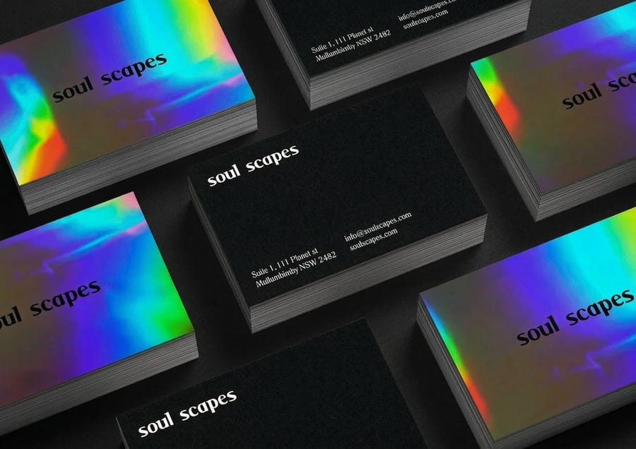
Look at stationery from firms that have been around a while and the same thing keeps happening: the design holds the top and bottom edges of the sheet and leaves the middle completely alone. Restraint is what reads as established. A busy letterhead competes with the letter, and the letter is the reason the page exists.
The second signal is the paper. A letter printed on a sheet you can feel the texture of lands differently from the same words on copier stock, and nobody has to be told why. Uncoated writing stock has tooth, takes a pen, holds toner properly and folds without cracking. Gloss coated stock does none of that, which is why almost no serious letterhead uses it.
The third is consistency across the pieces a client actually receives. The letter arrives in an envelope, often with a card clipped to it. When the business card uses the same mark, the same accent color and the same typeface as the sheet, the whole thing looks deliberate. When they were designed months apart by different hands, it shows immediately.
The live area is the design constraint nobody plans for
A business letter needs roughly eight inches of usable column, one inch of margin on each side, and a clean top for the date and address block. That leaves you about an inch and a half at the top and an inch at the bottom to work in. Every letterhead that fails does so because the design pushed into the letter and the first person to type on it had to fight the layout.
Set the letter up in a word processor before you finalise the artwork. Type a real two paragraph letter, print it on plain paper, and hold it over the proof. If the text collides with anything, fix the letterhead rather than asking everyone in the office to remember a special top margin. Our walkthrough for building letterhead in MS Word covers setting those margins so the file matches the printed sheet.
Where the folds land
An 8.5 by 11 sheet folded in thirds for a #10 envelope creases near 3.67 in and 7.33 in from the top. Those two lines are the reason a heavy solid rule or a photographic band across the middle of a letterhead so often looks damaged in the recipient’s hands. Ink cracks along a fold, and a crack through a logo is worse than no logo.
If you want a horizontal element, put it above the first crease or below the second. If you want a photograph, keep it in the top band. Fold a plain sheet, mark the creases, and lay it on your artboard once. It takes a minute and it saves a reprint.
Ten letterhead design ideas worth printing
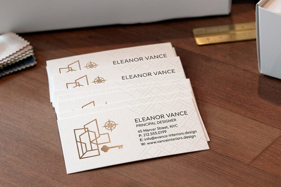
These are ten directions that hold up in practice, ordered roughly from the easiest to produce to the most involved. The first six can be printed commercially and then run through an office printer for each letter. The last four need the whole sheet printed at once, which changes how you buy them.
Every one of them is cheap to test as a short run, and each pairs with a piece a client will hold. A letterhead alongside a matching custom business card at $17.57 or a thank you card at $19.77 does more for how a small firm is perceived than a website refresh does.
Ideas one to five, the quiet ones that always work
1. Move the logo off center. A mark sitting hard left on a strong margin, with the contact details set small in the opposite corner, looks more considered than the same mark centered. Centering is the default, and defaults read as default.
2. Push everything to a footer. Put a small mark at the top and move the address, phone, registration numbers and site into a single hairline ruled band at the bottom. The top of the page stays clean for the letter, and the fine print stops fighting the greeting.
3. Set the contact block as a left sidebar. A vertical column an inch and a half wide down the left edge holds a lot of information without touching the letter, and it gives the page a shape that a horizontal masthead cannot. It suits practices with several offices or a long list of credentials.
4. Use one accent color, everywhere, forever. A single spot color on an otherwise black and white sheet costs less than a full color print and looks more disciplined. The accent then repeats on the card, the envelope and the envelope seal label, and the suite reads as one thing.
5. Set a very light watermark behind the text. The brand mark at 8 to 12 percent tint sits behind the letter without hurting readability. Above about 15 percent it starts to muddy black type, and after a photocopy or a fax it turns to gray mush.
Ideas six to ten, when you want the sheet to be the statement
6. Type only, no logo at all. The firm name set once in a typeface with real character, at a size nobody expects, is a legitimate letterhead. It works when the name is good and the typography is genuinely well set. It fails badly when either is half done.
7. Print on colored stock instead of with colored ink. A soft gray, cream or pale blue writing stock with black ink costs less than four color printing and feels considerably more expensive. It also photographs well, which matters more than it used to.
8. Run one edge to edge color band. A full bleed strip along the top or the left edge gives the sheet presence inside an envelope of white paper. The catch is real: your office printer cannot produce that band, so the shells have to be printed in advance and stocked.
9. Blind emboss the mark. No ink, just the mark pressed into the sheet so it catches the light. It is the most restrained option on this list and the most expensive per sheet, and it suits invitations and thank you notes more than daily correspondence.
10. Design the second sheet as its own piece. Pages two onward get a stripped back version, usually the mark small in one corner and nothing else. Ordering the second sheet in roughly a one to four ratio against the first is the detail that tells a recipient the stationery was planned rather than bought.
Paper, ink and the trade offs that set the price
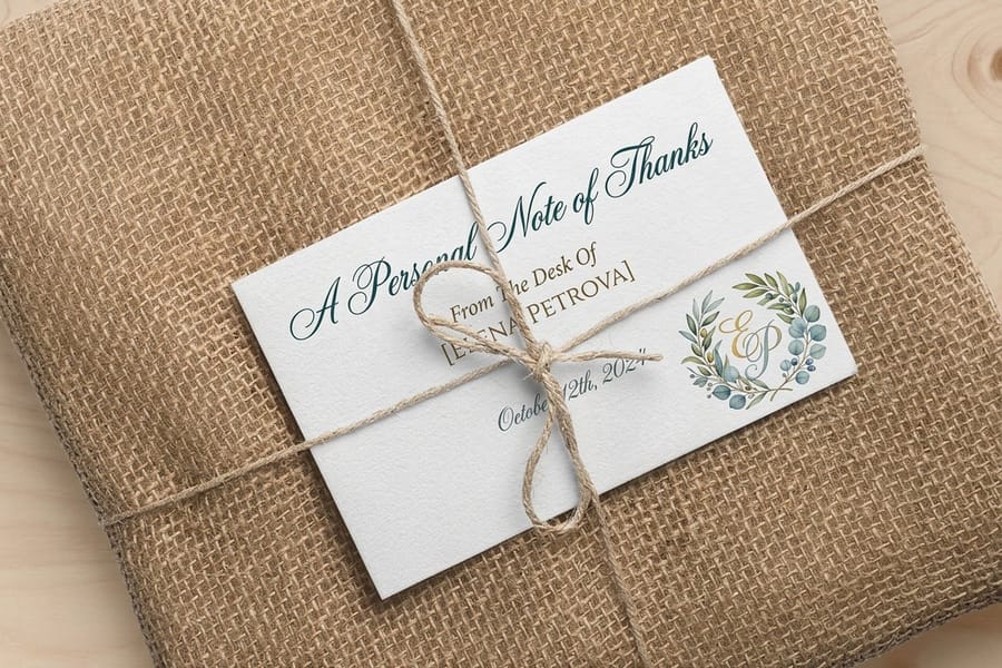
Once the layout is settled, three choices decide both the cost and whether the sheet actually works in an office: the weight of the stock, the coating, and the ink or finish. Artwork is the part everyone talks about and the part that matters least to whether the letterhead functions.
Weight first. Text weight writing stock, around 24 lb bond or 70 lb text, is the whole category. It is heavy enough to feel like something and light enough to fold flat, feed a desktop printer and go in an envelope without pushing the postage into the next band. Cover stock belongs on cards, not letters.
Coating second, and this is where most first attempts go wrong. Gloss coated stock rejects toner, resists a ballpoint pen, and shows every fingerprint. Uncoated is the default for letterhead for those three reasons, and a matte or dull coated sheet is the furthest you should go if you want photography on the page.
The finishes that fight a laser printer
Raised thermography looks like engraving at a fraction of the price, and it is a genuinely good choice for a card. On letterhead it is a risk, because a laser printer fuser runs hot enough to soften the raised resin and it can offset onto the rollers or the next sheet. If your letters are printed one at a time in the office, keep the sheet flat printed and put the raised finish on the card instead.
Foil has the opposite behavior and is usually fine, though a large solid foil area near the leading edge can still misbehave on some machines. Heavy solid ink coverage is worth a test as well: toner does not bond to a thick offset ink layer as reliably as it does to bare paper. The rule is simple. Print ten sheets of the real stock, run them through the real office printer, and look at the result before you order a thousand.
What the sheet costs against what it does
A one color letterhead on good uncoated stock is inexpensive and can carry a firm for a decade. Full color and edge to edge printing costs more per sheet and forces you to hold stock, which is a real cost when the phone number changes. Emboss and foil cost the most and are worth it on the pieces a client keeps, which is rarely the invoice cover letter.
A practical split most small firms land on: plain flat printed letterhead for volume correspondence, and the money spent on the pieces that get handled, the business cards and the thank you cards. If you want a broader view of the pieces that make up a print identity, the custom printing collection lays out what each one is for.
Stationery pricing and specs at 4OVER4.COM
Letterhead is bought as a set, so the number that matters is what the whole suite costs rather than the price of one piece. The card is the piece a client keeps and handles, and it is the one worth checking specs on first. The figures below come from the live configurator.
Quantity and price
Business card pricing and specs
Real configurator numbers for the card that has to match your letterhead, with the per unit cost dropping as the run grows.
| Quantity | Price Per Unit | Total |
|---|---|---|
| 100 | 17.6¢ | $17.57 |
| 200 | 11.5¢ | $23.07 |
| 300 | 9.15¢ | $27.46 |
| 400 | 7.96¢ | $31.86 |
| 500 | 7.25¢ | $36.26 |
| 600 | 6.77¢ | $40.64 |
You can also earn coins on every order and put them against the next reprint, which matters when a stationery suite gets refreshed one piece at a time.
Carrying the design onto the rest of the suite
A letterhead alone is half a job. The recipient meets the envelope first, then whatever is clipped to the letter, and the sheet last. Repeat one accent color and one typeface across all three and the set reads as one identity. Change any of them and it reads as three separate purchases, which is exactly what it was.
Print it
The card that matches the sheet
Custom business cards from $17.57, on stock and finishes that pair with uncoated letterhead.
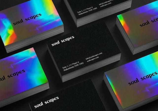
The envelope side is where most suites fall apart, because printing directly on envelopes is fiddly and expensive in small quantities. A printed seal or return address label solves it for a fraction of the cost, and standard custom labels start at $23.88. For correspondence that needs a follow up, a matching thank you card at $19.77 carries the same mark onto the one piece a client is likely to keep on a desk. If the identity extends into merchandise as well, the branded merchandise guide covers what survives the jump from paper to object.
Letterhead patterns by industry
The right layout depends less on taste than on what the letters are used for, so it usually breaks down like this.
- Law and accounting practices. A top masthead, one accent color, and a footer rule for registration details. The formality is the point, and the stock does the differentiating rather than the layout.
- Architecture and interiors. A left sidebar suits long project lists and multiple offices, and it leaves the page shape open. Echo the same column on the card, as the interior design business cards show.
- Design studios and agencies. Footer only, or type only. Clients are judging the typography, so the restraint has to be genuine rather than an empty page with a logo in the corner.
- Medical and dental practices. Readability above everything, since these letters get scanned into records. Skip watermarks, keep the tint off the body area entirely, and use a generous live area.
- Consultants and single operators. One accent color on uncoated stock plus a matching card is the whole identity. It costs very little and it removes the improvised look that loses work.
Letterhead blanks with the fold marks in place
Starting from a sized blank saves the most common mistake, which is artwork built to the trim line with no bleed. 4OVER4.COM sizes its blanks to exact product specs so the cut line and the bleed are already marked. Pull a print ready file from the blank template library, or start from a layout in the design template library and change the mark and the color.
Start fast
Letterhead blanks with the fold marks in place
Stationery design templates and exact size blanks so your artwork lands inside the cut line.














Wally lays out a letterhead that a printer will not argue with
Hold the edges, keep the folds clear, print on stock that takes a pen
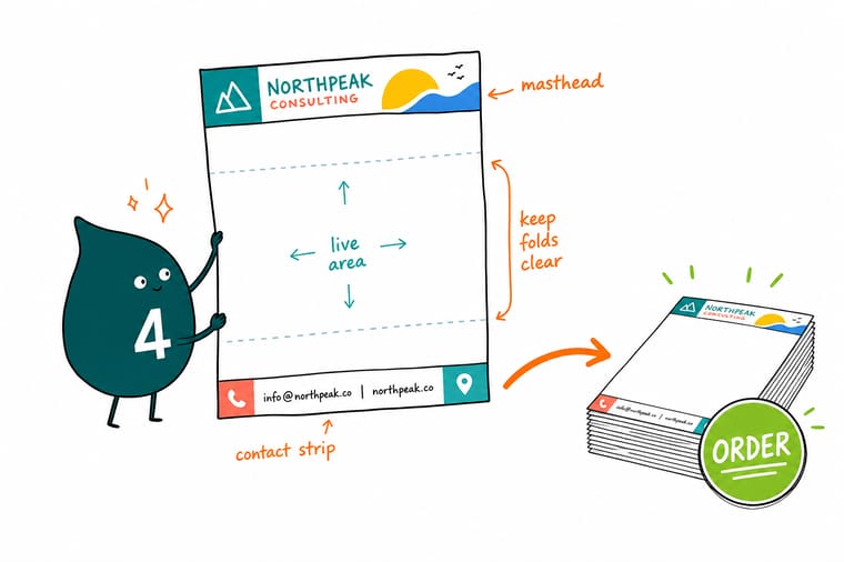
Leave about 1.5 inches at the top and 1 inch at the bottom for the design and give the rest to the letter. Keep rules and logos off the creases near 3.67 and 7.33 inches, hold watermark tints at 8 to 12 percent, and choose uncoated text weight stock so the sheet folds flat and feeds your office printer. 4OVER4.COM prints the matching cards, seals and thank you notes on the same schedule.
Order matching business cards →What an office printer does to a letterhead
Design tips that hold up at the press
- Type a real letter on it first. Set a genuine two paragraph letter on the layout before you approve anything. Half of all letterhead problems appear the first time somebody actually types on the page.
- Keep the folds clear. Mark the creases near 3.67 in and 7.33 in, and keep solid rules, logos and photographs off them. Ink cracks on a fold and a cracked logo is worse than no logo.
- Tints at 8 to 12 percent. A watermark heavier than that muddies black body type and turns to gray sludge in a photocopy. Print a proof and copy it once to check.
- Match the card and the seal. The same accent color and typeface on the card and the envelope label costs nothing extra and is most of what makes a suite look designed.
- Order a second sheet. Pages two and onward get a minimal version, roughly one for every four first sheets. It is a small detail that only planned stationery has.
Explore more
More ways to build the stationery suite
Business cards run 100 for $17.57 and thank you cards 25 for $19.77, the two pieces that follow a letterhead.
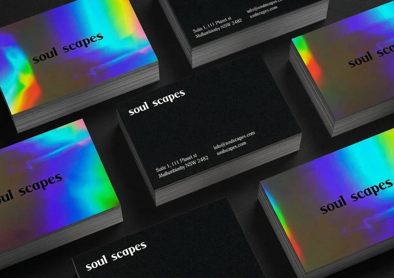 Product Custom Business Cards The card that has to match the letterhead, from $17.57.
 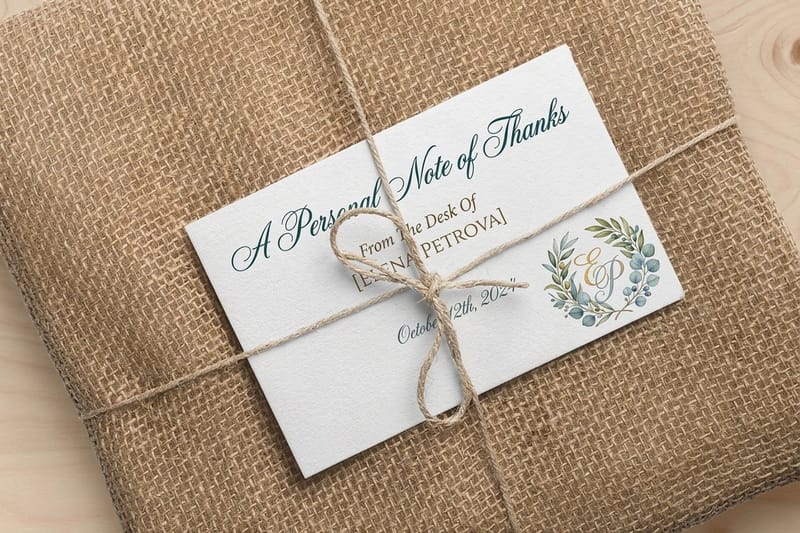 Product Thank You Cards The piece clients keep, printed on the same stock family.
  Product Standard Custom Labels Envelope seals and return address labels for the suite.
 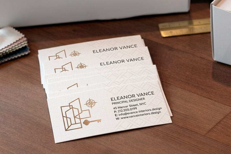 Product Interior Design Business Cards A sidebar layout carried from the sheet onto the card.
  Category Custom Printing Collection Every piece of a print identity in one place.
  Guide Letterhead in MS Word Set the margins so the file matches the printed sheet.
 Working on the rest of the brand at the same time? The company logo design article covers the mark itself, business card slogans covers the line that sits under it, and name badge design ideas carries the same identity onto your team.
Ready to print the suite?
Pick your pieces, drop in your design or start from a free template, and 4OVER4.COM prints them sharp on stock that matches across the set.
Common questions about letterhead
What paper weight should custom letterhead be printed on?
Text weight writing stock, roughly 24 lb bond or 70 lb text, and uncoated. That weight feels substantial in the hand, folds in thirds without cracking, feeds a desktop laser printer without jamming, and lets a pen write on it for a signature or a note in the margin. Cardstock is too rigid to fold and will jam most office machines. Gloss coated stock repels toner and ballpoint ink and shows fingerprints, which is why almost no professional letterhead uses it. If you want photography on the sheet, a dull or matte coated text weight is as far as you should go.
Can I print letters on top of commercially printed letterhead?
Yes, and that is how most letterhead is used: the shells are printed in bulk and each letter is run through the office printer as it is needed. Two things to watch. Raised thermography can soften under a laser fuser and offset onto the rollers, so keep the sheet flat printed if letters are run in house. And heavy solid ink coverage does not bond toner as reliably as bare paper, so if your design has a large solid area where text will land, print ten sheets on the real stock and run them through your real printer before ordering the full quantity.
How much of the page do I need to leave empty for the letter?
Plan on about eight inches of usable column with one inch margins left and right. In practice that gives you roughly the top inch and a half and the bottom inch for design. The date, the recipient address block and the greeting all sit in the upper third of a standard business letter, so anything you put across the top has to end cleanly before that. Set a real two paragraph letter on the layout and print it over the proof. If the two collide, change the letterhead rather than asking every person in the office to remember a custom top margin.
Should the letterhead match my business cards and envelopes?
Yes, and it is the cheapest upgrade available to a small firm. The recipient sees the envelope, then the card, then the sheet, usually within about ten seconds. Matching the accent color, the typeface and the position of the mark across all three is what makes the set read as designed rather than assembled. It does not have to be identical artwork: the card can carry the raised or foil finish the letterhead cannot, as long as the color and the type are the same. Custom business cards start at $17.57 and a matching envelope seal can come off standard custom labels at $23.88.
Do I really need a separate second sheet?
If your letters routinely run past one page, yes. A second sheet carries a stripped back version of the design, normally just the mark small in one corner, so pages two and three do not repeat the full masthead and address block. Order it in roughly a one to four ratio against the first sheet and you will not run short. If your correspondence is almost always a single page, skip it and put the budget into the stock instead.
