
Custom Photography Labels That Brand Every Print You Deliver


Print three labels rather than one: an uncoated label you can sign for the back of the print, a matte seal for the box or tissue, and a weatherproof label for the mailer. Stock is what separates them, because the paper that takes a pen will not survive a courier belt and the film that survives the belt will not take a pen.
Photography label placements at a glance
| Where it goes | Typical size | Face stock | What it carries | Product at 4OVER4 |
|---|---|---|---|---|
| Back of the print or mount | 2 x 3.5 in | Uncoated white, no laminate | Title, edition number, date, signature line | Standard Custom Labels |
| Glassine sleeve or folio | 1.5 in circle | Matte paper | Logo mark only | Custom Labels |
| Box seal or tissue wrap | 2 in circle or 3 x 1 in | Matte paper, permanent adhesive | Logo, one line, handle | Custom Labels |
| Outer mailer address block | 4 x 6 in | Semi-gloss, moisture resistant | Delivery and return address, handling note | Shipping Labels |
| USB, drive case, sample album | 1 x 3 in | Matte film | Client name, shoot date, gallery expiry | Standard Custom Labels |
Sizes are a starting point, not a rule. Measure the smallest print and the smallest sleeve in your range before you commit a layout, then order standard custom labels in a short run and check them on the real materials.
Where the labels actually go on a photography order
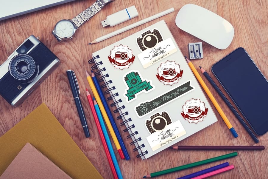
Walk a finished order backwards from the client’s hands and you find four surfaces worth branding: the outer mailer, the box or wrap inside it, the sleeve around each print, and the back of the print or its mount. Most photographers brand one of those, usually the sleeve, and leave the other three blank because a single label design cannot serve all four.
It cannot, and that is the point. The mailer label lives outdoors on a courier belt and needs a stock that shrugs off rain. The back-of-print label needs to take a pen. Those two requirements pull in opposite directions, so you print two designs rather than compromising on one.
The good news is that the cost of a second and third design is mostly artwork time, not print money. Standard Custom Labels start at $23.88 and Custom Labels at $25, so the whole set is a rounding error against the cost of the prints themselves. Photographers already ordering packaging can plan the labels alongside the boxes in our guide to printing custom boxes with your logo.
The seal label is the one people remember
A round label holding tissue paper closed is the moment the order stops being a parcel and starts being a gift. Print it on matte paper with a permanent adhesive so it tears as the client opens it. That sounds like a flaw and it is deliberate: a paper seal that tears reads as sealed, while a film label peels off in one piece and reads as a sticker someone can move.
Keep that label simple. A mark, or a mark and a handle. There is no room for a tagline at 2 inches across and no reason for one when the print inside is doing the persuading. Photographers who also wrap in printed tissue should read custom branded wrapping and tissue paper for your brand before choosing the seal color, because the two have to agree.
The mailer label is not a design exercise
The outer label carries an address, a return address, and whatever handling note you want a driver to read. It is the label a courier scans, so keep the barcode zone clean and resist putting artwork behind it. Shipping Labels at $25 cover the 4 by 6 inch block that fits every standard mailer, and a small printed return address block ties the parcel to your studio before it is opened. If most of your work goes out by mail, the wider address label printing range covers the return-address sizes that pair with it.
One practical note on mailers: a label sitting across the seam of a bubble mailer lifts at the crease. Place it flat on one face, not bridging the fold. The same rule applies to the rigid mailers covered in custom bubble mailers with your design printed on them.
Stock, adhesive, and the mistake that stains a print
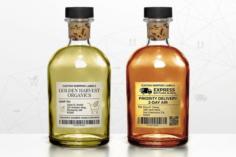
Face stock decides whether a label can be written on, and adhesive decides whether it can be trusted near the work. Those are two separate decisions and photographers tend to make only the first.
On stock, the rule is short. Uncoated paper takes pigment ink and a pencil, matte paper takes ink slowly and smudges under a thumb, and gloss or laminated stock rejects both. If a label has a signature line on it, it has to be uncoated, which also means it has no protection and will mark if it is handled roughly. That is the trade you accept for a signable label, and it is why the signable one goes on the back where nothing rubs it.
On adhesive, the caution is real. Pressure-sensitive adhesives can migrate into porous fiber-based papers over a long enough period, and on a thin sheet the outline of the label can eventually read through from the front. Stick the label to the back of the mount board, the backing board, or the glassine sleeve. Never to the back of an unmounted fine-art print you have sold as archival.
What to use where
For a print going into a folder or a folio, a matte paper label on the folder is enough and it will never touch the image. For a mounted print, the label belongs on the back of the mount, centered, with the top of the label matching the top of the image so an assistant can orient the piece without unwrapping it.
For anything that leaves the studio in weather, use a film face with a laminate or a semi-gloss shipping stock. Paper on the outside of a parcel turns to pulp in one rainy delivery, and a smeared address costs you a reprint and a reship.
Kraft, black tissue, and the white ink problem
A clear label on kraft paper looks beautiful in a mockup and disappears in real life, because the ink on a clear face is transparent and picks up whatever is behind it. Unless white ink is being laid down as a base, the answer on kraft, black tissue, or a dark box is a white or matte-white face stock cut to the shape you wanted the clear one to be.
The same applies to pale ink on a dark stock. If the design depends on a light mark, print the mark dark on a light label rather than fighting the substrate. Choosing those pairings is easier with the contrast rules in best color combinations for brand and print design.
Sizes, layout, and what a back of print label carries
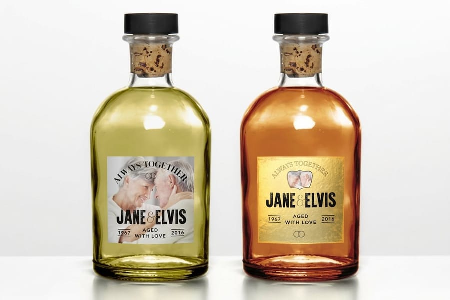
Size the label to the smallest print it will ever go on, not the largest. A photographer selling 5 by 7 up to 16 by 20 who designs the label for the 16 by 20 ends up with a label that swamps the small print. A useful ceiling is a third of the shortest side of the smallest print in the range, which for a 5 by 7 puts you at roughly 2 by 3.5 inches, the same footprint as a business card.
That footprint is enough for six lines. Title of the work, edition or sequence number if you sell editions, capture date, paper and process, studio name, and a signature line. Print the signature line as an actual rule rather than leaving blank space, because an unmarked gap invites a signature anywhere on the label and a printed rule keeps every print in the run looking identical.
Set the file at 300 DPI in CMYK with 0.125 inch bleed on every side and hold all type at least 0.125 inch inside the cut line. Rotary die cutting drifts slightly across a sheet, so a circle label needs more clearance than a square one, and a mark centered to the millimetre in the file will still read as centered only if it has room to move.
One design, several jobs
Rather than five label designs, build one grid and change what sits inside it. The seal label is the grid with only the mark. The back-of-print label is the same grid with the text block. The drive label is the same grid rotated. It keeps the set looking like one studio and it means new sizes are a layout change rather than a new design job.
Photographers who also sell dated products, calendars in particular, can carry the same grid across the whole delivery. Our guide to planning and printing a custom calendar covers how the print and the label schedule line up when you are producing a seasonal run.
Print one before you print a thousand
Order a short run, stick one on the actual mount board, and look at it under the light the client will see it in. Warm gallery light shifts a cool gray label noticeably, and a label that looked neutral on screen can read blue against a warm-toned print.
Then run a real parcel through the post to yourself. It is the only honest test of whether the mailer label survives a courier and whether the seal tears the way you intended when someone opens the box in a hurry.
Label pricing and specs at 4OVER4.COM
Label price moves with size, stock, finish and quantity, and the per unit cost drops as the run grows. The numbers below come from the live configurator, so you can budget the whole set before you order any of it.
Quantity and price
Custom label pricing and specs
Live configurator numbers for standard custom labels, the stock most photographers use for back-of-print and edition labels.
| Quantity | Price Per Unit | Total |
|---|---|---|
| 25 | 95.5¢ | $23.88 |
| 50 | 72.9¢ | $36.44 |
| 100 | 42.7¢ | $42.72 |
| 150 | 32.7¢ | $49.01 |
| 200 | 27.6¢ | $55.29 |
| 250 | 24.6¢ | $61.57 |

Every order also earns coins you can put toward the next run, which is worth knowing if you reprint the same seal label every season. The rules are on the earn coins page.
Finish and shape, what changes and what does not
Finish decides two things: whether the label can be written on, and how it holds up to handling. Gloss lifts color and resists moisture, which is why it belongs on the outside of a parcel. Matte reads calmer and takes ink slowly. Uncoated is the only one that reliably accepts a pen, and it is the one with no protection at all. Shape is a smaller decision than it looks, because a die-cut circle and a die-cut square cost the same on the same stock, and the circle is simply harder to align artwork inside.
Print it
Custom labels, cut to your shape
Seal labels, sleeve marks and print labels in the size your packaging actually needs.
One thing that catches photographers out on shaped labels: a rotary die drifts a little across a sheet, so a mark centered perfectly in the file can sit a hair off center on a few labels in the run. Give circular labels more clearance from the edge than you think they need, keep type 0.125 inch inside the cut line, and the drift stops being visible. If you are hand-applying labels to prints, that clearance also forgives your own placement.
What each kind of photographer needs
The label set changes with what you deliver and how it travels.
- Wedding photographers. Seal label on the tissue, back-of-print label on the album prints with the couple’s names and date. The date on the label is what makes the print findable in a drawer ten years later.
- Portrait studios. One matte seal for the folder, one signable label for the mounted print. Keep the studio name and the shoot reference on the same label so reorders are traceable.
- Fine-art print sellers. Edition number, title, paper and process on an uncoated back label, applied to the mount rather than the print. This is the label a collector reads before they read anything else you wrote.
- Event and sports photographers. High volume, short deadlines, so print one generic seal label in quantity and add the variable detail with a second small label rather than reprinting the whole design per event.
- Commercial and product photographers. Deliveries go out as parcels more often than as prints, so the shipping label and the return address block matter more than the print label does.
Label blanks with die clearance built in
If you would rather not build the die line yourself, start from a blank. 4OVER4.COM sizes its templates to exact product specs, so the bleed, the cut line and the safe area are already marked and your artwork lands where you expect. Pull a blank from the blank template library and drop your grid into it.
Start fast
Label blanks with die clearance built in
Exact size label blanks with the bleed, the cut line and the safe area already in place.
Wally sorts the three photography labels
One to sign, one to seal, one to ship
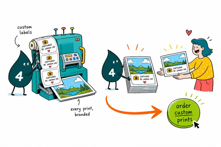
Print the back-of-print label uncoated at about 2 x 3.5 inches so a pigment pen bites and dries, keep it on the mount rather than the print itself, and set the seal label as a 2 inch matte circle that tears when the client opens the tissue. Save the gloss and the moisture resistance for the 4 x 6 inch mailer label. Build all three on one grid at 300 DPI in CMYK with 0.125 inch bleed, and 4OVER4.COM proofs the set before it runs.
Order custom labels →What a label must not do to a print
Layout habits that hold up across a whole range
- Print the signature rule, do not leave a gap. A printed rule keeps every signature in the same place. Blank space produces a different-looking print every time.
- Match the label top to the image top. Center the back label and align its top edge with the top of the image so anyone can orient a wrapped piece without opening it.
- Size to the smallest print in the range. A third of the shortest side is a safe ceiling. A label designed for the 16 by 20 will look enormous on the 5 by 7.
- Keep the courier zone clean. No artwork behind a barcode and nothing across a mailer seam. Both cost you a failed scan or a lifted corner.
- Decide gloss or uncoated by asking if you will write on it. That single question settles the finish faster than any mood board will.
Explore more
More ways to brand a delivery
Standard custom labels run 25 for $23.88, which is $0.96 a label, out in 3 business days.
 Product Standard Custom Labels Uncoated stock that takes a pen, for back-of-print and edition labels.
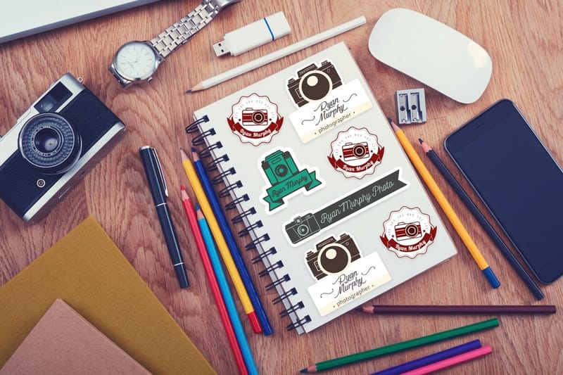
 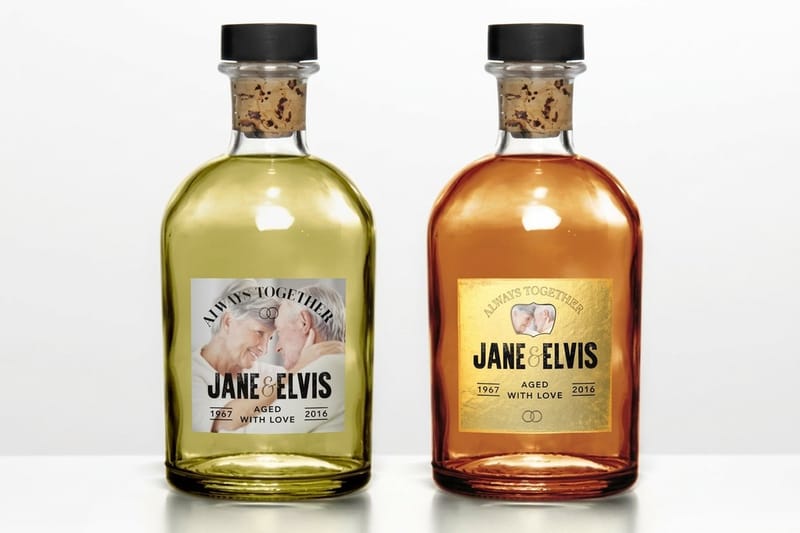 Product Custom Labels Seal labels and sleeve marks in any shape, from $25.
 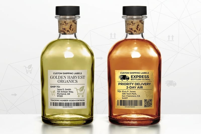 Product Shipping Labels The 4 by 6 inch address block that survives a courier belt.
 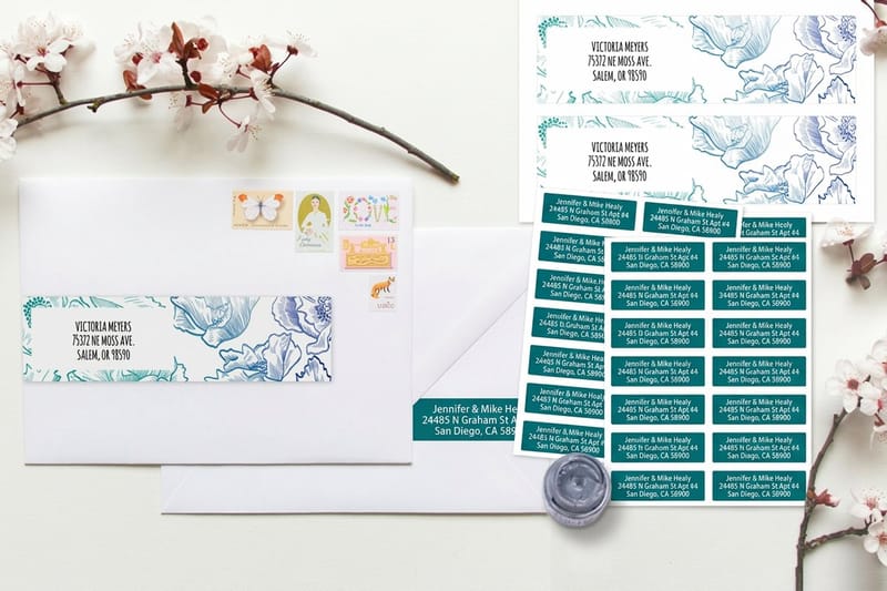 Category Address Label Printing Return address sizes that pair with your mailer label.
 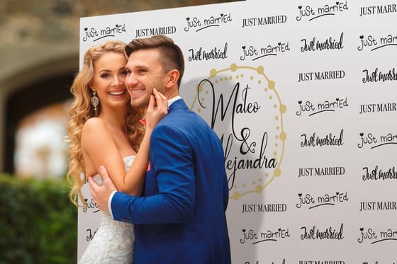 Article Custom Backdrop Printing for Photography The other print job that carries your brand into the frame.
  Guide How to Print Custom Boxes With Your Logo Plan the box and the seal label together, not separately.
 Ready to label your next delivery?
Pick your sizes, upload your grid or start from a free blank, and 4OVER4.COM prints the set on the stock each job needs, proofed before it runs.
Common questions about photography labels
What kind of label can I actually sign or write on?
An uncoated paper label with no laminate over it. Pigment pens and pencil bite into uncoated stock and dry within seconds. On a gloss or laminated face the ink sits on the surface, beads slightly, and smears the moment a thumb crosses it, and no drying time fixes that because there is nothing for the ink to soak into. The compromise is that an uncoated label has no protection, so it scuffs if it gets rubbed. That is fine for a label on the back of a mount, where nothing touches it, and wrong for a label on the outside of a parcel.
Will a label damage an archival print?
It can, if you stick it directly to the print. Pressure-sensitive adhesives contain plasticisers that migrate slowly into porous fiber-based paper, and on a thin sheet the rectangle of the label can eventually become visible from the image side. The safe practice is to keep the label off the artwork entirely: put it on the back of the mount board, on the backing board, or on the glassine sleeve. If you are selling work as archival, that distinction matters to the buyer and it is worth saying on your own site how you handle it.
What size should a back-of-print label be?
Around 2 by 3.5 inches works for most ranges, which is the same footprint as a business card. Size it to the smallest print you sell rather than the largest, using roughly a third of the shortest side as a ceiling, so the label never dominates a small piece. That size holds six lines comfortably: title, edition or sequence number, capture date, paper and process, studio name, and a printed signature rule. If you need more than six lines, the information belongs on a card in the package rather than on a label stuck to the work.
Can I print a white logo on kraft paper or black tissue?
Only if white ink is being laid down as a base layer. Standard four-color printing has no white, so anything left unprinted shows the substrate, which is why a clear label on kraft looks like a smudge and a pale design on a dark stock disappears. The straightforward answer for dark packaging is a white or matte-white face stock cut to the shape you wanted, with your mark printed dark on it. It costs the same, it prints cleanly, and it reads from across a room.
Do I need a different label design for every print size?
No, and it is worth avoiding. Build one grid and change what sits inside it: the seal label is the grid with only the mark, the back-of-print label is the grid with the text block, the drive label is the grid rotated. You keep a consistent studio look and adding a new size becomes a layout change rather than a new design job. It also helps the economics, because label pricing steps down with quantity, and one design ordered in a real quantity costs less per label than five designs ordered in fives.
