
Marketing Postcard Examples That Convert, Broken Down by Offer and CTA


Nadia is our customer education voice, built from the knowledge of our production team, with over 20 years in printing.
The seven marketing postcard examples below, from the dollar-off coupon and the free assessment to the shaped die-cut card, convert because each one carries one offer, one deadline, and one way to respond that you can count. Everything else on the card, the stock, the shape, the photography, changes the result at the margin. The seven examples below are grouped by offer type rather than by industry, because the offer is what decides whether a card gets acted on.
Marketing postcard examples at a glance
| Offer type | Size that suits it | What the front has to carry | Who uses it | Product at 4OVER4 |
|---|---|---|---|---|
| Percentage or dollar-off coupon | 5 x 7 or 6 x 4 | The amount, huge, plus a hard expiry date | Retail, restaurants, salons, auto service | Standard postcards |
| Free assessment or first visit | 6 x 9 oversized | What the visit includes, what it normally costs | Dental, chiropractic, HVAC, roofing | Oversized postcards |
| Cash offer or valuation | 6 x 4 plain, letter look | One sentence, a name, a phone number | Real estate investors, land buyers | Standard postcards |
| Grand opening or event invite | 6 x 11 jumbo or 5 x 7 | Date, address, a map, one reason to turn up | New locations, launches, open houses | Direct mail postcards |
| Reminder or win-back | 6 x 4 or 4 x 6 folded | Last service date, what is due, a booking link | Dentists, vets, garages, subscriptions | Folded postcards |
| Sample or texture-led brand card | 5 x 7 soft touch | Almost no copy, one product shot, one line | Beauty, interiors, premium retail | Soft touch postcards |
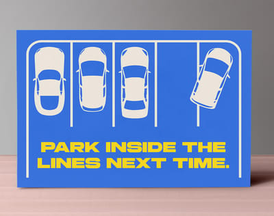
| Shaped card built to be kept | Die cut to outline | The shape carries the message, the copy is short | Pizza, pet care, fitness, seasonal | Die-cut postcards |
Sizes above are the ones that suit the offer, not the only ones that print. Check the postage band before you settle on a size, because a quarter inch of extra height can move the whole drop into letter pricing. You can order standard postcards in any of these sizes straight from the configurator.
What separates a postcard that converts from one that gets binned

Sorting mail over a bin is a two second job. In those two seconds a recipient decides whether the card is worth turning over, and the only thing that earns the turn is a single offer they can read without stopping. Cards that lose usually lost because they carried three offers of equal size, which forces a decision instead of prompting one.
The second thing that separates them is a deadline. An offer with no expiry gets filed on the counter and dies there. A date, even a soft one such as the end of the month, is what moves a card from the pile to the fridge to a phone call. Our breakdown of the ten elements of an effective mailer goes through the rest of the layout in order.
The third is a response mechanism you can count. A phone number that rings the main line tells you nothing. A dedicated number, a promo code the till already knows, or a QR pointing at a landing page built for that drop gives you a real number at the end of the campaign, which is the only way the second drop gets funded.
The zones you do not get to design
On a mailed card the right side of the back carries the address block and the indicia, and the bottom right strip is the barcode clear zone. Put your call to action there and the mail house will either move it or reject the file. Design the offer, the deadline and the response route into the left message panel, and treat the rest as reserved.
Keep 1/8 inch of bleed on every edge and pull anything you care about 1/8 inch inside the trim. Postcards are cut in stacks and the knife wanders slightly through the lift, which is exactly why a phone number sitting 1 millimeter from the edge comes back shaved on the bottom cards. The bleed and trim explainer shows what that margin is protecting.
The size decision is a postage decision
A card stays in the First-Class postcard price band only while it is at least 5 by 3.5 inches and no larger than 6 by 4.25 inches, with a thickness between 0.007 and 0.016 inch. One extra quarter inch of height pushes the whole drop into letter pricing, and on ten thousand pieces that is a real number. Check the current rates with USPS before you lock the size.
That does not mean small always wins. A 6 by 9 or 6 by 11 card pays more postage and gets noticed in a stack of envelopes, which is why service trades keep using it. Decide deliberately: cheapest to mail, or hardest to ignore. Our postcard mailing dimensions guide lists the bands side by side.
Seven marketing postcard examples, pulled apart
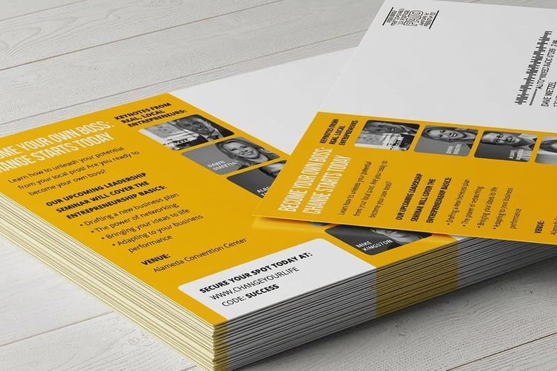
Each example below is a pattern rather than a picture to copy. What matters is the offer structure, where the ask sits, and what the card asks the reader to do next. The product beside each one is what we would print it on.
All of them are cheap to test. Standard postcards start at $16.48 and direct mail postcards at $89.68 with the addressing and the drop included, so running two offers against each other is a budget line most businesses can absorb.
Examples one to four: the offer does the work
1. The dated coupon. Front is the amount and almost nothing else, set large enough to read from a doormat. Back carries the terms in small type, the expiry, and a code the till recognises. Print it on standard postcards at 6 by 4 to stay in the cheapest postage band, and give the code to your staff before the drop lands rather than after.
2. The free assessment. Trades and clinics win with this because it removes the price question instead of discounting. Say what the visit includes, say what it normally costs, and put a booking route on the back. It works better on a 6 by 9 oversized card at $51.62, where there is room to list what the assessment covers without shrinking the type.
3. The plain cash offer. Property investors deliberately make this one look unmarketed: one sentence, a first name, a mobile number, sometimes a handwriting font. It converts because it reads as a person rather than a campaign. The trade-off is that it dies the moment your area is saturated with the same look, so it has a shelf life.
4. The neighborhood proof card. Real estate and home services put a recent local result on the front, a street or a postcode the reader recognises, then a short line asking whether they want the same. It needs a real, current example every drop, which is the reason most brands abandon it after two rounds.
Examples five to seven: the format does the work
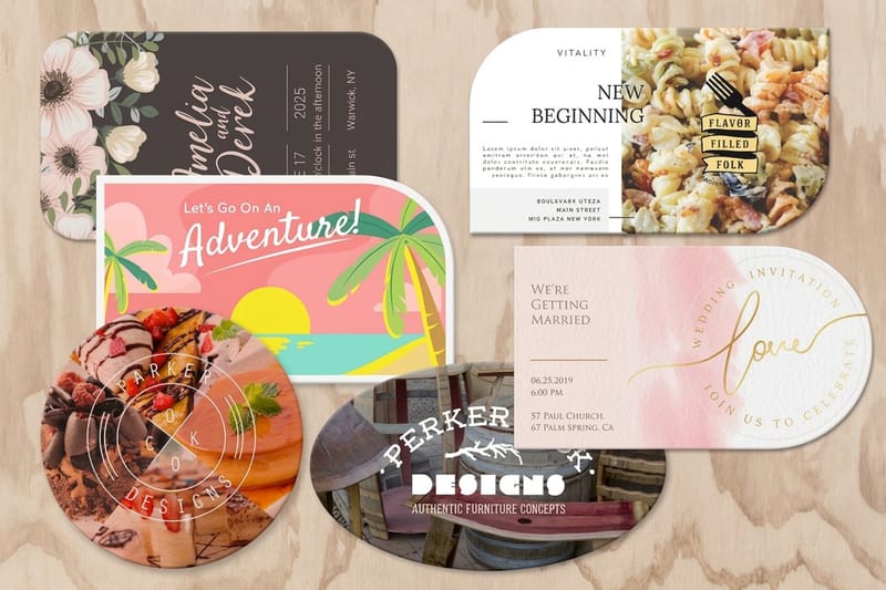
5. The shaped card. A die-cut postcard at $34.05 gets kept because it does not stack flat with the rest of the post. Cut to a shape that means something, a slice, a paw, a house outline, and keep the copy short because the shape has already made the point. Ask for a die line on your template before you start the artwork.
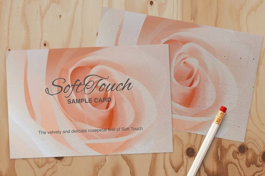
6. The texture card. Soft touch postcards at $29.44 are handled differently to gloss. People turn them over. Beauty, interiors and premium retail use almost no copy on the front, one product shot, and let the finish carry the impression. Do not put a fine 6pt legal line on soft touch, because the coating softens very small type.
7. The folded reminder. A folded postcard at $84.36 gives you four panels for the price of one mailpiece, which suits a service reminder that has to carry a date, a history and a booking route. It costs more per piece and it needs a heavier stock so it opens cleanly, so use it when the message genuinely needs the room.
Offers, deadlines and the response mechanism
The offer is the campaign. Layout and stock change the response rate at the margin; the offer changes it by multiples. Before you brief a designer, write the offer in one sentence and read it aloud. If it takes two sentences, it is two offers, and one of them is costing you the other.
Discount, free-first-step, and no-offer brand cards behave differently. A discount pulls fastest and trains people to wait for the next one. A free first step pulls slower and brings better customers, because they are buying the outcome rather than the price. A brand card with no offer pulls almost nothing on its own and works only as the second or third touch in a sequence.
The deadline is not a trick. It is the thing that makes the card an action rather than information. Give it a real date, print it on the front, and honor it, because an expiry that everybody knows is fake is worse than none at all.
Making the response countable
Use one response route per card. A phone number and a QR and a web address all on the same card split the count three ways and leave you unable to say what worked. Pick the one your buyer actually uses, then make it the largest element on the back after the offer itself. If you go with a code, point it somewhere useful; our guide to adding a QR code to postcards covers sizing and the quiet zone it needs to scan.
Give every drop its own code or landing page, even when the artwork is identical. That is what lets you compare a Tuesday drop against a Saturday one, or one postcode against another, instead of guessing. The direct mail results guide goes further into measuring a drop properly.
Who gets the card matters more than the card
A mediocre postcard to the right list beats a beautiful one to a bought list every time. Start with your own customers, then lookalike streets around your best jobs, then rented data last. Our guide to building or renting a mailing list explains what each option really costs.
If you do not have a list at all and you sell to a neighborhood, saturation mail by carrier route is the shortcut. It needs a flat-size piece rather than a standard postcard, which is why 6.5 by 9 is the common size for it. Read what EDDM is and whether it fits before you commit artwork to it.
Where the offer and the CTA can actually sit
The back of a mailed postcard comes with fixed zones. The address block, the indicia and the barcode clear zone are set before your layout starts, so on a 6 by 4.25 inch card, the largest that still mails at the postcard rate, your offer, deadline and response route share the left side of the back. The diagram below shows what is left for each.
Postcard pricing and specs at 4OVER4.COM
A test drop of 50 cards costs $16.48 on standard 14pt gloss cover, $29.44 on 32pt soft touch, $34.05 as a 4 by 6 die-cut card with rounded corners, and $51.62 as a 5.5 by 8.5 inch oversized card, so two offers side by side cost less than the postage on them. The numbers below come straight from the live configurator for standard postcards.
| Card | Sizes | Stock | First run | Production |
|---|---|---|---|---|
| Standard postcards | 2.5 x 2.5 to 6 x 11 in | 14pt gloss cover, 16pt, uncoated, linen and more | 50 for $16.48 | 3 business days |
| Soft touch postcards | 2.5 x 2.5 in and up | 32pt soft touch uncoated | 50 for $29.44 | 5 business days |
| Die-cut postcards | 6 shapes, from 4 x 6 in with rounded corners | 14pt gloss cover | 50 for $34.05 | 5 business days |
| Oversized postcards | 5.5 x 8.5 to 6 x 11 in | 14pt gloss cover | 50 for $51.62 | 3 business days |
| Direct mail postcards | 4 x 6 to 6 x 11 in | 14pt gloss cover | 500 for $89.68, mailed | 4 business days |
Quantity and price
Postcard pricing and specs
Real configurator numbers on premium gloss cover stock, where the more you order the lower the per unit cost drops.
| Quantity | Price Per Unit | Total |
|---|---|---|
| 50 | 33.0¢ | $16.48 |
| 100 | 24.2¢ | $24.16 |
| 200 | 15.9¢ | $31.86 |
| 300 | 12.8¢ | $38.45 |
| 400 | 11.3¢ | $45.04 |
| 500 | 10.3¢ | $51.62 |
You can also earn coins on every order and redeem them against later drops, which matters when a campaign runs monthly rather than once.
Stock and finish, and what each one signals
Stock changes how a card is handled before a word of it is read. 14pt gloss is the default: color sits bright, photography holds up, and it shrugs off a wet doormat. 16pt feels noticeably more rigid in the hand, which is worth paying for on anything above 6 by 4. Matte and soft touch read quieter and premium, and they are the right call when the card is a brand impression rather than a coupon. Uncoated stays writable, so it suits appointment reminders where the sender fills in a date.
Print it
Postcards, ready to mail
Preset sizes on premium gloss cover, the fastest route from an approved offer to a drop.

Finish also has a cost you feel later. Gloss resists a pen, so if your team writes a name or a date on the card by hand, gloss is the wrong choice and uncoated is the right one. Soft touch softens very small type, so keep legal lines at 7pt or above on it. Heavy coverage of a dark solid shows every handling mark, which is why a black-heavy card looks worse in a letterbox than it does on screen. If you want the finish to be the message rather than the offer, soft touch postcards at $29.44 are the cheapest way to test that.
Choosing the right example for your industry
Different industries have different needs, so here is a quick breakdown by business type.
- Retail and restaurants. Dated coupon on a 6 by 4 standard card, one amount, one expiry, a code the till already knows. Cheapest postage band and the fastest read on a doormat.
- Dental, chiropractic and clinics. Free first assessment on a 6 by 9 oversized card, with what the visit includes listed rather than implied, and a single booking route on the back.
- Home services and trades. Neighborhood proof on the front, a real recent job, then one line asking for the same work. Refresh the example every drop or the card stops being true.
- Real estate and investors. A plain, letter-looking card with one sentence and a mobile number. It reads as a person, and that is the whole mechanism.
- Beauty, interiors and premium retail. Soft touch stock, one product shot, almost no copy. The finish does the persuading and the card gets handled rather than sorted.
Blanks that save a round of file corrections
If you are not starting from scratch, templates save a round of file corrections. 4OVER4.COM sizes its blanks to exact product specs, from 4 by 6 to 6 by 11 inches, so the 1/8 inch bleed, the trim and the address panel are already marked. Export the finished file at 300 DPI in CMYK. Grab a print ready blank from the blank template library, or start from a layout in the free design template library.
Start fast
Blanks that save a round of file corrections
Blanks that leave the barcode strip and the right side of the back to the carrier.


Wally lays out a postcard that gets a reply
One offer, one date, one way to answer
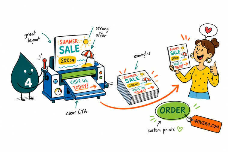
Put the offer on the front at a size you can read standing up, print the expiry beside it rather than in the terms, and keep the right side of the back clear for the address block and the barcode zone. Add 0.125 inch bleed on every edge, design at 300 DPI in CMYK, and give each drop its own code so you know which one worked.
Order postcards →What makes a card get answered
Layout tips that hold at every size
- One offer, sized to be read standing up. If the offer needs the reader to stop and focus, it is too small. Set it so it lands from about an arm and a half away.
- Put the expiry on the front. The date is part of the offer, not part of the terms. On the back it gets read after the decision has already been made.
- Keep the left panel for the ask. The right third of the back and the bottom right strip are reserved for the address and the barcode. Design the call to action into what is left.
- One response route, tracked. A number, a code or a QR. Pick one, make it big, and give each drop its own version so the result is countable.
- Proof the stock, not just the PDF. Gloss, matte and soft touch change how heavy the color reads. Order a proof and look at it in the light your buyer will hold it in.
Explore more
More ways to print and mail
Die-cut postcards run 50 for $34.05 and soft touch 50 for $29.44, both out in 5 business days.
Product Standard Postcards The cheapest way to test an offer against another one. Product Direct Mail Postcards Print, address and drop in one order. 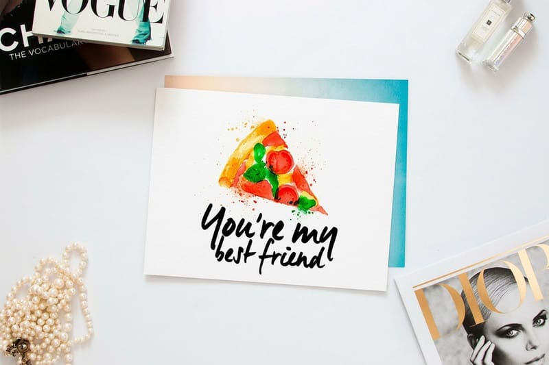 Product Oversized Postcards Room for a full assessment offer without shrinking type. Product Die-Cut Postcards Cut to an outline so the card does not stack flat.
 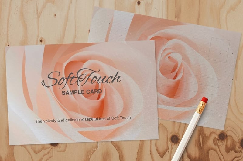 Product Soft Touch Postcards A finish people turn over instead of sorting. Category Postcard Printing Every postcard size, stock and finish in one place.
  Guide Run a Direct Mail Campaign List, offer, drop and measurement in order.
  Article Direct Mail Marketing Examples Campaigns beyond the postcard that earned a reply.
 Ready to print your next drop?
Pick your size, drop in your design or a free template, and 4OVER4.COM prints it sharp on premium stock and mails it for you if you want.
Common questions about marketing postcards
What makes a marketing postcard convert?
One offer the reader can take in without stopping, a real deadline printed on the front, and a single response route you can count. Cards that fail almost always carried two or three offers of the same visual weight, which turns a prompt into a decision and a decision into a bin. The layout matters after that: the offer on the front, the terms and the ask on the left panel of the back, and the right side left clear for the address block and the barcode zone the carrier needs.
What size should a marketing postcard be?
Use 6 by 4 inches when postage is the constraint, because a card stays in the First-Class postcard price band only between 5 by 3.5 and 6 by 4.25 inches at a thickness of 0.007 to 0.016 inch. Go to 6 by 9 or 6 by 11 when getting noticed in a stack of envelopes matters more than the per-piece cost, which is the usual choice for trades and clinics. Confirm the current rates and dimensions with USPS before the artwork is locked, and check the size bands in our postcard mailing dimensions guide.
Should a marketing postcard use a discount or a free first step?
A discount pulls faster and a free first step brings better customers. Discounts work when the purchase is small, frequent and price sensitive, such as food, retail and routine services, and the cost is that you teach people to wait for the next card. A free assessment, consultation or first visit pulls a lower response rate but the people who reply are buying the outcome rather than the price, which is why clinics and home services keep using it. If you are running a first campaign, test both with the same artwork and different codes.
How do I track which postcard drop worked?
Give each drop its own response route: a unique promo code, a dedicated phone number, or a QR pointing at a landing page built for that drop. Use one route per card, because putting a number, a QR and a web address on the same piece splits the count three ways and leaves you unable to say what happened. Keep the artwork identical between test cells so the only variable is the thing you are testing, whether that is the offer, the postcode or the day the drop lands.
Can I print and mail postcards in the same order?
Yes. Direct mail postcards at 4OVER4.COM cover printing, addressing from your list and the drop into the mail stream in one order, starting at $89.68, so the file never has to go to a separate mail house. Send a clean, deduplicated list with the addresses in separate fields, leave the address panel and the bottom right barcode strip clear on the back, and keep 1/8 inch of bleed on every edge. If you do not have a list and you sell to a neighborhood, saturation mail by carrier route is the alternative and it needs a larger flat-size card. If the card leads with a photo, our guide to a custom photo postcard covers the 300 dpi and bleed setup.
