
The American Psycho Business Card and Why It Still Works


Emma is our prepress and print production voice, built from the knowledge of our production team, with over 20 years in printing.
Why the American Psycho Business Card Scene Still Lands
Four men sit around a boardroom table and slide cards across it one at a time. Nobody raises their voice. The whole exchange is whispered specifications, paper color, typeface, lettering, thickness, and by the end of it Patrick Bateman is sweating over a rectangle of paper. It is the most accurate scene about business cards ever filmed.
It works because the joke is real. A card carries almost no information the other person cannot get from a phone. What it carries instead is judgment about how seriously you take your own name, and that judgment lives entirely in the material choices a printer makes for you.
That is the useful part for anyone who has to hand out cards for a living. Strip away the satire and the scene is a checklist: pick a paper color that is not plain white, pick a typeface with an opinion, decide whether the lettering sits on the surface or rises off it, and choose a thickness people notice when they take it from your hand. 4OVER4.COM prints every one of those variables, so the fictional card is closer to your desk than it looks.
The three cards on the table
Bateman opens with bone stock and Silian Rail lettering. Van Patten answers with eggshell and Romalian Type. Then Paul Allen produces the card with the raised lettering and the pale off white paper, and the room goes quiet. The escalation is entirely about surface and weight. Our guide on how to recreate the Paul Allen business card, bone stock and all walks through the paper, type and lettering.
The tell in the dialogue
Listen to the words that get the reactions. Watermark. Subtle coloring. Tasteful thickness. Every one of them is a print spec you can order, which is why designers have been trying to rebuild these cards for twenty years.
Why recreations usually miss
Most attempts nail the typography and stop there. They print on standard glossy stock, and the card feels like a flyer. The scene is about touch before it is about type, so the paper decision has to come first.
Shop the look
Business card printing
Every stock, thickness and finish the scene implies, in one catalog.

Card Analysis, Typeface, Color, Stock and Thickness
Break the fictional cards into their four parts and every one of them maps to a real ordering option. Once you see the mapping, recreating the look stops being a design exercise and becomes a spec sheet you hand to a printer.
Start from a real product rather than a blank canvas. Artist Business Cards give you the quiet uncoated surface the scene implies, and Automotive Business Cards keep the same restraint on a card built for daily handoffs.
- Paper color. Bone, eggshell and pale off white all mean the same thing in practice: a warm neutral instead of bright white.
- Typeface. A serif or copperplate face set small, letterspaced, and centered with a lot of air around it.
- Lettering relief. Flat ink reads as ordinary, raised lettering reads as expensive, and the scene turns on exactly that difference.
- Thickness. The single spec people register before they read a word, because they feel it in their fingers first.
- Restraint. Name, title, company, number. No tagline, no logo the size of a stamp, no color.
Hold those five decisions steady and almost any layout you draw will land in the right territory. Change one of them, a bright white sheet or a heavy sans in bold, and the whole effect collapses into a normal card.
Print picks
Three cards that carry the look
Live prices, ready to configure with your stock and finish.
 Artist Business Cards 100 for $17.57 Understated stock and clean type, the closest honest match to the bone card.
  Automotive Business Cards 100 for $17.57 A working card that still reads calm, name first and nothing shouting.
  3D Lenticular Business Cards 500 for $690.88 The card that ends the comparison the second it hits the table.
 The Fonts Behind Silian Rail and Romalian Type
Neither font exists. Silian Rail, Romalian Type and Pale Nimbus were written for the novel as convincing sounding names, which is exactly why they sound like real foundry releases. That leaves you free to choose a face that produces the same impression instead of hunting a font that was never made.
The impression you are after is old money engraving. Small letterforms, generous letterspacing, high contrast between thick and thin strokes, and nothing set larger than it needs to be. These are the families designers reach for when they rebuild the card:
- Copperplate style faces. Engraved small caps with tiny serifs, the closest visual cousin to a traditional calling card.
- Garamond and other old style serifs. Warm, humanist, and forgiving at the small sizes a card forces on you.
- Didone faces such as Bodoni or Didot. Sharp thick to thin contrast that reads as luxury goods packaging.
- Transitional serifs such as Baskerville or Caslon. Neutral enough that the paper does the talking.
- Letterspaced caps in any of the above. The spacing matters more than the family, so open the tracking before you change fonts.
Set the name in caps at seven or eight points, track it out until the letters breathe, and put the phone number in the same face two points smaller. That single move gets you most of the way to the Patrick Bateman business card font effect without licensing anything exotic.
Eggshell, Bone and Pale Off White, Getting the Paper Color Right
Every card in the scene is a shade of not quite white, and that is the detail most recreations skip. Bright white paper is optically brightened, it reads as modern and cheap under office lighting, and it fights any serif you put on it. A warm neutral reads as considered.
You have two honest routes to that color. The first is an uncoated natural or cream stock, where the warmth is in the fiber itself and the ink sinks slightly into the surface. The second is printing a very light warm tint edge to edge on a neutral uncoated sheet, which gives you exact control of the shade but demands careful proofing.
- Uncoated natural stock. Warmth built in, a soft tooth under the thumb, and writing on the back actually works.
- Flood tint on uncoated. Total control of the exact off white you want, at the cost of one more proofing round.
- Avoid gloss and high white. Both push the card toward promotional and away from personal.
- Test under two lights. A tint that looks warm on screen can look gray under fluorescent office lighting.
If you are choosing between two swatches and cannot decide, pick the warmer one. Warmth forgives the small color shifts that happen on press, while a cool near white can drift gray and take the whole effect with it.
Tasteful Thickness, What Card Weight Actually Feels Like
Thickness is the line everyone quotes, and it is the one spec you cannot fake in a design file. Card thickness is measured in points, where one point is a thousandth of an inch, so a 16pt card is sixteen thousandths thick. The jumps are small on paper and enormous in the hand.
A standard card sits around 14pt to 16pt. At 18pt and above people start to comment. Double thick and triple thick stocks, built by bonding sheets together, land in the range where the card stands up on its own edge and makes a sound when it hits a table. That sound is the entire point of the scene.
- 14pt to 16pt. The everyday card. Nobody complains and nobody remembers it either.
- 18pt to 20pt. Noticeably stiffer, the first weight that reads as deliberate.
- 32pt and up. Bonded stocks with a visible edge, the tasteful thickness bracket.
- Painted or colored edges. Only possible once the card is thick enough to show an edge, and a strong finishing move.
Order a sample before you commit a full run. Thickness is the one variable where the description never matches the experience, and holding two weights next to each other settles the argument in about four seconds.
Quantity and price
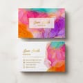
Artist business card pricing and specs
Real configurator numbers. The bigger the run, the lower the unit cost.
| Quantity | Price Per Unit | Total |
|---|---|---|
| 100 | 17.6¢ | $17.57 |
| 200 | 11.5¢ | $23.07 |
| 300 | 9.15¢ | $27.46 |
| 400 | 7.96¢ | $31.86 |
| 500 | 7.25¢ | $36.26 |
| 600 | 6.77¢ | $40.64 |
The Finishes That Sell the Look
Once the paper and the type are settled, finishing is what separates a nice card from the one that stops conversation. The film calls it raised lettering and a watermark. In a modern print shop those instincts translate into a short list of processes that all do the same job, which is to make the surface of the card do something your eye did not expect.
Keep the restraint. One finishing effect on an off white card outperforms three effects fighting each other, and the scene works precisely because each card changes only one variable from the last.
- Raised lettering. Type you can feel with a thumbnail, the direct descendant of engraved stationery.
- Blind emboss or deboss. Shape without ink, the closest print equivalent to the watermark line in the scene.
- Spot gloss on matte. Invisible until the card catches the light, then the monogram appears.
- Foil in a muted tone. Copper, bronze or matte silver rather than mirror gold, so it whispers instead of shouting.
- Lenticular depth. The one genuinely modern flex, where the card moves as the hand tilts it.
The modern flex
3D lenticular business cards
Depth that shifts as the card is tilted, the one finish nobody at the table can match.

How to Recreate the American Psycho Card Step by Step
Here is the whole build in order. Follow it top to bottom and you will end up with a card that carries the same authority as the one on screen, without looking like a costume.
Set your document at the standard 3.5 by 2 inch trim with a bleed on every edge, and keep every element well inside the safety margin. Centered layouts are unforgiving, so a millimeter of drift on a trim line is visible immediately.
Step 1: choose the stock before the layout
Pick your warm uncoated sheet and your thickness first. Every typographic decision afterward depends on how ink behaves on that surface, and uncoated stock spreads ink slightly, which changes how small type reads.
Step 2: set the name and nothing else
Name in letterspaced caps, centered, small. Title on the next line, smaller again. Company below that. Resist the urge to fill the space, because the empty area is doing as much work as the words.
Step 3: strip the color out
One ink. Black, or a very deep warm gray that sits closer to the paper. Color on this card reads as a sales flyer, and the whole effect depends on the card looking like it was printed by a stationer.
Step 4: add exactly one finishing move
Raised lettering on the name, or a blind deboss of a monogram in the lower corner. Not both. The single effect is what people notice and describe later, which is the outcome you are actually buying.
Step 5: proof it in your hand
Print a physical proof, carry it in a pocket for a day, and hand it to two people. If neither of them turns it over, adjust the thickness before you order the full run.
Everyday version
Automotive business cards
The same restrained layout on a card built to be handed out all day, every day.
What the Scene Gets Right About Real Business Cards
Strip the satire and the boardroom is running a blind comparison test, which is exactly what happens every time you hand someone a card in real life. They are not reading it. They are weighing it, feeling the surface, and forming an opinion before the words register.
That is why comparing stocks and finishes side by side is a better use of an afternoon than another round of layout tweaks. The variables that decide the reaction are the ones you pick from a dropdown, not the ones you nudge in a design file.
- Touch precedes reading. Weight and texture register in the first second, the copy takes three or four.
- Contrast creates the reaction. A card only feels premium next to a normal one, which is why the scene needs four cards.
- Restraint reads as confidence. The plainest card in the room usually wins the exchange.
- Consistency matters. If your card is thick and your invoice template is careless, the impression does not survive.
Compare finishes
Popular business cards, side by side
Automotive cards run 100 for $17.57 in 3 business days and metallic foil 500 for $222.13 in 7.
 free business cards |  Standard Business Cards | 3D Lenticular Business Cards |  Metallic Foil Business Cards | |
|---|---|---|---|---|
| Min price | Free | $17.57 | $690.88 | $222.13 |
| Paper / stock | 14pt Gloss Cover | 14pt Gloss Cover | 31pt Lenticular Lens | 16 Point Silk Laminated |
| Finish | - | Standard Finish | - | - |
| Size | 2" x 3.5" | 2" x 3.5" | 2" x 3.5" - Vertical | 2" x 3.5" |
| Default qty | 200 | 100 | 500 | 500 |
| Turnaround | 5 business days | 3 business days | 22 business days | 7 business days |
| Rating | ||||
| View & customize | View & customize | View & customize | View & customize |
Specs, Price and Turnaround for Your Recreation
Pricing on business cards is set by four things: the product line you choose, the stock and finish, the quantity, and how fast you need it. Quantity moves the number the most, because the setup work is the same whether you print one hundred cards or one thousand.
At 4OVER4.COM, Artist Business Cards and Automotive Business Cards both start at $17.57, while 3D Lenticular Business Cards start at $690.88 because the lenticular lens and registration work are a different class of production. Browse the full range in business card printing to compare stocks and finishes in one place.
Before you upload the file
- Bleed and safety. Extend the background past the trim, keep type well inside the margin.
- Resolution. Place art at 300 dpi at final size, not scaled up from a screen graphic.
- Color mode. Convert to CMYK, and set rich black properly for any solid area.
- Finishing layers. Supply raised lettering and spot effects as separate flagged layers.
Start fast
Card templates and print-ready blanks
Free layouts plus exact-size blanks so your trim, bleed and safety margins are right the first time.




Wally decodes the boardroom card
Four specs decide the reaction, and all four are orderable
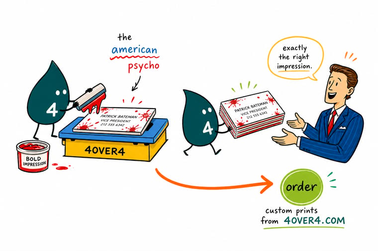
The scene sounds like satire, but every line in it is a print setting. Warm off white paper instead of bright white. A small letterspaced serif instead of a bold sans. Raised lettering you can feel with a thumbnail. And a thickness past the standard 14pt to 16pt range, so the card registers in the hand before anyone reads a word. Pick those four, add nothing else, and order a physical proof before the full run.
Design your business cards →The Short Version You Can Act On
Keep Reading Before You Print
 Guide Why Are Business Cards Important The case for paper in a phone contact world.
  Guide Standard Card Sizes Every card dimension, with the trim and bleed math.
  Guide Free Card Design Tool Lay out your recreation in the browser and print it. Guide How to Choose a Card Case Keep the thick card flat, clean and boardroom ready.
 Explore more
More business card reading and shopping
Related pages across 4OVER4.COM, one card for every kind of page.
 Shop Business Cards Printing Every stock, thickness and finish in one place. Product Artist Business Cards Quiet uncoated stock built for restrained type. Product Automotive Business Cards A working card that still reads considered.
  Product 3D Lenticular Business Cards Depth that moves as the hand tilts the card.
  Article Rounded Corner Business Cards One shape change that people notice immediately. Guide Why Business Cards Matter What a card does that a phone contact cannot. Guide Standard Card Sizes Trim, bleed and safety for every card format. Guide Free Business Card Design Tool Build the layout in your browser, then print it. Guide How to Choose a Card Case Protect a thick card between meetings. Alternative 4OVER4 vs MOO How the two compare on stock, finish and price. Alternative 4OVER4 vs Jukebox Specialty stocks and finishes, side by side.
  Alternative 4OVER4 vs GotPrint Turnaround, thickness options and real pricing.
 Ready to print the card that ends the comparison?
Choose your warm stock, take the thickness past standard, set the name in quiet letterspaced caps, and add one raised detail. Then order a proof and feel it.
American Psycho Business Card Questions
Why is the American Psycho business card scene still quoted?
Because it is the only famous scene in film that treats a business card as a physical object rather than a piece of information. The dialogue is nothing but print specifications, paper color, typeface, lettering relief and thickness, and the tension comes from four men ranking each other on exactly those variables. It works as satire and it also happens to be accurate, since those same four decisions really do determine how a card is received. For the practical case behind the joke, read why business cards are important.
What font is the Patrick Bateman business card in American Psycho?
There is no such font. Silian Rail, Romalian Type and Pale Nimbus were invented for the novel because they sound like plausible foundry names, which is exactly why people search for them. To recreate the effect, use a copperplate style engraved face, an old style serif such as Garamond, or a high contrast Didone such as Bodoni. Set it in caps at seven or eight points, open the letterspacing generously, and center it. The spacing does more work than the font choice.
What are bone and eggshell cardstock in practical terms?
They are warm off white papers rather than bright white ones. Bright white sheets are optically brightened and read as modern and mass produced, while a warm neutral reads as stationery. You can get there two ways: choose an uncoated natural or cream stock where the warmth is in the fiber, or print a very light warm tint across a neutral uncoated sheet for exact control. Check the result under office lighting as well as daylight, because a cool near white can drift gray.
How do I choose the right card for an American Psycho recreation?
Work in this order: stock, thickness, type, then one finishing effect. Choose a warm uncoated sheet, take the thickness above the standard 14pt to 16pt range so the card is felt before it is read, set the name in small letterspaced caps in a single ink, and add one raised or debossed detail. Artist Business Cards suit the restrained version of the look, while 3D Lenticular Business Cards are the modern equivalent of ending the comparison outright. Order a physical proof before the full run.
What do American Psycho style business cards cost and how is the price set?
Price is set by four inputs: the product line, the stock and finish, the quantity, and the turnaround you select. Quantity has the biggest effect, because setup is the same whether the run is one hundred or one thousand cards. At 4OVER4.COM, Artist Business Cards and Automotive Business Cards both start at $17.57, and 3D Lenticular Business Cards start at $690.88 since the lens and registration work belong to a different production class. Configure the exact combination to see your live number before ordering.
