
The Best Free Fonts for 2026 That Print Sharp


Sofia is our design and templates voice, built from the knowledge of our production team, with over 20 years in printing.
How to Judge a Free Font Before You Print It
Free does not mean disposable. Several of the most used typefaces in professional print are open source, drawn by working type designers and maintained like software, with issue trackers and version numbers. The job is telling those apart from the families that were exported from a weekend project, never tested below 12 points, and never opened in a print workflow at all.
A typeface that looks flawless on a backlit screen can fall apart on paper. Ink spreads into the sheet, thin strokes fill in, tight spacing closes up, and a headline that felt airy in the browser reads as a smudge on uncoated stock. Four checks catch almost every one of those problems before they cost you a reprint.
Type in the artwork is where a surprising share of avoidable problems begin. Missing accented characters in a client name, webfont files that refuse to embed, hairline weights set at 6 points, and fake bold applied by a layout app all show up in preflight week after week. Every family named on this page clears those hurdles and is free to use commercially.
Check the license, not the download button
Look for the SIL Open Font License, Apache 2.0, or an explicit commercial grant. Google Fonts and Fontshare state terms on every family page. If a site only promises free for personal use, it is not free for your business cards. Our guide to google fonts commercial use license terms reads the fine print, and the list of best business fonts for cards, logos and every printed brand piece picks from the licensed families.
Open the character set
Type a line with accented names, curly quotes, an ampersand, and the currency symbols you actually use. Free display faces often ship uppercase only or skip diacritics, and you find out at the worst possible moment.
Look at the weight range
One weight is a constraint, not a system. A family with regular, medium, and bold lets you build hierarchy without fake bold, which thickens strokes unevenly and prints muddy. A variable font hands you the entire range in a single file.
Print a proof before you commit
Screens lie about contrast and spacing. Print a page of your real copy at final size on the stock you plan to order, hold it at reading distance, and see whether the small text still holds together.
Shop the stock
Greeting cards printing
Every card format, paper, and finish, so your typeface lands on the right surface.
The Best Free Display Fonts for 2026
Display type carries the headline, the cover, the poster, the front of the card. It can be strange, it can be heavy, it can have one odd detail that people remember, because it only has to work at large sizes where a quirk reads as character instead of noise.
The families below are the ones turning up in the strongest work this year, and each prints cleanly at scale. Try one on the front of New Year Greeting Cards from $56.02, or across a set of New Year Invitations from $19.77, where a single confident line of type is the entire design. Our stories on new year greeting cards and new year invitations show both finished.
- Bricolage Grotesque. A variable grotesque with an optical size axis and just enough irregularity to feel drawn rather than generated. Open Font License.
- Clash Display. Compact, high impact, built for headlines that need to fill a measure edge to edge. Free for commercial use from Fontshare.
- Gloock. Very high contrast with hairline serifs, closer to editorial fashion than to a text face. Keep it large and it looks expensive.
- Syne. Wide and slightly off balance, with an extra bold that behaves like a logotype. Strong on posters and event invitations.
- Unbounded. Geometric and confident across nine weights, so one family can carry an entire campaign from banner to business card.
Pick one display face and let it do the shouting. Two competing display fonts on a single card is the fastest way to make careful typography look accidental, no matter how good each one is on its own.
Print picks
Three formats built for strong typography
Live prices, ready to customize with the typeface you just chose.
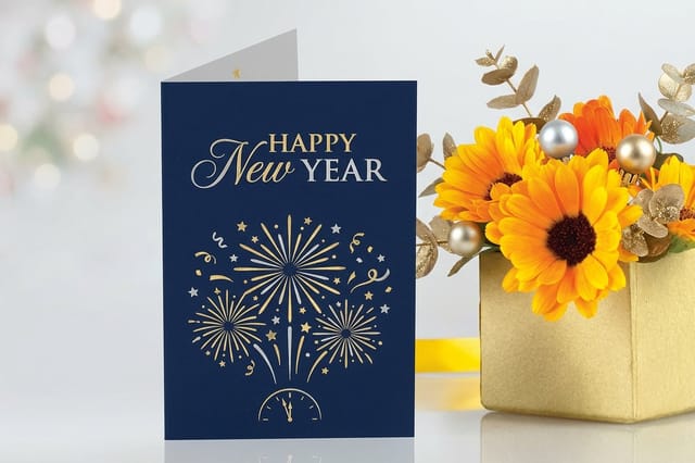 New Year Greeting Cards 50 for $56.02 A folded card front that gives a display face room to breathe.
 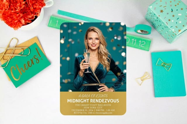 New Year Invitations 25 for $19.77 Flat stock where a script name and a clean date do all the work.
  free business cards 200 for $0.00 The cheapest way to hold your font choice in your hand before a full run.
 Free Sans Serifs That Stay Clean at Nine Points
Body copy is where a free font either proves itself or quietly ruins the piece. You need even color across a paragraph, generous spacing at small sizes, and numerals that line up in a price table. These families deliver all three and cost nothing.
Each one ships as a variable font or a full static family, so a single typeface can hold a business card, a rack card, and a folded brochure together while still giving you clear hierarchy.
- Inter. Drawn for interfaces, but the tall x height and open apertures also make it dependable at 9 points on coated stock. Optical sizing is built in.
- Geist. A newer neo grotesque with a matching monospace. Tidy and neutral, a sensible default when the brand voice is technical.
- Schibsted Grotesk. Newsroom heritage, economical spacing, and a bold that holds its shape reversed out of a dark field.
- Public Sans. Built for government documents, which means it stays legible under bad conditions and covers a wide character set.
- Manrope. Semi geometric and friendly without turning soft. Excellent for small labels and captions above the fold of a mailer.
If you are still deciding where the finished piece gets printed, our PrintPlace shipping comparison lays out how turnaround and delivery costs differ once the file is ready.
Free Serifs With Real Personality

A serif is still the quickest way to signal care. The free serif catalog has improved dramatically, and several of these families now carry optical size axes, which is the closest thing to a foundry release you will find without an invoice.
Serifs reward good paper. On matte and uncoated stock the fine details survive intact; under a heavy gloss, hairlines can flare as the ink sits on the surface and the crispness you designed for softens.
- Fraunces. A variable soft serif with weight, optical size, softness, and a wonk axis that switches on its most unusual letterforms. One file, an enormous range.
- Instrument Serif. Tight, tall, and dramatic in the display cut. Ideal for one line running across the front of a card.
- Newsreader. Made for sustained reading, with an optical size axis so headlines and captions come from the same family without looking identical.
- Young Serif. Chunky slabs and short ascenders. Reads warm and grounded, which suits food, hospitality, and craft brands.
- EB Garamond. A careful revival of a classic. Set it slightly larger than instinct suggests and it is timeless on an invitation.
Free Script Fonts That Do Not Look Free
Script is the hardest free category, because a weak one is obvious to everybody. What separates the usable faces is a consistent stroke rhythm, connecting letters that genuinely connect at every pair, and a lowercase that keeps its shape rather than collapsing into a squiggle.
Use script for a name, a date, or a single phrase. Never for a paragraph, never in all capitals. Pair it with a quiet serif or sans that handles the details, and set it a few points larger than the surrounding text so the thin strokes hold on press.
- Ephesis. A calligraphic script with elegant entry strokes, at its best on a name across the top of an invitation.
- Pinyon Script. A formal copperplate feel that suits weddings, anniversaries, and milestone events.
- Parisienne. Softer and more casual, good for informal celebrations and thank you cards.
- Caveat. Genuine handwriting rather than calligraphy, useful when a printed piece needs to feel like a personal note.
- Playwrite. A large family of regional handwriting styles based on how children are taught to write in different countries.
Quantity and price
New Year greeting card pricing and specs
Real configurator numbers. The larger the run, the lower the price per card.
| Quantity | Price Per Unit | Total |
|---|---|---|
| 50 | $1.12 | $56.02 |
| 100 | 78.0¢ | $77.99 |
| 200 | 50.0¢ | $99.95 |
| 300 | 40.6¢ | $121.92 |
| 400 | 36.0¢ | $143.89 |
| 500 | 33.2¢ | $165.86 |

Pairing Free Fonts Without the Guesswork
Most bad pairings come from choosing two faces that are nearly the same. When two fonts share a similar width, contrast, and mood, the reader senses a mistake rather than a decision. Contrast is what makes a pairing look deliberate.
Three formulas cover almost everything: a high contrast display serif over a neutral sans, a wide geometric headline over a narrow text serif, or one superfamily used at two very different weights. The last option costs nothing in files and never clashes.
- Bricolage Grotesque with Newsreader. A drawn grotesque headline over a serif body that reads comfortably at length.
- Gloock with Inter. Editorial contrast up top, an invisible body face underneath.
- Fraunces with Public Sans. Warmth in the headline, clarity in the fine print and legal lines.
- Clash Display with Manrope. Modern and compact, comfortable on a business card where space is scarce.
- Inter alone at 700 and 400. One family, two weights, zero risk of a mismatch.
Proof it first
Free business cards
The cheapest honest test of a pairing, printed on the paper you will actually use.
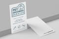
The Free Fonts That Make a Business Card Look Expensive
A business card gives you roughly three square inches of usable area, which means type is the design. There is nowhere for a font to hide, so the details that decide the result are the ones you see at 7 to 9 points: numerals, punctuation, and the space between letters.
Set the name in the display face, everything else in the text face, and leave tracking alone unless you are working in capitals, where a little extra letterspacing helps. Then print a real proof. free business cards start at $0.00, so testing a typeface on the actual paper costs you nothing but a little time.
- Name line. Instrument Serif or Clash Display, roughly 11 to 14 points depending on the length of the name.
- Title and contact details. Inter, Geist, or Public Sans at 7 to 8 points, one weight lighter than the name.
- Numbers. Confirm the digits are tabular so phone and suite numbers align when stacked.
- Reversed type. Move up one weight when light text sits on a dark field, because ink spread closes the counters.
- Capitalized labels. Add 40 to 60 units of tracking and drop half a point of size.
Set the date in type
New Year invitations
A script name, a clean date, and enough space around both. Flat stock keeps fine strokes crisp.
Licensing, Embedding, and the Fine Print Nobody Reads
Free fonts still carry obligations. The Open Font License permits commercial use and embedding, but it forbids selling the font on its own and it requires any modified version to travel under a different name. Most projects never brush against those limits, and it is worth knowing where they sit before a client asks.
The bigger day to day risk is file preparation. A press file that references a typeface it cannot embed will substitute something else, and nobody notices until the proof arrives with the wrong letterforms and the wrong line breaks.
- Embed or outline. Export the PDF with fonts embedded, or convert type to outlines once the file is final and no text edits remain.
- Never print from webfonts. A .woff2 is subset and optimized for browsers. Download the desktop .otf or .ttf for layout work.
- Keep the license file. Store the license text beside your brand assets so the next designer knows exactly what they inherited.
- Rename anything you modify. Editing an Open Font License family requires a new name and a copy of the license alongside it.
- Watch hairlines in CMYK. Strokes under 0.25 points can break up, and thin black type should sit on a single channel rather than a four color build.
Compare finishes
Popular card stocks, side by side
Stock, finish, size, quantity, turnaround, and price, so type decisions match the paper.
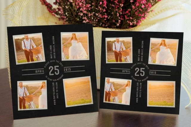 Save the Date Cards | 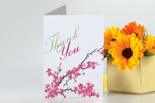 Greeting Cards | 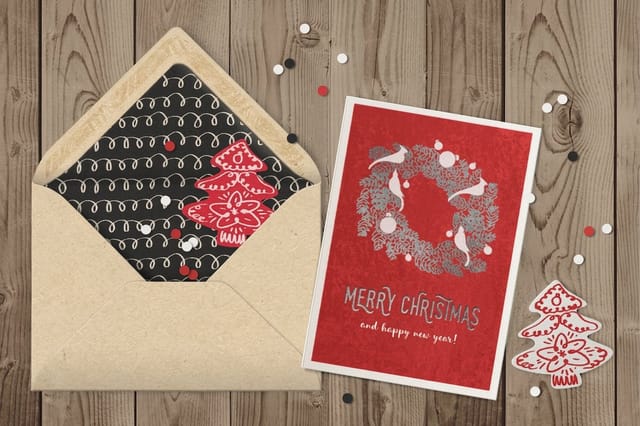 Velvet Greeting Cards | 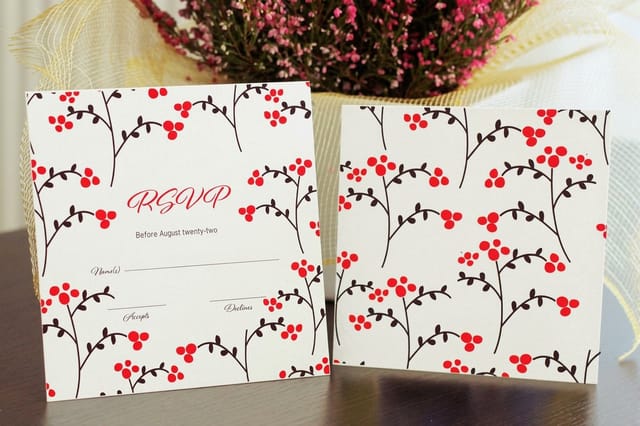 Response Cards | |
|---|---|---|---|---|
| Min price | $19.77 | $56.02 | $617.67 | $19.77 |
| Paper / stock | 14pt Gloss Cover | 14pt Gloss Cover | 16 Point Soft Velvet Laminated | 14pt Gloss Cover |
| Finish | Standard Finish | Standard Finish | - | Standard Finish |
| Size | 4.25" x 5.5" | 8.5" x 5.5" fold to 4.25" x 5.5" | 10" x 7" scored to 5" x 7" | 4.25" x 5.5" |
| Default qty | 25 | 50 | 500 | 25 |
| Turnaround | 5 business days | 5 business days | 7 business days | 3 business days |
| Rating | ||||
| View & customize | View & customize | View & customize | View & customize |
Setting Type for Press and Getting It Printed
Production is the last step and the one most people rush. Type that looks correct on screen needs a handful of adjustments to survive ink on paper, and none of them takes more than a minute once you know what to look for.
Start from a print ready layout in the design templates library so bleed, margins, and the safe zone are already right, drop your chosen fonts into the frames, then export a single flattened PDF with everything embedded.
Match the type to the finish
- Soft touch and matte. Hold your weights as designed, because matte coatings keep fine strokes sharp.
- Gloss and UV. Add a little weight to small text, since reflections make hairlines vanish at an angle.
- Uncoated and kraft. Avoid very high contrast serifs at small sizes, because ink spreads into the fibers.
- Foil and raised finishes. Keep strokes above 0.5 points so the foil has something solid to sit on.
Start fast
Card templates and print-ready blanks
Free layouts plus exact-size blanks so your type lands inside the safe zone every time.

Wally sorts the free fonts worth printing
Pick the typeface first, then the paper that shows it off
Free fonts fail in print for boring reasons, not exotic ones. A missing accent in a client name. A hairline weight that disappears under gloss. A webfont file that will not embed in the PDF. Wally checks four things in order: the license, the character set, the weight range, and a printed proof. Get those right and the font you paid nothing for looks like one you did.
Proof your font on free business cards →What to Remember When You Pick a Free Font
Explore more
More type and print resources across 4OVER4.COM
Twenty free fonts for business cards, fifteen Easter display faces, New Year greeting cards from $56.02 and invitations from $19.77 to test a font on, and how 4OVER4 compares with other printers.
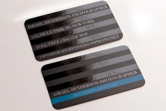 Article 20 Free Fonts for Business Cards Typefaces picked specifically for three square inches.
 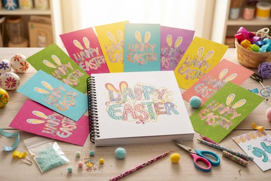 Article 15 Easter Inspired Free Fonts Seasonal display faces for spring cards and mailers.
 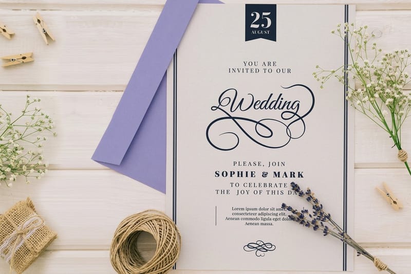 Guide Wedding Planning Checklist Where the invitation type decisions land in the timeline. Product New Year Greeting Cards A folded front that gives display type room to breathe. Product New Year Invitations Flat stock where a script name carries the design.
  Product free business cards Proof your font choice on real paper first.
 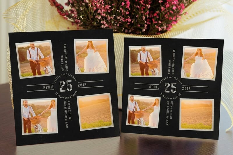 Shop Greeting Cards Printing Every card format, stock, and finish in one place.
  Templates Design Templates Print ready layouts with bleed and safe zones set.
  Alternative 4OVER4 vs MOO How the two compare on shipping and card finishes.
  Alternative 4OVER4 vs Vistaprint Free samples, proofs, and what each one includes. Alternative 4OVER4 vs GotPrint Shipping costs and turnaround, side by side. Alternative 4OVER4 vs 123Print Free proofs and coins rewards on every order.
 Print 25 invitations from $19.77 to see the font on paper
Set the headline in the display face you picked, keep the details quiet, and order a short run. Holding a printed proof tells you more in ten seconds than an hour of previews.
Free Font Questions, Answered
What are the best free fonts for 2026?
For display work, Bricolage Grotesque, Clash Display, Gloock, Syne, and Unbounded are the standouts, all free for commercial use. For body copy, Inter, Geist, Schibsted Grotesk, Public Sans, and Manrope stay legible down to 9 points on printed stock. On the serif side, Fraunces, Instrument Serif, Newsreader, Young Serif, and EB Garamond give you real character without an invoice. For a version of this list built specifically for three square inches of card, see our 20 free fonts for business cards.
How do I choose the right free font for a printed piece?
Start with the job the type has to do. Display faces only need to work large, so personality wins. Text faces have to hold at 8 or 9 points, so open shapes and generous spacing win. Then check three practical things: that the license allows commercial use, that the character set covers accented names and the punctuation you need, and that the family offers at least three weights. Finally, print a proof at final size on the stock you plan to order.
What does it cost to print with a free font?
The typeface itself costs nothing when it carries the Open Font License or a similar commercial grant, so your only cost is the print run. free business cards start at $0.00, which makes them the least expensive way to see a typeface on real paper before committing. New Year Invitations start at $19.77 and New Year Greeting Cards start at $56.02, with the exact price for your size, stock, quantity, and finish shown in the configurator before checkout.
What sizes, stocks, and finishes work best for free display fonts?
High contrast display faces such as Gloock or Instrument Serif look their best on matte and soft touch stocks, which preserve hairline strokes. Heavy geometric faces such as Unbounded or Clash Display handle gloss, UV, and uncoated kraft equally well because the strokes are thick enough to survive ink spread. For foil and raised finishes, keep every stroke above 0.5 points. Card sizes from standard business card up to large folded formats are available, along with 60+ paper options.
How long does printing and shipping take once my file is ready?
Turnaround depends on the product, the quantity, and the finish you select, and the available production and shipping options appear in the configurator with an estimated arrival date before you pay. Simple flat pieces on standard stocks move fastest; specialty finishes such as foil and raised printing add production time. If a deadline is tight, choose the fastest production option first and then adjust the finish, because production time moves the date far more than shipping does.
