Business Card Content Guide: What to Include in 2026
A business card content guide helps you decide exactly what information belongs on your card - and what doesn't. 4OVER4.COM has printed 10 billion+ cards for over 150,000+ businesses, and the most common mistake? Cramming too much onto a 3.5x2-inch space. The right content, placed well, turns a small card into a powerful networking tool.
Think about the last business card someone handed you. Did you glance at it and immediately know what that person does? Or did you squint at tiny text, confused by three phone numbers and a paragraph-long tagline? That's the difference between a card with purpose and a card with clutter.
Your card is often the first physical thing a potential client or partner holds from your brand. It shapes the impression about you and your business before you even follow up. So let's break down every element that belongs on a well-crafted business card - and how to arrange it all so nothing gets lost.
The Must-Have Elements on Every Business Card
Business card content breaks into two buckets: information people need and information that builds trust. You want both - but you don't want either to overwhelm the other. Here's what should always make the cut.
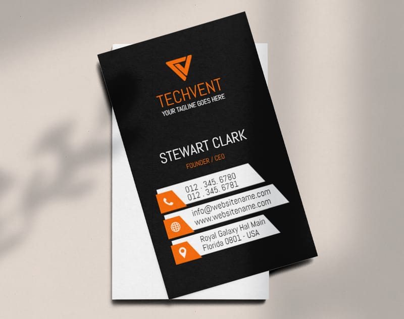
Your Name and Job Title
This sounds obvious, but you'd be surprised how many cards bury the person's name under a massive logo. Your name should be the largest text on the card after your company name. Your job title sits right below it - keep it clear. "Marketing Director" works. "Chief Visionary Happiness Officer" doesn't.
If you're a freelancer or solopreneur, your title is your chance to tell people what you actually do. "Freelance Photographer" beats "Creative Professional" every time. Be specific. People remember specifics.
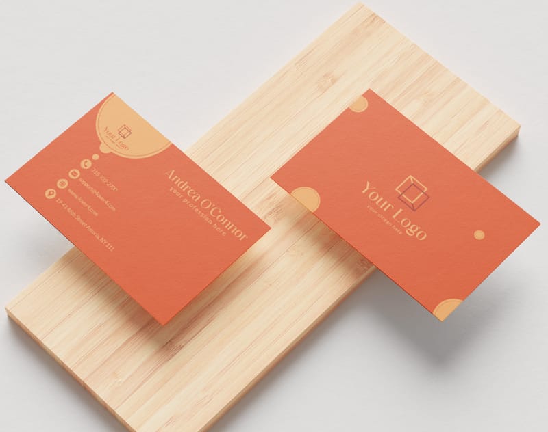
Company Name and Logo
Your logo anchors the card visually. It should be clean, high-resolution, and sized proportionally. Don't let it dominate the entire front of the card - it needs to share space with your contact details. A good rule: your logo should take up no more than 20-25% of the card's front face.
If you don't have a logo yet, 4OVER4.COM's Online Designer lets you build a card layout from scratch. You can add text, shapes, and color blocks that function as a visual identity until you invest in professional branding.
Phone Number and Email Address
One phone number. One email address. That's it. Listing your cell, office line, fax number, and two email addresses creates decision fatigue. Pick the number you actually answer and the email you actually check.
Format your phone number with dashes or dots for readability: 555-867-5309 reads faster than 5558675309. For email, use a professional domain. A Gmail address works for freelancers, but yourname@yourbusiness.com signals you're established.
Website and Social Media
Your website URL belongs on every business card in 2025. Drop the "http://www" - just print "yourbusiness.com" and save space. For social handles, pick one or two platforms where you're actually active. A real estate agent might include Instagram and LinkedIn. A B2B consultant probably just needs LinkedIn.
"I used to list every social platform on my card. Five icons, five handles. Nobody followed any of them. When I narrowed it to just my Instagram, my follower count from networking events tripled."
- Rachel K., Event Planner
Physical Address (When It Makes Sense)
If you run a storefront, restaurant, salon, or office that clients visit, include your address. If you work remotely or from home, skip it. A physical address on a card where it's not needed wastes valuable space and can feel outdated.
Some professionals split the difference with a city and state only: "Austin, TX" tells people your general location without giving a full street address.
Optional Content That Can Set Your Card Apart
Once the essentials are covered, you've got room to add elements that make your card memorable. These aren't required, but the right ones can turn a card someone pockets into a card someone keeps.
A Tagline or Value Proposition
A short tagline tells people what you do or what you stand for. Keep it under 8 words. "Making homes beautiful since 2010" works for an interior designer. "Your partner in digital growth" works for a marketing agency. Avoid vague phrases like "excellence in everything" - they say nothing.
For design ideas that show how taglines fit into card layouts, check out this Classy Business Card Design Inspiration roundup. You'll see how the best cards balance text with white space.
A QR Code
QR codes have made a real comeback. A small QR code on the back of your card can link to your portfolio, booking page, LinkedIn profile, or a special landing page. It bridges the gap between a physical card and your digital presence.
Place the QR code on the back of the card with a short call-to-action like "Scan to book a free consultation" or "See my portfolio." Don't just slap a code on there with no context - people need a reason to pull out their phone.
Professional Certifications or Credentials
If you're a CPA, licensed contractor, board-certified physician, or hold another credential that matters to clients, include the abbreviation after your name. "Jane Smith, CPA" or "Dr. Michael Torres, DDS" adds instant credibility without taking up much space.
| Quantity | Price Per Unit |
|---|---|
| 100 | $0.18 |
| 4,000 | $0.03 |
| 35,000 | $0.02 |
| 100,000 | $0.02 |
Ink Color
Finish
Variable Data (Codes, Names, Etc.)
Rounded Corners
Total Sets
Proof Options
How to Describe Yourself on a Business Card
This is where many people overthink it. Your business card isn't a resume. It's not a bio page. It's a quick-reference tool that answers one question: "Who is this person and how do I reach them?"
If you're a freelancer or entrepreneur, your card is a branding tool. Here's how to approach the self-description:
Lead with What You Do, Not Who You Are
"Graphic Designer" tells someone what to hire you for. "Creative Thinker and Problem Solver" doesn't. Use your job title line to communicate your function. Save the personality for your website.
If your role spans multiple areas, pick the one that generates the most business. A person who does web design, SEO, and copywriting might just go with "Digital Marketing Consultant" to cover all three without listing each one.
Keep Your Services Off the Front
Listing five or six services on the front of your card creates visual noise. If you want to highlight your service range, use the back of the card. A clean bulleted list of 3-4 core services on the reverse side works well. The front stays clean - name, title, contact info, logo.
4OVER4.COM offers double-sided printing on all Artist Business Cards and standard card products, so you've got a full second side to work with. Use it.
Invite Further Connection
A subtle call-to-action on your card encourages the next step. "Let's connect on LinkedIn" or "Visit my portfolio at janedoe.com" gives the recipient a clear path forward. This is especially useful for people in creative fields, consulting, or any service where seeing past work matters.
Colors, Fonts, and Design Choices That Communicate Your Brand
Your business card content isn't just words. The visual design - colors, fonts, paper stock, finish - communicates just as much as the text itself. Here's how to make those choices intentionally.
Color Psychology on Business Cards
Red signals energy, urgency, and passion. It works for brands in food, entertainment, and fitness. Blue communicates trust, calm, and professionalism - which is why it's popular in finance, healthcare, and tech. Black feels luxurious and authoritative. Check out Black Business Cards if you want that bold, high-contrast look.
Green connects to nature, wellness, and growth. Gold or metallic accents add a premium feel without overwhelming the design. The key is choosing 2-3 colors max and making sure they align with your existing brand palette.
Font Selection
Stick to one or two fonts. A sans-serif font (like Helvetica or Montserrat) reads clean and modern. A serif font (like Garamond or Times) feels traditional and established. Mixing one of each - say, a serif for your name and sans-serif for contact details - creates visual hierarchy without chaos.
Minimum font size for business cards: 8pt for body text, 10-12pt for your name. Anything smaller and people will struggle to read it, especially in dim lighting at networking events.
Paper Stock and Finish
The physical feel of your card is part of its content. A thick, textured card tells people you invest in quality. A flimsy card suggests the opposite. 4OVER4.COM offers 60+ paper types - from 14pt standard stock to 32pt ultra-thick options that feel like a credit card in your hand.
For something truly different, consider specialty materials. 30Mil Clear Plastic Cards make an unforgettable impression at trade shows. 3D Lenticular Business Cards add motion and depth that people can't stop looking at.
"I switched from a standard 14pt card to 32pt with soft-touch lamination. The number of people who commented on how the card felt in their hand - and then actually called me - went way up."
- David L., Financial Advisor
Common Mistakes That Weaken Your Business Card Content
Knowing what to include is half the battle. Knowing what to avoid is the other half. These are the mistakes 4OVER4.COM sees most often when customers upload their first draft.
Too Much Information
If your card looks like a miniature flyer, you've gone too far. Every element on the card should earn its place. Two phone numbers? Cut one. A mission statement? Move it to your website. A full list of services? Put it on the back or drop it entirely.
White space isn't wasted space. It's what makes your important content readable. A card with breathing room looks professional. A card packed edge-to-edge looks desperate.
Low-Resolution Images or Logos
A pixelated logo on a business card is worse than no logo at all. Make sure your logo file is at least 300 DPI at the size it will print. Vector files (AI, EPS, SVG) are ideal because they scale without losing quality.
If you're designing from scratch, the Online Designer from 4OVER4.COM flags low-resolution images before you go to print. That saves you from an expensive mistake.
No Clear Hierarchy
When everything on the card is the same size and weight, nothing stands out. Your name should be the most prominent text. Your title and company come next. Contact details are smaller but still legible. This hierarchy guides the reader's eye naturally from top to bottom.
Using Personal Email for Business
A card that reads "John Smith, CEO" followed by "johnnyboy92@hotmail.com" undermines every bit of credibility the title built. If you're serious enough to print business cards, get a domain-based email address.
Ink Color
Finish
Die Cutting
Total Sets
Proof Options
Industry-Specific Business Card Content Tips
Different industries have different priorities. Here's how to tailor your business card content based on your field.
Real Estate Agents
Include your headshot, brokerage name, license number (required in many states), and your primary service area. A QR code linking to your current listings page is a smart addition. Skip the generic "Your Dream Home Awaits" tagline - every agent uses it.
Creative Professionals
Designers, photographers, and artists should let the card itself showcase their style. A unique shape, bold color palette, or unusual finish does more than words. Keep text minimal - name, title, website, email. Your portfolio does the heavy lifting. For layout ideas, browse Design Templates that are tailored for creative fields.
Blank Templates


Healthcare Providers
Credentials after your name are non-negotiable. Include your practice name, specialty, office address, and phone number. A clean, professional design in calming colors (blues, greens, whites) reinforces trust. Avoid playful fonts or overly casual language.
Small Business Owners
Your card needs to communicate what your business does in under 3 seconds. A clear tagline, your logo, and a website URL are the essentials. If you sell products, consider adding a QR code to your online shop. For promotional branding beyond cards, explore Logo Sticker Design Ideas that complement your card strategy.
Corporate Professionals
Corporate cards tend to follow company templates, but you still have choices. Make sure your direct phone line and email are on the card - not a general company number. If your company allows it, adding your LinkedIn URL helps people connect with you personally rather than just the brand.
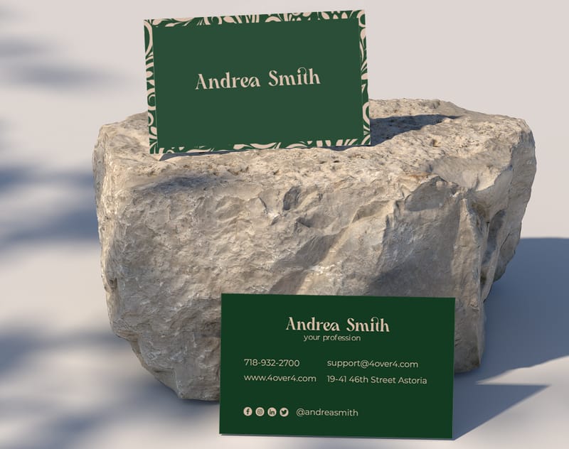
Front vs. Back - How to Split Your Business Card Content
A double-sided card gives you twice the real estate. Use it strategically.
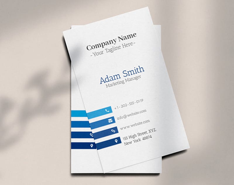
Front side: Name, title, company name/logo, phone, email, website. That's it. Clean, scannable, professional.
Back side: This is your flex space. Options include a brief list of services, a QR code, a tagline, a map to your location, social media handles, or even a special offer. Some businesses use the back for appointment reminders or loyalty stamps.
The back can also be a design statement. A bold color, a full-bleed image, or an interesting pattern makes the card feel more premium and gives people a reason to flip it over.
For seasonal or holiday-themed card ideas, check out Diy Greeting Card Design Ideas for creative inspiration that crosses over into business card design.
Choosing the Right Card Format for Your Content
Not all business cards are the same size or shape. The format you choose affects how much content you can include and how it gets arranged.
Standard (3.5 x 2 inches): The classic. Fits in wallets and cardholders. Best for straightforward professional cards with standard content.
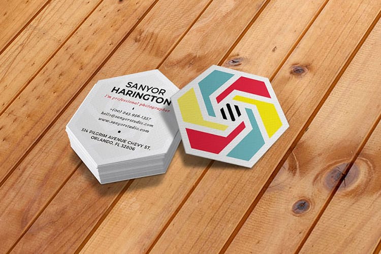
Square (2.5 x 2.5 inches): Stands out in a stack of standard cards. Works well for creative professionals and brands with square logos.
Oversized (3.5 x 4 inches or folded): More room for content. Good for businesses that need to include a mini menu, price list, or appointment calendar.
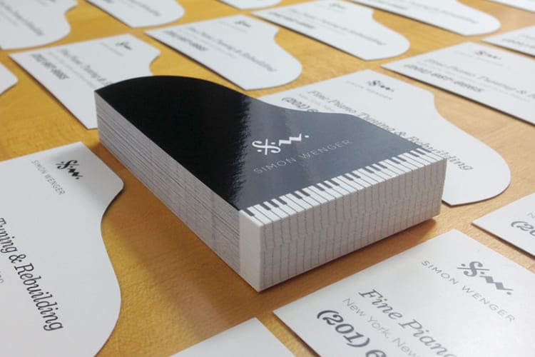
Die-cut (custom shapes): Maximum visual impact. A guitar-shaped card for a music teacher. A house shape for a realtor. The shape itself becomes part of your brand message.
Before you commit to a format, order Free Samples from 4OVER4.COM to feel the paper stocks and see print quality in person. Holding the actual product beats guessing every time.
Putting Your Business Card Content Guide Into Action
You've got the knowledge. Now it's time to build your card. Here's a quick content checklist before you hit print:
- Name and title - clear and prominent
- Company name and logo - high-resolution, properly sized
- Phone number - one number, formatted for readability
- Email address - professional domain
- Website URL - no "http://www" needed
- 1-2 social handles - only platforms you actively use
- Optional: tagline, QR code, credentials - only if they add value
Proofread everything twice. Then have someone else proofread it. A typo in your email address means lost leads. A wrong phone digit means missed calls. These are small cards with big consequences.
4OVER4.COM has earned a 4.8/5 star rating across 10,000+ reviews because the details matter - from content accuracy to print quality. Your card's content is the foundation. The printing brings it to life.
Here are the available paper types, finishes, and printing options you can choose from when you're ready to bring your business card content to life:
What to Remember From This Business Card Content Guide
- Less is more. Stick to one phone number, one email, and one or two social handles. White space makes your content readable and professional.
- Lead with function. Your job title should tell people what you do, not describe your personality. "Web Developer" beats "Digital Wizard" every day.
- Use both sides. Front for essentials (name, title, contact info, logo). Back for extras (services list, QR code, tagline, social links).
- Match your industry. A real estate agent needs a headshot and license number. A designer needs bold visuals and minimal text. Tailor content to your field.
- Paper matters. The physical feel of your card communicates quality before anyone reads a word. 4OVER4.COM offers 60+ paper types, including specialty options like 30Mil Frosted Plastic Cards for a standout tactile experience.
- Proofread ruthlessly. A typo on a business card is a typo 500 people will see. Check every number, every letter, every link.
-
Concise Contact Information: Ensure that your contact information, including your physical address, email, and phone number, is clearly displayed and easy to understand. Use a professional typeface and appropriate font size to make it easy for recipients to reach out to you.
-
Highlight Your Unique Services: Use your card to convey what makes you stand out as a freelancer and entrepreneur. Whether you specialize in social media management, graphic design, or another niche, clearly communicate your expertise and the value you offer to prospective clients.
-
Showcase Your Portfolio: If space allows, consider including a link to your online portfolio or website where prospective clients can explore your work further. This not only adds credibility to your services but also provides interested individuals with more information about your skills and capabilities.
-
Use Color and Design Wisely: Incorporate color and design elements that align with your brand and convey a professional look. Avoid overcrowding your card with too much information or using overly complex designs that may distract from your message. Instead, opt for a clean layout with ample white space to help your card stand out while remaining easy to read.
-
Encourage Further Engagement: Invite recipients to connect with you on social media platforms like Pinterest or LinkedIn to see more ideas and stay updated on your latest projects and offerings. This can help foster ongoing relationships with potential clients and expand your network within the freelance and entrepreneurial community.
-
First, identify the purpose of your card. When you know the objectives, it's easy to tailor your message accordingly.
-
You have very limited space So, use short and impactful phrases that convey your core services.
-
What sets you apart from the competition? Make sure to showcase it prominently.
-
Does your choice of words inspire recipients to take action?
-
Let your business card showcase your unique skill and expertise.
And don't forget to add your contact details like phone number, social media handles, email address
Free Design Templates


Business Card Content Questions, Answered
What are the best practices for business card content?
Keep your card focused on essentials: name, title, one phone number, one email, website, and logo. Use the back for secondary content like services or a QR code. Maintain clear visual hierarchy so the reader's eye moves naturally from your name to your contact details. Proofread everything before printing. Read more tips in our Printing Articles library.
How do I choose the right business card content?
Start with your industry and audience. A corporate professional needs credentials and a direct phone line. A creative freelancer needs a portfolio link and minimal text. Ask yourself what the recipient needs to know in 3 seconds - that's your front-side content. Everything else goes on the back or gets cut.
What makes business card content effective for marketing?
Effective business card content guide principles focus on clarity and action. Include a specific call-to-action like "Scan for a free quote" with a QR code, or "Book at janedoe.com." Pair strong content with premium materials - 30Mil White Plastic Cards feel high-end and get kept longer than standard paper cards, extending your marketing reach.
How much should I budget for business card content?
The content itself costs nothing but your time. The printing investment varies by paper stock, finish, and quantity. 4OVER4.COM offers options from budget-friendly 14pt cards to premium 32pt ultra-thick stock with specialty finishes. Most professionals spend between $30-$80 for 250-500 cards. Investing in thicker stock and a clean design pays back in stronger first impressions.