
Banner Fonts: How to Choose Type That Reads Loud and Clear


Tobias is our voice for cutting, binding and large format, built from the knowledge of our production team, with over 20 years in printing.
Banner type is read on the move, from a distance, under light you do not control. This guide covers how to pick a face that survives those conditions, how big to set it, how to space it, and how to hand the file to press without surprises.
A banner font is a typeface chosen for reading at distance, which means open counters, even stroke weight, distinct letterforms and a medium to bold weight. Size it by cap height using roughly one inch for every ten feet of viewing distance, tighten display tracking slightly, keep line spacing near 1.1 to 1.2, hold strong light to dark contrast, and outline the fonts before you upload so nothing substitutes at press.
Start here
Banner type in one paragraph
Pick the typeface for the distance, not for the mood board. A banner font needs open interior spaces, strokes of roughly even thickness, letters that cannot be confused with each other, and a weight in the medium to bold range. Set the headline by cap height, allowing about one inch for every ten feet a viewer stands away. Tighten the tracking a little because display sizes exaggerate the built in spacing, keep two line headlines close together, and protect the contrast between ink and background. Then outline the fonts and check the license before the file leaves your desk.
Watch it printed
See retractable banner stands on the press, in 112 seconds
Why your banner font decides whether the message gets read
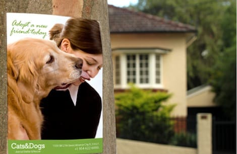
A banner is read on the move. Someone crosses an aisle at a trade show, glances up from a phone in a lobby, or walks past a storefront while talking to a colleague. You get one line of attention, not a paragraph. Everything that makes the line land or fail happens inside the type.
That is why the banner font is not a decorating decision made at the end. It is a legibility decision made at the start, and it changes the message, the layout, and the size of every other element on the panel. A face that looks elegant on a laptop screen at 24 pixels can collapse into mush at three inches of cap height under a hard spotlight.
The good news is that the rules are concrete. Choose an open, evenly weighted letterform, set it at a size the viewing distance actually requires, control the spacing, protect the contrast, and outline the file before you send it. Do those five things and a retractable banner stand will read from the far end of a hall as confidently as it reads from arm's length.
What is a banner font, and how is it different from a body font

A banner font is a typeface selected for large format display, where reading happens at distance and at speed. The category is defined by behavior, not by a label in a font menu. If a face holds its shape at three inches tall, seen from thirty feet, at an angle, under uneven light, it belongs on a banner. If it does not, it belongs somewhere else.
Body fonts are optimized for the opposite conditions. They are engineered for long reading at ten to twelve points, held at arm's length, with a full paragraph of context helping the eye correct mistakes. That optimization pushes toward moderate contrast, tight spacing, and subtle character shapes. Blown up to banner scale those same subtleties turn into visual noise: thin joins disappear, tight counters fill in, and similar letters like capital I, lowercase l, and the numeral 1 start colliding.
The practical shortlist for banners looks like this. Neo grotesque sans serifs give you neutral clarity. Humanist sans serifs add warmth without giving up openness. Slab serifs bring weight and a confident, mechanical feel. Strong display faces work for a single word or a short brand line and nothing more. Everything else, including most scripts and hairline geometric faces, should stay off the panel or appear only as a small accent that nobody needs to read to understand you.
Banner fonts that pass the distance test, by category
The rules above narrow the field, so here are named faces that meet them. Every one has open counters, even strokes and a bold cut, and each family is widely available, with the open source ones free for commercial print under their license.
Bold banner fonts for the headline
- Neo grotesque. Helvetica Bold, Arial Bold, Inter Bold and Roboto Bold. Neutral, wide counters, the safe default for a trade show panel.
- Humanist sans. Open Sans Bold, Source Sans Bold, Lato Bold and Gill Sans Bold. A little warmer, and still clear at thirty feet.
- Condensed display. Bebas Neue, Oswald, League Gothic and Franklin Gothic Condensed. Tall and narrow, so a long line fits a retractable panel at full cap height. Stop at moderately condensed.
- Slab serif. Rockwell Bold, Roboto Slab Bold, Arvo and Zilla Slab. Weight with a mechanical, confident feel, good for a single-word headline.
Faces to keep off the panel
Thin geometric sans faces such as light Futura or Montserrat Thin, most scripts, and anything with hairline strokes. Montserrat and Futura work in their bold cuts, so the rule is the weight, not the name. Whatever you pick, print a strip at 100 percent and walk back before you commit, then outline the type before it goes to press.
Legibility first: what actually makes a typeface readable at distance

Legibility at distance comes down to four measurable qualities. Learn to look for them and font selection stops being a matter of taste.
- Open counters. The enclosed spaces inside letters like a, e, o, and g have to stay open. When the aperture is narrow, distance and ink spread close it, and the word turns into a row of dark blocks.
- Even stroke weight. Faces with a big difference between thick and thin strokes lose their thin strokes first. At banner scale the thin parts do not just get lighter, they visually break the letter apart.
- Distinct letterforms. Test the classic collisions before you commit. Capital I, lowercase l, numeral 1, capital O, numeral 0, r followed by n. If any pair is ambiguous at size, your phone number and your web address will be misread.
- Generous x height. A tall lowercase relative to the cap height gives you more readable mass at the same nominal size, which is free legibility.
There is a simple test that beats every opinion. Set your headline in the candidate faces, print one strip at 100 percent scale on plain paper, tape it to a wall, and walk backward to the real viewing distance. The face that is still effortless at that distance is the right one, even if it was not your favorite on screen.
Type size: work from viewing distance, not from point size

Point size is close to meaningless in large format because it measures the em box, not the letters. Work from cap height instead, which is the actual height of a capital letter in inches. Cap height is what your eye reads and what you can measure with a ruler on the finished print.
The working guideline used across the sign trade is one inch of cap height for every ten feet of viewing distance for comfortable reading, and roughly one inch for every twenty five feet for the absolute minimum that a person can decode when they are looking for it. Design for comfortable, not for minimum. On a trade show floor where people first see your stand from about thirty feet, that puts your primary headline near three inches of cap height.
Then build a hierarchy from that number. The headline is the anchor. The subhead sits at roughly half to two thirds of the headline. Supporting copy sits at about half the subhead. Legal lines and web addresses can be smaller still, because nobody reads them from across the room, they read them once they have already walked over. On a standard retractable panel the top third is prime real estate at standing eye level, so the anchor line belongs there rather than centered on the panel where a crowd will block it.
Weight and width: the two dials that matter more than the font name

Once a family is legible, the specific weight and width you pick will change the result more than switching to a different family altogether. Medium, semibold, and bold cuts are the useful range for banner headlines. Light and thin cuts lose their strokes at distance and under bright light. Black and ultra cuts can be excellent for a single short word, but across a full sentence they close up their counters and turn into a solid bar.
Width follows the same logic. A normal width is the safe default. A moderately condensed cut is genuinely useful on a tall narrow retractable panel, because it buys you more characters per line at the same cap height without shrinking the letters. Push past moderate into extra condensed and the counters narrow to slits, which is the single fastest way to make a large headline unreadable. Extended and wide cuts have the opposite problem: they eat horizontal room and force line breaks in awkward places.
One more habit worth keeping. Use real weights from the family rather than a faux bold applied by the software. Synthetic bold smears the outlines evenly in all directions, which thickens the strokes and shrinks the counters at the same time, exactly the trade you do not want on a panel that will be printed at retractable fabric banner stand scale.
Tracking, kerning, and line spacing at banner scale

Typefaces are spaced by their designers for text sizes. Blow that spacing up to three inches and the gaps between letters grow proportionally, so a headline that felt normal on screen starts to look loose and disconnected on the panel. The fix is to tighten tracking slightly on large display lines, usually by a small negative amount, and to check the result at true size rather than trusting the number.
Kerning deserves individual attention on short headlines, because you only have a handful of pairs and every one of them is enormous. The usual suspects are capital A next to V or W, capital T or L next to a lowercase vowel, r followed by a comma, and anything next to a quotation mark. Fix them by eye at full scale, not by rule.
Line spacing runs the other way from body text. Body copy is comfortable around 1.4 to 1.6 times the type size, but a two line display headline usually wants something closer to 1.1 to 1.2, so the lines read as a single unit instead of two separate strips. Watch for descenders from the first line colliding with capitals on the second line, and adjust rather than accept the default.
Word spacing is the exception that gets looser, not tighter. When lines are read at speed from a distance, slightly generous word gaps help the eye chunk the phrase correctly, and they cost nothing on a panel with room to breathe.
Pairing fonts without turning the panel into a ransom note
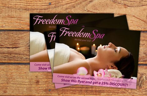
Two typefaces are plenty for a banner. Three is usually a mistake. The reliable structure is one expressive face carrying the headline and one neutral, highly legible face carrying everything else: the subhead, the bullet points, the contact line, and the small print.
Contrast is what makes a pairing work. Two faces that are similar but not identical read as a mistake, while two faces that are clearly different read as a decision. Pair a slab serif headline with a clean grotesque support face. Pair a bold condensed display face with a normal width humanist sans. What you should avoid is pairing two neutral sans serifs that look almost the same, because the viewer registers the difference as an error rather than as hierarchy.
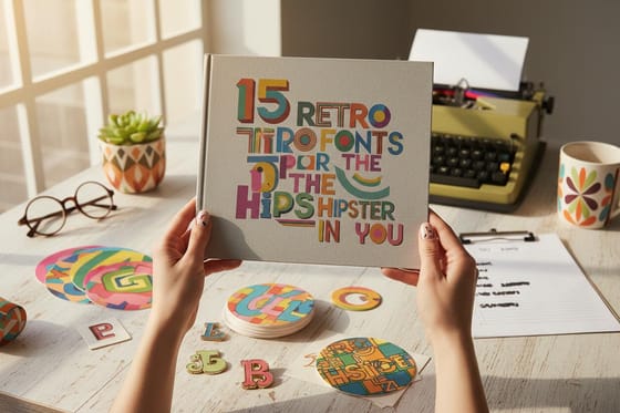
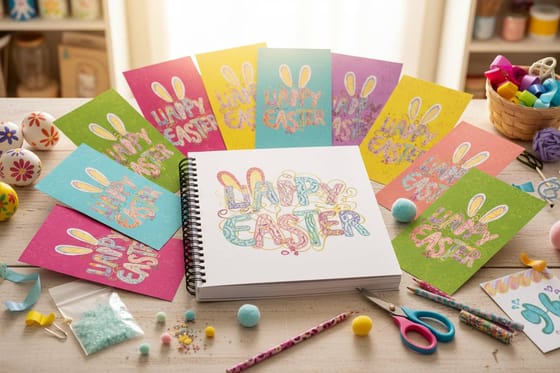
The simplest professional shortcut is to skip pairing entirely and use one family with many weights. A family that ships everything from light through black gives you a full hierarchy with guaranteed harmony, and the differences in weight do all the work that a second typeface would have done. If you want the personality of an expressive face without the risk, browse font roundups like retro display faces and warmer seasonal type for headline candidates, then keep your support face neutral.
Color, contrast, and the finishes that change how type reads
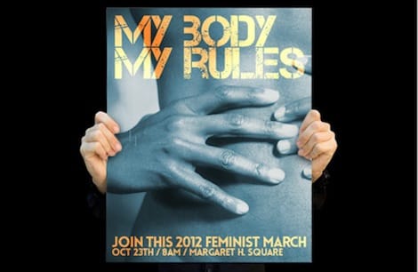
A perfect typeface at a perfect size still fails if the contrast between the type and the background is weak. Dark type on a light field is the most reliable combination in almost any lighting. Light type on a dark field works well too, but it optically thickens the letters, so drop back one weight and open the tracking slightly to compensate.
Color pairs that share a similar lightness value are the common trap. Mid blue on mid green, or red on a deep warm brown, can look bold on a monitor and read as a smudge in a hall. Convert your design to grayscale for a moment. If the headline disappears, the contrast is coming from hue alone and will not survive real lighting.
Material and finish matter as much as color. Coated vinyl film delivers dense saturated ink and sharp edges, which is why it is the default for hard hitting headlines. Polyester fabric has a softer matte surface that scatters light, so it kills the glare from overhead spotlights and photographs beautifully, at the cost of a fraction of edge crispness. If your booth sits under bright directional light, matte fabric usually reads better than a glossy panel even though the glossy panel looks punchier in the file.
One last practical note: keep small reversed type off a busy photographic background. If you must place text over an image, use a solid or heavily tinted shape behind it rather than trusting a drop shadow to do the job. See how material choices play out on vinyl banner options before you lock the design.
Licensing and file prep so your fonts survive the trip to press

Many banner problems that reach prepress are font problems, and almost all of them are avoidable in two minutes.
- Outline or embed the type. Converting text to outlines guarantees the shapes we print are the shapes you designed, with no substitution if a font is missing on the other end. Keep an editable copy of the file with live text before you outline, so you can still fix a typo.
- Keep vector type vector. Do not rasterize a headline unless you have to. Vector edges stay perfectly crisp at any output size, while a rasterized headline is locked to the resolution it was flattened at.
- Check the license. Commercial printing is a specific use case. Personal use licenses do not cover it, many free downloads are personal use only, and open source families under the SIL Open Font License generally are fine. Save the license file next to the artwork.
- Build in CMYK. Design in the color space you are printing in so that a rich brand color does not shift on you at conversion.
- Respect bleed and the safe area. Retractable panels lose a strip at the bottom inside the cassette and a strip at the top at the rail. Keep type well inside the live area shown on the product template rather than close to the trim.
If you are choosing between printing methods for a wider campaign, the overview of different types of printing explains how each process handles fine type and ink coverage.
How to choose your banner font in seven steps, and what printing costs
Here is the sequence that works, in order, every time.
- Step 1. Write the one line. Decide the single sentence a stranger must read from across the room. Everything else is support.
- Step 2. Measure the distance. Stand where your audience will stand. Count the feet. That number sets your cap height at roughly one inch per ten feet.
- Step 3. Shortlist three faces. Screen them for open counters, even stroke weight, distinct letterforms, and a tall x height.
- Step 4. Pick the weight and width. Medium to bold, normal to moderately condensed. Use real family weights, never faux bold.
- Step 5. Print a strip at 100 percent. Tape it up, walk back to the real distance, and let the wall decide instead of the monitor.
- Step 6. Fix the spacing. Tighten display tracking slightly, kern the obvious pairs by eye, set line spacing near 1.1 to 1.2, and keep word spacing generous.
- Step 7. Prepare the file. Outline the fonts, confirm the license, build in CMYK, and stay inside the safe area on the template.
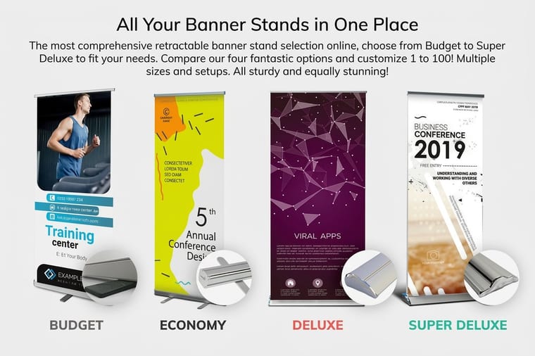
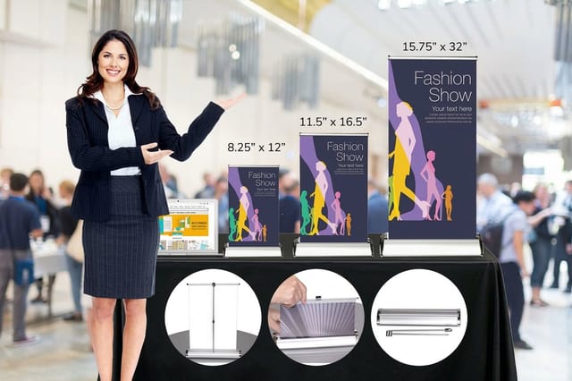
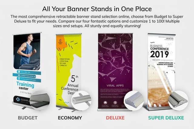
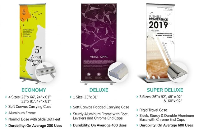
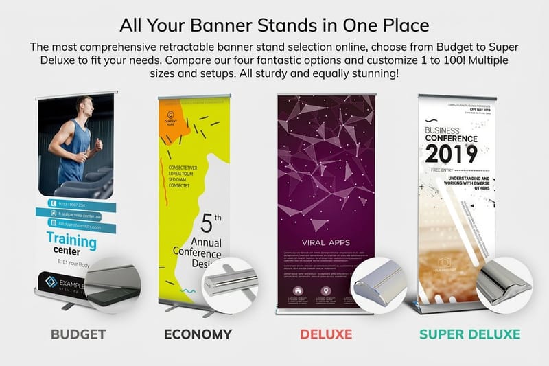
Then print it. At 4OVER4 a mini retractable banner stand starts at $49.41 for one and is the right call for tabletop displays and reception counters. A full height retractable banner stand starts at $139 for one and is the standard trade show workhorse. A retractable fabric banner stand starts at $159.85 for one and gives you a matte, glare resistant surface that photographs well under booth lighting. If you are weighing your options, our retractable banner comparison and step and repeat comparison lay out the differences in hardware and print quality.
Wally explains banner type
If you have to squint, the font already lost
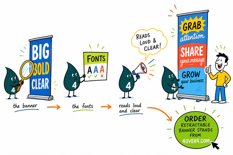
Wally has one test and he runs it every time. Print the headline at full size, tape it to the wall, and walk back to where your audience will actually stand. If you can read it without leaning in, the typeface, the size and the spacing are all correct. If you cannot, no amount of clever styling will rescue it. Fix it on paper before it becomes a five foot panel.
Design and print banner stands →
Infographic
The 7 rules of banner type at a glance
One frame, seven rules. Keep it open while you set your headline, and check the finished panel against it before you export the file.
No single rule saves a headline on its own. A bold face at the wrong size still fails, and a perfect size with weak contrast still fails. Run all seven before you export.
Specs and pricing
Retractable banner stand specs and live pricing
Once the type is set, the panel size and material decide the rest. Here are the current specs and live pricing for our standard retractable banner stand, straight from the product configurator.

| Quantity | Price Per Unit | Total |
|---|---|---|
| 1 | $139.00 | $139.00 |
Print it
Put your banner type on a stand that travels
See it in use
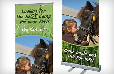
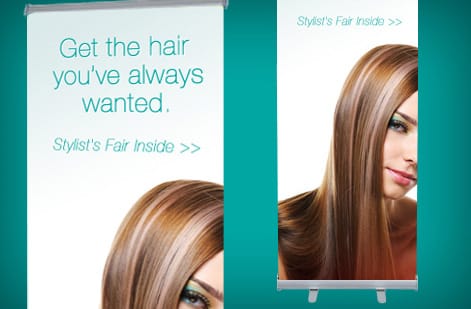
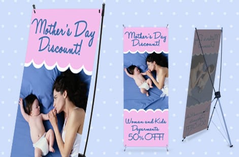
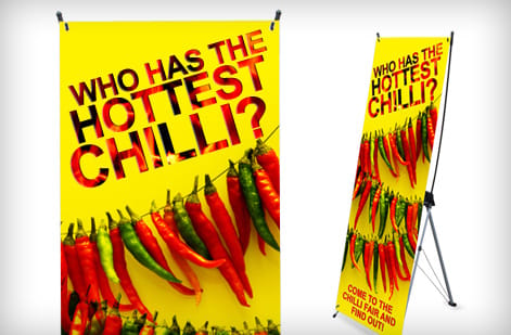
Banner type our customers set and printed

%22%2F%3E%3Ccircle%20cx%3D%2242%22%20cy%3D%2245%22%20r%3D%2227%22%20fill%3D%22%23f59e0b%22%20opacity%3D%220.15%22%2F%3E%3Ccircle%20cx%3D%2280%22%20cy%3D%2262%22%20r%3D%2226%22%20fill%3D%22%23f59e0b%22%20opacity%3D%220.1%22%2F%3E%3Crect%20x%3D%2272%22%20y%3D%2221%22%20width%3D%2227%22%20height%3D%2232%22%20rx%3D%224%22%20fill%3D%22%23f59e0b%22%20opacity%3D%220.08%22%20transform%3D%22rotate(7%2080%2030)%22%2F%3E%3C%2Fsvg%3E)
Explore more
Where to go next
By the numbers
The banner stock behind type set this large
Common Questions
Common questions about banner fonts
What font is best for a banner?
A bold humanist or neo grotesque sans serif. Helvetica Bold, Open Sans Bold, Montserrat Bold and Inter Bold all hold their shape at three inches of cap height from thirty feet, which is the job a banner font has to do. For a tall narrow panel, a moderately condensed face such as Oswald or Bebas Neue fits more characters per line at the same height. There is no single best, but there is a test. Print the headline at 100 percent, tape it up, and read it from the real distance.
What are the top 5 fonts?
For banners, five that keep showing up on panels that read well are Helvetica Bold, Open Sans Bold, Montserrat Bold, Oswald and Roboto Slab Bold. Between them they cover a neutral grotesque, a warm humanist sans, a geometric sans in its heavy cut, a condensed display face and a slab serif. Pick one for the headline and one for the support text, or use one family with many weights and skip pairing altogether.
What are the four main types of fonts?
Serif, sans serif, script and display. Serif faces carry small strokes at the ends of letters and suit long reading. Sans serif faces drop them and read cleanly at size, which is why most banner headlines use one. Script faces imitate handwriting and belong on a banner only as a short accent. Display faces are built for a single big word and lose legibility in a sentence. Some lists add monospace and slab serif, and slab serifs are the one extra category worth knowing for banner work.
What is a banner font?
A banner font is any typeface chosen specifically for large format display, where the type is read from a distance rather than held in the hand. In practice that narrows the field to designs with open counters, even stroke weight, clearly distinct letterforms, and a medium to bold cut. Grotesque and neo grotesque sans serifs, slab serifs, and sturdy display faces all qualify. Delicate scripts, hairline weights, and ultra condensed novelty faces almost never do.
How do I choose the right banner font?
Start with the reading distance and the message, not with the font menu. Decide the single line a passerby must absorb, set it in two or three candidate faces at true size, then print a section at 100 percent and stand back. The face that stays clean at that distance wins. After that, check brand fit, confirm you have a license that covers commercial printing, and make sure the family has enough weights to build a headline, a subhead, and a small legal line without swapping typefaces.
What size should banner text be?
Work from cap height, not point size. The common sign trade guideline is one inch of cap height for every ten feet of viewing distance, so a headline read from thirty feet wants roughly three inches of cap height. On a standard retractable banner stand the top third of the panel sits at eye level, so put the biggest line there and let the supporting copy drop to half that size or less.
What does a printed banner cost and how are prices set?
Price is driven by the format, the material, the size, and the quantity, not by the fonts you used. At 4OVER4 a mini retractable banner stand starts at $49.41 for one 8.25 x 12 inch stand, a standard retractable banner stand at $139 for one, and a retractable fabric banner stand at $159.85 for one. Larger panels, premium fabric, and hardware upgrades move the number up, while ordering several stands at once brings the unit cost down.
What sizes, materials, and finishes are available for banners?
Retractable stands run from compact tabletop panels up to full height floor units, most commonly in the 33 by 79 inch range for the standard stand. Material choices include coated vinyl film for maximum ink density and polyester fabric for a softer matte surface with less glare under spotlights. Matte finishes suit trade show lighting, while a gloss surface deepens saturated brand color. Each product page lists its exact panel sizes, material options, and hardware.
How long does banner printing take to produce and ship?
Production time is selected during checkout on the product page and runs alongside the shipping method you pick, so the delivery estimate you see reflects both. Files that are print ready with outlined fonts, correct bleed, and CMYK color move through prepress without a hold. The most common cause of delay is a missing font in a packaged file, which is exactly why outlining type before upload is worth the extra minute.
Can I use a free font on a commercial banner?
Often yes, but read the license before you commit. Many free fonts are licensed for personal use only, some allow desktop printing but not resale of printed goods, and open source families under the SIL Open Font License are generally safe for commercial print. Keep a copy of the license with the artwork. If a client ever asks how the type was licensed, you want the answer in the same folder as the file.
Get Started
Ready to see your type at full banner scale?
Upload the artwork with the fonts outlined and we handle the rest, from color to hardware, so your headline reads exactly as sharp in the hall as it does on your screen.
Legal Disclaimer
Gold Standard guarantees apply to all standard orders placed through 4over4.com. Price match requires verifiable proof of a competitor's published price for an equivalent product with matching specifications and turnaround time. Satisfaction guarantee covers manufacturing defects and print quality issues. Contact support with order number and documentation.
