
The Brand Refresh Checklist That Tells You What to Reprint First


Nadia is our customer education voice, built from the knowledge of our production team, with over 20 years in printing.
Nine steps, in the order a printer would run them. Where a refresh stops and a rebrand starts, how to time the switch against the stock in your cupboard, and which piece to reorder first.
A brand refresh keeps the name and changes how the brand looks. A rebrand changes what the business is called, and only that forces you to reprint everything on one date. The checklist runs in nine steps: decide refresh or rebrand, list exactly what changes, time the launch to your stock levels, test it with existing customers, keep what your history earned, prove the artwork on paper, apply it across every material, announce the reason rather than the logo, then reprint cards first, letterhead and envelopes next, long-life items last.
Quick answer
The name decides everything else on the list
Start by asking whether the name is changing. If it is not, you are refreshing: stage the work, run down the printed stock you already own, and switch each piece at its next reorder. If it is, you are rebranding, and every piece carrying the old name becomes wrong on the same morning, which changes both the budget and the schedule. The eight steps that follow are the same either way. Only the reprint plan differs.
Step 1: Decide Whether This Is a Refresh or a Rebrand

This is the one decision that sets the budget, the timeline, and how much printed stock you throw away. Everything else on the checklist follows from it.
A refresh keeps the name. The logo gets redrawn, the palette gets tuned, the typeface changes, the photography improves, but a customer still recognizes the company. A rebrand replaces the identity: a new name, a new legal entity, or a move into a market where the old positioning no longer fits. Mergers, acquisitions and trademark conflicts force rebrands. Looking dated does not.
| What changes | Refresh | Rebrand | Effect on your print |
|---|---|---|---|
| Color palette | Common | Always | Run existing stock down, reorder in the new palette |
| Typeface | Common | Always | No urgency, switch at the next reorder |
| Logo mark | Redrawn | Replaced | Cards first, everything else as it runs out |
| Company name | Never | Always | Every printed piece changes on one date |
| Legal entity | Never | Sometimes | Add invoices, contracts and tax documents to the list |
Read the last column. If nothing in your change list touches the name, you are doing a refresh and you can stage the reprints over months. If the name moves, plan a single switchover date and order the whole stationery set together. A useful reality check before you commit is what a small business owner learned rebranding for real.
Step 2: Write Down Exactly What Changes, and What Does Not
Most refreshes overrun because nobody wrote the scope down. Open a document and put every brand asset in one of three columns before a designer touches anything.
- Keep. The equity you have already paid for. Usually the name, often the primary color, sometimes a symbol customers recognize at a glance.
- Tune. Assets that work but look their age. A logo that needs redrawing for small sizes, a palette that needs a proper secondary range, a typeface with too few weights.
- Replace. Anything actively working against you. Clip art icons, a stock photo library nobody owns the rights to, a tagline that describes a product you retired.
Then list the deliverables that carry those assets: business cards, letterhead, envelopes, invoices, brochures, price lists, packaging, van livery, signage, email signature, website, social profiles. Put a quantity and a current stock level against each printed item. That column is what turns a mood board into a schedule, and it is the number your printer will ask for. To settle which stationery piece leads, compare letterheads vs envelopes vs notepads and which one to print first.
Keep the list short enough to finish. A refresh that touches six assets ships in six weeks. One that touches thirty becomes a rebrand with a smaller budget. If you want a model for restraint, read our guide to building a minimal brand identity.
Steps 3 and 4: Time It to Your Stock, and Check It With Real Customers
Set the launch date from the supply cupboard, not from the calendar. Count what you have, divide by how fast it goes out, and you have the date the reprint has to land. A business handing out two hundred cards a month with eight hundred left has four months of runway, which is plenty of time to redraw a logo and proof it properly.
Three timing traps are worth naming. Do not launch a refresh two weeks before a trade show, because show collateral has the longest lead time and the least room for a reprint. Do not launch during your busiest sales quarter, when nobody has time to police consistency. And do not launch the week a large stationery order arrives, which happens more often than it should.
While the design is in progress, show it to twenty existing customers rather than to the leadership team. Ask what the new mark says about the business, not whether they like it. Liking is noise. Recognition is the signal, and if regular customers cannot tell it is still you, the refresh has gone too far. Read what your own history is telling you as well: the elements customers name unprompted, the color they describe you by on the phone, the piece of collateral they kept. Those are equity, and they belong in the keep column.
Step 5 and 6: Get the Files Right and Prove Them on Paper
A refresh that only ever existed on a screen fails at the press. Two things break most often, and both are cheap to catch before the run.
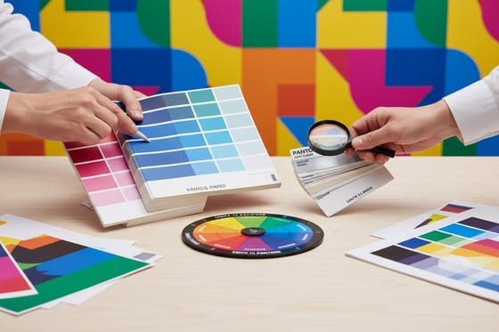
Color shifts on conversion. Screens build color from light, presses build it from ink, so saturated blues, vivid greens and bright oranges all lose intensity going from RGB to CMYK. Define the brand color as a Pantone reference with a matching CMYK build, and approve it on a printed swatch of the stock you will actually use. Coated and uncoated paper return two different results from the same ink film. Our guide on which color mode to use for printing covers the conversion, and the Pantone colors that shift most lists the specific ones to be careful with.
Detail closes up at real size. A logo reviewed at 1200 pixels on a monitor is being judged at roughly ten times the size it prints on a card. Thin strokes fill in, tight counters in letterforms go solid, and a fine outline can vanish. Print the mark at 3.5 by 2 inches on a desktop printer and look at it at arm length before signing off. Logo design best practices covers the minimum stroke weights that survive.
Build the production files the way any print job wants them: fonts converted to outlines, artwork at full size, bleed included, and a proper margin between the type and the trim. Start from a correctly sized layout in the blank template library so the dimensions are right before the artwork goes in. Then order one small run as a proof. A hundred cards costs less than discovering the problem on a box of two thousand.
Steps 7 and 8: Apply It Everywhere, Then Say Why
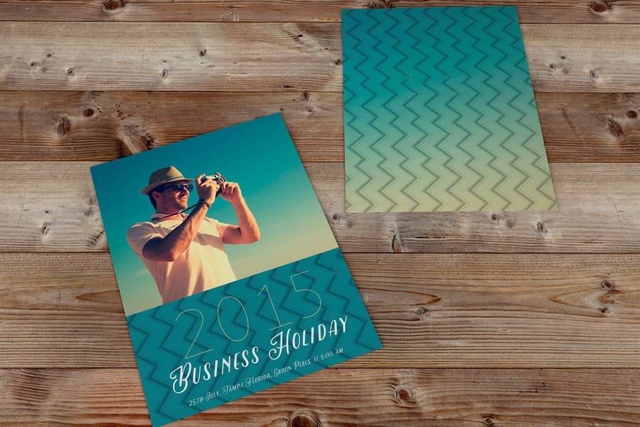
Consistency is not a design value here, it is a recognition mechanism. People learn a brand by seeing the same combination repeatedly, and a refresh that reaches the website but not the invoice teaches them two brands instead of one.
Work through the list you built in step two and mark each item done, in progress, or scheduled. The digital items change in an afternoon. The printed items change on a schedule you control, which is why they need the tracking more. Give one person the list. Shared ownership of a consistency checklist means nobody owns it.
When you announce it, lead with the reason and not the logo. A new mark on its own is a company talking about itself. The same mark alongside a sentence about what changed for the customer, a wider product range, a new service, a location, gives people something to care about. Standard postcards start at $16.48 and are the cheapest way to put the news in front of an existing customer list, and a short insert in outgoing orders costs almost nothing. For a longer story, a folded piece works better: standard brochures start at $57.11 and give you room to explain the change and the range behind it. Compare formats in the brochure printing range.
Step 9: Reprint in the Order People Actually Touch Things

The last step is a purchasing decision, not a design one. Order by how often a piece is handed to a person, and by how much of it you would have to scrap.
| Order | Piece | Why here | Starting price |
|---|---|---|---|
| 1 | Standard business cards | Handed over in person, cheapest to replace, most visible signal that something changed. | $17.57 |
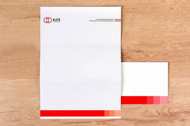
| 2 | Standard letterheads | Goes on quotes, invoices and contracts, so the old version keeps circulating until it is gone. | $99.95 |
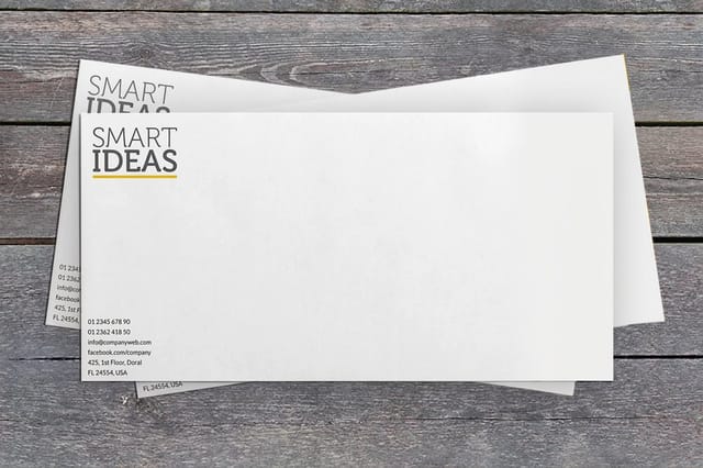
| 3 | Printed envelopes | The first thing a customer sees before opening anything. Mismatched with new letterhead it looks careless. | $142.99 |
| 4 | Standard brochures | Content usually changes with the look, so reprint once rather than twice. | $57.11 |
| 5 | Standard postcards | Short-lived by design, easy to order in the new look for the announcement itself. | $16.48 |
Signage, vehicle graphics and anything with a long production lead go after all of these, because they are expensive to redo and nobody expects a van to change overnight. Packaging is the exception worth checking early: if your boxes have a six week lead time and a high minimum, they need ordering before the launch date rather than after it.
One practical habit saves money at the switch. For the two or three pieces you burn through fastest, place a deliberately small order at the changeover instead of your usual quantity. It absorbs the last-minute corrections that always appear in week one, and you go back to normal run sizes once the artwork has settled. Browse the full business card printing range to pick the stock and finish before you place that first short run.
Wally runs the refresh checklist
Same name, staged reprints. New name, one switchover date.
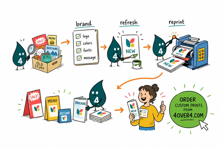
Wally checks the cupboard before he checks the mood board. If the name stays, he finishes the box of cards he already paid for and reorders each piece as it runs out. If the name changes, he books one date and orders cards, letterheads and envelopes together, because a card with a name you no longer trade under is scrap. Either way he proves the new mark on paper at 3.5 by 2 inches first, since a logo that looks sharp on a monitor can close up on a press.
Reorder standard business cards →
Specs and pricing
The three pieces you reprint first, with live options
Business cards run 2 by 3.5 inches on 14pt gloss up to 18pt uncoated or 14pt linen, 100 for $17.57 in 3 business days. Letterheads print 8.5 by 11 inches on 70# uncoated text or 24# Royal Laid, 50 for $99.95 in 5 business days. Brochures come in six sizes from 5.5 by 8.5 to 11 by 25.5 inches on 100# gloss or silk text, 50 for $57.11. Set the quantity for each below.


Cards, letterhead, envelopes
Order the refreshed stationery set


Logo, color and rebrand reads
Where to go next



Printing in Queens since 1999
A printer that has seen a few thousand refreshes
Common Questions
Your brand refresh questions, answered
What is the difference between a brand refresh and a rebrand?
A refresh updates the way an existing brand looks and sounds while keeping the name and the recognition it has already earned. New colors, a cleaner logo, a different typeface, better photography. A rebrand replaces the identity itself, usually the name, sometimes the whole positioning, and it is what you do after a merger, a legal name change, or a pivot to a different customer. The practical test is the supply cupboard: after a refresh you can usually finish the printed stock you already own, and after a rebrand you cannot use any of it past the launch date.
How often should a business refresh its brand?
There is no fixed interval, and doing it on a calendar is how brands lose recognition they spent years building. Refresh when something concrete has changed: the logo no longer works at small sizes or on a phone screen, the colors were chosen for print and now look wrong on the site, the audience has moved, or the identity was made when the business sold something different. If nothing on that list is true, spend the budget on a better business card stock instead.
Do I have to reprint everything at once?
Only if the name changed. When the name stays the same, a mixed cupboard is fine for a few weeks and nobody outside the company notices. Run down the pieces you already have and reorder them in the new look as they run out. When the name or the legal entity changed, everything with the old name on it becomes wrong on day one, so cards, letterheads, envelopes and anything customer-facing all have to land together. That single distinction is the biggest cost difference between a refresh and a rebrand.
Will my new brand colors print the same way they look on screen?
Not exactly, and the gap is worth planning for. Screens make color with light and presses make it with ink on paper, so bright saturated blues, vivid greens and neon oranges lose intensity when they convert from RGB to CMYK. Pick the brand color with a printed swatch in hand, define it as a Pantone plus a CMYK build, and check the build on the actual stock you will use. Coated and uncoated paper will give you two visibly different results from the same ink.
What should be on a brand refresh checklist?
Nine items, in this order: decide refresh or rebrand, list exactly what changes, set the date against your reorder cycle, check the change with the customers you already have, look at what in your history is worth keeping, prove the artwork in print before you commit, apply it consistently across every material, announce it with a reason rather than a logo reveal, and reprint in the order that people actually touch things. Skipping the first item is what turns a six week job into a year.
What do I do with the printed stock that is now out of date?
Sort it by whether the information on it is wrong or just old-looking. A card with the old logo and a correct phone number can still be handed out during a refresh. A card with a name you no longer trade under cannot, and it goes in the recycling on launch day. For anything in between, keep a small quantity for internal use and reorder the customer-facing pieces first. Ordering a smaller run at the switch point costs less than scrapping a full box twice.
Get Started
100 business cards cost $17.57, 50 letterheads $99.95
Start with the cards, add letterhead and envelopes when the stock runs low, and order a short first run while the artwork settles.
Legal Disclaimer
Gold Standard guarantees apply to all standard orders placed through 4over4.com. Price match requires verifiable proof of a competitor's published price for an equivalent product with matching specifications and turnaround time. Satisfaction guarantee covers manufacturing defects and print quality issues. Contact support with order number and documentation.
