
How to Design a Calendar Cover That Prints Clean


Emma is our prepress and print production voice, built from the knowledge of our production team, with over 20 years in printing.
The cover decides whether a calendar goes on the wall or in a drawer. Here is the size to build it at, the margins that survive the cut, and the half inch the binding takes from you.
Build a calendar cover at the flat panel size, not the hanging size: 11 by 8.5 inches for a standard wall calendar, plus 0.125 inch of bleed on every edge. Keep the year, the logo and any text at least 0.25 inch inside the trim, and leave the top 0.5 inch clear of anything that has to be read, because the wire-O punch and the wire loop cover that band. Supply a 300 dpi CMYK PDF with crop marks and bleed. Desk and pocket formats use other sizes, and the standard desk calendar size is in our calendar size guide.
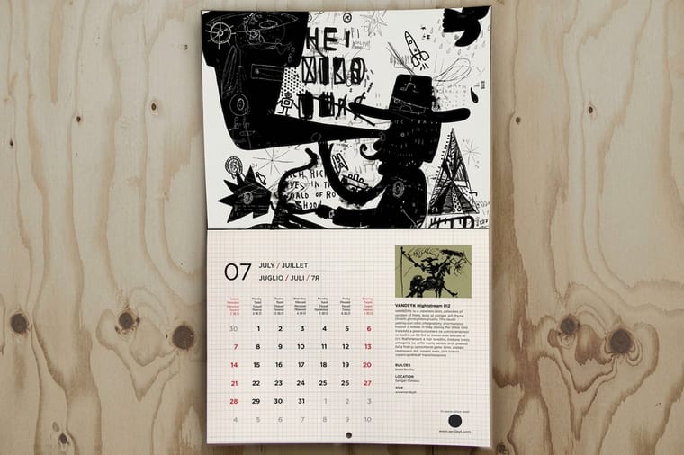
Quick answer
Flat panel size, bleed, safe margin, then the punch zone
Four measurements make a calendar cover printable. The artboard is the flat panel, 11 by 8.5 inches on a standard wall calendar rather than the 11 by 17 it hangs at. Bleed runs 0.125 inch past the trim so a wandering blade never exposes white paper. The safe margin holds the year and the logo 0.25 inch inside the trim. The punch zone takes the top 0.5 inch on a wire-O cover, where holes and metal sit over the artwork. Get those four right and the only remaining decisions are photographic.
Start From the Flat Panel Size, Not the Hanging Size
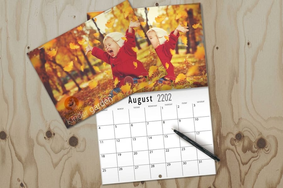
The most common mistake arrives before anyone opens a design tool. A wall calendar that measures 11 by 17 inches on the wall is printed as two 11 by 8.5 panels on one sheet, and the cover is the top panel only. Build an 11 by 17 artboard and the cover art gets scaled to half its intended size, or worse, gets placed across the fold.
So the document is 11 by 8.5 inches, plus 0.125 inch of bleed on each edge, which makes the file 11.25 by 8.75. Desk formats work the same way at a smaller scale: 8.5 by 5.5 and 6 by 4 inches are the panels you will meet most often, and each still needs its own bleed. If the calendar is a booklet with a separate front cover rather than a folded sheet, the cover is still a single flat page at the finished trim size.
Two numbers decide everything after that. Resolution: 300 dpi at final size, which for an 11 by 8.5 cover means an image of at least 3,300 by 2,550 pixels. Color: build in CMYK, because a cover photo that looks rich on a screen in RGB usually loses its deep blues and its brightest greens on press. Our guide to planning and printing a custom calendar covers the page count and the production schedule that sit around this file, and the blank template library has correctly sized layouts you can start from instead of typing the dimensions yourself.
Bleed, Trim and the Quarter Inch That Saves the Job
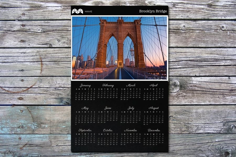
Bleed exists because a guillotine cutting through a lift of paper does not land on exactly the same line every time. The drift is small, roughly a sixteenth of an inch, and it is completely invisible if you planned for it. Extend every color and image that touches an edge 0.125 inch past the trim line, and the blade takes a slightly different bite out of the image on each copy rather than leaving a white sliver on some of them.
The safe margin does the same job in reverse. Keep type, the year, the logo and anything else that must look intentional at least 0.25 inch inside the trim. On a cover this is easy to forget because a designer looking at a screen sees a comfortable amount of white space that turns out to be an eighth of an inch on paper.
| Boundary | Where it sits | What belongs there |
|---|---|---|
| Bleed | 0.125 in outside the trim | Background color and photography only. It is thrown away. |
| Trim | The finished panel edge | Nothing you care about. The cut moves around this line. |
| Safe margin | 0.25 in inside the trim | The year, the company name, the logo, any legal line. |
| Punch zone | Top 0.5 in on a wire-O cover | Background only. The holes and the wire cover this band. |
Export a single PDF with crop marks and bleed included, not a JPEG. A flattened image file loses the trim geometry and forces the prepress step to guess where the cut belongs. If bleed is a new idea rather than a habit, bleed and trim explained walks through the same geometry on other products, and the rules carry over unchanged to poster printing and every other trimmed piece.
The Binding Edge Takes the Top Half Inch
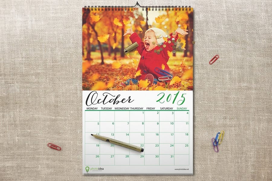
This is the constraint people design straight into and then discover on the proof. A wire-O calendar is punched with a row of small rectangular holes along the bound edge, and a metal wire threads through them and loops over the top. Between the punch and the loop, the first half inch of the cover is effectively gone.
Design for it rather than around it. Background photography and soft texture can run right through that band because losing a bit of sky to a wire costs nothing. Words, faces, product shots and logos must sit below it. The same applies at the bottom edge of a folded wall calendar, where the fold takes its own tolerance: keep a logo off the center fold line entirely, because a fold that lands a sixteenth of an inch off puts a crease through it.
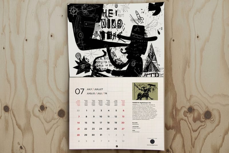
Formats without wire have their own dead zones. A saddle-stitched calendar has staples on the spine and a small amount of creep on the inner pages. A drilled hanging hole in the top panel needs about half an inch of clear space around it so the punch does not cut a letter in half. Ask which binding you are getting before you start the cover, not after; the binding, finishes and formats guide lays out what each option does to the layout, and wire-O coil calendars show the punched edge in the product photography.
Branding That Still Works in July
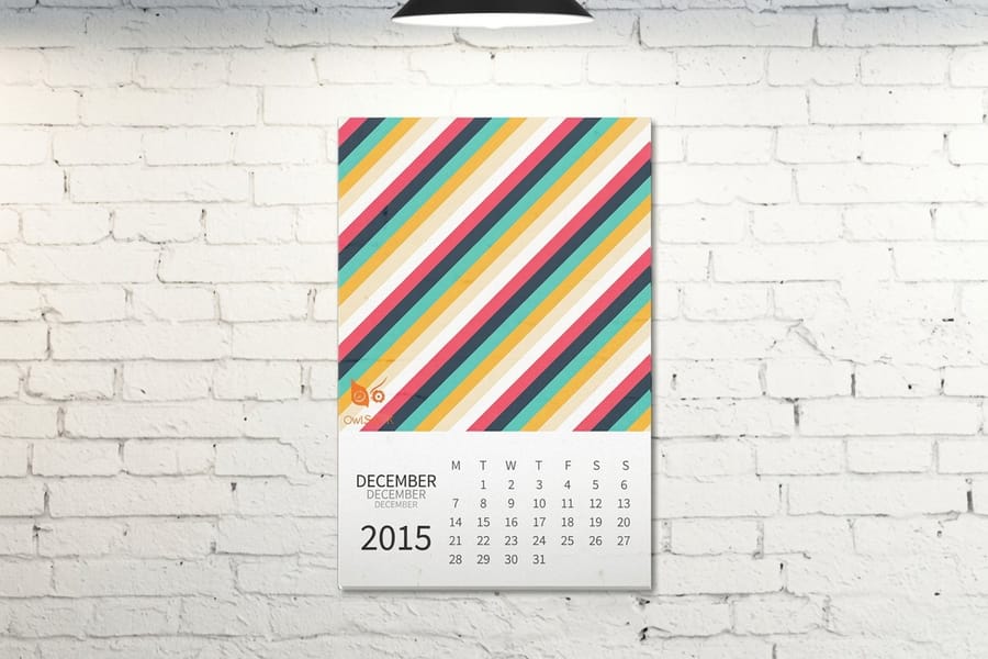
A promotional calendar has one job on the cover and a different job for the eleven months after that. The cover has to win the December decision: someone holds three or four calendars and picks the one going on the wall. That argues for a strong image, a large readable year, and restraint everywhere else. A cover crowded with services, a slogan and four social icons loses to a clean photograph every time.
Then January arrives and the cover flips behind the pad, where it stays until the calendar comes down. Every piece of contact information you put only on the cover is invisible for the rest of the year. Put a small, consistent contact strip along the bottom of each month page instead, and treat the cover as the piece that earns the wall rather than the piece that carries the phone number.
Two production choices matter more than they look. Coating: a gloss aqueous cover makes photography snap but shows fingerprints, while matte lamination handles better and lets someone write on it. Ink coverage: a heavy dark cover looks expensive and marks easily, so if the calendar is going into a workshop or a kitchen rather than an office, lighter artwork ages better. Standard calendars start at $812.59 for a bulk run, so the cover is worth a design review before the file goes out. For the ordering side, quantities and client versioning are covered in how to order bulk calendar printing for clients, and the full range sits under calendar printing. For your own company's run rather than a client's, the bulk calendar ordering guide covers quantities and deadlines.
Wally explains the calendar cover
One panel, three margins, and a wire that eats the top
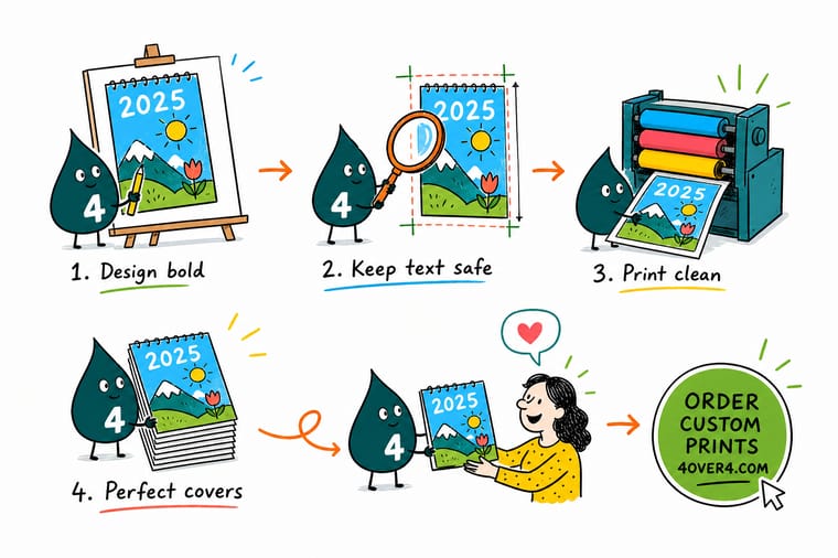
Wally lays out the cover at the flat panel size, 11 by 8.5 for a standard wall calendar, then pushes the photograph an eighth of an inch past the trim so the blade has room to wander. He pulls the year and the logo a quarter inch back inside the trim. Last he draws a line half an inch down from the bound edge and refuses to put a single word above it, because that is where the punch holes go and the wire loop sits on top of them. Background can live there. Nothing readable can.
Order custom calendars →
Specs and pricing
Calendar formats, sizes, and starting prices
Compare the bound formats side by side, with live configuration choices and starting prices straight from the 4OVER4.COM configurator. Saddle stitched calendars run 8.5 x 11 inches at 24 or 28 pages with a 14pt or 80 lb gloss cover, and wire-o calendars come in 8.5 x 11, 9 x 12, 11 x 17 or 12 x 12 inches at 26 pages for 12 months or 38 for 18, with a black or white coil and an optional thumb cut and hanger, all from 25 copies.



Print it
Print the calendar your cover deserves
Saddle stitched wall calendars and wire-o calendars from 25 copies, and saddle stitched booklets from 8 to 60 pages when the calendar travels with a catalog or a program.
%22%2F%3E%3Ccircle%20cx%3D%2236%22%20cy%3D%2220%22%20r%3D%2231%22%20fill%3D%22%23a78bfa%22%20opacity%3D%220.15%22%2F%3E%3Ccircle%20cx%3D%2233%22%20cy%3D%2229%22%20r%3D%2210%22%20fill%3D%22%23a78bfa%22%20opacity%3D%220.1%22%2F%3E%3Crect%20x%3D%2276%22%20y%3D%2210%22%20width%3D%2221%22%20height%3D%2220%22%20rx%3D%224%22%20fill%3D%22%23a78bfa%22%20opacity%3D%220.08%22%20transform%3D%22rotate(16%2080%2030)%22%2F%3E%3C%2Fsvg%3E)
Explore more
Where to go next
Four guides, the calendar range and the FAQs: planning a custom calendar, binding and finishes, bleed and trim, ordering calendars for clients, and every wall, desk and wire-o format.



By the numbers
Covers printed and punched with the calendar block
Common Questions
Your calendar cover questions, answered
What size should a calendar cover be?
Match the flat page size of the calendar, not the size it takes up on the wall. The common wall format finishes at 11 by 8.5 inches per panel and hangs at 11 by 17, so the cover artboard is 11 by 8.5 inches plus 0.125 inch of bleed on all four sides, which makes the document 11.25 by 8.75. Desk formats are usually 8.5 by 5.5 or 6 by 4 inches per panel. Set the document to the flat panel, add bleed, and let the printer handle the fold or the punch.
How much bleed does a calendar cover need?
An eighth of an inch on every edge, the same as any trimmed print job. The reason is mechanical rather than stylistic: a stack of sheets shifts slightly under the guillotine, so the blade can land up to a sixteenth of an inch off the intended line. Without bleed, that drift exposes a white hairline along the edge of a full-bleed photo. With bleed, the drift simply eats a little more of the image and nobody notices.
How far from the wire binding should text sit?
Half an inch from the bound edge is the number to design to. The punch line itself sits a few millimeters in from the trim, the holes are a few millimeters tall, and the wire loop arches over the top of them. Anything inside that band is either cut through by a hole or hidden under metal. Background color and out-of-focus texture can run into it without harm. A tagline, a face or a logo cannot.
Should the cover print on heavier paper than the inside pages?
It helps, and it is worth asking for. A cover on 100lb cover stock while the month pages run on 100lb gloss text gives the pad a stiffer front that survives shipping and handling. On a saddle-stitched or booklet-style calendar the difference is more obvious because the cover is the only page that gets gripped repeatedly. If everything runs on the same text weight, the cover curls at the corners within a month.
Can I use a full-bleed photo on the calendar cover?
Yes, and it is the most common cover treatment, but pick the photo for its quiet areas rather than its subject. You need one region calm enough and light enough to carry the year and the company name in a readable color. A busy image forces a translucent panel or a heavy drop shadow behind the type, both of which look like a patch. Crop for empty space first, then place the type.
Does the cover need the year on it?
Put it there. People stack promotional calendars in a drawer and pull one out in December, and the only thing that decides which one goes on the wall is whether the year is visible at a glance. Set it large, keep it inside the safe margin, and do not let it collide with the hang hole if the format has one punched through the top panel.
Get Started
Order 25 calendars from $812.59
Pick the format and the binding, upload a print ready cover with bleed, and we handle the punch, the pad and the shipping.
Legal Disclaimer
Gold Standard guarantees apply to all standard orders placed through 4over4.com. Price match requires verifiable proof of a competitor's published price for an equivalent product with matching specifications and turnaround time. Satisfaction guarantee covers manufacturing defects and print quality issues. Contact support with order number and documentation.
