
How to Optimize Food Labels for Shelf Appeal and Compliance


Shelf appeal and compliance fight over the same square inches. Splitting the panels settles that fight, the facestock has to survive the cooler, and the required copy has to sit outside the design.
Give the front panel three elements a shopper can read from three feet, keep the net quantity in the bottom 30 percent of that panel, and move every other required statement to the information panel at 1/16 inch type or larger. Then choose the facestock for where the product physically sits: paper for ambient dry goods, film with a cold-rated adhesive for anything that meets condensation, ice, or oil.
Quick answer
Two panels, two jobs, and a facestock chosen for the cooler
Shelf appeal is a front panel problem and compliance is a back panel problem, and most bad food labels come from mixing them. The principal display panel carries the brand, the common name of the food, and one flavor cue, with the net weight parked in the lower 30 percent. The information panel carries the ingredient list in descending order by weight, the allergen declaration, the nutrition panel, and your name and address, all at 1/16 inch or larger. Material is the third decision and the one that fails in the field: paper for dry ambient goods, film with a cold-rated adhesive for anything chilled, wet, or oily.
Decide What the Front Panel Says Before You Open the Design File
The front of your package is called the principal display panel, and FDA defines it as the part of the label most likely to be displayed under customary conditions of retail sale. On a cylinder, the usable area is calculated as 40 percent of the container height multiplied by the circumference. That number is smaller than designers expect, and it is the reason so many first labels feel crowded.
Two statements are legally anchored to that panel. The first is the statement of identity, which is the common name of the food, printed in bold type and generally in a size reasonably related to the largest type on the panel. Chili Crisp is a brand line. Chili Crisp Chili Oil Condiment is a statement of identity. The second is the net quantity of contents, which belongs in the bottom 30 percent of the panel, parallel to the base of the container, with a minimum type height that scales with panel area: 1/16 inch for panels up to 5 square inches, 1/8 inch from 5 to 25 square inches, and 3/16 inch from 25 to 100 square inches.
Block that bottom strip out in your layout before you place anything else. Then give the remaining space three elements: the brand mark, the identity statement, and one differentiator such as flavor, heat level, or varietal. A shopper walking an aisle takes in a jar from roughly three feet away, and a fourth element is the one that makes the other three unreadable. Awards, origin stories, and social handles all read fine on the back, which is where premium food labels earn their heavier stock and finish.
Match the Facestock and Adhesive to the Cooler, Not the Mockup
The single most common food label failure has nothing to do with design. It is a paper label on a container that sweats. Uncoated paper photographs beautifully, takes a warm ink well, and lifts at the corners within a day or two in a cooler door because moisture wicks into the cut edge and the adhesive gives up.
Work backward from where the product physically lives.
- Ambient shelf, dry goods. Coated or uncoated paper is fine, and paper is where the tactile, hand-made look lives. Spice jars, dry pasta, honey, and cookie packaging sit here.
- Refrigerated, handled, possibly wet. Film facestock. Sauces, dairy, fresh juice, and anything that goes back and forth between a cooler and a counter.
- Ice, immersion, or freezer. Film plus an adhesive rated for cold application. Most standard permanent adhesives will not grab reliably on a surface below roughly 40 degrees Fahrenheit at the moment the label goes on, which is a separate problem from whether it survives cold afterward.
- Oily or greasy contact. Oil migrates through an unprotected paper face and darkens it. A laminate or a film face is not optional here.
The honest trade-off is that film costs more and looks less handmade. A textured uncoated stock signals small batch in a way a glossy film never will, so if your product genuinely sits at ambient temperature and gets bought within weeks, paper is the better commercial choice, not the cheap one. Just do not let a photograph of a chilled bottle in a studio decide the spec. Our beverage label printing options are built around the wet case, and beer label printing assumes ice bucket duty from the start.
Lay Out the Information Panel So It Passes and Still Looks Designed
Everything the label legally has to say, other than the two front panel statements, goes on the information panel, which is the panel immediately to the right of the front as the shopper faces the package. It cannot be the bottom of the jar, and it cannot be a hang tag.
| Required element | Where it goes | The rule people miss |
|---|---|---|
| Statement of identity | Principal display panel | It is the common name of the food, not your product name, and it runs in bold type. |
| Net quantity | Principal display panel | Bottom 30 percent of the panel, parallel to the base, with a type size that scales with panel area. |
| Ingredient list | Information panel | Descending order of predominance by weight, using common names, with sub-ingredients in parentheses. |
| Allergen declaration | Information panel | Nine major allergens: milk, egg, fish, crustacean shellfish, tree nuts, peanuts, wheat, soybeans, and sesame. Declare in the ingredient list or in a Contains statement immediately after it. |
| Name and place of business | Information panel | Manufacturer, packer, or distributor, with the street address, city, state, and ZIP. A qualifier such as Distributed by is required if you are not the manufacturer. |
All of that information panel copy has a floor of 1/16 inch type height, measured on the lowercase letter o. That measurement is not negotiable and it is where designers lose the argument, because 1/16 inch is around 6 point and it eats far more of a small jar than a layout comp suggests. The fix is not smaller type. It is a wider label, a second panel, or a booklet label.
Two habits make the back panel look intentional rather than apologetic. Set the ingredient block in a single justified paragraph with the allergen Contains line broken out in bold beneath it, so the wall of text reads as one designed object. And align the nutrition panel, the ingredient block, and the address to a single left edge, because the required rules inside a Nutrition Facts box create a strong vertical line that everything else should agree with. Sesame became the ninth major allergen under the FASTER Act effective January 2023, so any artwork older than that needs a second look before it goes back on press. This is a summary rather than legal advice, and current FDA labeling guidance is the authority.
Cut Labels, Rolls, or Shaped, and What Each One Costs You

Format is an application decision before it is a design decision. How the label gets onto the container decides which one you order.
| Format | How it is applied | Best for | Starts at |
|---|---|---|---|
| Standard food labels | By hand, peeled from a sheet | Small batches, farmers market runs, testing a design on a real jar | $23.88 |
| Premium food labels | By hand, upgraded stock and finish | Retail shelf presence where the label is the packaging | $29.16 |
| Roll food labels | By machine, off a wound roll | Volume production with a semi-automatic or automatic applicator | $322.98 |
| Shaped wine labels | By hand, contour die cut | Bottles and jars where the silhouette itself is the differentiator | $10.99 |
Those starting prices reflect different starting quantities and sizes, so read them as entry points rather than as a like-for-like comparison. Configure the size and quantity you actually need before you decide anything, because a roll is not four times a sheet, it is a production quantity with a production price.
The shaped option deserves one warning. A die cut contour is the strongest shelf differentiator available on a label, and it is also the least forgiving on a tight radius, since every point where the outline curves inward is a place a corner can lift. Shapes work best on wider bottles and on flat-faced jars. On a narrow neck, a simple rectangle applied cleanly beats a beautiful shape applied with a wrinkle. If you are shipping direct to customers as well as selling wholesale, keep your outer carton simple and let address label printing handle the shipping side rather than reprinting product labels with variable data.
For the wider packaging decision behind all of this, the food packaging guide for small businesses covers containers and formats, and the printed food wrappers guide covers the cases where a wrap replaces a label entirely.
Wally explains food label panels
Three things on the front, everything else on the back
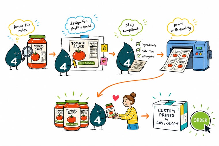
Wally turns the jar around before he designs anything. The front gets the brand, what the food actually is, and one flavor cue, with the net weight sitting in the bottom third where FDA expects it. The back gets the ingredients in descending order by weight, the allergen line, the nutrition panel, and the address, all at 1/16 inch or bigger. Then he asks one more question nobody asks early enough: is this jar going in a cooler? If yes, the pretty uncoated paper is out and film goes on.
Configure standard food labels →Specs and pricing
Food label sizes, stocks, and starting prices
Standard food labels start at 25 for $23.88 in 3 business days, roll food labels at 100 for $322.98 in 6.
Print it
Order labels that hold up in a cooler and sell on a shelf

Explore more
Where to go next

By the numbers
Facestocks rated for the cooler
Common Questions
Your food label questions, answered
Does every food label need a Nutrition Facts panel?
Most packaged foods sold at retail do, but there are real exemptions. FDA allows a low-volume exemption for firms that average fewer than 100 full-time equivalent employees and sell fewer than 100,000 units of that product in the United States over a 12 month period, claimed by filing a notice with FDA and renewed annually. Food prepared and sold on site by a retail establishment sits under different rules again. The exemption disappears the moment you make a nutrient content claim such as low fat or high fiber, so a marketing line on the front can create a panel requirement on the back. Confirm your own situation against current FDA guidance before you print.
How do I work out the right label size for a jar or bottle?
Measure the circumference of the container at the exact height the label will sit, then subtract a gap so the two ends do not have to meet perfectly. A gap of roughly one eighth to one quarter inch is normal and forgiving, because a butt joint that misses by a millimeter looks like a defect while a deliberate gap looks intentional. For height, keep the label off the shoulder curve and off the base radius, since adhesive on a compound curve is where lifting starts. Order one size, apply it to a real container, and only then commit to a full run.
Will paper labels survive refrigeration or a freezer?
Refrigeration alone is survivable for a coated paper label if the container goes on dry and stays dry. Condensation is what kills them. A bottle that sweats in a cooler door, gets handled, and goes back will wick moisture into a paper edge and the corner lifts. For chilled and frozen goods, a film facestock with a cold-temperature adhesive is the reliable answer, and the adhesive spec matters as much as the material because most standard permanent adhesives will not grab below about 40 degrees Fahrenheit at the moment of application.
Gloss or matte for a food label?
Gloss makes reds, oranges, and food photography look saturated and wipes clean, which is why sauces and beverages lean that way. It also throws glare under retail spotlights and shows every fingerprint on a dark background. Matte reads calmer and more premium, hides handling, and takes a handwritten batch number, but it mutes exactly the warm colors that make food look appetizing. If your front panel is a photograph of the product, go gloss. If it is typography on a solid color, matte usually wins.
Do I need a barcode before I can sell to a store?
Almost every retailer will ask for one, and you get the number from GS1 US rather than from your printer. Buy the company prefix, assign your own item numbers, and generate the UPC artwork at full size. Print it black on white with the quiet zones intact, do not shrink it below the size the retailer specifies, and never place it across a container seam or a tight curve where the scanner sees a distorted bar pattern.
When should I order labels relative to a launch?
Order the sample or the smallest run first and put it on the actual container, in the actual cooler, for a few days. That single step catches curl, adhesive failure, size errors, and the discovery that your net weight statement drifted out of the bottom 30 percent. Once the proof is approved on a real jar, the production run is straightforward and the turnaround at 4OVER4.COM is measured in business days rather than weeks.
Get Started
25 standard food labels cost $23.88, roll labels 100 for $322.98
Pick your size, choose a stock that matches where the product sits, and we print labels that stay put in a cooler and still read from three feet away.
Legal Disclaimer
Gold Standard guarantees apply to all standard orders placed through 4over4.com. Price match requires verifiable proof of a competitor's published price for an equivalent product with matching specifications and turnaround time. Satisfaction guarantee covers manufacturing defects and print quality issues. Contact support with order number and documentation. On-time delivery rate based on tracked orders 1999 to 2026. Individual results may vary based on shipping carrier performance.
