
How to Perfect Your Brand Presentation


A brand presentation wins when it tells a story, justifies every choice, and ends with something the client can hold. The leave-behind is what survives the meeting.
A brand presentation walks an audience from concept, through the reasoning, to the finished identity in real use. Justify the color and typography, prove the mark flexes across sizes and backgrounds, show real mockups, and end with a printed leave-behind in a branded folder that keeps selling after the meeting ends.

Start here
Justify every choice, then hand it over
A brand presentation moves an audience from concept to finished identity, justifying every choice along the way. Cover the story, the process, the color and type rationale, proof of flexibility, and real mockups, then wrap it in one consistent template and end with a printed leave-behind. The map below shows the arc from idea to the folder the client keeps.
What a brand presentation really is

A brand presentation is a structured walkthrough that introduces or pitches a visual identity. It moves an audience from the core concept, through the reasoning behind every choice, to the finished system and proof that it works in the real world. It is part story and part evidence, and the best ones feel inevitable by the last slide.
The trap is treating it as a gallery of pretty artboards. A logo dropped on a white square asks the audience to imagine your work in their world. A brand presentation does that imagining for them, explaining what the brand stands for and showing it on the things it will actually live on, from a presentation folder to a business card to a storefront sign.
This guide covers the components of a strong presentation, how to structure the flow, how to keep the whole thing consistent, and how to end with a printed leave-behind that keeps working after the room clears. If you want to prepare that leave-behind fast, our online design tool and templates get you to a print-ready file quickly.
The components a presentation has to cover

A complete brand presentation earns approval by covering a predictable set of pieces, each answering a question the client has not asked yet.
Illustrate the concept so the idea is clear. Showcase the creative process so the direction feels considered. If it is a rebrand, distinguish the new from the old and name what improved. Go into detail on the logo, its variations, and its clear space. Prove the identity is flexible and adaptable across sizes and backgrounds. Justify the color scheme and show off the typeface with a reason for each. Finally, put the brand in context with real mockups.
That last piece is where presentations win or fall flat. Swatches and letterforms on a grid feel abstract, but the same identity on a printed card and inside a branded folder feels real and finished. Show the brand where it will live and the decision gets easy.
Structuring the flow so it builds

Order matters as much as content. A brand presentation should build, each section setting up the next, so the finished identity lands as the natural conclusion rather than a reveal out of nowhere.
Open with the concept in a single line. Move through the creative process, then the logo detail, then color and type with their rationale. Escalate into flexibility and real-world context, because seeing the brand adapt is what converts a nod into a yes. Save the full system and the applications for near the end, when the audience has enough grounding to appreciate them.
Keep each section tight and let the work breathe. A presentation that rushes the story to cram in more slides feels defensive, while one that walks a clear arc feels confident. When you have supporting detail that would interrupt the flow, move it into the printed leave-behind so the live presentation stays a clean narrative.
Making the presentation itself on-brand
Nothing undercuts a brand pitch faster than a messy deck. If you are asking a client to trust your judgment about their identity, the presentation has to demonstrate that judgment in every slide.
Use one template, a consistent grid, and the very palette and typefaces you are proposing, so the deck becomes a live demo of the brand working. Keep one voice throughout, and treat spacing and alignment as seriously as you would in the final logo. The medium is the message here: a coherent presentation quietly proves the identity holds together.
That same discipline carries into the printed pieces you leave behind. Cards, a folder, and a brief that all match the on-screen system make the brand feel like one company, which is exactly the impression that closes the room. Printing them together at 4OVER4 keeps color and stock identical, so the physical set matches the pixels the client just saw.
The printed leave-behind that keeps selling
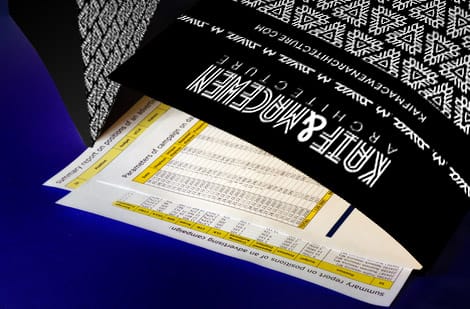
The decision to approve a brand is usually made after you leave, which is why the strongest presentations end with something the client can hold. A printed leave-behind keeps your identity physically present during that quieter, second conversation.
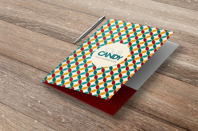
Build it as a branded presentation folder holding a few sample business cards, a one-page brief that captures the concept and rationale, and a couple of key applications. Because it lives on a desk rather than in an inbox, it keeps working for days. It also lets the client experience the brand in its real medium, feeling the stock and the finish instead of imagining them.
For client-facing industries, a tailored option like real estate presentation folders adds a professional frame straight out of the box. See the live specs and pricing below to build the set, and order the folder and cards together so the final impression is perfectly consistent.
Delivering it and following up

How you deliver the presentation shapes how it is received. Rehearse the arc so you can talk to the work rather than read the slides, and pause after each rationale to invite reaction, because a brand decision is a shared one.
Hand over the printed leave-behind at the end, not the start, so it becomes a memory anchor rather than a distraction. Then follow up with the digital deck for the record, but let the physical folder do the persuading in between. The combination of a confident live walk-through and a tangible set is what moves a brand from proposed to approved.
When the identity is signed off, that same folder-and-card system becomes the client’s first real print run, so the presentation flows straight into production. Browse the full business stationery range to extend the identity into every piece the brand needs next.
Wally ends the pitch with something they can hold
Story, rationale, real context, then a printed folder
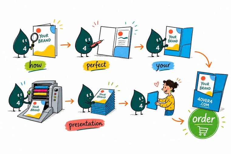
Wally treats a brand presentation like a walk, not a reveal: concept first, then the reasoning, then the identity proven on real cards, folders, and signs. The finish is a branded folder the client keeps on the desk, doing the persuading after you leave. Build the story clean, then let 4OVER4 print the folder and cards to match every pixel on screen.
Print your leave-behind →Quick reference
The brand presentation arc at a glance
Cover these beats in order and your presentation builds toward an easy yes.
| Beat | Deliver | Why it matters |
|---|---|---|
| Open with | Concept and story | A one-line idea that frames everything after it, so the audience knows what the brand is reaching for. |
| Justify | Color and type | A short reason for each choice turns taste into a decision people can defend later. |
| Prove | Flexibility | Show the mark at small and large sizes, on light and dark, so it clearly holds up in real use. |
| Context | Real mockups | Place the identity on a card, a folder, and a sign so the audience sees it in their world. |
| Leave-behind | Printed folder set | A branded folder of cards and collateral keeps the pitch working after the meeting ends. |
| Consistency | One template | A single slide system and one voice make the presentation itself feel on-brand. |
Step by step
Present a brand identity in 6 steps
- Frame the concept first Open with the single idea behind the identity in one clear line, so every slide after it reads as support for that concept rather than a random showcase.
- Walk the creative process Show a few key moments from exploration to resolution. Seeing the roads not taken makes the final direction feel considered and deliberate.
- Distinguish the new from the old If this is a rebrand, show a fair before and after and name exactly what improved and why, so the change feels like progress, not preference.
- Justify color and typography Give a short, concrete reason for the palette and the typefaces. Tie each to the brand personality so the choices are defensible, not decorative.
- Prove flexibility with real context Mock the identity onto business cards, a presentation folder, signage, and screens at different sizes, on light and dark, so it clearly adapts.
- Leave something printed behind Hand over a branded folder holding cards and a short brief. A physical leave-behind keeps the identity in front of the client long after the call.
Specs and pricing
Presentation folder specs and live pricing
The leave-behind starts with the folder, at 250 for $844.54, which is $3.38 each.

| Quantity | Price Per Unit | Total |
|---|---|---|
| 250 | $3.38 | $844.54 |
| 300 | $3.09 | $925.50 |
| 400 | $2.52 | $1,006.44 |
| 500 | $2.17 | $1,086.18 |
| 600 | $1.93 | $1,158.67 |
| 700 | $1.76 | $1,231.16 |
| 800 | $1.63 | $1,303.65 |
| 900 | $1.53 | $1,376.15 |
Print the leave-behind
The pieces that keep your pitch alive
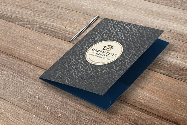

See it in use
Folders we printed for pitch meetings
Explore more
Where to go next
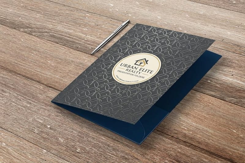





By the numbers
A print partner your brand can count on
Common Questions
Common questions about brand presentations
What is a brand presentation?
A brand presentation is a structured walkthrough that introduces or pitches a visual identity, moving an audience from the core concept, through the reasoning behind each choice, to the finished system and how it works in real use. It is part story and part proof: it explains what the brand stands for, justifies the color, typography, and logo decisions, and shows the identity applied to real things like cards, folders, and signage. Done well, it turns a set of design files into a decision a client can understand, approve, and defend.
How do you present a brand identity to a client?
Lead with the concept in one line, then walk the creative process so the final direction feels earned. Justify the palette and the typefaces with short, concrete reasons tied to the brand personality. Prove the identity is flexible by showing it at different sizes, on light and dark backgrounds, and mocked onto real applications. Close with a printed leave-behind, a branded folder of cards and a brief, so the work stays in front of the client after the meeting. Clarity, rationale, and context are what win approval.
What should a brand presentation include?
At minimum: the concept and story, the creative process, a clear before and after if it is a rebrand, the color rationale, the typography rationale, logo variations and clear space, proof of flexibility across sizes and backgrounds, and real-world mockups on cards, folders, packaging, and screens. Wrap it in a single consistent slide template and one voice so the presentation itself feels on-brand, then end with a physical leave-behind that lets the audience hold the identity, not just watch it.
Why does a printed leave-behind matter in a brand presentation?
Because a slide deck disappears the moment the call ends, while a printed piece stays on a desk. A branded presentation folder holding sample cards, a one-page brief, and a few key applications keeps your identity physically present during the decision, which is often made after you leave the room. It also demonstrates the brand in the exact medium it will live in, so the client experiences the quality rather than imagining it. Printing the folder and cards to match at 4OVER4 keeps that final impression consistent with everything on screen.
How do I justify color and typography choices?
Connect each choice to the brand personality and audience, not to personal taste. Explain what a color communicates and why it fits the positioning, and show it working against the competitors so its distinctiveness is obvious. For type, describe the tone each typeface carries and how the pairing balances character with readability across print and screen. A one-sentence rationale per decision is enough. The goal is to give the client language to defend the choices when you are not in the room.
What does it cost to print brand presentation materials?
Cost scales with the pieces you choose and the usual levers: quantity, size, paper stock, and finish, all set in the configurator with the price updating live. A typical set is a batch of presentation folders plus matching business cards and a short printed brief. Ordering the folder, cards, and collateral together keeps color and feel identical, and choosing higher quantities lowers the per-piece price. You can start from a template or the online designer to keep everything on-brand before you order.
Get Started
Order 250 real estate presentation folders at $3.38 each
Bring your identity to 4OVER4.COM and print presentation folders, cards, and collateral that match your deck exactly. Business cards run 100 for $17.57, which is $0.18 each.
Legal Disclaimer
Gold Standard guarantees apply to all standard orders placed through 4over4.com. Price match requires verifiable proof of a competitor's published price for an equivalent product with matching specifications and turnaround time. Satisfaction guarantee covers manufacturing defects and print quality issues. Contact support with order number and documentation. On-time delivery rate based on tracked orders 1999 to 2026. Individual results may vary based on shipping carrier performance.
