The Four Logo Variations Every Brand Needs and Where to Use Each One

Marcus Chen
Marcus Chen Senior Content Strategist at 4OVER4.COM

One logo is never enough. A brand that prints and posts everywhere needs a small family of marks: a primary, a secondary, a submark, and a favicon. Here is what each one is and exactly which printed and digital asset it belongs on.

Every brand needs four core logo variations: a primary logo, a secondary logo, a submark, and a favicon. The primary is your full lockup, the secondary is a reshaped alternate for tight spaces, the submark is a compact icon or monogram, and the favicon is the tiny mark for browser tabs and app icons. Together they keep your identity sharp on a billboard, a business card, and a 16 pixel tab alike.

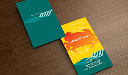
Business cards printed by 4OVER4 showing a brand logo in several lockups

Start here

Logo variations in one paragraph

A logo variation is an alternate version of your main mark, built to stay legible where the primary logo cannot fit. Most brands need four: the primary logo for full-size use, a secondary logo that reshapes it for tight or wide spaces, a submark that compresses it to an icon or monogram, and a favicon for tiny digital spots. Design them as one coordinated set, keep every file in vector, and you will always have the right mark for the business card, the sign, the package, or the browser tab. The map below shows which variation belongs where.

Logo Variation Usage Map One brand, four marks, matched to each surface Primary full lockup Secondary horizontal Submark icon 4 Favicon 16px Cards, letterhead, signage, covers Banners, sleeves, email, pens Stickers, tape, avatars, card backs

What is a logo variation

A single brand logo shown in primary, secondary, and submark lockups

A logo variation is not a different logo. It is the same identity redrawn into a different shape or level of detail so it stays clear in a specific spot. Your brand does not live in one size or one proportion: it goes on a wide banner, a square avatar, a narrow spine, and a 16 pixel tab, and a single lockup cannot do all of that well. Variations solve the fit problem without diluting the brand.

The goal is a small, coordinated logo system, not a pile of one-offs. Every variation shares the same colors, type, and personality, so no matter which one appears, it still reads as you. Build the set once and you stop improvising, cropping, or squishing your main mark to make it fit, which is exactly what makes a brand look amateur. Our free online design tool and ready-made design templates make it easy to lay each version onto a real printed piece.

The primary logo

A full primary logo lockup with name and icon printed on a business card

The primary logo is your headline mark, the complete lockup you reach for whenever there is room to show the brand at full strength. It usually pairs your icon or symbol with the full business name, set in your brand type, in the proportions you consider definitive. This is the version most people picture when they think of your company.

Because it is the most detailed, the primary logo wants space and a clean background. It belongs on the front of a business card, the top of a letterhead, a storefront sign, the cover of a brochure, and any hero placement where the brand should feel established. When you print it, give it a clear safe area so nothing crowds it, and always place the vector version so it stays crisp at any size.

The secondary logo

A secondary logo reshaped horizontally for a wide print space

The secondary logo is the same brand rearranged to fit where the primary cannot. If your primary is stacked vertically, the secondary is often a horizontal lockup, and vice versa. It might drop a tagline, reorder the icon and name, or simplify slightly so the brand still reads well in a long, narrow, or wide space.

Reach for it on wide web headers, email signatures, the sleeve of a package, a pen, or a banner where a stacked primary would shrink until the words disappear. The secondary is not a downgrade, it is a purpose-built alternate, and having it ready stops you from stretching or cramming the primary into a shape it was never drawn for. Note which orientation each printed asset needs before you send files to press.

The submark

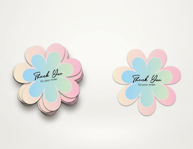
A compact submark icon printed as a sticker and a stamp

A submark is your brand compressed to its most compact form: an icon, a monogram, a lettermark, or a small badge that still says you at a glance. It carries the identity when the full name would be unreadable, which happens far more often than people expect. Think of it as your stamp.

The submark shines on small and repeating surfaces: a social profile avatar, a favicon-adjacent app tile, the back of a business card, a wax-seal style sticker, packaging tape, or a subtle watermark. Because it is simple, it holds up when everything else falls apart at small sizes. Keep it bold, keep it uncluttered, and make sure it works in a single color for stamps, embossing, and one-color print jobs.

The favicon

A tiny favicon mark shown at browser-tab scale next to a full logo

The favicon is the tiniest member of the family, the mark that has to survive at 16 by 16 pixels in a browser tab or as a small app icon. At that size, detail is the enemy: thin lines vanish, small text turns to mush, and anything intricate becomes a gray smudge. The favicon is usually your submark stripped down even further, or a single letter, drawn to stay recognizable when it is barely bigger than a period.

While it is a digital-first asset, the favicon logic matters in print too, because the same simplified mark works for tiny embossed corners, loyalty-punch stamps, and micro-labels. Design it as part of the set so your smallest touchpoint still ties back to your biggest one. If a mark reads clearly as a favicon, it will read clearly almost anywhere.

Matching each variation to the right printed asset

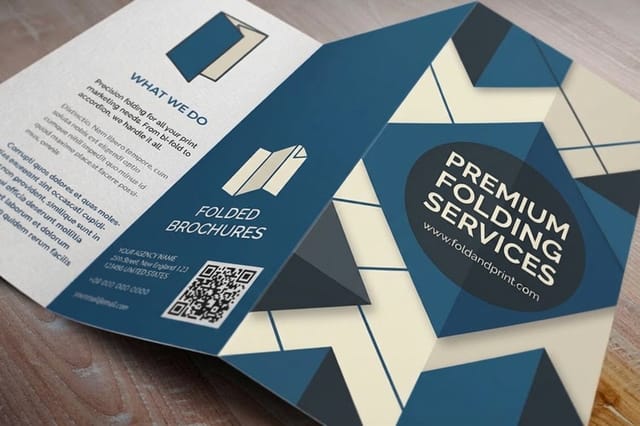
Business cards, a brochure, and packaging each showing a different logo variation

The whole point of a logo system is knowing which mark goes where without guessing. As a rule: use the primary when the brand is the hero and there is space, the secondary when the space is wide or narrow, the submark when the surface is small or the mark repeats, and the favicon when the surface is tiny. Map your assets to that logic and every piece stays consistent.

In practice that means the primary on business cards, letterhead, brochure covers, and signage; the secondary on banners, pens, and package sleeves; and the submark on stickers, tape, avatars, and the backs of cards. Our category pages for business cards, stickers, and brochures show the surfaces where each variation earns its place, and the size guides help you set the mark at the right scale for each one.

Building and organizing your brand kit

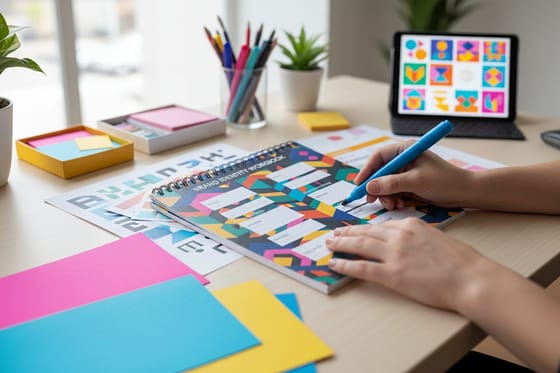
An organized brand kit folder of logo variation files

Once the four marks exist, treat them like assets, not afterthoughts. Save each variation in vector (SVG, EPS, or PDF) as the master, plus high-resolution PNGs for quick use, and export full-color, one-color, and reversed (white) versions of each. That way you always have the exact file a printer or platform asks for, and nobody rebuilds a logo from a screenshot.

Fold the set into a simple brand kit with your colors, fonts, and a one-line note on when to use each mark. It keeps every teammate and vendor consistent, and it makes ordering print painless because your files are already press-ready. For the design foundations underneath a strong set, pair this with our logo design best practices and 6 key principles of logo design.

Wally hands each surface the right mark

One brand, four variations, zero guesswork

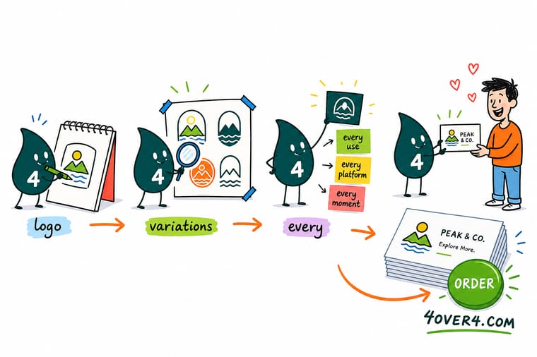
Wally, the 4OVER4 mascot holding a 4, placing four versions of a logo onto a card, a sign, and a box

Wally keeps four marks on his belt: a full primary for the card and the sign, a reshaped secondary for the wide banner, a compact submark for the sticker, and a tiny favicon for the tab. Same colors, same personality, right size every time. Build the set once, keep it in vector, and 4OVER4 prints it crisp on every asset your brand touches.

Print your branded cards →

Quick reference

Which logo variation goes where

Keep this map next to your files. When you are unsure which mark to place, match the surface to the row and use the version that fits.

VariationWhat it isBest used on
Primary logoFull lockup: icon plus full name in brand type.Business cards, letterhead, brochure covers, signage, hero placements.
Secondary logoReshaped alternate, often horizontal or restacked.Wide banners, email signatures, package sleeves, pens, narrow columns.
SubmarkCompact icon, monogram, or badge.Stickers, tape, social avatars, card backs, watermarks, stamps.
FaviconSimplest mark, legible at 16 pixels.Browser tabs, app icons, tiny embossed corners, micro-labels.

Step by step

Build a complete logo set in 6 steps

  1. Lock the primary logo first Finalize your full lockup: icon, name, type, spacing, and colors. Every other variation is derived from this one, so it has to be right.
  2. Draw a secondary lockup Rearrange the primary into the opposite orientation, horizontal if it is stacked, so you have an alternate ready for wide or narrow spaces.
  3. Reduce to a submark Strip the mark to an icon, monogram, or badge that still reads as your brand when the full name will not fit.
  4. Simplify a favicon Take the submark further until it survives at 16 by 16 pixels, cutting thin lines and small text that would blur at that scale.
  5. Export every color version Save full-color, one-color, and reversed (white) versions of each mark, in vector plus high-resolution PNG.
  6. File it as a brand kit Collect the marks, colors, fonts, and usage notes in one place so teammates and printers always grab the correct file.

Specs and pricing

Business card specs and live pricing

The fastest place to put your new primary logo to work is a business card. Here are the live specs and price-per-unit for standard business cards at 4OVER4.COM, straight from the configurator.

Printing Specifications & Options
Paper Type (73)
14pt Gloss Cover15pt Cover, Gloss 1 Side (30% PCW)16pt Gloss Cover24pt Ultra Thick Gloss Cover14pt Uncoated Cover (30% PCW)14pt Cream Uncoated Cover (30% PCW)+67 more
Ink Color
4/0 : 4 Color Front; Blank Back4/1 : 4 Color Front; Black Ink Back4/4 : 4 Color Both Sides
Finish
Standard FinishHigh Gloss UV Coating
Variable Data (Codes, Names, Etc.)
No, Thank YouYes, Variable Data
Rounded Corners
No Rounded CornersYes, 3/8" inch radiusYes, 1/8" inch radius
Bundling
noyes
Total Sets (24)
1 Set2 Sets3 Sets4 Sets5 Sets6 Sets+18 more
Proof Options
Straight To ProductionFree Online ProofNext Day Hardcopy Proof
Standard Business Cards Pricing
Starting from $17.57
QuantityPrice Per UnitTotal
10017.6¢$17.57
20011.5¢$23.07
3009.15¢$27.46
4007.96¢$31.86
5007.25¢$36.26
6006.77¢$40.64
7006.43¢$45.04
8006.18¢$49.43
View and customize

Print it

Put your logo on real print

Standard Business Cards
From $17.57
303 ordered
View and customize
Die-Cut Stickers
Die-Cut Stickers
From $93.37
23 ordered
View and customize
Folded Brochures
Folded Brochures
From $57.11
20 ordered
View and customize

See it in use

Real brand marks, printed in-house

Print showcase
4OVER4.COM Business Cards: real customer work printed in-house at 4OVER4's Queens, NY facility.
4OVER4.COM Business Cards customer work 14OVER4.COM Business Cards customer work 24OVER4.COM Business Cards customer work 34OVER4.COM Business Cards customer work 44OVER4.COM Business Cards customer work 54OVER4.COM Business Cards customer work 64OVER4.COM Business Cards customer work 74OVER4.COM Business Cards customer work 8

By the numbers

Custom printing you can count on at 4OVER4

60+ Paper stocks
1,000+ Products
99.8% On-time delivery
150,000+ Businesses served

Common Questions

Common questions about logo variations

What is a logo variation?

A logo variation is an alternate version of your main brand mark, redrawn into a different shape or level of detail so it stays legible in a specific space. It is not a different logo; it shares the same colors, type, and personality as your primary mark. The four variations most brands need are the primary logo (the full lockup), the secondary logo (a reshaped alternate), the submark (a compact icon or monogram), and the favicon (the tiny mark for browser tabs and app icons).

How do I choose the right logo variation for a project?

Match the mark to the surface. Use the primary logo when the brand is the hero and there is room, such as a business card, letterhead, or sign. Use the secondary logo when the space is wide or narrow, like a banner or a package sleeve. Use the submark on small or repeating surfaces such as stickers, tape, and social avatars. Use the favicon for tiny digital spots. If the full name would be hard to read at the size you need, step down to a more compact variation.

What does it cost to print with my logo and how are prices set?

Designing the logo set costs only your design time, and our free online design tool lets you place your marks onto a product at no charge. Printing price then scales with the product, the quantity, the size, the paper stock, and the finish you choose. More pieces lower the unit price, and premium stocks or finishes like foil add to it. You set each option in the configurator and the price updates live, so you can see exactly how a heavier card or a bigger run changes the number before you order.

What sizes, stocks, and finishes work best for a logo?

It depends on the asset. Business cards print sharpest on a sturdy stock with a clean finish that keeps your mark crisp, and finishes like spot gloss or foil can make a submark or icon stand out. Stickers reproduce a submark well in vinyl or clear material, and brochures give the primary logo room on a coated or matte cover. Whatever the surface, place your logo as a vector file so it stays razor-sharp, and check the live specs on each product page for the exact options.

How long does it take to print and ship branded materials?

Turnaround depends on the product, the quantity, and the finish, and the configurator shows the available production and shipping speeds for your exact order before checkout. Because 4OVER4 prints in-house in Queens, New York, most standard jobs move quickly. To avoid delays, upload a press-ready file with your logo placed as vector art, colors set to CMYK, and bleed included, so nothing needs fixing before it goes to press.

★ 4.810,000+ reviewsacross Google, Trustpilot, Facebook & 4OVER4.com
5Written guarantees
G7Certified printer
150K+Businesses served
25+Years printing

Get Started

Ready to put your logo variations into print?

Bring your primary, secondary, and submark marks to 4OVER4.COM and print them on cards, stickers, brochures, and more. Design online for free or upload a press-ready file, and watch your price update live.

Legal Disclaimer

Gold Standard guarantees apply to all standard orders placed through 4over4.com. Price match requires verifiable proof of a competitor's published price for an equivalent product with matching specifications and turnaround time. Satisfaction guarantee covers manufacturing defects and print quality issues. Contact support with order number and documentation. On-time delivery rate based on tracked orders 1999 to 2026. Individual results may vary based on shipping carrier performance.

FSC Certified Printer #C013635
G7 Certified Color Accuracy
25+ Years Since 1999
150,000+ Businesses Served