
Logotype vs Logomark vs Logo Differences Every Brand Should Know


A logo is your whole mark; a logotype and a logomark are the forms it takes. Here is what each one is, its real pros and cons, how to choose, and the print-legibility lens that decides how your brand looks on a card and a sign.
A logo is the umbrella term; a logotype and a logomark are the two forms it can take. A logotype is the name set as type, a logomark is a standalone symbol, and a combination logo pairs both. Choose based on how known your name is and where the mark must work, and always test it at business-card and sign scale before you commit.
Start here
Logotype vs logomark vs logo, in one paragraph
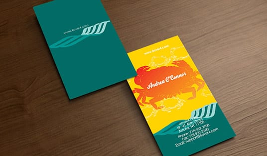
A logo is your whole brand mark, and a logotype and a logomark are the forms it takes. A logotype sets the name as distinctive type, a logomark is a standalone symbol, and a combination logo pairs both. Pick based on how known your name is and where the mark must work, and test it at business-card and sign scale before committing. Then carry the finished mark onto your printed brand with 4OVER4.COM. The comparison below maps all three.
Watch it printed
See standard business cards on the press, in 167 seconds
Logo, logotype, and logomark: the hierarchy

The three terms get used interchangeably, but they sit in a clear hierarchy, and knowing it makes every branding conversation easier. A logo is the umbrella term for your complete brand mark, the visual identity people recognize you by. A logotype and a logomark are two forms that logo can take, and a combination logo joins them.
Put simply: a logo is the whole thing, while logotype and logomark describe what it is made of. A logotype is the name set as distinctive type. A logomark is a standalone symbol with no words. A combination logo locks the two together. So when a designer asks whether you want a wordmark, a symbol, or a combination, they are asking which form your logo should take.
This guide explains each form with its real strengths and weaknesses, adds a print-legibility lens most explanations skip, and ends with how to carry the finished mark onto your printed brand. Because a logo lives or dies on the materials it appears on, from a business card to a sign, we tie the concept directly to what you will actually print, and to our free online designer for putting it to work.
What is a logotype, and when to use one
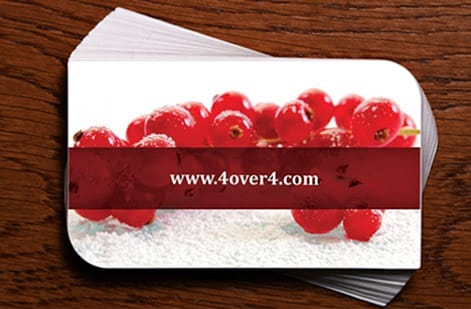
A logotype, also called a wordmark, is your business name rendered as distinctive type. The name is the logo. Think of any brand you recognize purely from the styling of its name, and you are picturing a logotype. Its greatest strength is direct name recognition: every time someone sees it, they reinforce the exact word you want them to remember, which is invaluable for a new or unfamiliar brand.
Logotypes also read clearly, feel professional, and avoid the ambiguity a symbol can carry before people learn what it means. The trade-offs are flexibility and space. A wordmark needs horizontal room, can be hard to squeeze into a tiny square like an app icon or favicon, and gives you less of a compact standalone mark. Long names amplify all of this.
To design a strong logotype, choose or customize a typeface that reflects the brand’s personality, refine the letterforms and spacing for balance, and make sure it stays legible when it shrinks to card scale. A logotype is best for new brands, word-based names, and businesses that want the name front and center. Our ultimate logo design guide covers building one in depth.
What is a logomark, and when to use one
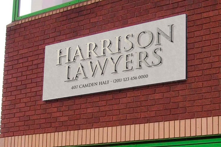
A logomark, also called a brand symbol or pictorial mark, is a standalone graphic or icon with no words. It is the symbol you can picture for the world’s most famous brands without seeing their name. Its strengths are compactness and reach: a simple symbol scales down to a favicon or app icon cleanly, works the same across every language, and becomes a powerful shorthand once people know it.
The catch is that recognition has to be earned. A brand-new symbol means nothing to an audience until repeated exposure teaches them to connect it with your name, which takes time and marketing reach. For a small business without that reach, a logomark alone can leave people unsure who they are looking at.
Logomarks are best for brands that already have name recognition, that operate across languages, or that need a mark for very small spaces. Even then, most pair the symbol with the name at least early on. If a symbol suits you, keep it simple and test it small, since a busy mark falls apart at icon scale, exactly the discipline covered in our key principles of logo design.
Combination logos: the best of both

A combination logo pairs a logomark with a logotype into a single lockup, and for most businesses it is the most practical choice because it captures the strengths of both. Early on, you lead with the full lockup so people learn the name and the symbol together. Later, once your audience recognizes the brand, you can use the symbol alone in tight spaces while the name carries elsewhere.
That flexibility is the real advantage. A combination gives you a version for every context: the full lockup on a website header or a storefront sign, the wordmark on a document, and the mark alone as an app icon or favicon. You are not forced to choose between name recognition and a compact symbol, because you have both in one system.
The design challenge is balance, making the symbol and the type feel like one considered mark rather than two things stuck together, and ensuring the pieces work independently as well as combined. Brief this clearly, as our guide on writing a logo design brief lays out, and you get a versatile identity that serves the whole brand.
Logotype, logomark and combination logo examples
Famous marks make the three types easy to tell apart, and each one shows why the brand chose that form.
- Logotypes. Coca-Cola, Google, FedEx and Visa are their names set in custom type. Nothing else identifies them, and the name is repeated every time the mark appears. FedEx even hides an arrow between the E and the x, proof that a wordmark can carry an idea.
- Logomarks. The Apple apple, the Nike swoosh, the Target bullseye and the Shell shell work with no words at all. Every one of them started next to the company name and dropped it only after years of exposure.
- Combination logos. Adidas, Burger King, Lacoste and Mastercard lock a symbol to the name. Adidas runs the three stripes beside the wordmark on a shoebox and the stripes alone on a shoe, which is exactly the flexibility a combination gives a smaller brand.
Notice the pattern by size. The wordmarks belong to brands that needed their name learned, the symbols belong to brands that had already earned recognition, and the combinations belong to brands that use one mark in a dozen sizes. Test your own candidate the same way, printed on a business card and viewed across a room.
How to choose between them

The decision comes down to two questions: how well-known is your name, and where does the logo have to work. If your name is new or unfamiliar, favor a logotype or a combination so the name stays visible and people learn it. If you need a mark that scales to a favicon or app icon and crosses languages, a logomark is more flexible, provided you can invest in the repetition that builds symbol recognition.
For most small businesses, a combination logo is the safest, most flexible starting point, since it teaches name and symbol together and can shed the wordmark later. A clean logotype is the strong low-risk option when budget or time is tight, and a logomark alone is best reserved for brands with the reach to build symbol recognition over time.
Whatever you lean toward, do not decide on a screen at full size alone. The next section covers the print-legibility test that most branding advice skips, and our guide on how much a logo costs helps you budget the work realistically.
The print-legibility lens most guides skip

Here is the factor most explanations of logotype versus logomark leave out entirely: your logo has to survive in print, at real sizes, on the materials you actually use. A mark that looks stunning at full size on a monitor can collapse the moment it shrinks to a business card or has to read across a room on a sign, and by then the brand is committed to it.
A logotype is the more fragile of the two at small scale, since thin strokes, tight spacing, and long names can turn to mud on a card or favicon. A logomark generally holds up better when tiny because a simple symbol stays readable, which is why apps and favicons lean on symbols. On large signage, both need strong contrast and clean shapes to read from a distance.
The safe rule is to test any candidate at both extremes before you commit: print it at business-card size and view it large on a sign or poster. If it fails at either end, refine it now. Preparing the final mark correctly for print, covered in our guide on preparing a logo for printing, is what keeps it crisp everywhere it lands.
From logo to print: cards, signs, and packaging
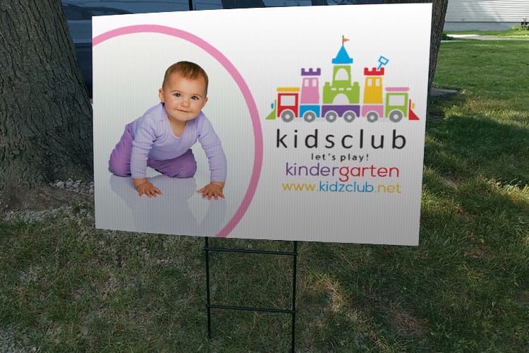
A logo only earns its keep when it appears consistently across your brand, and most of those touchpoints are printed. Your business cards are usually the first and most frequent place people hold your mark, which is exactly why the print-legibility test matters, and why a card is the best proving ground for a new logo. Apply the finished mark cleanly and it reinforces the brand with every handshake.
Beyond cards, the same logo carries onto signage, where it has to read across a room and hold up outdoors, and onto packaging and stationery, where it closes the loop on the customer experience. Using one consistent version of the mark across all of them, built in vector so it stays sharp at any size, is what makes a brand feel established rather than improvised.
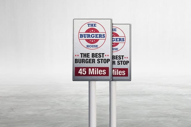
Once your logo is final, put it to work: order business cards and classic cards to carry it daily, and durable aluminum signs to display it. Design each piece in our free online designer or upload your artwork, and use the live specs panel below to configure your first run.
Wally sorts the wordmark from the symbol
Logo is the whole; logotype and logomark are the parts
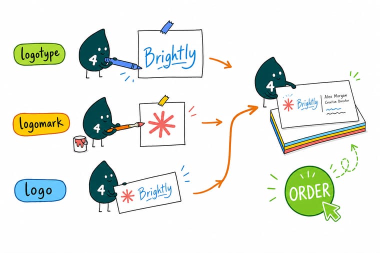
Wally keeps it straight: a logotype is your name as type, a logomark is a symbol, and a combination joins them. He picks by how known the name is and where the mark has to live, then shrinks it to a business card and blows it up on a sign to be sure it holds. Get it right and 4OVER4 prints it sharp on every touchpoint.
Put your logo on cards →Quick reference
Logotype, logomark, and logo, at a glance
The three terms, what each is, and when it fits. Match your brand to the right form and test it in print before you commit.
| Term | What it is | Why it matters |
|---|---|---|
| Logo | The whole brand mark | The umbrella term for your complete identity, which may be type, a symbol, or both. |
| Logotype | The name set as type | A wordmark that builds direct name recognition and ties the brand to the word itself. |
| Logomark | A standalone symbol | A compact icon that scales tiny and crosses languages once people learn it. |
| Combination logo | Symbol plus name | A lockup that leads with both early and drops to the mark once recognition is earned. |
| Best for a new name | Logotype or combination | People must learn the name first, so keep it visible until the brand is known. |
| Best for small spaces | Logomark | A symbol survives at favicon and app-icon scale where a wordmark would blur. |
| Print legibility | Test on a card and a sign | The mark has to read at business-card size and across a room on signage. |
| File format | Vector for any scale | Build the logo in vector so it stays razor-sharp from favicon to billboard. |
Step by step
Choose and apply your logo type in 7 steps
- Learn the hierarchy: logomark vs logotype vs logo A logo is the whole mark. A logotype is your name set as distinctive type, so the name itself is the mark. A logomark is a standalone symbol with no words. A combination logo joins the last two into one lockup, which makes logo the parent term and the other three its types.
- Weigh a logotype for a new or word-based brand If people need to learn your name, a distinctive wordmark ties the brand to the word and builds recognition directly, at the cost of flexibility in tight spaces.
- Weigh a logomark for reach and small spaces If you need a compact, language-independent mark that scales to a favicon or app icon, a symbol works, but plan for the time it takes people to connect it to you.
- Consider a combination logo for the best of both Pair a symbol with the name so you can lead with the full lockup early and drop to the mark alone once your audience knows the brand.
- Test the mark small before you commit Shrink your candidate down to business-card and favicon size and view it across a room on a sign, since a mark that fails there fails everywhere.
- Build it in vector at full quality Create the final logo as vector art, an EPS, PDF, or SVG, so it stays sharp at any size, from a tiny app icon to a large-format sign, and keep a print-ready version beside a single-color version for the jobs that cannot carry full color.
- Roll it out on your printed brand Apply the finished logo consistently across business cards, signage, and packaging so every printed touchpoint reinforces the same identity.
Specs and pricing
Business card specs and live pricing
Your business card is the best proving ground for a new logo. Here are the live specs and price-per-unit for standard business cards at 4OVER4.COM, straight from the configurator.

| Quantity | Price Per Unit | Total |
|---|---|---|
| 100 | 17.6¢ | $17.57 |
| 200 | 11.5¢ | $23.07 |
| 300 | 9.15¢ | $27.46 |
| 400 | 7.96¢ | $31.86 |
| 500 | 7.25¢ | $36.26 |
| 600 | 6.77¢ | $40.64 |
| 700 | 6.43¢ | $45.04 |
| 800 | 6.18¢ | $49.43 |
Print it
Put your finished logo to work with 4OVER4

See it in use
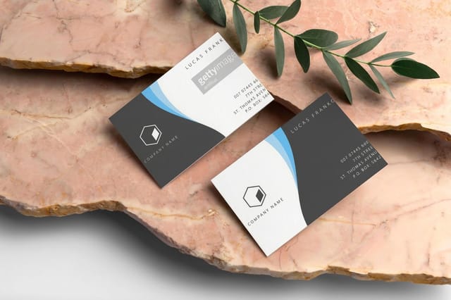
Customer logos printed on business cards








Explore more
Where to go next


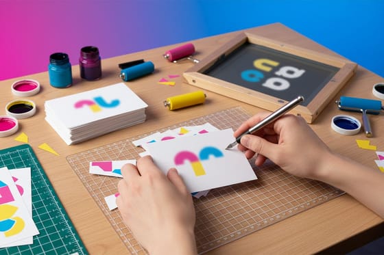

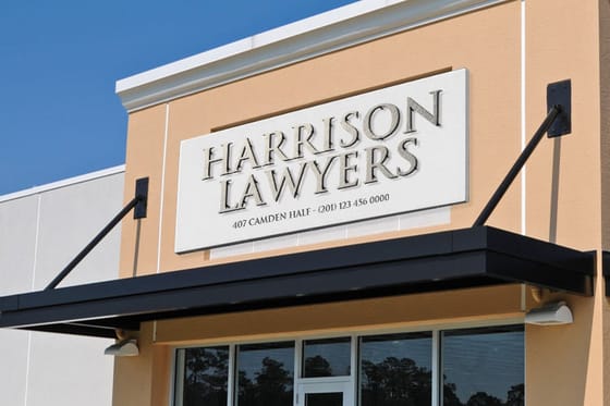
By the numbers
Logo printing across 60+ paper stocks
Common Questions
Common questions about logo types
What is the difference between a logo and a logo lockup?
A logo is the mark itself. A lockup is a fixed arrangement of its parts, usually the logomark and the logotype set at an exact spacing, size ratio and alignment that never changes. Most brands keep two or three lockups, horizontal, stacked and mark alone, so the logo looks the same on a card, a sign and an app icon. Break the lockup and you have redesigned the logo.
What is a logomark example?
The Apple apple, the Nike swoosh, the Twitter bird and the Target bullseye are logomarks, symbols that identify the brand with no words. Each one is simple enough to read as a favicon and was shown beside the company name for years before it stood alone. A small business logomark works the same way: pair it with the name until the audience knows it.
What are the three types of logos?
Logotype, logomark and combination logo. A logotype, also called a wordmark, is the name set as distinctive type. A logomark is a standalone symbol with no words. A combination logo locks the two together so the brand can use the full lockup early and the symbol alone later. Designers sometimes split these further into lettermarks, emblems and mascots, but every one of those is a variant of the three.
What is the difference between a logotype and a logomark?
A logotype is a brand name set as custom type, so the name itself is the mark. A logomark is a standalone symbol that identifies the brand without spelling its name. Both are kinds of logo, and both carry a second name you will hear from designers: a logotype is also called a wordmark, and a logomark is also called a brand symbol or a pictorial mark, a standalone graphic or icon with no words. The logotype builds direct name recognition and is easy for new audiences to read and remember, while the logomark is compact, works across languages, and scales down to tiny sizes but takes repetition before people connect it to your brand. Many companies use a combination logo that pairs a logomark with a logotype to get the strengths of both.
What is a logo, and how does it relate to a logotype and logomark?
A logo is the umbrella term for your complete brand mark, the visual identity people recognize you by. A logotype and a logomark are two forms a logo can take. A logotype is the name rendered as distinctive type, a logomark is a standalone symbol, and a combination logo joins the two into a single lockup. So when someone says logo they mean the whole thing, while logotype and logomark describe what the logo is made of. Understanding the hierarchy, logo as the parent and logotype, logomark, and combination as the types, makes it much easier to brief a designer and choose the right approach for your brand.
Which works better on a business card, a logotype or a logomark?
A combination logo usually wins on a card, because the space is small and fixed and you have two jobs to do at once: say who you are, and be recognizable next time. Set the logotype so the name reads at card size, then place the logomark small beside it, or alone on the back where it has room to breathe. If you have to choose one, choose by how well known the name is: an unfamiliar business needs the logotype out front, while a symbol people already associate with you can carry the card on its own. Either way, proof the card at actual size before you order a run. Thin strokes, tight letter spacing, and long names are what turn to mud when a mark shrinks to business-card scale, and a printed proof shows that faster than any zoomed-in screen.
How do I choose between a logotype and a logomark?
Base the choice on how well-known your name is and where the logo has to work. If your business name is new or unfamiliar, a logotype or a combination logo keeps the name visible so people learn it, which builds recognition faster. If you need a mark that scales to a favicon or app icon and works across languages, a logomark is more flexible, provided you are prepared to invest in the repetition it takes for people to associate the symbol with your brand. Also weigh how the mark reads in print: it has to survive at business-card size and read across a room on a sign, so test any candidate small before you commit.
What are the pros and cons of a logotype?
The main advantage of a logotype is direct name recognition: because the logo is the name, every time someone sees it they reinforce the word they need to remember, which is invaluable for new or word-based brands. Logotypes also read clearly, feel professional, and avoid the ambiguity a symbol can carry. The trade-offs are flexibility and space. A wordmark takes more horizontal room than a symbol, can be hard to fit into a tiny square like an app icon or favicon, and gives you less of a compact, standalone mark to use on its own. Longer names amplify these constraints, which is one reason many brands pair a logotype with a logomark.
How does my logo type affect printing and small sizes?
Logo type has a real impact on how your brand holds up in print and at small sizes, which is a factor many guides overlook. A logotype must stay legible when it shrinks to business-card scale or a favicon, so thin strokes, tight letter spacing, and long names can turn to mud and need testing before you commit. A logomark generally survives small sizes better because a simple symbol reads even when tiny, which is why so many apps and favicons use one. On large signage the opposite pressure applies: both need to read clearly across a room, with strong contrast and clean shapes. The safe rule is to test any mark at both extremes, a printed business card and a large sign, before locking your brand to it.
Which logo type is best for a small business?
For most small businesses, a combination logo is the safest and most flexible choice. It pairs a logomark with the business name, so early on you lead with the full lockup to teach people who you are, and later you can use the symbol alone once your audience recognizes it. If your budget or timeline is tight, a clean logotype is a strong, low-risk option that builds name recognition immediately and reads well on business cards and signage. A logomark alone is usually best reserved for brands with the marketing reach to build symbol recognition over time. Whatever you choose, prioritize a mark that prints clearly on the materials you actually use, starting with your business cards.
Get Started
Ready to put your logo on a card that proves it works?
Design your card in our free online designer or upload your artwork, then print your logotype, logomark, or combination logo on the stock and finish your brand calls for. Adjust every option and watch your price update live.
Legal Disclaimer
Gold Standard guarantees apply to all standard orders placed through 4over4.com. Price match requires verifiable proof of a competitor's published price for an equivalent product with matching specifications and turnaround time. Satisfaction guarantee covers manufacturing defects and print quality issues. Contact support with order number and documentation. On-time delivery rate based on tracked orders 1999 to 2026. Individual results may vary based on shipping carrier performance.
