Graphic Design Portfolio Examples That Win Clients in 2026
Graphic design portfolio examples are printed or digital collections of a designer's best work, curated to attract clients and job offers. A strong printed portfolio makes a physical impression that screens can't replicate. 4OVER4.COM helps designers turn their best projects into tangible, professional-grade portfolio pieces printed on premium paper stocks with finishes that match their creative vision.
In 2026, your portfolio is still the single most important tool you own as a designer. It's your handshake before the handshake. Your pitch before you open your mouth. And if you're relying only on a website or a PDF, you're leaving a massive opportunity on the table. A printed portfolio - one you can hand to an art director, leave behind after a meeting, or mail to a dream client - creates a sensory experience that digital simply can't match.
This guide breaks down real graphic design portfolio examples across different styles, formats, and specialties. You'll see what works, why it works, and how to print your own portfolio pieces that get you hired. Whether you're a brand identity designer, an illustrator, or a multi-disciplinary creative, there's something here for you.
"I printed my portfolio on heavyweight uncoated stock through 4OVER4.COM, and the texture alone started conversations in every interview. People wanted to hold it, flip through it. That never happens with an iPad."
- Megan R., Freelance Brand Designer
Showcasing Your Strongest Projects First
The best graphic design portfolio examples share one thing in common - they lead with impact. Your portfolio isn't a chronological record of everything you've ever made. It's a highlight reel. A curated, intentional selection of 10 to 12 projects that represent the work you want to keep doing.
Picking the right pieces means being honest with yourself. Does this project reflect where you're headed, or just where you've been? If a logo redesign from three years ago doesn't align with the brand work you're chasing now, cut it. Every page in your printed portfolio should earn its spot.
Integrating case studies into each project section adds depth that standalone images can't provide. Walk the viewer through your process - the brief, the research, the iterations, the final result. Clients don't just want to see pretty pictures. They want to understand how you think. A well-told case study proves you can solve problems, not just push pixels.
Mix up your presentation formats to keep things engaging. Include a range of print items like brochures, business cards, packaging mockups, and poster designs. This variety shows adaptability. You can use 4OVER4.COM's design templates to build consistent layouts across your portfolio pages while still letting each project breathe on its own.
Photography matters more than most designers realize. Shoot your printed pieces in context - on a desk, in someone's hands, on a retail shelf. Contextual mockups help clients picture your work in their world. Place these images alongside your case study text so the visual storytelling flows naturally from page to page.
Custom printing options can set your portfolio apart from every other designer in the waiting room. The paper weight, the finish, even the binding method sends a message about your standards. Explore 4OVER4.COM's online design tools to dial in every detail before you print. Your portfolio should feel as good as it looks.
Bold Minimalist Portfolio Design
A bold minimalist portfolio strips away everything that doesn't serve the work. No decorative borders. No busy backgrounds. Just your projects, breathing in generous white space on heavy, premium paper. This style works especially well for brand identity designers, typographers, and anyone whose work speaks loudest when it's not competing for attention.
What Makes Minimalist Portfolios Stand Out
High-quality images at large scale are the backbone of this approach. Each spread should feature one or two hero images that fill the page. When printed on a smooth, coated stock, these images pop with color accuracy and sharpness that makes the viewer stop and look.
Clean typography ties the whole thing together. Limit yourself to two typefaces - one for headings, one for body text. Bold sans-serifs for project titles paired with a readable serif for descriptions creates contrast without clutter. The type itself becomes a design element.
Color restraint is your friend. A minimalist portfolio often uses a monochromatic or two-tone palette for the portfolio structure itself, letting the project work provide all the color. Think black text on white pages, or dark gray on cream uncoated stock. The projects are the stars. Everything else is the stage.
Negative space isn't wasted space - it's intentional breathing room that guides the eye. When a client flips through a minimalist portfolio, they know exactly where to look on every page. There's no guessing, no visual noise. Just your work, presented with confidence.
If you're building print collateral to include in your portfolio, check out Classy Business Card Design Inspiration for ideas on how to design business cards that match this clean aesthetic.
Bright and Colorful Portfolio Approaches
Not every designer wants restraint. If your work lives in bold color palettes - think packaging design, editorial illustration, event branding, or children's book art - your portfolio should reflect that energy. A bright printed portfolio, done right, feels alive in your hands.
The trick is organized boldness. Color everywhere doesn't mean chaos everywhere. Use a consistent grid system so the eye has structure to follow, even when every page is bursting with hue. Assign each project section its own accent color to create visual chapters within the portfolio.
Paper choice matters enormously for colorful portfolios. A glossy or silk-finish stock will make saturated colors look vivid and punchy. Uncoated stocks absorb more ink, which can soften colors - great for some aesthetics, but not ideal if you want maximum vibrancy. Talk to 4OVER4.COM about paper options that match your color goals.
Include process shots alongside finished work. Sketches, color swatches, mood boards, and iteration sequences show the journey behind each project. Clients love seeing how a concept evolved from rough idea to polished deliverable. It builds trust and demonstrates your creative thinking.
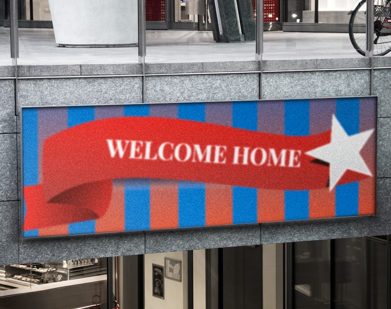
For designers who work across packaging, signage, and environmental graphics, consider including photos of your work installed in real spaces. A poster on a wall, a banner at an event, a menu in a restaurant - these real-world shots add credibility. You might even print some of these larger pieces through 4OVER4.COM. Products like 2 Sided Blockout Banners or Aluminum A Frames can serve double duty as both client deliverables and portfolio photography subjects.
"I included actual printed samples - a mini brochure, a die-cut business card, a folded mailer - tucked into pockets throughout my portfolio. Every interviewer commented on it. Touching the work changes the conversation completely."
- David K., Art Director
Interactive and Tactile Portfolio Formats
The most memorable graphic design portfolio examples go beyond flat pages. They invite the viewer to interact - pull out an insert, unfold a gatefold spread, flip through a bound booklet nested inside a larger case. These tactile moments create surprise and delight, and they demonstrate your understanding of physical design in ways a screen never could.
Pocket Folders with Loose Inserts
A custom-printed pocket folder acts as your portfolio shell. Inside, you place individual project sheets, mini case study booklets, and printed samples that the viewer can pick up, examine, and rearrange. This format is incredibly flexible - you can swap projects in and out depending on the client meeting.
Each insert becomes its own design moment. A business card sample printed on 32pt ultra-thick stock. A postcard mockup with spot UV coating. A folded brochure that demonstrates your layout skills. The folder itself should feature your personal branding - logo, color palette, contact info - printed on a sturdy, textured stock.
Bound Booklets with Special Finishes
Saddle-stitched or perfect-bound booklets give your portfolio a polished, editorial feel. Think of it as a magazine dedicated entirely to your work. Add special finishes like soft-touch lamination on the cover, foil stamping on your name, or die-cut elements that reveal the first project page underneath.
These finishes aren't just decorative. They signal quality and attention to detail - exactly what clients are looking for in a designer. When someone picks up a portfolio with a velvety soft-touch cover and crisp foil lettering, they immediately associate those qualities with your work ethic.
For more ideas on how printed materials can serve creative purposes, browse Diy Greeting Card Design Ideas and Logo Sticker Design Ideas for inspiration on incorporating unique print pieces into your portfolio.
Industry-Specific Portfolio Strategies
Your graphic design portfolio examples should be tailored to the industry you're targeting. A portfolio aimed at a luxury fashion brand looks and feels completely different from one pitched to a tech startup or a restaurant group. Here's how to adjust your approach based on your target market.
Brand Identity and Agency Work
Lead with comprehensive brand systems. Show the logo, the color palette, the typography system, the brand guidelines document, and then the applications - business cards, letterheads, signage, packaging. Clients hiring for brand work want to see systematic thinking, not just pretty logos in isolation.
Print your brand case studies on uncoated premium stock for a sophisticated, tactile feel. The slightly rough texture communicates craft and intentionality - qualities that brand-focused clients value.
Packaging and Product Design
Include actual printed samples whenever possible. A flat mockup of a box design is fine, but handing someone the actual folded, printed box is unforgettable. 4OVER4.COM's Online Designer can help you create custom packaging prototypes that look production-ready.
Photograph your packaging in lifestyle settings - on store shelves, in someone's hands, next to the product it contains. These contextual shots prove your designs work in the real world, not just on a computer screen.
Editorial and Publication Design
Print a sample spread or a mini version of a publication you've designed. A half-size magazine mockup or a trimmed-down annual report lets the viewer experience your layout skills firsthand. Pay attention to paper weight and finish - editorial designers are judged on their understanding of print production as much as their aesthetic choices.
Advertising and Campaign Work
Show the full campaign arc. Don't just include a single print ad - show the billboard, the social media adaptations, the direct mail piece, the in-store display. Campaign thinking is what separates senior designers from junior ones. For creative ad inspiration, check out Funny Print Ad Examples to see how humor and bold creative choices translate to print.
DIY Portfolio Solutions on a Budget
You don't need a massive budget to create a printed portfolio that impresses. Smart designers use affordable printing options and clever formatting to punch above their weight.
Start with a strong cover. Even if you print interior pages on standard stock, invest in a heavier, finished cover. That first touch sets expectations for everything inside. A 16pt cover with matte lamination feels professional and costs far less than you'd expect.
Use 4OVER4.COM's Online Designer to lay out your pages with precise bleeds, margins, and color profiles. Getting the file right before printing saves money on reprints and ensures your colors look exactly as intended.
Blank Templates

Consider printing individual project sheets rather than a bound book. Loose sheets in a custom folder let you update your portfolio project by project instead of reprinting the whole thing. It's more cost-effective and keeps your portfolio current.
Another budget-friendly approach is printing a smaller format. An A5 or 6x9 portfolio costs less than a full-size A4 book but still feels intentional and polished. Smaller formats also fit easily into a bag or mailer, making them practical for leave-behinds and postal submissions.
"I ordered a short run of saddle-stitched booklets as my portfolio through 4OVER4.COM. The quality was sharp, the turnaround was fast, and I spent less than I would on a nice dinner. No excuses not to have a printed book."
- Tanya L., Junior Designer
Common Mistakes That Weaken a Printed Portfolio
Even talented designers sabotage their portfolios with avoidable errors. Here are the biggest ones to watch for.
Including too many projects. More is not better. A portfolio with 25 projects tells a client you can't edit your own work. Stick to 10-12 of your absolute best. Quality over quantity, every single time.
Inconsistent presentation. If your first three spreads use a clean grid and then the fourth switches to a totally different layout style, it feels disjointed. Establish a visual system - grid, typography, color palette - and stick with it throughout.
Ignoring print production basics. Low-resolution images, incorrect color modes (RGB instead of CMYK), missing bleeds - these mistakes scream amateur. Before sending files to print, double-check every image is at least 300 DPI and your document is set up in CMYK with proper trim marks.
No context for the work. A beautiful logo floating on a white page tells a client nothing. Who was the client? What was the brief? What problem did you solve? Add short descriptions that give each project meaning and demonstrate your strategic thinking.
Cheap materials. Printing your portfolio on thin, flimsy paper undermines everything. The physical quality of your portfolio is a direct reflection of your standards. Invest in at least 100lb text weight for interior pages and a heavier cover stock. The difference in feel is dramatic.
For more creative and print-related guidance, explore the full library of Printing Articles on the 4OVER4.COM blog.
How to Print Your Portfolio with 4OVER4.COM
Once your portfolio is designed and your files are ready, the printing process should be straightforward. 4OVER4.COM makes it simple to go from finished design to a professional printed portfolio in your hands.
Start by choosing your format. Booklets, flat sheets, folded pieces, or a combination - 4OVER4.COM prints all of these with consistent color accuracy and sharp detail. Select your paper stock based on the feel you want. Smooth and glossy for bright color work. Uncoated and textured for a more organic, artisanal aesthetic. Thick and rigid for covers and dividers that feel big.
Upload your files through the 4OVER4.COM website. The system checks your files for common issues before printing, so you'll catch problems before they become expensive mistakes. If you need help with layout or setup, the Online Designer tool walks you through the process.
Order a small test run first. Print two or three copies to check colors, alignment, and overall feel before committing to a larger batch. This is standard practice among professional designers, and it saves headaches down the line.
Your printed graphic design portfolio examples become a physical extension of your brand. Every paper choice, every finish, every binding decision communicates something about who you are as a designer. Make those choices intentionally, and you'll walk into every meeting with confidence.
What to Remember About Building a Printed Design Portfolio
- Curate ruthlessly. Include only 10-12 of your strongest projects. Every piece should represent the work you want to attract, not just the work you've done.
- Add case studies. Don't just show the final design - walk viewers through your process, the brief, the challenges, and the results. Context turns pretty pictures into proof of problem-solving ability.
- Invest in paper and finish. The physical quality of your portfolio reflects your professional standards. Choose stocks and finishes that match your creative identity.
- Tailor to your audience. Graphic design portfolio examples aimed at luxury brands should look and feel different from those targeting startups. Customize your selection and presentation for each target market.
- Mix formats for impact. Combine bound booklets with loose inserts, printed samples, and special finishes. Tactile variety keeps viewers engaged and demonstrates your print production knowledge.
- Print smart, not expensive. 4OVER4.COM offers short-run printing and a range of paper options so you can produce a professional portfolio without overspending. Products like Aluminum Sign Panels can even serve as display pieces for environmental design work in your portfolio.
| Element | Description |
|---|---|
| Format | Custom printed booklet showcasing design work |
| Typography | Sublime composition and thoughtful type choices |
| Contextual Notes | Essential insights accompany each design piece |
| Visual Aesthetics | Balanced use of color and whitespace enriches the presentation |
| Recommendation | Benefits |
|---|---|
| Integrated Mock-ups | Visualize designs in real-world settings |
| Case Studies | Illustrate creative processes |
| Engaging Formats | Brochures, posters, and promotional materials |
- High-Quality Images: Using large, striking images captures attention and conveys professionalism. Every image should represent the designer's best work, providing a clear representation of their style.
- Clean Typography: Selecting a limited number of typefaces enhances readability and coherence. Bold fonts for headings paired with simpler body text create contrast, guiding the viewer's eye across the pages.
- Whitespace Utilization: Strategic use of whitespace creates an organized and easy-to-navigate layout. It helps maintain focus on the work displayed while preventing visual clutter.
- Limit Color Palette: Choosing a narrow color palette aligns with the minimalist aesthetic. Neutral backgrounds combined with a few accent colors can bring the design to life without overwhelming the viewer.
- Lisa Dino's Creative Kit:
- ALU's Handcrafted Portfolio:
- Quality Imagery:
- Case Studies:
- Diverse Formats:
- Interactive Elements:
Free Graphic Design Portfolio Examples Templates


- High-Quality Graphics: Focus on vibrant visuals that demonstrate social media design capabilities. Use imagery from successful campaigns and projects.
- Diverse Formats: Utilize various formats, such as brochures, business cards, and mock-ups. This diversification reveals adaptability and a broad skill set.
- Project Narratives: Integrate case studies that detail the process behind each project. Narratives help potential clients understand the thought processes and challenges overcome.
- Visual Consistency: Maintain brand identity by using consistent colors, fonts, and graphic styles throughout the portfolio. A cohesive look reinforces professionalism.
- Custom Printing Solutions: Leverage solutions from 4OVER4.COM to elevate presentation quality. High-quality printing enhances visual appeal, allowing creative designs to shine.
- Interactive Elements: Introduce interactive features like QR codes linking to online campaign strategies. This bridge between print and digital engages audiences dynamically.
- Mock-Up Visualization: Showcase designs with mock-up images to visualize real-world applications. Clients appreciate seeing how designs translate into marketing materials.
Your Questions About Graphic Design Portfolio Examples, Answered
What are the best practices for graphic design portfolio examples?
Focus on quality over quantity - select 10-12 of your best projects and present each with a brief case study explaining the brief, your process, and the outcome. Use consistent typography, a clean grid system, and high-resolution images throughout. Print on premium paper stock to give the portfolio a professional, tactile feel that digital formats can't match. Explore Custom Aluminum Signs if your work includes environmental or signage design.
How do I choose the right graphic design portfolio examples to include?
Pick projects that represent where you want your career to go, not just where it's been. Each piece should demonstrate a specific skill - brand systems, layout design, illustration, or typography. Remove anything that doesn't align with your target clients or industries. If you're unsure, ask a trusted colleague which pieces made the strongest impression on them.
What makes graphic design portfolio examples effective for marketing yourself?
Effective portfolios tell a story about your design thinking, not just your aesthetic taste. Include context for every project - the client's challenge, your strategic approach, and measurable results when possible. A printed portfolio adds a physical dimension that digital portfolios lack, making you more memorable after meetings. Printed materials like those available through Backlit Film can showcase large-format and environmental work in your book.
How much should I budget for graphic design portfolio examples?
A professional printed portfolio typically costs between $30 and $150 depending on page count, paper stock, binding method, and special finishes. Short-run booklets with saddle-stitch binding are the most affordable option. Perfect binding and premium finishes like soft-touch lamination or foil stamping add cost but increase perceived value. Start with a small test print to confirm quality before ordering multiple copies.