
10 Funny Print Ad Examples to Spark Your Next Campaign


Funny print ad examples that made people stop and laugh
The best print ad examples share one habit: they do the whole job in a single image. Magazines, billboards, posters, postcards, all of them get about two seconds of a reader's attention, so the idea has to arrive before the copy does. Humor is the fastest way to buy those two seconds, which is why the ten campaigns below are funny ones, but the mechanics underneath work just as well on a serious brief. 4OVER4.COM has printed 10 billion+ cards and print products for 150,000+ businesses since 1999, and the pieces customers reorder are almost always the ones that made someone react.
You scroll past hundreds of digital ads a day and flip through magazines without pausing. A genuinely funny print ad works differently. It gets torn out and pinned to a corkboard, photographed and shared, and turned into a conversation at dinner. That is the quiet power of print humor. It turns a disposable ad into something people want to keep. Further down there is a section on classic print ad examples that used the same one-image discipline without a single joke, so you can see the technique on its own. For a broader look at the format, these large format print advertising examples show how the same ideas scale up to billboard size.
We pulled together ten of the most memorable funny print ad examples from real brands. Some are clever, some are absurd, and all of them worked. Along the way we break down exactly why each one landed, so you can borrow the technique for your own print advertising and marketing materials.
Blackstar Panda: when your product becomes the punchline
Blackstar makes functional bikes built from bamboo, an interesting product on its own. Their print ad took it somewhere unexpected. Park a bamboo bike next to a hungry panda and the visual writes itself. One confused panda, one half-eaten bicycle, one very memorable brand moment.
This is a textbook funny print ad example because it turns the product's most distinctive feature into the joke. Instead of explaining why bamboo works as a frame, the ad makes you laugh about it first. Then you remember the brand, then you look it up. That is the exact sequence every advertiser wants.
The lesson is simple. If your product has a quirky feature, do not hide it. Lean into it and make it the star of the joke. People remember what makes them laugh far longer than what makes them nod politely.
Volia Broadband: speed you can see
Volia Broadband ran a print campaign showing what happens when your connection is ridiculously fast. The visual gag communicated speed without a single technical spec. No megabits per second, no comparison charts, just a joke that made the benefit crystal clear.
This is where funny print ad examples shine brightest. Technical products often struggle in print because specs bore people, but humor bypasses all of that. You do not need to understand bandwidth to get the joke. You just laugh, then link that laugh to the brand.
If you are designing print materials for a tech product, strip away the jargon. Find the one benefit that matters most, then exaggerate it to absurd proportions. That exaggeration is where the humor lives. For layout ideas that push boundaries, these graphic design portfolio examples are full of bold visual storytelling.
Kaya King jumbo peanuts: exaggeration done right
Kaya King's jumbo peanuts ad featured an elephant, an animal with one of the largest throats on the planet, struggling to swallow the product. The message was that these peanuts are absurdly large. The execution was a cartoon elephant clutching its throat in genuine surprise, one oversized peanut in hand.
Exaggeration is one of the oldest humor tools in advertising, and it works especially well in print. You have a single frame to tell the story, no motion and no sound, so the visual does all the heavy lifting. An elephant choking on a peanut communicates jumbo far more powerfully than any bold-font claim.
The ad also proves that funny print ad examples do not need to be complicated. One visual, one joke, one product benefit. When you design your own, resist the urge to cram in several messages. Pick your funniest angle and commit to it completely.
Fresh Step cat litter: the invisible problem
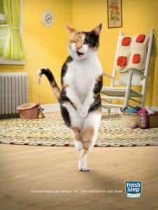
Fresh Step's print ad showed a cat that could not find its own litter box. The product works so well at eliminating odor that even the cat is confused, wandering the house with its nose twitching, completely lost.
This is a brilliant example of turning a product benefit into a funny consequence. Most cat litter ads talk about odor control in clinical language. Fresh Step skipped all of that and showed the result in a way that made you smile. You understand the benefit instantly, and you remember it because it made you laugh.
Showing an unexpected consequence of your product working too well is one of the most reliable formulas in print humor. Your cleaning product is so effective the cleaner has nothing to do. Your coffee is so strong the alarm clock feels jealous. For a creative format that adds a physical dimension to a gag, 3D lenticular postcards make visual jokes move as the reader tilts them.
Wolf Hot Sauce: heat you can feel through paper
Wolf Hot Sauce kept it simple. Their print ad communicated extreme heat with a visual so direct it barely needed words. Looking for seriously hot sauce? The image did all the talking.
Minimalism in funny print ad examples is underrated. Sometimes the funniest ads trust the audience to get the joke without explanation. No tagline, no call to action, just a visual that hits immediately. This works best when the benefit is visceral, something people can almost physically feel by looking.
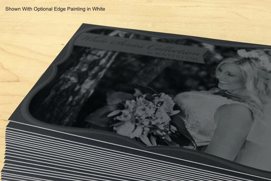
Hot sauce, air conditioning, mattresses, athletic shoes, products with sensory benefits are perfect for this stripped-down style. Let the image speak, trust your audience, and resist the temptation to add a paragraph explaining the joke. Bold stocks like black postcards give a single-image gag extra drama.
3M Privacy Filter: relatable frustration as comedy
We have all been there. On the train, phone tilted at a weird angle, one hand cupped around the screen as if you are shielding launch codes. 3M's privacy filter ad tapped that universal frustration and turned it into comedy, showing someone going to absurd lengths to hide their screen, then offering the simple fix.
This funny print ad example works because it starts with empathy. The reader sees themselves in the situation and laughs because they recognize the behavior. Then the product becomes the hero that saves them from the embarrassment. It is a classic problem-solution structure wrapped in humor that feels fresh instead of formulaic.
Relatability is gold in print advertising. When people see their own daily struggles reflected back, exaggerated just enough to be funny, they feel understood, and people buy from brands that understand them. For more ways to connect through physical media, browse the full library of printing articles.
Print it
Postcards built to carry a punchline
The fastest, cheapest way to put one funny visual straight into someone's hands.
Personal Up toilet paper: timing is everything
When nature calls in the worst possible place, you need a backup plan. Personal Up's print ad featured a scout in a compromising outdoor situation, the kind of moment everyone dreads but nobody talks about. The humor was gentle, relatable, and just edgy enough to be memorable without crossing a line.
Toilet paper is one of the hardest products to advertise with humor because the territory is, well, sensitive. This ad found the sweet spot between funny and tasteful. It acknowledged an awkward truth everyone relates to, used a lighthearted visual to defuse the tension, and positioned the product as the solution.
The takeaway for your own funny print ad examples is to not fear slightly uncomfortable topics, as long as you handle them with a light touch. The best humor often lives right at the edge of what is socially acceptable. Just stay on the right side of that line.
Quantity and price
Postcard pricing and specs
Real configurator numbers. The more you order, the lower the per-unit cost drops.
| Quantity | Price Per Unit | Total |
|---|---|---|
| 50 | 33.0¢ | $16.48 |
| 100 | 24.2¢ | $24.16 |
| 200 | 15.9¢ | $31.86 |
| 300 | 12.8¢ | $38.45 |
| 400 | 11.3¢ | $45.04 |
| 500 | 10.3¢ | $51.62 |
Soflan fabric softener: softness taken to extremes
Soflan's print ad showed a wrestler falling asleep mid-match because his opponent's clothes were so incredibly soft. Not even the intensity of a wrestling ring could overpower the comfort of Soflan-treated fabric. The visual contrast of a brutal sport meeting pillow-soft clothing created an instantly funny moment.
Contrast is a powerful tool in funny print ad examples. Place your benefit in the most unlikely context imaginable and the disconnect creates humor automatically. Softness in a wrestling ring. Silence at a rock concert. Calm in a hurricane. The bigger the contrast, the bigger the laugh.
Contrast also plays to the strength of print. You have one image and one moment of attention, so the joke has to be immediately visible and immediately understood. For brands that want a tactile surprise on top of the gag, 3D lenticular postcards shift the image as the card tilts.
Utopolis Cinema: reality versus fantasy
Utopolis Cinema ran a print ad showing what happens when someone tries to recreate a famous movie scene in real life. The message was essentially that reality is not as forgiving as the movies. The result was a painful, hilarious reminder of why we go to the cinema in the first place, to escape reality rather than imitate it.
This funny print ad example tapped pop culture, always a smart move. When the audience already knows the reference, you do not need to build context. They get the joke instantly, and instant recognition means an instant emotional response, exactly what you want from an ad someone glances at for two seconds.
Pop culture references do carry a shelf life. A movie nod from 1993 hits differently today. If you use this technique, make sure the reference is either timeless or perfectly timed. Classic films, iconic TV moments, and universally known memes age better than trending topics.
Listerine: when one image says it all
Listerine's print ad was a masterclass in visual storytelling. No headline, no body copy, just an image that communicated everything you needed to know about bad breath and its consequences. A picture worth more than a thousand words, and probably worth millions in brand recall.
This is the pinnacle of funny print ad examples, when the humor is so clear and the visual so strong that words become unnecessary. It takes confidence to run an ad with almost no text, but when it works, it works harder than paragraphs of persuasion ever could.
The Listerine ad also proves that humor does not need to be laugh-out-loud to be effective. A knowing smile, a raised eyebrow, a quiet chuckle, these subtle reactions drive brand recall just as well as belly laughs. Sometimes restraint is the funniest choice of all.
Go big
Poster materials and finishing
Indoor and outdoor stocks that turn a one-image joke into a landmark people photograph.
Why humor works so well in print advertising
Funny print ad examples succeed for reasons rooted in psychology, not just creativity. When you laugh, your brain releases dopamine, and that dopamine gets associated with whatever triggered it, in this case the brand. Humor literally builds a chemical connection between your audience and your product.
Print has a unique advantage here. Unlike a digital ad that vanishes after a scroll, a print ad occupies physical space. A funny poster stays on a wall, a hilarious flyer gets passed around an office, a clever postcard ends up stuck to a refrigerator. That permanence means your joke keeps working long after the first laugh.
There is also the sharing factor. People photograph funny print ads and post them online, so a single clever billboard can earn thousands of social impressions with no extra spend. According to the Advertising Research Foundation, ads that generate emotional responses, humor included, run about 23% more effective at driving sales than ads built purely on rational messaging. That is the gap between a campaign that pays for itself and one that does not.
The four parts of a print ad that do the work
Strip any print ad back and four parts are doing the job, whether the ad is funny or not. Knowing which one is carrying the idea tells you what to cut.
- The visual. The image, the illustration or the empty space. In every funny ad above, this is the part carrying the idea.
- The headline. One line that either sets up the visual or pays it off, never both. If the picture already lands, the headline shrinks or goes.
- The body copy. The argument, for the reader who has stopped. On a poster it is often a single sentence. In a magazine it can be a column.
- The call to action and the mark. What to do next and who is asking. Listerine got away with almost nothing here because the logo was enough.
The common failure is four parts all shouting at once. Pick the one that carries the idea, let it dominate, and size the other three to support it.
Classic print ad examples and why they worked
None of these five made anyone laugh. They are here because they solved the same problem the funny ones solved, getting a whole idea across in one image, and they are the cleanest place to see the mechanic without the joke distracting you.
Volkswagen, Think Small
A small car floating in an enormous field of white space, with a two-word headline. Every other car ad of the period filled the page with chrome and a family standing proudly beside a long sedan. Volkswagen printed the opposite of that and let the empty page do the arguing. The mechanic is scale as an argument: the layout itself makes the claim before you read a word, and the copy underneath just confirms what the picture already told you.
Avis, We Try Harder
Avis admitted in print that it was second to Hertz, then turned that admission into the reason to choose it. The mechanic is the conceded weakness. Naming the thing your competitor beats you on buys instant credibility for everything you say next, because a brand willing to say the unflattering part is a brand you start believing on the rest. It is also unusually hard to counter, since the leader cannot rebut a claim its rival already made for it.
The Economist, white out of red
One line of white type on a red field, no image, no product shot, no logo beyond the masthead. The mechanic is the flattering puzzle. Each line only lands if you are well informed enough to decode it, so getting the joke is itself the sales pitch for the magazine. The rigid format is doing real work too: after a few of these, the red rectangle alone is recognizable from across a train platform.
Absolut, the bottle series
Hundreds of executions, one rule: the bottle silhouette appears somewhere in every one, sometimes as a swimming pool, sometimes as a building, sometimes as a gap between two objects. The mechanic is the repeated shape. By committing to a single silhouette across years of work, the brand made the outline itself the logo, so the ads became a game of finding the bottle rather than a series of unconnected pages.
Apple, Think Different
A black and white portrait, a small logo, three words. No computer anywhere on the page. The mechanic is borrowed association: put your mark next to people the audience already admires and let them transfer the feeling. It is a risky move, because it only works if the brand has earned the company it is keeping, and it collapses into embarrassment the moment it has not.
Compare formats
Popular postcard products, side by side
Stock, finish, quantity, turnaround, and from-price across our most-ordered postcards.
 Standard Postcards |  Metallic Foil Postcards |  Mini Cards |  Spot UV Postcards | |
|---|---|---|---|---|
| Min price | $16.48 | $421.91 | $17.57 | $190.02 |
| Paper / stock | 14pt Gloss Cover | 16 Point Silk Laminated | 14pt Gloss Cover | 16pt Gloss Cover |
| Finish | Standard Finish | - | Standard Finish | - |
| Size | 2.5" x 2.5" | 4" x 6" | 2" x 2" | 2" x 6" |
| Default qty | 50 | 500 | 100 | 1,000 |
| Turnaround | 3 business days | 7 business days | 3 business days | 5 business days |
| Rating | ||||
| View & customize | View & customize | View & customize | View & customize |
Where print ads run, from a magazine to a table tent
A print ad is paid or placed space inside something printed, and the format changes how much of an idea you can carry.
- Magazine and newspaper pages. One frame, held at reading distance, with time for body copy. Most of the classics above ran here.
- Posters and transit panels. Read at speed from a distance, so one image and at most a few words.
- Direct mail postcards. The whole ad arrives in a hand, which is why an exaggerated consequence works so well on one.
- Flyers and door hangers. Volume and repetition rather than scale, handed out or dropped until the idea is familiar.
- Inserts, table tents and shelf cards. Caught mid-decision, so the offer has to be the visual.
Pick the format from how the idea has to be delivered. A relatable frustration needs a beat longer than a poster gets, and a one-image joke is wasted on a folded panel.
How to create your own funny print ad examples
Ready to make your own audience laugh? Here is what the best funny print ad examples share, and how to apply each principle to your next campaign.
- Start with a single benefit. Every great funny print ad focuses on one benefit, not three or five. Pick your strongest and build the whole joke around it.
- Exaggerate the consequence. Push the benefit to its logical extreme. The most absurd result is your ad concept, as long as the link to the product stays clear.
- Trust the visual. If the joke needs a paragraph to explain, it is not a print joke. The best ads land in under two seconds.
- Know your audience. Study what frustrates, embarrasses, or delights your market. The funniest ads feel made for the exact people seeing them.
If you are sketching a concept for logo sticker design ideas, the same rules apply, one clear message and one clever visual. The 4OVER4.COM online designer lets you test layouts before committing to a full print run, and it pays to show the concept to five people outside your team first. If three or more laugh or smile, you have something. Use blank templates to mock up ideas quickly and gather feedback before a full run.
Start fast
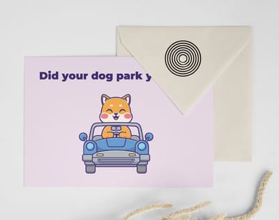
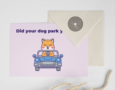
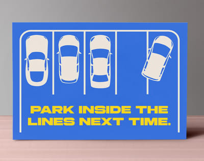
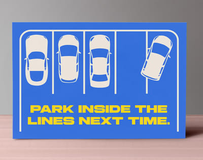
Templates and print-ready blanks
Postcard design templates and exact-size blanks so your gag lands inside the cut line.

Crafting shareable print campaigns that spread
The best funny print ad examples do not just make people laugh, they make people share. Sharing is the holy grail of advertising because it is free, authentic, and far more persuasive than any paid placement.
What makes a print ad shareable? First, it has to be visually self-contained, so someone photographing it and texting a friend needs no extra context. Second, it should trigger an emotional response strong enough to spark the you-have-to-see-this impulse.
Physical materials have a built-in edge here. A funny postcard gets stuck on a communal fridge, a clever flyer gets photographed and posted, a witty sticker travels on laptops for years. Greeting cards and seasonal mailers open the same door, and the how to make greeting cards guide shows how humor blends with the occasion. Match your humor to the format that gives it the longest life, and study proven playbooks like these creative outdoor advertising examples and these local print marketing campaigns. If distribution is your next question, here are smart places to leave print flyers.
Design principles behind the funniest print ads
Humor in print is not only about the joke. It is about how the joke is presented, and the design choices matter as much as the concept.
- White space creates timing. Generous space around a visual gag gives the eye a clear path to the punchline. Cluttered layouts bury jokes, clean layouts deliver them.
- Typography sets the tone. The font tells people how to feel before they read a word. Match or deliberately contradict your visual tone with the type you choose.
- Color communicates mood. Bright, saturated color signals energy and fun, muted tones suit dry humor. Let the palette support the emotional tone of the joke.
- Contrast carries the laugh. Place the benefit in the most unlikely context imaginable. The bigger the disconnect, the bigger the laugh.
More brands now use humor to talk about their environmental commitments, and a funny ad about sustainability can disarm skeptics without sounding like a lecture. If your brand runs on green printing, humor is one of the best ways to say so. If you are new to layout, studying these amazing business card designs teaches how type, color, and space work together. 4OVER4.COM has helped businesses bring creative print campaigns to life for 25+ years, so whether your concept calls for oversized postcards, big posters, or eye-catching flyers, the right stock and finish make the humor hit harder.
Wally turns a laugh into a lasting impression
One funny print piece, kept and shared for months
The funniest ads share one trick, a single benefit pushed to the point of laughter. Pick your one idea, trust the visual, and print it on a format that sticks around. Postcards travel, posters become landmarks, and 3D lenticular postcards move as they tilt. 4OVER4.COM prints it sharp so your customers do the sharing for you.
Order custom postcards →Turn these print ad examples into your own campaign
Each mechanic above suits a different piece of paper. Pick the format by how the idea has to be delivered, not by what is cheapest, and the ad does half its own work.
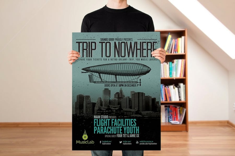
- One image, no copy. Wolf Hot Sauce, Listerine, Think Small. Give it size and a wall. Print it on large-format posters, where the whole idea can be read from across a room and there is nothing else on the page competing with it.
- Exaggerated consequence. Fresh Step, Kaya King, Soflan. These need volume and repetition rather than scale, so they belong on full-color flyers handed out, left on counters, or dropped door to door until the gag is familiar.
- Relatable frustration. 3M, Personal Up. The reader has to see themselves in it, which takes a beat longer than a poster gets. Run it on a folded brochure, where the outside panel sets the awkward moment and the inside delivers the fix.
- Conceded weakness. Avis. This one lives or dies on being read in full, so it wants a piece that stays: a brochure or a mailer someone keeps on a desk, not something glanced at on a pole.
- Repeated shape. Absolut. The point is the series, so plan the run before the first execution and print the whole set together on postcards, one mechanic per card, mailed in sequence.
What to remember about humor in print advertising
Formats that carry a joke
- Postcards. Cheap enough to hand out by the hundreds and just big enough for one clean visual gag.
- Oversized postcards. Extra real estate for a bigger punchline, ideal for a mailer people keep.
- Posters. Turn a joke into a landmark that people stop to photograph and pose with.
- Flyers. Fast, affordable, and easy to leave where your audience already gathers.
- Brochures. Multi-panel humor that builds a setup and reveal as readers unfold each flap.
- Booklets. Room for a longer comedic narrative across several pages.
- Stickers. A witty one-liner that rides on laptops and bottles for months.
Explore more
More ways to make print funny and shareable
Every related page type on 4OVER4.COM, one card each, so you can keep exploring print advertising.
 Shop Postcards Printing Browse every postcard format in one place.
  Hub Marketing Materials The full hub of print built to promote.
 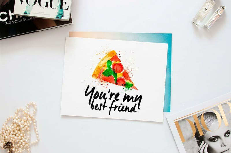 Product Oversized Postcards Extra room for a bigger punchline, from $51.62.
  Article Large Format Print Ads Ten billboard-scale ads worth studying.
 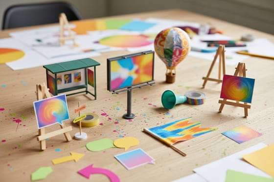 Article Creative Outdoor Advertising Outdoor ideas that turn heads.
  Article Local Print Marketing Campaign ideas that work close to home.
  Guide How to Make Posters Design, print, and display a poster right.
  Product Flyers Fast, affordable handouts from $39.54.
  Article Graphic Design Portfolios How pros handle bold visual work.
  Benefit Online Designer Lay out your idea before you print.
 Ready to print something people will actually keep?
Pick a format, drop in one funny visual or a free template, and 4OVER4.COM prints it sharp, as fast as same day.
Common questions about funny print ad examples
What are examples of print ads?
Magazine and newspaper advertisements, direct mail postcards, inserts and coupon books, transit and bus shelter posters, flyers, door hangers and table tents all count. The ten campaigns on this page are magazine and poster work, chosen because each lands its whole idea in one frame. Anything that buys attention inside a printed medium is a print ad.
Can you give me 10 examples of advertisements?
The ten on this page are Blackstar Panda, Volia Broadband, Kaya King, Fresh Step, Wolf Hot Sauce, 3M Privacy Filter, Personal Up, Soflan, Utopolis Cinema and Listerine. Five classics follow them, Volkswagen Think Small, Avis We Try Harder, The Economist, Absolut and Apple Think Different. Between them they cover exaggeration, relatable frustration, contrast, a conceded weakness and a repeated shape.
What counts as a print ad?
Paid or placed space in a printed medium counts. A magazine page, a newspaper strip, an insert, a transit poster, a direct mail postcard and a door hanger are all print ads. A brochure a salesperson hands you is collateral instead, because the reader has already asked. The line matters for a student brief, where the task is usually to fill one frame and stop a stranger who was not looking.
What are the best practices for funny print ad examples?
Focus on one product benefit and exaggerate it visually. Keep copy minimal so the image tells the joke in under two seconds, and test the concept with people outside your team before printing. Use a quality stock so the piece feels worth keeping. Custom brochures work well for multi-panel humor that unfolds as readers flip through the panels.
How do I choose the right funny print ad examples for my brand?
Match your humor style to your audience. A law firm’s clients respond to dry wit, while a skateboard shop’s crowd wants bold absurdity. Study funny print ad examples from brands in your industry, then find your own angle. Avoid copying, because audiences spot recycled jokes instantly and it damages credibility.
What makes funny print ad examples effective for marketing?
Humor triggers a dopamine release that creates a positive association with your brand. Print ads with humor get shared physically and digitally, multiplying reach without extra spend. 4OVER4.COM prints with 99.8% on-time delivery so your campaign arrives when you need it. Custom booklets give you room to build a longer comedic narrative across several pages.
How much should I budget for funny print ad examples?
The creative concept usually costs the most, so hire a designer or copywriter who understands visual humor. Printing costs vary by format, quantity, and paper type, and postcards or flyers start at just cents per piece while large format costs more for bigger impact. A useful split is 60 to 70% for creative and 30 to 40% for production and printing.
