
Creative Business Card Design Ideas That Make a Lasting Impression


Emma is our prepress and print production voice, built from the knowledge of our production team, with over 20 years in printing.
The business cards people keep break exactly one rule and leave the rest alone: a shape the eye has not seen, a finish the fingers notice, or an illustration worth a second look. Everything else on the card stays plain, because a card shouting in five directions at once reads as noise and goes in the bin.
Creative card styles at a glance
| Style | What people notice | What it costs you | Product at 4OVER4 | From |
|---|---|---|---|---|
| Illustration | Art worth a second look, in full color | Hairlines under 0.25pt can drop out on press | Premium Business Cards | $17.57 |
| Die-cut shape | An outline nobody else in the stack has | Will not sit flat in a wallet or cardholder | Die-Cut Business Cards | $26.37 |
| Raised foil | Metal you can feel with a thumbnail | Type below about 7pt fills in and closes up | Raised Foil Business Cards | $86.78 |
| Spot UV | A pattern that only appears in raking light | Needs a separate 100% K mask file | Spot UV Business Cards | $76.88 |
| Kraft, uncoated | Paper you can feel, and write on with a pen | Ink dries darker and photos go muddy | Kraft Business Cards | $24.75 |
| Soft touch | A velvet surface the hand notices first | Fingerprints show on large dark solids | Soft Touch Business Cards | $40.28 |
| Plastic | A card that behaves like nothing else handed over | Highest cost per card, and no pen will write on it | Plastic Business Cards | $180.02 |
Prices are the live starting prices in the configurator and move with quantity, stock and turnaround. Every style in this table still needs 0.125 in bleed, 300 DPI artwork and CMYK color. You can compare every business card stock and finish side by side before you choose.
Sizes, first runs and production times
| Style | Sizes | Stock | First run | Production |
|---|---|---|---|---|
| Illustration | 2 x 3.5, 2 x 2, 1.5 x 3.5 or 2.125 x 3.375 in | 14pt to 24pt gloss, or 14pt to 18pt uncoated | 100 for $17.57 | 3 business days |
| Die-cut shape | 2 x 3.5 in leaf, oval or half circle, or a 2 or 2.5 in circle | 14pt or 16pt gloss, linen, plastic or magnet | 100 for $26.37 | 3 business days |
| Raised foil | 2 x 3.5 in | 16pt velvet laminated, gold, silver or holographic foil | 100 for $86.78 | 7 business days |
| Spot UV | 2 x 3.5 in | 14pt or 16pt gloss, or 16pt silk laminated | 500 for $76.88 | 5 business days |
| Kraft, uncoated | 2 x 3.5 in and five other cuts | 18pt kraft uncoated, 100% PCW | 100 for $24.75 | 5 business days |
| Soft touch | 2 x 3.5, 2 x 2 or 1.5 x 3.5 in | 32pt, 48pt, 64pt or 80pt soft touch | 50 for $40.28 | 5 business days |
| Plastic | 2 x 3.5 or 2.125 x 3.375 in | 20pt white, frosted or clear | 250 for $180.02 | 7 business days |
Upload a PDF at the trim size plus 0.125 in bleed on every side, with 300 DPI images and CMYK color. A spot UV or raised foil card adds a second file: the 100% K mask that marks where the finish lands.
What makes a business card memorable
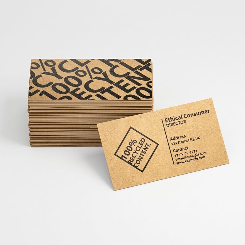
The cards that survive a jacket pocket break exactly one rule and leave everything else alone. A shape the eye has not seen before, a finish the fingers register before the brain does, or an illustration worth a second look. One idea, executed properly.
The cards that get binned try three ideas at once. Foil plus a die-cut plus a photo background plus reversed type at 6pt, and the result reads as noise. When a card comes back across our counter for a reprint, the reason is almost never that it was too plain.
There is a physical reason this works. A person receives a card in the middle of a conversation, looks at it for roughly the length of a handshake, and files it. That window rewards one clear signal and punishes clutter. Our business card basics guide covers the layout side; this page is about the idea that makes someone keep it.
Memorable is not the same as loud
A card printed in one ink on a heavy uncoated stock, with generous white space and the name set large, will out-remember a rainbow gradient every time. Restraint reads as confidence. It also prints reliably, which matters more than designers expect.
The exception is when the work itself is visual. An illustrator, a tattoo artist, a florist and a muralist all have a legitimate reason to put a picture on the card, because the card is a sample. Everyone else is better off with typography and a finish.
The three levers you actually have
Shape, surface and ink. Shape means the cut: rounded corners, a square format, a die-cut silhouette. Surface means the stock and the coating: uncoated, kraft, soft touch, gloss. Ink means color, foil, raised resin and spot gloss.
Pick one lever, push it hard, and keep the other two conventional. That is the whole method, and it is why a plain black card with a raised foil monogram works while a card that tries all three at once does not. If you want the finish comparison first, matte, gloss or soft touch lays out how each one behaves in the hand.
Illustrated and artistic business cards
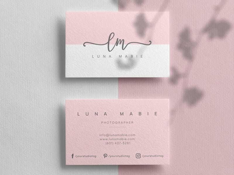
An illustrated card is a portfolio you can hand over. Draw the thing you make, print it edge to edge on the front, and put the contact details on the back where they belong. A tattoo artist with a flash sheet card, a baker with a line drawing of a loaf, a landscape designer with a plan view of a garden: in each case the picture is doing sales work that a logo cannot.
The print constraint is line weight. Anything below about 0.25pt gets thin or vanishes when a four-color build sits on coated stock, and a delicate stipple can turn into a gray smudge. Draw at final size, then look at the file at 100% before you send it. If a line reads as a suggestion on screen, it will read as nothing on paper.
Two color choices matter here. Rich saturated art belongs on premium business cards with a coating, which holds density and keeps blacks deep. Line art and muted palettes look better uncoated, where the ink sinks slightly and the drawing gains a hand-made quality. Both start at $17.57, so print a few of each and decide with the real thing in your hand.
Set the art up so it survives the press
Work in CMYK from the start rather than converting a bright RGB drawing at the end. Electric blues, neon greens and hot pinks that glow on screen sit outside what four process inks can reach, and the conversion drops them without asking. If a specific brand color is non-negotiable, spot color is the answer, and Pantone spot color printing explains when it earns the cost.
Keep the artwork clear of the cut. Anything that must not be trimmed sits 0.125 in inside the edge, and any background that runs to the edge extends 0.125 in past it. A drawing that ends exactly on the trim line will show a white sliver on some cards in the box and not on others, because cutting has tolerance.
The back is half the card and most people waste it
Printing 4/4 rather than 4/0 costs very little and doubles the space you have. Use the back for the picture and the front for the details, or reverse it. A blank back is a missed opportunity unless you deliberately want a writable surface, which is a real reason on an uncoated stock.
For the range of things worth putting there, fourteen back of card ideas covers what earns its space and what does not.
Die-cut and custom-shape cards
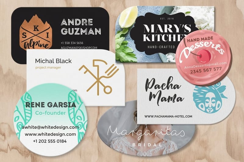
A shape is the fastest way to be the only card in the stack. A leaf for a nursery, a bottle for a wine shop, a wrench outline for a mechanic, a house for an estate agent. The recipient works out what you do before reading a word, and that recognition is what gets the card kept on a fridge instead of dropped in a drawer.
Die-cut business cards start at $26.37, roughly nine dollars over a rectangle, which is the cheapest differentiation on this page. Rounded corners are the mildest version and half-circle or arch tops are the middle ground. A full silhouette is the loud end.
Now the limit nobody mentions. A shaped card does not stack, does not sit flat in a wallet, and will not go in a standard cardholder or a Rolodex. If your buyer keeps cards in a binder, a shape works against you. If your buyer pins things to a noticeboard or drops them in a bowl, a shape wins. Know which one you are dealing with before you commit the run.
How to build the cut file
Supply the die line as a separate vector path on its own layer, drawn as a single closed shape in a spot color named for the cut, with no fill. Keep it simple: tight interior corners and narrow spikes tear during cutting and look ragged at the corner. A radius of at least 0.125 in on any inside corner keeps the edge clean.
Keep type at least 0.125 in inside the die line, and further on a curved edge, because the eye reads a letter crowding a curve as a mistake even when the cut is accurate. The complete guide to business card shapes shows which outlines cut cleanly and which ones fight the die.
Shapes that do double duty
The strongest shaped cards are also useful objects. A bottle-opener outline in plastic, a bookmark long-format card, a card notched to hold a seed packet, a coaster-weight card for a bar. The card stops being paper and becomes a thing that sits on a desk.
If you want a run of examples before committing, twenty custom shaped card ideas is the reference, and leaf-shaped cards is a worked example of one shape done properly.
Foil, spot UV and specialty finishes
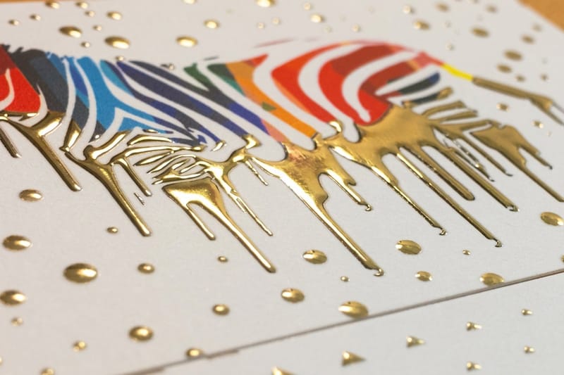
Finishes work because they change how the card behaves in the light and under a thumb, not because they add information. That is exactly why they suit a monogram, a logo, a rule or a single word, and why they fail on a paragraph of body copy.
Raised foil business cards start at $86.78. The foil is applied digitally with a raised resin underneath, so there is no metal die to pay for and a run of 250 is realistic in a way that hot foil stamping never was for a small business. The catch is size: below roughly 7pt, letterforms fill in and counters close up, so keep the foil to display type and marks. Another route to a metallic card is our silk aluminum foil business cards.
Spot UV business cards start at $76.88 and do the opposite. A gloss varnish sits on selected areas of a matte laminate, so a pattern is nearly invisible straight on and jumps out when the card tilts. It is the quietest premium finish we print, and it works best when the gloss shape is different from the printed artwork rather than a copy of it.
The spot UV file, which is where most jobs stall
Spot UV needs two files, not one: the artwork, and a mask that says where the gloss goes. The mask is 100% black on white, vector where possible, with no grays, no gradients, no transparency and no live strokes. Gray does not mean half gloss. It means the job comes back with a question.
Give the gloss shapes a little bulk. Very thin gloss lines are hard to see and waste the finish. A pattern, a large monogram, a solid panel or a run of overlapping shapes all read strongly. Building a spot gloss card in Illustrator walks through the layer setup step by step.
Choosing between raised foil, flat foil and gloss
Raised foil gives you shine plus relief, so the card is doing something on two senses at once. Flat foil business cards start at $222.13 and give a cleaner, thinner metal line with a more traditional stamped look. For a true hot stamped finish, order foil stamped business cards. Spot UV gives you texture and light with no metal at all, at the lowest cost of the three.
A useful order of operations: decide whether the effect should be felt or only seen. Felt points to raised foil or an embossed treatment, and how embossing behaves on a card covers what a die can and cannot hold. Seen points to spot UV or metallic ink, and foil accents explained shows how far a small amount of metal goes.
Texture and premium stock cards
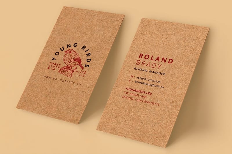
Texture is the most underrated idea on this list because it works before anyone looks at the card. The hand reports back first. Two cards with identical artwork, one on a slick coated stock and one on a heavy uncoated sheet, produce completely different judgements about the business.
Kraft business cards start at $24.75 and are brown all the way through, which suits a maker, a coffee roaster, a joiner or anything that wants to read as honest and unbleached. Two limits to know before you design: kraft is uncoated, so ink dries darker and duller than the proof suggests, and there is no white ink, so anything you leave unprinted is brown, not white. Photographs on kraft look muddy. Line art and single-color type look superb.
Soft touch business cards start at $40.28 and go the other way. A laminate with a velvet surface that people cannot stop rubbing, deep blacks, and a slightly muted color reproduction. The trade is fingerprints: a large area of solid dark on soft touch shows every touch, so break up big black panels or accept the patina.
Thickness does more work than the coating
Weight is read as quality faster than any finish. A 16pt card is noticeably more rigid than a 14pt one, and the difference shows up the moment someone flexes it between two fingers. The 14pt against 16pt comparison puts real numbers to it.
Above 16pt you get into duplex and painted edge territory, where two sheets are bonded and the seam becomes a design feature. It costs more and it is genuinely memorable, because almost nobody hands you a card that thick. What makes a card read as premium ranks the upgrades by effect per dollar.
When uncoated is the smarter choice
Uncoated stock takes a pen. If your card gets a scribbled appointment time, a table number, a stamp on the tenth visit or a note to remember where you met, coated is the wrong choice and no amount of design fixes it. Ballpoint sits on gloss and smears.
Uncoated also photographs well, which matters if the card ends up on a social feed. Card stock explained covers how each weight and coating behaves once it leaves the box.
Interactive and conversation-starter cards
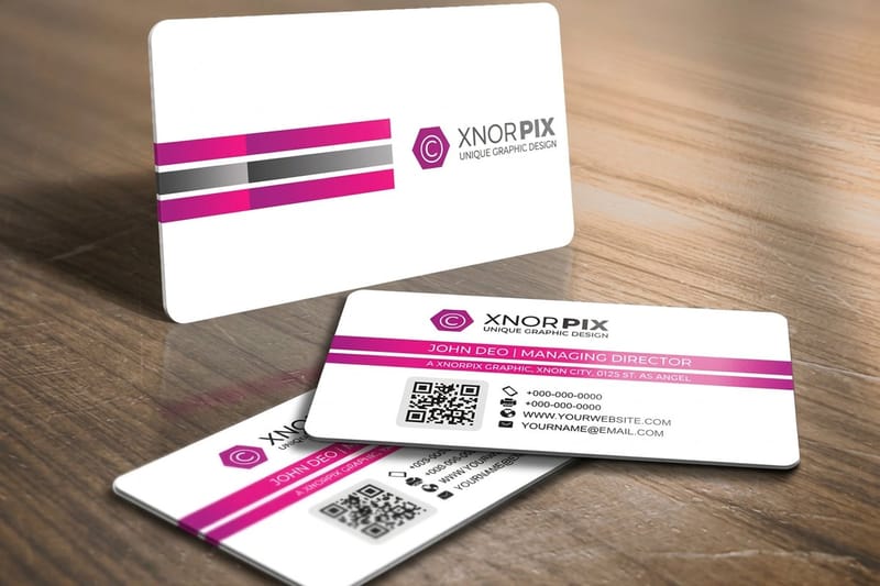
The last category is the card that asks to be used. A perforated tear-off discount, a punch card grid on the back, a scratch panel, a QR code that leads somewhere worth going, a card that doubles as a luggage tag or a bookmark. The recipient has a reason to keep it beyond politeness.
Plastic business cards start at $180.02, which is the highest number on this page and buys a card that does not crease, does not soften in a wallet and survives a decade in a toolbox. Nightclubs, gyms, salons and membership businesses use them because the card is a credential, not a leaflet. You cannot write on one with a pen, and that rules them out for anyone who needs a writable surface.
QR codes belong here too, but only if the destination earns the scan. Point the code at a booking page, a portfolio or a menu, never at a homepage, and keep the code at least 0.8 in across with a clear quiet zone and dark ink on a light field. Using QR codes on business cards covers the sizes and contrast that actually scan.
Ideas that give the card a second job
A punch card grid turns a business card into a loyalty scheme with no app and no signup, and it works best on uncoated stock where a stamp pad takes. A perforated corner gives you a referral coupon the holder can pass on. A card sized and drilled to hang on a keyring stays in a pocket instead of a drawer, and choosing a key card holder covers the sizes that fit.
For a card that lives on a desk rather than in a pocket, coaster business cards is the heavier version of the same idea, and bookmark cards is the version for anyone whose customers read.
The line between clever and annoying
A gimmick works when it relates to the work. A dentist with a mirror-finish card is making a joke the recipient gets. A dentist with a bottle-opener card is confusing. If you cannot explain the connection in one sentence, the idea is decoration rather than communication.
Second test: does it still function as a business card. Name, what you do, one way to reach you, legible at arm’s length. Quirky and unconventional card ideas is full of examples that pass both tests and a few that only pass the first.
Matching your business card to your other marketing materials
A creative card works harder when the pieces around it share its stock, finish, colors and type. Someone who keeps your card and later gets your postcard or letter should see the same accent color and the same logo lockup, on paper that feels related. Print the set from one file of brand colors and match the stocks as you go.
- Postcards. Postcards print on the same 14pt and 16pt gloss or uncoated covers as premium cards, from $16.48 for 50, so the mailer and the card feel the same in the hand.
- Flyers. Flyers start at $39.54 for 50 on 100# gloss or silk text; carry the card's accent color and typeface onto the headline.
- Letterheads. Letterheads print at 8.5 x 11 in on 24# Royal Laid or 28# Royal Linen from $99.95 for 50, a quiet match for an uncoated or kraft card.
- Envelopes. Printed envelopes come in #10 and other sizes on the same Royal Laid and Royal Linen papers, from $142.99 for 250, so the letter and its envelope match the letterhead.
How to bring your idea to print
The gap between a good idea and a good card is the file. Four things settle almost every job: the trim size, the bleed, the color mode and, if you are using a finish, the mask that tells the press where it goes. Get those right and a creative card runs as smoothly as a plain one.
Start from a template rather than an empty artboard. Our blanks are drawn to the exact product size with the bleed and safety already marked, which removes the most common reason a file comes back. If you are laying out from scratch, business card outline and file setup gives the measurements, and how to order business cards covers what happens after you upload.
Quantity and price
Business card pricing and specs
Live configurator numbers on premium stock, where the per unit cost drops as the run grows.
| Quantity | Price Per Unit | Total |
|---|---|---|
| 100 | 17.6¢ | $17.57 |
| 200 | 11.5¢ | $23.07 |
| 300 | 9.15¢ | $27.46 |
| 400 | 7.96¢ | $31.86 |
| 500 | 7.25¢ | $36.26 |
| 600 | 6.77¢ | $40.64 |
You can also earn coins on every order and put them against the next run, which makes testing two versions of an idea cheaper than it looks.
Proof it before you print the whole run
A creative card is the one job where a screen proof is not enough. Foil catches light, spot UV is invisible straight on, soft touch shows fingerprints on dark solids, and a die-cut edge feels different in the hand than it looks in a PDF. Print a short run, carry one for a fortnight, and let the card tell you what the monitor could not.
Print it
Premium business cards, ready to run
Heavier stock and full color on both sides, the base most creative cards are built on.
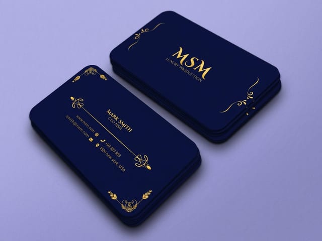
Watch for three things in the proof. First, does the small type hold, especially anything reversed out of a dark field. Second, does the finish land where the mask said it would, and is it big enough to see. Third, does the card feel like the business it represents when someone who has never seen it picks it up. If the answer to any of them is no, the fix is cheap now and expensive after two thousand cards. Using samples to pick the right card covers what to compare when the stocks are in front of you.
Which idea suits your business
The right idea depends on where the card is handed over and what happens to it afterwards. This is how it goes by trade.
- Designers and illustrators. Print the work edge to edge on premium stock and put the details on the back. The card is a sample, so treat it like one and keep the typography quiet.
- Salons, spas and studios. Soft touch laminate with a punch grid or an appointment line on the back. The surface sells the service before anyone reads a word.
- Trades and construction. Plastic or 16pt with a die-cut tool silhouette. It has to survive a van, a toolbox and a pocket full of screws, and it has to be readable at a glance.
- Bars, clubs and events. Plastic or spot UV, because a card handed over in low light needs to catch what light there is. Add a QR to the booking page, not the homepage.
- Makers and food producers. Kraft or uncoated with a single ink and a hand-drawn mark. Skip photographs on kraft, they go muddy, and let the stock carry the story.
- Consultants and law firms. Heavy uncoated stock, one raised foil monogram, generous white space. The most restrained card in the room is usually the one that gets kept.
Blanks that save a round of corrections
Each blank is drawn to the card you will order: 2 x 3.5 in for standard and premium cards from $17.57 or kraft from $24.75, and 2.125 x 3.375 in for credit card size plastic from $180.02 or flat foil from $222.13. The cut line and 0.125 in of bleed are already marked, so your artwork lines up before the first proof. Print 100 of the same file on two stocks and compare them in the hand before the full run. Grab a print-ready blank from the blank template library with bleed and trim already marked, or start from a full design in the design template library.
Start fast
Blanks that save a round of corrections
Blanks drawn to the exact die, so a spot UV mask lines up with the card underneath it.









Wally picks one idea and prints it properly
Shape, surface or ink. Pick one, keep the rest plain
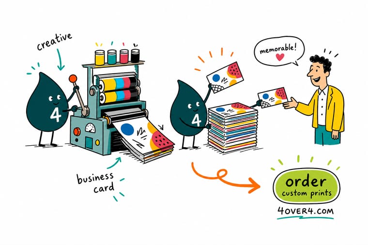
Push a single lever hard: a die-cut outline, a textured stock, or one raised foil mark. Set nothing below 7pt, extend backgrounds 0.125 inch past the trim, keep vital artwork 0.125 inch inside it, and build spot UV as a separate 100% K mask with no grays. Then print a short run and carry it for a week before you commit.
Order business cards →What a creative card costs you in return
Design rules that hold at every price point
- One idea, executed fully. Choose shape, surface or ink and push that one lever. Three effects on one card cancel each other and the card reads as busy rather than considered.
- Set type for arm’s length. Nothing below 7pt, and nothing below 8pt if it is reversed out of a dark field. A card people have to squint at gets put down and not picked up.
- Bleed and safety, every time. Extend backgrounds 0.125 in past the trim and keep anything vital 0.125 in inside it. Cutting has tolerance, and the trim line is not a guarantee.
- Build blacks properly. A large black area built from 100% K alone prints gray and streaky. Use a rich black build for solid panels and keep small type as 100% K only.
- Order a sample before the full run. Finishes look different in the hand than on a monitor. Print a small quantity, carry one for a week, then commit to the quantity you actually need.
Explore more
More ways to print the idea
Plastic cards run 250 for $180.02 on 20 point white rigid vinyl and foil 500 for $222.13 in 9 business days.
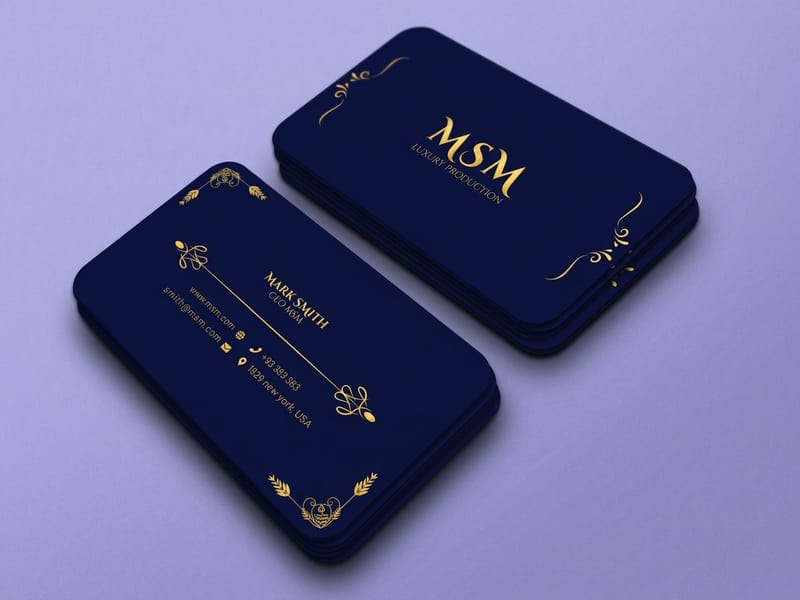 Product Premium Business Cards Full color on heavier stock, from $17.57. Product Die-Cut Business Cards Cut to your outline instead of a rectangle. Product Raised Foil Business Cards Metal you can feel, with no die charge.
 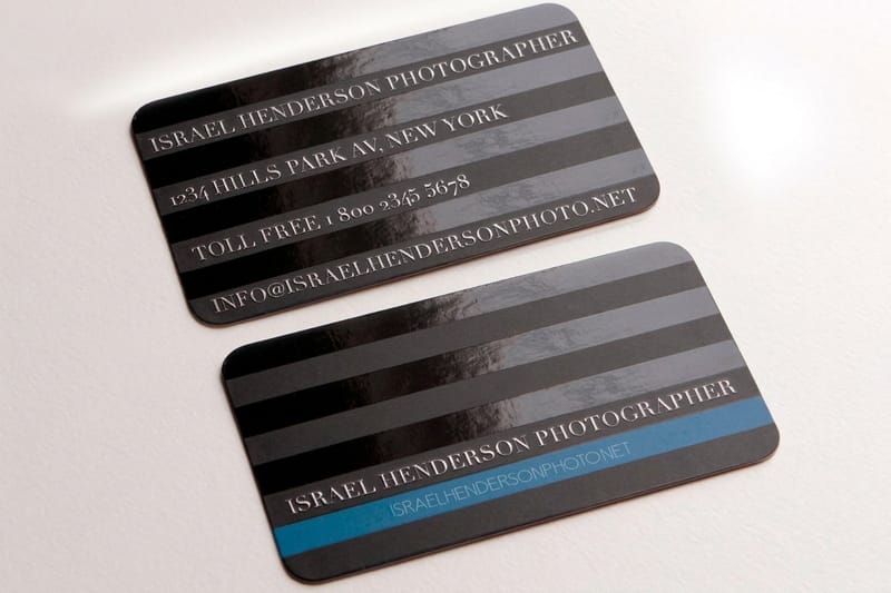 Product Spot UV Business Cards Gloss pattern on matte, seen only in the light.
 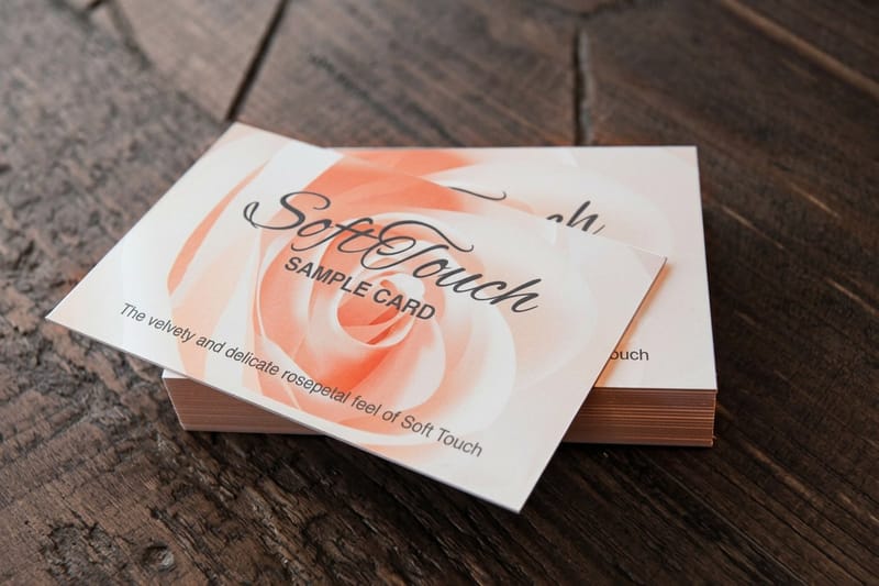 Product Soft Touch Business Cards A velvet laminate people keep rubbing. Product Kraft Business Cards Uncoated brown stock that takes a pen.
  Category Business Card Printing Every stock, shape and finish in one place.
 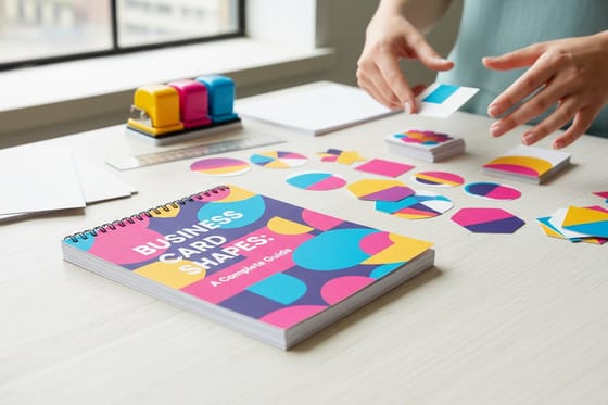 Guide Business Card Shapes Guide Which outlines cut cleanly and which fight the die.
 Ready to print the idea?
Pick your stock and finish, upload your artwork or start from a free template, and 4OVER4.COM prints it sharp with a proof before the run.
Common questions about creative business cards
What makes a business card actually memorable?
One strong idea and nothing competing with it. The cards people keep tend to break a single convention, either the shape, the surface or the ink, and leave everything else conventional. A die-cut silhouette on plain stock, a heavy uncoated card with one raised foil monogram, or a full-bleed illustration with a quiet typographic back all work for the same reason. The cards that get thrown away are usually the ones carrying three effects at once, because the eye cannot decide what to look at and gives up. Restraint costs nothing and prints more reliably than complexity.
Do I need a special file for spot UV or foil?
For spot UV, yes. You supply the artwork plus a separate mask file that shows where the gloss lands, drawn in 100% black on white, vector where possible, with no grays, no gradients, no transparency and no live strokes. Gray does not translate to partial gloss, it translates to a query and a delay. Raised foil at 4OVER4.COM works the same way, with a mask marking the foiled areas. Keep foil and gloss shapes reasonably chunky, because very thin lines waste the finish and small type below about 7pt fills in.
Are die-cut business cards worth the extra cost?
Usually yes, because they are the cheapest way to be the only card in the stack. Die-cut business cards start at $26.37 against $17.57 for a rectangle, so the differentiation costs about nine dollars a batch. Our guide on how to print cheap business cards that still look expensive shows where else to trim. The real cost is practical rather than financial: a shaped card does not stack, will not lie flat in a wallet, and does not fit a standard cardholder or a binder page. If your customers file cards in a binder, a shape works against you. If they pin cards up or drop them in a bowl, a shape is the single best money you can spend on a card.
Can I print photographs on kraft business cards?
You can, and in most cases you should not. Kraft stock is brown through the sheet and uncoated, so there is no white base under the ink and no coating holding it on the surface. Photographs lose contrast, skin tones go warm and dirty, and highlights simply become brown paper because there is no white ink. Kraft is at its best with line art, a single ink, solid type and a hand-drawn mark. If the design depends on a photograph, print it on a coated premium card and use a kraft stock for something else.
How many creative cards should I order on a first run?
Order the smallest quantity that lets you carry the card for a few weeks, then reorder once you know it works. Finishes behave differently in the hand than on a monitor: soft touch picks up fingerprints on dark panels, spot UV is invisible in flat light, and a die-cut shape that looked clever in a file can be awkward to hand over. Cards are cheap enough at $17.57 to test properly. The expensive mistake is ordering two thousand of a design you have never physically held.
What is the latest trend in business cards?
Texture leads the latest trend in business cards: raised foil you can feel with a thumbnail, spot UV patterns that show only in raking light, and kraft stock that takes a pen. Raised foil cards start at $86.78 for 100, spot UV at $76.88 for 500 and kraft at $24.75 for 100, so a tactile card costs little to test before a big run.
What are the best business card designs for 2026?
The best business card designs for 2026 push one lever and keep the rest plain: a die-cut outline from $26.37, a soft touch laminate from $40.28 for 50, or full color art on premium stock from $17.57 for 100. Premium and die-cut cards print in 3 business days, so you can order two versions and keep the one people comment on.
