
15 Best Free Art Deco Fonts for Print Design


Sofia is our design and templates voice, built from the knowledge of our production team, with over 20 years in printing.
The fifteen free art deco fonts worth printing are Poiret One, Limelight, Josefin Sans, Megrim, Italiana, Julius Sans One, Gruppo, Jost, Monoton, Six Caps, Oswald, Abril Fatface, Prata, Tenor Sans and Federo, all of them on Google Fonts under the SIL Open Font License 1.1. That license is the part that matters commercially: it permits printed goods you sell, PDF embedding and conversion to outlines, which "free for personal use" downloads do not. The pieces deco type usually lands on are posters from 11 x 17 in to 22 x 28 in, wedding invitations, and raised foil business cards.
The fifteen fonts at a glance
| Font | Weights shipped | Letterform | Best print use | License |
|---|---|---|---|---|
| Poiret One | 1 weight | Hairline geometric with deco flourishes on K, R and W | Invitation and menu headlines, set large | OFL 1.1 |
| Limelight | 1 weight | Heavy display drawn from 1930s signage lettering | Poster headlines, marquee panels | OFL 1.1 |
| Josefin Sans | 100 to 700, plus italics | Geometric 1920s sans with a very small x-height | The one that can carry a whole layout | OFL 1.1 |
| Megrim | 1 weight | Hairline letterforms built from bare geometric strokes | Large titles only, never body copy | OFL 1.1 |
| Italiana | 1 weight | High contrast display with fine hairlines and long caps | Menu covers, wedding stationery | OFL 1.1 |
| Julius Sans One | 1 weight | Wide thin caps with a lighter lowercase | Section labels, ticket headers | OFL 1.1 |
| Gruppo | 1 weight | Narrow geometric with squared-off curves | Short labels, price lines, tags | OFL 1.1 |
| Jost | 100 to 900, plus italics | Geometric sans in the 1927 Futura lineage | The companion text face for the display picks | OFL 1.1 |
| Monoton | 1 weight | Inline face where every stroke is drawn as parallel lines | Marquee headlines at large size only | OFL 1.1 |
| Six Caps | 1 weight | Ultra condensed capitals, no lowercase | Stacked deco poster headlines | OFL 1.1 |
| Oswald | 200 to 700 | Condensed gothic reworked for screen and print | Programmes, tickets, listings | OFL 1.1 |
| Abril Fatface | 1 weight | Fat didone with extreme thick-to-thin contrast | Big poster headlines with weight behind them | OFL 1.1 |
| Prata | 1 weight | Didone-flavored display serif with crisp hairlines | Menu headings, invitation names | OFL 1.1 |
| Tenor Sans | 1 weight | Light geometric sans with slightly flared stems | Second lines, addresses, credits | OFL 1.1 |
| Federo | 1 weight | Geometric with a subtle flare at the stem ends | Deco headings that need to feel handmade | OFL 1.1 |
Read the weight column before the letterform column. A single-weight face gives you no bold and no italic, so it needs a companion family from the first layout rather than a patch at the end. Pair a single-weight face such as Poiret One with a family that has real weights, such as Josefin Sans or Jost, and keep the thinnest stroke at 0.25pt or more. You can order standard posters in any size once the type is set, and the standard posters video shows a finished print first.
What actually makes a font art deco

Art deco lettering is built out of a compass and a ruler rather than a pen. The shapes are geometric, the strokes shift hard between thick and thin with almost nothing in between, the capitals run tall against a shrunken lowercase, and the terminals cut flat instead of curling. That is the whole recipe, and it is why deco type photographs so well on a poster and reads so badly in a paragraph.
Three families do most of the work. Geometric sans faces such as Josefin Sans and Jost come from the same 1920s workshop thinking as Futura. Hairline display faces such as Poiret One and Megrim reduce a letter to a single thin line. Fat didones such as Abril Fatface take a nineteenth century high contrast serif and push the thicks until the hairlines almost vanish.
Two neighbors get mistaken for deco all the time. Art nouveau is the older one, organic and vine-like, and it curves where deco squares off. Mid-century retro leans on rounded softness and outlined shadows. If you want the softer end of the shelf, the retro font roundup covers it. Everything on this page is the ruler and compass side.
Why free deco fonts fail in print more often than free sans faces
A free geometric sans usually ships several weights and a full punctuation set, so it survives contact with a real layout. A free deco display face is often one person drawing one weight of capitals for a specific project, then releasing it. The character set stops short, the kerning pairs are thin, and there is no bold to reach for.
None of that matters at 96pt across the top of a poster. All of it matters the moment the same face has to set an address block, a price list or a phone number. Choose the deco face for the headline, then choose a second face for everything the headline does not say.
Where deco type earns its keep
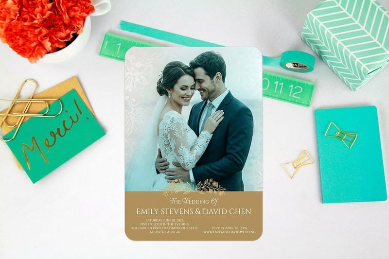
Deco reads as occasion. It suits things people keep and look at rather than things they scan and bin: a wedding invitation at 25 for $19.77, a restaurant menu at 50 for $57.11, a theater or gallery poster at 50 for $108.75, and any card meant to feel like an object rather than a contact detail.
It suits certain trades more than others. Cocktail bars, jewellers, barbers, gallery openings, speakeasy-styled venues, vintage clothing, and anything selling an evening rather than a product. It suits a plumbing van badly, and no amount of good typesetting fixes that mismatch.
The fifteen fonts, and what each one is for
Every font below is on Google Fonts under the SIL Open Font License 1.1, which is the license that makes them safe for commercial print. They are grouped by the job they do rather than by looks, because that is the decision you are actually making.
The weight count in each entry is the thing to read first. A single-weight face means you cannot bold a word for emphasis without your software faking it, and faked bold thickens the outline unevenly and ruins the geometry that made the face deco in the first place.
Fonts one to five: the display set
1. Poiret One. The face most people picture when they say art deco. Hairline strokes, geometric bowls, and small flourishes on the K, R and W that stop it looking generic. One weight, caps and lowercase. Set it at 40pt and above, and give it tracking. Below about 18pt in print the hairlines start losing to ink spread.
2. Limelight. Heavy, confident display drawn from 1930s signage. It is the opposite problem to Poiret One: nothing here is fragile, so it prints beautifully on anything, including uncoated stock and vinyl. One weight, and it wants to be set in capitals.
3. Josefin Sans. The most useful font on this list. A geometric 1920s sans with a famously small x-height, and unlike almost everything else here it ships as a variable family from 100 to 700 with matching italics. It can set a headline, a subhead and a caption without you reaching for a second family.
4. Megrim. Letters reduced to bare geometric lines, closer to a diagram than a typeface. One weight. It is genuinely beautiful at 60pt and it disappears at 12pt, so treat it as a title face and nothing else. Check the stroke weight before you send it, especially if it is going on uncoated paper.
5. Italiana. High contrast, long elegant capitals, hairlines that read as expensive on a coated sheet. One weight. It is the deco face to pick when the job is a menu cover or a wedding suite rather than a poster.
Fonts six to ten: the poster set
6. Julius Sans One. Wide, thin capitals with a lighter lowercase underneath. One weight. It works as a label above a block of text, which is a job most deco faces do badly because they take up too much room.
7. Gruppo. Narrow, geometric, with curves squared off at the corners. One weight. Best on short strings: a price, a date, a two-word category. Give it letterspacing or the counters close up on press.
8. Jost. A geometric sans in the direct lineage of Futura, which was released in 1927 and is the single most deco-adjacent text face in wide use. Variable from 100 to 900 with italics. This is the companion face for nine of the ten display picks above and below it.
9. Monoton. Each stroke is drawn as a set of parallel lines, so it looks like a lit marquee sign. One weight. The gaps between those lines are the risk: at small sizes, or in foil, or on absorbent stock, they close up and the letter turns into a solid slab. Keep it large and keep it on coated paper.
10. Six Caps. Ultra condensed capitals, no lowercase, one weight. Deco posters stacked short words in tall narrow columns, and this is the free face that does that without distortion. Never stretch a wider font to fake this look, because scaling destroys the stroke ratio.
Fonts eleven to fifteen: the quiet workers
11. Oswald. A condensed gothic in the tradition deco printers used for programs and tickets. Variable from 200 to 700, no italic. Not strictly deco, and the most practical face here for dense listings that still need period flavour.
12. Abril Fatface. A fat didone with brutal thick-to-thin contrast. One weight. It carries a headline the way a wood type poster does. The hairlines are the weak point, so scale up rather than down and check them before output.
13. Prata. A didone-flavored display serif with crisp hairlines and a calmer tone than Abril. One weight. Good for a name across the top of a printed menu where Italiana would be too thin for the stock.
14. Tenor Sans. Light geometric sans with slightly flared stems, which softens it just enough to sit under a hard deco headline. One weight. Use it for addresses, credits and second lines.
15. Federo. Geometric with a subtle flare where the stems end, so it reads a shade warmer and more handmade than Jost. One weight. It suits a heading that wants period feel without shouting about it.
Where to download them, and what the license lets you do
Download all fifteen from Google Fonts itself, or from the Google Fonts GitHub repository if you want the source files. Both give you the real font files with the license text alongside them. Aggregator sites repackage the same families, sometimes with an older version, sometimes with an added installer you did not ask for, and almost never with the license file attached.
The SIL Open Font License 1.1 is short and it says four useful things. You may use the font for anything, including commercial work and printed goods you sell. You may embed it in a document, which covers a print-ready PDF. You may modify it. You may not sell the font file on its own, and if you modify and redistribute it you must keep it under the same license and rename it, because most families reserve their name.
The trap is the phrase "free for personal use". It appears on thousands of font downloads and it means the opposite of what a small brand assumes: no client work, no products for sale, no logo. If a font page does not name a license you can read, treat it as unusable and pick one of the fifteen above instead. Our guide on whether Google Fonts are free for commercial and print use works through the detail.
What a printer needs from you, license-wise
Nothing, if you send outlines. A PDF with the type converted to outlines contains shapes, not font data, so no license question ever reaches us. Read how to convert text to outlines before sending files to print before you do it, because the step is one-way and you want to keep an editable copy.
If you embed instead, the Open Font License allows it and every one of these fifteen families embeds cleanly. Embedding keeps the text searchable and lets a small typo be fixed without going back to the source file. Our note on embedding fonts for print covers the export settings.
Pairing a deco display face with something that can carry text
Pick one deco face for the headline and one neutral family for everything else. The neutral one needs real weights, real italics and a full punctuation set, because that is what the deco face is missing. Jost is the obvious answer when you want the pairing to stay in period. Oswald works when the text is dense. A plain serif works when the deco face is a sans, and the reverse holds too.
Contrast the two hard rather than a little. Poiret One at 48pt over Jost at 10pt reads as a deliberate hierarchy. Poiret One at 20pt over Jost at 16pt reads as a mistake. If the two faces are close in size and close in weight, the eye has nowhere to land, which is the most common fault in amateur deco layouts.
One accent, held steady. Deco layouts lean on rules, a thin border, and a single geometric ornament repeated. Three ornaments is a costume. The pairing advice in serif versus sans serif for your brand and the poster-specific version in poster typography tips both apply here.
Tracking is not optional with deco capitals
Deco capitals were drawn tight, for signs where the letters were painted individually and spaced by eye. Set them at default tracking in InDesign or Illustrator and the word turns into a solid block. Add tracking until the counters breathe, then check it at final size on paper rather than at 400 percent on screen.
Lowercase deco needs the opposite discipline. Josefin Sans has such a small x-height that generous line spacing is what makes it readable, not letter spacing. Increase the leading before you touch anything else.
Poster pricing and specs at 4OVER4.COM
A deco headline needs size to work: the hairlines in Megrim or Gruppo only hold at poster scale, at 18 x 24 in or larger. Standard posters start at $108.75 for 50 and run from 11 x 17 in to 22 x 28 in on 100# gloss or silk text, 80# gloss cover or 14pt cover, and size moves the price along with stock and quantity. The live numbers are below, so you can pick a format before you commit to a layout.
Quantity and price
Poster pricing and specs
Live configurator numbers, where the per unit cost drops as the run grows.
| Quantity | Price Per Unit | Total |
|---|---|---|
| 50 | $2.18 | $108.75 |
| 100 | $1.64 | $163.67 |
| 200 | $1.01 | $202.11 |
| 300 | 80.2¢ | $240.55 |
| 400 | 69.7¢ | $278.99 |
| 500 | 63.5¢ | $317.44 |
You can also earn coins on every order and put them against the next print run.
Stock and finish decide how thin your type can go
The same hairline behaves differently on two sheets. A coated stock holds ink on the surface, so fine strokes stay fine and a face such as Italiana or Poiret One prints as drawn. An uncoated sheet absorbs ink into the fibers, the stroke spreads sideways, and a hairline that measured 0.2pt in the file comes back looking either soft or broken. 0.25pt is the working floor on coated stock and 0.5pt is the honest floor on uncoated.
Print it
Posters, ready for a big headline
Preset sizes with the stock options that suit fine display type.

Finish changes the reading as much as the stock. Gloss lifts contrast, which flatters a fat didone such as Abril Fatface and can make a hairline face look sharper than it is. Matte cuts glare and suits a menu or an invitation held close to the eye. Foil is its own case: it needs a wider stroke footprint than ink, so geometric deco marks work and hairline deco faces do not. If foil is the plan, read how to set up design files for foil before you pick the font, and look at raised foil business cards, 100 for $86.78, for the effect on a card.
Which deco font suits which business
The face should match what the business sells, not just the era it likes. Here is where each group lands.
- Bars and cocktail venues. Limelight or Six Caps on the poster, Jost for the drinks list. Deco was a nightlife style first, and it still reads that way on a menu.
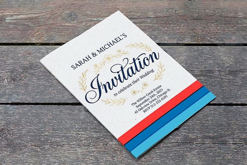
- Wedding stationery. Italiana or Prata for names, Tenor Sans for the details. Print on a heavy card and let the hairlines sit on a coated surface where they stay crisp.
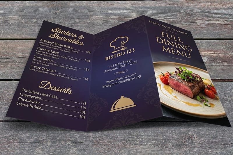
- Restaurants and cafes. Prata for headings, Oswald for a long list of dishes. Prata holds up better than Italiana on the uncoated stock most menus use.
- Galleries and theaters. Monoton or Abril Fatface on the poster, Josefin Sans for the program. Big format is where these faces were drawn to live.
- Barbers, jewellers and vintage retail. Federo or Poiret One for the shopfront and card, Jost for the price list. The period cue does the positioning work for you.
Poster blanks before the thin strokes go in
Set your type inside a file that already knows the trim. The poster blanks below come in each standard size, from 11 x 17 in to 22 x 28 in, with bleed and cut lines marked, so a thin Italiana or Gruppo stroke never ends up in the trim zone. Pull a print-ready blank from the blank template library, or start from a layout in the design template library and swap the type for one of the fifteen.
Start fast
Poster blanks before the thin strokes go in
Poster templates and exact size blanks so your artwork lands inside the cut line.
Wally checks a deco headline before it goes to press
Five checks that decide whether a free deco font survives the run
Track the capitals out until the counters breathe, pair a real text family because most free deco faces ship one weight, measure the thinnest stroke and keep it at 0.25pt on coated stock or 0.5pt on uncoated, set anything under 10pt in 100 percent black only, then embed the font or convert the type to outlines. The Open Font License permits both.
Order posters →What to remember about free deco fonts
Setup rules that apply to all fifteen
- Set the headline first, at final size. Deco faces change character with scale. Type the real words at the real point size on a printed proof before you commit the layout.
- Measure your thinnest stroke. Hairline faces such as Megrim and Poiret One thin out as you scale down. Keep the thinnest stroke at 0.25pt or above, and above 0.5pt on uncoated stock.
- Never fake a bold. Twelve of these fifteen ship one weight. A software-applied bold thickens the outline unevenly and destroys the geometry. Change size or change face instead.
- Small type gets 100K black. Fine deco type built from four plates fuzzes at the edge if registration drifts. Set anything under about 10pt in black only.
- Keep an editable copy before outlining. Converting to outlines is one-way. Save the live-text version first, then outline the copy that goes to press.
Explore more
More ways to print and promote
Standard posters run 50 for $108.75 in 5 business days, which is where a thin deco stroke gets tested.
Product Standard Posters Large format for headline type that needs room to work. Product Wedding Invitations Heavy card that holds a hairline deco face cleanly. Product Restaurant Menus Deco headings over a dense list of dishes. 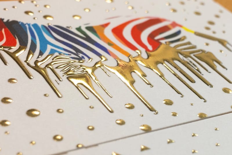 Product Raised Foil Business Cards Foil suits geometric deco marks better than fine hairlines. Category Poster Printing Every poster size, stock and finish in one place.
  Guide Smallest Printable Font Size Where fine type stops being readable on press.
 Ready to print your deco layout?
Pick a size, drop in your artwork or start from a free template, and 4OVER4.COM prints it sharp on the stock your hairlines need.
Common questions about free art deco fonts
Can I legally use a free art deco font on products I sell?
Yes, if the font ships under the SIL Open Font License, which is what all fifteen families on this page use. The license permits commercial use, including printed goods you sell, packaging, logos and signage. It also permits embedding the font in a print-ready PDF and converting the type to outlines. The two things it does not permit are selling the font file on its own and redistributing a modified version under the original name. A font offered as "free for personal use" is a different license and none of that applies: it excludes client work, resale and logos, and that is the license that causes most of the trouble small brands run into.
Why does my deco headline look thinner on the printed sheet than on screen?
It usually is not thinner, it is fighting the paper. Hairline strokes in faces such as Poiret One, Megrim and Italiana sit near the limit of what a press can hold, and on an uncoated sheet the ink spreads sideways into the fibers, so a thin light stroke can partly fill in while a thin dark stroke on a light ground can look broken. Measure the thinnest stroke in your artwork and keep it at 0.25pt or above for coated stock, 0.5pt or above for uncoated. If the design will not survive that, scale the headline up or move to a heavier deco face such as Limelight.
Should I convert deco type to outlines or embed the font?
Either is fine under the Open Font License, and the choice is about workflow rather than legality. Outlines remove every font question because the PDF then contains shapes, not font data, which is the safest option for a display face with unusual characters. The cost is that the text can no longer be edited or searched, and the step is one-way, so keep an editable copy before you do it. Embedding keeps the text live so a late typo can be fixed, and every one of these fifteen families embeds cleanly. For a one-off poster, outline it. For a menu you will reprint with changes, embed it.
Which free deco font works for body text?
None of the display faces do, and that is not a flaw in them. Josefin Sans is the closest thing to an exception, because it ships as a variable family from 100 to 700 with italics and a full character set, so it can set short paragraphs if you increase the leading to compensate for its small x-height. For anything longer than a few lines, pair a deco headline with Jost or Oswald and let the display face do the one job it was drawn for. A page set entirely in a deco face is a page nobody finishes reading.
Does art deco type work in foil or raised printing?
Geometric deco marks work extremely well in foil. Solid shapes, thick strokes and clean flat terminals are exactly what foil holds. Hairline deco faces are the opposite: a stroke that is already at the limit in ink is below the limit in foil, because foil needs a wider footprint to adhere and register. If you want a deco card in foil, use Limelight, Abril Fatface or a heavy custom mark rather than Poiret One or Megrim. Raised foil business cards start at $86.78 for 100 at 4OVER4.COM, and the file setup differs from a standard print job, so check the foil file setup guide before you build the artwork. The foil business cards video shows how the foil catches light on a finished card.
