
Why Designers Keep Choosing the Jost Font for Print


Sofia is our design and templates voice, built from the knowledge of our production team, with over 20 years in printing.
What the Jost Font Actually Is

Jost is an open source geometric sans serif drawn by Owen Earl and published under the SIL Open Font License, which means you can use it in client logos, packaging, and printed signage without a license fee. That covers the pieces you would actually order with it: business cards where the name and phone line sit at 8pt, 2 sided blockout banners where the headline runs at display size, and clear plastic cards where a thin stroke has no white paper behind it. It sits in the same tradition as the 1920s German geometric faces, the ones built from circles, triangles, and straight lines rather than from a pen stroke.
The practical version of that history is simple. Jost has a single story lowercase a, near perfect round bowls on the o and the e, and uniform stroke weight across the whole alphabet. Nothing in it is calligraphic. That gives a brand a calm, engineered voice that reads as modern without shouting about it.
We care about this from the press side. A face made of near circles behaves differently on a 13pt gloss card than it does on a vinyl banner, and differently again on clear plastic where there is no white paper underneath to hold the ink. Most of this article is about those differences, because that is where a font choice either survives production or quietly falls apart.
Where Jost came from
Earl released Jost through indestructible type*, an open source foundry, and kept refining it in public. Later versions widened the character set and cleaned up spacing that early adopters flagged. Because the project lives on GitHub and Google Fonts, you can pin a version rather than hope your teammate has the same file.
What ships in the family
You get a variable font covering Thin through Black with a true italic companion, not a slanted fake. That range matters for print. A poster can run Black at 300pt while the legal line at the bottom runs Regular at 7pt, and both stay recognizably the same brand.
Why designers reach for it
It is free, it is well spaced, it has enough weights to build a system, and it does not look like the default font on anyone else's laptop. For a small business building an identity on a budget, that combination is hard to beat.
Where it is the wrong answer
Long reading. A 2,000 word brochure set in Jost at 9pt will tire people out, because the round shapes and even color give the eye very few landmarks. Use it for the voice and let a text face carry the paragraphs.
Closest match
Clear plastic cards
The hardest surface for a geometric wordmark, and the best test of your type system.

Where Jost Shines in Logos, Headings, and Signage
Geometric sans faces peak where the type is big, short, and needs to be recognized rather than read word by word. That is exactly a logotype, a section heading, an exhibition sign, a price on a shelf talker, or a headline on a banner hung above a trade show booth. Jost holds its shape at distance because its letters resolve into simple geometry long before the details arrive.
Three formats in our catalog show the range clearly, from a wall sized banner down to a wordmark on a product you can hold in one hand. Prices below are live starting prices from the configurator.
- Wordmarks. Set Jost Medium or Semibold, then letterspace it by 20 to 60 units. The extra air is what separates a logo from a word typed in a nice font.
- Headings. Bold or Black, tight tracking, sentence case. Jost gets loud fast, so one strong heading per surface beats three competing ones.
- Signage and banners. Medium or Semibold reads better than Bold at long distance, because heavy weights close up the counters and turn an a into a blob.
- Numbers. Jost figures are clean and even width, which makes price lists, table numbers, and event schedules line up without manual nudging.
- Small branded objects. On a pen or a keychain, drop to a single word in Medium and let the object do the rest.
The one rule that covers all five: the shorter the text, the better Jost performs. Every extra line of copy moves you toward the territory where a humanist sans or a serif would serve the reader better.
Print picks
Three surfaces that put a type system to the test
Live starting prices, ready to configure with your own artwork.
 2 Sided Blockout Banners $108.75 each A blockout core keeps back-side type from ghosting through your headline.
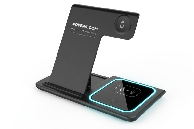
 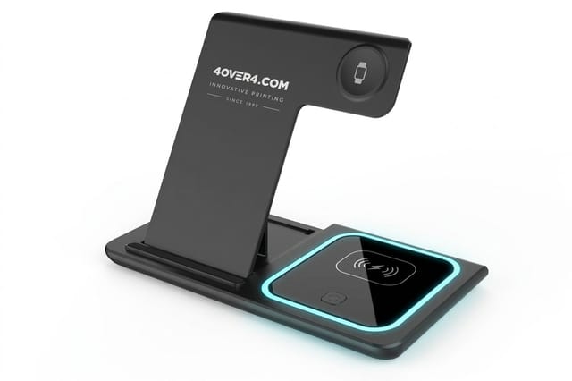 3 in 1 Foldable Wireless Charger $15.00 each A ready-made desk gift to send beside your printed pieces.
 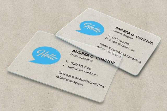 30mil Clear Plastic Cards 500 for $529.26 Clear stock rewards clean geometry and punishes thin, delicate strokes.
 How Jost Behaves at Small Sizes

This is the question that decides whether Jost can carry a whole identity or only the top of it. Below roughly 9pt on coated stock, two things start working against you. The counters in a, e, and s are small relative to the round outer shape, so ink spread fills them. And the low contrast between letters means a word starts reading as a texture instead of a shape.
The fix is not a different font, it is a different setting. Bump the tracking slightly positive, add a point of leading over what you would give a humanist sans, and step up one weight so the strokes survive dot gain. Jost Medium at 8pt often reads better than Jost Regular at 8.5pt on an uncoated sheet.
Small size settings that work
- Tracking. Add 5 to 15 units below 10pt. Geometric faces are spaced for display, not for captions.
- Leading. Give it 140 percent of the type size. Round shapes need vertical air or the lines start to merge.
- Weight. Prefer Medium over Regular on uncoated and on any absorbent stock.
- Line length. Cap it near 60 characters. Long measures make a low contrast face much harder to track across.
- Reverse type. White Jost on a dark field needs one weight lighter, not heavier, because the ink closes in on the letter.
Run a real proof before you commit an entire print run. A screen at 200 percent zoom will never show you what an 7pt disclaimer looks like after it hits paper at 300 lines per inch.
Pairing Jost With Other Fonts
A geometric sans wants a partner with a different skeleton, not a different name. Pair Jost with something built by a pen or a chisel and the contrast does the work for you. Pair it with another geometric sans and you get an argument nobody wins.
Four pairings we see survive real print jobs, all using freely licensed partners so the whole system stays free to hand off to a client.
- Jost plus Source Serif. The safest business pairing. Jost carries headings and labels, Source Serif carries body copy that people actually have to read.
- Jost plus Lora. Warmer and more editorial. Good for menus, event programs, and anything that should feel handmade rather than corporate.
- Jost plus IBM Plex Mono. For technical brands. The mono carries specs, part numbers, and captions while Jost carries the voice.
- Jost with Jost. A single family system. Black for the headline, Light for the deck, Medium for labels. Works when the layout has strong structure to lean on.
Whichever you choose, lock the ratio before you start laying out. A heading at 2.5 times the body size, a deck at 1.4 times, and labels at 0.8 times will give you a system that scales from a card to a banner without a redesign each time.
Quantity and price
Blockout banner pricing and specs
Real configurator numbers. Larger runs bring the unit price down quickly.
| Quantity | Price Per Unit | Total |
|---|---|---|
| 1 | $108.75 | $108.75 |
| 2 | $108.74 | $217.47 |
| 3 | $108.74 | $326.22 |
| 4 | $97.76 | $391.02 |
| 5 | $97.76 | $488.78 |
| 6 | $97.76 | $586.53 |

Fonts That Sit Closest to Jost
Designers reach for Jost because it looks like the 1920s geometric faces without the license cost, so its nearest relatives are the other members of that family. Swap one in and recheck the three numbers this article sets for Jost: the 8pt floor for Regular on coated stock, one weight up below 9pt on uncoated, and nothing finer than display weights under 24pt on vinyl.
- Futura is the original reference. Jost was drawn in its tradition, so a layout built in one moves to the other with almost no redraw, though Futura is licensed and Jost is not.
- Poppins is rounder and wider with taller lowercase letters, which makes it friendlier and a little less precise at display sizes.
- Questrial and Josefin Sans sit either side of Jost, one plainer and one more decorative, and both are freely licensed.
- Century Gothic is wider again and ships on many office machines, which makes it a fallback rather than a choice.
Switching between any of these changes the line length, so reflow the layout rather than swapping the font and assuming the copy still fits.
Quantity and price
Blockout banner pricing and specs
Real configurator numbers. Larger runs bring the unit price down quickly.
| Quantity | Price Per Unit | Total |
|---|---|---|
| 1 | $108.75 | $108.75 |
| 2 | $108.74 | $217.47 |
| 3 | $108.74 | $326.22 |
| 4 | $97.76 | $391.02 |
| 5 | $97.76 | $488.78 |
| 6 | $97.76 | $586.53 |
Print Tips for Geometric Sans Type
Geometric faces expose production sloppiness faster than almost anything else, because the eye already knows what a circle is supposed to look like. A slightly out of register o reads as broken in a way a serif o never would. These are the checks worth running before you send files.
- Convert to outlines or embed properly. Jost is variable, and some RIPs flatten a variable instance to the default weight. Outline your logotype and heading type, or export a static instance.
- Watch thin weights on absorbent stock. Jost Thin and Light below 14pt will gain weight on uncoated. Move to Regular or step the size up.
- Keep reverse type out of four color builds. White Jost sitting on a rich black built from four inks will fringe if registration drifts. Use a single strong ink or a spot color under it.
- Mind the apertures. The c, s, and e close up as weight increases. On anything read from more than a few feet, stop at Semibold.
- Set your own tracking on all caps. Jost all caps at default spacing looks cramped. Add 40 to 80 units and it turns into a proper display setting.
- Test the numerals against the layout. Even width figures are great in tables and slightly stiff in running text. Check both before choosing.
One more that only shows up on press. Because Jost strokes are close to uniform, any banding or streaking in a solid area beside the type becomes very visible by comparison. If a job has large flat color behind headline type, ask for a press proof rather than a digital one.
Specialty stock
30mil clear plastic cards
Transparent stock with no white base, where stroke weight decides whether your wordmark reads.

Setting Jost for Banners and Large Format
Large format flips several of the small size rules. At two feet tall, ink spread stops mattering and viewing distance takes over. The question becomes how fast a person walking past can decode the word, and geometric type does that job well because the shapes are unambiguous.
Practical distances to plan around: a headline should be roughly one inch of cap height for every ten feet of viewing distance. A banner read from thirty feet needs three inch caps minimum, which on a standard banner leaves room for about four words across.
Banner settings for Jost
- Weight. Semibold reads farther than Bold. Counters stay open and the word keeps its silhouette.
- Case. Sentence case beats all caps at distance. Word shape helps recognition and all caps removes it.
- Contrast. Dark type on light ground wins outdoors. Reverse type loses about twenty percent of its effective reading distance.
- Double sided jobs. Ask for a blockout core so type on the back does not ghost through the front and muddy your headline.
The blockout point is the one people miss. A standard banner printed on both sides lets light through, and the mirrored type behind a clean geometric headline is exactly the kind of visual noise that makes a sign look cheap from twenty feet away.
Brand it small
Wordmarks on branded hard goods
A geometric logotype has to hold at one inch on a promo item, which is the strictest legibility test in any identity rollout.
Jost on Coated, Clear, and Specialty Surfaces
Substrate changes what a font can do more than most designers expect. The same Jost setting that looks precise on gloss card can look soft on kraft and fragile on clear plastic. Here is how the family behaves across the surfaces we print most.
- Gloss and matte coated. The ideal home. Minimal dot gain, so Regular and Light hold their shape down to 8pt.
- Uncoated and kraft. Ink sinks in and strokes thicken. Step up one weight and add tracking.
- Clear plastic. No white base means thin strokes lose density against whatever is behind the card. Use Medium or heavier, or lay a white ink layer under the type.
- Vinyl and mesh. Fine for display weights, rough on anything under 24pt. Mesh in particular eats detail.
- Metal, acrylic, and hard goods. Engraving and pad printing both round off corners. Jost survives this well because its corners are already soft geometry.
If a single design has to run across several of these at once, which is normal for a brand rollout, build the system at the hardest surface first. Get the wordmark working on clear plastic and it will work everywhere else without a second version.
Compare finishes
Popular business cards, side by side
Stock, finish, size, quantity, turnaround, and price for the formats a wordmark lands on first.
 free business cards |  Standard Business Cards |  3D Lenticular Business Cards |  Metallic Foil Business Cards | |
|---|---|---|---|---|
| Min price | Free | $17.57 | $690.88 | $222.13 |
| Paper / stock | 14pt Gloss Cover | 14pt Gloss Cover | 31pt Lenticular Lens | 16 Point Silk Laminated |
| Finish | - | Standard Finish | - | - |
| Size | 2" x 3.5" | 2" x 3.5" | 2" x 3.5" - Vertical | 2" x 3.5" |
| Default qty | 200 | 100 | 500 | 500 |
| Turnaround | 5 business days | 3 business days | 22 business days | 7 business days |
| Rating | ||||
| View & customize | View & customize | View & customize | View & customize |
A Designer Template Using Jost
Here is a complete starting system you can copy into your file today. It is deliberately small, four type styles and one rule, because a brand that a two person team can apply consistently beats a beautiful system nobody follows.
The four styles
- Display. Jost Semibold, tracking minus 10, leading 95 percent of size. Headlines and the logotype lockup.
- Subhead. Jost Medium at 40 percent of the display size, tracking 0, leading 120 percent.
- Body. Your paired serif at 10pt, leading 140 percent, measure capped near 60 characters.
- Label. Jost Medium all caps at 7.5pt, tracking plus 60. Use it for eyebrows, tabs, and small print callouts.
The one rule: never let two Jost weights heavier than Medium appear in the same visual block. That single constraint keeps layouts from turning into a wall of shouting, which is the most common way geometric identities go wrong in practice.
Start from a print ready layout so the trim, bleed, and safe area are already correct, then drop your Jost styles in. The template libraries below cover the exact sizes we print, and the blank templates give you the dielines when you would rather build from scratch.
Start fast
Templates and print-ready blanks
Free layouts plus exact-size blanks so your trim, bleed, and safe area are right before the type goes in.
Licensing Jost for Client Work
Jost ships under the SIL Open Font License, the most permissive license a working designer meets, and it still has rules worth knowing before you hand a brand to a client.
You can use it in a logo, on packaging, on signage and in a printed piece sold commercially, with no fee and no seat count. You can install it on every machine in your studio and the client can install it on every machine in theirs. You can modify it, as long as the modified version travels under the same license and not under the original name.
What you cannot do is sell the font file itself as a product. Handing the file over inside a brand package is fine, and including the license text alongside it is the part people forget. Keep the license and the version number in the brand folder so the next designer inherits both.
Start fast
Templates and print-ready blanks
Free layouts plus exact-size blanks so your trim, bleed, and safe area are right before the type goes in.
Wally sizes up your type before it hits the press
Pick the weight for the surface, then print a proof
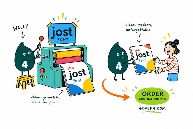
Jost is free, sharp, and easy to overuse. Wally's shortcut: choose the weight from viewing distance first, step up one weight on uncoated or clear stock, and cap all caps tracking at plus 60. Then print one real proof before the full run. A screen will never show you what an 8pt line looks like after ink spreads on paper, and a proof costs a fraction of a reprint.
Order clear plastic cards →Type Decisions Worth Remembering
Guides
More reading on type and identity
Retro and free seasonal faces for when Jost reads too neutral, plus two branding reads on running one type system from an 8pt card line to a 300pt poster.
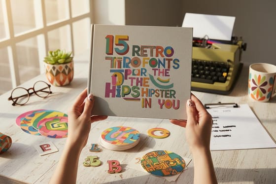 Guide 15 Retro Fonts Worth Downloading Display faces with more personality than a clean geometric sans.
 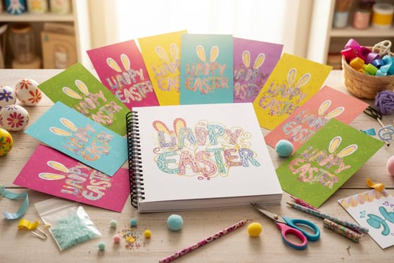 Guide 15 Free Seasonal Fonts Free type for campaign work when Jost is too neutral.
  Guide Affordable Branding Strategies Build an identity on a budget, starting with free type.
  Guide 50 Corporate Identity Examples See how mature brands handle a single type system.
 Explore more
More branding and type reading across 4OVER4.COM
Branding reads for packaging, restaurants, storefronts and nonprofits, where one typeface has to hold on a menu, a sign and a label.
Article 15 Retro Fonts for the Hipster in You Character heavy display faces to contrast with Jost. Article 15 Easter Inspired Free Fonts Free seasonal type you can license for print. Article Affordable Small Business Branding Seven moves that build an identity without an agency. Article Corporate Identity and Branding Fifty identity systems worth studying before you design.  Article Product Branding Strategies Naming, packaging, and identity decisions in one place.
  Article Restaurant Branding Guide Menus and signage, where geometric type gets tested.
 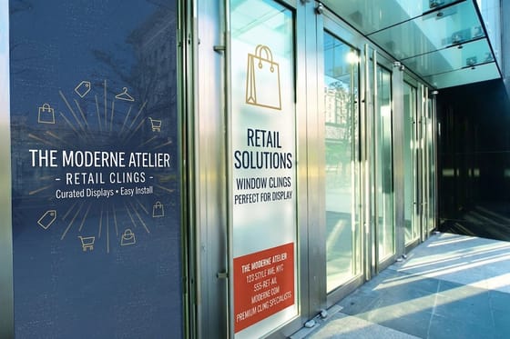 Article Store Branding Ideas Storefront and in store applications for a type system. Article Nonprofit Branding Do and Do Not Clear, trustworthy identity work on a tight budget.
 Ready to see your type on something real?
Set your wordmark in Jost, pick the surface that tests it hardest, and let a printed proof settle the argument.
Jost Font Questions, Answered
Is Jost available in Canva?
Jost is a Google Font, and browser design tools carrying the Google library usually list it, though what any one tool offers can change without notice. If you cannot find it, upload the font file, which most tools allow on their paid tiers. For print work the safer route is to build the file with the font installed locally and export a PDF with the fonts embedded.
Is Jost a good font for a logo?
It is a strong choice for a logotype, because geometric letters hold their shape at any size and stay readable reduced to an app icon or blown up on a banner. The caution is that it is free and widely used, so the wordmark needs something of its own, custom spacing, a redrawn letter or a mark beside it. A logo that is only the brand name typed in a default weight will look like other logos using the same font.
How do we make sure everyone uses the same Jost file?
Pin a version and keep that file in the brand folder rather than letting each person download their own. Jost has been revised more than once, and spacing and character coverage changed between releases, so two designers on different versions produce layouts that do not match. Record the version number next to the file and hand both over with the artwork.
What is the Jost font?
Jost is an open source geometric sans serif drawn by Owen Earl and released under the SIL Open Font License, which makes it free to use in commercial logos, packaging, and printed signage. It follows the 1920s German geometric tradition, so letters are built from circles and straight lines with near uniform stroke weight and a single story lowercase a. The family ships as a variable font spanning Thin through Black with a matching italic, which is enough range to build a full brand system from one file.
How do I choose the right Jost weight for my project?
Start from viewing distance and surface. Display work above 24pt handles Semibold or Black comfortably. Signage read from across a room does better at Semibold than Bold, because heavier weights close the counters and the word loses its silhouette. Anything under 10pt should step up to Medium, especially on uncoated or absorbent stock where ink spread thickens every stroke. Light and Thin belong in large sizes on coated stock and nowhere else.
What does printing with Jost cost and how are prices set?
The font itself costs nothing, so your budget goes entirely into the printing. Prices at 4OVER4.COM are driven by product, size, stock, quantity, and turnaround rather than by any design choice, so switching to Jost never changes a quote. As live reference points, 2 Sided Blockout Banners start at $108.75, a 3 in 1 Foldable Wireless Charger starts at $15.00, and 30mil Clear Plastic Cards start at $529.26. Every product page shows the full quantity ladder, and unit cost drops as the run grows.
What sizes, stocks, and finishes work best for Jost?
Coated gloss and matte stocks are the easiest home for a geometric sans, because minimal dot gain lets lighter weights keep their shape down to around 8pt. Uncoated and kraft need one extra weight step and a little added tracking. Clear plastic needs Medium or heavier, or a white ink layer under the type, since there is no white base to hold density. For large format, vinyl and mesh handle display sizes well but lose detail below roughly 24pt. Our banner and card configurators list every available size and finish.
How long does printing and shipping take?
Turnaround depends on the product and the finish you select, and every option shows its production window in the configurator before you check out. Simple flat items on standard stock move fastest. Specialty work such as clear plastic cards, blockout banners, and branded hard goods needs extra production days, and shipping time is added on top of production time. Pick your turnaround early rather than at checkout, because it changes the price as much as quantity does. Related reading on planning a rollout sits in our small business branding strategies.
