
Corporate Poster Design Ideas for Lobbies, Events, and Recruiting Walls


A corporate poster works when it carries one idea, sized for the distance people actually stand from it, and mounted so it can be changed before it goes stale. That means roughly one inch of capital height per ten feet of viewing distance, one accent color used two or three times, matte stock under overhead lighting, and a frame or hanger bar chosen by how often the sheet has to change.
Corporate poster placements at a glance
| Placement | Reader distance | Headline cap height | How much copy | Mounting |
|---|---|---|---|---|
| Reception or lobby wall | 10 to 15 ft | 1 to 1.5 in headline caps | One idea, the company name, no body copy | Hanging poster display or a framed print |
| Corridor and lift lobby | 4 to 8 ft | 0.5 to 0.8 in headline caps | Headline plus three supporting lines | Wood poster hanger frame |
| Event booth backwall | 8 to 20 ft | 1.5 in caps and larger | Brand mark and one offer | Hanging poster display |
| Event table and handout wall | 2 to 4 ft | 0.3 in caps | Detail, pricing, a QR worth scanning | Flat print plus stickers |
| Recruiting or careers board | 3 to 6 ft | 0.5 in caps | Role, location, one reason to apply | Swappable hanger bar |
Measure the real distance before you set the type, because a lobby reads at three times the distance of a careers board and the same layout cannot serve both. You can order a hanging poster display for the large formats or a wood hanger frame for sheets that change often.
What a corporate poster has to do that a flyer never does
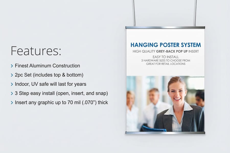
A corporate poster has one job: land a single idea on someone who is walking past and not planning to stop. A flyer is held at arm’s length and read; a poster is glanced at from across a room, so the headline either survives that distance or the whole sheet is wallpaper.
The distance is the design brief. Signage practice puts it at roughly one inch of capital letter height for every ten feet of viewing distance, which means a headline read from twelve feet needs caps a little over an inch tall. On a 24 by 36 inch sheet that is a headline of six or eight words, not a paragraph. Most corporate posters fail here, before color or photography enters the conversation.
The second thing to settle is what happens after the glance. A poster that carries no next step is decoration. A poster that carries a QR code sitting seven feet up the wall is worse, because people try, fail, and stop trusting your codes. If you want a full walkthrough of the layout stage, our eight-step poster design guide takes it from brief to print file.
Size the poster to the wall, not to the file
Corporate walls settle into a few sizes. 24 by 36 inches is the lobby default because it holds a headline at lobby distance without dominating the room. 18 by 24 inches suits corridors and lift lobbies where people stand closer. 11 by 17 inches is a notice, not a poster, and it belongs on a board rather than a feature wall.
Pick the size before the layout, because a design that was set for 18 by 24 and then scaled to 24 by 36 usually ends up with a headline that is technically large and still weak, since everything grew with it. Our guide to poster sizes for walls lays the standard sizes against the distances they actually work at.
The height that decides whether a QR code gets used
If the poster carries a code, keep it between roughly four and five and a half feet from the floor, which is where a standing adult can hold a phone comfortably without stretching or crouching. Print it at least an inch square, on a plain background, with quiet space around it.
Point it at something specific: the role being advertised, the event agenda, the calculator, the booking page. A code that lands on a homepage teaches everyone in the building that your codes are not worth the effort.
Poster ideas that work on a lobby wall
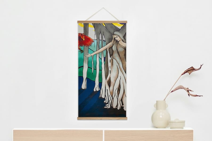
A lobby set is usually two to four posters seen together, and the set matters more than any one sheet. Give them one grid, one type family and one accent color, and the wall reads as a company rather than as four separate projects.
These are the directions that hold up in reception spaces. Each one is cheap to test, because the mounting is reusable: a wood poster hanger frame starts at $32.75 and takes a new sheet in about a minute, and a hanging poster display at $53.83 gives you a larger format without drilling the wall.
Five layouts worth stealing
1. One number, one line. A single figure the company is proud of, set enormous, with one short line under it. It works because it can be read while walking and it gives a visitor something to ask about at the desk.
2. The value stated as a sentence. Not the word "Integrity" in 200pt, which says nothing, but the sentence behind it, written the way people talk. Values posters fail when they print the label instead of the meaning.
3. The timeline strip. Founding year to now, five marks across the sheet, dates in the accent color. It reads in three seconds from a distance and rewards a closer look, which is exactly what a waiting visitor does.
4. The photograph with one caption. A real photograph of the team or the work, full bleed, with one caption in a corner. Stock photography reads as stock photography from twelve feet away, so use your own or use type instead.
5. The map. Offices, clients or coverage plotted on a plain map. It answers the question every visitor silently has about how big you are, without a paragraph of copy.
Brand color, used the way brand color survives
Hold the accent to one color and let it appear two or three times per sheet, not everywhere. A poster that uses the full brand palette at full strength turns into noise at distance, because nothing is dominant and the eye has nowhere to land first.
Keep the background either close to white or close to black and put the contrast into the headline. If your corporate palette is mid-tone, that is exactly the case where you tint it back for the field and keep it full strength for the type. For the wider system that the posters sit inside, our corporate design guide covers how the palette, type and marks hold together across formats.
Event posters that still work at the tenth hour
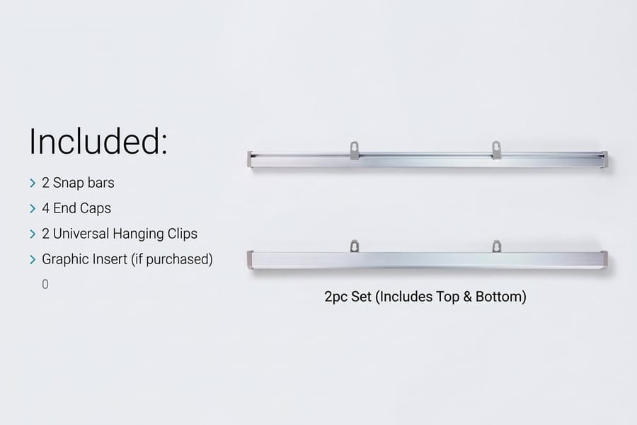
Event posters are read in worse conditions than anything else you print: crowded aisles, mixed lighting, people moving, competing booths either side. The design consequence is simple. Fewer words, larger type, and the brand mark high enough to clear the heads of the people standing at your table.
Split the wall into two zones. The high zone, above roughly five feet, carries the brand and one offer and is designed for eight to twenty feet of distance. The low zone, at table height, carries detail, pricing and a code, and is designed for two feet. Trying to make one layout do both is why so many booth graphics read as busy from far away and thin up close.
What people take away from the wall
Nobody carries a poster home, so give the wall something detachable. Standard promotional and events stickers at $23.88 are the cheapest way to do it, and premium promotional and events stickers at $29.16 use a heavier stock and finish when the sticker is meant to end up on a laptop rather than in a bin.
Design the sticker as a fragment of the poster, not a shrunk copy of it. The mark, the accent color, one word. A sticker that tries to carry the full message is unreadable at sticker size and gets left on the table.
Print the campaign once, in a set
Booth backwall, table sign, handout, sticker: print them in one order so the color matches across the set. Two orders placed a fortnight apart on different stocks will not match under booth lighting, and the mismatch reads as carelessness from the aisle.
If the event repeats, keep the layout and change only the year and the offer. The campaign-poster approach in our campaign poster guide transfers directly, and there are more visual directions in our roundup of creative poster ideas.
Recruiting walls, where most corporate posters fail
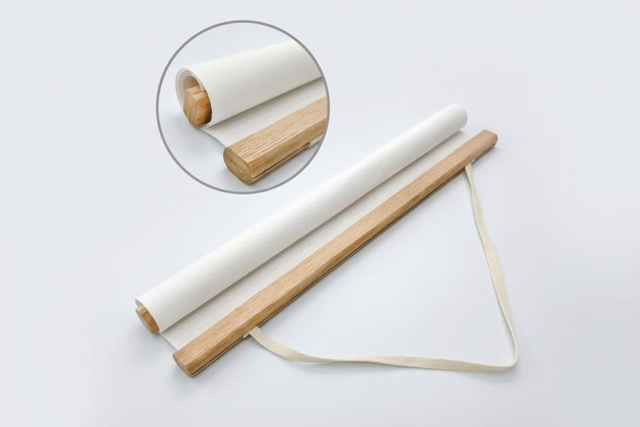
Recruiting posters go stale faster than anything else on a corporate wall. The role gets filled, the intake closes, the salary band moves, and a poster advertising a closed job quietly tells every candidate that nobody in the building is paying attention.
So design for replacement. One fixed frame, one fixed layout, and a single changeable block: role, location, and one honest reason to apply. Printing short runs of a swappable sheet costs less over a year than one bulk order that becomes wrong in March, and a hanger frame makes the swap a one-person job.
Say something a candidate cannot get from the job board. The team size, the shift pattern, who they would report to, whether the role is on the floor or at a desk. Generic encouragement is what every other careers poster already says, and it is the reason people walk past them.
The trade-off between frames and hanger bars
A glazed frame protects the sheet, looks the most finished, and makes changing the poster a slow two-person job that nobody wants to do, so the poster stays up past its date. A hanger bar leaves the sheet exposed, so edges can curl in a humid lobby and the print takes fingerprints, and it lets one person swap the sheet in a minute.
For anything with a date on it, the hanger bar wins on the thing that actually matters. Keep glazed frames for the permanent set: the values, the map, the timeline. A hanging poster display sits between the two, holding a large sheet flat without wall fixings.
Mounting prices and specs at 4OVER4.COM
The sheet is only half the job. What holds it decides whether the poster stays flat, whether it survives a humid lobby, and how likely anyone is to replace it when the date passes. The numbers below come from the live configurator.
Quantity and price
Hanging poster display pricing and specs
Real configurator numbers, where the per unit cost drops as the run grows.
| Quantity | Price Per Unit | Total |
|---|---|---|
| 1 | $53.83 | $53.83 |
| 2 | $53.82 | $107.64 |
| 3 | $53.82 | $161.47 |
| 4 | $49.16 | $196.62 |
| 5 | $49.43 | $247.15 |
| 6 | $49.25 | $295.47 |

You can also earn coins on every order and redeem them against future printing, which matters when a recruiting wall is reprinted several times a year.
Stock, finish, and how they behave on a wall
Heavier stock hangs straighter. A light sheet in a hanger bar ripples along the free edge within a week in an air-conditioned lobby, and the ripple catches the overhead light, which is the thing a visitor notices before they read anything. Finish is the second decision: matte for anything lit from above, gloss only when the poster is photography-led and lit from the front or the side.
Print it
A frame that makes swapping easy
One person, about a minute, no wall fixings to undo.

Think about the room, not the sample. A poster approved under a desk lamp will be seen under ceiling lighting at a shallow angle, and the two look nothing alike. Tape a proof in the real position, at the real height, and stand where visitors stand. For files that need to be sharp at large sizes, our guide to poster templates that print sharp covers resolution, bleed and the trap of scaling web images up.
Choosing the approach for your industry
Different workplaces read posters in different conditions, so the sensible starting point changes by sector.
- Professional services. A permanent lobby set of three: one number, one map, one photograph. Framed, changed once a year, printed as one order so the color matches across the wall.
- Manufacturing and logistics. Safety and shift information at corridor distance, headline caps around half an inch, plus one recruiting sheet in a swappable hanger bar near the entrance.
- Technology companies. Event backwalls in the high zone and detail in the low zone, with stickers as the takeaway, because a sticker is the one piece of print that survives a conference bag.
- Healthcare and clinics. Matte stock, since waiting-room lighting is overhead and gloss throws glare at seated eye level. Wayfinding first, brand second.
- Retail head offices. Campaign posters printed in short runs and rotated with the season, using one grid so a year of posters still reads as one brand.
Where to get a blank at the wall size
If you are not starting from a blank page, templates save the setup. 4OVER4.COM sizes its blanks to exact product specs, so your artwork lines up with the cut lines and the bleed. Grab a print-ready blank from the blank template library with bleed and trim already marked, and there are seasonal layouts worth borrowing in our poster and flyer ideas roundup.
Start fast
Where to get a blank at the wall size
Poster blanks at each wall size, with the headline area already sized for viewing distance.
Wally sizes the headline from the doorway
Design for the distance, then pick the mounting
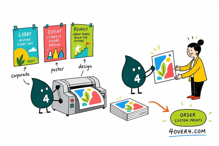
Allow about one inch of capital height for every ten feet of viewing distance, keep one idea per sheet, and hold your accent color to two or three appearances. Print matte for lobbies lit from above, keep QR codes between four and five and a half feet off the floor, and mount anything with a date on it in a hanger frame so it takes a minute to replace.
Order poster displays →What a lobby poster has to survive
Design tips that hold at every size
- Stand where the reader stands. Print a proof, tape it up, and walk to the door before you approve anything. Every failed corporate poster was approved on a screen at desk distance.
- One idea per sheet. If the poster needs two headlines it is two posters. A wall of four single-idea posters outperforms one crowded sheet every time.
- Matte for overhead light. Lobbies and corridors are lit from above, and gloss returns that light straight to standing eye height. Matte holds up at more angles.
- Keep the bottom six inches quiet. Furniture, plants and reception desks eat the bottom of a poster. Put nothing there that has to be read.
- Set a date rule before you print. Decide up front which posters are permanent and which get replaced, then buy the mounting to match. That one decision prevents most stale walls.
Explore more
More ways to print and mount your posters
A hanging poster display is $53.83 and takes 4 business days, which is what a changeable wall costs.
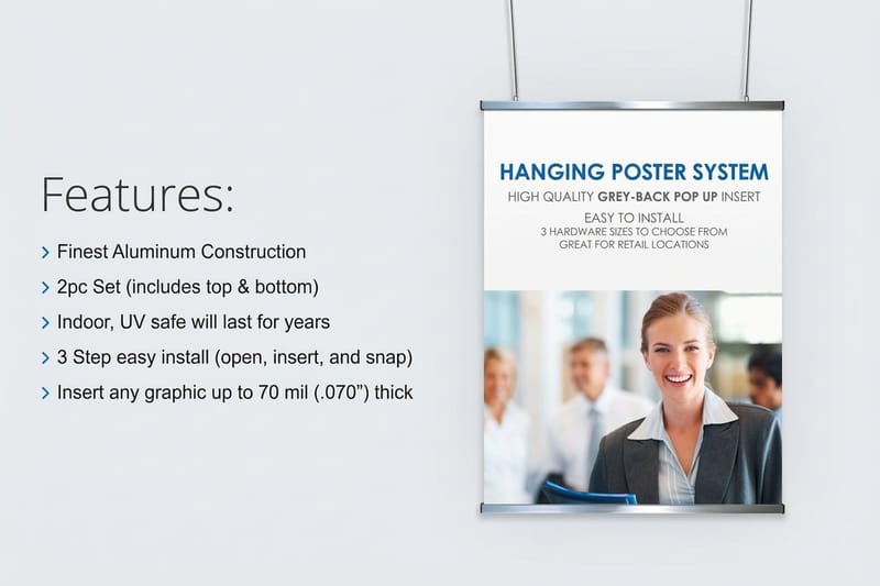 Product Hanging Poster Displays Hold a large poster flat without drilling the wall.
 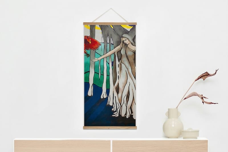 Product Wood Poster Hanger Frame Swap a dated sheet in about a minute, on your own.
 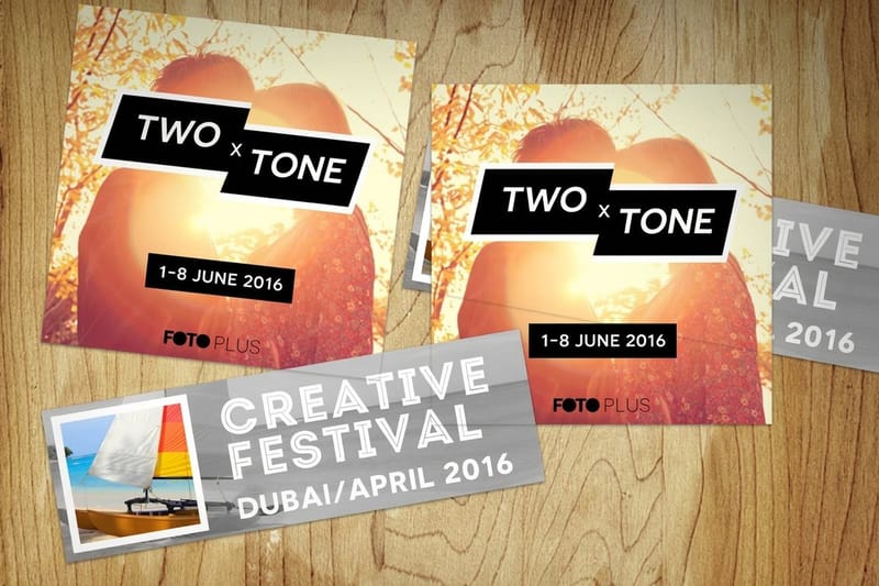 Product Premium Promotional Stickers The takeaway that ends up on a laptop, not in a bin.
 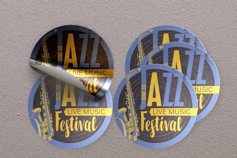 Product Standard Promotional Stickers Cheapest way to give an event wall something detachable.
  Guide Poster Sizes for Walls Standard sizes against the distances they work at.
  Article 15 Creative Poster Ideas Visual directions to borrow for your next print run.
 Ready to print the wall?
Pick your size, drop in your artwork or a free template, and 4OVER4.COM prints it sharp and ships the mounting with it.
Common questions about corporate posters
What size should a corporate lobby poster be?
24 by 36 inches is the working default for a reception or lobby wall, because it holds a headline that reads from ten to fifteen feet without taking over the room. Drop to 18 by 24 inches for corridors and lift lobbies where people stand within eight feet, and treat 11 by 17 inches as a notice for a board rather than a feature wall. Choose the size before you start the layout. A design set at 18 by 24 and scaled up later usually ends with a headline that is bigger in absolute terms and no stronger, because every other element grew with it.
How big does the headline type need to be?
Use roughly one inch of capital letter height for every ten feet of viewing distance. A poster read from twelve feet needs headline caps a little over an inch tall, which on a 24 by 36 inch sheet allows about six to eight words. The practical test costs nothing: print a proof, tape it in the real position, and walk to the point where people actually enter the room. If you cannot read the headline while still walking, the type is too small no matter what the file says.
Should corporate posters be printed gloss or matte?
Matte for almost every indoor corporate wall. Lobbies, corridors and waiting rooms are lit from above, and a gloss surface returns that light straight into the eyeline of someone standing in front of it, so the headline disappears behind a hotspot at exactly the distance it needs to work. Gloss earns its place when the poster is photography-led and lit from the front or the side, where the extra color depth shows and the glare does not. If you are unsure, matte is the safer default indoors.
How do I keep recruiting posters from going out of date?
Design one fixed layout with a single changeable block for the role, the location and one reason to apply, then mount it in something that swaps quickly. A wood poster hanger frame at $32.75 lets one person change the sheet in about a minute, so nobody puts off the job. Print short runs rather than chasing the bulk price, because a stack of posters advertising a role that closed in March costs more in credibility than it saved per sheet.
What should go on an event booth poster versus the table?
Split the wall by height. Above roughly five feet, carry the brand mark and one offer, sized for eight to twenty feet of viewing, because that is what people read while walking the aisle. At table height, carry the detail, the pricing and a QR code, sized for two feet. Give people something to take away as well, since nobody carries a poster home. Promotional and events stickers start at $23.88 and work best when the sticker is a fragment of the poster, the mark and one word, rather than a shrunken copy of the whole layout.
More frequently asked questions →
Keep reading: Earth Day poster ideas, calendar design ideas, and the full article library.
