
Event Poster Examples and Design Ideas for Every Type of Event


Tobias is our voice for cutting, binding and large format, built from the knowledge of our production team, with over 20 years in printing.
A good event poster lands three facts at walking pace: what the event is, when it happens, and where. The event type decides which of the three goes first, and that ordering is the difference between the examples below. A concert leads with the headliner, a fundraiser leads with the cause, a festival leads with the lineup, and a grand opening leads with the offer.
Event poster formats at a glance
| Event type | Size that works | Reading order | Where it hangs | Product at 4OVER4 |
|---|---|---|---|---|
| Concert or club night | 11 x 17 or 18 x 24 in | Headliner name, then the date, then the venue | Bulletin boards, bar windows, record shops | Concert Posters |
| Fundraiser or gala | 18 x 24 in | The cause, then the ask, then the date | Lobbies, offices, places people stand still | Matte Posters |
| Festival or multi-day lineup | 24 x 36 in | Festival name, then the lineup block, then dates | Street poles, outdoor stands, campus kiosks | Laminated Posters |
| Grand opening | 24 x 36 in on an easel | The offer, then the opening date, then the address | Sidewalk easels, storefront windows | Foam Core Posters |
| Conference or awards night | 18 x 24 in, framed | Event name, then the schedule, then the sponsors | Hotel lobbies, registration desks | Framed Posters |
Measure the distance people will read from before you set the size, because the type height decides the sheet and not the other way round. An 11 x 17 inch sheet suits a bulletin board read at arm's length, while a street pole needs 24 x 36 inches. You can order concert posters in any of these sizes, from 11 x 17 up to 24 x 60 inches, straight from the configurator, or browse the full range on posters and wall art.
What an event poster has to do before anyone stops walking

A poster gets read on the move. Someone walks past a window, a pole or a corkboard, and in that moment the sheet either lands three facts or it lands none. Those facts are always the same: what the event is, when it happens, and where. The design work is deciding which of the three goes first, and that decision changes with the event.
Type size is the mechanism, and sign shops size it by a rule of thumb: roughly one inch of letter height for every ten feet between the poster and the reader. A poster on a bar wall is read from about ten feet, so a one inch headline works. A festival poster on a pole is read from thirty, so the festival name needs to be nearer three inches tall, and everything else on the sheet has to shrink to make room.
Most weak event posters fail the same way. Four elements are set at almost the same weight, so nothing wins, and the reader gets none of the three facts instead of one. Pick the single element that has to survive at walking pace, set it two or three times larger than anything else, and let the rest fall into a clean second and third tier. Our step by step poster design guide works through that hierarchy in order.
The three tiers, in the order people read them
Tier one is the hook, and it is whatever makes a stranger care: a headliner name, a cause, a festival brand, an opening offer. Tier two is the commitment, meaning the date and the time. Tier three is the logistics, meaning the venue, the address, the ticket link and the sponsors.
Tier three is where posters get crowded. Sponsor logos and small print pile up along the bottom until they eat a third of the sheet. Give that band a fixed height before you start placing anything in it, and hold the line. If the logos will not fit at a legible size, they belong on the program or the ticket, not on the poster.
Where the QR code should actually sit
Put the code at eye level, not in a top corner. A poster hung at head height puts its top corner above most people, and a code you have to reach up to scan does not get scanned. Keep it at least three quarters of an inch square, leave the quiet zone clear of artwork, and point it at the ticket page rather than a homepage.
Print one at full size and tape it where the poster will live before you order the run. Scanning your own code from the actual distance takes a minute and catches the two problems that never show on screen: a code sized for a phone screenshot, and a headline that looked huge on a laptop and reads as small print on a wall.
Examples by event type, and why each one works
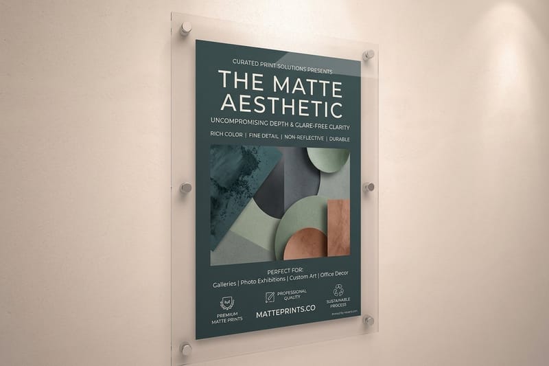
The four event types below cover most of what gets printed. Each one puts a different fact in tier one, and each one lives in a different place, which is what decides the stock. Read them as patterns to borrow rather than layouts to copy.
None of them are expensive to test. Concert posters and matte posters both start at $25, which is inside the budget of a single night, and the full range sits on the poster printing category page.
Concert and club night posters
The headliner name is tier one, set large enough to read from the far side of a room, usually as type rather than as a photograph. Support acts drop to roughly a third of that height, and the date sits directly under the block so the eye does not have to hunt for it. The classic mistake is a beautiful full bleed photograph with the date reversed out in thin white type across a busy area of the image, which disappears at any distance.
These live indoors, on bar walls, record shop windows and corkboards, so gloss is the right call. It lifts saturated artwork and deep blacks, and the glare that gloss brings does not matter much on a wall lit by ordinary room light. Print 11 x 17 inches for corkboards and 18 x 24 inches for windows, and expect to lose a strip along the top to staples.
Fundraiser, gala and benefit posters
Here the cause goes in tier one and the event name goes second, because nobody attends a gala for the word gala. A line that states plainly what the money does, set as the largest thing on the sheet, outperforms an elegant logo lockup every time. Under it, the ask: the ticket price, the table price, or the deadline to sponsor.
Fundraiser posters hang in lobbies, offices and corridors where people stand still and read at arm length, which changes the finish decision. Matte posters are the better fit because they take no glare from overhead office lighting and hold small type cleanly. You give up a little depth in the blacks compared with gloss, and at reading distance nobody notices.
Festival and multi-day lineup posters
The lineup block is the whole design. Set the headliners at one size, the second tier at about half, and the rest as a justified block of equal weight, then keep the vertical rhythm identical between rows. That grid is what makes a wall of names look like a festival instead of a list. Dates and the city sit above or below the block, never inside it.
These go outside on poles, fences and kiosks, so the stock has to survive weather. Laminated posters take rain, hands and tape without the surface breaking down, and the laminate is what you are paying the extra for. Print 24 x 36 inches, and set the festival name near three inches tall so it still works from across a street. If the poster will be zip tied to a pole, keep the top and bottom two inches clear of anything you need to read.
Grand opening and retail launch posters
The offer is tier one, not the store name. Ten dollars off, free coffee all day, the first fifty customers: that is what stops a person on a sidewalk. The store name comes second and the date third, which feels backwards to most owners and works better on the street.
Foam core posters start at $49.99 and stand on an easel without a frame, which is why they beat paper for a sidewalk or a doorway. The limits are real. The corners dent if the board gets knocked, and any breeze will take an unweighted board over, so weight the easel or bring it inside when the wind picks up. For a launch that runs a week, print two and swap the damaged one.
How many posters one event needs
Most organizers print too many of one size and too few of the right one. Work backwards from the places on your list. Count the venues that will genuinely take a poster, add one spare for each because they get damaged or taken down, and that number is your run.
A single show in one venue rarely needs more than a couple of dozen sheets. A festival running across a district needs a larger outdoor size in smaller numbers, plus a stack at 11 x 17 inches for indoor boards, because the boards are where a run gets used up. Short runs also let you fix the first version, and the fix is nearly always the same one. The headline was too small and the date was buried in the artwork.
Sizes, stocks and what each event should print
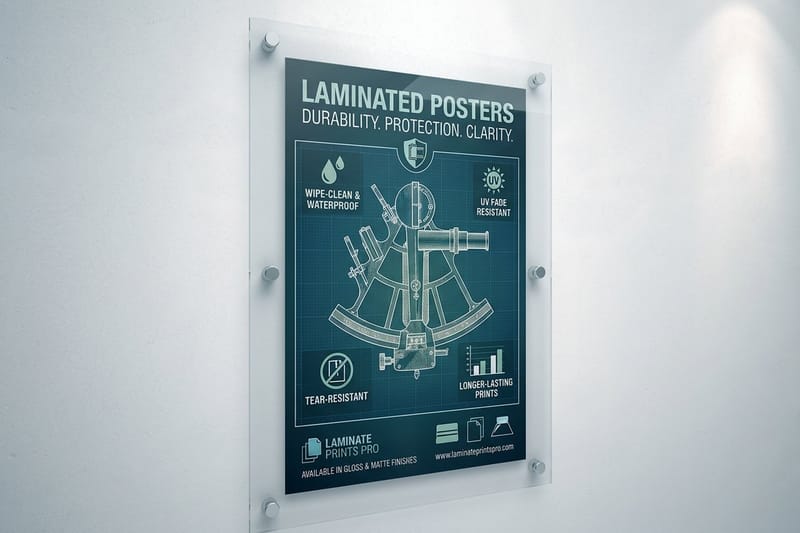
Three choices decide what an event poster costs and how long it survives: the size, the stock, and whether it gets a laminate. Everything else is artwork.
Size follows reading distance rather than budget. Indoors at ten feet, 11 x 17 inches is enough. In a window read from a sidewalk, 18 x 24 inches. On a pole or a stand read from across a road, 24 x 36 inches. Going a size up costs less than reprinting a run that nobody could read, and the poster sizes in inches guide lists every standard dimension with its usual use.
Stock is the durability decision. Paper is right for anything indoors that comes down after the event. Laminate is right for anything that meets rain, wind or repeated handling. Rigid board is right for anything that has to stand up by itself. A conference or awards night sits in its own category, because a framed poster at $87.86 gets reused in the lobby afterwards instead of being recycled on Monday.
Setting the file up so it prints as designed
Build the artwork at final size with 0.125 inch of bleed on every edge, and keep anything you need to read at least a quarter inch inside the trim. Large-format posters are the one place you can relax resolution: 24 x 36 inches at 150 DPI prints cleanly, because the viewing distance does the rest. At 11 x 17 inches, stay at 300 DPI, since that one does get read close up. Our bleed and trim explainer and the image resolution guide cover both settings.
Convert to CMYK before you export and check the deep blacks. A rich black built from all four inks looks different from a single black plate, and on a large flat area the difference is visible from across the room. If the poster hangs beside another printed piece from the same campaign, print both together so the color match is made on one press run.
Where event posters actually get seen
A poster only works where the right people already walk, and for most events that is a short list. The venue takes the first stack, since everyone inside it is already the audience for the next show. Independent cafes, record shops, bookshops and bike shops keep community boards and generally say yes if you ask the person behind the counter rather than pinning one up and leaving.
Universities and libraries have boards with rules and a stamp, and the rules are usually posted beside the board. Street poles and hoardings are the ones to check before you print, because plenty of towns set their own rules about what can go up and for how long, and a run stripped on day two is money gone. Windows of businesses that share your audience are the best of the lot, and a laminated sheet is what survives the sun behind glass.
Poster pricing and specs at 4OVER4.COM
An event poster at 4OVER4.COM starts at $25 for a concert or matte poster, $49.99 for a foam core board that stands on an easel, and $87.86 for a framed poster a conference can hang in its lobby afterwards. Paper posters print on 10mil semi gloss by default, in any size from 11 x 17 to 24 x 60 inches, with a 2 business day turnaround. The table below comes from the live configurator, so you can price one show or a whole season before you commit a design.
Quantity and price
Poster pricing and specs
Real configurator numbers on matte poster stock, where the more you order the lower the per unit cost drops.
| Quantity | Price Per Unit | Total |
|---|---|---|
| 1 | $25.00 | $25.00 |

You can also earn coins on every order and redeem them against the next print run, which helps when a season of shows means a poster every few weeks.
Paper stock and finish, how they work with size
Stock and location work together. A paper poster zip tied to a pole in October is pulp by the second week of rain, while the same artwork on a laminated sheet is still readable at the end of the run. The default 10mil semi gloss paper suits anything indoors that comes down after the event. A laminated stock, with 3 mil gloss or matte lamination on one side or both, is what survives weather and handling, and 7mil weatherproof polypropylene holds up longer on an outdoor pole. A rigid board is what stands up by itself on a sidewalk.
Print it
Concert posters, ready to hang
Preset sizes on gloss poster stock, the fastest way to get a show on a wall.
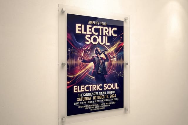
Finish changes both look and readability. Gloss lifts colour and photography, which is why band artwork almost always prints on it, and it throws glare under a spotlight. Matte reads calmer, kills reflections from overhead lighting and holds small type, which is what a fundraiser poster in a corridor needs. Laminate sits over either one and takes the abrasion instead of the ink. If the poster has to go on a wall without damaging the paint, the guide to hanging posters without a frame covers the mounting options that come off cleanly.
Choosing the right poster for your event
Different organizers have different constraints, so here is the short version by who is printing.
- Venues and promoters. Concert posters in 11 x 17 for corkboards and 18 x 24 for windows, gloss finish, headliner name in tier one. Print short runs per show rather than one big run for the season.
- Nonprofits and charities. Matte at 18 x 24 for lobbies and corridors. Lead with what the money does, not with the event name, and keep the sponsor band to a fixed height.
- Festival organizers. Laminated at 24 x 36 for poles and outdoor stands, with the lineup block on a strict grid and the top and bottom two inches kept clear for ties.
- Retail and hospitality openings. Foam core at 24 x 36 on a weighted easel, offer first, plus a matching window run on paper so the street and the glass say the same thing.
- Conference and awards organizers. Framed posters at the registration desk and in the lobby, because they get reused after the event instead of thrown away with the signage.
If the poster is one piece of a wider push, pair it with the handouts and signage in promotional materials for events, and keep a stack of event flyers at the door so the poster has something to hand people. For more layouts to steal from, 21 event posters that inspire runs through a wider set of examples.
Templates and print-ready blanks
If you are not starting from scratch, poster templates save the setup. 4OVER4.COM sizes its blanks to each poster size it prints, from 11 x 17 to 24 x 60 inches, with the 0.125 inch bleed already marked, so your artwork lines up with the cut lines. Grab a print ready blank from the blank template library before you open the artboard.
Start fast
Templates and print-ready blanks
Poster design templates and exact size blanks so your artwork lands inside the cut line.
Wally sizes the headline before anything else
Let the reading distance pick the poster, not the budget
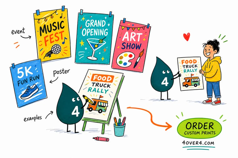
Allow about one inch of letter height for every ten feet a reader stands away, then pick the sheet that fits it: 11 x 17 inches indoors, 18 x 24 in a window, 24 x 36 on a pole. Build at final size with 0.125 inch bleed, keep readable content a quarter inch inside the trim, and 4OVER4.COM prints it on gloss, matte, laminated or rigid board.
Order event posters →What to remember about event posters
Design tips that work at every size
- Size type to the distance. About one inch of letter height for every ten feet a reader stands away. Measure the real distance before you set the headline, not after.
- One element wins. Set tier one two or three times larger than anything else. Four elements at similar weight is the most common reason an event poster reads as noise.
- Fix the sponsor band first. Decide how much of the sheet the small print gets before you place a single logo in it, then keep every logo legible or move them to the program.
- Tape a full-size proof to the wall. Print one, put it where the poster will hang, and walk past it at normal pace. Everything that fails, fails right there, for the cost of one sheet.
- Match the finish to the light. Gloss under a spotlight throws glare into the reader eyes. Matte under office lighting stays readable. Laminate is for weather, not for looks.
Explore more
More ways to print and promote
Related products and categories on 4OVER4.COM, one card each, so you can keep planning the campaign.
Product Concert Posters Gloss stock for indoor walls, windows and corkboards. Product Matte Posters Low glare finish for lobbies and corridors. Product Laminated Posters Sealed surface for poles, fences and weather. 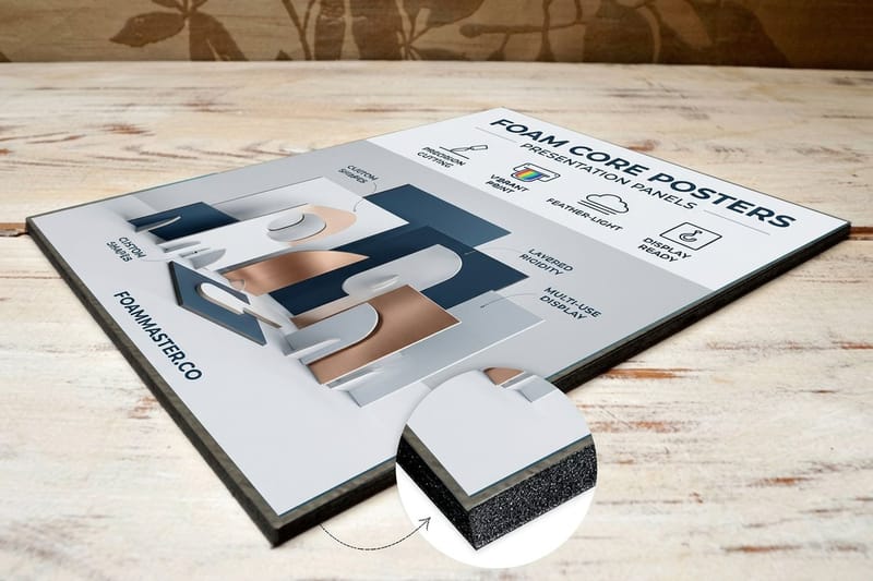 Product Foam Core Posters Rigid board that stands on an easel without a frame.
  Product Framed Posters Lobby and registration desk pieces you reuse.
  Category Poster Printing Every poster size, stock and finish in one place.
 Ready to print your event posters?
Pick the size the reading distance calls for, drop in your design or a free template, and 4OVER4.COM prints it sharp on gloss, matte, laminated or rigid board, as fast as the show date needs.
Common questions about event posters
How far in advance should event posters go up?
Three to four weeks before the date for most events, with a second wave in the final week to replace the sheets that have come down. Earlier than a month and people note it and forget it. Later than two weeks and anyone who has to arrange a night out has already made other plans. Print both waves in one run, since a second short run costs more per sheet than the spares would have.
Can I use the same artwork for the poster and for social media?
The elements carry across, the layout does not. A poster is built to read from across a room in portrait, and a phone screen is a small square or landscape held at arm's length. Rebuild the layout at the new proportions, make the headline much larger relative to everything else, and drop the small logistics type, which nobody reads on a screen anyway.
What should happen to the posters after the event?
Take them down in the week after. Whoever let you put a poster up will let you do it again if the last one did not sit there for two months past the date. Paper posters go in the recycling and laminated ones do not, which is a reason to keep the laminate for the outdoor sheets that need it rather than using it across the whole run.
What size should an event poster be?
Pick the size from the distance people read it at. Indoors on a corkboard or a bar wall, 11 x 17 inches is enough. In a shop window read from the sidewalk, 18 x 24 inches. On a street pole, a fence or an outdoor stand, 24 x 36 inches. The check is the type, not the sheet: allow about one inch of letter height for every ten feet of viewing distance, and if your headline cannot reach that height at the size you picked, go up a size. Poster sizes step up in standard dimensions, so the jump usually costs less than reprinting a run nobody could read.
Should an event poster be gloss, matte or laminated?
Gloss for indoor walls and windows, because it lifts saturated artwork and deep blacks, and the glare it brings does not matter in ordinary room light. Matte for lobbies, offices and anywhere lit from overhead, because it takes no glare and holds small type cleanly, at the cost of a little depth in the blacks. Laminated for anything outdoors, since the laminate is what survives rain, tape and handling. Laminate costs more per sheet than the paper under it, so use it where weather is real rather than as a default upgrade.
What has to go on an event poster?
What the event is, when it happens, and where. Everything else is optional, including the sponsor logos, the artwork credit and the social handles. Rank those three by event type: a concert leads with the headliner, a fundraiser leads with the cause, a festival leads with the lineup, a grand opening leads with the offer. Add a ticket link or a QR code at eye level, keep it at least three quarters of an inch square with the quiet zone clear, and point it at the ticket page rather than a homepage.
What resolution do I need for a large event poster?
A 24 x 36 inch poster prints cleanly at 150 DPI at final size, because nobody stands six inches from a poster that big. An 11 x 17 inch poster does get read close up, so build that one at 300 DPI. Either way, work at final size with 0.125 inch of bleed on all four edges, keep readable content at least a quarter inch inside the trim, and convert to CMYK before you export so the deep blacks land the way you expect.
Can I print a different poster for each date or venue?
Yes, and it is worth doing when the venue or the date is the thing that sells the ticket. Build one layout with the venue line and date as the only variables, then order a short run per show instead of one long run for the season. Short runs also let you fix what the first poster got wrong, which is usually a headline that was too small or a date buried in the artwork. Concert posters start at $25, so several small runs cost less than most people assume.
