
18 Famous Logos and the Design Lesson Hiding in Each One


Sofia is our design and templates voice, built from the knowledge of our production team, with over 20 years in printing.
Why a Handful of Logos Became Impossible to Forget
You can draw the Nike swoosh from memory. You can picture the golden arches from a highway exit sign before you can read the words underneath. That is not luck and it is not budget alone. The most famous logos were built to be recalled by people who were not paying attention, which is almost everybody, almost all of the time. Your own mark faces the same test every time it goes out in print, on business cards handed across a counter, on a double sided blockout banner above a storefront, and on the printed card that travels with a ready-made wireless charger on a client's desk.
The useful part for a small business is that none of these marks depend on a huge media spend to work as drawings. Strip away the advertising and the swoosh is still a single confident stroke. The lessons transfer down to a one-person studio, a bakery, a contractor, a clinic.
The logos that keep reordering well share a pattern. They hold together at 3.5 by 2 inches on a business card, they hold together at eight feet on a banner, and they survive being printed in one flat color on a sticker. This article walks 18 famous marks, pulls one lesson from each, and ties every lesson to something you can actually print this week.
The four second test every famous logo passes
Show the mark for four seconds, take it away, ask someone to sketch it. If they can rough it out, the idea is simple enough to live in memory. If they draw a blob, the logo is carrying too many ideas at once and no amount of polish will fix that.
Copy the thinking, never the shape
Nobody needs a second swoosh. What is worth taking is the decision behind it: one gesture, one meaning, drawn so it works in a single color. Read the lessons below as decisions, not as visual references.
Start here
The card that tests your logo
Small format is where a weak mark shows every flaw, so print it first.

18 Famous Logos and the Design Lesson Behind Each One
Each entry below is one line about what the mark actually does, followed by the move you can borrow. None of them require a design degree. Most of them require the discipline to remove something you are attached to.
If you enjoy the trivia side of this, the companion piece on cool facts about logos you probably did not know goes deeper on the origin stories, and the principles of design explains the underlying rules these marks are all obeying.
- Nike. Carolyn Davidson drew the swoosh in 1971 as a single stroke of motion. Lesson: one gesture can carry the entire brand idea. Now apply it: draw your mark with the fewest strokes that still say what you do, then print it small on a card and see if it survives.
- Apple. A flat silhouette with a bite taken out, so it reads as an apple and not a cherry at small sizes. Lesson: add a detail only when it solves a recognition problem. Now apply it: test your mark at 16 pixels before you fall in love with it.
- McDonald’s. The golden arches came from the physical architecture of the restaurants before they became a letter form. Lesson: the strongest symbol is often already in your real world. Now apply it: look at your building, your tool, your product shape first.
- Coca-Cola. The Spencerian script has run essentially unchanged since 1886, when bookkeeper Frank Mason Robinson wrote it out. Lesson: consistency compounds, and reinvention resets the clock. Now apply it: lock one wordmark and refuse to redraw it every year.
- Amazon. The arrow runs from the a to the z and doubles as a smile. Lesson: a second meaning rewards the people who look twice. Now apply it: hide one honest idea in the mark, never two.
- Starbucks. The siren was cropped and simplified across decades until the wordmark was dropped entirely in 2011. Lesson: you earn the right to remove your name only after years of repetition. Now apply it: keep your name attached until people can name you without it.
- FedEx. Lindon Leader hid an arrow in the negative space between the E and the x. Lesson: the gaps in a logo are working surface, not leftovers. Now apply it: look at the counters and the spacing before you add another element.
- NASA. The 1975 worm reduced the agency to four letters with the crossbars removed from the A. Lesson: legibility can survive brutal reduction if the silhouette stays distinct. Now apply it: delete one feature and check whether anyone actually misses it.
- IBM. Paul Rand cut the letters into eight horizontal bars, turning a wordmark into a system. Lesson: a rule applied consistently is stronger than a picture. Now apply it: build your mark from one repeatable rule you can reuse across print.
The second nine lean toward restraint, color and reproduction, which is where most small business logos fall apart once they leave the screen and hit paper, vinyl and fabric.
- Prada. A plain serif wordmark, set quietly, with heraldic detail reserved for the crest. Lesson: restraint reads as confidence, and confidence reads as premium. Now apply it: if you want an upmarket feel, remove the gradient and the icon before you add anything.
- Target. A literal bullseye for a literally named brand. Lesson: when your name is a picture, draw the picture. Now apply it: stop searching for an abstract metaphor if your name already gives you one.
- Shell. The pecten scallop has been redrawn over generations, most famously by Raymond Loewy in 1971, but never replaced. Lesson: evolve the mark, do not restart it. Now apply it: refine your logo in small steps so equity carries forward.
- WWF. The panda was chosen partly because black and white printed cheaply and reliably. Lesson: design for the worst reproduction you will ever pay for. Now apply it: prove your mark in one flat ink before you approve the full color version.
- Chanel. Two interlocking Cs, perfectly symmetrical, endlessly repeatable. Lesson: a monogram works when the balance is exact. Now apply it: if you use initials, obsess over the overlap and the optical center.
- Toyota. Three overlapping ellipses that quietly contain the letters of the name. Lesson: geometry can hold a wordmark inside a shape. Now apply it: try constructing your mark from two or three primitives instead of drawing freehand.
- Mastercard. Two overlapping circles, with the name removed in 2019. Lesson: overlap is a fast visual way to say connection. Now apply it: use intersection deliberately when your business joins two things together.
- Michelin. Bibendum was drawn from a stack of tires, which is the product itself turned into a character. Lesson: a mascot built from your product never feels borrowed. Now apply it: sketch your product as a figure before you buy a stock icon.
- Airbnb. The Bélo was drawn so that anyone could copy it by hand in a few seconds. Lesson: a mark people can redraw becomes a mark people share. Now apply it: hand a pen to a friend and ask them to copy your logo from memory.
Read them in sequence and the pattern is obvious. Not one of these marks is complicated, and not one of them is trying to explain the business. They point at an idea and then get out of the way.
Print picks
Three surfaces that prove a logo works
Small, large and everyday. Live prices, ready to customize with your artwork.
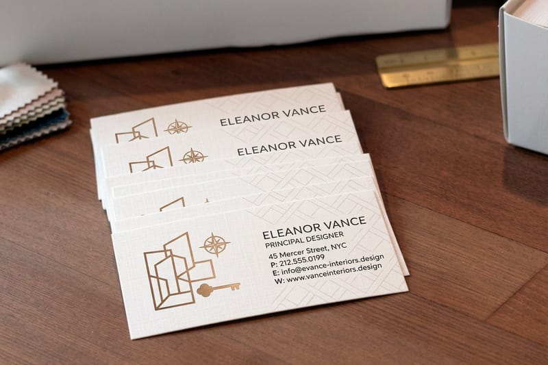
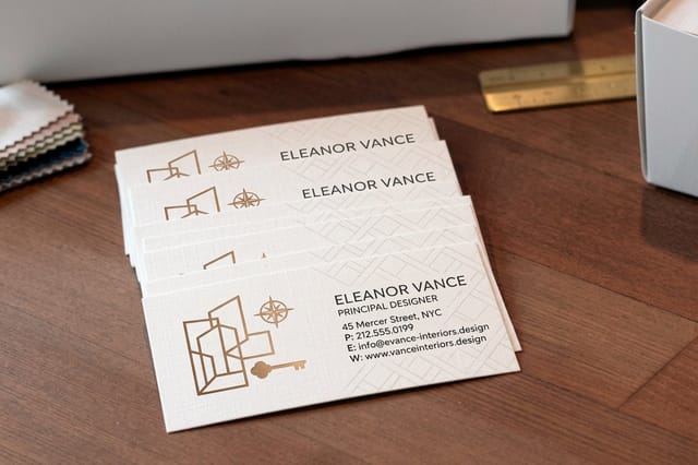 Interior Design Business Cards 100 for $17.57 The smallest test your logo has to pass, printed on stock people keep.
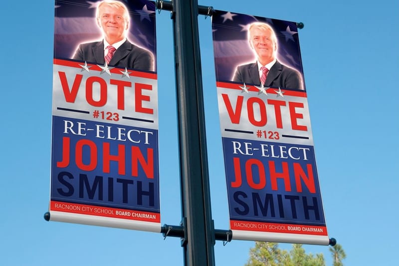
 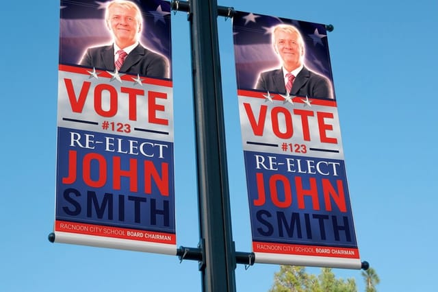 2 Sided Blockout Banners $108.75 each An opaque core so your mark reads clean from both sides, no ghosting.
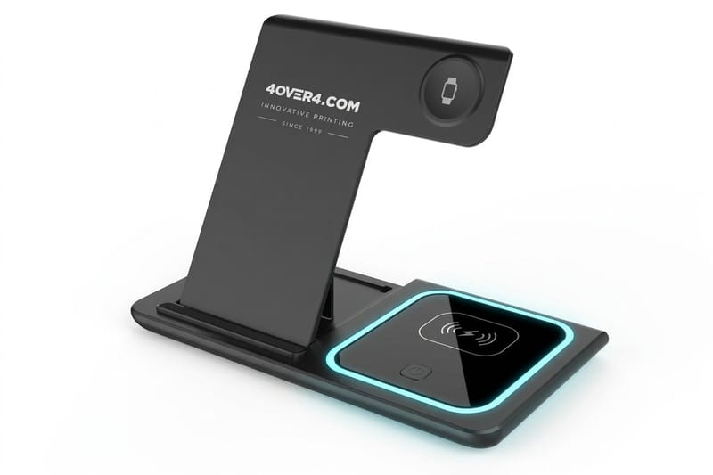
 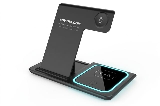 3 in 1 Foldable Wireless Charger $15.00 each A ready-made desk gift that ships as it comes, with no logo.
 The Traits Every Memorable Logo Shares
Strip the 18 marks above down to their common properties and you get five traits, each one you can test at a real print size: a sketch after four seconds, a solid black silhouette, a single ink, the jump from a 3.5 by 2 inch card to an eight foot banner, and the same lockup on every piece. Most logo problems come from adding, and this checklist catches them before a file goes to press.
Run your own mark against these five traits before you send anything to print. If it fails two of them, the fix is usually subtraction rather than a full redesign.
- Simple enough to sketch. If a stranger cannot rough it out after four seconds, it will not stick.
- Distinct in silhouette. Fill the whole mark solid black. If it turns into a generic blob, the outline is not doing enough work.
- Legible in one color. Every logo here works in a single ink, which is exactly how it will be printed on a stamp, an embroidered shirt or a one-color sticker.
- Scalable in both directions. The same file has to hold at favicon size and at banner size without redrawing.
- Repeated without exception. Same shade, same clear space, same lockup on every card, sign and package you produce.
That last trait is the one small businesses drop first, usually because a file gets stretched or a color gets eyeballed. It is also the cheapest one to fix, because it costs nothing but discipline.
Quantity and price
Business card pricing and specs
Real configurator numbers. Larger runs bring the unit cost down quickly.
| Quantity | Price Per Unit | Total |
|---|---|---|
| 100 | 17.6¢ | $17.57 |
| 200 | 11.5¢ | $23.07 |
| 300 | 9.15¢ | $27.46 |
| 400 | 7.96¢ | $31.86 |
| 500 | 7.25¢ | $36.26 |
| 600 | 6.77¢ | $40.64 |

Simplicity Is a Subtraction Exercise, Not a Style
People treat minimalism as a look. It is closer to an editing process. The swoosh, the bitten apple and the Mastercard circles are what was left after everything that needed explaining was removed. Nobody started there.
A practical way to run the exercise is to draw your logo, then delete one element and ask whether the meaning survived. Repeat until deleting breaks it. Back up one step. That is your mark.
- Delete the tagline from the mark. It belongs on the card, not inside the logo lockup.
- Delete gradients and shadows. They are the first things to fail on vinyl, fabric and uncoated stock.
- Delete the second typeface. One family with two weights outperforms two families almost every time.
- Delete the outer circle. Badge rings hide weak marks and vanish at small sizes anyway.
- Delete anything you have to explain. If a viewer needs the story to see the idea, the idea is not in the drawing yet.
Once the mark is that lean, big formats stop being scary. A logo that holds in one flat color is exactly the logo that reads cleanly on a banner viewed from across a parking lot.
Large format
2 sided blockout banners
An opaque core keeps the reverse artwork from ghosting through your mark.

Color Does the Recognizing Before the Shape Does
At a distance, and at speed, people register color before they resolve form. That is why the Coca-Cola red, the Tiffany blue and the McDonald’s yellow do so much lifting. Owning one shade is more achievable for a small business than owning one shape.
The catch is that screen color and ink color are different systems. A brand blue that glows on a phone can print flat and gray on uncoated stock. Pick your color with printed proofs in hand, not from a monitor, and write the values into a one page brand sheet so nobody guesses later.
- Choose one hero color and one neutral. Two brand colors is a system, five is a mood board.
- Record it in both CMYK and RGB. Print and screen need separate recipes for the same shade.
- Check contrast against white and against black. Your mark will land on both, often on the same job.
- Decide the one color version now. Every business eventually needs a single ink logo for stamps, foil and merchandise.
- Put the color on objects, not just paper. Branded items keep the shade in front of someone for months.
Packaging is where color discipline pays off fastest, because the shelf gives you about one second. The roundup of notable packaging design trends shows how the strongest brands hold one shade across a whole product line.
Everyday repetition
Put the mark on an object
A ready-made charger sits on a desk for months as a gift, beside the printed pieces that carry your logo.
Scalability Runs From Favicon to Storefront Sign
A logo is not one artwork. It is a family of artworks that all have to agree. The famous marks work because somebody planned for the extremes early instead of discovering them during a print run.
Build three versions before you order anything: the full lockup with your name, a compact version for tight spaces, and a symbol only version for avatars and stamps. Then decide the minimum size for each so nobody shrinks the wrong one.
- Vector master file. Keep the original as vector artwork so it scales to a banner without softening.
- Minimum size rule. Write down the smallest width your full lockup may be printed at, then enforce it.
- Clear space rule. Reserve breathing room around the mark equal to a repeatable unit, such as the height of one letter.
- Large format check. View the artwork at 25 percent on screen and squint. That approximates a sign seen from across the street.
- Reverse version. Prepare a knockout white version for dark banners and dark packaging.
If you are assembling this into a portfolio or a client presentation, the walkthrough of graphic design portfolio examples shows how designers present a mark across its full size range instead of a single hero image.
Compare finishes
Popular business cards, side by side
Stock, finish, size, quantity, turnaround and price, compared in one table.
 free business cards |  Standard Business Cards |  3D Lenticular Business Cards |  Metallic Foil Business Cards | |
|---|---|---|---|---|
| Min price | Free | $17.57 | $690.88 | $222.13 |
| Paper / stock | 14pt Gloss Cover | 14pt Gloss Cover | 31pt Lenticular Lens | 16 Point Silk Laminated |
| Finish | - | Standard Finish | - | - |
| Size | 2" x 3.5" | 2" x 3.5" | 2" x 3.5" - Vertical | 2" x 3.5" |
| Default qty | 200 | 100 | 500 | 500 |
| Turnaround | 5 business days | 3 business days | 22 business days | 7 business days |
| Rating | ||||
| View & customize | View & customize | View & customize | View & customize |
How to Apply These Lessons to Your Own Logo This Week
You do not need a rebrand to benefit from any of this. Most owners get eighty percent of the improvement from a single afternoon of tightening and one careful print run.
A five step pass on the logo you already have
Work in this order, because each step makes the next one easier. Skipping to the print stage is what produces the fuzzy stretched logos you see on real storefronts.
- Write the one idea. A single sentence about what your mark should make someone feel or understand.
- Subtract until it breaks. Remove elements one at a time and stop one step before the meaning collapses.
- Lock the color. One hero shade, recorded for print and screen, proofed on the actual stock.
- Build the three sizes. Full lockup, compact, symbol only, each with a minimum size written down.
- Print the smallest thing first. A business card is the cheapest, harshest test your logo will ever face.
If you are choosing between doing it yourself and hiring help, the comparison of the free online designer and professional design help lays out where each option makes sense, and whether Canva mails printed pieces for you answers the question most people hit right after the design is finished.
Start fast
Card templates and print ready blanks
Free layouts plus exact size blanks so your logo lands inside the safe margins.






Where Your Logo Actually Lives Once the Design Is Finished
A logo that only exists in a folder never becomes familiar. Familiarity is a function of repetition across real surfaces, which is the one advantage a small business has over a slow moving corporation. You can be everywhere in your neighborhood by Friday.
- Business cards. The hardest legibility test and the most personal handoff. Interior Design Business Cards start at $17.57 and carry your mark at the size where every flaw shows.
- Banners and signage. The scale test. 2 Sided Blockout Banners start at $108.75, with an opaque blockout core so the artwork on one side never ghosts through to the other.
- Useful objects. The repetition engine. A ready-made 3 in 1 Foldable Wireless Charger starts at $15.00 and stays on a desk long after a flyer is recycled.
- Stickers. The cheapest way to put a one color version of your mark on laptops, windows and packages. The list of fun ways to use logo stickers is full of placements owners forget about.
- Posters and flyers. Seasonal, high visibility, and a good excuse to test your lockup at scale. See the poster and flyer design ideas for layouts that leave the logo room to breathe.
Order the smallest piece first, hold it, and be honest about what you see. Every famous mark on this page went through some version of that moment, usually many times, long before anyone recognized it from a highway.
Wally reads a famous logo in ten seconds
Steal the thinking behind the mark, never the shape
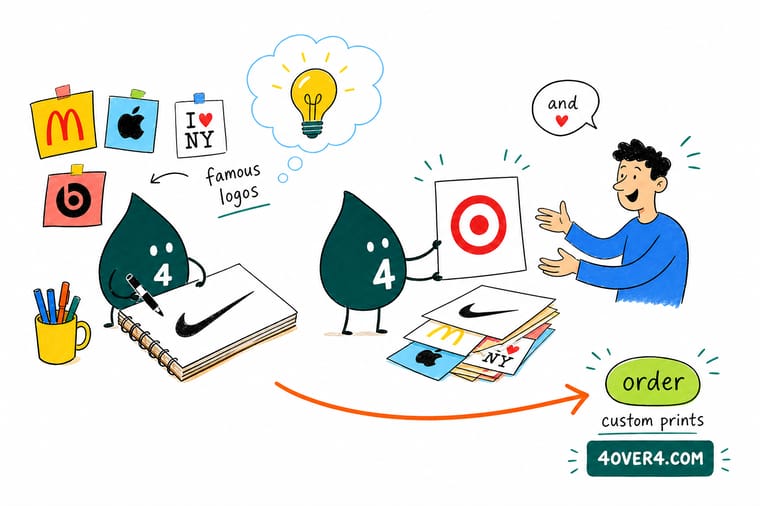
Wally looks at a logo the way a press does. Can it be drawn in one flat ink? Does the silhouette stay distinct when it is filled solid? Does it still read at the size of a card and at the size of a banner? Answer yes three times and you have a mark worth printing everywhere. Start with the smallest piece, hold it in your hand, and judge it there.
Print your logo on business cards →Logo Lessons Worth Keeping
Explore more
More ways to put a strong mark into print
Design guides and logo articles, plus the business cards, blockout banners and charger that put a finished mark into print at three different sizes.
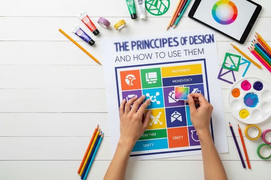 Guide The Principles of Design Emphasis, balance, contrast and the rest, with an infographic.
  Article 15 Cool Facts About Logos Origin stories and hidden details in marks you see daily.
  Article 10 Ways to Use Logo Stickers Cheap, high repetition placements for a freshly tightened mark.
  Article 10 Graphic Design Portfolios How designers present logo work that wins the next client.
  Article Packaging Design Trends Where logos are heading on boxes, labels and wraps.
 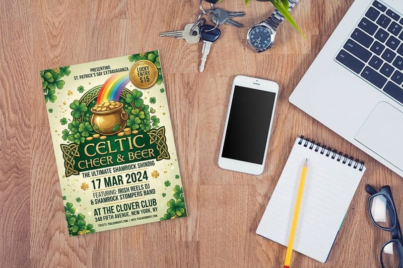 Article Poster and Flyer Design Ideas Seasonal layouts that give a logo room to work at scale.
  Alternative Design Services Compared Free online designer plus real design help, side by side.
 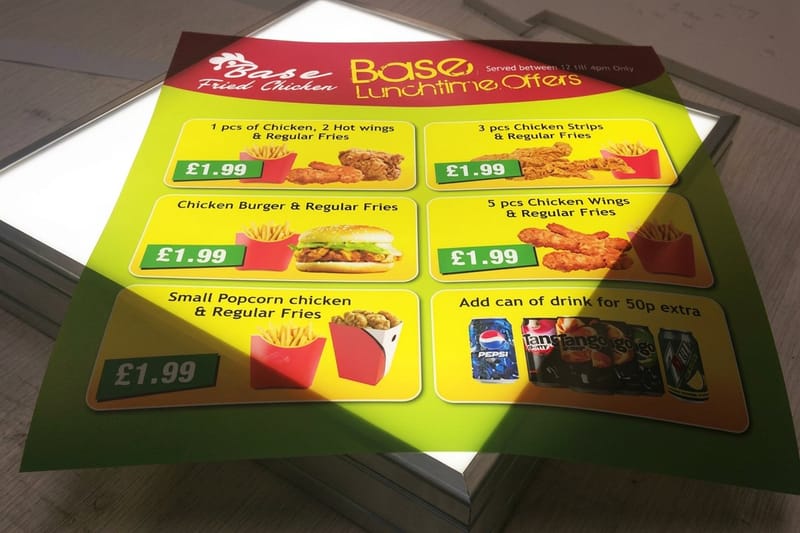 Alternative Does Canva Mail Postcards What Canva prints and mails for you, and what it does not. Product Interior Design Business Cards Your mark at handheld scale, the harshest test it will face. Product 2 Sided Blockout Banners The same logo at storefront scale, clean on both sides. Product 3 in 1 Foldable Wireless Charger A ready-made object that stays on a desk for months. FAQs Printing FAQs Straight answers on stocks, files, proofs and turnaround.
 Test your logo at 3.5 by 2 inches first
Tighten the mark, lock one color, then print the smallest piece first. Business cards from $17.57, blockout banners from $108.75.
Famous Logo Design FAQs
What makes a logo famous rather than just well designed?
Fame comes from a simple idea repeated without exception for years. Every mark in this article can be sketched from memory after a few seconds, works in a single ink, and has appeared in the same shade and the same proportions across millions of surfaces. Good design gets you the first two properties. Discipline gets you the third, and the third is what turns a nice mark into a familiar one. For more origin detail, see our cool facts about logos.
How do I choose the right logo direction for my business?
Start from the one idea you want a stranger to take away, then pick the simplest form that carries it. If your name is already a picture, draw the picture the way Target did. If you are selling craft or care, a restrained wordmark like Prada beats an illustrated badge. If you join two things together, overlap is a fast visual shorthand. Choose one direction, test it small, and refuse to blend three approaches into one crowded mark.
What does it cost to print my logo on business cards and banners?
Pricing scales with quantity, size, stock and finish, and it drops sharply as quantity rises. Interior Design Business Cards start at $17.57, which is the cheapest way to test how your mark reads at small size. 2 Sided Blockout Banners start at $108.75 for large format use. Ready-made gifts such as a 3 in 1 Foldable Wireless Charger start at $15.00. Live pricing for your exact configuration appears in the price table on each product page.
What sizes, stocks and finishes work best for a logo in print?
For cards, a heavier stock holds crisp edges and signals care, while uncoated stock softens fine detail, so simplify the mark if you want that natural feel. Matte and soft touch finishes suit restrained marks. Gloss and foil suit bold shapes with plenty of open space. For banners, a blockout core stops artwork on the reverse from showing through. 4OVER4.COM offers 60+ paper types, so proof on the actual stock before you commit a full run.
How long does it take to produce and ship printed logo materials?
Turnaround depends on the product, the finish and the quantity, and it starts once your artwork passes prepress checks. Small format pieces such as business cards move fastest, while large format banners and specialty finishes need extra production time. Faster turnaround options are available at checkout when a deadline is tight. Upload print ready vector artwork with correct bleed and safe margins, since file corrections are the most common cause of delay.
