
Financial Poster Ideas for Banks, Advisors, and Fintech Offices


The financial posters that work are rate boards built as a swappable shell, service explainers in the advisor office, wayfinding for the services people are shy about asking for, and one portable display for events. Design each one around its reading distance first, leave space for the disclosure block before the artwork exists, and keep every number that changes on a piece you can reprint on its own.
Financial poster placements at a glance
| Placement | Poster size | Read from | What it says | Hardware at 4OVER4 |
|---|---|---|---|---|
| Teller line and queue | 18 x 24 in | 6 to 10 ft | One product, one rate, one next step | Wood poster hanger frame |
| Lobby wall, main sightline | 24 x 36 in | 12 to 20 ft | Headline offer or the season campaign | Hanging poster displays |
| Advisor office or meeting room | 18 x 24 in | 4 to 8 ft | A process explainer a client reads while waiting | Wood poster hanger frame |
| Street-facing window | 24 x 36 in | 15 to 40 ft | Rate, hours, and the branch name only | Hanging poster displays |
| Events, fairs, and recruiting | 24 x 36 in or larger | 10 to 30 ft | Brand, one proposition, a person to talk to | Standing poster displays |
Measure the real distance from where a customer stands to where the poster hangs before you pick a size, because that number sets the headline height and the headline height sets everything else. You can order hanging poster displays and the printed sheets together from the configurator.
Where posters actually work in a branch
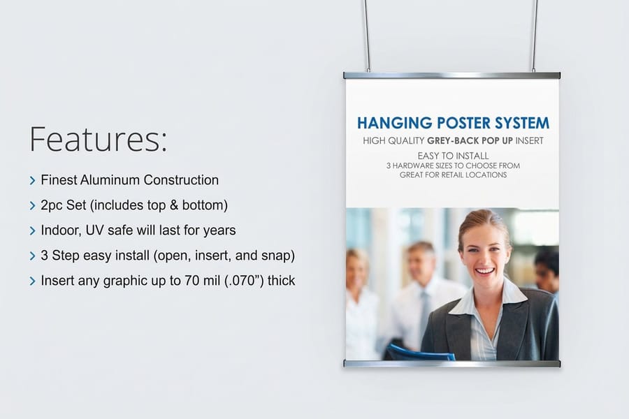
Financial posters earn their place in four spots: the queue, the lobby sightline, the advisor office, and the street-facing window. Each one has a different reading distance and a different amount of attention, and a poster that ignores that is decoration.
The queue is the only place in a bank where a customer is standing still with nothing to do. That is where a rate, a fee comparison, or an appointment prompt gets read all the way through. The lobby sightline is the opposite: three seconds of attention while someone walks, so it holds one idea and a headline big enough to land from twenty feet.
The advisor office is where the longest-form poster belongs. A client waiting for a meeting will read a diagram of how a financial plan gets built or what happens in the first ninety days of an engagement, and that poster does the trust work your brochure was supposed to do. Our complete guide to poster sizes covers the dimensions each of these placements takes.
The distance rule that decides your type size
Sign shops have used the same rough measure for decades: about one inch of capital letter height for every ten feet of viewing distance. A poster read across a twenty foot lobby needs a two inch headline, which on a 24 by 36 inch sheet is most of the top third. That is the constraint that kills a layout, and it is better to find it in the sketch than in the proof.
Work backwards from it. Measure the distance from where people actually stand to where the poster will hang, set the headline height, then see what room is left. Most financial posters fail because they were laid out to fit the copy rather than the room.
Why the window poster is a different job
A poster in a street-facing window is read from the sidewalk, often at an angle, often by someone walking. It carries a rate or an hours change and nothing else. Two lines of body copy in a window are two lines nobody reads.
It also gets the worst treatment of any poster you print. Direct sun through glass fades printed color, and a south-facing window will take the punch out of a paper poster faster than you expect. Plan on replacing window sheets on a schedule rather than being surprised when one looks tired.
Ten poster ideas worth printing
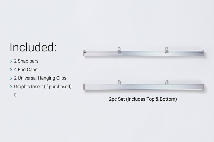
These ten hold up in real branches and real advisory offices. They are ordered from the ones a marketing team can ship this week to the ones worth a designer.
Most of them cost less to test than a week of paid social. A single sheet in a wood poster hanger frame at $32.75 gives you a placement you can change whenever the message changes.
Ideas one to five: the branch floor
1. A rate board built as a shell plus a strip. Print the branded frame once and print only the rate panel each time the number moves. The reprint is a small sheet, not a full poster, and the branch never displays a stale figure.
2. A fee comparison, honestly laid out. Three accounts, four attributes, no asterisks hiding the real one. Customers already assume the fine print is where the cost lives, and a poster that puts it in plain type buys more trust than a slogan.
3. Wayfinding for the services people are embarrassed to ask about. Notary, safe deposit, coin counting, wire desk. A small poster at the right corner removes the moment where someone gives up and leaves.
4. The appointment prompt. One line about what a fifteen minute review covers, and where to book it. Put it in the queue where people are already waiting, not by the exit.
5. A community board that is actually current. Local sponsorships, the school program you fund, the branch team. A hanger frame makes this a two minute swap, which is the only reason such boards stay current.
Ideas six to ten: advisors and fintech offices
6. The engagement roadmap. A diagram of what happens in the first meeting, the first month, and the first year. Clients read this while they wait, and it answers the question they were too polite to ask.
7. A single concept explained properly. Compounding, tax-deferred growth, sequence of returns risk. One idea, one chart, no product pitch on the sheet. It positions the firm as the place that explains things.
8. Recruiting posters in a fintech office. Print the engineering values, the on-call promise, or the open roles at 18 by 24 inches near the kitchen. It works on the people already there more than on candidates.
9. A security and fraud notice you wrote yourself. The generic laminated warning gets ignored. A poster in your own brand voice, naming the three scams your customers actually report, gets read.
10. A portable event poster. One standing poster display travels from the lobby to a chamber of commerce breakfast to a campus fair. Pair it with financial advisor business cards at $17.57 so the follow-up is in someone’s pocket before they walk away.
Rates, disclosures, and the parts compliance sends back

This is where financial posters differ from every other kind of poster, and it is the part that gets a print run scrapped. A poster that advertises a deposit account, a loan, or an investment service sits inside the same advertising rules as the rest of your marketing, whether or not it ever leaves the lobby.
The practical consequence is a layout rule: leave the disclosure block real estate from the first sketch. Compliance will not shrink the required language to fit your design, so a poster that has 40 words of disclosure squeezed into six point type at the bottom edge comes back, and it comes back after the artwork is finished.
Get the specifics from your own compliance officer rather than from a design blog. Requirements differ between a bank, a credit union, and a registered investment adviser, and they change. What does not change is that the poster has to carry them legibly at the distance it is read from.
Do not put a QR code on a bank poster
This is the one recommendation on this page that contradicts most poster advice, and it is deliberate. Fraudsters place stickers with their own QR codes over legitimate ones, and a bank lobby is the single most attractive place to do it. Training your customers that scanning a code inside a branch is normal makes them easier to defraud somewhere else.
Print a short readable URL instead, on your own domain, and make it one a person can type from memory. If a poster genuinely needs a code, put it behind glass in a frame where a sticker cannot be applied over it, and check it as part of the branch opening routine.
The rate that goes stale is worse than no rate
A displayed rate that no longer matches what you offer is a customer service problem at the counter and a compliance problem on paper. The fix is structural, not procedural: design so that the changing number lives on a separate printed piece.
A shell poster in a hanger frame with a swappable rate strip means a rate change costs one small reprint and thirty seconds of a branch manager’s time. A single-piece poster means a full reprint, a delay, and a stretch of days where the wall is wrong.
Sizes, stock, and the hardware that holds them
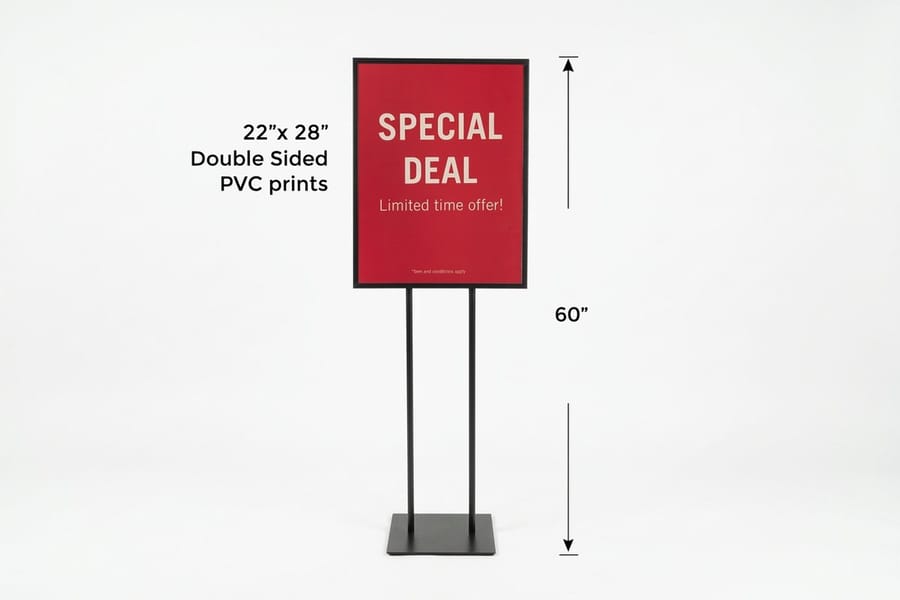
Three decisions set the cost and the look: the sheet size, the stock and finish, and what holds the poster on the wall. Hardware is the one most people skip, and it is the one that decides whether the poster gets updated ever again.
For size, 18 by 24 inches suits anything read from under ten feet, and 24 by 36 inches is the usual size for a lobby wall or a window. Going larger than that in a branch usually means the poster is competing with the architecture rather than the customer.
For stock, the branch lighting decides. Most banks use recessed downlights, and gloss stock turns each one into a bright spot across the sheet. Matte or uncoated reads cleanly from every angle, holds ink well, and looks less like a retail promotion, which suits a financial brand. The exception is a window poster seen from outside in daylight, where a little gloss helps the color hold up.
Frame, hanger, or stand
A wood poster hanger frame at $32.75 grips the top and bottom edge and reads warmer than a metal frame, which fits an advisory office better than a bank lobby. A hanging poster display at $53.83 suits a bigger sheet on a main wall and takes a swap in seconds. A standing poster display at $130.72 needs no wall at all and goes wherever the branch team goes.
Buy the hardware once and treat the printed sheets as consumable. That is the whole economic argument for this approach: the expensive part stops being expensive after the first order, and the cheap part is what you change.
Poster display pricing and specs at 4OVER4.COM
Pricing moves with size, material, and quantity, and the per unit cost drops as the run grows. The numbers below come from the live configurator, so a branch or firm can size a budget before ordering.
Quantity and price
Hanging poster display pricing and specs
Real configurator numbers, where ordering for several branches at once lowers the per unit cost.
| Quantity | Price Per Unit | Total |
|---|---|---|
| 1 | $53.83 | $53.83 |
| 2 | $53.82 | $107.64 |
| 3 | $53.82 | $161.47 |
| 4 | $49.16 | $196.62 |
| 5 | $49.43 | $247.15 |
| 6 | $49.25 | $295.47 |

You can also earn coins on every order and put them against the next round of branch printing, which matters when the same shell gets reprinted across a network.
Stock and finish under branch lighting
Lighting decides the finish more than taste does. Recessed downlights are standard in branches and advisory offices, and gloss stock reflects every one of them as a bright patch that wipes out part of the sheet from certain angles. Matte and uncoated read cleanly from anywhere in the room, hold heavy ink coverage without looking wet, and carry the quieter tone a financial brand usually wants. Save gloss for the window poster read from outside in daylight.
Print it
Poster displays, ready for the wall
Preset sizes and hardware, so the sheet changes and the fixture stays.
Size follows the same logic. An 18 by 24 inch sheet suits a queue or an office where people read from under ten feet, and 24 by 36 inches covers a lobby wall or a window. Bigger than that inside a branch and the poster starts arguing with the architecture. For ideas on treatment and composition once the size is fixed, the creative poster ideas roundup is a useful next read, and free poster templates that print sharp covers bleed, resolution, and the setup that stops a headline from going soft at full size.
What to print, by institution type
The right mix changes with the kind of business and the room it lives in.
- Retail banks. A rate shell in a hanging display on the main lobby wall, a wayfinding poster at the service corner, and an appointment prompt in the queue. Matte stock, because branch downlights are unforgiving.
- Credit unions. Community and membership posters in wood hanger frames, refreshed each quarter. The swap is what keeps a member-owned brand from looking like a bank.
- Independent advisory firms. One engagement roadmap poster in the meeting room and one concept explainer in the corridor. These do the work a brochure only does if somebody picks it up.
- Fintech offices. Internal posters at 18 by 24 inches: values, on-call promises, open roles. Cheap to print, easy to change when the team or the roadmap changes.
- Insurance and mortgage brokers. A standing poster display that travels to open houses and chamber events, paired with cards so the conversation continues after the room empties.
Everything here sits alongside the rest of the branch kit. The financial printing collection holds the statements, folders, and cards that a poster campaign usually needs a match for, and business postcard ideas and examples covers the mailed piece that carries the same offer off the branch floor.
Poster blanks for a branch wall
Starting from a correctly sized blank saves a proof cycle. 4OVER4.COM builds its blanks to exact product specs, so the artwork lands inside the cut line with bleed already marked. Pull one from the blank template library before the design starts rather than resizing afterwards.
Start fast
Poster blanks for a branch wall
Poster design templates and exact size blanks so nothing important sits in the trim.

Wally builds a rate board that never goes stale
Print the shell once, swap the number as often as it moves
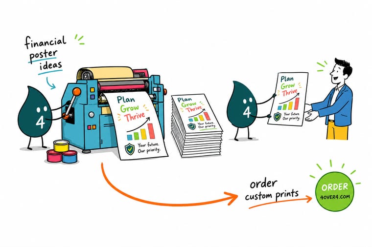
Design the branded poster at 24 by 36 inches for a lobby wall or 18 by 24 inches for the teller queue, set the headline at roughly one inch of cap height per ten feet of reading distance, and leave the disclosure block its own space before the artwork starts. Print on matte stock so branch downlights do not mirror back, hang it in a frame that opens, and reprint only the rate strip when the number changes.
Order poster displays →What compliance and distance both demand
Design tips that hold at every size
- Set the headline height first. Roughly one inch of cap height per ten feet of viewing distance. Decide that number, then find out how much copy actually fits.
- Give the disclosure block its space early. Compliance language does not shrink to fit a layout. Draw the box in the first sketch and design around it.
- Separate the number from the artwork. Anything that changes on a schedule belongs on a piece you can reprint alone. A rate on the same sheet as the brand is a reprint waiting to happen.
- Choose matte for interior walls. Recessed downlights turn gloss into a mirror. Matte and uncoated read from any angle and suit a financial brand better anyway.
- Proof it on the wall, not on the screen. Print a tiled draft at full size, tape it up, and stand where the customer stands. Every legibility problem shows itself in ten seconds.
Explore more
More ways to print for a financial brand
A hanging display is $53.83 and a standing one $130.72 on 1/8 inch white PVC, both in 4 business days.
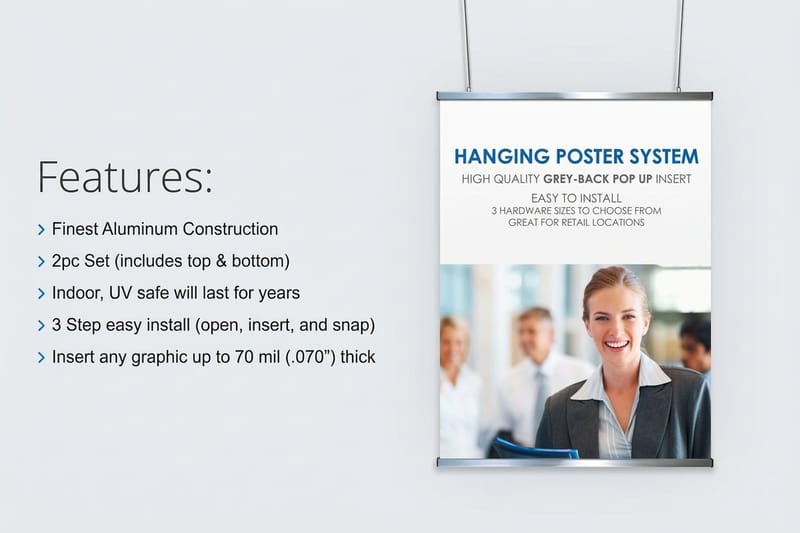 Product Hanging Poster Displays Large format sheets that swap out in seconds on a lobby wall.
  Product Wood Poster Hanger Frame A warmer frame that suits an advisory office corridor.
 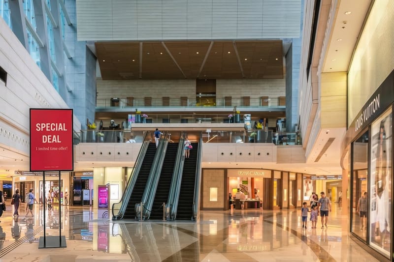 Product Standing Poster Displays Freestanding display that travels to events and fairs.
 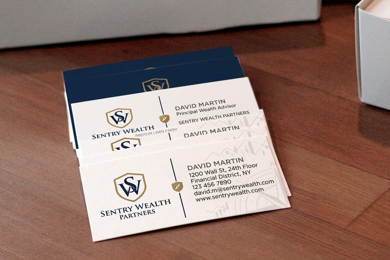 Product Financial Advisor Business Cards The follow-up piece that leaves the room with the client. Category Financial Printing Print built for banks, credit unions, and advisory firms.
  Guide Common Poster Sizes Every standard poster dimension and where each one fits.
 Ready to print your branch posters?
Pick the size, drop in your design or start from a free template, and 4OVER4.COM prints it sharp on the stock your lighting calls for, as fast as your deadline needs.
Common questions about financial posters
What size poster works best in a bank lobby?
Use 24 by 36 inches for the main lobby wall and 18 by 24 inches for the teller queue and advisor offices. The difference is reading distance, not importance. A lobby poster is read from twelve to twenty feet while someone walks, which needs a headline around two inches tall and almost no body copy. A queue poster is read from six to ten feet by someone standing still, so it can carry a fee comparison or a rate table that a lobby poster cannot. Measure the actual distance from where customers stand before you commit to a size.
How do I display a rate that changes every quarter?
Split the poster in two. Print the branded shell once, on good stock, and print only the rate panel each time the number moves. The reprint is then a small sheet rather than a full poster, and it lands in days instead of weeks. Hold the shell in a hanging poster display or a wood poster hanger frame so the swap takes seconds and does not need tools. This is the single change that stops branches from displaying a stale figure, which is both a service problem at the counter and a compliance problem on paper.
Should I put a QR code on a poster in a branch?
We advise against it in a customer-facing financial space. Placing a sticker with a fraudulent QR code over a legitimate one is an active tactic, and a bank lobby is the most credible place for it to work. Beyond the individual poster, teaching customers that scanning codes inside a branch is normal makes them easier to defraud elsewhere. Print a short URL on your own domain that a person can type from memory instead. If a code is unavoidable, put the poster behind glass where a sticker cannot be applied over it and check it during the branch opening routine.
What stock should a financial poster be printed on?
Matte or uncoated for anything hanging indoors. Most branches and offices use recessed downlights, and gloss stock reflects each one as a bright spot that wipes out part of the sheet from certain angles. Matte reads cleanly from everywhere in the room and looks less like a retail promotion, which suits a financial brand. The exception is a street-facing window poster viewed from outside in daylight, where a little gloss helps the color stay punchy. Note that any poster in direct sun will fade, so window sheets belong on a replacement schedule.
Do posters still matter when the branch has screens?
They do different jobs, and the honest answer is that a screen wins on anything that changes daily. A screen needs a content system, someone to run it, and it fails silently when it goes to a blue error state at nine in the morning. A printed poster in a frame costs a fraction of that, never goes dark, and holds a message that is worth more than three seconds of attention, which is exactly what a queue poster or an advisor office explainer is. Most branches end up with a screen for the changing offers and printed posters for the things that stay true.
More frequently asked questions →
Keep reading: brochure ideas you have not thought of yet, Earth Day poster ideas, and the custom branded merchandise guide for the giveaway side of a branch campaign.
