
Green Business Card Design Ideas That Stand Out


Jordan is our labels, packaging and sustainability voice, built from the knowledge of our production team, with over 20 years in printing.
The best green business cards pick the shade and the stock together, and they stay inside the greens that CMYK can actually reproduce. Muted greens (sage, olive, forest) print close to what you approved. Bright emerald and mint sit outside the process gamut and come back duller, so those need a Pantone spot ink or a different shade.
Green shades and what each one signals
| Shade | What it signals | Prints best on | Watch out for |
|---|---|---|---|
| Forest green | Established, careful with money, unhurried | Matte or soft touch laminate on 16pt | Build it with black in the mix, not cyan and yellow alone, or it goes flat and thin |
| Emerald | Confident, modern, spends on design | Gloss, or spot UV over matte | The brightest emeralds fall outside CMYK. Specify a Pantone spot green if the exact shade is the brand |
| Sage | Calm, natural, wellness and skincare | Uncoated cotton or a matte laminate | Low saturation means a small shift on press reads as a different color. Ask for a hard proof |
| Olive | Heritage, outdoors, food and drink | Kraft, where the brown substrate warms it | On bright white it can read as surplus military. Warm the stock or warm the ink |
| Mint and pastels | Fresh, light, clinics and beauty | White uncoated or soft touch, with plenty of empty space | Pale greens across a large solid show roller marks and banding. Keep the coverage light |
Treat the signals as conventions you can break on purpose, and treat the printing notes in the last column as requirements: black in a forest green build, a Pantone spot ink for a bright emerald, a hard proof for sage. You can order standard business cards in two shades, 100 for $17.57 per shade, and compare them in daylight for less than the cost of a bad reprint.
Why green works, and where it fails
Green is the only color that carries two opposite meanings at once. Deep green reads as money, law, land and permanence, which is why banks and estate agencies keep coming back to it. Sage and olive read as the opposite: slow, natural, handmade. Pick the wrong half of that range and a card meant to say careful with your money ends up saying herbal tea.
The practical problem is that green is the hardest color family to reproduce in print. CMYK has a narrow green gamut, narrower than its reds or blues, so the vivid greens that glow on a screen land noticeably duller on paper. That is not a printer failing, it is the ink set. If you have ever approved a design on a monitor and been disappointed by the card, a green is usually why. Our explainer on CMYK versus RGB covers what happens in the conversion.
There are two honest ways around it. Choose a muted green (sage, olive, forest) that lives comfortably inside CMYK, or pay for a Pantone spot green mixed as a real ink rather than built from four process colors. Everything else is hoping.
Building a deep green that does not go flat
A forest green made from cyan and yellow only, with no black, prints thin. There is nothing underneath it to give the color weight, and on a large solid it shows every inconsistency in the ink film. Adding black to the build gives it depth in the same way a rich black beats a flat 100K black.
Watch the total ink coverage though. Piling on all four channels to chase depth can push past what the sheet will hold, which slows drying and risks set-off between sheets. If you want a very dark green across the whole card, tell your printer what you are after and let them set the build.
Green against the stack in someone’s pocket
Most cards in a wallet are white with black type. That is the field you are competing against, and it is why green works so well as a flood color across the whole card rather than as a small logo on white. The card reads as green from the side of the pile, before anyone has read a word.
The cost of that decision is fingerprints. Heavy dark coverage on gloss shows every touch, and matte laminate scuffs pale where a dark solid gets rubbed. Soft touch handles it better than either, which is one reason dark green and soft touch keep turning up together. Compare the three in our finish comparison.
Stock and finish pairings that flatter green
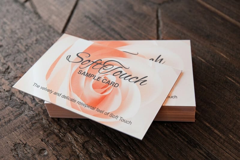
The stock decides how the green lands more than the artwork does. Coated stock keeps ink sitting on the surface, so colors stay saturated. Uncoated stock absorbs it, so the same green dries back lighter and softer. Neither is better. They are two different cards.
Laminates shift things again. Gloss lifts saturation and makes an emerald sing. Matte pulls a percentage of the life out of every color, which suits a muted sage and hurts a bright green. Soft touch mutes slightly more than matte and adds a haze, but it gives a dark green a depth that no other finish matches. Soft touch business cards start at $40.28.
Foil, spot UV and edge paint on a green field
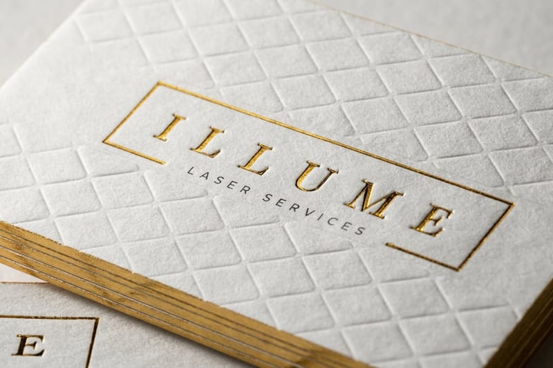
Metallic ink printed onto a dark green sinks into it and reads as gray. Foil does not, because it is a film pressed on top of the sheet rather than an ink absorbed into it. Gold on forest green is the pairing that has survived a century of stationery for that reason. Raised foil business cards start at $86.78 and hold 4.9 out of 5 across 105 reviews.
Spot UV is the quieter option. A matte green card with a gloss varnish pattern in the same green shows nothing until the card tips toward a light, then a leaf, a monogram or a pattern appears. It costs less than foil and it reads as considered rather than expensive. Spot UV business cards start at $76.88.
Painted edges are the third route. A white 32pt sandwich stock with a green painted edge gives you the color without flooding the faces, so the type stays crisp black on white. Our painted edge guide walks through what the edge does to the trim.
Thickness matters more with a flood of color
A dark flood color makes a thin card feel thinner, because the eye expects weight to match the tone. 14pt is fine for a light sage on white. For a full-bleed forest green, 16pt or heavier stops the card feeling like a coupon. The 14pt versus 16pt comparison shows the difference in the hand.
The other reason to go thicker with dark ink is the cut edge. On a flooded card the white core shows as a fine line all the way round after trimming. Some designers hate it and some use it deliberately. Decide which camp you are in before you order, because it is not an accident you can fix later.
Eco and recycled green cards
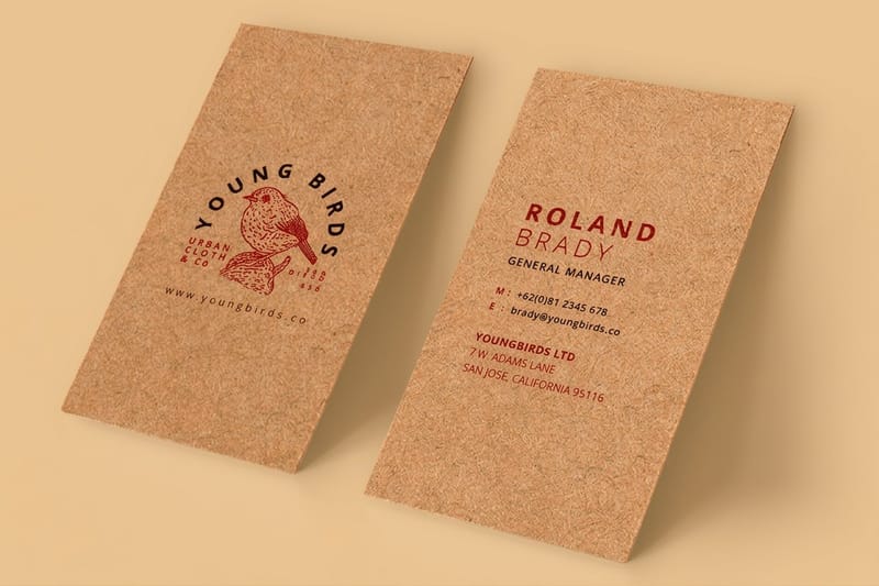
If the green is about sustainability rather than color, the stock carries the message and the ink barely matters. Kraft is the shortcut: unbleached, uncoated, visibly recycled-looking, and it does the talking before anyone reads the card. Kraft business cards start at $24.75, which is a few dollars over standard.
One caution. Do not print an environmental claim on the card unless you can back the specific wording. Ask your printer for the actual recycled content and the certification on the stock you ordered, and phrase the claim to match. A vague badge on a card is easy to write and awkward to defend. Our green printing page sets out what we can document, and whether business cards are recyclable answers the question customers ask next.
Kraft shifts every green you put on it
Kraft is brown, and printing is transparent ink over a substrate, so the brown mixes into everything. An olive laid on kraft deepens and warms, which is usually an improvement. A mint on kraft turns muddy and a pale sage almost vanishes. White ink is the only way to get a light color to sit clean on kraft, and it is a separate pass.
The safe brief for kraft is one dark ink, used sparingly, with the stock doing the work. Deep green or black type, a small mark, wide margins. Our kraft versus standard comparison covers where kraft is the wrong choice, which is anything needing a photograph.
Cotton, and what it costs
Cotton stock is the other end of the natural range: pale, soft, thick, with a texture you feel before you look. It suits sage and olive better than any coated sheet because the absorbency softens the ink into the surface rather than laying it on top. It cannot be laminated and it will not hold a photograph.
Cotton business cards start at $328.42, so this is a considered purchase, not a first print run. If you are testing the design, run it on standard business cards at $17.57 first and move to cotton once the layout is settled.
Four green cards worth copying
Four directions that hold up in the hand rather than only in a portfolio shot. Each one commits to a single idea, which is the thing they have in common.
- Forest green flood, gold foil, nothing else. Both sides flooded in a dark green built with black in the mix, name and title in gold foil, no other ink anywhere. The foil is the only thing that reflects, so the eye goes straight to the name. Works because it commits: one color, one metal, and a lot of empty space. Print it on raised foil.
- Sage on cotton, wide margins, small type. Uncoated cotton, a single sage ink, type set small and centered with a margin most designers would call excessive. No laminate, no foil, nothing shiny. The texture and the restraint carry it. This is the card that skincare and therapy practices keep landing on, and it is why cotton business cards exist.
- Olive on kraft, one pass, stock doing the work. Kraft stock, olive ink on the front only, back left bare. The brown substrate warms the olive into something closer to moss. Cheap to produce, hard to make look cheap. Pair it with the rest of the kraft range if you want the packaging to match.
- Emerald with a spot UV leaf pattern. Matte laminate over an emerald flood, then a gloss spot UV pattern in the same shape language as the logo. Flat under office lighting, alive when it tips toward a window. The trick is using the pattern at a scale big enough to read, because small spot UV detail disappears on a dark ground. Print it on spot UV business cards.
If you want more layouts before you settle, minimalist card examples and the best colors for business cards cover the ground either side of green.
Where to print green business cards
Pricing moves with stock, finish, quantity and turnaround. Standard business cards run 100 for $17.57 and 500 for $36.26, about 7 cents a card, printed in 3 business days. Kraft is 100 for $24.75 on 18pt uncoated kraft in 5 business days, soft touch starts at 50 for $40.28 on 32pt stock, spot UV at 500 for $76.88, raised foil at 100 for $86.78 in 7 business days, and cotton at 250 for $328.42 in 15. The numbers below come from the live configurator, so you can size a budget before you commit a design.
Quantity and price
Business card pricing and specs
Live card pricing, from 100 kraft at $24.75 up to 250 cotton at $328.42.
| Quantity | Price Per Unit | Total |
|---|---|---|
| 100 | 17.6¢ | $17.57 |
| 200 | 11.5¢ | $23.07 |
| 300 | 9.15¢ | $27.46 |
| 400 | 7.96¢ | $31.86 |
| 500 | 7.25¢ | $36.26 |
| 600 | 6.77¢ | $40.64 |

You can also earn coins on every order and redeem them against future printing, which helps when you are reordering a short run each quarter rather than printing five thousand at once.
Designing your own green card
Start with the stock, then the shade, then the finish. Doing it in that order stops you falling in love with a mint that the paper you want cannot hold. Set the file at 300 DPI in CMYK, add 0.125 inch bleed on all four sides, and keep type at least 0.125 inch inside the trim, because a flooded card makes any drift at the cut obvious.
Print it
Soft touch, for deep greens
The finish that gives a dark green weight and hides the fingerprints heavy coverage attracts.
Do not judge the shade from your screen. Export the file, print a proof, and look at it next to a window, because the same green shifts noticeably between daylight, office fluorescents and a phone screen. If the exact shade is part of the brand, convert it properly rather than eyeballing it: our Pantone to CMYK matching guide shows which greens survive the conversion and which need a spot ink instead. And before you flood both sides, read what the stock actually does to ink, since an uncoated sheet will hand you a lighter card than the proof suggests.
Green cards by business type
The same green means different things in different sectors, so here is what tends to work where.
- Accountants, law and finance. Deep forest green on 16pt with a matte or soft touch laminate. It is the traditional signal for money handled carefully, and it separates you from the navy blue everyone else in the sector defaults to.
- Landscaping and tree services. Olive or mid green on kraft, or a green flood with white type. Skip pale greens, because these cards get handled outdoors with dirty hands and a pale card shows it within a day.
- Skincare, therapy and wellness. Sage on uncoated cotton, small type, wide margins. The low saturation is the point. Ask for a hard proof, because sage shifts more visibly than any other green on press.
- Food, drink and farm shops. Olive or moss on kraft with a single ink pass. It matches the packaging most independent food brands already use, so the card looks like part of the same family.
- Clinics and dental practices. Mint or pale green on white uncoated, kept as an accent rather than a flood. Pale greens over large solid areas show banding, so use them on rules, panels and the logo instead.
Where to start once the green is chosen
Templates save the fiddly part. 4OVER4.COM sizes its blanks to exact product specs, so a 2 x 3.5 inch card blank carries 0.125 inch of bleed on every side, 2.25 x 3.75 inches in all, with bleed and trim already marked and your artwork landing where you expect it. Run the green flood out to the edge of the bleed and keep type 0.125 inch inside the trim. Grab a print-ready blank from the blank template library and drop your green in.
Start fast
Where to start once the green is chosen
Blanks with bleed and trim marked, so a dark green field does not stop short of the edge.














Wally checks the green in daylight, not on screen
Pick the stock first, then the shade, then the finish
Muted greens like sage, olive and forest print close to your proof. Bright emerald and mint fall outside CMYK, so specify a Pantone spot ink or move to a deeper shade. Build dark greens with black in the mix, choose 16pt or heavier for a full flood, and print a proof before you order the run.
Order business cards →What green does on paper that it does not on screen
Design tips that hold at every shade
- Choose the shade in daylight, not on a screen. Every green looks brighter backlit. Print a proof, take it to a window, and pick from paper. This is the single decision that causes the most reprints.
- Give a dark green weight. A forest green with no black in the build prints flat. If the whole card is flooded, ask for the build rather than exporting whatever your design app produced.
- Do not fight the stock. Uncoated absorbs and softens, kraft warms everything, coated keeps color saturated. Pick the stock and the shade together, never one and then the other.
- One green, not three. A palette with a forest, a sage and a mint on one card reads as indecision. Use one green and let the neutrals do the contrast work.
- Check the type contrast. Mid greens are the worst background for black type. Either go dark enough for white type or light enough for black, and avoid the middle where neither works.
Explore more
More ways to print and promote
Cotton business cards run 250 for $328.42 on 45pt cotton and take 15 business days.
Product Soft Touch Business Cards The finish that gives a dark green depth without gloss. Product Kraft Business Cards Unbleached brown stock that warms olive and moss greens. 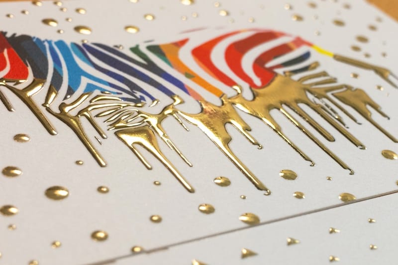 Product Raised Foil Business Cards Gold foil on forest green, the pairing that never dates.
  Product Standard Business Cards The cheap way to test two greens before you commit.
 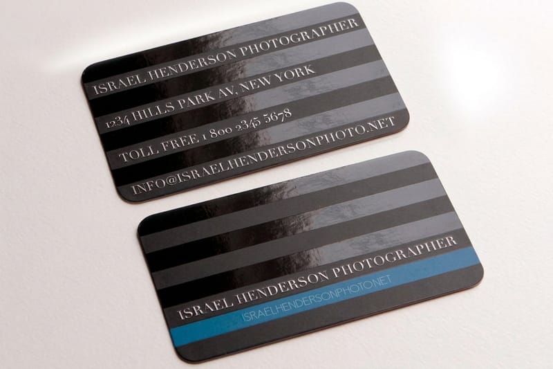 Product Spot UV Business Cards A gloss pattern on a matte green that only shows in the light.
  Category Business Card Printing Every stock, finish and shape in one place.
 Ready to print your green cards?
Pick the stock, drop in your design or a free template, and 4OVER4.COM prints it sharp from our Queens facility, as fast as your deadline needs.
Common questions about green business cards
Why does my green print darker and duller than it looks on screen?
Because your monitor makes green with light and the press makes it with ink, and the CMYK ink set covers a narrower range of greens than a screen does. The vivid emeralds and mints that glow backlit simply have no equivalent in four process inks, so the conversion lands on the nearest available color, which is always duller. You have two real options. Pick a green that already sits inside the CMYK range, which in practice means the muted family: sage, olive, moss, forest. Or specify a Pantone spot green, mixed as a physical ink and printed as its own pass, which reproduces the exact shade rather than approximating it.
What green works best on kraft or recycled stock?
A dark one. Kraft is brown and uncoated, and printing inks are transparent, so the substrate mixes into every color you lay on it. Olive, moss and forest deepen and warm, which usually improves them. Mint, pastel and pale sage turn muddy or disappear. If you need a light green on kraft you have to print white ink underneath it first, which is a separate pass and adds cost. The design that works on kraft is one dark ink used sparingly with wide margins, letting the stock carry the character.
Does soft touch laminate change the color of a dark green?
Yes, slightly. Soft touch and matte laminates both pull a little saturation out of every color underneath, and they add a faint haze that makes a mid green look softer than the proof. For a dark forest green that is usually a benefit, because the finish adds a depth that gloss cannot, and it hides fingerprints far better than gloss or matte on heavy coverage. For a bright emerald it works against you, and gloss or spot UV is the better call. If the exact shade matters, order a printed sample with the laminate on it rather than judging from an unlaminated proof.
What foil color goes with a green card?
Gold on forest or hunter green is the classic and it is classic because it works: warm metal against a cool dark ground, with maximum contrast. Copper and rose gold suit olive and warmer greens. Silver suits sage and cooler mints, though it is quieter and can vanish against a mid green. Avoid green foil on a green card unless the shades are far apart, since a close match reads as a printing error. Foil is also the right choice rather than metallic ink on any dark background, because metallic ink absorbs into the ground color and comes out looking gray.
Are recycled or kraft business cards cheaper than standard ones?
No, they usually cost a little more. Kraft business cards at 4OVER4.COM start at $24.75 against $17.57 for standard business cards, because the stock is a specialty sheet rather than the house default. Uncoated recycled and cotton stocks sit higher again, with cotton starting at $328.42. The saving in an eco-minded print run comes from ordering the quantity you will actually hand out before your details change, not from the stock. Order fewer, order more often, and nothing goes in a drawer.
