
Health and Beauty Labels That Make a Product Look Worth the Price


A health and beauty label reads premium when it is printed on a synthetic face stock with a matte or soft-touch laminate, carries one small metallic or spot accent, and leaves real empty space around the brand mark. Anything that lives in a shower or meets oil needs that synthetic stock plus a laminate, because paper wicks water in from the cut edge and lifts at a corner within a few washes.
Health and beauty label formats at a glance
| Container | Typical size | What the label carries | Stock that suits it | Where it is used |
|---|---|---|---|---|
| Serum or dropper bottle | Roughly 2 x 1.5 in, or a narrow band | Brand mark, one product word, volume | Premium, synthetic with matte laminate | Facial oils, serums, tinctures |
| Cream jar lid or side | Round 1.5 to 2.5 in diameter | Logo on the lid, INCI list on the base | Premium, clear or white synthetic | Moisturisers, balms, masks |
| Shampoo or body wash bottle | Full wrap, roughly 8 x 4 in | Full front panel plus ingredients and directions | Synthetic with gloss laminate, always | Anything that lives in a shower |
| Supplement or vitamin jar | Wrap, roughly 6 x 2.5 in | Supplement Facts panel, dosage, warnings | Premium paper with laminate is enough | Capsules, powders, gummies |
| Sachet, sample or tester | Flat, roughly 2 x 1 in | Product name and shade or scent only | Standard stock, short run | Sampling, gift with purchase, PR kits |
Measure the real container before you set the size, because circumference and curvature both change what fits. You can order premium health and beauty labels in a custom size straight from the configurator, and address label printing covers the small shipping labels that go on the outer box.
What makes a beauty label read premium
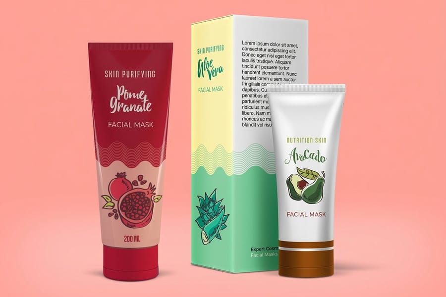
Premium is a stock and finish decision far more than an artwork decision. A synthetic face stock with a matte or soft-touch laminate, a small metallic or spot accent, and a layout with real empty space in it will read as expensive on a plain white bottle. The same artwork on uncoated paper with a full-bleed background reads as a supplement from a discount shelf.
The reason is that people judge a beauty product with their hands before they read a word of it. A laminated synthetic label has a slight give and a smooth, cool surface. Paper feels dry and thin, and once a customer has felt it they have already priced your product.
Restraint is the other half. Look at the labels that hold the top shelf in any pharmacy: one type family, two sizes, a large quiet area, and the ingredient list carried on the back where it belongs. Our product label printing range covers the stocks and finishes below, and the print resolution guide explains why a logo placed at 300 DPI holds its edge at a size this small.
Finish, and what each one costs you
Gloss laminate lifts colour, makes photography snap, and shrugs off water. It is the right call for anything in a bathroom and the wrong call if you want the product to feel understated. Matte laminate mutes colour a little and reads calmer, which is why most skincare uses it. Soft-touch matte goes further: it has a velvet surface that people notice immediately, and it also holds fingerprints and oil marks, which shows on a body oil or a hand cream more than on a boxed serum.
A spot accent on a matte field is the cheapest way to buy perceived value. Put the brand mark in metallic or a raised finish and leave everything else flat. The contrast does the work, not the amount of shine. A label covered in metallic reads cheaper than one with a single metallic word.
Clear labels and the white underprint nobody plans for
A clear label on a coloured bottle looks like the type is printed straight onto the glass, and that is the effect most premium brands want. The catch is that ink is not opaque. Print a pale grey logo on a clear label and stick it on an amber bottle, and the logo turns amber.
The fix is a white underprint behind whatever has to stay true, applied only where you need it. Ask for it at the file stage and mark it as a separate layer. Discovering it after the run is a reprint, not an adjustment.
Custom shapes and sizes for an awkward container
Measure the container before the artwork, because the number on the bottle is the volume inside it and tells you nothing about the surface outside. Wrap a strip of paper around it, mark where it meets, then lay it flat. That length is your maximum width, and the label wants to stop short of it so the two ends meet without overlapping into a ridge.
Shape follows the container after that. A round label suits a jar lid and the flat face of a wide pot. A tall rectangle with rounded corners fits a dropper bottle or a serum, where the usable area is a narrow band. An oval sits better on a curved shoulder than a rectangle, because the corners of a rectangle lift first on a curve. Anything outside those is a die cut shape, and a custom size can be ordered from the configurator rather than forced into a preset.
Labels that survive water, oil and a hot bathroom
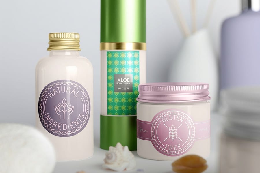
Anything that goes in a shower needs a synthetic face stock. Vinyl and BOPP films do not absorb water, so the label edge stays down and the print stays sharp. Paper wicks water in from the cut edge, and the failure always starts as a soft, wavy corner before the whole label lifts.
A laminate on top matters as much as the face stock. Steam, hot water and repeated wet hands abrade the surface, and the laminate takes that abrasion instead of the ink. Without one, the printed area goes chalky where the thumb sits, usually right on the brand name.
Oil is the quieter problem. Body oils, cleansing balms and anything with a dropper leave residue on the label every time the product is used. A laminated surface wipes clean; an uncoated one darkens where the oil soaks in. If you are printing a full packaging system rather than a bottle alone, our custom product packaging article covers how the carton and the label should agree.
Curved bottles change the size you can use
A flat label on a tightly curved bottle wrinkles at the top and bottom edge. The tighter the curve and the taller the label, the worse it gets. On slim serum bottles the practical answer is a short label, a narrow band, or a full wrap that meets itself rather than a tall panel stuck on one face.
Print one, apply it to the real container, and leave it a day before you judge it. Adhesive keeps moving for a few hours, so a label that looks perfect at the bench sometimes shows a lifted corner the next morning. That single test costs nothing and it is the one step most first-time brands skip.
Small type, and the point where it fills in
Ingredient declarations are set small by necessity, and small type is where printing gets unforgiving. Positive type on a light background holds down to about 5 or 6 point. Reversed type, white out of a dark field, fills in earlier because ink spreads slightly into the letterform, and a reversed 5 point INCI list on a dark navy label turns into a grey stripe.
Set the ingredient panel in positive type on a light area whenever the layout allows it, keep it to a single weight, and do not condense the font to make it fit. If it will not fit, the panel is too small for the amount of copy, and the honest fix is a bigger label or a wrap that continues onto the back.
Sheet labels, roll labels and which one you actually need
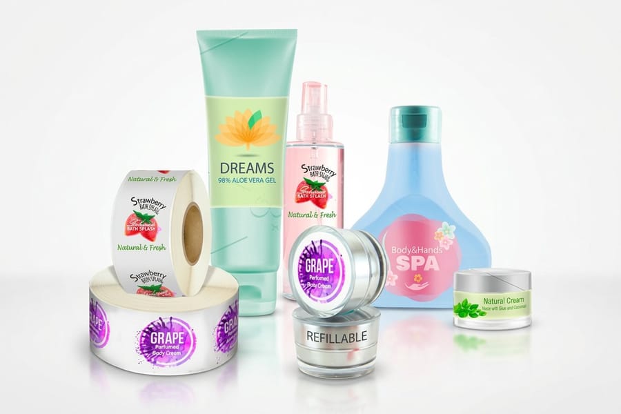
Sheet labels are peeled and applied by hand. Roll labels come wound on a core, ready to feed a labelling machine. The price difference reflects the format and the quantity that comes with it: standard health and beauty labels start at $23.88 and premium health and beauty labels at $29.16, while roll health and beauty labels start at $322.98.
If you are hand-filling a few hundred units in a workshop, sheets are the correct answer and the roll is money spent on a format you cannot use. Once a co-packer or an in-house applicator is doing the work, rolls stop being optional, because nobody is hand-peeling ten thousand labels.
The volume itself is also the cost lever. Label pricing steps down as the run grows, and the way price breaks stack is worth understanding before you pick a quantity. Our guide to how bulk price breaks work lays out where the steps fall so you order to a break rather than just under one.
The quantity trap on a first run
The cheapest unit price is always at a quantity most new brands should not order. Artwork changes after the first month of real feedback: a shade name gets clearer, the volume marking moves, a claim gets softened. A pallet of labels for the previous version is an expensive lesson in patience.
Order enough to cover the batch you can actually sell, keep the artwork file clean and layered, then reorder to a bigger break once the design has survived contact with customers. The difference between the two unit prices is smaller than the cost of scrapping a run.
Printing your own labels at home and what it costs you
Blank label sheets and an office printer are a reasonable way to test a layout on a real bottle, and a poor way to sell a product. A home printer lays ink or toner on a paper face with nothing over it, so the first splash in a bathroom lifts the color and the cut edge starts wicking within a week.
The test is still worth doing. Print the artwork at final size, cut it out and wrap it on the actual container to check that the ingredient panel fits and the seam lands where you expected. Then order the real thing on stock that suits where the product lives. Standard health and beauty labels start at $23.88, which is short run money for a design you are still deciding on, and premium stock at $29.16 is where the synthetic faces and the laminates sit.
Label pricing and specs at 4OVER4.COM
Label price moves with size, stock, finish and quantity, and the per unit cost drops as the run grows. The numbers below come straight from the live configurator, so you can size a first batch before you commit artwork.
Quantity and price
Health and beauty label pricing and specs
Real configurator numbers on premium stock, where a larger run lowers the cost of each label.
| Quantity | Price Per Unit | Total |
|---|---|---|
| 1 | $29.16 | $29.16 |
You can also earn coins on every order and redeem them against future printing, which helps when a growing range means a reprint every time you add a shade.
Matching the stock to where the product lives
Stock and container work together, and the deciding question is where the product spends its life. A boxed serum on a dressing table stays dry, so premium product labels on a laminated paper stock look and perform well. A body wash in a shower is a different job: it wants a synthetic film and a gloss laminate, and the adhesive has to be rated for a surface that will be wet again within hours.
Print it
Health and beauty labels, ready to apply
Premium stock and finishes sized to skincare bottles, jars and supplement containers.
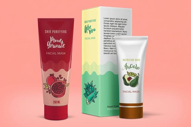
Supplements sit between the two. The jar stays dry, so premium paper with a laminate holds up, and the real constraint is the Supplement Facts panel rather than moisture. Treat that panel as the biggest fixed block on the layout and build the brand around it. If part of the range needs a hanging tag instead of an adhesive label, our custom printed product tags guide covers where a tag does the job better, and standard product labels at $23.88 remain the sensible way to test a layout before scaling it.
Choosing the right label for your part of the industry
Health and beauty covers products with very different lives. Here is how the choice changes by category.
- Skincare and serums. Small labels on curved glass. Premium synthetic with a matte laminate, a single metallic accent, and the ingredient panel on a light field so the small type holds.
- Haircare and body wash. Full wraps on bottles that live in a shower. Synthetic stock with gloss laminate, no exceptions, and an adhesive rated for a wet surface.
- Supplements and vitamins. Design around the Supplement Facts panel first. Premium paper with a laminate is usually enough because the jar stays dry, and the panel is the biggest fixed block on the layout.
- Salons and treatment rooms. Retail-ready labels on backbar decants plus a matching promo piece. Pair them with the offers in our beauty salon promotions article.
- Soap and candle makers. Short runs, seasonal scents, one layout with a colour variable. Standard stock is fine for a boxed product and a synthetic is worth it for anything sold near a sink.
Templates and print-ready blanks
Templates save the round of proofs that gets spent on trim and bleed. 4OVER4.COM sizes its blanks to exact product specs, so your artwork lines up with the cut line without a guess. Pull a print-ready blank from the blank template library with bleed and trim already marked, then place the ingredient panel inside the safe area rather than against the trim.
Start fast
Templates and print-ready blanks
Label design templates and exact size blanks so your artwork lands inside the cut line.
Wally picks the stock before the artwork
Where the bottle lives decides what the label is made of
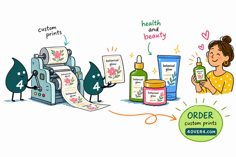
Use a synthetic face stock with a laminate for anything that meets water or oil, and premium paper with a laminate for a dry jar. Add a white underprint behind any artwork on a clear label, set the ingredient panel in positive type on a light field, and print one label on the real container before you order the run.
Order health and beauty labels →What to remember about beauty labels
Design tips that hold at every size
- Leave real empty space. The single most reliable premium signal on a beauty label is unused area. Every element you remove makes the remaining ones look more deliberate.
- One accent, used once. A metallic word on a matte field reads expensive. A metallic background reads like a discount shelf. Contrast is the effect, not coverage.
- Put the seam behind the panel. On a wrap, land the overlap under the ingredient block rather than through the logo. It is a two-minute layout decision that decides whether the finished bottle looks considered.
- Set the INCI list in positive type. White out of a dark field fills in at the sizes an ingredient list needs. Positive type on a light area survives the press.
- Check it wet, not dry. Run a finished label under a tap, thumb it while it is wet, then leave it overnight. That is the test the product will actually face.
Explore more
More ways to print and package
Related products, categories and reading on 4OVER4.COM, one card each.
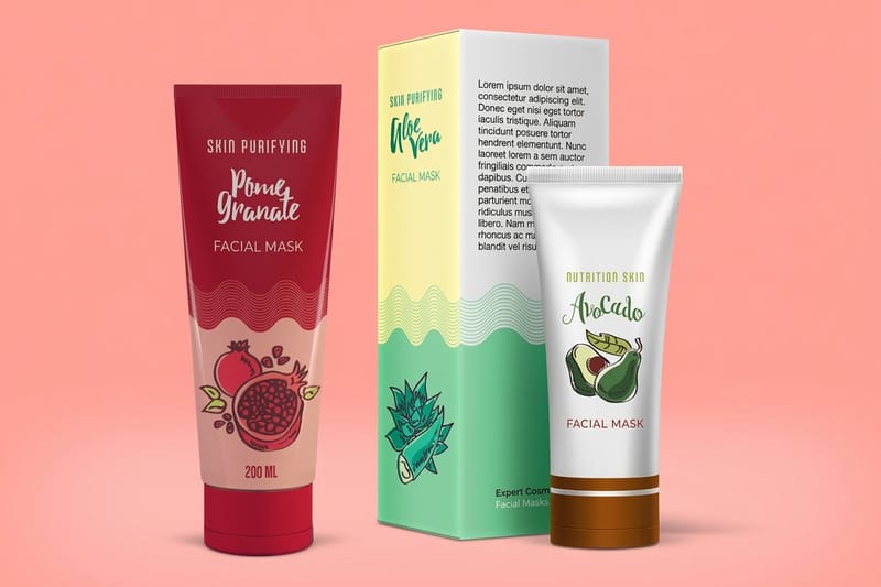 Product Premium Health and Beauty Labels Premium stock and finishes for skincare and supplement containers.
 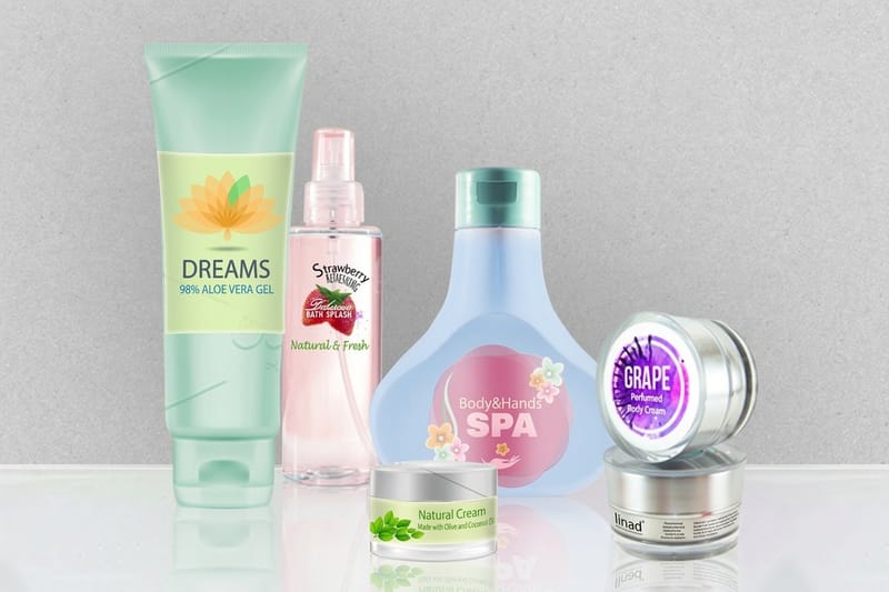 Product Standard Health and Beauty Labels The short-run option for testing a design on real product.
 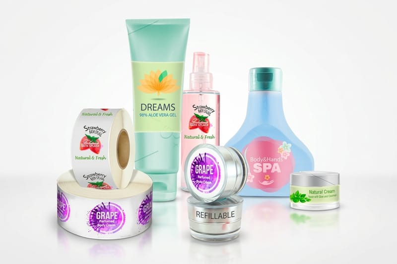 Product Roll Health and Beauty Labels Wound on a core for machine application at volume.
 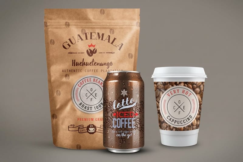 Product Premium Product Labels Durable stock and finishes for products that get handled daily.
 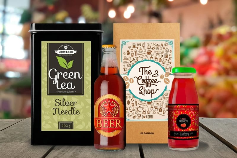 Category Product Label Printing Every stock, finish and size in one place.
 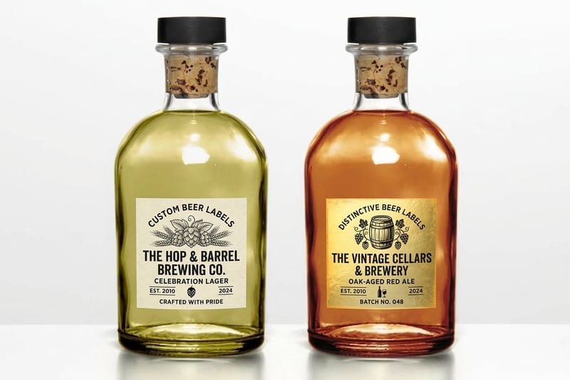 Category Beer Label Printing Wet-strength labels for bottles that sit in ice.
 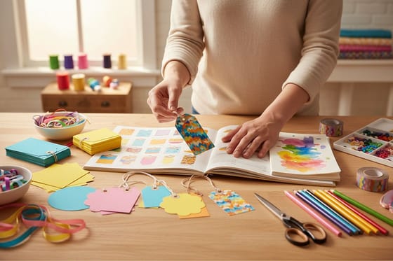 Guide Custom Printed Product Tags When a tag does the job a label cannot.
  Article Custom Product Packaging Making the carton and the label agree.
 Ready to print your labels?
Pick your size, drop in your artwork or a free template, and 4OVER4.COM prints it sharp on premium stock, as fast as your fill date needs.
Common questions about health and beauty labels
Does a health and beauty label need a barcode?
Only if it sells through a retailer or a marketplace that scans one. A barcode is a trade requirement rather than a legal one, and each retailer will tell you which symbol it wants. If you are heading that way, leave the space in the first layout instead of squeezing it in later, keep it on a light background with the quiet zone clear, and never scale it down to make it fit.
Can I use one label design across every size in a range?
The artwork carries across, the file does not. Each container has its own circumference, so a label that fits a small jar will not wrap a tall bottle, and scaling the whole design up drags the ingredient panel below a readable size. Keep the brand block and the colors fixed, then rebuild the layout for each size from a template sized to that container.
What is the difference between a laminate and a varnish?
A laminate is a thin film applied over the printed face, and it is what survives water, oil and rubbing. A varnish or coating is a liquid layer that dries on the surface, changing how the label looks and giving light protection but not much more. For anything living in a bathroom the laminate is doing the work, and the varnish is a finish choice rather than protection.
What label material is waterproof enough for a shampoo bottle?
A synthetic face stock such as vinyl or BOPP with a gloss laminate over the top. Synthetic film does not absorb water, so the cut edge stays flat instead of wicking moisture inward, and the laminate takes the abrasion from wet hands rather than the ink taking it. Paper stock with a laminate is not the same thing: the laminate protects the surface but the exposed edge still soaks. Confirm the adhesive as well as the face stock, because an adhesive applied to a bottle that is already damp will never reach full bond. Premium health and beauty labels at 4OVER4.COM start at $29.16 and carry the synthetic options this needs.
Does a clear label really look more expensive than a white one?
On a bottle worth showing, yes, because the type appears to sit directly on the glass and the product itself becomes part of the design. It works against you when the container is an ordinary shape or the fill is an unappealing colour, since a clear label puts both on display. It also demands a white underprint behind any artwork that has to stay true, otherwise the container colour tints your ink. A pale grey wordmark on an amber bottle turns amber. Decide this before the file goes to press, because it is a separate layer, not a setting.
What has to legally appear on a cosmetic label in the United States?
A cosmetic sold at retail carries the identity of the product, the net quantity of contents on the principal display panel, the name and place of business of the manufacturer, packer or distributor, and an ingredient declaration using INCI names in descending order of predominance. Warning statements apply to specific product categories. Dietary supplements follow a different set of rules built around the Supplement Facts panel. Design around whichever panel applies from the first layout rather than fitting it in at the end, and confirm the current requirements with your own regulatory advisor before you commit a run.
Should I order roll labels or sheet labels?
Sheets if a person is applying them by hand, rolls if a machine is. Roll health and beauty labels start at $322.98 because the format exists to feed a labelling applicator, and the quantity that comes with it only makes sense once you are filling at that scale. A brand hand-filling a few hundred units in a workshop gets nothing from a roll except a core it cannot use. The switching point is usually the move to a co-packer, since no co-packer will hand-peel your labels.
How small can the ingredient list be printed?
Positive type on a light background holds down to about 5 or 6 point in offset and digital printing. Reversed type, white knocked out of a dark field, fills in earlier because ink spreads slightly into the letterform, so a reversed 5 point ingredient list on a dark label reads as a grey band rather than words. Set the panel positive on a light area, use one weight, and resist condensing the typeface to make copy fit. If it still does not fit, the label is too small for the amount of required copy and the fix is a larger size or a wrap that carries onto the back.
