
Logos With Hidden Meanings and What Your Brand Can Learn


Sofia is our design and templates voice, built from the knowledge of our production team, with over 20 years in printing.
A hidden meaning only works when the logo already reads without it. The arrow in FedEx, the a-to-z smile under Amazon and the bear in the Toblerone mountain are rewards for looking twice, not the reason any of those marks work the first time. What follows is what each one hides, the four techniques behind them, and the point at which a clever detail stops surviving the printer. That point is set by the printed pieces the mark lives on: a 2 by 3.5 inch business card, a full size letterhead and a 2 inch die-cut sticker each show a hidden detail at a different scale.
Nine logos and what is hidden inside them
| Brand | What is hidden | Technique | At small printed size |
|---|---|---|---|
| FedEx | A right-pointing arrow | Negative space between two letters | Survives down to about a quarter inch |
| Amazon | An arrow from a to z, read as a smile | A rule that doubles as an image | Survives, the curve is thick |
| Toblerone | A bear standing in the mountain | Silhouette inside an illustration | Gone below about half an inch |
| Baskin-Robbins | The number 31 | Color split across letterforms | Needs two colors to read at all |
| Tostitos | Two people sharing a chip over salsa | Letters redrawn as figures | Readable, the dot of salsa is the giveaway |
| Hyundai | A handshake inside the H | A letter slanted until it becomes a picture | Survives, the strokes are heavy |
| Beats | A head wearing one headphone cup | Containment, the letter becomes an object | Survives at any size |
| NBC | Six feathers for six divisions | Meaning carried by a count, not a shape | Survives, but nobody counts |
| Pittsburgh Zoo | A gorilla and a lioness in the tree | Negative space inside dense illustration | Fails on anything small |
The last column is the one that matters for your own mark. A secret built from filled shapes survives every reproduction; a secret built from a sliver of background survives only where the background is clean and the mark is large. Judge yours by printing it on standard business cards at the size it will really appear.
Why a hidden meaning makes a logo stick

A hidden meaning only works when the logo already reads without it. The FedEx arrow, the Amazon smile and the bear in the Matterhorn are rewards for looking twice, never the reason the mark works the first time. Cover the secret and each of those logos still does its job.
What the second layer buys you is a story someone can retell. Nobody repeats that your wordmark uses a humanist sans. People do repeat that there is an arrow hiding in FedEx, and every retelling drags the brand name along with it. That is the whole mechanism, and it is why the technique is worth understanding even if your own mark ends up perfectly plain.
The trap is building the joke first. A mark designed backwards from a clever idea tends to be fussy, hard to reproduce, and dead the moment it prints small. If you are still working out what the mark should say before you draw it, the questions in 22 logo design questions to ask before you start are the right place to begin.
Memorable is not the same as clever
Recall comes from a simple silhouette repeated often. The Nike swoosh has no secret in it at all, and it is the most recognized mark on this page. A hidden detail adds a second hook on top of a shape that was already working, which is a very different job from rescuing a shape that was not.
Test it honestly. Draw the mark at 12 millimeters, black on white, and hand it to someone who has never seen it. If they cannot describe the outline back to you, the hidden layer is decoration on a problem.
The moment the trick has to survive
Your logo will spend most of its life smaller than you designed it. It prints at roughly 0.4 inches tall in the corner of a business card, smaller than that on a pen, and it gets reversed out of a dark background on a shirt. A negative-space detail that depends on a hairline gap closes up in every one of those cases.
That is not a reason to avoid the technique. It is a reason to draw the gap fat enough to survive. The cheapest way to find out is to print a sheet at real size on standard business cards and look at it under a desk lamp rather than at 400 percent on a monitor.
Famous logos and the secrets inside them
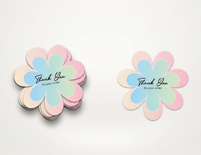
These are the marks people bring up whenever the subject comes round, with the part that matters for your own work: what was hidden, and what it cost the designer to hide it.
FedEx. Lindon Leader drew the 1994 wordmark so the counter between the capital E and the lowercase x forms an arrow. Getting there meant a custom blend of two typefaces, because no stock font produced letters that closed the gap into a clean arrowhead. That is the honest price of the technique: you draw the letters, you do not set them.
Amazon. The curve under the wordmark starts at the a and ends at the z, which says the catalog covers everything, and its upward tail reads as a smile. One stroke, two meanings, and it is thick enough to survive on a shipping label at any size.
Toblerone. The mountain on the pack is the Matterhorn, and a bear stands inside the snow on the right flank. The bear is the emblem of Bern, where the bar has been made since 1908. It is also the clearest example of a detail that only exists on the packaging, because it disappears completely at small sizes.
Baskin-Robbins. The pink sections of the B and the R form a 31, the original flavour count. It is a color trick rather than a shape trick, which means it dies in single-color printing, on an embroidered cap, and on anything etched or foiled.
The ones that read at a glance
A few of these secrets hold up rather than break. The Hyundai H is a slanted letter that also reads as two hands meeting, and both readings sit in the same heavy stroke, so nothing is lost when it shrinks. The lowercase b in the Beats mark contains a head wearing a headphone cup, built from a filled circle and a ring, with no thin gap to close.
That is the pattern worth copying. When the hidden reading lives in the same ink as the obvious one, it survives every reproduction. When it lives in a sliver of background, it survives only where the background is clean and the size is generous.
The ones that only work large
The Pittsburgh Zoo mark puts a gorilla and a lioness facing each other in the negative space of a tree, with fish and birds in the branches. It is superb on a sign and unusable on a lapel pin. The NBC peacock carries its meaning in a count, six feathers for the six divisions the network had in 1986, and nobody has ever counted them.
Neither is a failure. Both brands own signage, vehicles and screens where the detail has room. If your logo mostly appears on a card, a sticker and a shirt pocket, you do not have that room, and pretending otherwise is how brands end up with a mark that only their designer can see. There is more of this in 15 cool facts about logos and in 23 black and white logos that are anything but boring.
The techniques doing the actual work
Strip the famous examples down and there are only four moves. Knowing which one you are using tells you exactly where the mark will break.
Negative space. The gap between or inside letters becomes the picture. Highest payoff, lowest tolerance. The gap has to stay above roughly half a point at final printed size or the ink spread closes it, and it needs a plain background to be visible at all.
Letterform surgery. A letter is redrawn until it is also an object, as in the Hyundai H or the Tostitos t pair. Robust, because the meaning is in the ink rather than the paper, and it holds up in one color, in reverse, and in embroidery.
Containment. A shape is placed inside a counter, the enclosed space in a b, an o or an a. The Beats head is this. It survives well because a filled circle inside a bowl is still a filled circle at any size.
Fusion. Two letters or two symbols merge into one form, the way a monogram does. It reads fast, but every fusion produces a tight junction, and tight junctions fill in with ink, foil and thread. Set the joint wider than looks right on screen. Our guide to converting text to shapes in Illustrator covers the outlining step that makes those junctions editable in the first place.
Where each technique fails in print
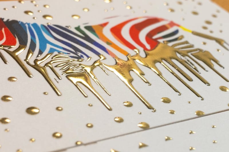
Foil is the least forgiving surface a logo meets. A heated die pushes metallic film into the stock, and anything below about half a point either fills solid or drops out entirely, so a negative-space arrow drawn as a hairline simply will not appear on raised foil business cards. The same floor applies to flat foil business cards. Bold shapes are what foil is for, and the difference between the two foil methods is set out in foil stamping versus raised foil. To see bold marks done right, watch the fat foil business cards video overview and the raised holographic business cards video overview.
Spot UV has a registration tolerance, which means the gloss layer can land a fraction off the ink underneath. If your hidden shape depends on the gloss aligning exactly with a thin gap, a small shift ruins it. Design the varnish to sit on a shape with mass, and the tolerance stops mattering.
Embroidery and small die-cut work have their own floor. Thread cannot hold a detail much under a sixteenth of an inch, and a cut line has a wander of its own, so a secret parked near the edge of a sticker gets trimmed away. If stickers are the plan, ten ways to use logo stickers shows the sizes people actually order.
What a small brand can actually borrow
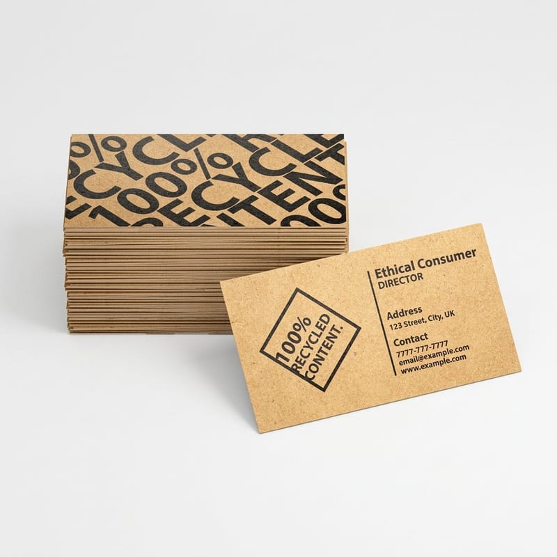
You do not need a hidden arrow. You need one deliberate decision that a customer can repeat out loud, and it does not have to be buried in negative space to count.
Borrow the discipline instead of the trick. Every mark on this page is simple enough to draw from memory, works in a single color, and carries at most one idea. Those three constraints are free, they apply to a two-person business as much as to a network, and they are what actually make a logo usable across a card, a shirt, a van and a sign.
If you want the second layer, aim it at something true about the business rather than something clever in the abstract. A bakery whose oven is the thing customers mention should hide the oven mouth, not a generic upward arrow. Meaning that comes from the business survives a rebrand of the styling. Meaning invented to be meaningful does not.
Three checks before you commit
First, print it at 12 millimeters in plain black and see whether the outline still reads. Second, reverse it out of a dark rectangle, because half of everything you print will be reversed at some point. Third, hand it to someone outside the business and ask what they see, without prompting. If the hidden reading needs a sentence of explanation, it is not hidden, it is missing.
Then check the file itself. Type has to be outlined, the mark should exist as vector artwork rather than a flattened image, and the colors need to be built for print rather than for screen. Choosing the right file type for printing and the CMYK and RGB comparison both cover the exports a printer expects.
What it costs to put your logo on paper
Standard business cards start at 100 for $17.57 in the 2 by 3.5 inch size and print in 3 business days, which puts a first test run of a new mark on paper within the week. Card pricing then moves with stock, finish and quantity, and the per unit cost drops as the run grows: 500 cards run $36.26. The numbers below come from the live configurator, so you can size a test run before you order the real one.
Quantity and price
Business card pricing and specs
Real configurator numbers, where a short proof run costs little and the per unit price falls as the quantity climbs.
| Quantity | Price Per Unit | Total |
|---|---|---|
| 100 | 17.6¢ | $17.57 |
| 200 | 11.5¢ | $23.07 |
| 300 | 9.15¢ | $27.46 |
| 400 | 7.96¢ | $31.86 |
| 500 | 7.25¢ | $36.26 |
| 600 | 6.77¢ | $40.64 |

You can also earn coins on every order and redeem them against later printing, which makes a second test run cheaper than the first.
Stock and finish decide how much detail survives
Stock and finish are not styling choices when your logo carries a fine detail. Uncoated stock lets ink spread into the fibre, which closes small counters first, so a negative-space arrow loses its point on uncoated before it loses anything on a coated sheet. Coated stock holds the edge, which is why a mark with any hairline in it belongs on gloss or matte coated card rather than on a textured uncoated one.
Print it
Spot UV, gloss on matte
A clear gloss layer over one part of the design, best used on a shape with mass rather than a hairline.
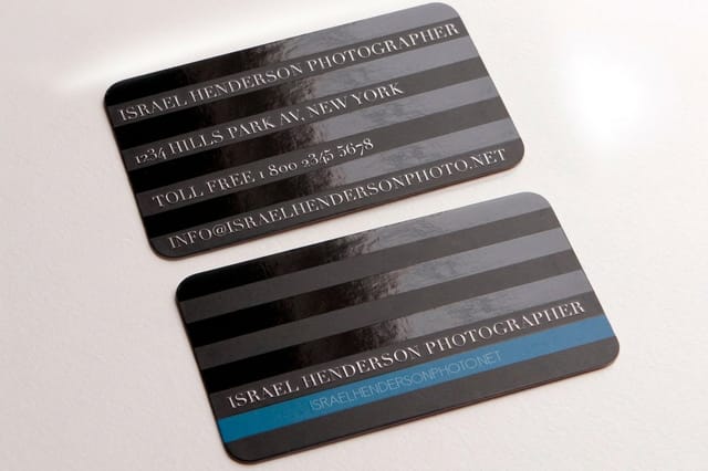
Finish changes what the eye finds. Spot UV puts gloss over one element and leaves the rest matte, which is a good way to point at a mark without adding color. Raised foil at $86.78 adds metal and relief, and it wants bold shapes because heat and pressure fill anything thin. Die-cut stickers at $93.37 let the logo outline become the edge of the object, which is the most literal way to make a shape memorable. For the stationery side of the same identity, letterheads start at $99.95 and reproduce the mark at a size where detail actually shows.
What a clever logo is worth, by business type
The right amount of hidden detail depends on where the mark spends its life, so the answer changes by business type.
- Local service businesses. One heavy shape, one color, no negative-space gag. The mark spends its life on a van door, a shirt and a card, and all three are hostile to fine detail.
- Cafes and bakeries. A containment trick inside a round counter works well here, because a filled shape inside an o survives a stamp, a cup sleeve and a die-cut sticker.
- Studios and agencies. This is where letterform surgery pays, since the audience looks closely and the mark appears large on portfolio pieces and on letterheads.
- Retail and product brands. Design for the shelf first and the tiny uses second. Anything that only reads on packaging needs a simplified mark held in reserve for small applications.
- Trades and contractors. Fusion monograms read fast on a truck at 40 feet. Widen every junction, because what looks tight on screen fills in solid in vinyl and in foil.
Blanks for a first test run of the mark
Testing a mark goes faster when the file setup is already correct. 4OVER4.COM sizes its blanks to exact product specs, so bleed and trim are marked before you place the logo and the only thing you are judging is the artwork. The business card blanks cover all four standard sizes, 2 by 3.5, 2 by 2, 1.5 by 3.5 and 2.125 by 3.375 inches, so you can check how the hidden detail holds up on the smallest one first. Pull one from the blank template library, or start from a layout in the design template library if you want a card built around the mark.
Start fast
Blanks for a first test run of the mark
Card templates and exact size blanks so your logo lands inside the cut line on the first test run.














Wally checks whether your secret survives the press
Print it small before you fall in love with it
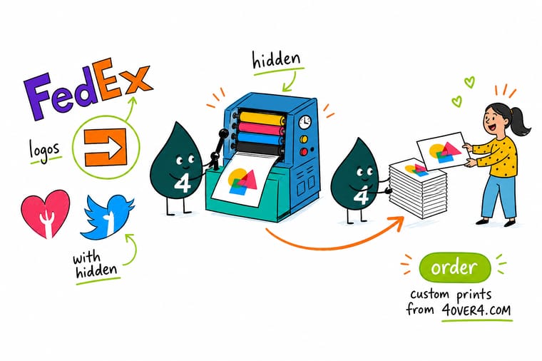
Draw any meaningful gap wider than half a point at final size, keep the hidden reading inside the ink rather than the background, and test the mark at 12 millimeters in one color and again reversed out of black. Coated stock holds fine detail, uncoated closes it, and foil wants bold shapes. 4OVER4.COM prints a short proof run so you judge the logo on paper.
Print your logo on business cards →What to remember about hidden-meaning logos
Design tips that hold up on press
- Draw the gap fatter than looks right. Ink spreads on press and foil spreads under heat. A counter that measures fine on screen closes on paper, so give any meaningful gap real width before you sign off.
- One idea per mark. Every logo on this page hides exactly one thing. Two secrets in one shape produce noise, and noise is what a viewer edits out first.
- Make the secret live in the ink. A hidden reading built from filled shapes survives reversing, embroidery and foil. One built from background never does.
- Keep a small-size version. Simplify the mark for anything under half an inch and use it without guilt. Almost every brand with a detailed logo quietly does this.
- Test on the real substrate. Coated stock, uncoated stock and vinyl all hold detail differently. A short run costs less than discovering the problem on a thousand cards.
Explore more
More ways to print your brand
Die-cut stickers run 25 for $93.37 in 5 business days and raised foil cards 100 for $86.78 in 7.
Product Standard Business Cards The cheapest way to see your logo at real printed size. 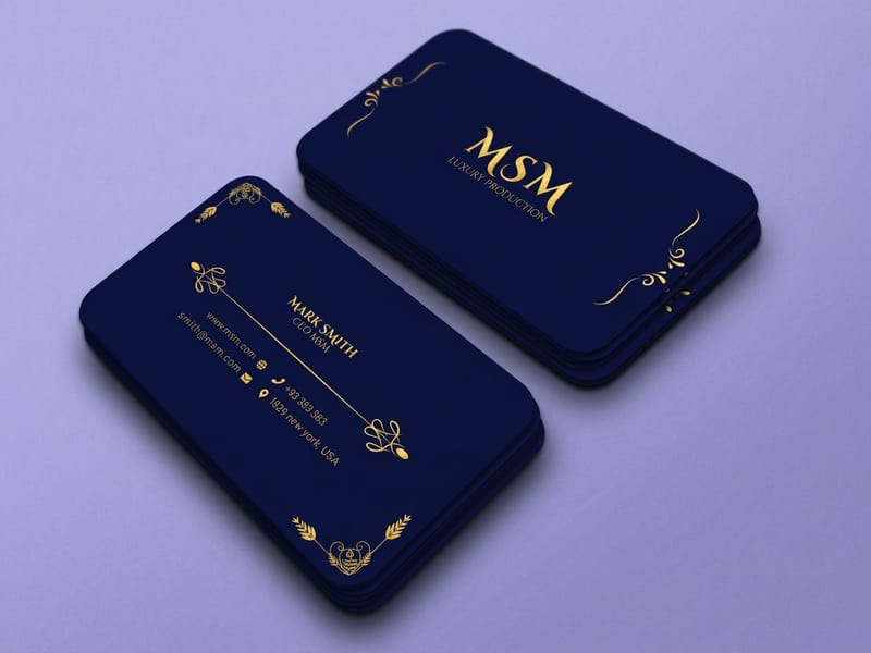 Product Premium Business Cards Heavier stock and finishes for a mark that has to feel considered. Product Raised Foil Business Cards Metallic relief that rewards bold shapes and punishes hairlines.
 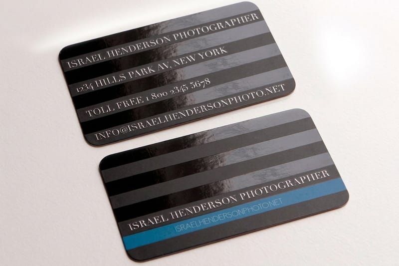 Product Spot UV Business Cards Gloss on matte, so one part of the logo catches the light. Product Die-Cut Stickers Your logo cut to its own outline instead of a rectangle.
  Category Business Card Printing Every stock, size and finish for the card your logo lives on.
 Still working on the mark itself? The walkthroughs collected in the best logo design tutorials on the web cover construction, and sticker printing is the cheapest place to see a finished outline cut to shape.
Ready to see your logo in print?
Pick a stock, drop in your artwork or a free blank, and 4OVER4.COM prints it sharp enough to judge the detail, as fast as your deadline needs.
Common questions about hidden-meaning logos
Does my logo need a hidden meaning?
No, and most strong logos do not have one. The swoosh, the Apple silhouette and the McDonald’s arches carry no second layer, and they are among the most recognized marks in the world. A hidden detail is a bonus hook on a shape that already reads clearly, so it earns its place only after the outline works on its own. If you are choosing between a simple mark that reads at 12 millimeters and a clever one that needs explaining, take the simple one every time.
How small can a hidden detail get before it disappears?
As a working rule, any gap or stroke that carries meaning should stay above about half a point at the final printed size. Below that, ink spread on press closes a counter, foil fills it under heat, and embroidery thread cannot form it at all. The FedEx arrow survives to roughly a quarter of an inch tall because the arrowhead is wide relative to the wordmark, while the bear inside the Toblerone mountain is gone well before that. Print your own mark at the smallest size you will really use, on the stock you will really order, and judge it on paper rather than on a screen.
Will a negative-space logo work in foil or spot UV?
Only if the gap is wide. Raised foil is applied as a film pressed into the stock, so hairline detail either fills solid or drops out, and the effect is built for bold shapes with mass. Spot UV carries a registration tolerance, which means the gloss layer can land slightly off the ink beneath it, and a hidden shape that depends on perfect alignment with a thin gap will show that shift. Both finishes are excellent for a simple contained mark. Send the printer a vector file, ask for a proof, and if the detail is critical, keep a simplified version of the logo for these applications.
Do customers actually notice these details?
Mostly not on their own, and that is fine. The value shows up when somebody points it out, because the discovery gets retold with the brand name attached. FedEx has had decades of free retelling from a shape most people never spotted unaided. For a small business the same effect is available in a much smaller circle, when a customer notices the detail on a card and mentions it. What you should not do is rely on the discovery for the logo to make sense, because the majority of viewers will only ever see the first reading.
How do I test a logo before printing a full run?
Print a short run at real size on the actual stock, then look at it in ordinary room light. Check the mark small, check it reversed out of a dark field, and check it in one color. A pack of standard business cards at $17.57 gives you every one of those checks on paper for less than another round of on-screen mockups. Start from a print-ready blank with the bleed and trim already marked so the test is measuring your logo rather than a file-setup mistake, and ask for a proof before the real run goes on press.
