
Printable Graphic Design Inspiration for Cards, Posters and Flyers You Can Order


Sofia is our design and templates voice, built from the knowledge of our production team, with over 20 years in printing.
Pick the format before the artwork, because reading distance decides which ideas survive: detail and texture on a card, a headline plus one offer on a flyer, a single statement on a poster. Then build the file the same way every time, at 0.125 in bleed, 300 DPI at final size, CMYK, with nothing important inside 0.125 in of the trim, and the idea you liked on screen comes back looking like itself.
Which format suits which idea
| Format | Typical size | What it holds | Where the idea works | Product at 4OVER4 |
|---|---|---|---|---|
| Business card | 3.5 x 2 in | One idea, held in the hand | Detail wins: foil, edge color, a cut shape | Premium Business Cards, from $17.57 |
| Postcard | 4 x 6 in or larger | One image front, one message back | Cheapest way to test a layout in print | Standard Postcards, from $16.48 |
| Club flyer | 4.25 x 5.5 in or 4 x 6 in | Photograph plus reversed type | Handed out, kept in a pocket | Club Flyers, from $16.48 |
| Standard flyer | 8.5 x 11 in | A headline, a body block, an offer | Counters, mailboxes, door drops | Standard Flyers, from $39.54 |
| Poster | 18 x 24 in and up | One statement read from across a room | Walls, windows, events | Large Format Posters, from $25 |
Prices are the starting price on each product page: 50 postcards at $16.48, 100 premium business cards at $17.57 on 14pt gloss, one 11 by 17 inch large format poster from $25 on 10mil semi gloss. If you are undecided, start on the cheap end: you can order standard postcards in a short run and see the layout in your hand before it becomes anything bigger.
Why an idea from a screen looks different on paper
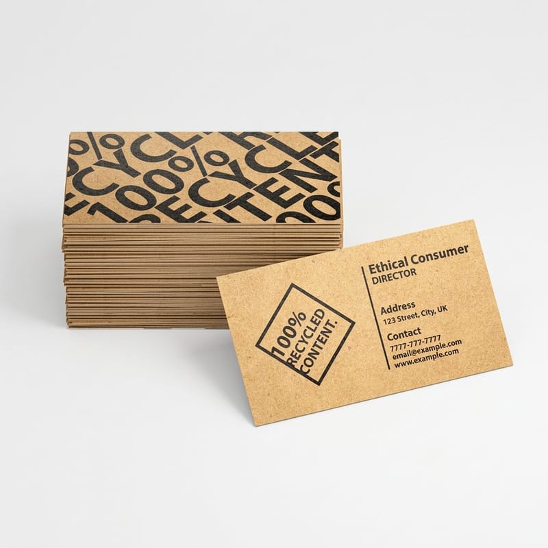
A monitor makes color by shining light through red, green and blue pixels. A press makes color by laying down cyan, magenta, yellow and black ink on a sheet that reflects room light back at you. The two ranges overlap, but they are not the same range, and the parts that fall outside are exactly the parts designers fall in love with online: electric greens, hot pinks, fluorescent orange, anything that seems to glow.
That is the first thing to know before you copy a reference. Convert the file to CMYK yourself and look at it, rather than letting the conversion happen quietly at the printer. What you see after the conversion is close to what will come back in the box.
The second thing is black. A large area filled with 100% K alone prints as a soft charcoal, not the deep black it looked like on screen. Build a rich black for those areas, around 60 cyan, 40 magenta, 40 yellow and 100 black, and keep plain 100% K for small text so the type stays sharp instead of doubling up on four plates. Our page on printing terms defines the vocabulary if any of this is new.
Resolution is measured at final size, not in pixels
A 1200 pixel image is generous on a phone and thin on paper. At 300 DPI it covers four inches. Pull the same file onto a poster and it covers four inches of a two foot sheet, which is why saved inspiration so often prints soft while the original looked perfect. Our giant poster guide sets out what 300 DPI poster printing means at full size.
Vector is the way out. Logos, type and any flat shape should be drawn as vector so they stay crisp at any size, and if a font is going to travel with the file, convert the text to shapes before you send it.
Stock changes the design, not just the feel
Gloss holds fine detail and lifts photography. Matte reads calmer and kills glare under a shop light. Uncoated absorbs ink, so lines thicken slightly and reversed type at small sizes can close up, which is the trade for a surface people can write on. Our explainer on gloss cover paper covers where each one earns its place.
Pick the stock while you are still designing. A layout built for gloss and printed on uncoated is not ruined, but it is not the design you approved either.
Ten ideas and the product each one prints on

Each of these is a direction rather than a template, and each one is cheap enough to try on a short run. They are grouped by what you are holding when it is done.
Start with the format that suits the idea. A detail you want people to touch belongs on a card. A statement you want read across a room belongs on a poster.
Five that work in the hand
1. One oversized initial. A single letter set enormous, bleeding off two edges, with the name small in a corner. It works on premium business cards because a card is read at arm length and the letter has nowhere to hide.
2. A foil accent on one word. Foil earns its cost when it is rare on the card. Put it on the name or one mark, keep every stroke above roughly half a point so the fine parts do not fill in, and supply the foil layer as solid black vector on its own layer. Foil business cards are the format for it.
3. A cut silhouette. A shape that follows the brand rather than a rectangle changes how the card is handled, and people keep it. Die-cut business cards start at $26.37, and the cut path is drawn as a vector line on its own layer, never painted into the art.
4. Seventy per cent empty. One line of type, placed off center, and nothing else. Restraint is difficult to sell to a client and it is the single cheapest way to look expensive, because it costs nothing extra to print.
5. The postcard as a small poster. One full bleed image on the front, all the type on the back. Standard postcards at $16.48 are the least expensive way to see a layout in print before you commit it to anything bigger.
Five that work on a wall or a counter
6. Type as the whole image. One word, filling the sheet, cropped by the trim. It reads from across a room and it needs no photography, which is why it survives on a small budget.
7. The two color look. Limit the palette to two inks and let them overlap. It borrows the feel of a riso print, it hides a weak stock photo library, and it keeps a series looking related on standard flyers.
8. Edge to edge photograph, reversed type. The club flyer approach. Choose an image with a quiet area for the words, and keep reversed type large and bold so it holds against the picture. There is more on the craft of it in our nightclub flyer design guide.
9. One layout, color by event. Fix the grid, change only the color and the date. A season of events reads as one campaign instead of nine unrelated sheets, and each new print run becomes a color change rather than a design job.
10. The repeated grid. One object photographed once and tiled across a poster. It is a strong image built from a single asset, which is why it shows up so often in campaign poster work where budgets are tight and deadlines are short.
What each format lets you get away with
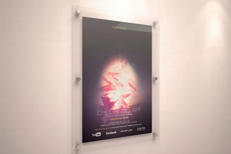
The same idea does not survive every size. Reading distance is what decides it, and reading distance changes what you can put in front of someone.
A card is read at about a foot and a half, so it holds one idea and rewards texture, foil and a cut edge. A flyer is read at arm length and can hold a headline, a short body block and an offer. A poster is read from ten feet or more, where a rule of thumb worth keeping is that an inch of cap height carries about ten feet. Set your headline, stand back the real distance, and cut whatever you can no longer read.
Ink coverage is the other limit. A design that floods every sheet with solid color costs the same to print, but heavy coverage shows every handling mark on a gloss card and every roller line on a large sheet, so a flat solid background is less forgiving than a photograph.
Where an idea usually breaks
Type set right against the trim is the most common failure, and it is invisible on screen. Cutting has a small tolerance, so a line placed a sixteenth of an inch from the edge can end up shaved on one card in a stack and comfortable on the next. Keep the safety margin at 0.125 in and the whole run looks deliberate.
The second break is a border. A thin frame drawn around the edge of a card is the hardest thing in printing to make look right, because any drift in the cut shows as an uneven border on one side. If the reference you love has a border, either make it thick enough to absorb the movement or leave it out.
Turning a reference into a print ready file

Build the document at the finished size, add 0.125 in of bleed on each side, and extend every background color and image right into that bleed. Set the working space to CMYK before you place any artwork, so you are choosing colors you can actually print rather than converting them afterwards and being surprised.
Export a flattened PDF with fonts embedded or outlined, and check the file at 100% on screen once before you send it. Most problems are visible at that magnification: a low resolution photo, type sitting too close to the edge, a stray white line where a background stopped short of the bleed.
If you would rather not start from an empty document, the blank template library already has the bleed, trim and safety lines drawn for each product, and the design templates give you a layout to edit instead of a blank page.
Borrowing an idea without borrowing the file
Reference is how design has always worked. Copying is different, and it carries real risk: photographs, illustrations and typefaces all belong to someone, and a font licensed for a website is not automatically licensed for a printed run you sell.
The practical route is to name what you actually liked. It is rarely the whole piece. It is the palette, or the way the type is cropped, or the amount of empty space. Take that one decision, apply it to your own content, and you end up with something you can print and defend.
What a run actually costs
A design idea costs $16.48 to test as 50 postcards, and the same layout as 500 foil business cards costs $222.13 and takes 9 business days, so try it cheap first. Large format posters start at $25 and print in 2 business days. The numbers below come straight from the live configurator for premium business cards, so you can size a first run before you commit to the design.
Quantity and price
Premium business card pricing and specs
Live run pricing, from 50 postcards at $16.48 up to 500 foil cards at $222.13.
| Quantity | Price Per Unit | Total |
|---|---|---|
| 100 | 17.6¢ | $17.57 |
| 200 | 11.5¢ | $23.07 |
| 300 | 9.15¢ | $27.46 |
| 400 | 7.96¢ | $31.86 |
| 500 | 7.25¢ | $36.26 |
| 600 | 6.77¢ | $40.64 |

You can also earn coins on every order and redeem them against later runs, which helps when a series of flyers or posters is going to be reprinted every few weeks.
Finishes that change how an idea lands
Finish is not decoration on top of a design. It changes the design. Gloss deepens photography and makes color look wet, which suits an image led card and shows fingerprints on a dark solid. Matte lowers the contrast slightly and removes glare, which is why it reads calmer and why fine type looks more comfortable on it. Foil and spot gloss add a second reading of the same surface, visible only when the card catches the light, and both work best used once rather than everywhere.
Print it
Premium business cards
The format where one well made detail does the most work, on stock heavy enough to feel it.
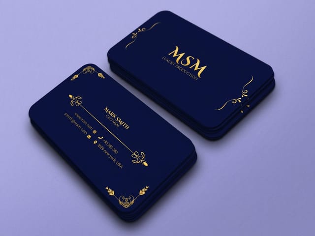
Weight matters as much as coating. A 14pt card is the everyday standard and a 16pt card is noticeably stiffer in the hand, which is the difference people register without being able to name it. On a poster the equivalent decision is the surface: a matte poster stays readable under a spotlight where a gloss one throws it straight back at the reader. Sizes and orientation for wall work are covered in the horizontal poster sizes guide, and mailing layouts have their own rules in how to lay out a postcard for mailing.
Where these ideas earn their keep
The same ten directions land differently depending on who is printing them, so the useful ones change by business type.
- Studios and freelancers. A card that shows a craft decision does more than a portfolio link. One detail, executed properly: a cut shape, an edge color, or foil on a single word.
- Bars, clubs and promoters. Club flyers at $16.48 make a weekly series affordable. Fix the grid, change the color and the date, and the run reads as a campaign.
- Retail and hospitality. Counter cards and window posters carry one message each. Large format posters from $25 mean a seasonal change costs less than the window display it sits in.
- Local services. Standard flyers at $39.54 hold a headline, a short block of proof and one offer. Print a small run, watch which offer gets calls, then reprint.
- Event organisers. One poster layout with a color per event keeps a season legible on a noticeboard where every other sheet is fighting for the same attention.
Blanks that remove the mechanical part
If you are not starting from scratch, a template removes the mechanical part of the job. 4OVER4.COM sizes its blanks to exact product specs, from a 3.5 by 2 inch card to an 11 by 17 inch poster, so the 0.125 inch bleed, the trim and the 0.125 inch safety margin are already drawn and your artwork lands where you expect it to.
Start fast
Blanks that remove the mechanical part
Editable design templates and exact size blanks so your artwork lands inside the cut line.














Wally turns a saved screenshot into something printable
Same idea, built to the rules a press can hold
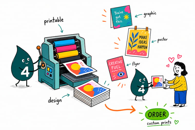
Rebuild the reference at final size in CMYK, keep photographs at 300 DPI and draw logos and type as vector, add 0.125 inch bleed on all four sides, and hold everything important 0.125 inch inside the trim. Give foil areas and die lines their own layers, then prove the layout on a short postcard or club flyer run before it becomes a poster.
Order premium business cards →What to check before an idea goes to press
Design tips that hold at every size
- Convert to CMYK yourself. Do the conversion in your own file and look at the result. A color that shifts on your screen is a color that would have shifted in the box, only later and with a print run attached.
- Keep 0.125 in clear of the trim. Bleed extends the artwork past the cut. Safety keeps the content inside it. Both are needed, and skipping the second is what produces a shaved headline.
- Set the headline at real distance. Print the poster headline at scale, tape it up, and stand where the reader will stand. Cut what you cannot read from there.
- Give foil and die lines their own layer. A foil area and a cut path are instructions to the machine, not artwork. Draw them as solid vector on separate layers and label them.
- Test the idea on the cheapest format first. Postcards and club flyers start at $16.48, so a layout can be proven in print before it becomes a poster run or a thousand cards.
Explore more
More ways to print an idea
Foil business cards run 500 for $222.13 in 9 business days and large format posters print in 2.
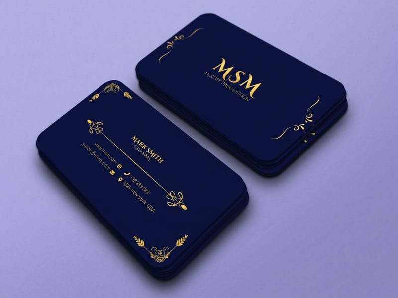 Product Premium Business Cards From $17.57. The format that rewards one well made detail. Product Large Format Posters From $25. One statement, read from across a room. Product Standard Flyers From $39.54. Headline, proof and an offer on one sheet. Product Standard Postcards From $16.48. The cheapest way to see a layout in print.
 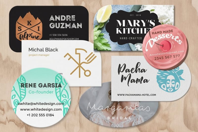 Product Die-Cut Business Cards From $26.37. A cut shape instead of a rectangle.
  Category Business Card Printing Every stock, finish and shape we print, in one place.
 Ready to print the idea?
Pick the format, drop in your artwork or start from a free template, and 4OVER4.COM prints it sharp on premium stock, as fast as your deadline needs.
Common questions about printing design inspiration
Why does the color I picked on screen come back duller in print?
Because a screen makes color with light and a press makes it with ink. RGB can display saturated greens, hot pinks and fluorescent oranges that sit outside the range four process inks can mix, so those colors land on the nearest printable equivalent, which reads calmer. Convert your file to CMYK yourself while you are still designing and judge the colors after the conversion. If one specific color has to be exact across a brand, ask about a spot ink rather than fighting the process build.
Can I print a design I saved from a website or a social feed?
Not directly, for two reasons. A saved image is usually 72 to 150 pixels per inch at a small size, which prints soft the moment it is scaled, and the artwork, photography and typeface all belong to somebody. Use it as reference instead. Name the one thing you liked, whether that is the palette, the crop or the amount of empty space, and rebuild it with your own content at 300 DPI. Fonts matter here too: a license for web use does not automatically cover a printed run you sell.
What is the cheapest way to test a design idea in print?
A short run of postcards or club flyers, both starting at $16.48. Print the layout at a real size on real stock, hold it, and put it on a table next to whatever it will compete with. Type that looked balanced on a monitor often looks small in the hand, and a color that looked rich on screen sometimes looks flat on paper. Testing at that price is far cheaper than discovering it on a thousand business cards or a poster run.
How big should type be on a poster?
Work back from the reading distance. A useful rule of thumb is about one inch of cap height for every ten feet, so a headline meant to be read from thirty feet wants roughly three inch capitals. Print the headline at scale, tape it to a wall, and stand where the reader will actually stand. Whatever you cannot read from there is decoration, and cutting it usually makes the poster stronger.
Do I need a designer, or can I start from a template?
A template is a legitimate starting point, especially when you already know what the piece has to say. The blank templates carry the bleed, trim and safety lines for each product so the mechanics are handled, and the design templates give you a layout to edit. Bring in a designer when the piece has to carry a brand across several formats at once, because that is where consistency, type licensing and production decisions start to compound.
