
The History of Logos From Ancient Symbols to Modern Brands


Marcus is our print marketing voice, built from the knowledge of our production team, with over 20 years in printing.
Ancient Foundations of Symbolism in Graphic Arts
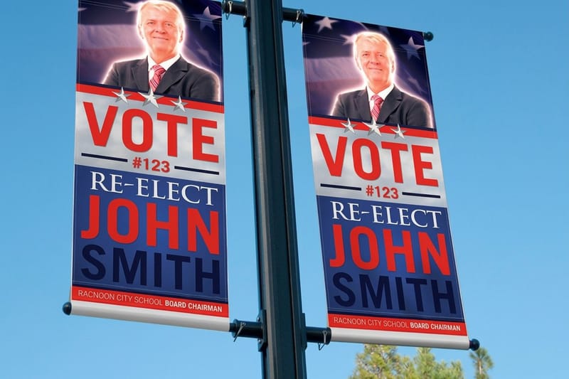
A logo is a promise compressed into a shape, and people have been compressing promises into shapes since long before anyone used the word brand. The earliest examples were not selling anything. They answered a simpler question that mattered enormously in a world without paperwork: who made this, who owns it, and can you trust what is inside the jar. Your own mark answers the same questions on a smaller scale, on a 3.5 x 2 inch business card from $17.57, a 2 sided blockout banner from $108.75 or a 2.125 x 3.375 inch 30mil clear plastic card. Aldus Manutius signed his books with a dolphin and anchor from 1502; a coffee cart today puts its mark on its cups, its card and the banner over the window.
Mesopotamian cylinder seals are the clearest ancestors. A carved stone cylinder rolled across wet clay left a continuous image that identified a person or an office, and it could not be copied casually because the carving itself was the credential. Egyptian cartouches did similar work for royal names, wrapping a set of glyphs in an oval so the eye grouped them as one unit.
Rome industrialized the idea. Brickmakers stamped their yards into the clay, oil lamp workshops signed the base of every lamp, and amphorae carried painted notes about origin and contents. Archaeologists still use those marks to trace trade routes, which is a useful reminder for anyone designing a mark today: a symbol applied consistently across thousands of ordinary objects becomes a record that outlives the company that made it.
Marks of ownership came first
Livestock brands, mason marks on cathedral stones and workshop signatures on pottery all served the same purpose. They fixed responsibility to an object. That is still the load bearing job of a logo, and everything decorative sits on top of it.
Symbols had to work without words
Most people could not read, so meaning traveled through silhouette, color and repetition. A shape had to survive being scratched, stamped, or painted by different hands and still be recognized as the same shape.
Guild and hallmark systems added accountability
Goldsmiths in London were struck with an assay mark from the fourteenth century onward, tying purity to an identifiable maker. A mark that carries a consequence is worth more than a mark that only looks good.
Why any of this matters to a small brand now
The oldest marks were designed for the worst reproduction conditions imaginable. Design yours the same way and it will hold up on a stamp, a screen, an embroidered cap and a banner across a parking lot.
Keep reading
Logo facts most people get wrong
The origin stories worth repeating, and the ones that turn out to be inventions.
Heraldry, Crests, and the Legacy of Marks for a Nonreading Public
Heraldry arrived in twelfth century Europe for a practical reason. Armor hid the face, so a knight painted identity onto the shield and surcoat instead. What began as battlefield recognition hardened into a formal system with its own vocabulary, its own registry of who could use what, and its own rules about which colors could sit next to each other. Those rules still work on a small printed piece: a crest built from two flat colors stays readable when it shrinks to the corner of a 3.5 x 2 inch card.
Those rules are the reason heraldry still feels modern. The rule of tincture, which keeps a metal from being placed on a metal or a color on a color, is a contrast rule dressed in medieval language. It exists so a shield reads at distance, in motion, in bad light. Swap shield for phone screen and the constraint is identical.
- One dominant idea per mark. A coat of arms carries a single charge that does the recognizing, with detail kept subordinate to it.
- High contrast is a rule, not a preference. The tincture rule anticipated by centuries what accessibility guidelines now measure numerically.
- Systems beat one-offs. Cadency marks let a family generate related versions from one parent design, which is exactly how a brand builds sub-marks today.
- Registration creates value. Heralds recorded who owned which arms, the first real precedent for trademark law.
- Meaning is assigned, not inherent. A lion did not mean courage until enough people agreed it did, and the same is true of your shape.
Shop signs did the same job on the street. A red and white pole meant barber surgeon, three gold balls meant pawnbroker, a bush over the door meant wine. Customers navigated a city by picture. When you print a mark on a 2 Sided Blockout Banner and hang it at a trade show, you are working in that unbroken tradition of the sign that speaks before the copy does.
Print picks
Three surfaces that put your mark in front of people
Live prices, ready to customize with your own logo files.
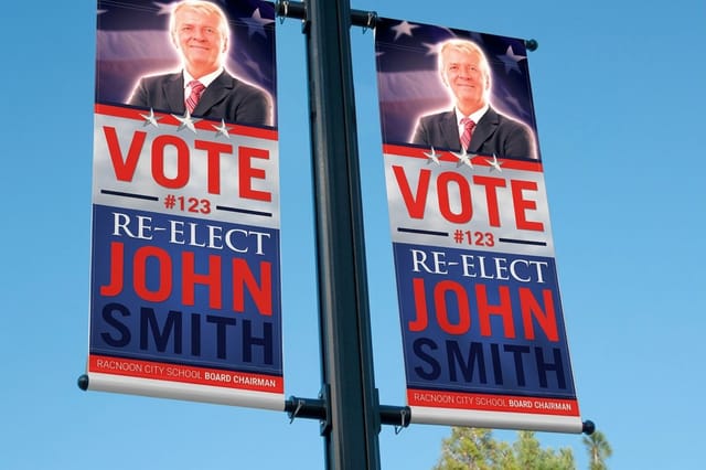 2 Sided Blockout Banners $108.75 each The modern descendant of the guild sign, with a blockout layer so your mark reads clean from both sides.
 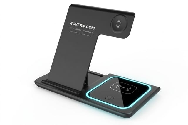 3 in 1 Foldable Wireless Charger $15.00 each An object people keep on the desk, the same logic that put maker marks on everyday tools.
 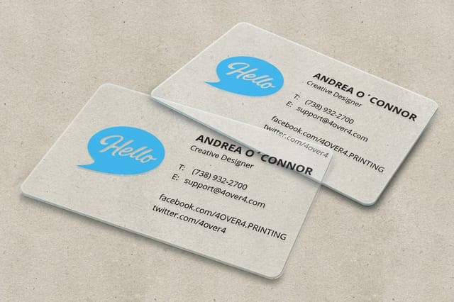 30mil Clear Plastic Cards 500 for $529.26 Transparent stock that rewards a simple silhouette, the way a good seal or monogram always did.
 How Paper and Textile Technology Fueled the First Logos
Marks needed a surface that could carry them cheaply and identically. Papermaking supplied it. Italian mills at Fabriano began working wire figures into their moulds in the late thirteenth century, and the resulting watermark sat inside the sheet rather than on it. It identified the mill, guaranteed a grade, and could not be forged with ink. That is a brand mark and an anti counterfeiting device in the same gesture.
Printing multiplied the effect. Once Gutenberg's press made identical impressions possible, printers began signing books with a device on the title page. Aldus Manutius used a dolphin coiled around an anchor from 1502, Christophe Plantin used a compass, and readers learned to buy by the mark because the mark predicted the quality of the edition. If you want the wider story of that machine, the article on the printing press and modern printing follows it through to today's presses.
Textiles pushed in parallel. Weavers wove selvedge marks into cloth, dyers stamped bolts, and trade companies burned marks into crates and bales so cargo could be sorted at a dock by people who spoke different languages. Every one of these industries had the same requirement: a mark that reproduces identically at scale, in one color, on an unforgiving surface.
That requirement is why the best logos are still monochrome first. If your mark only works in full color with a gradient behind it, it fails the oldest test in the business.
Industrialization, Advertising, and the Birth of Branding

The nineteenth century changed the job description. Factories produced more soap, biscuits and beer than any local market could absorb, railways moved goods far beyond the shopkeeper who knew the maker, and packaging replaced the barrel and the scoop. Suddenly a mark had to sell to a stranger who had never met the manufacturer, which is the moment the ownership mark became a brand.
Law followed commerce. Britain's Trade Marks Registration Act took effect in 1876, and Bass and Company's red triangle was the first mark on the register. The United States built its own framework across the following decades, culminating in the Lanham Act of 1946. Once a symbol could be owned and defended, companies started investing in it like property, because it was.
The marks from this era still dominate recognition tests. Frank Robinson's Spencerian script for Coca-Cola dates to 1886 and has barely moved since. Lyle's Golden Syrup has carried the same illustration since the 1880s. Michelin's Bibendum appeared in 1898, Prudential adopted the Rock of Gibraltar, and Quaker Oats put a face on a commodity nobody had thought to differentiate. What these have in common is not beauty. It is stubborn consistency across generations.
- Packaging created the canvas. Tins, cartons and labels gave the mark a permanent home that traveled with the product.
- Mass print gave it reach. Lithographed posters and newspaper advertising repeated the mark until repetition became familiarity.
- Trademark law gave it teeth. Registration turned a drawing into an asset that could be licensed, defended and valued.
- Characters carried personality. A face or figure gave an anonymous commodity a voice long before brand strategy had a name.
The Typographic Turn From Monograms to Wordmarks
Between the wars, European design schools stripped the ornament away. The Bauhaus argued that form should follow function, Jan Tschichold's new typography made asymmetric layout and sans serif type a principle rather than a fashion, and Peter Behrens built what is widely regarded as the first corporate identity program for AEG, covering the logo, the products, the buildings and the printed matter as one system. A modern wordmark in that tradition needs one vector file that holds from a 3.5 x 2 inch card to a 4 x 10 foot banner. Our breakdown of the bauhaus logo principles shows how that thinking carries into a mark today.
The result was a shift from pictures to letters. Monograms let a long company name collapse into two or three characters that could be cast, embroidered, stamped and set in type. A wordmark did the same job while keeping the name legible, which is why so many enduring identities are simply a name drawn carefully once and then never redrawn on a whim.
Letterforms also print beautifully. A well spaced wordmark holds its shape at small sizes on stock where fine illustration would clog, which matters when your mark has to sit on a card edge or a transparent panel. Look at how much white space a mark needs and then buy the size that respects it.
Quantity and price
Clear plastic card pricing and specs
Real configurator numbers. The more you print, the lower the unit cost falls.
| Quantity | Price Per Unit | Total |
|---|---|---|
| 500 | $1.06 | $529.26 |
| 1,000 | 63.0¢ | $630.31 |
| 2,000 | 56.8¢ | $1,135.55 |
| 2,500 | 53.0¢ | $1,325.02 |
| 3,000 | 50.5¢ | $1,514.49 |
| 3,500 | 48.7¢ | $1,703.96 |

The Modern Era of Thoughtful Logo Design
Postwar America turned identity into a profession. Paul Rand gave IBM its striped wordmark and rebuilt marks for ABC, UPS and Westinghouse, arguing that a logo derives meaning from the quality it symbolizes rather than the other way around. Saul Bass brought film title thinking to corporate marks. Chermayeff and Geismar solved Chase in 1960 with an abstract octagon that meant nothing until the bank made it mean something, which was precisely the point. For more marks in that line, see our roundup of the best corporate identity examples.
Europe formalized the manual. Otl Aicher's identity for the 1972 Munich Olympics defined a grid, a palette and a full pictogram family, and those pictograms are the direct ancestors of the wayfinding symbols in every airport. Massimo Vignelli pushed the same discipline into transit and publishing. The deliverable stopped being a drawing and became a rulebook.
- Reduction over illustration. Fewer elements survive scaling, embroidery, engraving and low ink coverage.
- Abstract marks are earned. Carolyn Davidson's Nike swoosh from 1971 meant motion only after years of consistent use.
- Simple beats clever. Rob Janoff's 1977 Apple mark reads instantly at the size of a favicon, which is where most logos live now.
- The system is the product. Color specifications, clear space and minimum sizes are what keep a mark intact across a hundred applications.
- Responsive marks are the newest chapter. Many identities now ship in full, compact and icon-only versions for different screens and print sizes.
If you enjoy the trivia side of this, the collection of cool facts about logos gathers the origin stories that get repeated most often, along with the ones that turn out to be myths.
Large format
2 sided blockout banners
A blockout core stops the back artwork showing through, so a bold mark stays crisp on both faces.

What Centuries of Marks Teach a Small Brand Today
You do not need a design department to apply the lessons. The through line from a cylinder seal to a modern identity is that the mark must be reproducible, ownable and repeated without flinching. Most small brands fail on the third one, redesigning every eighteen months and resetting the recognition they had started to build.
Start with the hardest reproduction case you actually have. Embroidery on a cap, a one color stamp, an engraved pen, a favicon. Draw for that, then let the generous applications inherit the discipline. A mark that survives the worst case looks confident everywhere else, and it costs less to produce because it does not demand special handling on every job.
Then put it on things people keep. Merchandise is not a modern gimmick, it is the same instinct that put maker marks on tools and vessels, and a useful branded object earns more repeat impressions than a poster ever will. The 3 in 1 Foldable Wireless Charger is a good example of an item that stays on a desk for years, sold as it comes beside your printed pieces.
Branded objects
Put the mark on something people keep
Useful items earn years of repeat impressions, which is exactly how maker marks on tools worked in the first place.
Famous Logo Origins and the Redesigns That Followed
Every well known mark has a version history, and the interesting part is usually what stayed rather than what changed. Shell began as a literal mussel shell in 1900 and was simplified over decades into the flat pecten Raymond Loewy refined in 1971. Mercedes-Benz kept the three pointed star from 1909 and only cleaned up its rendering. Apple dropped the rainbow but kept the bite. Each of those redesigns kept a mark that still prints at full strength in one flat color, which is the test to run on your own logo before you reprint cards and signs.
Other brands used redesign as a strategic reset. Pepsi has cycled through scripts, bottle caps and globes more than almost any major brand, and the reasoning behind each move is worth studying on its own in the breakdown of the Pepsi logo and what it teaches brands. Before you change your own, read how to redesign a logo without losing brand recognition.
- Simplify, do not replace. The strongest redesigns keep the recognizable asset and remove everything competing with it.
- Fix the reproduction problem first. Most historic redesigns were triggered by a new medium, from lithography to television to the small screen.
- Keep the equity you already paid for. Color, silhouette and typography carry memory even when details change.
- Test at the smallest size you will ever print. If it fails there, it fails everywhere that matters.
Comparing print formats side by side is the same exercise in miniature. Stock, finish and size change how a mark behaves, and the honest way to choose is to see the specifications next to each other rather than guessing from a thumbnail.
Compare finishes
Popular card formats, side by side
Stock, finish, size, quantity, turnaround, and price in one view so the choice is evidence based.
 free business cards |  Standard Business Cards |  3D Lenticular Business Cards |  Metallic Foil Business Cards | |
|---|---|---|---|---|
| Min price | Free | $17.57 | $690.88 | $222.13 |
| Paper / stock | 14pt Gloss Cover | 14pt Gloss Cover | 31pt Lenticular Lens | 16 Point Silk Laminated |
| Finish | - | Standard Finish | - | - |
| Size | 2" x 3.5" | 2" x 3.5" | 2" x 3.5" - Vertical | 2" x 3.5" |
| Default qty | 200 | 100 | 500 | 500 |
| Turnaround | 5 business days | 3 business days | 22 business days | 7 business days |
| Rating | ||||
| View & customize | View & customize | View & customize | View & customize |
From Historic Marks to Your Printed Brand
A logo only becomes a brand when it appears in the physical world often enough that people stop noticing it and start expecting it. That is what the guild sign, the printer's device and the packaged tin all did. Your version is a consistent set of printed touchpoints where the mark shows up in the same weight, the same color and the same clear space every time.
Build the kit in layers. Start with the pieces you hand to people, add the surfaces that hold a room, then the objects that leave with them. A 30mil Clear Plastic Card makes a minimal mark look deliberate because the transparent stock exposes any clutter immediately, which is a useful discipline to inherit from the seal makers.
Match the surface to the mark
- One color marks. Stamps, engraving and embroidery, where silhouette does all the work.
- Detailed wordmarks. Cards and stationery, where fine spacing survives on a smooth stock.
- Bold silhouettes. Banners and signage, read at distance and often in motion.
- Small icon versions. Merchandise, stickers and anything under an inch wide.
Stickers deserve a specific mention because they are the cheapest way to repeat a mark in the wild, and the piece on fun ways to use logo stickers for promotion covers where to put them so they actually get seen.
Start fast
Templates and print-ready blanks
Free layouts plus exact-size blanks so your mark sits inside the safe area from the first draft.
Wally traces your mark back to the first seals
Old rules, new surfaces, one recognizable brand
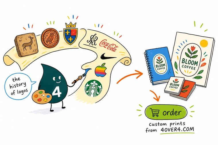
Every strong mark in history was built for bad printing conditions and then repeated without flinching. Draw yours in one color, check it at favicon size, lock the clear space, and then put it on the pieces people actually handle. Clear plastic cards are the honest test, because transparent stock exposes any clutter and rewards a confident silhouette.
Print your logo on clear cards →What Logo History Means for the Mark You Print Next
Explore more
More on brand marks, printing, and getting noticed
The Pepsi logo history, the printing press story, fifteen logo facts, logo sticker promotions, and the banner and plastic card that carry a mark in print.
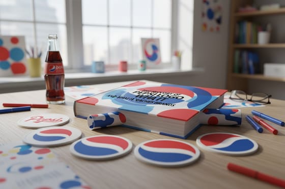 Article The Pepsi Logo History What a century of redesigns teaches every brand owner.
  Article The Printing Press Story From movable type to the presses running your job today.
  Article 15 Cool Facts About Logos Hidden shapes, origin myths and marks with a secret.
  Article Logo Stickers for Promotion Ten placements that turn a sticker run into real reach.
  Article Daring Table Tent Designs Small format signage that puts your mark on every table.
  Article 20 Small Business Hacks Founder tactics that make a young brand look established.
  Article 25 Social Content Ideas Where to repeat your mark once the print pieces exist.
  Alternative Vistaprint Invitations Alternative Print house pricing compared for custom invitations. Product 2 Sided Blockout Banners Your mark readable from both sides, with no bleed through. Product 30mil Clear Plastic Cards Transparent stock that rewards a simple, confident logo.
 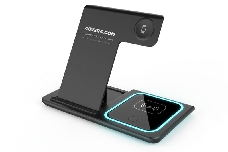 Product 3 in 1 Foldable Wireless Charger A ready-made desk object that stays in use for years.
 Test your mark in one flat color on 100 business cards
Pick the format, upload your artwork, and let the same mark repeat across banners, cards and branded objects until people recognize it before they read a word.
Logo History Questions People Ask
What is logo history and why does it matter to a business today?
Logo history is the story of how identifying marks moved from ownership stamps on clay, metal and cloth to the trademarked brand symbols we recognize now. It matters because the requirements never really changed. A mark still has to be reproducible on rough surfaces, distinct enough to defend, and repeated long enough to be remembered. Studying how seals, heraldry and printers’ devices solved those problems saves you from mistakes that were settled centuries ago, and the same lessons show up again in these logo facts.
How do I use logo history to design a better logo now?
Borrow the constraints rather than the styles. Draw your mark in one color first, make sure it holds at the size of a favicon and an embroidered cap, keep a single dominant element the way a coat of arms does, and define clear space and minimum size before you use it anywhere. Then commit. The Victorian marks that still feel current were not redrawn every few years, they were applied relentlessly. Consistency, not novelty, is what turned those shapes into assets.
What does it cost to print branded pieces carrying your logo?
Cost depends on format, quantity and finish rather than on the logo itself. At 4OVER4.COM, 2 Sided Blockout Banners start at $108.75, the 3 in 1 Foldable Wireless Charger starts at $15.00 as a ready-made giveaway, and 30mil Clear Plastic Cards start at $529.26 for a premium card run. Every product page shows live tiered pricing, so you can see exactly where the per unit cost drops as quantity climbs and plan a launch kit against a real budget.
What sizes, stocks and finishes suit a logo best?
Match the surface to the mark. Bold silhouettes belong on large format banners where distance and motion are the test. Fine wordmarks and detailed monograms belong on smooth card stock where spacing survives. Transparent 30mil plastic exposes any clutter, so it flatters minimal marks and punishes busy ones. For promotional objects, use the icon-only version of your logo. Each product page lists the exact sizes, stocks, coatings and specialty finishes available for that format.
How long does it take to print and ship branded materials?
Turnaround varies by product and by the options you select. Flat printed pieces such as cards move fastest, large format banners need finishing time for hems and grommets, and promotional items with imprinting run on their own schedule. The configurator on each product page shows the available production speeds with the shipping estimate attached before you check out, so you can work backward from a trade show date or a launch and pick the speed that lands in time.
