
How to Redesign a Logo Without Losing Brand Recognition


A logo redesign should sharpen your brand, not erase the recognition you spent years building. Keep whichever element people actually recognize, and change everything around it.
Redesign a logo by evolving it, not replacing it. Audit where the mark lives, keep one strong anchor like the color or shape, refresh the dated parts, test candidates at real size on a printed card, build clean CMYK vector files, and reprint your cards, letterhead, and signs together so the new look is consistent everywhere.

Start here
Evolve the mark, keep the recall
A recognizable redesign evolves the mark instead of replacing it. Audit where your logo lives, keep one strong anchor like the color or silhouette, modernize the dated parts, test at real printed size, and rebuild the winner as clean CMYK vector files. Then reprint cards, letterhead, and signage together so the refreshed brand from 4OVER4.COM reads as one whole. The timeline below shows how a mark evolves without losing recognition.
Why and when to redesign a logo, and when to leave it alone
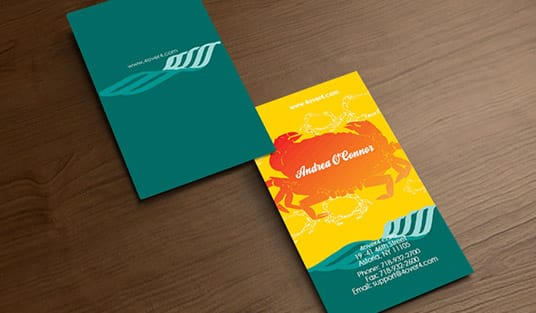
Redesign a logo when it stops doing its job: it turns to mush at business card size, the typeface dates the business, the name or the category has changed, or the only artwork you still have is a JPG rather than a vector file. Leave it alone when it still reads small, still prints clean in a single ink, and customers still name you from the shape alone. Boredom is not a reason, and neither is a new marketing manager. A logo earns its value slowly. Every time someone sees it on a card, a sign, or a receipt, the mark gets a little more familiar, until it becomes shorthand for your business. That accumulated familiarity is brand equity, and it is the thing a careless redesign can quietly destroy.
Good reasons to redesign do exist. The mark may look dated next to newer competitors, it may break down on small screens or app icons, or the business may have outgrown what the old logo says about it. The goal in every case is the same: modernize the look while keeping enough of the original that customers still know you on sight. Think evolution, not replacement. A practical rule from the press side: hold one anchor completely still, the color, the silhouette, or the symbol, and change only what sits around it. That single fixed cue is what carries recognition from the old card in a customer wallet to the new one you hand them next month.
This guide walks the redesign in the order you would actually do it, from auditing your current mark to reprinting the full set. If you would rather refine your logo without design software, our online design tool and ready-to-edit design templates give you a guided starting point, and the finished mark goes straight onto standard business cards and the rest of your brand kit.
Audit your current logo and brand equity
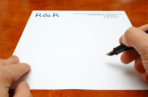
Before you change a single line, map where your logo already lives. List every printed and digital touchpoint: business cards, letterhead, signage, packaging, vehicles, social profiles, and your site. Seeing the full footprint tells you how big the reprint will be and which pieces carry the most weight.
Then score the mark honestly. Which parts do people recognize instantly? For many brands it is the color or the overall silhouette, and those are your anchors, the cues you protect no matter what. Which parts feel dated or cause trouble at small sizes? Those are your candidates for change. This split, anchors to keep versus problems to fix, is the whole foundation of a recognizable redesign.
If you are unsure what your equity even is, our guide on developing a branding strategy helps you name it, and the wider practical guide to branding puts the logo in the context of the whole identity it anchors.
Redesigning a logo without losing recognition: before and after examples
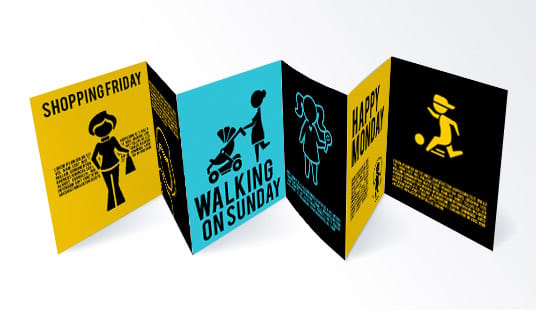
The rebrands people quote as successes all did the same thing: they held one anchor perfectly still and changed everything around it. Read them as before and after pairs and you can see how much change a mark absorbs before it stops being yours.
- Starbucks. Kept: the green, the circular format, the siren silhouette. Changed: the outer ring and the wordmark came off, and the siren was redrawn so she holds up at app icon and cup size. The cup is still identified from across a room with no name on it.
- Mastercard. Kept: the two overlapping circles, red on the left, yellow on the right, and the orange where they cross. Changed: the interlaced stripes went away, the circles flattened, and the name moved out of the symbol, so the mark can run alone on a card face at a fraction of an inch.
- Apple. Kept: the bitten apple outline, essentially untouched for decades. Changed: the rainbow stripes gave way to one flat color, which is why the mark now prints in a single ink on a box, a card, or an engraved case without any color management at all.
- Google. Kept: the capital G and the blue, red, yellow, blue, green, red color order that people read before they read the letters. Changed: the serif typeface was replaced with a geometric sans, which cleaned up the small sizes on phone screens and favicons.
- Burger King. Kept: the two bun halves wrapping the name, in red and yellow. Changed: the blue swoosh, the drop shadow and the gloss came off and the type was redrawn thicker and flatter, closer to the version the brand ran decades earlier. Flat, heavy type is also what survives a printed bag or a vinyl sign.
- Pepsi. Kept: the red, white and blue circle, the single cue everyone recognizes. Changed: the wave inside it and the position and weight of the name have been reworked repeatedly, including the return of the wordmark inside the circle.
The pattern is worth copying exactly: one anchor untouched, type and detail modernized, and the mark simplified until it works in one ink at small size. Before you sign off on a candidate, print the old mark and the new one side by side on real standard business cards and hand them to someone who knows your business. If they hesitate about who the new card belongs to, you changed the anchor, not the detail.
Set redesign goals and constraints

A redesign without limits drifts into a brand nobody recognizes. The fix is a short, written brief. State the single goal in one sentence, then draw two lists: what must stay fixed, and what is fair game. If your color is an anchor, write down its exact value and lock it. If the outdated typeface is the real problem, put type at the top of the change list.
Constraints are not creative handcuffs, they are what keep the refresh recognizable. A tight scope forces better decisions and makes every candidate easy to judge against the same yardstick. Our template for a logo design brief gives you the exact structure, and the logo checklist keeps each stage on track.
Decide your palette rules here too. If exact brand color matters across every printed piece, our guide on choosing a brand color palette covers how to define it so it survives the jump from screen to CMYK ink.
Sketch, refine, and test concepts
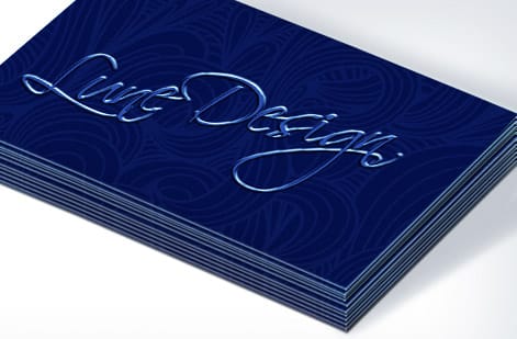
Now sketch, and sketch inside the brief. Draw several evolutions that hold the anchor steady while modernizing the type, the proportions, and the detail. Resist the urge to start from a blank page unless the audit told you the old mark was genuinely broken. Small, confident refinements almost always beat a dramatic reinvention when recognition is the goal.
Refine the two or three strongest directions, then test them where they will actually live. Put each candidate on a mock business card and a mock sign at real size and look at them in your hand, not just on a large monitor. A mark can feel bold at full screen and turn muddy the moment it shrinks to card scale, and printing a quick proof is the cheapest way to catch that early.
Gather honest reactions from people who know your brand and people who do not. If longtime customers still read it as you, and newcomers find it clean and current, you have found the evolution. For type decisions specifically, our guide on serif versus sans serif helps you pick a face that fits.
Prepare files for print and web

A winning sketch is not a usable logo yet. Rebuild the final mark in vector, using a format like AI, SVG, or EPS, so it scales from a favicon to a wide banner with no loss. Vector is non-negotiable for a logo, because raster files break down the moment they are enlarged past their captured resolution.
Set the print color in CMYK so what you approve on screen matches what the press lays down in ink, and note a spot color reference if one exact color must stay identical across every job. Then export a proper file pack: the full-color mark, a single-color version for stamps or foil, and a reversed version for dark backgrounds. Our guide on converting RGB to CMYK covers the color step, and making a logo transparent handles the web variants.
Add clear-space and minimum-size rules while you are here, so whoever places the logo next keeps it legible. These small guardrails are what hold a refreshed brand together as it rolls out across dozens of printed pieces.
Reprint your brand materials at 4OVER4

A redesign is only finished when the new mark is in the world and the old one is gone. Roll it out across every printed touchpoint at once so the brand reads as one coherent whole instead of a confusing mix of old and new. Start with the pieces customers see most: business cards, letterhead, and signage.
Reprinting the full set in one order keeps color consistent from card to sign, since the same files run on the same presses. Pricing scales with quantity, size, stock, and finish, and updates live in the configurator, so you can weigh a heavier card stock or a matte finish against the budget before you commit. If exact brand color is critical, order free paper samples first and judge the ink on the real stock.
From there it is simply picking each product and its specs. Use the live specs and pricing panel below to reprint your cards, then work outward to the rest of the identity until the refreshed logo is everywhere it needs to be.
Wally evolves your mark, he does not erase it
Keep the anchor, refresh the rest, reprint the set
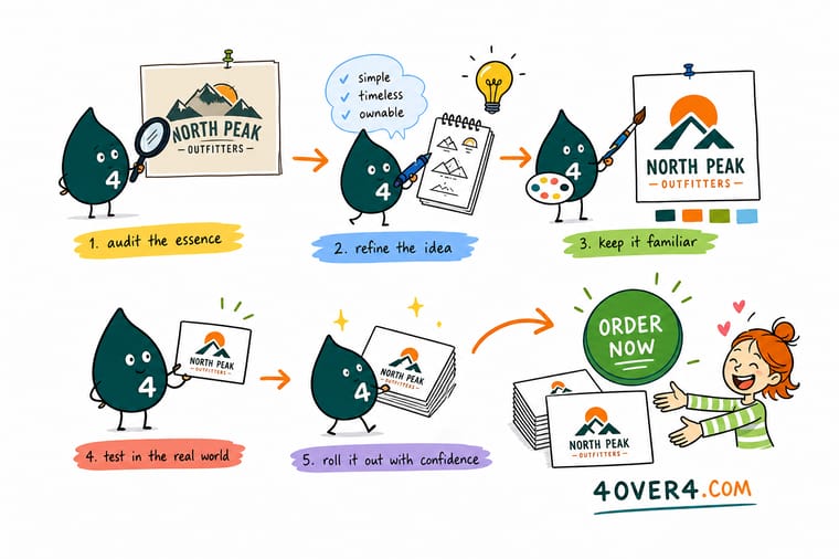
Wally treats a redesign like a careful upgrade: hold on to the color or shape people already know, modernize the type and detail around it, and test the result at real card size before committing. Once the vector files are clean and set to CMYK, he prints the refreshed logo across cards, letterhead, and signs so the whole brand lands together. Evolve it, do not restart it, and 4OVER4 reprints it sharp.
Reprint your brand cards →Quick reference
The recognizable-redesign checklist, at a glance
Every logo redesign that keeps its equity comes down to the same decisions. Match these and your refreshed mark stays unmistakably you.
| Decision | Get it to | Why it matters |
|---|---|---|
| Keep the anchor | Color, shape, or mark | Hold at least one strong visual cue constant so customers still recognize you at a glance. |
| Refresh the rest | Type, spacing, detail | Modernize the parts that date a logo, the typeface, proportions, and fussy detail, without touching the anchor. |
| Master format | Vector (AI, SVG, EPS) | Build the final mark in vector so it scales from a favicon to a banner with zero loss. |
| Print color | CMYK plus any spot | Define the brand color in CMYK, and note a spot reference if one exact color must stay consistent across jobs. |
| Clear space | Padding equal to the mark height | A defined exclusion zone keeps the logo legible on every card, sign, and letterhead. |
| File pack | Full, one-color, and reversed | Ship variants so the mark works on white, on dark, and in a single ink for stamps or foil. |
| Reprint set | Cards, letterhead, signage | Roll the new mark out across every printed touchpoint so the brand reads as one coherent whole. |
Step by step
Redesign a logo in 7 steps
- Inventory where your logo lives Walk the whole footprint: business cards, letterhead, signage, packaging, vehicles, and screens. You cannot judge what to keep until you see everywhere the current mark shows up.
- Score your brand equity Mark what already works. If people recognize your color or silhouette instantly, those are anchors to protect, not problems to fix.
- Write a one-page brief State the goal, what must stay fixed, and what is fair game. A tight brief is the single best guard against drifting into a brand no one recognizes.
- Sketch evolutions, not replacements Draw several refinements that keep the anchor and modernize the rest. Push the type, the spacing, and the detail, but hold the recognizable core steady.
- Test at real size Place the top candidates on a mock business card and a mock sign at actual scale, then get honest reactions before you decide.
- Build clean vector master files Rebuild the winner in vector, define the CMYK color, add clear-space rules, and export full, one-color, and reversed variants.
- Reprint every branded piece Update your cards, letterhead, and signage together so the refreshed mark lands everywhere at once and nothing outdated stays in circulation.
Specs and pricing
Business card specs and live pricing for your reprint
Once the new mark is set, reprinting the team starts with the card, at 100 for $17.57, which is $0.18 each.

| Quantity | Price Per Unit | Total |
|---|---|---|
| 100 | 17.6¢ | $17.57 |
| 200 | 11.5¢ | $23.07 |
| 300 | 9.15¢ | $27.46 |
| 400 | 7.96¢ | $31.86 |
| 500 | 7.25¢ | $36.26 |
| 600 | 6.77¢ | $40.64 |
| 700 | 6.43¢ | $45.04 |
| 800 | 6.18¢ | $49.43 |
Print it
Roll your new logo out across the brand

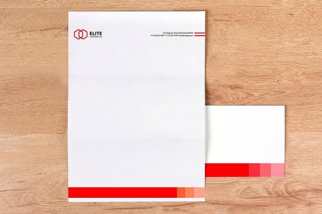

See it in use
Refreshed marks we reprinted across a set








Explore more
Where to go next





By the numbers
A new logo reprinted across 1,000+ products
Common Questions
Common questions about redesigning a logo
What is a logo redesign?
A logo redesign is the deliberate reworking of an existing brand mark to make it feel current, work better across modern formats, or reflect a shift in the business, while keeping enough of the original that customers still recognize it. The strongest redesigns are evolutions rather than replacements: they hold one or two proven visual anchors constant, usually the core color, silhouette, or symbol, and refresh the parts that date a mark, such as the typeface, proportions, and fine detail. Done well, a redesign modernizes the look without spending the recognition you have already earned.
What do customers actually recognize in the old mark?
Start by scoring your existing equity. If people already recognize your color or shape instantly, protect those and make a light refresh. If the mark is genuinely dated or was never strong, you have room for a bolder evolution. Write a one-page brief that names exactly what stays fixed and what can change, then sketch several options inside those limits. Test the front-runners at real size on a printed card and a sign, because a mark that looks fine on a large screen can lose legibility once it is small on paper. Pick the version that feels new but still unmistakably you.
How much does a logo redesign cost and how are prices set?
Redesigning the mark itself ranges from doing it yourself at no cost, using our free online design tool, up to a professional designer fee that scales with scope and reputation. The larger and more predictable cost is the reprint: once the new logo is set, you replace cards, letterhead, and signage. Print pricing then scales with quantity, size, paper stock, and finish, and you can see it update live in the configurator as you choose each option, so you know exactly what refreshing the full set will cost before you commit. Two things move the reprint bill more than anything else: how many pieces carry the mark, and how many of them you replace at once. Price the cards first, since they are the piece you hand out fastest, then add letterhead and signage as the old stock runs down.
Do I have to reprint everything at once after a logo redesign?
No, but sequence it so the old and the new mark do not land in front of the same customer in the same week. Start with what a buyer touches first and what you go through fastest: business cards, then letterhead and envelopes, then signage, packaging, and vehicles. Long-life pieces such as a sign or a wrap can wait until the short-life stock is used up. Lock one master vector file plus a one-color and a reversed version before the first reprint, so every batch you order from that point forward matches the last one exactly.
What sizes, stocks, and finishes work best for a rebranded logo?
A redesigned logo has to survive every size it will print at, so build it in vector and confirm it reads on a small business card and a large sign alike. For the reprint, standard business cards on a heavier stock give a crisp, professional first impression of the new brand, while matte or soft-touch finishes keep colors clean and modern. If your identity depends on one exact color, order free paper samples or a proof so you can judge the ink on the real stock before the full run of your rebranded set. With 60+ paper stocks to choose from, judging the new mark on the actual sheet beats judging it on a monitor.
How long does a logo redesign take, from design to reprint?
The design phase depends on scope, from an afternoon in the online designer to a few weeks with an outside designer and rounds of feedback. The reprint is the fast part. Once your press-ready files are set, standard printed products move through production and ship on a predictable timeline, and you can reprint cards, letterhead, and signage in the same order so the whole refreshed identity arrives together rather than trickling out piece by piece.
Will a redesign hurt my brand recognition?
Only if you change too much at once. Recognition lives in a handful of strong cues, most often the color and the overall shape of the mark. Keep at least one of those anchors constant and evolve everything else, and customers read the new logo as the same brand, only sharper. The risk comes from replacing the mark wholesale with something unrelated, which forces people to relearn who you are. Protect the anchors, test before you commit, and a redesign strengthens recognition instead of spending it.
Get Started
Order yard signs on 4mm White Coroplast with the new mark
Bring your new mark to 4OVER4.COM and reprint cards, letterhead, and signage on the stock and finish your brand calls for. Letterhead runs 50 for $99.95, which is $2.00 a sheet.
Legal Disclaimer
Gold Standard guarantees apply to all standard orders placed through 4over4.com. Price match requires verifiable proof of a competitor's published price for an equivalent product with matching specifications and turnaround time. Satisfaction guarantee covers manufacturing defects and print quality issues. Contact support with order number and documentation. On-time delivery rate based on tracked orders 1999 to 2026. Individual results may vary based on shipping carrier performance.
