What Not to Include on a Business Card in 2026
What Not to Include on a Business Card - and Why It Matters
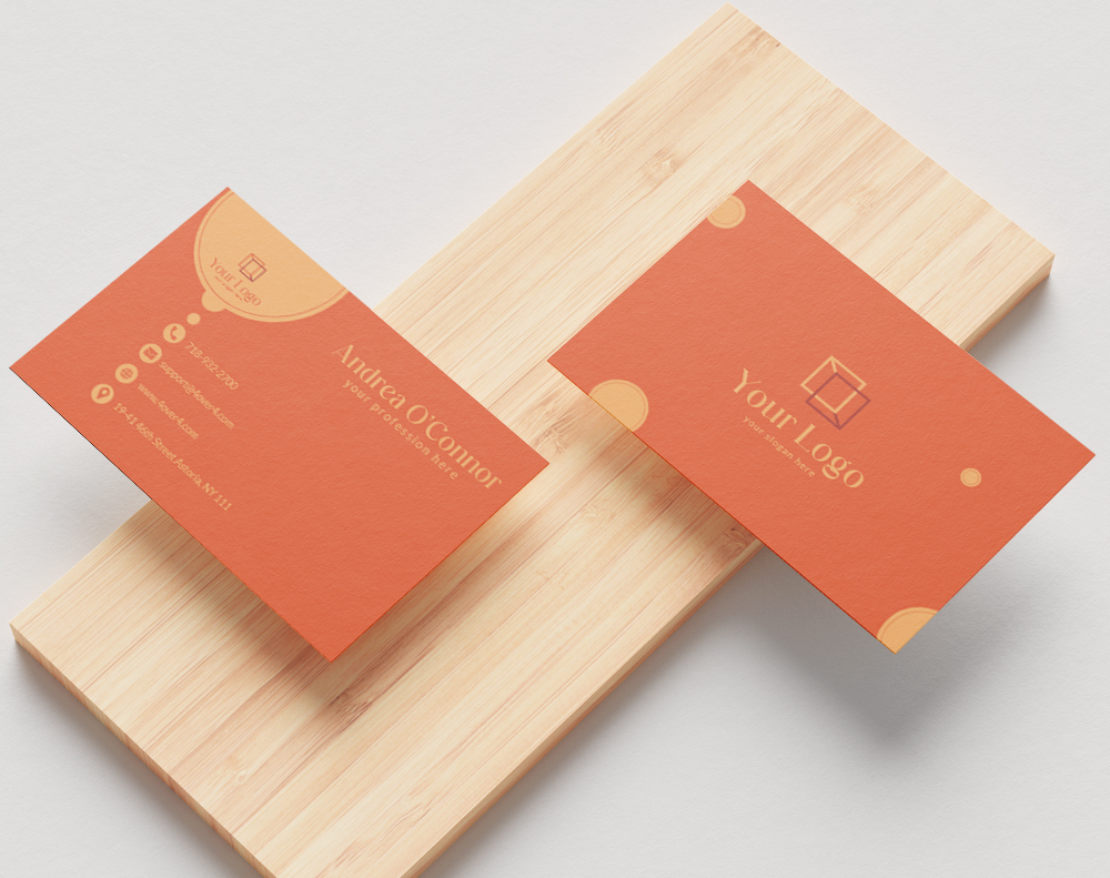
Knowing what not to include on a business card is just as important as knowing what belongs on one. A cluttered or poorly thought-out card can damage your credibility before you even shake hands. Business cards printed by 4OVER4 have helped over 150,000+ businesses make strong first impressions - but the design choices are yours. This guide walks you through every mistake to avoid so your card works harder, not louder.
Your business card is a tiny billboard. It gets about two seconds of attention. If those two seconds are filled with clutter, outdated info, or an unprofessional email address, that card goes straight into the trash. Let's break down exactly what to leave off - and what to put on instead.
Personal Details That Don't Belong on Your Card
The number one rule when deciding what not to include on a business card? Keep personal information off it. Your home address, personal cell number, and social security number have no place on a networking tool that gets handed to strangers. Use your business phone, business address, and a professional email instead.
Think about where your cards end up. They sit on desks, get pinned to bulletin boards, and sometimes land in the wrong hands entirely. Including your home address creates a security risk you don't need. A P.O. box or office address does the same job without the vulnerability.
"I used to put my personal cell on every card. After getting calls at 11 PM from people who found my card at a coffee shop, I switched to a business line. Best decision I ever made."
Marcus L., freelance consultant
Your date of birth, marital status, and other demographic details? Leave those off too. They're irrelevant to a business relationship and can open the door to bias or unwanted contact. Stick to information that helps someone do business with you - nothing more.
Confidential and Sensitive Business Information
This sounds obvious, but it happens more than you'd think. Don't include client names, internal project codes, pricing structures, or proprietary processes on your business card. Trade secrets and financial details are for contracts, not cardstock.
Even something as innocent as listing a specific client you work with can backfire. That client might not want their vendor relationships made public. Keep your card focused on you and how to reach you - not on proving what you know behind closed doors.
Unprofessional Email Addresses - A Silent Credibility Killer
Your email address says more about you than you realize. An address like "partygirl@email.com" or "gamer4life@email.com" tells a potential client you're not serious about your work. It doesn't matter how talented you are - that first impression is already damaged.
Use a variation of your name or your company domain. Something like "jane@yourcompany.com" or "j.smith@yourdomain.com" works perfectly. If you don't have a custom domain, even "janesmithdesign@gmail.com" is a massive step up from a novelty handle. For more on what to include and what to leave out, 4OVER4's content hub has a detailed breakdown.
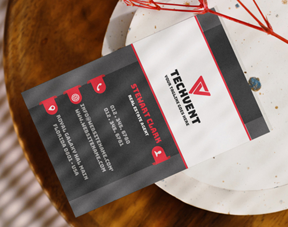
Outdated Information - The Most Common Business Card Mistake
Handing someone a card with a disconnected phone number or a job title from two promotions ago is worse than handing them nothing. It signals carelessness. If your information changes, order new cards immediately. With 4OVER4's fast turnaround, you can have updated cards in hand within days.
Here's a quick check before your next print run. Call every number on your card. Visit every URL. Send a test email to every address listed. If anything bounces, fix it before you print. Old fax numbers are a common offender - if nobody uses that fax line anymore, drop it.
Old logos are another issue. If your brand went through a redesign six months ago but your cards still show the old mark, you're sending mixed signals. Consistency across all touchpoints - cards, website, social media - builds trust. Inconsistency erodes it.
Too Many Social Media Handles Clutter Your Card
You don't need to list every platform you're on. If you're active on LinkedIn, Instagram, Twitter/X, TikTok, Facebook, YouTube, and Pinterest, that's seven lines of text just for social media. That's half your card gone.
Pick the one or two platforms where you're most active and where your target audience actually hangs out. A real estate agent? LinkedIn and Instagram. A musician? Instagram and TikTok. A B2B consultant? LinkedIn alone might be enough. Check out some Classy Business Card Design Inspiration to see how top professionals handle this balance.
Better yet, use a QR code that links to a Linktree or your website's contact page. One small square replaces seven lines of text. That's smart design.
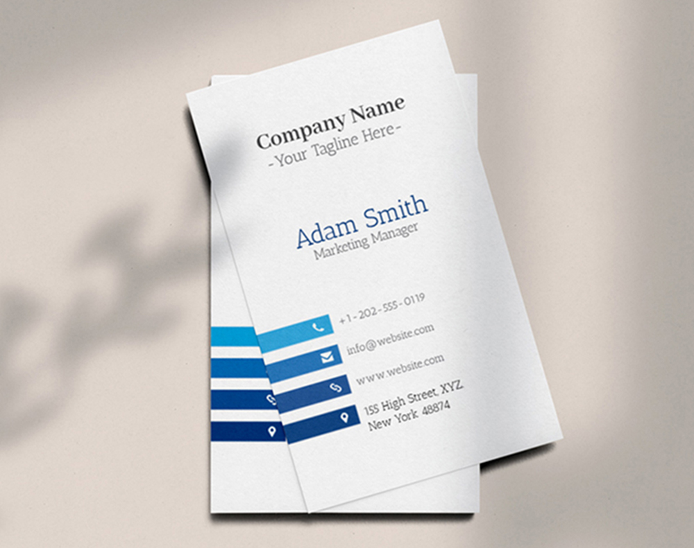
Multiple Phone Numbers and Addresses
Listing your office number, cell number, home number, and fax number gives people too many choices. When people have too many options, they often choose none. Give them one phone number - the one you'll actually answer - and one email. That's it.
The same goes for addresses. If you have three office locations, don't cram all three onto a single card. Either print location-specific cards or use your headquarters address and let your website handle the rest.
Design Mistakes That Sabotage Your Business Card
What not to include on a business card isn't just about text. Design choices matter just as much. Here are the visual mistakes that kill otherwise good cards.
Tiny, Unreadable Fonts
If someone needs a magnifying glass to read your phone number, your card has failed. Don't go below 8pt for body text, and keep your name and company at 10pt or larger. Decorative script fonts look beautiful on a screen but become illegible at small sizes on paper. Test your design by printing a sample and reading it at arm's length.
Too Many Colors and Fonts
Stick to two or three colors max. Your brand colors plus one accent is plenty. The same rule applies to fonts - one for headings, one for body text. Mixing four or five typefaces makes your card look like a ransom note, not a professional introduction.
If you're looking for design direction that avoids these pitfalls, browse Artist Business Cards for creative approaches that still stay clean and readable. For something bold and dramatic, Black Business Cards prove that simplicity can be striking.
Low-Resolution Images and Logos
A pixelated logo screams "I don't care about details." Your logo file should be at least 300 DPI for print. If you're pulling your logo from your website, it's almost certainly too low resolution. Go back to the original vector file (AI, EPS, or SVG) and export it properly for print.
Photos on business cards can work - but they need to be high quality. A blurry headshot does more harm than no headshot at all. Read about the potential drawbacks of putting your photo on a card before you commit to it.
"Standard Business Cards /5"
| Quantity | Price Per Unit |
|---|---|
| 100 | $0.18 |
| 4,000 | $0.03 |
| 35,000 | $0.02 |
| 100,000 | $0.02 |
Ink Color
Finish
Variable Data (Codes, Names, Etc.)
Rounded Corners
Total Sets
Proof Options
Information Overload - When Your Card Tries to Do Too Much
A business card is not a brochure. It's not a resume. It's not a product catalog. Its job is simple: tell someone who you are, what you do, and how to reach you. That's it. Everything beyond those three things needs to earn its spot.
A tagline? Sure, if it's short and adds clarity. A QR code? Great, if it links somewhere useful. A full paragraph describing your company history? Absolutely not. Save that for your website.
"The best business cards I've received had maybe six lines of text total. Name, title, company, phone, email, website. Done. I remembered every one of them."
Rachel K., marketing director
White space isn't wasted space. It's what makes your card readable. It's what draws the eye to the information that matters. Resist the urge to fill every square millimeter.
Irrelevant Quotes and Slogans
Inspirational quotes on business cards almost never land the way you hope. "Be the change you wish to see in the world" doesn't tell anyone what you do or why they should call you. If you want a tagline, make it about your value proposition. "Helping small businesses grow since 2015" beats a Gandhi quote every time.
For some creative inspiration that actually works in print, check out these Funny Print Ad Examples - they show how personality and clarity can coexist.
QR Codes That Link to Nothing Useful
A QR code that goes to your homepage is fine. A QR code that goes to a broken link, a generic "under construction" page, or a landing page that isn't mobile-optimized is worse than no QR code at all. Test it. Then test it again. Then have someone else test it on a different phone.
"Free Business Cards With Free Shipping /5Paper Type14pt Gloss Cover14pt Uncoated Cover (30% PCW)Proof OptionsStraight To ProductionFree Online Proof"
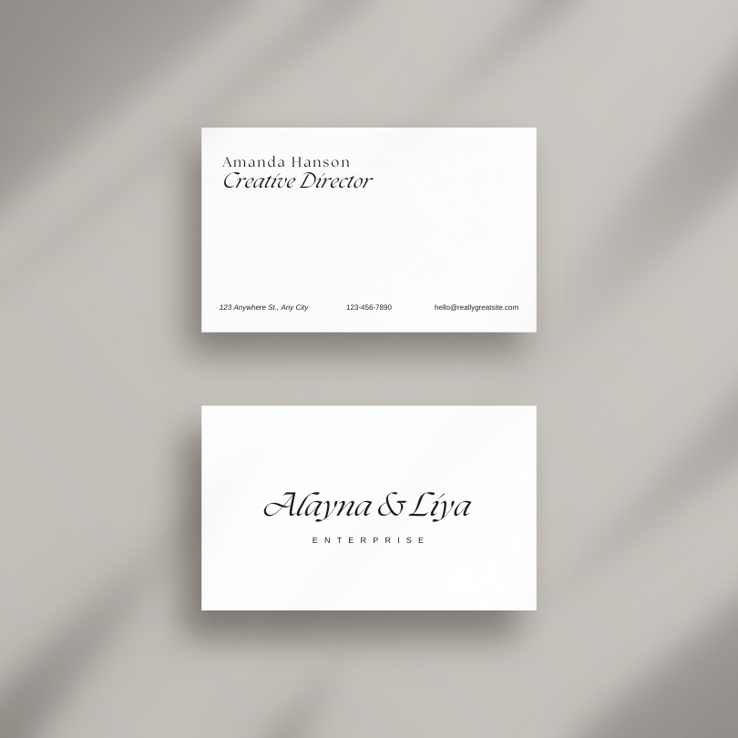
What to Actually Include - The Essential Checklist
Now that you know what not to include on a business card, here's what should make the cut:
- Your full name - first and last, spelled correctly (check twice)
- Job title - current, accurate, and understandable to outsiders
- Company name and logo - high-resolution, properly positioned
- One phone number - the one you actually answer
- One professional email address - on your company domain if possible
- Website URL - keep it short and clean
- One or two social media handles - only the platforms that matter for your industry
Optional additions that earn their space: a QR code linking to your portfolio or booking page, professional certifications (especially in regulated industries like law, medicine, or finance), and a short tagline that communicates your value.
Using the Back of Your Card Wisely
The back of your business card is free real estate - but that doesn't mean you should dump everything there. Use it strategically. A brief mission statement, a list of your core services, or a customer testimonial can add value without cluttering the front.
Here's what works well on the back:
- A brief company overview or mission statement
- A curated list of your top services or products
- Social media handles and website URL (if they didn't fit on the front)
- A customer testimonial or endorsement
- A call-to-action - "Book a free consultation at yourwebsite.com"
Leaving the back completely blank is a missed opportunity. But cramming it with 12-point text edge to edge defeats the purpose. Balance is everything. For unique card formats that give you more design flexibility, explore 3D Lenticular Business Cards - they create a visual experience that standard cards can't match.
"I switched to double-sided cards with a clean testimonial on the back. People actually flip the card over now and read it. My callback rate went up noticeably."
David T., financial advisor
"Die-Cut Any Shape Business Cards /5"
Ink Color
Finish
Die Cutting
Total Sets
Proof Options
Templates Help You Avoid These Mistakes Automatically
If you're worried about making design errors, professional templates solve most of these problems before they start. 4OVER4 offers free design templates that are already sized correctly, with proper bleed areas, safe zones, and balanced layouts. You just drop in your information.
Templates prevent the most common formatting disasters: text too close to the edge, images in the bleed zone, fonts that are too small, and layouts that feel cramped. They give you a proven structure so you can focus on your content rather than wrestling with design software.
Looking for more creative projects beyond business cards? Browse these Diy Greeting Card Design Ideas or discover Logo Sticker Design Ideas to extend your brand across multiple print products.
Here are some of the most popular business card templates to get you started:
Choosing the Right Paper and Finish for a Clean Design
Your card's content matters, but the paper it's printed on tells its own story. A thin, flimsy card with perfect content still feels cheap. A thick, textured card with clean information feels like it belongs to someone who takes their work seriously.
4OVER4 offers 60+ paper types across multiple weights and finishes. For a professional, no-nonsense feel, 14pt uncoated cardstock works well for industries like law and accounting. For a premium, tactile experience, 32pt ultra-thick stock with a soft-touch matte finish makes people pause and actually feel the card in their hands. That moment of hesitation - that's when they read your information instead of pocketing it and forgetting.
Glossy finishes make colors pop but can be hard to write on. Matte finishes feel sophisticated and accept pen ink easily - great if you want people to jot notes on your card. Spot UV adds a subtle shine to specific elements like your logo, creating visual depth without overwhelming the design.
Here are the available paper types, finishes, and printing options you can choose from:
Real Pricing So You Can Plan Your Order
Knowing what not to include on a business card saves you from reprints - and reprints cost money. Getting it right the first time means your investment goes further. Here's what current pricing looks like for standard business cards at 4OVER4:
What the Data Says About Business Card Effectiveness
Business cards aren't going away. Despite the rise of digital networking tools, physical cards continue to play a role in how professionals connect. The data below shows why getting your card right - and avoiding the mistakes outlined above - is worth your attention:
Start With a Blank Template and Build It Right
If you'd rather start from scratch instead of using a pre-designed template, 4OVER4 provides blank templates with the correct dimensions, bleed areas, and safe zones already set up. Download one, open it in your design software, and you'll know exactly where your text and images need to go. No guesswork, no reprints because your phone number got cut off at the edge.
Blank Templates


What Real Customers Say About Their 4OVER4 Business Cards
With 10,000+ reviews and a 4.8/5 star rating, 4OVER4 customers consistently highlight the print quality, paper selection, and turnaround speed. Here's what recent buyers had to say:
"Ordered what not to include business card from 4OVER4 and the quality blew me away. Sharp colors, premium feel, arrived 2 days early."
"Been using 4OVER4 for what not to include business card for a year. Consistent quality every time. The online designer made it easy."
"Switched to 4OVER4 and saved 40% on what not to include business card. Better quality than my old printer. 60+ paper options."
"4OVER4's what not to include business card helped us look more professional. Clients notice the difference."
Key Takeaways for Designing a Clean, Effective Business Card
- Leave personal details off your card. Home addresses, personal phone numbers, and social security numbers create security risks and look unprofessional. Stick to business contact information only.
- One phone number and one email are enough. Giving people too many ways to reach you creates decision paralysis. Pick the channels you'll actually respond on.
- Ditch the unprofessional email address. Use your company domain or a clean variation of your name. Novelty handles undermine your credibility instantly.
- White space is your friend. A business card is not a brochure. Let your key information breathe so it's easy to scan in two seconds.
- Update your cards when your information changes. Outdated phone numbers, old job titles, and retired logos signal carelessness. 4OVER4 delivers with 99.8% on-time delivery, so reordering is fast and painless.
- Use the back of your card strategically. A short testimonial, a QR code, or a call-to-action adds value without cluttering the front. For a unique material choice, consider 30Mil Clear Plastic Cards - they make a statement before anyone reads a single word.
-
gamer4life@email.com
-
partygirl@email.com
-
beerlover@email.com
-
Your name and job title
-
Your company name and logo
-
Contact information
-
A tagline or value proposition
Free Design Templates
-
A brief overview or mission statement
-
A list of your products or services
-
Your social media handles and website URL
-
A customer testimonial or quote
-
A call-to-action to visit your website or schedule a consultation
Common Questions About What to Leave Off Your Business Card
What are the best practices for what not to include on a business card?
Remove personal details like home addresses and personal phone numbers. Drop outdated information, unprofessional email handles, and excessive social media links. Keep your card focused on your name, title, company, and one clear way to reach you. Less clutter means more impact. Browse 30Mil Frosted Plastic Cards for a premium material that lets your clean design stand out.
How do I decide what information to cut from my business card?
Ask yourself: "Does this help someone contact me or understand what I do?" If the answer is no, cut it. Inspirational quotes, multiple phone numbers, full service lists, and personal demographics all fail that test. One phone number, one email, and your website URL cover the essentials. Everything else is optional and needs to earn its spot.
How does knowing what not to include on a business card improve marketing results?
A clean, uncluttered card gets read. A busy card gets ignored. When your information is easy to scan in two seconds, people are more likely to save your card and follow up. 4OVER4 has printed over 10 billion+ cards, and the highest-performing designs consistently prioritize clarity over quantity of information. Explore 30Mil White Plastic Cards for a durable option that keeps your message front and center.
How much should I budget for professionally printed business cards?
Standard business cards at 4OVER4 start at just a few cents per card depending on quantity, paper stock, and finish. Ordering 250 to 500 cards is the sweet spot for most professionals - enough to last several months without a huge upfront cost. Investing in thicker stock or specialty finishes adds a small premium but dramatically increases the chance your card gets kept instead of tossed.