
Worst Fonts to Avoid on a Resume and What to Use Instead


Sofia is our design and templates voice, built from the knowledge of our production team, with over 20 years in printing.
Cut Comic Sans, Papyrus, Brush Script, Impact, Curlz, Courier New and Century Gothic from a resume, and treat Times New Roman as a default rather than a choice. Set the body in EB Garamond, Cambria, Source Sans 3 or Lato at 10pt to 12pt, keep to two families, and re-check the page break after any swap, because apparent size follows x-height rather than point size. The worst resume templates are the ones that ship with those faces, set body type under 10pt or squeeze the margins below 0.5 inch.
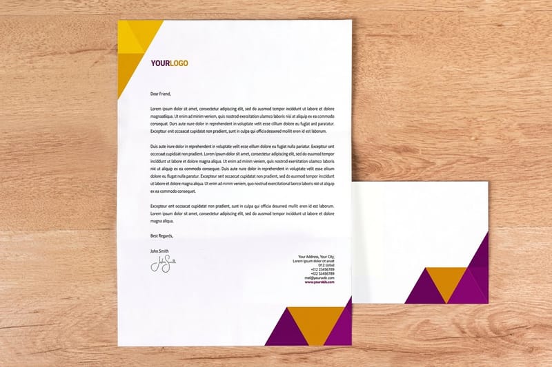
When the resume goes out on paper, carry the same two families onto the printed set: letterheads from $99.95 for the cover letter, standard business cards from $17.57 and printed envelopes from $142.99.
Fonts to cut, and what to set instead
| Font | What it was drawn for | Why it fails on a resume | Set this instead | Where it still belongs |
|---|---|---|---|---|
| Comic Sans MS | Casual comic lettering, 1994 | Drawn for speech balloons in a Microsoft chat product, so it reads as a joke on a CV | Source Sans 3 or Lato | Kids party flyers, and honestly not much else |
| Papyrus | Rough textured display, 1982 | Every letter carries fake deckle texture that clogs at small print sizes | EB Garamond | A spa menu, at large sizes only |
| Brush Script MT | Connected script, 1942 | Connecting strokes break apart when a parser lifts the text out of the PDF | Cambria or Charter | A signature line, never a paragraph |
| Courier New | Monospaced typewriter | Every character eats the same width, so a page holds roughly a third less text | Calibri or Aptos | Code samples and legal redlines |
| Impact | Condensed display, 1965 | Counters close up below 14pt and the tight fit makes lowercase text unreadable | Montserrat SemiBold for headings | A poster headline, three words maximum |
| Times New Roman | Newspaper serif, 1932 | Not ugly, just the default. It signals that no decision was made about the page | EB Garamond or Cambria | Court filings that mandate it |
None of these are badly drawn typefaces. Comic Sans was drawn in 1994 for speech balloons, Brush Script in 1942 as a connected script and Impact in 1965 as a condensed display face, and each one breaks down at the 10pt to 12pt body size a resume is read at. When the same type has to carry onto paper, our stationery set guide covers how the resume, the letter and the card stay consistent.
Why the font decides how a resume is read before a word is
A recruiter gives a resume a few seconds on first pass, and in those seconds the typeface is doing more work than any bullet point. A display or novelty face reads as a decision about tone, and the tone it sets is wrong for almost every job. That is the whole mechanism. The font does not make you a worse candidate, it just spends your first impression on something you did not want to say.
The second problem is mechanical rather than aesthetic. Applicant tracking systems pull the text layer out of your PDF before a human ever opens it, and the fonts that fail hardest are the ones with heavy ligatures, connected scripts, or non-standard character mapping. When the extraction goes wrong you do not get an error, you get a name field reading Jo n Sm t and no explanation.
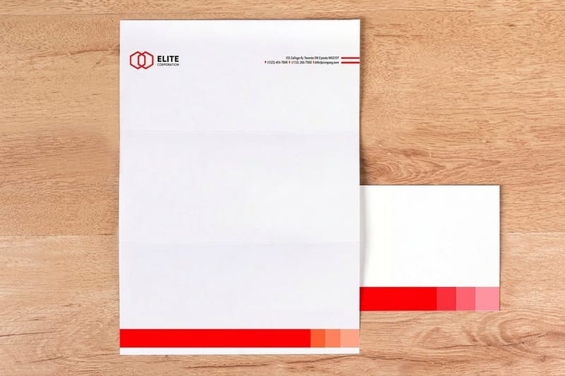
Print adds a third layer. Ink spreads slightly into the paper fibre, so thin strokes thicken and tight counters fill in. A face that looks crisp on a retina display can turn muddy on an uncoated sheet at 10pt, which is why the same typography rules that govern a resume also govern printed letterheads and business cards. Our standard letterheads video overview shows the sheet those rules end up on.
What a parser actually sees
Export to PDF and the file carries a text layer plus an embedded font. A parser reads the text layer. Problems start when the font substitutes a single glyph for a pair of letters, which is what a ligature is, and the parser has no mapping back to the two original characters. Older systems drop the pair entirely.
The safe move is dull and effective: use a widely licensed system or Google font, export as PDF with fonts embedded, then open the PDF and try selecting and copying a paragraph. If what lands in your clipboard is missing characters, the parser will lose them too.
The point size trap nobody warns you about
Point size measures the em, not the letters. Two faces at the same point size look different sizes because their x-heights differ, and x-height is what your eye reads as size. Garamond sits near 0.44 of the em, Calibri near 0.47, Verdana near 0.55.
That is why a font swap is never only a font swap. Move from Verdana to Garamond at 11pt and the text visibly shrinks and the page gets shorter. Move the other way and a one-page resume becomes a page and a bit. Change the family, then re-check the page break before you print anything.
The ten worst resume fonts, and why each one fails

These are ranked by how much damage they do, worst first. A few are decent typefaces being asked to do a job they were never drawn for, and the entry says so. Novelty is only half the list. The other half is fonts that are technically fine and still cost you the page.
The set below is the one we see on real files that come through the shop for business cards and stationery, so the failures are the ones that actually happen rather than a list copied from a design blog.
One to five: the fonts that get the file closed
1. Comic Sans MS. Vincent Connare drew it in 1994 for speech balloons in a Microsoft chat product. It is a competent casual face doing exactly what it was built to do, which is the problem: it makes your career history read like dialogue. Nothing rescues it, not even at 10pt.
2. Papyrus. Every glyph carries simulated rough-edge texture baked into the outline. At heading size on a poster it works. At 11pt on a resume the texture is smaller than the ink spread, so it prints as fuzz rather than character, and it looks like fuzz on screen too.
3. Brush Script MT. Connected scripts fail twice. Visually they lose legibility past a line or two, and technically the connecting strokes and tight letter fit are the exact conditions that make text extraction unreliable. Use a script for a signature graphic and nowhere else.
4. Impact. Geoffrey Lee cut it in 1965 as an ultra-condensed display face. The counters, meaning the enclosed white shapes inside letters like a and e, are already tiny at display size. Set it at 11pt and print it, and the ink closes them completely.
5. Curlz MT and its relatives. Anything with decorative curls, drop shadows or outline effects is a display face. Display faces are drawn to be looked at once, large. A resume is read, small, in a hurry.
Six to ten: the fonts that quietly cost you the page
6. Courier New. Monospaced means the i and the m occupy the same width. That wastes roughly a third of your line, so a resume that fits one page in a proportional face runs to two in Courier. It also reads as a typewriter, which is a specific era you probably do not want evoked.
7. Century Gothic. The geometric single-storey a is handsome and the face is very wide. On a dense resume it inflates line length and forces either a smaller size or an extra page. Fine for a title, expensive for body copy.
8. Bodoni, Didot and other Didones. These are genuinely beautiful, and their thin strokes are hairlines. Below roughly 9pt on uncoated stock those hairlines drop out in patches. If you love the look, use it for your name at 16pt and set the body in something sturdier.
9. Times New Roman. Stanley Morison commissioned it in 1932 for The Times, to hold up in narrow newspaper columns at small sizes. On a full-width letter page it is not wrong, it is just the default nobody chose. That is a wasted signal rather than a bad one.
10. Any font you did not license. A font pulled off a free-download site often has no embedding permission. Word or your PDF exporter will silently substitute it, and the file the recruiter opens is not the file you designed. Google Fonts under the SIL Open Font License are safe to embed and free to use commercially.
The fonts worth using instead
Pick one family and use its weights, or pick one serif and one sans and stop there. Three families on a single page is the point where a resume stops looking designed and starts looking assembled.
For serif body text, EB Garamond, Cambria and Charter all hold their shape at 10pt in print. Cambria was drawn specifically for screen and low-resolution output, which makes it the safest of the three when you do not know how the file will be viewed. Garamond is the most elegant and runs the smallest, so set it a point larger than you think.
For sans body text, Source Sans 3, Lato and Calibri are all quiet and legible. Microsoft replaced Calibri with Aptos as the default Office font in 2024, so Calibri now reads as a choice rather than a default, which is a small point in its favour. Helvetica and Arial both work and both say nothing, and if you want to know why they are near-identical, the Arial and Helvetica story covers it properly.
Serif or sans is not the real question
Both work. The decision that actually matters is contrast between your heading level and your body level, and consistency down the page. A resume set entirely in one weight of one font, with size doing all the hierarchy, still reads well. A resume with four fonts and six sizes does not, however good each font is on its own.
If you want the reasoning in full, our guide on serif against sans serif works through where each one earns its place, and the same logic carries into choosing a logo font when you build the rest of the identity.
Pairing and sizing rules that hold on paper
Pairing is mostly subtraction. Choose a face for headings and a face for body, make them clearly different in structure rather than slightly different, then leave the rest of the page alone. A serif heading over a sans body works. A humanist sans heading over a geometric sans body usually just looks like a mistake, because the two are close enough that the difference reads as inconsistency.
Sizing is arithmetic. Body between 10pt and 12pt, your name at 14pt to 18pt, section headings one clear step above body, line spacing near 1.15. Give yourself margins of at least 0.5 inch on every side, and more on the left if the page will be stapled or punched. Anything tighter than that and a printed copy loses characters into the gutter.
Quantity and price
Business card pricing and specs
Live configurator numbers on our standard card stocks, where the per unit cost drops as the run grows.
| Quantity | Price Per Unit | Total |
|---|---|---|
| 100 | 17.6¢ | $17.57 |
| 200 | 11.5¢ | $23.07 |
| 300 | 9.15¢ | $27.46 |
| 400 | 7.96¢ | $31.86 |
| 500 | 7.25¢ | $36.26 |
| 600 | 6.77¢ | $40.64 |

You can also earn coins on every order and put them toward the next print run, which helps when you are building a full application set rather than a single piece.
Applying the rules to printed letterheads and cards
Paper is less forgiving than a screen. Ink spreads a fraction into the fibre, so thin strokes get thicker and the enclosed shapes inside letters get smaller. On coated stock the spread is minimal. On uncoated, which is what most letterheads use because you have to be able to write on them, it is enough to close the counter of an e set below about 8pt in a light weight.
Print it
Letterheads on writable stock
The cover letter sheet that carries the same two fonts as the resume, from $99.95.
Reverse type, meaning light text on a dark field, needs one weight heavier than you would use the other way round, for the same reason. Ink closing in from all sides thins a white letter instead of thickening it. On a business card that means a name knocked out of a dark panel should be set in medium or semibold, never in a light weight, and never below 8pt.
Before any of it goes to press, either embed the fonts in your PDF or convert the type to outlines. Outlines guarantee the shapes but make the text uneditable and unsearchable, so we prefer embedded fonts on printed envelopes and stationery where a small correction is likely. The letterhead setup guide for Word walks through the export settings that get this right.
Choosing type by field
Convention differs by industry, and reading the room is part of the job. Here is where each field actually sits.
- Finance, law and academia. A serif at 11pt. EB Garamond or Cambria, one weight for body, bold for headings. This is the one field where a sans still reads slightly informal to some readers.
- Design, architecture and creative. A single well-drawn sans across the whole page, sized carefully. The restraint is the portfolio piece. Save the display face for the work itself.
- Engineering and technical. Source Sans 3 or Lato. Both hold up in tables and dense skill lists, and both keep numerals even in width so aligned figures stay aligned.
- Healthcare and public sector. Calibri or Cambria at 11pt, generous line spacing. These files get printed, photocopied and scanned more than most, and both survive a generation of copying.
- Sales and client-facing roles. Whatever you use on the resume, use on the card. A candidate whose business card matches the resume looks like someone who runs a consistent process.
Blanks with the margins and sizes already right
Starting from a template settles the two numbers people get wrong most often: margins of at least 0.5 inch on every side and body type between 10pt and 12pt. An 8.5 by 11 inch letterhead blank or a 3.5 by 2 inch card blank arrives with bleed and trim marked, so your type sits safely inside the cut. Pull one from the blank template library, or start from a finished layout in design templates and swap the fonts to your pair.
Start fast
Blanks with the margins and sizes already right
Design templates and exact size blanks so your type lands inside the cut line every time.














Wally sizes the type before he prints it
Two families, 10pt to 12pt body, and a page break you checked twice
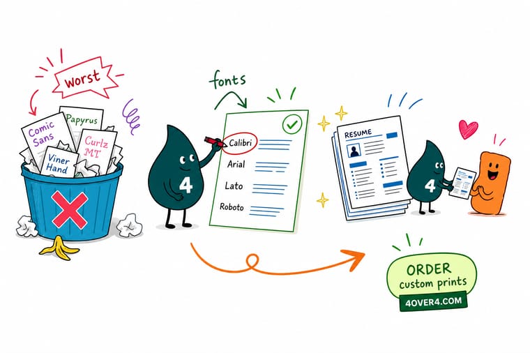
Set the body in EB Garamond, Cambria, Source Sans 3 or Lato at 10pt to 12pt, with your name at 14pt to 18pt and line spacing near 1.15. Keep to two families, embed the fonts in the PDF, and re-check the page break after any swap because apparent size follows x-height. Then carry the same pair onto the card and the letterhead, and 4OVER4.COM prints the set on stock that holds the thin strokes.
Print the matching business cards →The quick resume font checklist
Rules that hold at every size
- Two families, hard stop. One serif plus one sans, or a single family in two weights. The third font is where a page starts to look assembled instead of designed.
- 10pt to 12pt for body. Below 10pt the reader squints and the scanner struggles. Above 12pt you are padding. Your name sits at 14pt to 18pt and nothing else competes with it.
- Line spacing near 1.15. Single spacing crowds descenders into the line below. Anything past 1.3 spreads a one-page resume into two for no gain in readability.
- Check the x-height before you swap. Apparent size follows x-height, not point size. Change the family and the page break moves, so re-check the fit before printing.
- Embed the fonts, then test the copy. Export as PDF with fonts embedded, open it, select a paragraph and copy it. If characters go missing in your clipboard, they go missing in the parser.
Explore more
More on type, cards and stationery
Premium business cards run 100 for $17.57 in 3 business days, the piece that travels with the resume.
Product Standard Business Cards The matching card, from $17.57, on 14pt or 16pt stock.  Product Premium Business Cards Heavier stocks and finishes when the card is the first handshake. Product Letterheads Your resume typography carried onto the cover letter sheet.
  Product Printed Envelopes The envelope that arrives before the letter is opened.
  Category Business Card Printing Every stock, size and finish in one place.
  Guide Letterhead Font and Size Tips The same typography rules applied to a letterhead layout.
 Carry the same type onto paper
Pick your stock, drop in your layout or a free template, and 4OVER4.COM prints the cards, letterheads and envelopes so the whole application set reads as one thing.
Common questions about resume fonts
What is the single worst font to use on a resume?
Comic Sans MS. Vincent Connare drew it in 1994 for speech balloons in a Microsoft chat product, and it does that job well, which is exactly why it fails here. It carries a deliberate casual, hand-lettered tone that fights everything a resume is trying to say, and unlike Times New Roman it cannot be rescued by good layout or a smaller size. Papyrus runs a close second, because its simulated rough-edge texture is baked into every glyph and turns to fuzz at body sizes both on screen and in print.
Is Times New Roman actually bad on a resume?
No, it is undecided rather than bad. Stanley Morison commissioned it in 1932 for The Times of London, where it had to stay legible in narrow newspaper columns at small sizes, and it does that well. On a full-width letter page it is simply the default that arrives when nobody chooses, so it spends a signal without saying anything. EB Garamond and Cambria cost you nothing extra and both read as a deliberate decision. Cambria is the safer of the two because it was drawn for low-resolution output and holds its shape when a file is printed, photocopied or scanned.
What size should the type be on a printed resume?
Body text between 10pt and 12pt, and your name between 14pt and 18pt, with line spacing near 1.15. Below 10pt a reader squints and a scanner struggles with the thinner strokes. Above 12pt you are padding rather than helping. Remember that point size is not apparent size: a font with a large x-height such as Verdana looks roughly a quarter bigger at 11pt than Garamond does at the same setting, so when you change the family you have to look at the page break again before printing.
Do fonts really break applicant tracking systems?
Some do, and the failure is silent. A tracking system pulls the text layer out of your PDF before any person opens it. Connected scripts, faces with heavy ligature substitution, and fonts with non-standard character mapping are the ones that lose characters during that extraction. There is a two-minute test that catches almost all of it: export the PDF with fonts embedded, open it, select a full paragraph, copy it and paste it into a plain text editor. Whatever goes missing in your clipboard is what goes missing in the parser.
Should the fonts on my business card match my resume?
Yes, and it is one of the cheapest signals of professionalism available. Use the same two families in the same roles, headline face for your name and body face for the details, across the resume, the cover letter and the card. The card only needs three sizes: your name near 10pt to 12pt, your role a step down, and contact details at 7pt or 8pt. Do not go below 6pt on a printed card, because ink spread starts closing the counters. Standard business cards at 4OVER4.COM start at $17.57, so a matching set costs less than most people assume.
