
How to Choose the Right Logo Fonts


The right logo font sends your brand message before anyone reads a word. A face with hairline strokes disappears at card size, which is where most logo type fails.
Choose a logo font by brand personality first, then by style family. Serif reads as heritage and trust, slab serif as bold and confident, script as elegant and personal, and sans-serif as clean and current. Keep the logo to one or two contrasting fonts, and always proof the typeface at business-card size so it stays legible in print.
Start here
Personality first, legibility always
Name your brand personality, then pick the style family that carries it. Serif for heritage and trust, slab serif for bold and confident, script for elegant and personal, sans-serif for clean and current. Hold the logo to one or two contrasting fonts, adjust the spacing so the name reads as one unit, and proof the typeface at business-card size in solid black. The matrix below maps each style to the brands it fits.
Why the logo font decides how your brand feels
Before anyone reads your business name, they feel it. The shape of the letters does that work. A law firm set in a crisp sans-serif can read as a tech startup, and a bakery set in a hard slab serif can read as a hardware store. The font is not decoration on top of the name, it is half the message.
That is why font choice comes before font browsing. The goal of this guide is to give you a decision framework first: name the personality, pick the style family, then shortlist. Do it in that order and you skip the endless scrolling that leads most people to a font that looks nice but says the wrong thing.
We also cover the part most guides ignore, which is how the font behaves once it prints. A logo lives on business cards, signs, and packaging at small sizes, so legibility on paper matters as much as looks on a screen. You can set your type free in our online designer or start from a ready template if you would rather not build from scratch.
Serif logo fonts: heritage and trust

Serif fonts carry small strokes, called serifs, at the ends of each letter. Those little feet are the oldest letterform detail in print, which is exactly why they read as established, credible, and timeless. When a brand wants to signal that it has been around and can be trusted, a serif does the job without a word of copy.
Reach for a serif when the brand lives on reputation: law, finance, publishing, universities, and luxury goods. Classic faces like Garamond, Times, and Trajan feel authoritative, while a high-contrast serif such as Bodoni tips toward fashion and elegance.
The one caution is weight. Fine serifs have thin strokes that can weaken at small sizes, so if your logo will print an inch wide on a card, pick a serif with a little more body and proof it small before you commit.
Slab serif logo fonts: bold and confident

A slab serif keeps the feet of a serif but makes them thick, blocky, and squared off. The result feels sturdy and self-assured, modern without being cold. Slab serifs hold their weight at any size, which makes them a favorite for logos that need to punch.
They suit brands that want to feel strong and approachable at once: sports teams, tech companies, coffee shops, and anything built around a confident headline. Faces like Rockwell, Museo Slab, and Roboto Slab give you that grounded, dependable tone.
Because slabs are heavy by nature, they read cleanly on everything from a small business card to a large banner, which is one reason they translate so well across a full brand kit.
Script logo fonts: elegant and personal

Script fonts imitate handwriting, with strokes that flow and often connect. They feel personal, warm, and crafted, which is why they show up on wedding brands, beauty lines, bakeries, and boutiques. A script says a human made this, by hand.
Scripts split into two moods. Formal scripts feel refined and ceremonial, while casual and brush scripts feel friendly and energetic. Pick the mood that matches your brand and resist stacking a script on top of another expressive face.
Legibility is the trade-off. Tight loops and thin connectors can fill in when printed small, so scripts work best on smooth, uncoated stocks and usually want a plain supporting font nearby to carry the smaller details.
Sans-serif logo fonts: clean and current
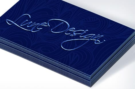
Sans-serif fonts drop the foot strokes entirely, leaving clean, even letterforms. They read as modern, simple, and honest, which is why so many technology and consumer brands set their wordmarks in one. A good sans-serif gets out of the way and lets the name speak.
They are the most versatile family for a logo because they stay crisp at any size and any medium, from a favicon to a storefront. Helvetica, Futura, Montserrat, and Proxima Nova each carry a slightly different feel, from neutral to geometric to friendly.
The risk with a sans-serif is blending in, since so many brands use one. Give yours a point of difference through weight, spacing, or a single customized letter so the wordmark feels owned rather than borrowed.
How many fonts should a logo use
The short answer is one, and at most two. A logo is a compact signal, and the fewer typefaces it carries, the faster it registers and the easier it is to reproduce everywhere. Most iconic wordmarks use a single face, sometimes a single customized face.
A second font earns its place only when the logo has two distinct jobs, such as a brand name plus a tagline, or a primary line plus a descriptor. In that case the two fonts should contrast clearly, one expressive and one plain, so the hierarchy is obvious.
Three fonts is where logos go wrong. The eye loses the anchor, the mark looks assembled rather than designed, and it becomes fragile at small sizes. When in doubt, cut back to one and let spacing and weight do the rest.
How to pair and combine logo fonts
When you do use two fonts, pair by contrast. The reliable formula is one distinctive display face for the name and one quiet, neutral face for everything else. A serif name over a sans-serif tagline, or a script name over a clean sans-serif, gives the eye a clear lead and a clear support.
Avoid pairing two fonts that are almost alike, because near-matches read as an error rather than a choice. Also avoid two loud fonts fighting for attention. One should clearly win.
A quick cheat sheet: serif with sans-serif is timeless, slab serif with a light sans-serif is confident and clean, and script with a simple sans-serif is elegant and readable. Test any pairing by setting your real name and tagline together and squinting. If the hierarchy survives the squint, the pairing works.
Top logo fonts worth knowing
You do not need a huge library, just a handful of dependable faces per family. In serifs, Garamond, Bodoni, and Trajan cover classic through high-fashion. In slab serifs, Rockwell and Museo Slab give you grounded and modern.
In sans-serifs, Futura, Helvetica, Montserrat, and Proxima Nova span geometric, neutral, and friendly. In scripts, a formal face like Great Vibes and a brush face like Pacifico cover ceremonial and casual.
Treat any of these as a starting point rather than the finished logo. The strongest marks tweak the chosen font, adjusting a letter, the spacing, or a single connection, so the result is recognizably yours and not simply the typeface typed out.
How logo fonts print at small sizes
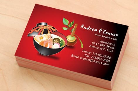
A logo has to survive the smallest place it will appear, and that place is almost always a printed one. On a business card the wordmark may sit an inch wide, and at that scale thin serifs, tight scripts, and fine details can fill in, blur, or vanish.
Proof every candidate at final size in solid black before you decide. Shrink the logo to card scale, print it or view it at one hundred percent, and check that each letter stays open and separate. Keep small logo text a true single black rather than a four-color mix so edges stay sharp.
Stock matters too. Smooth, uncoated, and coated stocks hold fine detail better than heavy textures, so if your font leans delicate, pair it with a smoother paper. Order the logo on real business cards and judge it in the hand, since a mark that reads well at card size reads well everywhere.
Design your logo and put it to work
With the personality named, the family chosen, and the font proofed small, you have a logo that says the right thing and holds up in print. The last step is to build it and get it onto the things your customers actually touch.
Our free online designer lets you set your logo type, adjust spacing, and lay it out with no software to install, and our design templates give you a running start if you would rather adapt a proven layout. Both keep your file print-ready as you go.
From there, put the mark to work on classic business cards, custom shapes, and the rest of your brand kit. Use the live specs and pricing below to pick the stock and finish that flatter your typeface.
Wally picks the font that fits the brand
The letters speak before the words do
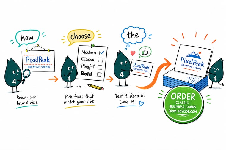
Wally starts with the feeling, not the font. Trusted and established points to a serif, bold points to a slab serif, personal points to a script, and clean points to a sans-serif. Then he keeps it to one or two faces, sets the spacing so the name reads as one word, and shrinks the mark to card size to be sure it holds up. Set yours in the 4OVER4 designer and print it where it counts.
Design your logo now →Quick reference
The four logo font families, at a glance
Match the feeling you want to the family that carries it, then shortlist inside that family and proof it small.
| Style | Signals | Best for |
|---|---|---|
| Serif | Heritage, trust | Small foot strokes read as established and editorial, a fit for law, finance, and luxury brands. |
| Slab serif | Bold, confident | Thick block feet feel strong and modern, at home in sports, tech, and retail. |
| Script | Elegant, personal | Flowing connected strokes feel handcrafted, right for beauty, food, and boutique brands. |
| Sans-serif | Clean, current | No foot strokes gives a crisp, neutral look that suits startups, apps, and wordmarks. |
| Font count | One or two | A single face, or a name face plus one support face, keeps the mark unified. |
| Small-size test | 1 in wide, still legible | Proof the font at card size so thin strokes do not fill in or blur on paper. |
Step by step
Choose your logo font in 7 steps
- Write down your brand personality Pick three words for how the brand should feel, such as trusted, bold, or friendly. Those words point straight at a font family before you open a single type menu.
- Choose the style family that fits Map your words to serif, slab serif, script, or sans-serif. This one decision removes ninety percent of the fonts you would otherwise scroll past.
- Shortlist three typefaces Inside your chosen family, gather three candidates. Type your actual business name in each, not the alphabet, so you judge the real word you will use.
- Add a supporting font only if needed If the name needs a tagline or the mark uses two lines, add one contrasting face. Otherwise stop at one and keep it clean.
- Set your final spacing Adjust the space between letters so the name reads as one unit. Loosen tight scripts a hair and tighten wide sans-serifs so nothing floats apart.
- Proof it small and in one color Shrink the logo to an inch wide and view it in solid black. If it still reads cleanly there, it will read anywhere.
- Lock the fonts before you print Outline the type or embed the fonts in your file so the letters print exactly as drawn when your logo lands on cards, signs, or packaging.
Specs and pricing
Put your logo on business cards, with live pricing
Once your typeface is set, size, stock and finish are what is left. Classic business cards run 100 for $17.57, which is $0.18 each.
| Quantity | Price Per Unit | Total |
|---|---|---|
| 100 | 17.6¢ | $17.57 |
| 200 | 11.5¢ | $23.07 |
| 300 | 9.15¢ | $27.46 |
| 400 | 7.96¢ | $31.86 |
| 500 | 7.25¢ | $36.26 |
| 600 | 6.77¢ | $40.64 |
| 700 | 6.43¢ | $45.04 |
| 800 | 6.18¢ | $49.43 |
Print it
Bring your new logo to 4OVER4
See it in use
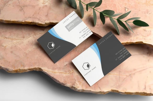
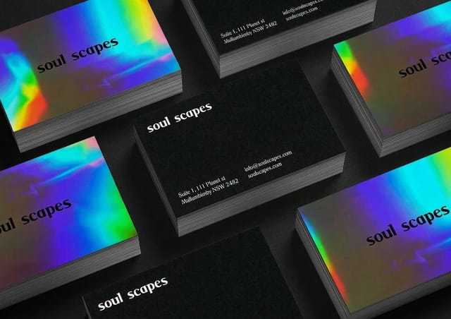
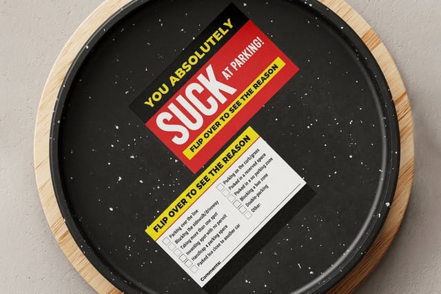
Logos customers printed on their cards








Explore more
Where to go next



By the numbers
Stocks that hold a logo crisply, and the delivery record
Common Questions
Common questions about logo fonts
What are logo fonts?
Logo fonts are the typefaces used to set a brand name or wordmark inside a logo. They differ from body fonts because a logo font only has to render a few letters perfectly rather than paragraphs of text, so it can be more distinctive and expressive. The four style families that cover most logos are serif, slab serif, script, and sans-serif, and each one sends a different signal about the brand. A logo font is often customized after selection, with adjusted spacing or a tweaked letter, so the final mark is not simply the font typed out.
Will this face still read at 3.5 by 2 inches?
Start with brand personality, not with a font list. Write down three words for how the brand should feel, then match them to a style family: serif for heritage and trust, slab serif for bold and confident, script for elegant and personal, and sans-serif for clean and current. Shortlist three faces inside that family, type your real business name in each, and pick the one that reads best at small size in a single color. Keep the whole logo to one or two fonts, and if you add a second, choose one that contrasts clearly with the first.
How many fonts should a logo use?
One or two. The strongest logos rely on a single typeface for the name, which keeps the mark unified and instantly recognizable. A second font is only worth adding when you have a distinct supporting element, such as a tagline or a secondary line, and it should contrast with the main face rather than sit close to it. A third font almost always dilutes the identity and makes the logo look busy, so treat two as a firm ceiling.
What does printed logo work cost and how are prices set?
Choosing and pairing fonts costs nothing beyond your design time, and our free online designer lets you set your logo type without any software. Printing your finished logo onto a product then scales with a few levers: quantity, where larger runs lower the unit price, plus the product size, the paper stock, and any finish. On business cards, for example, you set each option in the configurator and the price updates live, so you can see exactly how a heavier stock or a specialty finish changes the number before you order.
What sizes, stocks, and finishes work best for a logo?
For the most common home of a logo, the business card, the standard trim is 3.5 by 2 inches on stocks that range from a everyday 14 point to a premium 16 point or specialty cotton and plastic. Finishes such as matte, gloss, soft-touch, spot UV, and foil each change how the logo reads, so a thin script may want a smooth uncoated stock while a bold slab serif can carry a glossy or foil treatment. The safe rule is to keep fine detail on smoother stocks and reserve heavy textures for chunkier letterforms.
How long does it take to print a logo product?
Turnaround depends on the product and options you pick rather than the font itself. Many business card and card orders at 4OVER4.COM move through production quickly once your press-ready file is uploaded, with the live product page showing the current production and shipping estimates for the exact size, stock, and finish you select. Specialty finishes such as foil or spot UV can add a little time, and you always see the estimate before you check out.
Get Started
Order 50 ready made cards at $0.10 each to test the type
Choose your typeface, lay out your mark in the free 4OVER4 designer, and print it on business cards across dozens of stocks and finishes. Ready made cards run 50 for $5.00, which is $0.10 each.
Legal Disclaimer
Gold Standard guarantees apply to all standard orders placed through 4over4.com. Price match requires verifiable proof of a competitor's published price for an equivalent product with matching specifications and turnaround time. Satisfaction guarantee covers manufacturing defects and print quality issues. Contact support with order number and documentation. On-time delivery rate based on tracked orders 1999 to 2026. Individual results may vary based on shipping carrier performance.
