
CMYK Values for Print, From Rich Black to Total Ink Limits


Emma is our prepress and print production voice, built from the knowledge of our production team, with over 20 years in printing.
The values a printer would give you across the counter: the black that reads black, the ink ceiling that decides whether a sheet dries, and the colors that change on their way out of RGB.
A CMYK value is four ink percentages written C/M/Y/K, and the values that print true are 0/0/0/100 for text and thin rules, 60/40/40/100 for large black areas, and 0/0/0/40 for a neutral gray. Add the four numbers together and keep the sum at or under 300 percent on coated stock, around 260 percent on uncoated. Never put 100/100/100/100 in artwork: that is registration black, it doubles the ink load, and it cracks on every fold.

Quick answer
Four numbers, and the fifth one you have to add up yourself
CMYK values tell four printing units how much ink to lay down, so the useful skill is knowing which builds behave. Flat 100K for type and hairlines. Rich black at 60/40/40/100 for large solids. Grays from the black plate alone so they stay neutral through the run. Then add the four numbers of your darkest color together and check that total against the stock: 300 percent on coated, about 260 percent on uncoated, and less on anything that folds.
What a CMYK Value Actually Tells the Press
Every color in a print file is four numbers: cyan, magenta, yellow and black, each between 0 and 100. Those numbers are not a description of a color. They are an instruction telling four printing units how much ink to lay down on the same piece of paper, one plate after another.
That distinction changes how you read a value. 0/0/0/100 means one unit prints and three sit idle. 60/40/40/100 means all four print, stacked. The eye sees black in both cases, but the press has done two completely different jobs, and only one of them dries fast. Our explainers on what CMYK stands for and why printing uses CMYK at all cover the model itself. This page is about the numbers you type in.
There is a fifth number nobody prints but everyone should check: the sum. Add the four values and you get total ink coverage, sometimes written TAC or TIC. 60/40/40/100 totals 240 percent. That single figure predicts more press problems than any other value in your file, and almost no design software warns you about it unless you go looking.
One more habit worth keeping. Type values as whole numbers, and avoid tints under about 5 percent or over 95 percent. A 3 percent tint often drops off the plate entirely and prints as white paper, while a 97 percent tint fills in and prints as solid. If you want a very pale wash, 8 percent holds far more reliably than 3.
The stock you order sets which values are safe, so match them before you export:
| What you order | Surface | Ink ceiling | Black for large areas |
|---|---|---|---|
| Business cards or postcards on 14pt gloss cover | Coated | 300% | 60 / 40 / 40 / 100 |
| Flyers or brochures on 100# gloss or silk text | Coated | 300% | 60 / 40 / 40 / 100 |
| Cards on 14pt, 16pt or 18pt uncoated cover | Uncoated | About 260% | 40 / 30 / 30 / 100 |
| Flyers on 70# uncoated text | Uncoated | About 260% | 40 / 30 / 30 / 100 |
Upload a CMYK PDF with those values already set, 0.125 inches of bleed, and body text at 0 / 0 / 0 / 100.
The Four Blacks, and the One That Ruins a Job

Black causes more reprints than any other color, because four different builds all look black on a monitor and behave nothing alike on paper.
| Build | CMYK value | Total ink | Use it for |
|---|---|---|---|
| Flat black | 0 / 0 / 0 / 100 | 100% | Body copy, hairlines, thin rules, small reversed type, anything under about 24 point. |
| Cool black | 60 / 0 / 0 / 100 | 160% | Medium panels where you want depth without loading the sheet. Reads slightly blue. |
| Rich black | 60 / 40 / 40 / 100 | 240% | Large solid areas, full bleed black backgrounds, display type above roughly 24 point. |
| Registration black | 100 / 100 / 100 / 100 | 400% | Press marks only. Never artwork. |
Registration is the dangerous one, because it sits in the swatch panel of every Illustrator and InDesign document looking like an ordinary black. It exists so crop marks and color bars print on all four plates at once. Drop it into a design and the press lays 400 percent ink into one area: the sheet leaves the press wet, sets off onto the next sheet in the pile, and cracks white along every fold and score.
The rich black recipe deserves its reputation. 60/40/40/100 is dense enough that it holds its own beside a photograph, and at 240 percent it stays well inside what coated stock can carry. Our rich black guide goes deeper into the variants. The one place it fails is small type: four plates have to register perfectly, and a shift of a hair puts a magenta halo on every letter, which is exactly why the text on a set of standard business cards from $17.57 should stay at flat 100K while the background panel behind it goes rich.
In practice, one card uses two blacks: 60 / 40 / 40 / 100 for a full bleed black back on 14pt gloss cover, and 0 / 0 / 0 / 100 for the name, the phone number and any rule. On an uncoated card the background drops to 40 / 30 / 30 / 100, and the text stays at 100K on every stock.
Total Ink Coverage Decides Whether the Sheet Dries
Ink is a liquid. Stack too much of it in one place and the paper cannot absorb it fast enough, which is the mechanical reason behind the ceiling. Different stocks hold different amounts.
| Stock | Safe ink ceiling | What goes wrong above it | What to do instead |
|---|---|---|---|
| Coated, sheetfed | 300%, 320% at a push | Set off onto the next sheet, mottling in solids, slow drying. | Build blacks at 240% and let the black plate do the work. |
| Uncoated | Around 260% | Ink spreads into the fibers, detail closes up, colors go flat and dark. | Lighten the under colors: 40/30/30/100 instead of 60/40/40/100. |
| Folded or scored pieces | Same as the stock, minus the crease | Heavy ink cracks white along the fold line. | Reduce coverage across the fold, or score before folding. |
| Lightweight web stock | Around 240% | Strike through to the reverse side, wrinkling. | Use cool black at 160% and keep photos in a matched profile. |
Photoshop makes this easy to police. Open the Info panel, hover the eyedropper over the darkest part of an image, and read the four values. If they add up past 300, the picture is going to be trouble no matter what you do with the rest of the layout. A profile conversion set to US Web Coated (SWOP) v2 pulls most images down automatically, which is one of the practical reasons to convert deliberately rather than let the export do it silently.
Folded work is where the ceiling bites hardest. A dark color that runs across the spine of a brochure from $57.11 sits on a crease that has been bent, and heavy ink film on a bent fiber cracks and shows the white paper underneath. If a design calls for a black cover on a folded piece, drop the under colors rather than the K. When the coverage is borderline, order a proof and check the fold before the run, which is the whole point of printing a proof.
Converting RGB Values to CMYK Without Losing the Color

Screens make color with light and paper makes it with ink, so a straight conversion is not a translation, it is a compromise. Some colors cross without a fight, and some cannot be reached at all.
Yellows, warm reds and most skin tones survive well. Bright orange loses a little punch but stays recognizable. The colors that collapse are the ones a monitor produces best: electric blue drifts toward violet because cyan and magenta cannot make that hue together, neon green goes dull and slightly yellow, and anything fluorescent has no CMYK equivalent whatsoever. If a brand lives on a vivid blue, see it on paper before you approve anything.
Convert on purpose rather than at export. Set the document to CMYK with a profile that matches the press, US Web Coated (SWOP) v2 or GRACoL for coated work, then look at what changed and fix the colors that moved too far by hand. Exporting an RGB file and letting the printer's software decide gives you whatever their default profile prefers, which is how the same file comes back different from two shops. Our conversion walkthrough covers the steps, and choosing the right profile explains which one to pick.
Photographs get their own treatment. Convert the image, then check the shadows: an RGB photo with dense blacks routinely converts into a shadow above 320 percent ink. On a large piece such as a poster from $108.75, that area is what people stand closest to, so it is worth opening Curves and lifting the shadow slightly rather than discovering the problem on press.
Values That Behave: Grays, Tints, and Brand Colors

Beyond black, a handful of value habits separate files that come back right from files that come back close.
- Build grays from K alone. A gray mixed from all four inks shifts the moment the press adjusts ink balance, so a page of 40/32/30/0 gray can come back pink at one end of the run and green at the other. 0/0/0/40 stays neutral through the whole job.
- Keep one value for one brand color. Write the CMYK build into the brand guide and use it on every piece. Two designers each converting the same logo from RGB will land on two different builds, and both will print.
- Watch reversed type on rich black. White type knocked out of a four ink black needs all four plates aligned. Under about 10 point, use flat 100K behind it so only one plate has to hold the shape.
- Check the percentages before upload. No tint under 5 or over 95 percent, grays set as K alone such as 0 / 0 / 0 / 20, 40 or 60, and no color whose four values add up past 300 percent on coated stock or about 260 percent on uncoated.
- Do not chase a color with black. Adding K to darken a mid tone kills its saturation. Increase the two dominant inks instead and leave K for genuine dark neutrals.
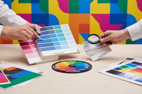
- Match spot to process through the Bridge. Pantone's Color Bridge shows the printed CMYK equivalent next to the spot swatch, which is a far better guide than the on screen conversion. Our page on matching Pantone to CMYK covers the colors that shift most.
Set the file up on a correctly sized layout and half these problems never appear. The blank template library gives you the trim, bleed and safety area for every product, and our print ready PDF export guide covers the settings that preserve your values instead of reprocessing them. Then check one last time before upload: grays neutral, small text 100K, no registration black anywhere, nothing over 300 percent. A run of flyers from $39.54 or a set of cards from business card printing lives or dies on those four checks.
Wally explains CMYK values
Four inks, four numbers, one total to watch
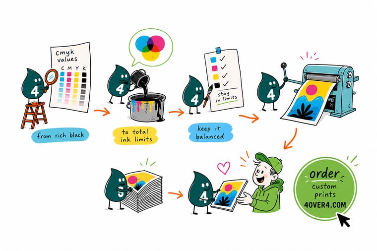
Wally stacks the plates in order: cyan, magenta, yellow, then black on top. One layer of black alone gives him charcoal, so for a big solid he puts 60 cyan, 40 magenta and 40 yellow underneath and gets a black with real depth. Then he adds the numbers up. Two hundred and forty percent, under the ceiling, dry by the time it hits the stack. He keeps small type on the black plate alone so nothing has to line up, and he keeps registration black out of the artwork entirely, because four hundred percent of anything cracks on a fold.
Print business cards with a proper rich black →
Specs and pricing
Stocks, sizes, and starting prices for full color work
Coated or uncoated changes the ink ceiling your file has to respect, so pick the stock while you are still building the values. Business cards start at 100 for $17.57 on 14pt gloss, with uncoated cover in the same configurator; flyers start at 50 for $39.54 on seven stocks from 70# uncoated text to 14pt cover; postcards start at 50 for $16.48 on 22 stocks.



Print it
Put those values on paper
A business card shows a rich black background best, a flyer tests your tints and grays across a full sheet, and a brochure shows whether heavy coverage survives the fold. Order a small run of the piece your values matter most on.




Explore more
Where to go next
Go deeper on the rich black recipe, control an RGB conversion, learn how profiles change a print, and see which Pantone colors cross to CMYK cleanly.



By the numbers
Color printing measured in years and products
Common Questions
Your CMYK value questions, answered
What CMYK values make a good rich black?
60 cyan, 40 magenta, 40 yellow, 100 black is the build we use most, and it works on almost any coated stock. The 100K carries the density, the three color inks underneath kill the gray cast, and the total lands at 240 percent, comfortably under the 300 percent ceiling. If a job needs a slightly cooler black, drop the magenta and yellow to 30 and lift cyan to 60. For a warmer black, run 40/60/40/100. What you should not do is guess a build with all four inks at 80 or above, because the sum goes over 320 percent and the sheet stops drying properly.
Why does my black print gray instead of black?
Two causes, and they are easy to tell apart. If the black area is large and you built it as 0/0/0/100, one layer of black ink simply cannot cover the paper densely enough, and it reads as charcoal next to a photo that contains rich black. Switch that area to 60/40/40/100. The other cause is a file still in RGB: black at 0,0,0 in RGB converts into a heavy four ink mix whose exact values depend on the profile, and it prints muddy and slightly warm rather than neutral. Convert to CMYK yourself and set the value deliberately.
What is the maximum total ink coverage for CMYK printing?
On coated sheetfed stock, 300 percent is the practical ceiling and 320 percent is the absolute edge. On uncoated stock the fibers hold more ink and release it more slowly, so 260 percent is a safer limit. Newsprint and lightweight web stocks want 240 percent or less. Over the limit, wet ink transfers onto the back of the next sheet in the stack, solid areas mottle, and anything scored or folded cracks along the crease. Photoshop shows the running total in the Info panel when you hover the eyedropper over an image.
Should small text be rich black or 100K?
Flat 100K, every time. Rich black needs all four plates to land on top of each other, and a shift of a fraction of a millimeter puts a cyan or magenta fringe on the edge of every letter. On 8 or 9 point type that fringe is visible at arm's length and looks like a printing fault. The same rule covers hairline rules, thin outlines and small reversed type. Save rich black for areas larger than a postage stamp and for display type above roughly 24 point.
Do the CMYK values on my screen match what prints?
Not exactly, and no monitor makes them match. A screen emits light and can show colors that no ink mix can reach, so an electric blue on screen returns as a duller navy on paper. Working in a CMYK document with a profile such as US Web Coated (SWOP) v2 gets the preview close, but the only real check is a proof. Order a printed sample of the piece before committing to a long run when color accuracy carries the job.
How do I convert a brand Pantone color to CMYK values?
Use the Pantone Color Bridge, which pairs each spot color with the closest four color build rather than letting your software compute one. Some colors cross cleanly and some do not: bright oranges, deep blues and anything fluorescent lose saturation in CMYK because the ink set cannot reach them. When a brand color shifts too far, the answer is either a spot ink on that job or an approved CMYK alternate recorded in your brand guide so every printer builds it the same way.
Get Started
50 posters cost $108.75, printed to your ink limits
Set the blacks, check the ink total, upload the file. We print on coated and uncoated stock and tell you when a build is going to fight the press.
Legal Disclaimer
Gold Standard guarantees apply to all standard orders placed through 4over4.com. Price match requires verifiable proof of a competitor's published price for an equivalent product with matching specifications and turnaround time. Satisfaction guarantee covers manufacturing defects and print quality issues. Contact support with order number and documentation.
