
How Color and Ink Work in Commercial Printing


Almost all commercial color comes from four inks, yet color still surprises people who design on a glowing screen. A screen emits light and paper reflects it, which is why the same file looks different in the hand.
Most commercial color printing is achieved with CMYK, four process inks layered as tiny dots. Screens use additive RGB light while presses use subtractive ink, so design in CMYK to match your preview to the result. Use spot inks for exact brand colors, manage color with profiles and calibration, and confirm critical color on a real printed proof.

Start here
CMYK by default, spot by exception
Commercial color is built mostly from four CMYK inks, so design in CMYK to match your screen to the press. Screens glow with additive RGB light while ink is subtractive, spot colors handle exact brand matches, and color management plus a real proof keep the result true. The RGB versus CMYK diagram below shows why the two look different.
Color in printing, and how it is made

Almost every full-color printed piece you have ever held was made from just four inks. Commercial color printing is achieved mainly through the CMYK process: cyan, magenta, yellow, and black, laid down as tiny overlapping dots. At normal viewing distance your eye blends those dots into smooth, continuous color, which is how four inks can reproduce a photograph, a gradient, or a brand palette.
This four-ink approach carries the industry because it is affordable and flexible. A single set of plates or a single digital pass can print an enormous range of colors, from a subtle skin tone to a punchy headline. It is why a run of posters, a stack of business cards, and a folded brochure can all come off the same process looking sharp and consistent.
Understanding a little about how this ink actually behaves, and where it differs from the color on your screen, is what lets you design files that print the way you expect. The rest of this guide covers the parts that most affect your results: RGB versus CMYK, spot color, color management, and getting a true proof.
RGB versus CMYK, and why it matters

Screens and presses build color in opposite directions. A monitor is additive: it emits red, green, and blue light that combines toward white, which is why screens can glow with brightness that paper cannot. A press is subtractive: it lays down cyan, magenta, yellow, and black ink that absorbs light and moves toward black. Because the two systems cover different ranges, some colors that dazzle on screen simply cannot be matched in ink.
The practical consequence is that if you design in RGB and send it to press without converting, the file gets converted anyway, and colors can shift in ways you did not choose. Bright blues can drift toward purple, and vivid greens and oranges lose punch. The fix is to design in CMYK from the start so your preview reflects ink, then convert any RGB photos or web graphics before you export.
After converting, look hardest at the colors most likely to shift, and pull key brand colors from a printed reference rather than a monitor. This single habit prevents most color surprises on jobs like business cards and posters. When one color has to be exact, though, four inks are not always enough, which is where spot color comes in.
Spot colors and when to use them

A spot color is a single, pre-mixed ink matched to a published standard, rather than a color assembled from the four process inks. Because it is one consistent ink laid down directly, a spot color reproduces the exact same hue on every job. That precision is why brands specify spot colors for a logo or a signature brand color that must look identical across a business card, a sign, and a brochure.
Spot inks also unlock effects the four-color process cannot produce on its own, such as metallics or certain ultra-bright colors that sit outside the CMYK range. The trade-off is that each spot ink is an additional element on press, so it is reserved for where exactness or a special effect genuinely matters, while the bulk of full-color artwork stays in CMYK.
If your identity depends on a precise color, note the spot reference in your file and confirm it against a printed standard, not a screen. For most projects, though, a well-prepared CMYK file on a good stock gives excellent, consistent color. Keeping it that consistent from your desk to the press is the job of color management.
Color management and workflow

Color management is the set of practices that keep color predictable as a file travels from your screen to the press. It rests on a few pillars: designing in the right color space, using consistent color settings and profiles, working on a calibrated monitor, and confirming the result with a proof. Each pillar removes a place where color could drift unexpectedly.
The workflow matters as much as any single setting. Decide your color space up front, keep the same profiles across every asset in a project, and avoid last-minute conversions that can shift hues. When a job spans several pieces, a managed workflow is what keeps the brand color on the brochure matching the one on the business card, rather than each piece drifting on its own.
None of this requires a color science degree. The high-value habits are simple: design in CMYK, keep settings consistent, and never trust a glowing monitor for a final color call. The one piece that ties the workflow together is calibration and a real proof.
Color calibration and choosing a color space

Calibration is what makes your screen tell the truth. An uncalibrated monitor can run warm, cool, or too bright, so a color that looks perfect on it may print noticeably different. Working on a calibrated display, with consistent room lighting, narrows the gap between what you approve and what the press outputs, and it is the foundation for trusting any on-screen color decision.
Choosing a color space follows from where the work is going. Use sRGB or Adobe RGB only while editing photos, then convert to CMYK before exporting for print, since CMYK is the space the press actually uses. Reserve spot colors for exact brand matches, and build large solid blacks as a rich black rather than plain K. The color-space table below sums up when each one belongs.
Even with a calibrated screen, the surest confidence comes from a physical proof. Judging critical color on the real stock removes the last variable, because paper reflects while a monitor glows. For color-critical work, that final check is worth the small cost, and it is the natural lead-in to placing the order.
Order color-critical prints at 4OVER4

When your file is in CMYK and your key colors are confirmed, ordering is the easy part. Choose the product, set the size, stock, and finish, and the price updates live. For anything where color is critical, add a proof or order free paper samples first so you can judge the ink on the actual paper before committing to a full run.
Design in our free online Designer or upload your own artwork, and every file runs through a free print check that flags issues before the press does. Whether it is a saturated poster, a brand-critical business card, or a multi-panel brochure, a well-prepared color file plus a real proof is the recipe for prints that match your intent.
Use the live specs and pricing panel below to pick your size and stock, then order with the confidence that your color was set for ink, not for a screen.
Wally sets your color for ink, not for a screen
CMYK for the press, spot ink for the exact match
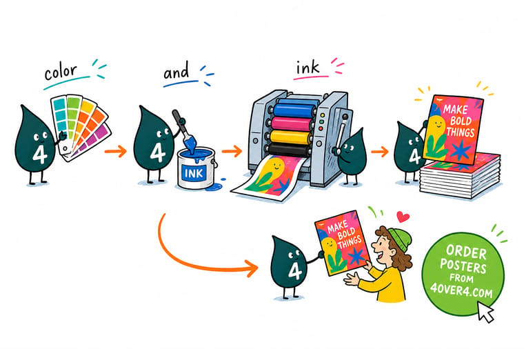
Wally knows the screen lies a little. Presses build color from four inks, cyan, magenta, yellow, and black, so he designs in CMYK, converts photos before export, and keeps a rich black for the big solid areas. When one color must be exact, he calls in a spot ink and checks a real proof on the stock. 4OVER4 prints what you approved.
Print in true color →Color space guide
Color spaces and where each belongs
Choosing the right color space is half the battle, and each one has a point in the workflow where it belongs.
| Space | Use for | What to know |
|---|---|---|
| sRGB | Screens and web | The default color space for monitors and the web. Great for display, but its bright glow does not fully translate to ink, so convert before print. |
| Adobe RGB | Photo editing | A wider space than sRGB used in photography. Useful for editing, but still an RGB space that must be converted to CMYK for press. |
| CMYK | Commercial printing | The four-ink process space presses actually use. Design and export in CMYK so your preview matches the printed result. |
| Spot color | Exact brand color | A single pre-mixed ink matched to a standard, used when one precise color must be identical on every run. |
| Rich black | Large solid blacks | A CMYK black built from more than K alone, so big black areas print deep and even instead of washed and streaky. |
Step by step
Get color-accurate prints in 6 steps
- Design in CMYK from the start Set your document to CMYK so the screen preview reflects process ink, and avoid designing in RGB and converting at the last minute.
- Convert and re-check RGB assets Convert any photos or web graphics to CMYK, then look hard at bright blues, greens, and oranges, which shift the most in conversion.
- Flag exact brand colors If a color must be precise, note the spot reference and confirm it against a printed standard rather than trusting your monitor.
- Build large blacks as rich black Use a rich black mix for big solid areas so the ink lays down deep and even instead of looking thin.
- Manage color with profiles and calibration Work with a calibrated screen and consistent color settings so what you approve matches what the press outputs.
- Proof on the real stock before the run Order a printed proof or free paper samples to judge the ink on the actual paper, then approve and print the full run with confidence.
Specs and pricing
Poster specs and live pricing
When your color is set for ink, size, stock and finish are what is left. Posters run 50 for $108.75, which is $2.18 each.

| Quantity | Price Per Unit | Total |
|---|---|---|
| 50 | $2.18 | $108.75 |
| 100 | $1.64 | $163.67 |
| 200 | $1.01 | $202.11 |
| 300 | 80.2¢ | $240.55 |
| 400 | 69.7¢ | $278.99 |
| 500 | 63.5¢ | $317.44 |
| 600 | 55.8¢ | $335.02 |
| 700 | 50.4¢ | $352.59 |
Print it
Print color-critical work at 4OVER4



See it in use
Files we matched from screen to sheet








Explore more
Where to go next






By the numbers
Color across 60+ paper stocks
Common Questions
Common questions about color and ink
How is most commercial color printing achieved?
Most commercial color printing is achieved through the CMYK process, which uses four inks: cyan, magenta, yellow, and black. The press lays these inks down as tiny overlapping dots, and at normal viewing distance your eye blends them into a full range of color. Because four inks can approximate most colors affordably, CMYK is the default for almost everything from business cards to posters. When a color must be exact rather than approximated, a spot ink is added, but the four-color process carries the vast majority of printed pieces.
What is the difference between RGB and CMYK?
RGB and CMYK are two ways of building color for two different media. RGB is additive: screens emit red, green, and blue light that adds up to white, which is why monitors can glow. CMYK is subtractive: a press lays down cyan, magenta, yellow, and black ink that absorbs light and moves toward black. The two ranges do not fully overlap, so some bright RGB colors, especially vivid blues and greens, cannot be reproduced exactly in ink. Designing in CMYK lets your screen preview reflect what the press will actually print.
What is a spot color?
A spot color is a single, pre-mixed ink matched to a published standard, rather than a color built from the four process inks. Because it is one consistent ink, it reproduces the exact same color on every job, which is why brands use spot colors to keep a logo or brand color perfectly consistent across different pieces and print runs. Spot colors are also used for effects the four-ink process cannot achieve, such as metallics or certain ultra-bright hues. For most full-color artwork, CMYK is used, with spot inks reserved for precision.
How do I keep color consistent from screen to print?
Consistency comes from color management: designing in CMYK, working on a calibrated monitor, using consistent color settings and profiles, and confirming the result with a proof. The most reliable single step is to judge critical color on a printed proof or a paper sample rather than on a screen, because monitors vary and glow while paper reflects. For exact brand colors, specify a spot reference and check it against a printed standard. Together these steps keep what you approve close to what prints.
Which color space should I choose for my project?
For anything going to a commercial press, work and export in CMYK, since that is the space the press uses. Use sRGB or Adobe RGB only while editing photos, then convert to CMYK before you export for print. Reserve spot colors for cases where one exact brand color must be identical everywhere. Build large solid blacks as a rich black rather than plain K. When you are unsure, follow the product setup notes and confirm the final look with a proof on the real stock.
What does color-critical printing cost and how are prices set?
Standard CMYK color printing is included in the base price, which scales with quantity, size, stock, and finish, with larger runs lowering the unit cost. Spot inks and certain specialty finishes can add to the price because they use additional inks or passes. Ordering a proof or free paper samples to confirm color is an inexpensive safeguard against a costly reprint. You set each option in the configurator and the price updates live, so you can see the cost of a heavier stock or a larger run before you order.
Get Started
Order 50 brochures at $1.14 and check the color
Set your file in CMYK, confirm it on a proof, and order color-accurate prints at 4OVER4.COM. Pick your size, stock, and finish and watch the price update live.
Legal Disclaimer
Gold Standard guarantees apply to all standard orders placed through 4over4.com. Price match requires verifiable proof of a competitor's published price for an equivalent product with matching specifications and turnaround time. Satisfaction guarantee covers manufacturing defects and print quality issues. Contact support with order number and documentation. On-time delivery rate based on tracked orders 1999 to 2026. Individual results may vary based on shipping carrier performance.
