
Free Calligraphy Practice Sheets You Can Print at Home


The fastest way to improve your lettering is consistent practice on well-spaced guide sheets. Guidelines printed too dark compete with your strokes, so they go in a light gray, not black.
Calligraphy practice sheets are printable pages with slanted guideline grids and stroke drills that train your hand to form consistent letters. To use them, print the page at 100 percent scale on a smooth, fairly heavy paper so ink does not bleed, then trace and repeat the basic strokes before moving to full letters. Start with the fundamental strokes, practice daily in short sessions, and once your lettering is steady, put it to work on real printed invitations and cards.

Start here
Ruled lines and daily drills
Calligraphy practice sheets are printable guideline pages that train your hand to form even, consistent letters through repetition. You print them at full scale on smooth, fairly heavy paper, drill the basic strokes before whole letters, and practice in short daily sessions. The stroke diagram below shows the fundamental marks that build every letter, so you know exactly what to repeat first.
What you need to start calligraphy
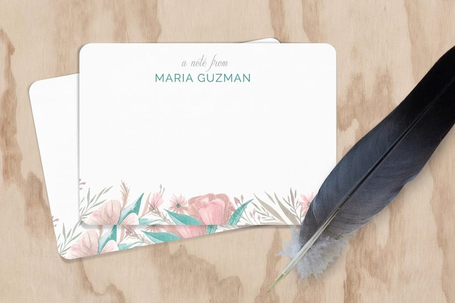
You need surprisingly little to begin. A pen or brush pen, some practice sheets, and smooth paper that will not fight your ink. Beginners often start with a brush pen because it forgives pressure mistakes, while pointed-pen and broad-edge calligraphy use dip pens and nibs. Any of them work with the same guideline sheets.
The one thing worth getting right early is your paper. Rough or thin stock lets ink feather and bleed, which makes even good strokes look messy and hides your progress. A smooth, heavier paper keeps lines crisp so you can actually see whether your practice is improving. When you graduate to real projects, that same instinct for good stock carries straight into printed notecards and invitations.
How calligraphy practice sheets work
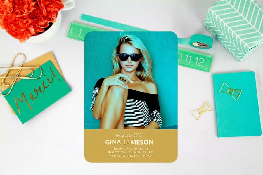
A practice sheet is a grid of guidelines. Horizontal lines set the baseline, the x-height, the ascender and descender heights, while evenly spaced slanted lines set the consistent angle that gives calligraphy its rhythm. When you letter between those lines, every stroke lands at the same slant and height, which is what makes a word look intentional rather than wobbly.
That is why printing accuracy matters so much. If you scale the page or print it skewed, the guideline spacing no longer matches the size your pen is built for, and the sheet stops helping. Print at 100 percent, confirm the grid looks even, and let the lines do their job. Our online design tool at the 4OVER4 designer is also a handy place to test your finished lettering as artwork once your hand is steady.
Calligraphy paragraph examples to practice
Guidelines only help once you are writing real words, so here is exactly what to put on the sheet. Start with pangrams, sentences that contain all 26 letters, because a single line tells you which letters are still wobbly. Write each one three times before you judge it, then move up to a paragraph. If any of them feel like a fight, drill the basic strokes below first and come back.
Modern brush pen: the quick brown fox jumps over the lazy dog. All 26 letters in 35 characters, and the short words let you exaggerate the thick pressured downstroke and the hairline upstroke without losing your place in the sentence. Let the baseline bounce a little here, because modern brush is the one hand where that reads as style rather than as a mistake.
Modern brush pen, second pass: how vexingly quick daft zebras jump. 30 letters loaded with tall ascenders and deep descenders, which is what turns a bouncy line into a composed one instead of a scattered one.
Copperplate: pack my box with five dozen liquor jugs. 32 letters on a steep 55 degree slant, and the slant is the whole exercise, because every downstroke in the sentence has to lean at the identical angle. The slanted guidelines printed on your sheet are there to prove whether yours do.
Copperplate, harder: jackdaws love my big sphinx of quartz. 31 letters, with j, q, y and g all dropping below the baseline, so it forces the descenders to match each other in length and in pressure rather than trailing off.
Italic: sphinx of black quartz, judge my vow. 29 letters written with a broad edge nib held at a steady 45 degrees, on a sheet whose x-height is usually set at five nib widths. Italic exposes an inconsistent pen angle faster than any other hand, and this short line makes it obvious in one pass.
Gothic blackletter: the five boxing wizards jump quickly. 31 letters built almost entirely from vertical strokes, so the work is spacing rather than shape: the white gap between two stems should read the same width as the stems themselves. Once that is even, drill waltz, bad nymph, for quick jigs vex, 28 letters and the shortest pangram worth your time.
Then the paragraph. Take four or five lines of prose you actually like and copy them out at your normal writing size. Single letters and single words hide bad spacing, a block of text cannot, and the gaps between words are where most beginners lose the rhythm. Work through all of it at half your usual speed. If you are still choosing which hand to learn first, our step by step beginner guide to learning calligraphy covers the tools and the order to learn them in, and when a line finally comes out clean it is ready to be scanned and printed on notecards.
The basic strokes to drill first
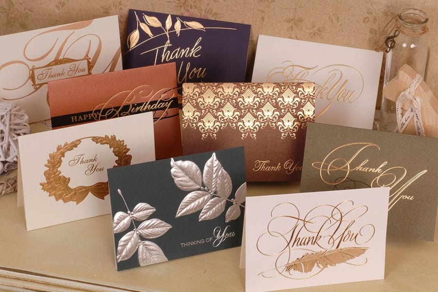
Calligraphy looks complex but reduces to a handful of foundational strokes. The thin upstroke made with light pressure, the thick downstroke made with firm pressure, the underturn, the overturn, the compound curve, and the oval. Nearly every letter in a script alphabet is assembled from these pieces, so drilling them is the single highest-return thing a beginner can do.
Fill whole rows with just one stroke at a time before you ever attempt a letter. Watch for even spacing, consistent slant, and the smooth transition from thin to thick, which comes from pressure, not speed. Only once the strokes feel automatic should you connect them into letters and then words. This stroke-first discipline is why practice sheets exist in the first place.
How to print and use your sheets at home
Print your practice sheets at 100 percent scale, never fit to page, so the guideline spacing stays true. Choose a smooth paper heavy enough that ink does not bleed through, roughly a text weight or light cardstock, and check that the print is dark enough to trace but light enough not to distract from your own lettering. Many people print the same sheet several times or slip it into a clear sleeve and letter on top with an erasable guide beneath.
If your home printer struggles with heavier stock or you want a stack of clean, consistent sheets to work through, printing them professionally on smooth cardstock gives you crisp guidelines every time. A short run of flat cards or a custom sheet on quality stock turns a blurry home printout into a practice tool you will actually enjoy using.
From practice to printed projects
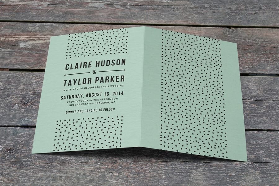
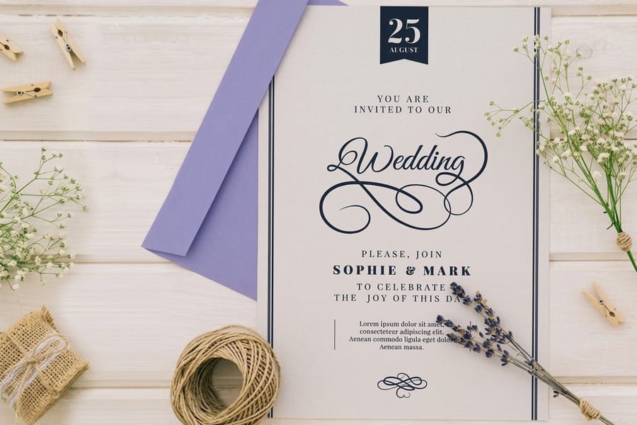
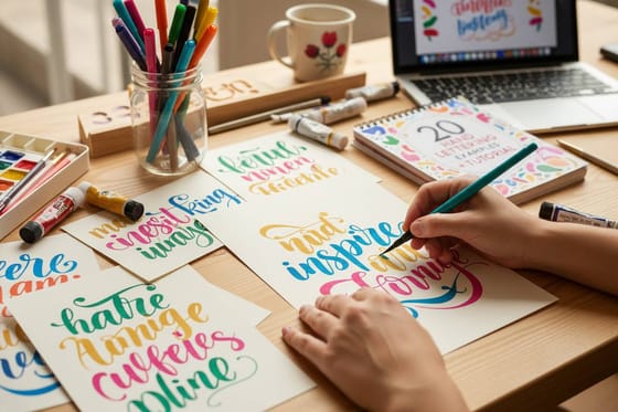
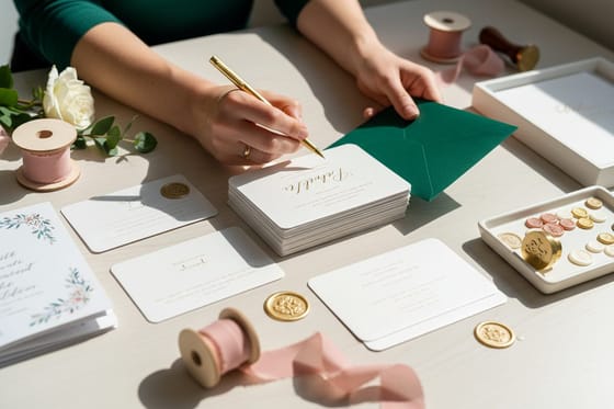
Practice is most motivating when it leads somewhere. Once your lettering is steady, put it to work: hand-letter a phrase, scan or photograph it cleanly, and turn it into artwork for real printed pieces. Wedding invitations, greeting cards, place cards, and menus all shine with genuine calligraphy, and seeing your own lettering printed beautifully is the best reason to keep practicing.
When you make that jump, the stock matters again. A heavier, textured, or premium card gives your lettering a surface worthy of the effort, and printing a batch means every guest or recipient gets the same crisp result. Browse the invitations and cards range to see where your practice can lead, from a single keepsake to a full event suite.
Tips to improve faster
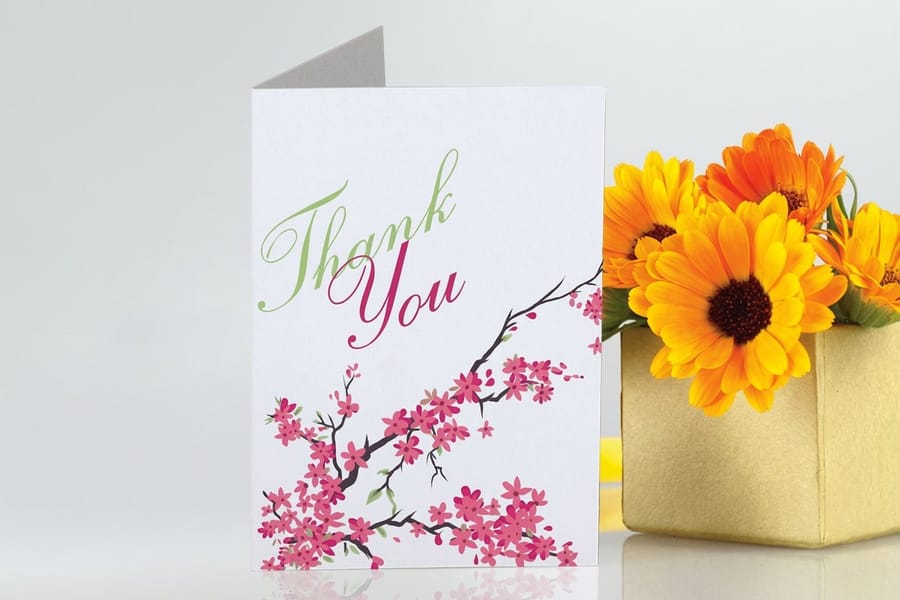
Progress in calligraphy is mostly about frequency and honest self-review. Short daily sessions build muscle memory faster than occasional long ones, so fifteen focused minutes most days beats a rare marathon. Keep your old sheets so you can compare where you started to where you are now, which is both motivating and diagnostic.
Slow down. Nearly every beginner problem, shaky lines, uneven slant, inconsistent thickness, improves the moment you stop rushing. Letter deliberately, watch the guidelines, and let speed come naturally over months. When you are ready to show your work, printing it on quality stock at 4OVER4 is the reward that keeps the practice going.
Wally drills the strokes before the letters
Guidelines, repetition, then a real card
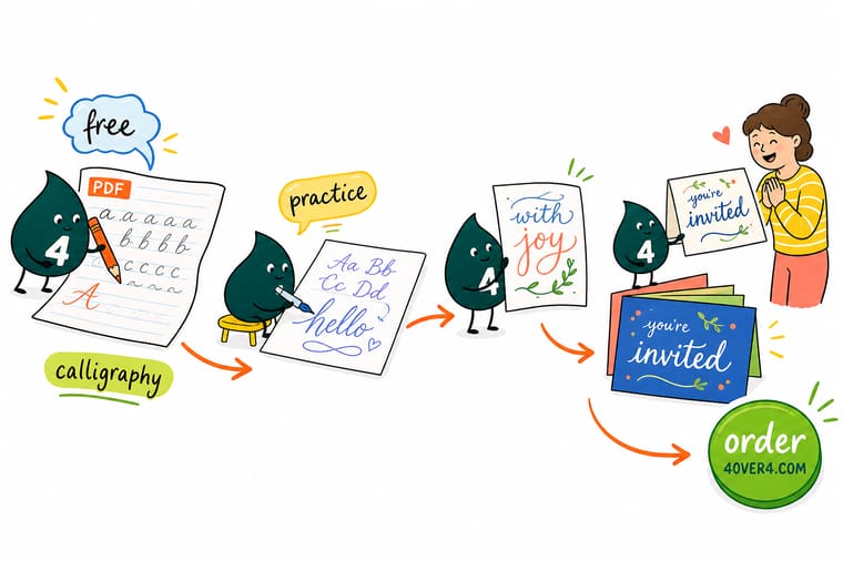
Wally practices the smart way: print the sheets at full scale on smooth paper, drill the basic strokes one row at a time, and letter in short daily sessions between the guidelines. Then he puts the steady hand to work on a real invitation or card. Practice with intent, and 4OVER4 prints the finished lettering on stock that does your effort justice.
Print your lettering →Quick reference
Practice sheet printing at a glance
The settings that keep a calligraphy practice sheet useful, and the stock that makes lettering feel good.
| Element | Get it to | Why it matters |
|---|---|---|
| Print scale | 100 percent, never fit to page | Scaling changes the guideline spacing your pen is built for and stops the grid from helping. |
| Paper | Smooth, text weight to light cardstock | Smooth heavier stock stops ink from feathering and bleeding so your strokes read clearly. |
| Guideline darkness | Visible but not distracting | Lines dark enough to follow yet light enough to keep your own lettering the star of the page. |
| First drills | Basic strokes, one per row | Every letter is built from a few strokes, so drilling them first is the fastest route to clean letters. |
| Session length | About 15 minutes daily | Frequent short sessions build muscle memory faster than rare long ones. |
| Project stock | Premium or textured cards | When practice becomes a real piece, quality stock gives your lettering a surface worth the effort. |
Step by step
Start practicing calligraphy in 6 steps
- Gather a pen and smooth paper Start with a brush pen or dip pen and smooth, fairly heavy paper so your ink stays crisp instead of feathering.
- Print the sheets at full scale Print your practice pages at 100 percent, never fit to page, so the guideline grid keeps the spacing your pen needs.
- Drill the basic strokes Fill whole rows with single strokes, the thin upstroke, thick downstroke, and curves, before you attempt any letters.
- Build strokes into letters Once the strokes feel automatic, connect them into letters, then words, keeping every mark on the slant and baseline.
- Practice a little every day Do short focused sessions most days and keep your old sheets so you can see your progress build over time.
- Print your lettering for real When your hand is steady, turn your lettering into artwork and print it on quality cards, invitations, or menus.
Specs and pricing
Live notecard specs and pricing
Flat notecards run 25 for $19.77, which is $0.79 each, and the coated face takes ink without feathering.

| Quantity | Price Per Unit | Total |
|---|---|---|
| 25 | $1.53 | $38.22 |
| 50 | $1.34 | $67.22 |
| 100 | 93.6¢ | $93.58 |
| 200 | 60.0¢ | $119.94 |
| 300 | 48.8¢ | $146.30 |
| 400 | 43.2¢ | $172.67 |
| 500 | 39.8¢ | $199.03 |
| 600 | 38.2¢ | $229.34 |
Print it
Print your lettering with 4OVER4
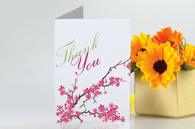
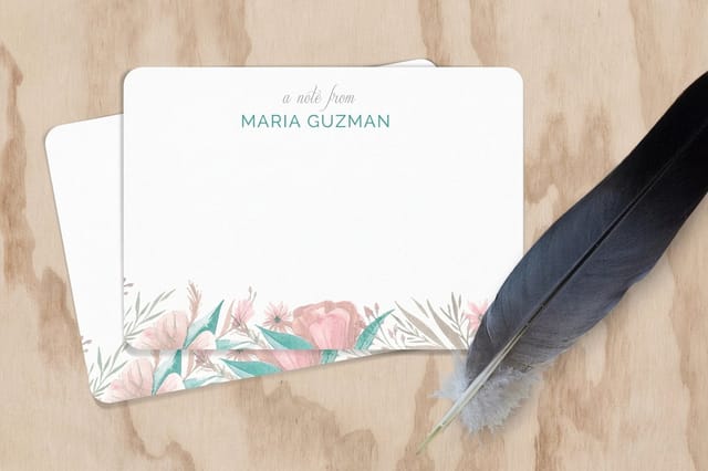
See it in use
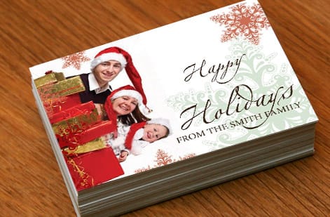
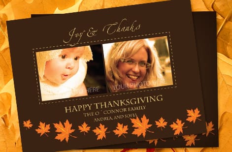
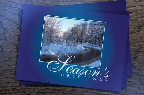
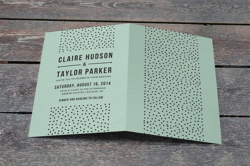
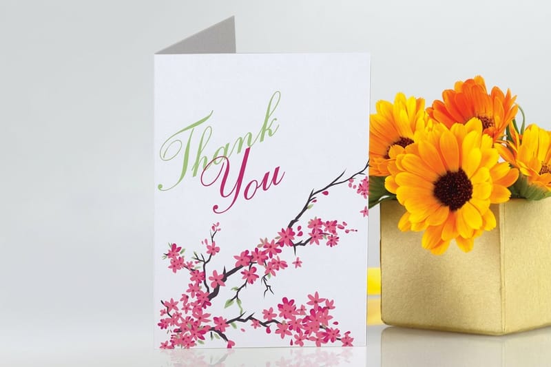
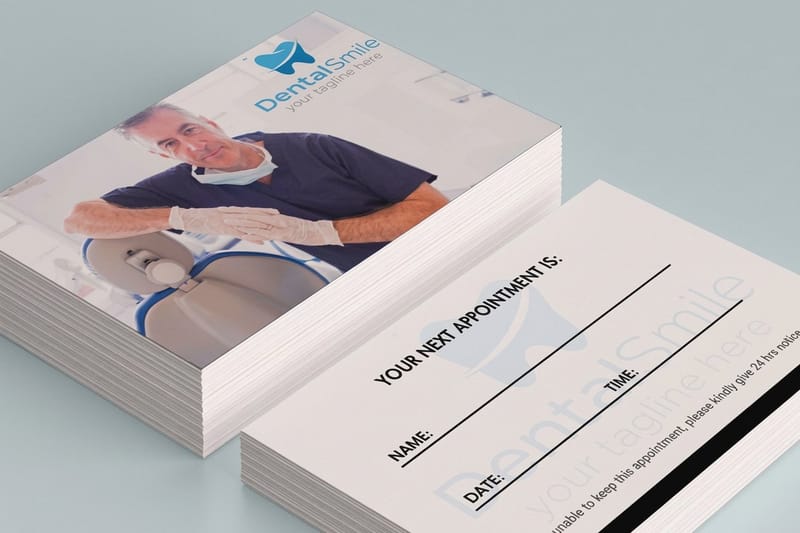
Invitation and card work customers printed





Explore more
Where to go next
By the numbers
Stationery stocks across 1,000+ products
Common Questions
Common questions about calligraphy practice sheets
What are calligraphy practice sheets?
Calligraphy practice sheets are printable pages of guidelines and stroke drills that train your hand to form consistent letters. They provide a grid of horizontal lines for baseline and letter heights plus evenly spaced slanted lines for a consistent angle, so every stroke lands at the same slant and size. Some sheets add stroke drills or traceable letters. Lettering between the guidelines is what turns wobbly, uneven writing into calligraphy that looks intentional and rhythmic.
What nib size are my guide sheets ruled for?
Match the sheet to your tool and your level. Beginners using a brush pen do well with basic-stroke and large-letter sheets that forgive pressure mistakes, while pointed-pen and broad-edge work benefit from sheets with the correct slant angle for that style. Start with sheets that isolate the fundamental strokes before ones with full alphabets or words. Whatever you choose, the most important thing is printing it accurately at full scale on smooth, fairly heavy paper so the guidelines stay true and the ink stays crisp.
What does it cost to print calligraphy practice sheets?
Printing practice sheets on a home printer costs only paper and ink, and the sheets themselves are free to use. If you want a stack of clean, consistent sheets on smooth cardstock that heavier home printers struggle with, a short professional run is inexpensive and priced like any small card or sheet job: quantity, size, and stock set the total, and the cost per sheet drops as the quantity goes up, so one larger run beats several small ones. When your practice becomes a finished piece like an invitation, the same levers apply and the price updates live in the configurator as you choose options.
What paper and stock work best for calligraphy?
Smooth paper is the priority, because rough or thin stock lets ink feather and bleed, which hides your progress and makes clean strokes look messy. For practice, a smooth text weight or light cardstock holds crisp lines and takes ink well. Test one sheet before you print a stack: pull a slow pressured downstroke and a hairline upstroke, and if the hairline spreads or the nib catches the surface, that paper is too absorbent or too toothy for the ink you are using. For finished pieces like invitations and cards, heavier premium and textured stocks give your lettering a richer surface. The through-line is smoothness first, then weight, so your strokes read exactly as your hand made them.
How long does it take to get good at calligraphy?
It depends on frequency more than total hours. Short daily sessions of around fifteen focused minutes build muscle memory faster than occasional long ones, and most beginners see real improvement in the basic strokes within a few weeks of consistent practice. Drilling strokes before letters, slowing down to keep lines even, and keeping old sheets to track progress all speed things up. A simple test: write the same pangram once a week, date the sheet, and stack them, because the change shows up in your spacing before it shows up in your letterforms. Calligraphy rewards patience and repetition, so steady practice beats intensity every time.
Can I use my calligraphy on printed cards and invitations?
Yes, and it is one of the best reasons to keep practicing. Once your lettering is steady, hand-letter a phrase, scan or photograph it cleanly at high resolution, and use it as artwork for printed pieces like wedding invitations, greeting cards, place cards, and menus. Scan at 600 dpi or higher so the hairline upstrokes survive, letter in solid black ink on white so the background drops out cleanly, and give yourself a few takes of the same phrase to choose from. Printing a batch means every recipient gets the same crisp result, and a premium or textured stock gives your lettering a surface worthy of the effort. Seeing your own hand lettering printed beautifully is a powerful motivator.
What should I write when practicing calligraphy?
Write pangrams first, sentences that use all 26 letters, so one line drills the whole alphabet and shows you which letters are still weak. Four worth keeping on the sheet: the quick brown fox jumps over the lazy dog at 35 letters, pack my box with five dozen liquor jugs at 32, sphinx of black quartz, judge my vow at 29, and waltz, bad nymph, for quick jigs vex at 28. Match the sentence to the hand you are learning: modern brush pen suits short bouncy phrases where you can exaggerate the thick downstroke, copperplate and italic suit longer sentences where the slant and the pen angle have to stay identical line after line, and gothic blackletter suits dense text where even spacing between the vertical stems is the entire exercise. Then write a real paragraph, four or five lines of anything you like, because word spacing and rhythm only reveal themselves across a full block of text. Date each sheet and keep it so you can see the change.
Get Started
Order 25 folded invitations at $1.53 each
Practice on crisp guideline sheets, then bring your finished lettering to 4OVER4 and print it on cards and invitations that do your hand justice. Set every option and watch your price update live.
Legal Disclaimer
Gold Standard guarantees apply to all standard orders placed through 4over4.com. Price match requires verifiable proof of a competitor's published price for an equivalent product with matching specifications and turnaround time. Satisfaction guarantee covers manufacturing defects and print quality issues. Contact support with order number and documentation. On-time delivery rate based on tracked orders 1999 to 2026. Individual results may vary based on shipping carrier performance.
