
How to Add Paper Texture in Photoshop


Faking paper texture in Photoshop takes a layer, a blend mode and a slider. It is a picture of texture, and on smooth stock it stays a picture.
Place a paper-texture image above your artwork, desaturate it, change the blend mode, and drop the opacity. Multiply reads as ink on paper, Overlay and Soft Light add depth, and a layer mask keeps logos crisp. A screen fake sells a mockup, but for a piece people hold, print on real kraft, linen, or cotton stock.
Start here
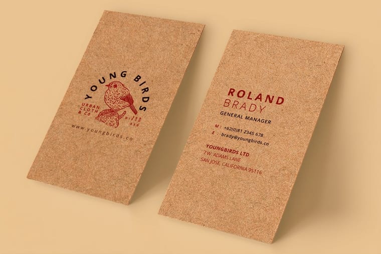
Simulated grain against real fiber
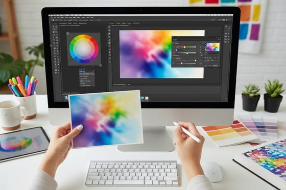
Paper texture in Photoshop is a layer, a blend mode, and an opacity slider. Place a desaturated texture image above your art, set it to Multiply, Overlay, or Soft Light, drop the opacity, and mask it off logos. That sells a design on screen, but only a real textured stock like kraft, linen, or cotton delivers a grain you can feel. The blend stack below shows the layers.
What paper texture actually adds to a design
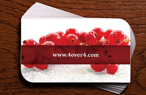
Flat color can look clean, but it can also look sterile. A hint of paper texture gives a design warmth and depth, suggesting something made rather than merely rendered. It softens harsh gradients, unifies mismatched elements under one surface, and nudges a design toward feeling handmade or premium.
In Photoshop, that effect is surprisingly simple: a texture image, a blend mode, and an opacity slider. This guide walks the exact steps to fake paper texture on screen, then makes the more important point, which is knowing when a fake is enough and when your piece needs a genuinely textured stock like kraft, linen, or cotton that a person can feel.
The distinction matters because the two solve different problems. A texture layer sells a mockup on a monitor. A real stock sells the piece in someone’s hand. We will cover both, starting with the Photoshop technique and ending at the print choice that turns a simulated grain into a physical one you can order.
Adding texture in Photoshop, step by step

The whole technique is five moves stacked on top of your finished artwork. Master these and you can add convincing paper texture to any design in a couple of minutes.
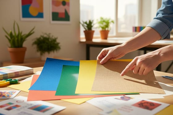
First, place a high-resolution paper, kraft, or canvas texture image on a new layer above your art, scaled to cover the canvas. Second, desaturate it so it does not tint your colors. Third, change the blend mode, starting with Multiply. Fourth, pull the layer opacity down until it reads as paper rather than a filter. Fifth, add a layer mask and paint the texture back off logos and fine type so they stay crisp.
Work in CMYK at 300 DPI with bleed from the start so what you see previews what prints, the same discipline our guide on converting RGB to CMYK covers in depth. When the look is right, you can push it further with related techniques like filling text with images and building duotones, which rely on the same layer thinking.
Choosing the right blend mode

The blend mode is where the effect lives, and picking the right one is the difference between convincing paper and a muddy overlay. Each mode does a specific job.
Multiply darkens your design along the texture’s grain and shadows, which reads as ink sitting on paper and suits most light designs. Overlay and Soft Light lighten and darken at once for a richer, more dimensional feel, with Soft Light being the subtler of the pair. Screen lightens only, which is the move when your design is dark and you want the grain to lift through it rather than disappear.
There is no single correct answer, because the right mode shifts with your colors. Try each, judge by eye, and remember you can always lower opacity or stack two low-opacity texture layers in different modes for a more natural result. The goal is texture that feels like part of the paper, not a sticker laid over the top.
Digital texture versus a real textured stock
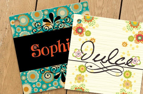
The Photoshop trick has an honest limit: it is a picture of texture, not texture. A blended layer can make a business card look like kraft on a screen, but when that file prints on smooth stock, it is still smooth. The grain lives in the pixels, not the paper.
That is fine for anything that stays digital, a website mockup, a social post, or a proof. It falls apart the moment someone picks the piece up expecting the feel the image promised. Touch is a real channel of quality: a fibrous kraft card, a woven linen finish, or a soft cotton stock communicates craft instantly, and no monitor can reproduce that sensation.
So the practical rule is to match the method to the medium. Simulate texture when the piece lives on a screen, and print on a genuinely textured stock when the piece will be held. For the differences between real stocks in the hand, our guide on paper stocks explained is the companion to this one.
The best textured stocks to print for real

When the feel matters, three real stocks do what a Photoshop layer only imitates, each with a distinct character.
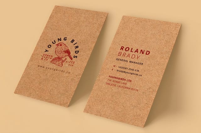
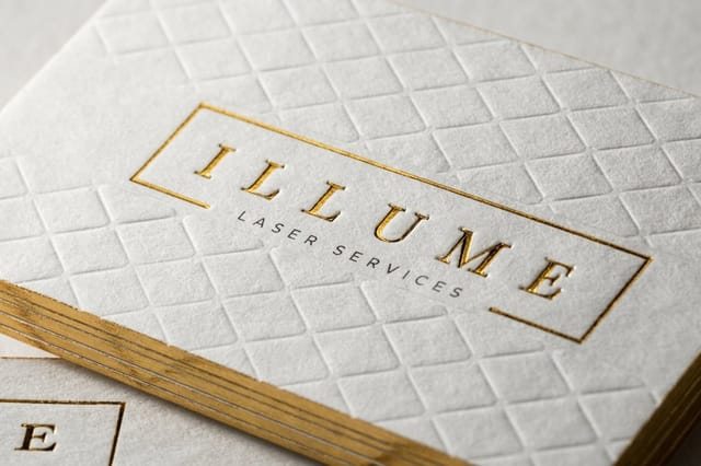
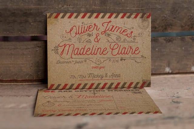
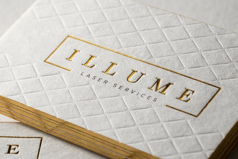
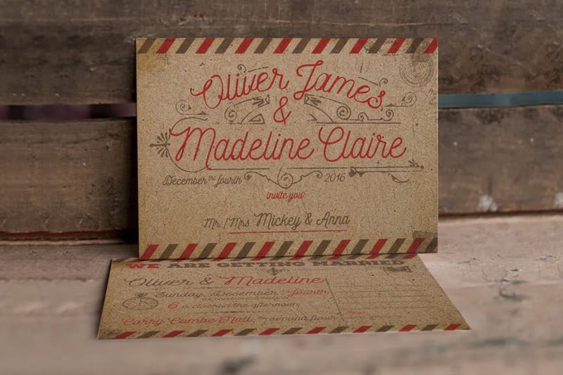
Kraft is warm, natural, and lightly fibrous, which suits an organic or eco-forward brand, and it comes as kraft business cards and matching kraft postcards. Linen carries a fine woven cross-hatch that reads as classic and premium. Cotton is soft, thick, and luxurious, a favorite for high-end cards and invitations, available as cotton business cards. Each one turns the grain you faked on screen into something a recipient registers the instant they touch it.
Because the texture is physical, these stocks change the whole piece: the ink, the weight, and the edge all feel considered together. See the live specs and pricing below for kraft business cards, or browse the cotton and linen collections to match the exact hand feel your brand calls for.
When to fake it, when to print it, and how to export
Put the two halves together and the decision is easy. Reach for the Photoshop layer when your piece lives on a screen and the feel is irrelevant, or when you want to preview how a real textured stock will look before ordering it. Print on a genuine stock whenever the piece will be handled and the tactile impression is part of the message.
If you are staying digital, finish by flattening a copy of your file, confirming the color is CMYK and the resolution holds at 300 DPI, and exporting a press-ready PDF, exactly as our guide on saving a print-ready PDF lays out. If you are going physical, you often do not need the texture layer at all, because the stock supplies it.
The best of both worlds is to design clean, use a light texture layer only to preview, then order the piece on real kraft, linen, or cotton so the grain is in the fingertips instead of the file. Use the specs and pricing below to print it for real.
Wally fakes the grain, then makes it real
A texture layer for the screen, a real stock for the hand
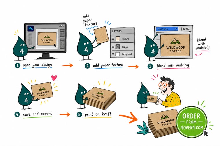
Wally knows the Photoshop trick: a texture layer, set to Multiply, dialed back, masked off the logo. It sells a mockup on a monitor. But a card lives in a hand, so when the feel is the message, Wally skips the fake and prints on true kraft, linen, or cotton at 4OVER4, where the grain is in your fingertips, not just the pixels.
Print on real textured stock →Quick reference
The paper texture setup at a glance
Five layer moves fake the grain on screen, and one print choice makes it real in the hand.
| Step | Set it to | Why it matters |
|---|---|---|
| Texture layer | Above the artwork | The paper-texture image sits on top so its grain and shadows fall over your design. |
| Desaturate | Grayscale first | Removing color keeps the texture from tinting your design, adding depth without a cast. |
| Blend mode | Multiply / Overlay / Soft Light | Multiply for grain and shadow, Overlay and Soft Light for depth in both directions. |
| Opacity | 20 to 60 percent | Dial the strength so the texture reads as paper, not as a heavy filter over the art. |
| Layer mask | Hide texture off key areas | Mask the texture back from logos or fine type so they stay crisp and legible. |
| Real stock | Kraft, linen, or cotton | When the piece will be held, print on a true textured stock so the feel is physical. |
Step by step
Add paper texture in Photoshop in 7 steps
- Set your document up for print first Work at the final size in CMYK at 300 DPI with bleed, so the texture you add previews the way it will actually print rather than only looking right on screen.
- Place the paper texture as a top layer Bring in a high-resolution paper, kraft, or canvas texture image and position it on a new layer above your finished artwork, scaled to cover the whole canvas.
- Desaturate the texture Remove the texture image’s color with a Hue and Saturation or Black and White adjustment so it contributes grain and shadow without tinting your design.
- Change the blend mode Try Multiply first for a printed-on-paper look, then compare Overlay and Soft Light for more depth, or Screen if your design is dark and you want the grain to lift.
- Adjust opacity to taste Pull the texture layer’s opacity down to somewhere between 20 and 60 percent so it reads as paper rather than overpowering the artwork underneath.
- Mask it off the important areas Add a layer mask and paint out the texture over logos, fine type, or focal images so they stay clean while the background keeps its tactile feel.
- Flatten and export a print-ready PDF When it looks right, flatten a copy, confirm CMYK and resolution, and export a press-ready PDF, or move to a real textured stock if the piece needs to be felt.
Specs and pricing
Kraft business card specs and live pricing
When you want the texture to be real, kraft is the cheapest way in, at 100 for $24.75 on 18pt Kraft Uncoated Cover.
| Quantity | Price Per Unit | Total |
|---|---|---|
| 100 | 24.8¢ | $24.75 |
| 250 | 14.2¢ | $35.57 |
| 500 | 13.1¢ | $65.60 |
| 1,000 | 13.3¢ | $132.55 |
Print it for real
Textured stocks you can actually feel
See it in use
Grain you can feel, not simulate








Explore more
Where to go next
By the numbers
A print partner your designs can count on
Common Questions
Common questions about paper texture
How do I add paper texture in Photoshop?
Place a high-resolution paper-texture image on a new layer above your artwork, desaturate it so it does not tint your design, then change that layer’s blend mode. Multiply gives a printed-on-paper look, while Overlay and Soft Light add depth in both directions. Drop the opacity to somewhere between 20 and 60 percent so the effect reads as paper rather than a heavy filter, and add a layer mask to paint the texture back off logos and fine type. That five-move sequence, layer, desaturate, blend, opacity, mask, covers almost every case.
Which blend mode is best for paper texture?
It depends on what you want the texture to do. Multiply darkens your design along the texture’s grain and shadows, which reads as ink sitting on paper and works on most light designs. Overlay and Soft Light lighten and darken at once for a richer, more three-dimensional feel, with Soft Light being the subtler of the two. Screen lightens only, which is the move when your design is dark and you want the texture to lift through it. Try each and judge by eye, since the right one changes with your colors.
Why does my paper texture change my colors?
Because the texture image still has color of its own that mixes into your design through the blend mode. The fix is to desaturate the texture layer to grayscale first, using a Hue and Saturation or Black and White adjustment, so it contributes only light and dark, not a tint. If a color cast remains, lower the layer opacity or switch from Multiply to Soft Light, which is gentler. Keeping the texture neutral is what lets your brand colors stay exactly as you designed them.
Is a Photoshop paper texture the same as a real textured stock?
No, and it is important not to confuse them. A texture layer in Photoshop is a visual effect that sells a design on a screen or in a mockup, but it prints as flat ink on whatever stock you choose, so it cannot actually be felt. A real textured stock, like kraft, linen, or cotton, has physical grain your fingers register the moment they touch it. For anything a person will hold, a business card or an invitation, printing on a genuinely textured stock delivers what a screen fake only suggests.
When should I print on a real textured stock instead of faking it?
Fake it when the piece lives on a screen: a web mockup, a social post, or a digital proof where the feel is irrelevant. Print it real whenever the piece will be handled and the tactile impression is part of the message, which covers business cards, invitations, hang tags, packaging, and premium collateral. The touch of a kraft or cotton card communicates quality in a way no monitor can, and at 4OVER4 you can print on true kraft, linen, and cotton stocks so the texture is physical rather than simulated.
What textured stocks can I print at 4OVER4?
Several, each with a distinct hand feel. Kraft is warm, natural, and lightly fibrous, ideal for an organic or eco look. Linen carries a fine woven cross-hatch that reads as classic and premium. Cotton is soft, thick, and luxurious, a favorite for high-end cards and invitations. You can order kraft business cards, cotton business cards, and matching pieces like kraft postcards and hang tags, all on real textured stock. Prices and options are set live in the configurator by quantity, size, and finish.
Get Started
Order 100 kraft postcards at $0.28 each
Bring your design to 4OVER4.COM and print it on genuine kraft, linen, or cotton stock so the texture is physical, not simulated. Cotton cards run 250 for $328.42 on 45pt Cotton.
Legal Disclaimer
Gold Standard guarantees apply to all standard orders placed through 4over4.com. Price match requires verifiable proof of a competitor's published price for an equivalent product with matching specifications and turnaround time. Satisfaction guarantee covers manufacturing defects and print quality issues. Contact support with order number and documentation. On-time delivery rate based on tracked orders 1999 to 2026. Individual results may vary based on shipping carrier performance.
