
How to Design a Logo With a Tagline or Slogan


A tagline turns a recognizable mark into an understandable one. The lockup has to survive shrinking to an icon, which is when the tagline gets dropped.
Design the logo and tagline as one locked-up unit. Keep the tagline short, three to seven words, set it smaller and quieter than the mark in a complementary font, fix the spacing between them, and give the whole lockup clear space. Use the full lockup on cards, letterhead, and brochures, and keep a clean mark-only version for tiny spaces like avatars and favicons.
Start here
A lockup that survives a shrink
Lock the logo and tagline into one fixed unit. Keep the tagline short and specific, set it smaller and quieter than the mark, fix the spacing, and give the pair clear space. Use the full lockup where it explains you, on cards, letterhead, and brochures, and keep a clean mark-only version for the tiny spaces a tagline cannot survive. The diagram below shows how the pieces stack.
What a tagline is, and how it differs from a slogan

A tagline is a short, lasting phrase that lives with your logo and tells a stranger who you are or why you matter. Where the mark makes you recognizable, the tagline makes you understandable. It is the difference between seeing a symbol and knowing, in a second, what stands behind it. The best ones are three to seven words, specific, and memorable enough to repeat.
People often ask how a tagline differs from a slogan. A tagline is tied to your brand identity and stays put for years, sitting beside the logo across everything you make. A slogan is usually tied to a single campaign or product and changes more often. For logo design the distinction barely matters, because the craft is identical: a short line, set quietly next to the mark, that a first-time viewer can read at a glance.
This guide covers the whole job in order: when a logo actually needs a tagline, how to lock the two together, how to set the type and hierarchy, and where to use the full lockup versus a clean mark on its own. If you are still shaping the core mark, pair this with our logo design best practices and the six key principles of logo design.
When your logo actually needs a tagline
Not every logo needs a tagline, and forcing one on a mark that carries its own meaning only adds clutter. A tagline earns its place when the brand still has to explain itself. There are four common cases where it does real work.
- A limited or niche audience. If your name does not signal your specialty, a tagline can say exactly who you serve, so the right customer knows they are in the right place.
- A crowded marketplace. When you sell in a sea of similar businesses, a sharp tagline stakes out your point of difference and gives people a reason to pick you.
- A brand-new business. No one knows you yet, so a tagline does the explaining your reputation cannot do for you and shortens the gap to a first sale.
- A rebrand. When you change your name or direction, a tagline bridges the old and the new, telling existing customers what has changed and why.
The flip side is that strong, established brands often drop the tagline, because the mark already means something. The smart move is to design both: a full lockup for the moments you need to explain yourself, and a clean mark-only version for when you do not. Our guide on building a strong brand identity covers how the tagline fits the bigger system.
How to design a logo with a tagline: the lockup

The core skill here is the lockup: treating the logo and tagline as one fixed unit that always appears together the same way. Instead of dropping a line of text near your mark ad hoc, you set the exact position, spacing, and proportion once, then reuse that locked pair on every piece. Consistency is what turns a logo-plus-tagline into a recognizable signature.
Start by choosing an arrangement. A tagline can sit centered beneath the mark, which is the most common and flexible, or to the right of it in a horizontal lockup for wide spaces, or occasionally above. Pick the one that keeps both elements readable, then fix the gap between them, often measured against a piece of the logo so it scales proportionally. Give the whole lockup clear space on all sides so nothing crowds it.
Then test the lockup at its smallest real size. Shrink it to fit a business card and see whether the tagline still reads. If it turns to mush, the tagline is too long or too small, and you either simplify the wording or enlarge the line. This is exactly why keeping a mark-only version matters, so you are never forced to jam a tagline into a space it cannot survive. When you are ready to place a finished lockup onto a template, the Online Designer keeps the spacing intact.
Typography, hierarchy, and spacing for the tagline
The fastest way to make a logo-plus-tagline look amateur is to let the tagline compete with the mark. Good hierarchy fixes that: the logo leads, the tagline supports, and the eye knows instantly which is which. Keep the tagline clearly smaller, quieter in weight, and never louder in color than the logo it serves.
Type choice matters too. Pair the tagline with a font that complements the logo rather than mimicking it, often a clean, simple typeface that stays legible at small sizes. Watch the letter spacing, because a tagline is usually set small and tight tracking can close it up into an unreadable line. A touch of extra spacing keeps short taglines crisp on a card or a sign.
Finally, set the tagline in a true, single color that prints cleanly, and keep small text out of a four-color mix so the letters stay sharp rather than fuzzy at the edges. Those print-side details are covered in our guide on preparing a logo for printing, and they are what separate a tagline that looks crisp on paper from one that blurs.
How big should the tagline be
Set the tagline cap height at 20 to 25 percent of the logotype cap height and the hierarchy sorts itself out. On a logotype with a 24pt cap height, that puts the tagline near 5 to 6pt: clearly secondary, still readable. Below 20 percent the line drops out of sight on paper, above 25 percent it starts arguing with the mark for attention. Lock that ratio into the lockup once, so when the logo scales up for a banner the tagline scales with it and the relationship never shifts.
Then open the tracking as the size comes down. Add 50 to 100 units of letter spacing, thousandths of an em in Illustrator or InDesign, to any tagline set under 10pt, because ink spread on uncoated stock closes the small counters and a tightly tracked line prints as a gray smear. Small caps help on a three or four word tagline, since one even cap height survives at small sizes better than a mix of ascenders and descenders. Keep it out of hairline weights and high-contrast serifs at these sizes; the thin strokes are the first thing to break up on press.
Hold two floors and do not cross them: 6pt is the smallest a tagline should ever print on a business card, and 8pt is the floor on letterhead, where the reader sits further from a brighter sheet. If the wording will not fit above the floor, cut words rather than points, or use the mark-only version.
Those numbers land like this on the pieces we print most, measured as cap height rather than the full bounding box of the artwork:
| Printed piece | Logotype height | Tagline height | Minimum readable size |
|---|---|---|---|
| Business card, 3.5 x 2 in | 22 to 28pt | 5 to 7pt | 6pt |
| Letterhead, 8.5 x 11 in | 30 to 36pt | 7 to 9pt | 8pt |
| Brochure cover | 40 to 60pt | 10 to 14pt | 9pt |
| Banner, read from 10 ft | 4 to 6 in | 1 to 1.5 in | 1 in |
| Vehicle graphic, read from 25 ft | 8 to 12 in | 2 to 3 in | 2 in |
Proof the smallest row first. Print the card-size lockup at 100 percent on any office printer, hold it at arm length, and if the tagline reads there it will read on the press sheet.
Where a logo and tagline belong in print

Print is where a logo-plus-tagline does its best explaining, because a printed piece often reaches someone who does not know you yet. Use the full lockup where there is room and the tagline earns its keep, and switch to the mark alone where space is tight. A few reliable homes for the full lockup:
- Business cards, where a tagline turns a name and number into a clear, memorable pitch.
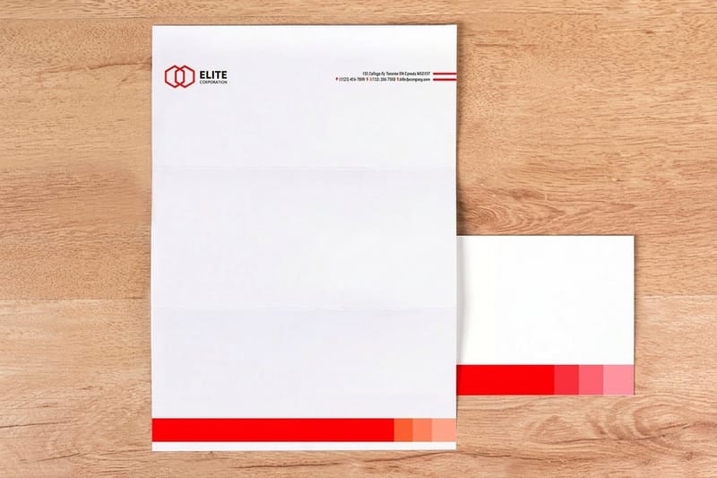
- Letterhead, where the tagline reinforces what you do on every quote, invoice, and letter.
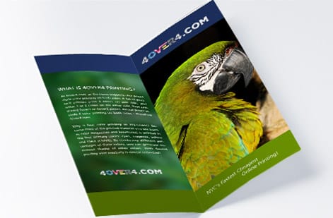
- Brochures and greeting cards, where the cover has space for the mark and its line to breathe.
Wherever the space shrinks to an icon, drop the tagline and use the clean mark, then browse the full business card lineup to print a lockup that reads clean at card size. If you want inspiration for wording that lands on a card specifically, our companion piece on making a business card slogan stand out is a useful next read.
How to choose your approach, and what printing costs
Choosing your approach comes down to one honest question: does a first-time viewer understand you from the mark alone? If yes, a tagline is optional. If not, design a lockup that explains you in a few words, and always keep a mark-only version for the tiny spaces. Lock the spacing, fix the hierarchy, and reuse the pair everywhere so it becomes a signature.
When you are ready to print, the tagline changes nothing about cost, because you pay for the piece, not the words on it. Printing price scales with quantity, stock, size, and finish. Cards start low and the per-unit price falls quickly as the run grows, while heavier stocks and premium finishes sit higher.
The clearest way to see the number is to configure it. Every 4OVER4.COM product page shows live price-per-quantity from the configurator, so you watch the per-card cost drop as the quantity rises. Check the standard card specs and pricing below, then print your logo-and-tagline lockup on the pieces that carry it furthest.
Wally locks your mark and tagline together
One unit, fixed spacing, always the same
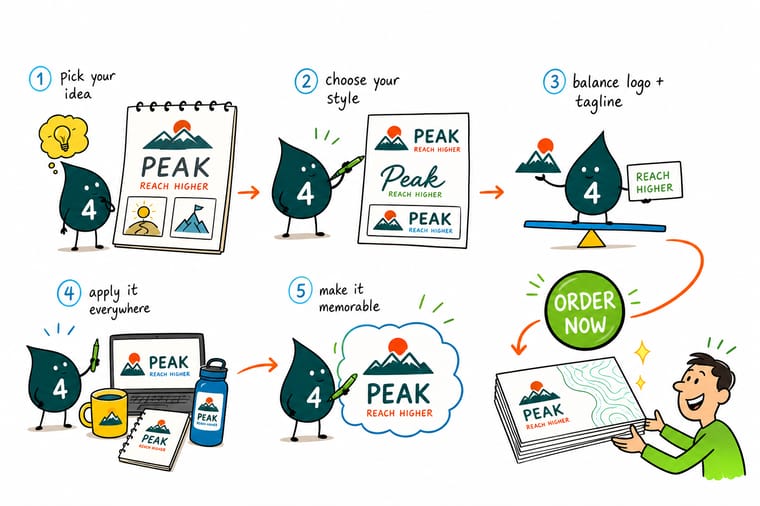
Wally treats the logo and tagline as a single locked pair: the mark leads, the tagline supports, and the spacing between them never changes. He keeps the line short, sets it quietly beneath the mark, and holds a clean mark-only version for the tiny spots. Then he prints the full lockup on cards and letterhead where it does the explaining for you.
Print your logo and tagline →Specs and pricing
Standard business card specs and live pricing
Once your lockup is set, stock, size and finish are what is left. Standard business cards run 100 for $17.57, which is $0.18 each.

| Quantity | Price Per Unit | Total |
|---|---|---|
| 100 | 17.6¢ | $17.57 |
| 200 | 11.5¢ | $23.07 |
| 300 | 9.15¢ | $27.46 |
| 400 | 7.96¢ | $31.86 |
| 500 | 7.25¢ | $36.26 |
| 600 | 6.77¢ | $40.64 |
| 700 | 6.43¢ | $45.04 |
| 800 | 6.18¢ | $49.43 |
Print your lockup
Put your logo and tagline on the pieces that carry them

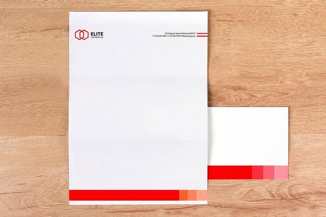

See it in use
Logos and taglines printed on customer cards








Explore more
Where to go next


By the numbers
Cards, letterhead and brochures in one lockup
Common Questions
Common questions about logos and taglines
What is the difference between a tagline and a slogan?
A tagline is a short, lasting phrase tied to your brand identity that usually sits with your logo, expressing who you are or what you stand for. A slogan tends to be tied to a specific campaign or product and changes more often. In everyday use the words are used interchangeably, and for logo design what matters is the same either way: a short line, three to seven words, that sits cleanly beneath or beside the mark and helps a stranger understand you fast.
Does every logo need a tagline?
No. A tagline earns its place mostly when your brand still needs to explain itself: a new business, a niche audience, a crowded market, or a rebrand where the name alone does not signal what you do. Established brands with strong recognition often drop the tagline entirely, because the mark already carries the meaning. The safe approach is to design a lockup with the tagline and a clean mark-only version, then use whichever fits the space.
How long should a tagline be?
Keep it short, ideally three to seven words. A tagline has to be readable at a glance and legible at small sizes next to the logo, so long sentences fail on both counts. The best taglines are specific and memorable rather than vague, and they say something only your brand could say. If you cannot fit it comfortably beneath the mark at a business-card size, it is too long.
How big should a slogan be next to a logo?
Set the slogan or tagline cap height at 20 to 25 percent of the logotype cap height. On a logotype with a 24pt cap height that lands the tagline near 5 to 6pt, small enough to stay secondary and large enough to read. Below 20 percent the line drops out of sight on paper, above 25 percent it competes with the mark. On a 3.5 x 2 in business card a 22 to 28pt logotype pairs with a 5 to 7pt tagline; on 8.5 x 11 in letterhead a 30 to 36pt logotype pairs with 7 to 9pt. Lock that ratio into the lockup once, so the pair scales together and the relationship never changes when the logo grows for a banner.
What is the smallest size a tagline can be printed?
6pt is the floor on a business card and 8pt on letterhead, and both assume the tagline is set in one solid color rather than built from a four-color mix. Add 50 to 100 units of tracking to anything under 10pt so ink spread does not close the letters up, and avoid hairline weights and high-contrast serifs at those sizes, since the thin strokes break up first on press. For large-format work the limit is viewing distance rather than points: about 1 in of tagline height on a banner read from 10 ft, and 2 in on a vehicle graphic read from 25 ft. If the wording will not fit above the floor, shorten the tagline to three to seven words or print the mark-only version instead of shrinking the type further.
How do I design a logo and tagline together?
Design them as one locked-up unit. Set the tagline in a complementary typeface, smaller and quieter than the logo, align it to the mark, and fix the spacing between them so the pair always appears the same way. Give the whole lockup clear space on every side, and test it small: if the tagline turns to mush on a business card, increase its size or simplify the wording. Lock the spacing once and reuse the lockup everywhere.
Where should I use the logo with the tagline versus without it?
Use the full lockup where there is room and a viewer benefits from the explanation: your website header, a business card, a letterhead, a brochure cover, or signage. Drop the tagline where space is tiny or the audience already knows you: a social avatar, a favicon, an app icon, or a repeated watermark. Keeping both versions means you never squeeze a tagline into a space where it cannot be read.
What does it cost to print a logo and tagline on business cards, and how are prices set?
The logo and tagline cost nothing to print beyond the card itself. Printing price scales with quantity, where more cards lower the per-unit price, plus the paper stock, size, and finish you pick. You set each option in the configurator and the total updates live, so you can see exactly what a heavier stock or a larger run does to the number before you order.
Get Started
Order 50 greeting cards at $1.12 each with the lockup
Drop your finished lockup onto cards, letterhead, or brochures, pick your stock and finish, and watch your price update live as you build the job.
Legal Disclaimer
Gold Standard guarantees apply to all standard orders placed through 4over4.com. Price match requires verifiable proof of a competitor's published price for an equivalent product with matching specifications and turnaround time. Satisfaction guarantee covers manufacturing defects and print quality issues. Contact support with order number and documentation. On-time delivery rate based on tracked orders 1999 to 2026. Individual results may vary based on shipping carrier performance.
