
Top 10 Print Errors and How to Prevent Them


Nearly every print mistake starts in the file, not on the press. Ten of them cost the most, each with a concrete fix, and the free proof and guarantee that remove the risk entirely.
Most print errors are file errors: RGB color, low-resolution images, missing bleed, unlocked fonts, and skipped proofs. Design in CMYK, place images at 300 DPI at final size, run art past the trim, keep text inside the safe margin, outline or embed fonts, export a flattened PDF, and review the proof. A free file check and reprint guarantee cover the rest.

Start here
Where print mistakes actually start
Almost every print error is a file error you can fix before you upload. Design in CMYK, place images at 300 DPI at final size, run art past the trim, keep text inside the safe margin, outline or embed fonts, use rich black on solids, export a flattened PDF, and review the proof. Then a free file check and a reprint guarantee catch anything left. The checklist below maps all ten at a glance, each with the cause, what the mistake looks like once the job runs, and the one habit that stops it.
At a glance
Common file errors in professional printing
Every error in this table is an artwork and file preparation error: RGB color, low resolution, missing bleed, loose fonts, the wrong trim size. None of them are desktop printer hardware faults such as a jam, a streak, or a clogged nozzle. These are the ten that reach a commercial press and print perfectly wrong at full quantity, so read the cause, then the fix.
| Error | What causes it | What it looks like on press | How to prevent it |
|---|---|---|---|
| 1. Colors do not match the screen | The file was built or exported in RGB instead of CMYK. | Bright blues, vivid greens, and oranges come back duller and darker than the monitor showed. | Design and export in CMYK, convert every RGB asset before export, and order a proof when brand color has to land exactly. |
| 2. Blurry or pixelated images | Art placed below 300 DPI at final size, or a small image scaled up to fill a panel. | Soft edges, mushy photo detail, and fuzzy logos that looked sharp on screen. | Use 300 DPI at the size the image actually prints, check every placement at 100 percent zoom, and keep logos and line art as vectors. |
| 3. Missing bleed | Background art stops at the trim line instead of running past it. | A thin white sliver along one or two edges once the stack is cut. | Extend every background 0.125 in past all four edges. |
| 4. Text too close to the trim | Type, logos, or contact details sit outside the safe margin. | Clipped letters and lopsided margins when the blade drifts by a hair. | Keep anything you cannot afford to lose inside a 0.125 in safe margin. |
| 5. Wrong file format | A native layout file that still depends on the same software, fonts, and linked images. | Relinked or missing images and a layout that shifts before it ever hits paper. | Export a flattened PDF, ideally PDF/X-1a, which freezes the design in place. |
| 6. Fonts reflow or substitute | Fonts left loose in the file rather than outlined or embedded. | A typeface you never chose, lines rewrapping, and headlines running long. | Outline or embed every font before handoff. |
| 7. The proof goes unread | Approving the order without reading the proof end to end. | One typo or one bad crop, reproduced across the entire run. | Read the proof at full size, check spelling, phone numbers, and crops, then approve. |
| 8. Last-minute changes | Edits made after the file was uploaded, so two versions are in play. | The older file runs while the corrected one sits unsent. | Finish the edits first, upload one final file, then re-read the new proof. |
| 9. Muddy black on large solids | Large solid areas built as plain 100 percent K. | Big blacks look washed and grey next to the crisp black of the type. | Use a rich black build on large solids and keep small text at plain 100 percent K so it stays sharp. |
| 10. Built to the wrong trim size | The document was set up at a size that does not match the size ordered. | The art gets scaled or shifted to fit, so margins and bleed go wrong together. | Build to the ordered trim size first, then add the 0.125 in bleed on top of it. |
Two different problems
File errors versus printer hardware errors
If your pages come out streaked, faded, jammed, or smeared, that is a machine problem on a desktop printer, and no amount of file preparation will fix it. The ten errors on this page are the other kind: the file prints exactly as you built it, and the mistake was built in.
- Streaks, banding, or missing lines. A drying inkjet nozzle or a tired drum on a desktop machine. Run the cleaning cycle and print a nozzle check, and leave the artwork alone.
- Faded, washed-out pages. Low ink or toner, or a draft and eco setting left switched on in the print dialog.
- Paper jams and skewed sheets. Feed rollers, tray guides set wider than the paper, or stock too heavy for the machine to pull straight.
- Ink or toner that rubs off. Toner that never fused, usually a media setting that does not match the paper sitting in the tray.
- The piece prints smaller than it should. Fit to page or scale to fit shrinking a full-size document. Print at 100 percent, with scaling switched off.
- Nothing prints at all. A stalled queue, an offline driver, or the job quietly sent to a different printer.
The quick test: if the same file prints wrong on every machine, it is a file error, and the table above names which one. If one machine prints it wrong and another prints the same file cleanly, look at the machine, its ink or toner, the paper setting, and the driver.
Color and black: the mistakes ink makes visible

The most jarring print error is opening a box and finding colors that do not match your screen. It almost always traces to one cause: the file was built in RGB. Screens create color with red, green, and blue light, while a press lays down cyan, magenta, yellow, and black ink, and those two systems do not cover the same range. A blue that glows on a monitor can print a shade duller or drift toward purple on paper.
The fix is to design and export in CMYK from the start, convert any RGB assets before you export, and scrutinize the colors that shift most: bright blues, vivid greens, and oranges. A related error hides in large solid blacks. Plain 100 percent K over a big area looks washed and streaky, so rebuild it as a rich black for deep, even coverage. When a brand color has to be exact, a proof lets you judge the ink on the real stock before a full run of flyers or brochures.
These are not press problems, they are file problems, which is good news: you can prevent every one of them before you upload. The right file type and a CMYK workflow do most of the work, and a proof catches whatever slips through.
Blurry images and low resolution
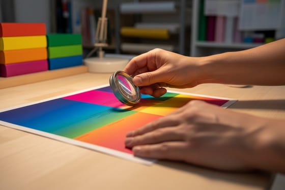
The second most common error is a print that comes back soft. Presses reproduce detail at roughly 300 DPI, and they need that resolution at the size the image actually prints, not the size it happened to be saved at. The trap is that a screen forgives what a press will not: an image can look perfectly crisp small on a monitor and fall apart the moment it is scaled up to fill a panel.
To catch this before it prints, view every image at 100 percent zoom in your layout. If it looks soft there, it will look soft on paper, and no export setting can add detail that was never captured. Source art at or above the final size, never enlarge a small file to fit a bigger space, and keep logos and line art as vectors so they stay razor-sharp at any size. This single habit prevents the blurry-print error on business cards, flyers, posters, and everything in between.
Low-resolution art is the error most people do not see coming, because it looks fine right up until it prints. A quick 100 percent pass through every placed image is the cheapest insurance in print, and our free file check flags resolution problems before your run goes to press.
Missing bleed and text too close to the edge
Two related errors come from misunderstanding how printing is cut. Pieces print on larger sheets and get trimmed down, and the blade can shift by a hair from one cut to the next. If your background art stops exactly at the trim, that shift leaves a thin unprinted white sliver along the edge. This is the missing-bleed error, and the fix is to run any color, photo, or background 0.125 in past the trim to the bleed line.
The mirror image is text set too close to the edge. If a headline or logo sits right at the trim, the same slight shift clips it. The fix is a safe margin: keep all text, logos, and anything you cannot afford to lose at least 0.125 in inside the trim. Together, bleed on the outside and a safe margin on the inside make cropping a non-event instead of a gamble.
Both errors vanish the moment you set up your document correctly, which is why our bleed and trim guide is worth a read before you design. Starting from the live product template also removes the tenth error on our list, building to the wrong trim size, because the dimensions are correct from the first click.
Fonts, file format, and last-minute changes

A quieter set of errors hides in fonts and file format. A font that lives on your computer does not automatically travel inside your design. Hand off a file that only references a typeface, and if the press does not have it, the software substitutes another and your layout silently shifts. The fix is to outline your type into vector shapes or embed the fonts on export so they cannot be swapped.
File format matters just as much. Native design files depend on the same software, fonts, and linked images being present wherever they open, and any one of those going missing changes the result, sometimes by relinking the wrong image. A flattened PDF, ideally PDF/X-1a, freezes the design in place so nothing has to be interpreted on our end. Export to that and two more errors disappear at once.
The last file-side error is human: last-minute changes after approval. A rushed edit is how a typo or a misalignment slips into an otherwise clean file. Finalize the design, then export and upload, rather than tweaking after you have approved a proof. When you are choosing a format for a specific job, our guide on choosing the right file type lays out when each one fits.
Skipping the proof, and how to order risk-free
The most avoidable error of all is skipping the proof. The proof is your last chance to catch a typo, a cropping problem, or a color surprise before thousands of copies print. Read it at full size, line by line, checking copy, images, cropping, and color, and only approve when it is exactly right. A few minutes here saves the cost and the delay of a reprint.
This is where ordering with us removes the risk entirely. Every order can include a free proof and a free file check, so problems get caught before the press runs, not after. And if something goes wrong on our end, the print guarantee means we make it right. That combination, a free check up front, a proof to approve, and a guarantee behind the order, is what lets you print with confidence.
Prevent the errors in your file, review the proof carefully, and lean on the safety net for anything human. Use the live specs and pricing panel below to configure your job, and order flyers, business cards, or brochures knowing every common mistake has already been headed off.
Wally catches the error before the press does
Ten common mistakes, all fixable in the file
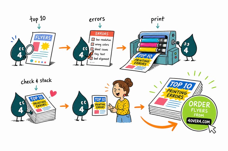
Wally has seen every print error, and almost none of them are the press. Color built in RGB, an image scaled too far, art that stops at the trim, a font left loose: those are file problems you can fix before you upload. Wally runs your artwork past the same ten checks every time, then the free proof and the guarantee cover anything human. Fix the file, read the proof, order with confidence.
Order risk-free →Quick reference
The 10 print errors and their fixes, at a glance
Every common print mistake and the one change that prevents it. Clear these ten and your file is ready for almost any commercial job.
| Error | The fix | Why it works |
|---|---|---|
| 1. Colors do not match the screen | Design and export in CMYK | Screens glow in RGB and presses print CMYK ink. Convert before export and check bright blues, greens, and oranges. |
| 2. Blurry or pixelated images | 300 DPI at final size | Low-resolution art looks fine on screen and soft on paper. View every image at 100 percent before you export. |
| 3. Missing bleed | 0.125 in past every edge | Art that stops at the trim leaves a white sliver when the cut drifts. Run backgrounds to the bleed line. |
| 4. Text too close to the trim | Keep inside a 0.125 in safe margin | A slight cut shift clips text and logos near the edge. Pull anything important into the safe zone. |
| 5. Wrong file format | Flattened PDF, ideally PDF/X-1a | Native files depend on the same software, fonts, and links. A flattened PDF freezes the design in place. |
| 6. Fonts reflow or substitute | Outline or embed every font | A missing typeface gets swapped and your layout shifts. Lock type into the file before handoff. |
| 7. Unreviewed proof | Read the proof line by line | The proof is your last look before the press. Check copy, cropping, and color at full size. |
| 8. Last-minute changes | Finalize before you upload | Rushed edits after approval are how typos and misalignments slip through. Lock the file, then order. |
| 9. Thin or muddy black | Rich black for large solids | Plain 100 percent K looks washed on big areas. Use a rich black build for deep, even coverage. |
| 10. Wrong trim size or setup | Build to the product trim size | Guessing dimensions leads to scaled, off-center art. Start from the live product specs and templates. |
Step by step
A 7-step preflight that catches all ten
- Set the document to the right trim and color Start at the exact product trim size, add bleed on every side, pull in the safe margin, and set the color mode to CMYK before you place a single element.
- Check every image at 100 percent Zoom to full size and inspect each photo and logo. If it looks soft on screen, it will look soft on paper, so replace it with full-resolution art or a vector.
- Confirm bleed and safe margins Make sure every background runs to the bleed and every piece of text and every logo sits inside the safe margin, well clear of the blade.
- Lock your fonts and blacks Outline or embed all fonts, and rebuild any large solid black as a rich black so it prints deep and even instead of washed and streaky.
- Export a flattened press-ready PDF Flatten transparency and export to PDF, ideally PDF/X-1a, with bleed and crop marks included, so nothing has to be interpreted on our end.
- Read the proof like it costs money Because it does. Review the proof at full size, check every line of copy, the cropping, and the color, and only approve when it is exactly right.
- Order risk-free with a free check and guarantee Run the file through our free file check, order with free proofs, and rely on the print guarantee so an honest mistake gets made right.
Specs and pricing
Flyer specs and live pricing
Once your file clears the ten checks, size, stock, and quantity set the price. Here are the live specs and price-per-unit for flyers at 4OVER4.COM, straight from the configurator.

| Quantity | Price Per Unit | Total |
|---|---|---|
| 50 | 79.1¢ | $39.54 |
| 100 | 57.1¢ | $57.11 |
| 200 | 37.3¢ | $74.69 |
| 300 | 28.6¢ | $85.68 |
| 400 | 24.4¢ | $97.76 |
| 500 | 21.8¢ | $108.75 |
| 600 | 18.7¢ | $112.03 |
| 700 | 16.5¢ | $115.33 |
Print it
Order risk-free at 4OVER4



See it in use
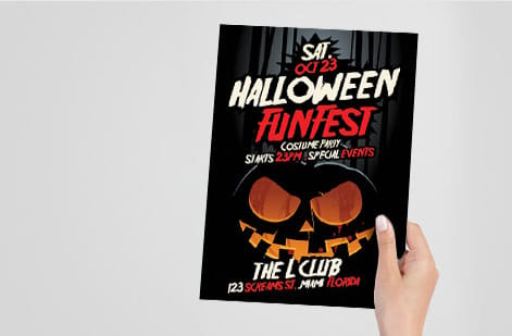
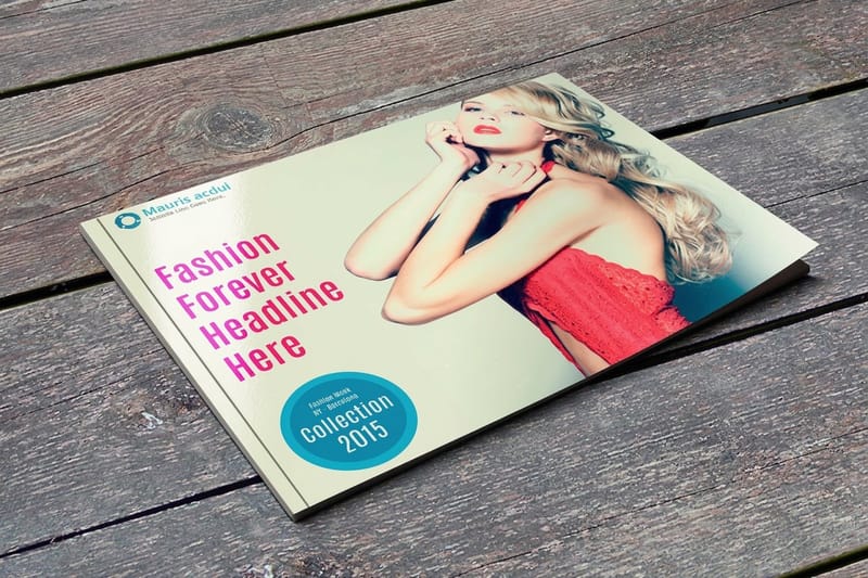
Flyers our customers designed

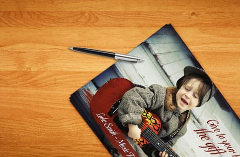
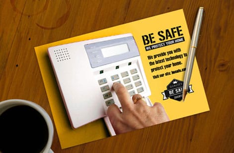
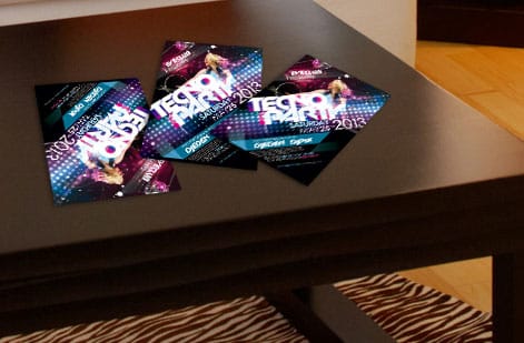


Explore more
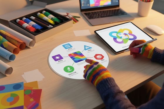
Where to go next


By the numbers
What a press catches and what it will not
Common Questions
Common questions about print errors
Is my print problem a file error or a printer hardware error?
Print the same file on a second machine. If it comes out wrong everywhere, it is a file error: RGB color, art below 300 DPI at final size, missing bleed, text outside the 0.125 in safe margin, loose fonts, or the wrong trim size. If one machine streaks, fades, jams, or smears while another prints the same file cleanly, it is hardware: low ink or toner, a clogged nozzle, an unfused page, a tray setting, or the driver. This page covers the file side, the errors that survive a healthy commercial press and print perfectly wrong across the whole run.
What are the most common printing errors?
The most common printing errors nearly all start in the file, not on the press. The big three are color that does not match the screen because the file was built in RGB instead of CMYK, blurry images from low-resolution art placed below 300 DPI at final size, and missing bleed that leaves a white sliver when the piece is cut. After those come text set too close to the trim, the wrong file format, fonts that reflow or substitute, an unreviewed proof, last-minute changes, muddy black on large solids, and building to the wrong trim size. In order of what actually costs money, the trio of color, resolution, and bleed accounts for most reprints, because each one is invisible on a monitor and obvious on paper. Fix the file and almost every one of these disappears.
Why did my printed colors shift from what I saw on screen?
Because the file went to press in RGB. Design and export in CMYK rather than RGB. Screens create color with red, green, and blue light, while a press lays down cyan, magenta, yellow, and black ink, and the two do not cover the exact same range. Convert any RGB assets before you export, then look hard at the colors that shift most, especially bright blues, vivid greens, and oranges, which are the three that reliably come back duller and darker than the monitor promised. For large areas of black, use a rich black build instead of plain 100 percent K, and keep small text at plain 100 percent K so the edges stay sharp. When exact brand color matters, order a proof so you can judge the ink on the real stock before printing a full run.
What resolution do I need so images do not print blurry?
Presses reproduce detail at about 300 DPI, and they need that resolution at the size the image actually prints, not the size it was saved at. A 300 DPI photo enlarged to twice its size is a 150 DPI photo, and it prints like one. An image can look crisp small on a screen and fall apart when scaled up to fill a panel. The reliable habit is to view every image at 100 percent zoom in your layout: if it looks soft there, it will look soft on paper. Source art at or above the final size, never enlarge a small file to fit a bigger space, and keep logos and line art as vectors, which stay sharp at any size.
What causes text to be cut off at the edge of a print?
Because it sits too close to the trim line. Pieces print on larger sheets and get cut down, and the blade can shift by a hair from one cut to the next. To protect your design, keep all text, logos, and anything you cannot afford to lose inside a safe margin of about 0.125 in from the trim, and run any background art out to a bleed of 0.125 in past the trim. Those two lines together mean a slight shift in the cut never clips your content or leaves an unprinted sliver. On a desktop printer the same symptom has a second cause worth ruling out: a non-printable border of roughly a quarter inch, which is why a full-bleed design has to be trimmed or printed commercially rather than run edge to edge at home.
Do I really need to review the proof?
Yes, and skipping it is the most avoidable print error of all. Read it at full size, not as a thumbnail, and check the things nobody else can check for you: spelling, phone numbers, web addresses, prices, and how tight the crop runs to the artwork. The proof is your last chance to catch a typo, a cropping problem, or a color surprise before thousands of copies print. Read it at full size, line by line, checking copy, images, cropping, and color, and only approve when it is exactly right. At 4OVER4.COM every order can include a free file check and free proofs, so a careful review costs you nothing but the few minutes it takes, and it saves the cost and delay of a reprint.
What happens if my print job comes out wrong?
If a job comes out wrong, the first question is whether the problem was in the file or in the printing. Errors baked into the artwork, like a low-resolution image or missing bleed, are prevented by the free file check and the proof before the run. If something goes wrong on our end, the 4OVER4.COM print guarantee means we make it right. That combination, a free file check up front, free proofs to approve, and a reprint guarantee behind the order, is exactly why preparing a clean file and reviewing the proof carefully lets you order with confidence.
Get Started
50 flyers cost $39.54 once the file clears
Clear the ten checks, then order at 4OVER4.COM with a free file check and free proofs, backed by a reprint guarantee. Set your size, stock, and finish and watch your price update live.
Legal Disclaimer
Gold Standard guarantees apply to all standard orders placed through 4over4.com. Price match requires verifiable proof of a competitor's published price for an equivalent product with matching specifications and turnaround time. Satisfaction guarantee covers manufacturing defects and print quality issues. Contact support with order number and documentation. On-time delivery rate based on tracked orders 1999 to 2026. Individual results may vary based on shipping carrier performance.
