
How to Plan a Wayfinding Signage System That Guides Everyone


Wayfinding is the system of signs that lets a first-time visitor move through your building without asking for help. Planning the whole system runs from sign types and ADA basics to layout and durable materials.
You plan a wayfinding system by mapping the routes people take, then placing four kinds of signs along them: identification signs that name a place, directional signs with arrows, informational signs, and regulatory or ADA signs. Keep messages short, place signs at every decision point, meet ADA rules for room identification with tactile text and Braille, and print on durable materials sized for viewing distance. The system, not any single sign, is what guides people.

Start here
Moving a stranger through your building
A wayfinding system is a connected set of signs placed along the routes people actually take, so a first-time visitor can move through your space without help. You map the paths, place identification, directional, informational, and ADA signs at the decision points, keep every message short, and print on durable materials. The layout map below shows how the four sign types work together along a single route.
What wayfinding signage is and why the system matters

Wayfinding is the practice of guiding people through a physical space with signage. It matters because a confused visitor is a stressed visitor, and in a hospital, campus, office, or retail center, that confusion costs time, staff attention, and goodwill. Good wayfinding answers the three questions everyone has on arrival: where am I, where do I want to go, and how do I get there.
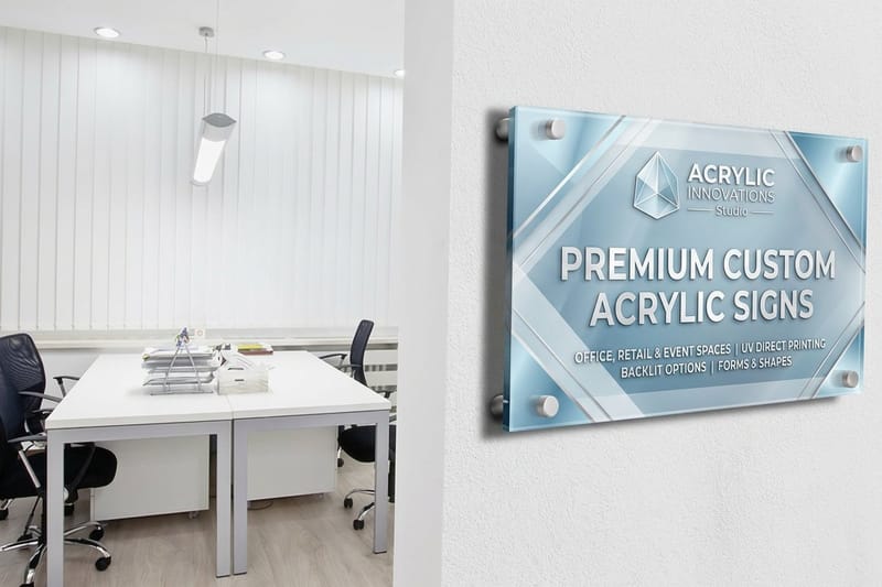
The critical idea is that no single sign does this. Wayfinding works as a system, a chain of signs that hands you off from one to the next along your route. That is why planning comes before printing. Once the plan is set, durable pieces like aluminum signs and acrylic signs carry the system through years of daily use.
The four types of wayfinding signs
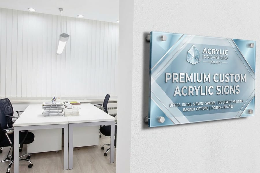
Almost every wayfinding system is built from four sign types. Identification signs name a destination, like a room number or a department. Directional signs use arrows to point the way at junctions. Informational signs share details such as hours or a building directory. Regulatory signs, including ADA and safety signs, state rules and requirements.
Planning is largely a matter of deciding which type goes where. Entrances and lobbies need identification and a directory, corridors and junctions need directional arrows, and every permanent room needs a compliant identification sign. Our online design tool at the 4OVER4 designer and the full signs range let you build each type from one consistent template so the whole set matches.
ADA and accessibility basics
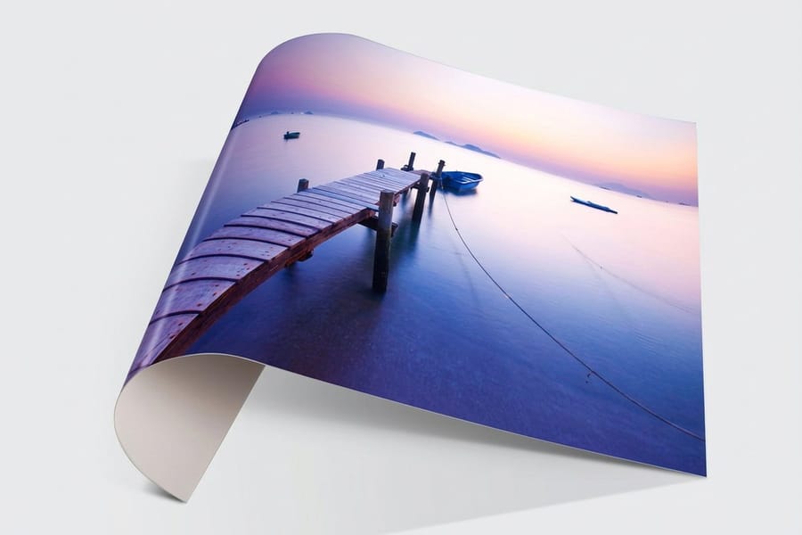
Accessibility is a baseline of any real wayfinding plan, not a finishing touch. Permanent room identification signs, the ones naming a space that will not change, must carry tactile raised characters and Braille, use non-glare finishes, and maintain strong contrast between text and background. Character height, typeface, and mounting position all have requirements so that people who are blind or have low vision can locate and read them.
The numbers behind those rules sit in section 703 of the ADA Standards for Accessible Design, published by the US Access Board at access-board.gov, and they are specific enough to design a sign from. Tactile characters run 5/8 inch minimum to 2 inches maximum in height and stand at least 1/32 inch off the face, set in a sans serif face, uppercase, with no italic, script or heavily decorative type. Grade 2 braille sits directly below the tactile text it repeats, at least 3/8 inch clear of any other tactile characters, with domed or rounded dots rather than square ones. Characters and the field behind them both need a non glare finish, and the pair has to read light on dark or dark on light, the working rule being at least 70 percent difference in light reflectance value between character and background. Where a pictogram is used on a room sign, its field is 6 inches high minimum and the text descriptor sits below that field, never inside it.
Mounting height and placement matter as much as the sign face: tactile signs go on the wall beside the latch side of a door at a defined height so a person can find them by touch. Build these rules into the plan from the start, because retrofitting compliance later is far more expensive than designing for it up front. When a permanent sign names a room, treat ADA requirements as non-negotiable.
That defined height is 48 inches minimum from the floor to the baseline of the lowest tactile character and 60 inches maximum to the baseline of the highest, with the sign centered roughly 18 inches from the door frame on the latch side and an 18 by 18 inch clear floor space in front of it so a person can stand and read by touch with the door open. On double doors with one active leaf the sign goes on the inactive leaf, and where there is no wall on the latch side at all it moves to the nearest adjacent wall. For the face itself, a matte or brushed acrylic sign holds the non glare requirement cleanly on interior room doors, a matte styrene sign keeps the cost down on back of house and storage rooms you still have to label, and a matte aluminum sign takes the wear in corridors, stairwells and exterior doorways.
ADA directional signs
A directional sign carries no room designation, so it is not held to the tactile and braille rules; it is judged on the visual character requirements instead, and those still set real numbers. Keep the non glare finish, keep the same 70 percent light reflectance contrast, and size the characters to the distance the sign is read from. A corridor sign mounted between 40 and 70 inches above the floor needs 5/8 inch characters minimum when it is read from under 72 inches away, plus 1/8 inch of extra height for every foot of viewing distance beyond that. A sign hung between 70 and 120 inches starts at 2 inch characters, and anything mounted above 120 inches starts at 3 inches. Hold the arrow style, destination naming and character spacing identical across the set so a visitor learns the system once and trusts it at the next junction.
| Sign type | ADA requirement | Mounting height | Character height | Finish |
|---|---|---|---|---|
| Permanent room identification | Tactile raised characters plus Grade 2 braille under section 703.2 and 703.3 | 48 in min to the lowest baseline, 60 in max to the highest, latch side of the door | 5/8 in to 2 in, raised 1/32 in | Non glare on characters and field, 70 percent contrast |
| Directional | Visual characters only under 703.5, no tactile or braille needed | Typically 40 in to 70 in above the floor in corridors, higher for overhead runs | 5/8 in min under 72 in viewing distance, add 1/8 in per foot beyond | Non glare, 70 percent contrast |
| Informational and directory | Visual characters under 703.5, tactile only if the panel names a permanent space | Read standing, roughly 48 in to 70 in to the copy block | 5/8 in min, sized up for the reading distance | Non glare, 70 percent contrast |
| Exit | Tactile exit sign at the door under 703.2, alongside the illuminated visual sign your fire code calls for | 48 in to 60 in to the tactile baselines, latch side | 5/8 in to 2 in tactile, visual exit lettering per code | Non glare tactile face |
Work the table into the plan while you are still assigning sign types, because the same door often needs two pieces: a tactile room sign at 48 to 60 inches and a visual directional or exit sign sized for the corridor it is read from.
Planning the layout and message hierarchy
Start by walking the routes a visitor takes from every entrance to every major destination, and mark each point where they must make a decision: a corridor split, an elevator bank, a staircase. Those decision points are exactly where directional signs belong. A sign placed between decisions is ignored, while a missing sign at a junction is where people get lost.
Keep each sign's message short, because people read signs while moving. Three to five destinations per directional sign is a practical ceiling, with clear arrows and consistent naming that matches the identification signs at the destination. Group information by priority so the most common destinations are easiest to find, and keep the same layout logic on every sign so visitors learn the system as they go.
Choosing durable materials and sizes
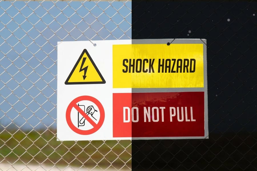
Wayfinding signs live on walls and posts for years, so material and durability drive the choice. Rigid aluminum suits high-traffic and outdoor locations, acrylic gives interior signs a clean professional face, and lighter rigid stocks work for lower-wear indoor spots. For parking and exterior direction, reflective materials keep signs readable at night.
On the ADA room signs the finish decides the material more than the thickness does, because the face has to stay non glare and hold the 70 percent contrast between characters and background. Matte acrylic signs are the usual interior choice, matte styrene signs cover the back of house and storage doors that still need naming, and matte aluminum signs handle stairwells, loading areas and exterior doorways where a plastic face would scuff or yellow. Skip gloss laminates on any sign carrying tactile characters.
Size follows viewing distance. A directory read up close can be modest, while a directional sign spotted from down a long corridor needs larger text and a bigger face. Plan a small family of sizes, one for identification, one for directional, one for directories, and apply them consistently so the system looks deliberate. Compare the durable options across the signs and banners range before you commit.
What a signage system costs and how price is set
Because wayfinding is a system, budget for the set, not a single sign. Price on each piece follows the usual levers of size, material, and quantity, and the good news is that a system involves many signs, so ordering the identification signs as one batch and the directional signs as another lowers the per-piece cost. Premium materials like thick acrylic and reflective aluminum cost more but last longer in the spots that need them.
Batch by sign type, not by floor, because every room sign shares the same size and the same 48 to 60 inch mounting rule and every directional sign shares its own size. One run of acrylic room plates, one run of styrene for the back of house doors and one run of aluminum for corridors and exteriors covers most buildings, and it leaves you a repeatable reorder when a department name changes.
Set your options in the live configurator for each sign type and the total updates as you adjust size, material, and quantity, so you can see the whole system's cost as you plan it. Starting with your highest-traffic signs on durable aluminum and filling in the rest keeps both the look and the budget under control.
Wally maps the route before he prints a sign
A system guides people, one sign never does
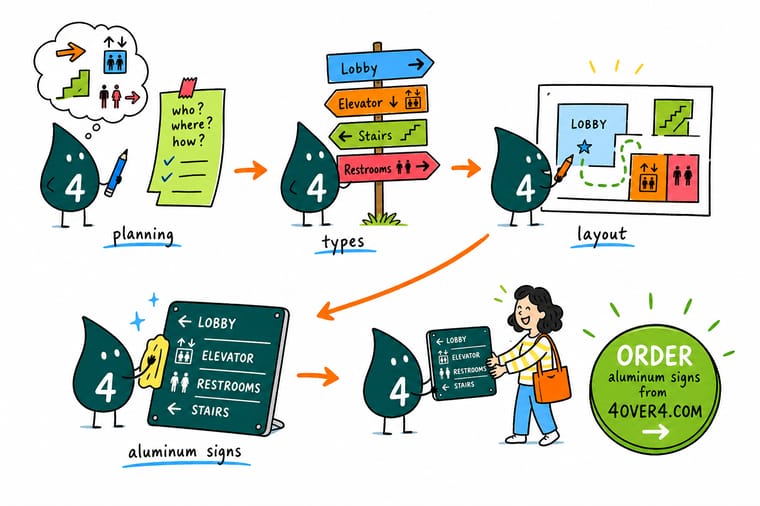
Wally plans wayfinding the right way: walk the routes, mark every decision point, and place the four sign types where they are needed, with ADA built in from the start. One font, one color system, one arrow style, printed on durable material. Do that and 4OVER4 gives you a signage system a first-time visitor can follow without ever asking for directions.
Order your wayfinding signs →Quick reference
Wayfinding planning at a glance
The decisions behind a wayfinding system that guides people cleanly and meets accessibility rules.
| Element | Get it to | Why it matters |
|---|---|---|
| Sign types | Identification, directional, info, ADA | These four types cover almost every wayfinding need across a building or campus. |
| Placement | One sign per decision point | People need direction exactly where paths split, and signs between decisions get ignored. |
| Message length | Three to five destinations per sign | People read signs while moving, so short, prioritized messages get followed and long ones do not. |
| ADA room signs | Tactile text, Braille, correct mounting | Permanent room identification must be accessible by touch at the right height with proper contrast. |
| Materials | Aluminum, acrylic, reflective outdoors | Durable rigid materials keep signs sharp for years, and reflective stock reads at night outdoors. |
| Consistency | One font, color, and arrow style | A single visual system across every sign is what makes the whole set readable and trustworthy. |
Step by step
Plan a wayfinding system in 6 steps
- Walk and map the routes Trace the path a first-time visitor takes from every entrance to every major destination, and note where they must make a decision.
- Mark the decision points At each junction, split, or elevator bank, plan a directional sign. These points, not the hallways between them, are where signs belong.
- Assign the sign types Place identification signs at destinations, directional signs at junctions, a directory at entrances, and compliant ADA signs on every permanent room.
- Build ADA compliance in Give permanent room signs tactile characters, Braille, non-glare finishes, proper contrast, and correct mounting height from the start.
- Set one visual system Choose a single font family, color scheme, arrow style, and small family of sizes, then apply them consistently across every sign.
- Pick materials and print the set Match durable materials to each location, then order the signs as batches by type so the system stays consistent and cost efficient.
Specs and pricing
Live aluminum sign specs and pricing
Here are the live sizes, materials, and price per unit for aluminum signs at 4OVER4, a durable base for any wayfinding system.

| Quantity | Price Per Unit | Total |
|---|---|---|
| 1 | $36.00 | $36.00 |
Print it
Print your wayfinding system with 4OVER4

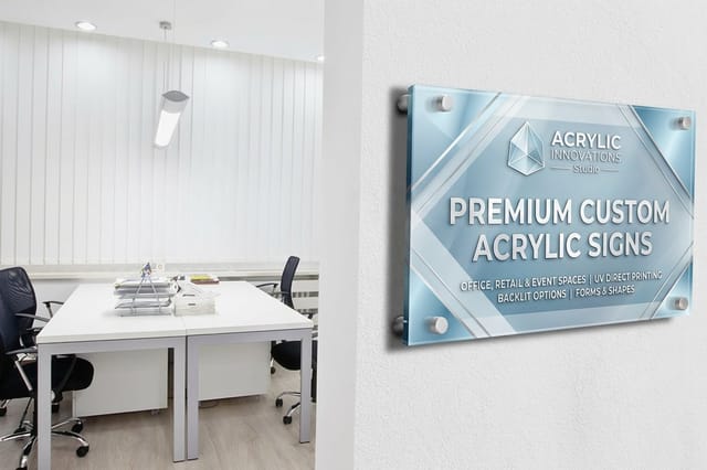
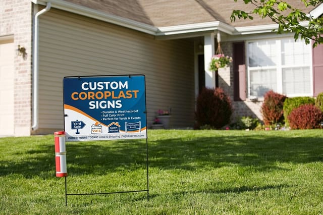
See it in use
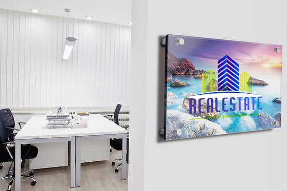
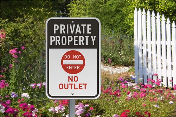
Rigid sign panels customers ordered






Explore more
Where to go next




By the numbers
The catalog a wayfinding sign system is built from
Common Questions
Common questions about wayfinding signage
What is wayfinding signage?
Wayfinding signage is the connected system of signs that guides people through a physical space, letting a first-time visitor find their way without asking for help. It answers three questions on arrival: where am I, where do I want to go, and how do I get there. A wayfinding system is built from four sign types, identification, directional, informational, and regulatory or ADA, placed along the routes people take. The system as a whole does the guiding, which is why planning the placement matters more than any single sign.
Which signs does a visitor need first?
Choose by role and location. Identification signs name destinations and go at each room or department, directional signs with arrows go at every decision point, a directory goes at entrances, and ADA room signs go on every permanent room. Then match materials to the setting: aluminum for high-traffic and outdoor spots, acrylic for a clean interior face, and reflective stock where signs must read at night. Size each sign for its viewing distance, and keep one consistent visual system across the whole set.
What makes a sign ADA compliant?
On a permanent room sign, compliance is a short list of measurable things from section 703 of the ADA Standards for Accessible Design: tactile uppercase sans serif characters 5/8 inch to 2 inches high, raised at least 1/32 inch off the face, with Grade 2 braille directly below the text it repeats and at least 3/8 inch clear of any other tactile characters. Characters and background both need a non glare finish and must read light on dark or dark on light, the working rule being at least 70 percent difference in light reflectance value. If the sign uses a pictogram, the pictogram field is 6 inches high minimum with the text descriptor below the field, not inside it. Get those five things right, mount it correctly, and the sign is compliant.
Where must ADA signs be mounted?
Beside the door on the latch side, centered roughly 18 inches from the frame, with the baseline of the lowest tactile character 48 inches minimum above the floor and the baseline of the highest 60 inches maximum. Leave an 18 by 18 inch clear floor space in front of the sign so a person can stand and read it by touch while the door is open. On double doors with one active leaf, the sign goes on the inactive leaf, and if there is no wall on the latch side at all it moves to the nearest adjacent wall. Fixing a mounting height after the signs are installed usually means new holes, patched paint and reprinted faces, which is why the heights belong in the plan, not the install day.
Do directional signs have to be ADA compliant?
Directional signs carry no room designation, so they are not held to the tactile character and braille rules; they follow the visual character requirements instead. That still means a non glare finish, the same 70 percent light reflectance contrast between copy and background, and character height sized to the reading distance: 5/8 inch minimum on a sign mounted 40 to 70 inches above the floor and read from under 72 inches, plus 1/8 inch per foot of viewing distance beyond that, 2 inches minimum once the sign hangs between 70 and 120 inches, and 3 inches minimum above 120 inches. Keep arrows, naming and spacing identical across the set so the system stays readable end to end.
What does wayfinding signage cost and how is price set?
Because wayfinding is a system, you budget for the set rather than one sign. Each piece is priced by size, material, and quantity, and since a system uses many signs, ordering them in batches by type lowers the per-piece cost. Premium materials like thick acrylic and reflective aluminum cost more but last longer where wear is high. You set every option in the live configurator for each sign type, and the total updates as you adjust, so you can see the whole system's cost while you plan it.
What sizes, materials, and finishes are available for wayfinding signs?
Sizes should follow viewing distance, with a small family of sizes for identification, directional, and directory signs applied consistently. Materials include rigid aluminum for durability and outdoor use, acrylic for a professional interior look, lighter rigid stocks for lower-wear indoor spots, and reflective options for nighttime exterior direction. Finishes include non-glare surfaces that support ADA readability. The signs and banners range lets you compare durable materials side by side before you commit to a system.
How long do wayfinding signs take to print and ship?
Turnaround depends on the materials and quantities you choose and your shipping method, since a rigid aluminum sign and a lighter interior sign move at different speeds. Because a system involves many pieces, it helps to order in batches by type and check the production speeds shown on each product page for your configuration. The live configurator reflects how each choice affects the timeline so you can coordinate installation across a building or campus.
Do wayfinding signs need to be ADA compliant?
Permanent room identification signs, the ones that name a space that will not change, must meet ADA requirements: tactile raised characters, Braille, non-glare finishes, adequate contrast, and mounting at a defined height beside the latch side of the door. In numbers, that is uppercase sans serif characters 5/8 inch to 2 inches high raised at least 1/32 inch, Grade 2 braille directly below the text and 3/8 inch clear of other tactile characters, at least 70 percent difference in light reflectance value between copy and background, and baselines between 48 inches and 60 inches above the floor with the sign centered about 18 inches from the door frame. Directional and informational signs have their own readability best practices but are not held to the same tactile rules; they follow the visual character sizing instead, starting at 5/8 inch for close reading and stepping up to 2 inches when the sign hangs between 70 and 120 inches and 3 inches above that. The safe approach is to treat accessibility as a baseline of the plan and build compliance into every permanent room sign from the start, since retrofitting later costs far more.
Get Started
Acrylic and aluminum signs ship in 4 business days, coroplast in 5
Bring your building map to 4OVER4 and print a complete wayfinding system on durable, accessible materials sized for every route. Set every option and watch your price update live.
Legal Disclaimer
Gold Standard guarantees apply to all standard orders placed through 4over4.com. Price match requires verifiable proof of a competitor's published price for an equivalent product with matching specifications and turnaround time. Satisfaction guarantee covers manufacturing defects and print quality issues. Contact support with order number and documentation. On-time delivery rate based on tracked orders 1999 to 2026. Individual results may vary based on shipping carrier performance.
