
What PT Means in Printing for Paper Thickness, Line Weight and Font Size


Sofia is our design and templates voice, built from the knowledge of our production team, with over 20 years in printing.
One abbreviation, two different measurements. PT on a paper spec and pt in your artwork mean different things, and the ladder from 10pt to 32pt has a millimeter and a gsm equivalent at every rung.
On a paper spec, PT means point, and one point is one thousandth of an inch. So 10pt paper is 0.010 inch or 0.25 mm thick, and 16pt is 0.016 inch or 0.41 mm. It describes caliper, not weight, which is why there is no exact gsm conversion. In your design file the word means something else: a typographic point is 1/72 inch, so a 1 pt stroke or a 10 pt font uses a unit about fourteen times larger than one point of paper.

Quick answer
A thousandth of an inch on the sheet, a seventy-second of an inch in the file
PT on a stock spec is caliper measured in thousandths of an inch. 10pt is 0.010 inch, 14pt is 0.014 inch, 32pt is 0.032 inch. Because it measures bulk rather than mass, gsm equivalents are approximate and shift with coating and fiber. The pt in your artwork panel is the typographic point, 1/72 inch, which governs stroke weights and font sizes and is a completely separate scale.
What PT Means on a Paper Spec

PT is short for point, and on a stock spec one point equals one thousandth of an inch. Write 14pt and you have said 0.014 inch, or 0.36 mm. Nothing about color, finish, brightness or weight is contained in that number.
Printers measure it with a micrometer, closing the anvil on a single sheet and reading the caliper directly. That is the whole definition, and it is why PT is the honest way to talk about how a card will feel in a hand. A spec sheet that only quotes gsm is describing mass, and mass and bulk are not the same thing.
One part trips people up. Your design software also measures in points, but a typographic point is 1/72 inch, which is 0.0139 inch or 0.353 mm. So a 1 pt rule in Illustrator is about fourteen times thicker than one point of paper. Same three letters, two unrelated scales, and files arrive at our prep desk every week where somebody has confused them. The rest of this guide keeps them apart: PT for the sheet, pt for anything you draw or set.
On the order form the PT size sits in the stock name, so you pick caliper and finish in one choice. These are the calipers each card product lists today:
| Product | PT sizes on the order form | Card sizes | First run |
|---|---|---|---|
| Standard business cards | 13pt to 18pt single sheets, plus 24pt ultra thick gloss | 4, from 2 x 3.5 in | 100 |
| Silk laminated business cards | 16pt silk laminated | 4, including 2.125 x 3.375 in | 250 |
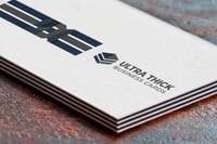
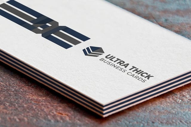
| Ultra thick business cards | 32pt, 48pt, 64pt and 80pt uncoated, 40pt, 56pt and 72pt gloss | 3, from 2 x 3.5 in | 50 |
| Birthday invitations | 10pt StarLustre Platinum up to 26pt Metallic Pearl Ice | 4.25 x 5.5, 5 x 7, 6 x 6 in | 25 |
Standard cards and invitations run on a standard turnaround of 3 business days, silk laminated cards on 4, and ultra thick cards on 5, because the bonded sheets take longer to make.
If you want the weight side of the story rather than the caliper side, the complete paper thickness and weight guide lays out lb and gsm against caliper, and 100lb text vs 10pt stock shows how far the two can drift apart on the same shelf.
How Caliper Turns Into Feel, Snap and Cost
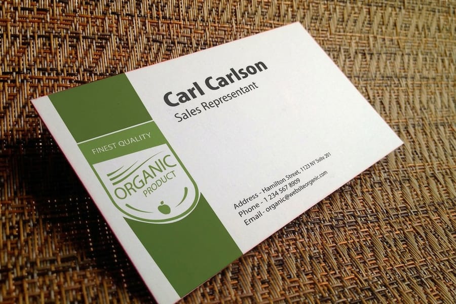
Thickness is not what your fingers judge. Stiffness is. And stiffness does not track caliper in a straight line: bending resistance rises with the cube of thickness, so a 16pt card is about 49 percent more rigid than a 14pt card even though it is only 14 percent thicker. That is why a jump most people cannot see is a jump almost everybody can feel.
Three things change the caliper you actually receive:
- Coating compresses the sheet. A coated cover stock runs through calender rollers under pressure, so it finishes thinner than an uncoated sheet of the same gsm. Ask for uncoated and you often get more caliper for the same mailing weight.
- Lamination adds to it. A film laminate contributes roughly 0.001 to 0.0015 inch per side. A 16pt sheet finished both sides lands nearer 18pt or 19pt, which is a real part of why silk laminated business cards feel heavier than the base spec suggests.
- Bonding multiplies it. Mills rarely make single sheets above about 18pt in a printable cover, so ultra thick stock is two sheets glued together. That construction is what makes a contrasting core or a painted edge possible in the first place.
Cost follows the same curve, roughly. Moving up two points is cheap. Moving from a single sheet to a bonded one changes the manufacturing route, and the price step there is much larger than the step from 14pt to 16pt. Plan the budget around that break, not around a smooth ladder.
The 10pt to 32pt Ladder and Where Each One Belongs
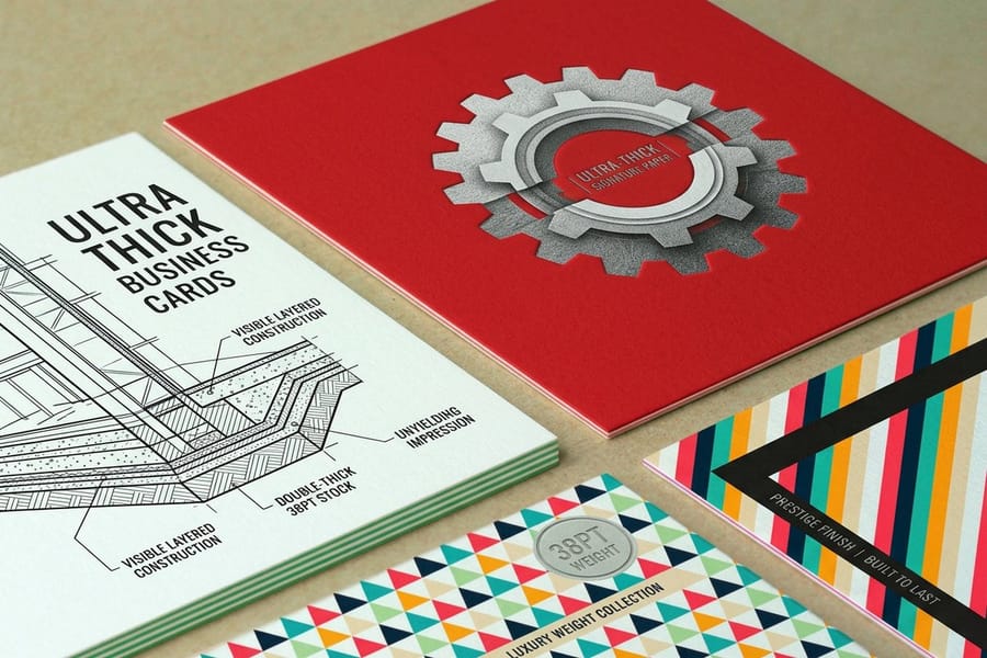
Six calipers cover almost every flat piece we print. The gsm column is approximate on purpose, because caliper and mass are measured differently and every mill sits in a slightly different place.
| Stock | Inch | Millimeters | Approx. gsm | Where it belongs |
|---|---|---|---|---|
| 10pt | 0.010 | 0.25 | ~240 | Sell sheets, tent cards, menu inserts, anything that folds without a heavy score. |
| 12pt | 0.012 | 0.30 | ~280 | Entry level cards, folder bodies, tags that hang rather than take handling. |
| 14pt | 0.014 | 0.36 | ~310 | The default for business cards and postcards. Firm, mails well, costs least. |
| 16pt | 0.016 | 0.41 | ~360 | Premium cards and heavier postcards. The exact ceiling for the USPS postcard rate. |
| 18pt | 0.018 | 0.46 | ~410 | Hang tags, luggage tags, cards that get pinned, punched or handled hard. |
| 32pt | 0.032 | 0.81 | ~750 | Ultra thick statement cards, usually two 16pt sheets bonded, edges often painted. |
The 16pt row carries a rule worth knowing before you commit. USPS requires any mail piece to be at least 0.007 inch thick, and a card has to be no more than 0.016 inch to qualify for the postcard rate. Print your mailer on 18pt and it is a lovely piece of card that no longer qualifies, so the postage moves to the letter rate on every single copy. On a run of twenty thousand that decision costs more than the stock upgrade did.
If you want 10pt card stock itself, the 10pt sheet on our menu is 10pt StarLustre Platinum Cover. It sits on the stock list of invitations and thank you cards such as business thank you cards, in 4.25 by 5.5, 5 by 7 and 6 by 6 inch sizes, from 25 pieces on a standard turnaround of 3 business days. At 0.010 inch it folds without a heavy score.
For everything sent through the mail stream, standard postcards start at $16.48 and stay inside the rate. For a card that is handed over rather than mailed, ultra thick business cards at $36.62 make the argument that no amount of design can. The ultra thick business cards video shows the bonded edge up close. Compare the two ends against each other in the business card thickness chart or browse the full range under business card printing.
PT as Line Weight in Your Artwork

Switch to the artwork and the unit changes: a 1 pt stroke is 1/72 inch. The number that matters here is not how thick the paper is but how thin a line the press can hold.
A 0.25 pt hairline is about 0.0035 inch wide. A plate can carry that easily. Ink on paper is less obliging: on uncoated stock the ink spreads into the fiber and a hairline turns ragged or breaks up in places, and on a large solid it can disappear against a busy background. Half a point is the safe floor for a positive line on coated stock, and 0.75 pt to 1 pt for a line reversed white out of a dark field, because spread eats into the gap from both sides.
Two more traps show up constantly:
- Build thin rules from black only. A 0.5 pt rule in rich black needs four plates to land on top of each other. Any normal press movement shows as a colored fringe. Set thin rules to 100 percent K and the problem disappears.
- Watch the scale factor. Artwork built at one tenth size for a banner turns a 1 pt rule into a 10 pt rule at output. In Illustrator, Scale Strokes and Effects decides whether the line grows with the artboard, and it silently ruins layouts either way if nobody checks it.
Line weight also interacts with the stock underneath it. A fine keyline on 10pt uncoated will not look like the same keyline on 16pt coated, so proof the detail on the stock you ordered. Ordering free paper samples before a fine-line job costs nothing and settles the argument. The bleed and trim guide covers the other half of file setup, and correctly sized artboards are waiting in the blank template library.
PT as Font Size, and Where Legibility Stops
Font size uses the same 1/72 inch point, with one wrinkle that catches designers out. The point size measures the em box, not the letter. Set two typefaces at 9 pt and the one with the larger x-height prints visibly bigger, because more of the em is being used by the lowercase. This is why a size that reads fine in one font looks like fine print in another, and why a substitution late in a job can quietly break a layout.
Working sizes we hand out across the counter:
- 6 pt is the floor for legal lines and disclaimers on coated offset. Below that the counters fill in and the text becomes a gray texture.
- 7 pt is the floor if the type is reversed out of a dark background, and it should not be a fine serif. Ink spread thickens every stroke inward.
- 7 to 9 pt suits body detail on a business card, with the name at 10 to 12 pt so it reads at arm length.
- 9 to 10 pt is comfortable body copy on a postcard or flyer, with a headline at 24 to 36 pt because mail gets scanned in a second, not read.
Reading distance decides the rest. A card is held at 12 inches and a poster is read at 6 feet, so the same 10 pt caption that works on standard business cards vanishes on a wall piece. Scale type to the distance, not to the page. For the hard limits and how they change with stock, see the smallest font size you can print. For wall pieces, typography poster ideas that stay readable from 30 feet away scales headlines to distance.
Choosing the Right PT for Your Project

Pick the caliper from how the piece gets handled, then check it against the two constraints that override taste: postage and folding.
Handed over and kept. A card that introduces you gets held, turned, and put in a pocket. 16pt is the sensible floor and 32pt is the statement. This is the one place where the caliper is doing marketing work rather than structural work.
Mailed in volume. Stay at 14pt or 16pt and stay under 0.016 inch. The stock saving is small; the postage saving repeats on every piece. Postcard stock choices are worked through in the postcard paper and cardstock guide, and the products sit under postcard printing.
Folded. Cover stock above roughly 12pt cracks along the fold unless it is scored first, and it cracks worse when the fold runs across the grain rather than with it. Heavy coating makes it more visible again, because the coating layer splits before the fiber does. If a piece must fold, go thinner or accept a score line.
Hung, punched or pinned. Tags take stress at a single hole, so caliper is doing real structural work. 18pt and up is the range, which is where custom hang tags at $25.27 sit.
When two options are close, order the stocks rather than guessing from a chart. Caliper on paper is a number; caliper in a hand is a decision. Our business card stock guide covers the finishes that sit on top of these calipers, and 300 gsm in lb and pt is the fastest route if your supplier quotes in metric.
Wally measures a point
One thousandth of an inch on the sheet, one seventy-second in the file
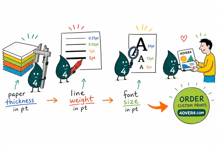
Wally puts a micrometer on the card and reads 0.016 inch, so the stock is 16pt. Then he opens the artwork, where a 1 pt rule is 1/72 inch, about fourteen paper points wide. Two scales, one word. He checks the caliper for feel and postage, and the type point for strokes and font sizes, and he never lets the two swap places.
Compare card stocks from 14pt to 32pt →
Specs and pricing
Stock options, sizes, and starting prices
Three products, three caliper ranges: standard business cards from 13pt to 80pt in 4 sizes, ultra thick cards from 32pt in 3 sizes, and postcards from 10pt to 26pt in 14 sizes. Each widget reads the live 4OVER4.COM configurator for the stocks and starting prices.


Print it
Order the caliper that suits the job
Pick by thickness: standard cards on 14pt or 16pt from 100 pieces, silk laminated cards on 16pt that finish closer to 18pt from 250, or ultra thick cards from 32pt up from 50.


Explore more
Where to go next
The 14pt against 16pt guide explains the two thousandths of an inch you can feel, the weight guide converts lb and gsm to caliper, and the font size guide sets the smallest type each stock holds.





By the numbers
Stock you can specify with confidence at 4OVER4
Common Questions
Your PT and paper thickness questions, answered
What is 10 pt paper?
10 pt paper is a sheet that measures 0.010 inch thick, which is a quarter of a millimeter. In coated cover that lands around 240 gsm, though the gsm figure moves with the mill and the coating. It is a light card stock: firm enough for a sell sheet, a tent card, a folded menu or an insert, and too flexible for a business card that has to survive a wallet. If you want a card people describe as substantial, start at 14pt and go up from there. To order 10pt card stock here, choose 10pt StarLustre Platinum Cover on an invitation or thank you card, from 25 pieces in a 4.25 by 5.5, 5 by 7 or 6 by 6 inch size.
Is PT the same as GSM?
No. PT is a caliper, measured with a micrometer in thousandths of an inch. GSM is a mass, the weight of one square meter of the sheet. Two stocks at 300 gsm can read 13pt and 15pt depending on how bulky the fiber is, which is why uncoated stock feels thicker than coated stock at the same weight. Use PT when you care about stiffness and feel, and GSM when you care about mailing weight. Our guide to paper weight and thickness works through both scales with a full chart.
Is 14pt or 16pt better for a business card?
14pt is the everyday standard and 16pt is the upgrade you actually feel. The measured difference is only 0.002 inch, but stiffness rises with the cube of caliper, so 16pt is roughly half again as rigid. On a card 3.5 by 2 inches that shows up as less flex when someone holds it at one corner. Go 16pt if the card is your main introduction, and stay at 14pt if you print in volume and hand out hundreds a week.
Does lamination change the pt thickness?
Yes, and it is often forgotten at the quoting stage. A film laminate adds roughly 0.001 to 0.0015 inch per side, so a 16pt sheet laminated both sides finishes closer to 18pt or 19pt. That extra caliper is part of why silk laminated cards feel more expensive than the base stock suggests. It also matters if the finished piece has to fit a slot, a sleeve or a card holder with a fixed opening.
What is the thickest business card you can print?
At 4OVER4.COM the ceiling is 32pt, which is 0.032 inch or 0.81 mm. Stock that heavy is not made as a single sheet in most mills, so it is built by bonding two 16pt sheets, which is also what makes a colored or painted edge possible. Ultra thick business cards start at $36.62 against $17.57 for standard business cards, so the premium is real but it is a fixed cost per box rather than a recurring one.
What font size in pt still prints cleanly?
For offset on coated stock, 6 pt is the practical floor for legal lines and 7 pt if the type is reversed out of a dark background, because ink spread closes the counters in letters like e and a. Body copy on a business card sits at 7 to 9 pt and the name at 10 to 12 pt. Remember that the point size describes the em box, not the printed letter, so a 9 pt face with a large x-height reads noticeably bigger than a 9 pt face with a small one.
Get Started
Not sure which caliper to order?
Hold the stocks before you commit. Order free samples, feel the difference between 14pt, 16pt and 32pt, then configure the job with the caliper you picked.
Legal Disclaimer
Gold Standard guarantees apply to all standard orders placed through 4over4.com. Price match requires verifiable proof of a competitor's published price for an equivalent product with matching specifications and turnaround time. Satisfaction guarantee covers manufacturing defects and print quality issues. Contact support with order number and documentation.
