
What Visual Identity Is and the 8 Core Elements That Build It


Visual identity is how a brand looks across everything it touches. It is narrower than brand identity, it rests on 8 core elements, and it only becomes real on printed assets.
Visual identity is the complete set of visual elements a brand uses to be recognized, from logo and color to typography and print assets. It is the seeable part of a wider brand identity. The 8 core elements are the logo and wordmark, color palette, typography, imagery, patterns and graphic systems, motion, physical and print assets, and a scalable design system that holds them together.
Start here
How a brand looks everywhere at once
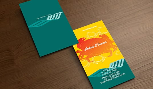
Visual identity is everything people see that makes a brand recognizable. It is the visible layer of a broader brand identity, and it is built from eight core elements: the logo and wordmark, the color palette, typography, imagery and photography, patterns and graphic systems, motion, physical and print assets, and a scalable design system that keeps them consistent. Get these working together and a customer knows your brand from a glance, whether on a screen or on a business card printed by 4OVER4.
What visual identity is
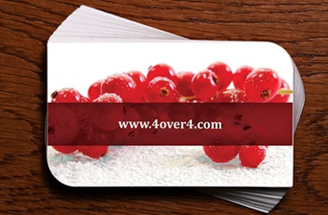
Visual identity is the complete collection of visual elements a brand uses to present itself and be recognized. It is the logo you see, the colors that repeat, the typefaces, the style of imagery, and the way all of it shows up on a website, an ad, a package, and a business card. If someone can tell a brand apart at a glance without reading the name, that is visual identity doing its job.
The purpose is recognition and trust. Consistent visuals repeated across every touchpoint train a customer to know a brand instantly, and that familiarity reads as reliability. Inconsistent visuals do the opposite: a logo that changes, colors that drift, and mismatched type make even a good company feel unsettled and unprofessional.
Visual identity is deliberate, not decorative. Every element is a choice made to be repeated, which is why brands document them and apply them the same way everywhere. The strongest test of a visual identity is a printed piece, because a business card or a letterhead has nowhere to hide a weak logo or an off color.
Visual identity vs brand identity

Visual identity and brand identity are related but not the same, and the difference matters. Brand identity is the whole personality of a brand: its values, its voice, its promise, and how it wants to be perceived. Visual identity is the seeable part of that, the specific design elements that express the personality where people can look at them.
Put simply, brand identity is who the brand is, and visual identity is how the brand looks. The voice a brand uses in its writing is brand identity; the typeface that voice is set in is visual identity. The feeling a brand wants to create is brand identity; the color palette that creates it is visual identity. One is strategy, the other is the visible execution of that strategy.
The two have to agree. A playful brand personality set in a stiff, corporate typeface sends mixed signals, and a premium promise printed on cheap, misaligned materials undercuts itself. A strong visual identity translates the brand's personality faithfully, which is why it starts from the strategy and not from a designer's preference. Our guide on building a minimal brand identity shows that alignment in practice.
The 8 core elements of a visual identity

A complete visual identity is built from eight elements that work as a system. Miss one and the identity feels incomplete or falls apart the moment it moves to a new medium.
1. Logo and wordmark. The central mark and the styled version of the name. It is the anchor everything else hangs from, and it has to work at any size, in one color, and on any background. 2. Color palette. A defined set of primary and secondary colors that repeat everywhere and become shorthand for the brand. 3. Typography. The typefaces for headings and body text, chosen to match the brand voice and to stay readable across screen and print. 4. Imagery and photography. A consistent style of photos, illustration, and image treatment so visuals feel like they belong to one brand.
5. Patterns and graphic systems. Supporting shapes, textures, icons, and layout rules that extend the identity beyond the logo. 6. Motion. How the identity moves in video, animation, and interface, from logo animations to transitions. 7. Physical and print assets. The identity made tangible on business cards, letterhead, packaging, signage, and folders, where it meets customers in the real world. 8. A scalable design system. The documented rules, tokens, and templates that hold all seven together and let the identity grow without drifting. The logo carries the most weight, so it is worth following logo design best practices before anything else.
How the elements work together
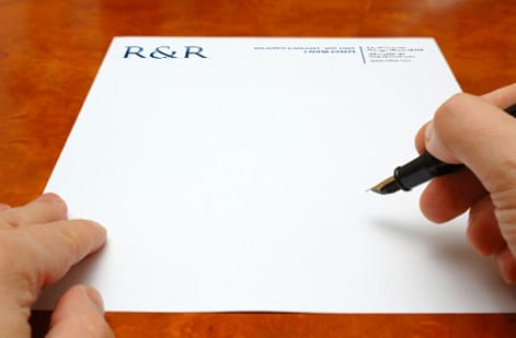
The eight elements are not a checklist to complete once; they are a system that has to stay in agreement. The color palette has to flatter the logo, the typography has to sit comfortably beside the imagery, and the patterns have to feel like they came from the same place. When every element points in the same direction, the identity is more than the sum of its parts, and recognition compounds across touchpoints.
Consistency is what turns a collection of elements into an identity. Seeing the same logo, colors, and type on a website, an email, a package, and a card teaches a customer the brand faster than any single showpiece could. That repetition is only possible with the eighth element, the design system, which documents how each piece is used so a new designer or a new medium applies it the same way.
This is also where a brand often reveals gaps. An identity can look perfect in a logo presentation and fall apart on a letterhead or a folder if no one defined how it applies there. Testing the system across real assets, especially printed ones, is the fastest way to find and fix those gaps.
Bringing your visual identity to print
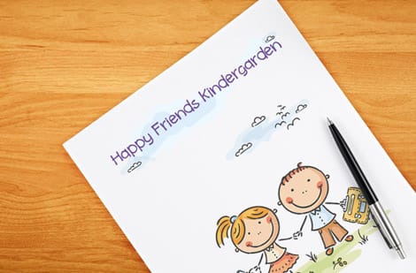
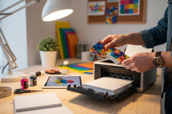
Print is where a visual identity stops being a file and becomes something a customer holds. A business card, a letterhead, a folder, or a package is the identity made physical, and it is also the most honest test of it. Color has to be right in CMYK, the logo has to stay crisp at small size, and the type has to hold up on paper, which surfaces any weakness the screen forgave.
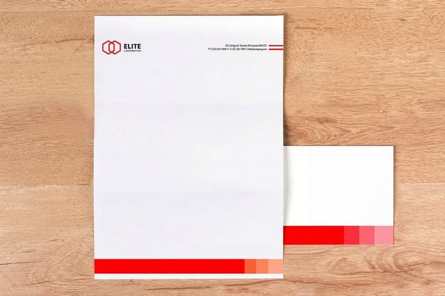
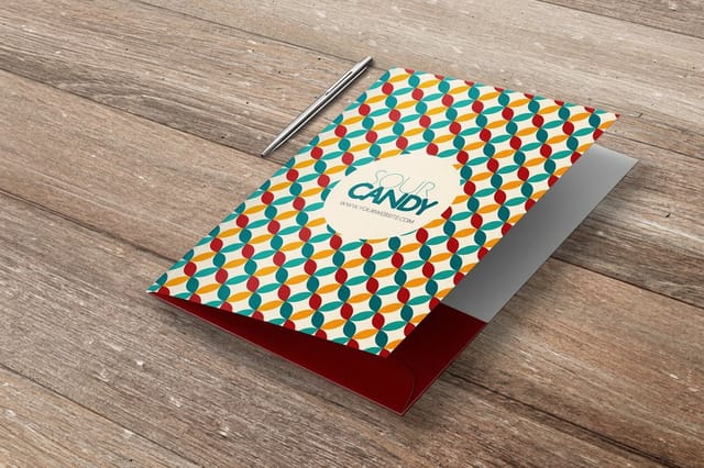
Start with the assets that touch customers most. A business card is the identity in miniature and the piece most people judge first, so it is worth getting perfect. Letterhead and folders carry the identity into correspondence and proposals, and consistent stock, color, and layout across all of them makes a small company feel established.
To land the identity accurately in print, design in CMYK, send vector artwork for the logo, and keep the palette and type exactly as the system defines them. Our free online design tool helps hold that consistency, and 4OVER4 prints the cards, letterhead, and folders that turn your visual identity into something customers can see and hold. Browse business stationery to print the core set together.
Wally turns an identity into something you hold
Eight elements, one consistent system
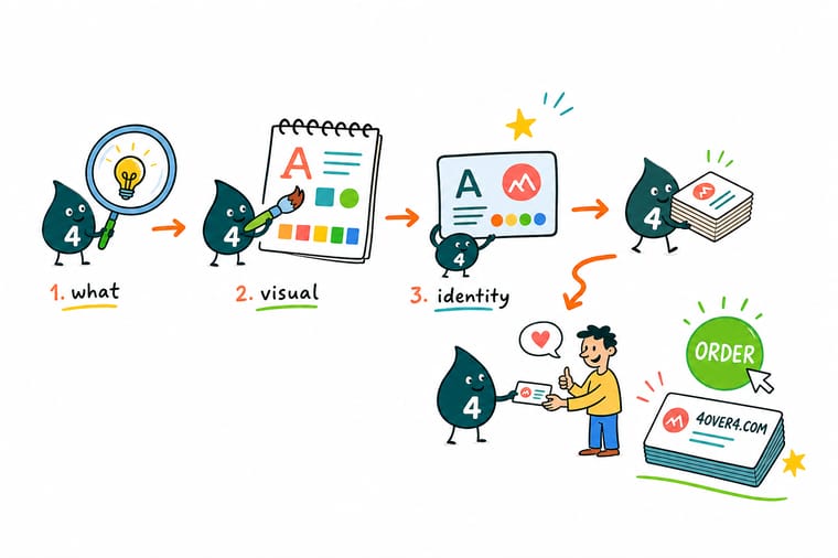
Wally lines up the eight elements, logo, color, type, imagery, patterns, motion, print assets, and the system that binds them, then proves the identity on real print. A business card, a letterhead, and a folder are the honest test of any brand look. 4OVER4 prints them in accurate CMYK so your visual identity holds up in a customer\\u2019s hand.
Print your identity →Step by step
Build a visual identity in 6 steps
- Define the brand identity firstPin down the personality, voice, and promise, because visual identity is the visible expression of that strategy.
- Design the logo and wordmarkCreate a mark that works at any size, in one color, and on any background, since everything else hangs from it.
- Set the palette and typographyChoose primary and secondary colors and heading and body typefaces that match the voice and stay readable in print.
- Define imagery, patterns, and motionDecide the photo style, supporting graphics, and how the identity moves so every medium feels consistent.
- Document a scalable design systemWrite down the rules and templates so anyone can apply the identity the same way as the brand grows.
- Test it on real printed assetsApply the identity to a business card, letterhead, and folder to find gaps and prove it holds up in the real world.
Specs and pricing
Business card specs and live pricing
A business card is your visual identity in miniature and the first piece most people judge. Here are the live specs and price-per-unit for standard business cards at 4OVER4, straight from the configurator.

| Quantity | Price Per Unit | Total |
|---|---|---|
| 100 | 17.6¢ | $17.57 |
| 200 | 11.5¢ | $23.07 |
| 300 | 9.15¢ | $27.46 |
| 400 | 7.96¢ | $31.86 |
| 500 | 7.25¢ | $36.26 |
| 600 | 6.77¢ | $40.64 |
| 700 | 6.43¢ | $45.04 |
| 800 | 6.18¢ | $49.43 |
Print it
Print the core of your visual identity

See it in use
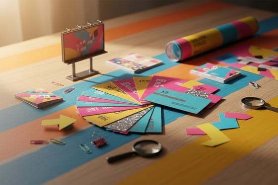
Standard business cards carrying a full identity








Explore more
Where to go next



By the numbers
Identity pieces printed across 60+ stocks
Common Questions
Common questions about visual identity
What is visual identity?
Visual identity is the complete collection of visual elements a brand uses to present itself and be recognized. It includes the logo, the color palette, the typography, the style of imagery, supporting graphics and patterns, how the brand moves in motion, and how all of it appears on physical and printed assets. It is the visible layer of a wider brand identity, the part people can actually look at. When someone can tell a brand apart at a glance without reading the name, that is visual identity working. Its purpose is recognition and trust, built by applying the same deliberate elements consistently across every touchpoint, from a website to a business card.
What is the difference between visual identity and brand identity?
Brand identity is the whole personality of a brand, including its values, voice, and promise, and how it wants to be perceived. Visual identity is the seeable part of that, the specific design elements that express the personality where people can look at them. Put simply, brand identity is who the brand is and visual identity is how the brand looks. The voice a brand writes in is brand identity; the typeface that voice is set in is visual identity. The two have to agree, because a playful personality set in a stiff typeface or a premium promise on cheap materials sends mixed signals and undercuts the brand.
What are the 8 core elements of a visual identity?
A complete visual identity is built from eight elements that work as a system. They are the logo and wordmark, the anchor everything hangs from; the color palette, a defined set of colors that become shorthand for the brand; typography, the typefaces for headings and body text; imagery and photography, a consistent visual style; patterns and graphic systems, the supporting shapes, textures, and icons; motion, how the identity moves in video and interface; physical and print assets, the identity made tangible on cards, letterhead, packaging, and signage; and a scalable design system, the documented rules and templates that hold the other seven together and let the identity grow without drifting.
How much does it cost to bring a visual identity to print?
Building the identity itself is a design cost, but printing it is priced like any print job, by product, quantity, stock, and finish. A run of business cards, letterhead, or folders scales down in unit price as the quantity rises, and premium stocks or finishes cost more than standard ones. Because a business card is the identity in miniature and the piece most people judge first, it is usually the highest-value place to start. Set each option in the 4OVER4 configurator and the price updates live, so you can print the core stationery set that expresses your identity at a cost that fits, then expand to packaging and signage as you grow.
How do I make sure my visual identity prints accurately?
Print is the honest test of a visual identity, so design for it deliberately. Work in CMYK color rather than RGB so your on-screen preview reflects process-ink output, send vector artwork for the logo so it stays crisp at small size, and keep the palette and typography exactly as your design system defines them. Test the identity on the assets that touch customers most, a business card, letterhead, and a folder, to find gaps before they reach a customer. Ordering a proof or free samples lets you judge the real color and stock in hand, and printing the core set together at 4OVER4 keeps every piece consistent.
Get Started
50 letterheads cost $99.95, or $2.00 a sheet
Bring your logo, colors, and type to 4OVER4.COM and print the business cards, letterhead, and folders that make your brand recognizable. Letterheads ship in 5 business days, pocket folders in 7.
Legal Disclaimer
Gold Standard guarantees apply to all standard orders placed through 4over4.com. Price match requires verifiable proof of a competitor's published price for an equivalent product with matching specifications and turnaround time. Satisfaction guarantee covers manufacturing defects and print quality issues. Contact support with order number and documentation. On-time delivery rate based on tracked orders 1999 to 2026. Individual results may vary based on shipping carrier performance.
