
Yard Sign Best Practices That Get Your Message Read From the Road


Tobias is our voice for cutting, binding and large format, built from the knowledge of our production team, with over 20 years in printing.
A yard sign gets about two seconds and forty feet. The cap height, the color pairing, the word count and the stake setup all have to fit inside that budget.
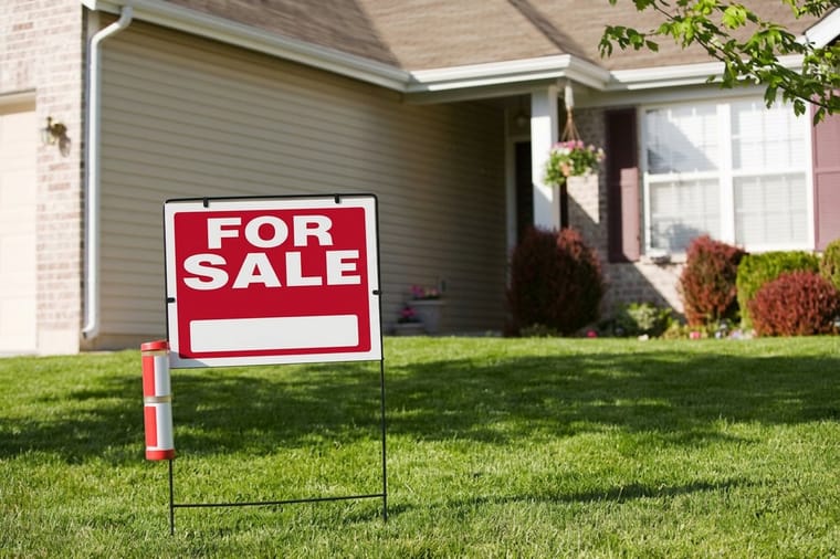
A yard sign reads at roughly ten feet for every inch of capital letter height, so four inch caps carry about forty feet and that is the working range of a standard 24 by 18 face. Keep the message to five to seven words in one idea, set dark type on a light ground because brightness contrast survives distance and hue does not, and order the coroplast with vertical flutes so the H stake legs slide into the channels. Then plant it square to the oncoming lane, six to eight feet back from the curb, at a corner where traffic already slows.
Quick answer
Two seconds, forty feet, one idea
A yard sign is a distance problem before it is a design problem. Capital letters carry about ten feet of legible distance per inch of height, so the three or four inch type that fits on a standard 24 by 18 face reads from thirty to forty feet. A driver at 25 miles per hour covers 37 feet a second, which is why the sign has to say one thing in five to seven words, in dark type on a light ground, planted square to the oncoming lane where traffic is already slowing.
Start With Reading Distance, Not With the Layout
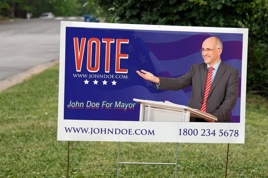
Every other decision on a yard sign follows from one number: how far away the reader is when they first look at it. The sign trade works to roughly ten feet of legible distance per inch of capital letter height, and it holds up well in practice.
| Cap height | Reads from | What fits on 24 by 18 | Where it belongs |
|---|---|---|---|
| 2 in | About 20 ft | Five or six lines, far too many. | Contact details on a sign people walk up to. |
| 3 in | About 30 ft | Four lines with a tight margin. | Second line under a headline, arrows, dates. |
| 4 in | About 40 ft | Three lines with a comfortable margin. | The standard size for a front lawn sign. |
| 6 in | About 60 ft | One headline plus two small lines. | A single word or a name that has to carry. |
Now put a car in the picture. At 25 miles per hour a driver covers about 37 feet every second, so the two seconds it takes to notice a sign, read it and get back to the road eats 73 feet. Six inch capitals give you 60. That gap is why a yard sign on a residential street works and the same sign on a 35 mile per hour arterial does not: at 35 you would need caps around ten inches tall, and ten inches does not fit on an 18 inch sign with anything else on it.
Two ways out. Move up a size, since yard signs run well past the standard 24 by 18 and a 24 by 36 face carries a genuine ten inch headline. Or accept the format for what it is and plant it where traffic is already slow, at a corner, a driveway, or a stretch with parked cars. The sizes and materials guide lays out which faces are available before you start setting type.
Contrast Is Brightness, and Brand Color Is Usually the Problem
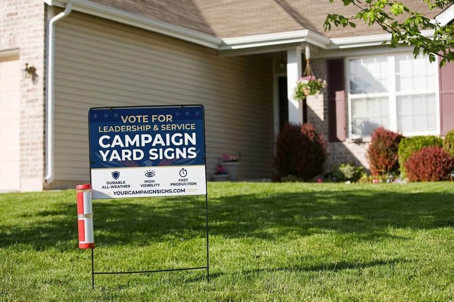
Your eye separates light from dark long before it separates one hue from another, and at distance the hue information goes first. That single fact explains most of the yard signs that look sharp on a monitor and turn to mush from the sidewalk.
Black on yellow is the strongest pair anyone has found, which is why highway crews still use it. Black on white and very dark navy on white sit just behind it. The failures are the pairs that look different but measure similar in brightness, and they are common in brand palettes: red on green, blue on red, a mid gray logo on a mid blue field. Those combinations blur into a single tone at the exact moment you need them to separate. If you are choosing a palette from scratch, the guide to sign colors works through the pairs one by one.
There is a cost to reversing the sign as well. Light type on a dark ground loses about one size step at distance, because the dark field visually crowds the letterforms and thin strokes disappear first. Reversed headlines are fine when the type is heavy and short. Reversed phone numbers are not. A practical compromise on a branded sign is to give the brand color a band across the top for the logo and keep the message area dark type on white, which is how most political and real estate signs are built even when the brand insists otherwise.
The limit worth naming: coroplast is a matte white plastic and it does not reflect. A sign that has to work after dark needs to sit inside a streetlight pool or carry reflective vinyl, and no amount of contrast in the artwork changes that. For a sign you rewrite by hand, the dry erase coroplast video overview shows the laminated version of the same board.
Cut the Message Until Only One Idea Is Left
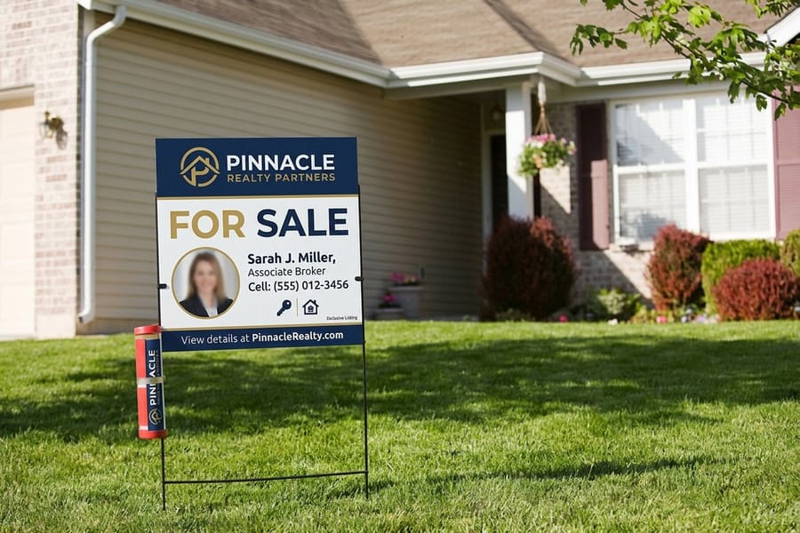
Five to seven words across the whole face is the working budget. The reader takes in the largest line and very little else, so the real design question is which three or four words deserve that line.
The answer is rarely the company name. On an open house sign it is the word OPEN and an arrow. On a campaign sign it is the candidate name, because name recognition is the entire job. On a service sign it is the trade, since a homeowner scanning a street is looking for ROOFING, not for a business they have never heard of. Everything below the headline is for someone who has already stopped, which means a phone number can be far smaller than most people set it.
- One call to action, not three. A phone number and a website and a QR code on the same face means the reader chooses none of them.
- Arrows outperform addresses. A driver cannot act on 4412 Oak Ridge Terrace at 25 miles per hour. They can follow an arrow.
- Dates only if they are current. A stale date on a sign that stayed up costs more credibility than the date was ever worth.
- Leave the outer half inch alone. Text that crowds the edge gets clipped by trim and, on a staked sign, by the grass line.
Set the file at full size with a standard bleed and keep live text a quarter inch inside the trim. Starting from a correctly sized layout in our blank template library removes most of the trimming surprises, and campaign yard signs ship with the same setup rules as any other coroplast face.
Stakes, Flutes, and the Six Feet That Decide Everything
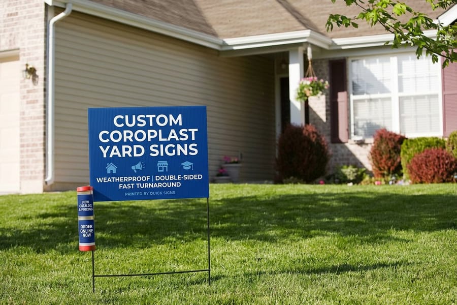
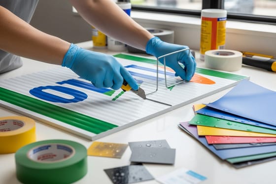
Coroplast is corrugated plastic, so the sheet has hollow channels running one direction through its core. A wire H stake works by sliding its two legs up inside those channels. Get the direction wrong and the stake has nowhere to go, which is the failure mode nobody catches on a proof because flute direction is invisible in the artwork.
On a 24 wide by 18 tall sign the flutes have to run vertically, parallel to the 18 inch side. Say that out loud when you order rather than assuming it, especially on a custom size or a portrait layout. If the plan is to hang the sign from a bracket or zip tie it to a fence instead, you want the opposite: horizontal flutes and grommets. Our coroplast costs and stakes guide covers where the quantity breaks fall once stakes are in the order.
Wind is the other thing that decides a sign's life. A single H stake holds a 24 by 18 face well enough, but the same stake in a 24 by 36 face lets the sign pivot and flex until the wire tears a flute open. Two stakes, or a step stake frame, fixes it for very little money. Thicker 10mm coroplast resists the twist better than the standard 4mm sheet, and the outdoor materials guide compares how each option ages through a full season of sun.
Placement rules that pay off, in order of how much they change the result:
- Face the oncoming lane square. A sign angled with the property line reads as a parallelogram from the road and loses a third of its legible width.
- Six to eight feet back from the curb. Closer and it sits below the sightline of anyone in a truck or an SUV. Farther and you have given up reading distance you already paid for.
- Right hand side of the travel direction. That is where drivers already look for signage, and it is why a two way street usually justifies a double sided print.
- Corners, not straightaways. Traffic slows to turn, which is free reading time.
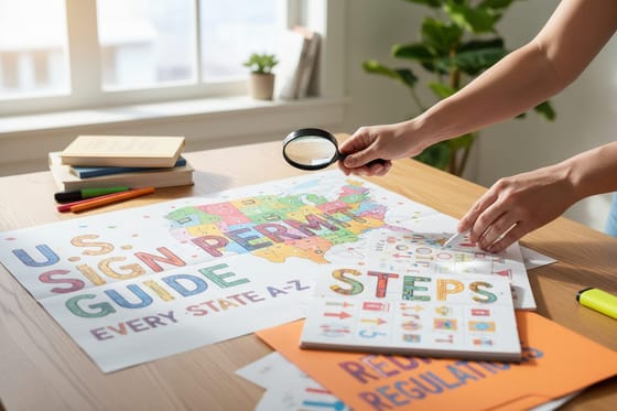
- Check the right of way before you plant. The strip between the sidewalk and the curb is frequently municipal, and signs there get pulled. The state by state permit guide is the place to check first.
Push the stake in with a foot on the crossbar rather than hammering the sign itself. In hard or frozen ground, open two slots with a screwdriver first, because a bent wire leg never goes in straight afterward. If the ground is a problem every time, an A frame is the better format and the yard signs versus A frames comparison makes the case either way. Ready to print? The yard signs category lists every face and stake combination, and coroplast yard signs start at $25.
Wally explains the yard sign
Big caps, dark on light, five words, stake in the flutes
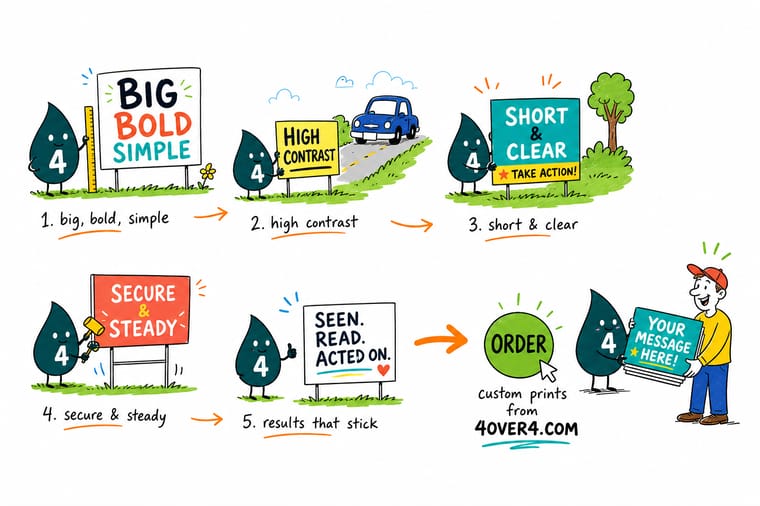
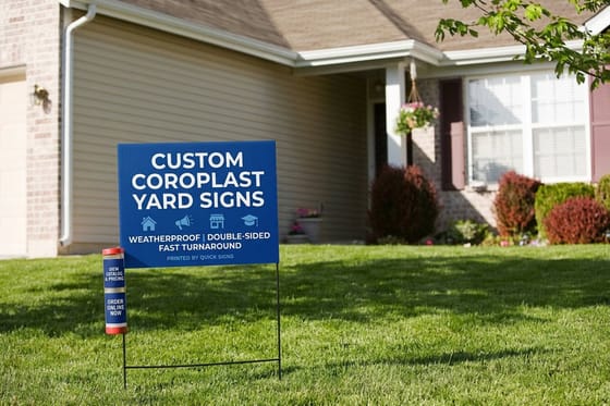
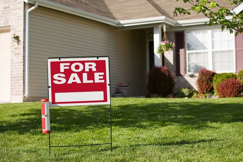
Wally walks away from the sign until he cannot read it any more, then counts the steps. Every inch of capital letter height bought him about ten feet. Four inch caps got him forty. He cut the copy to five words so the biggest line does all the work, put black type on a light ground because brightness reads farther than color, and slid the H stake legs up inside the vertical flutes. Then he set it square to the traffic, six feet off the curb, at the corner where cars slow down.
Order coroplast yard signs →%22%2F%3E%3Ccircle%20cx%3D%2247%22%20cy%3D%2220%22%20r%3D%2222%22%20fill%3D%22%23a78bfa%22%20opacity%3D%220.15%22%2F%3E%3Ccircle%20cx%3D%2254%22%20cy%3D%2227%22%20r%3D%22-3%22%20fill%3D%22%23a78bfa%22%20opacity%3D%220.1%22%2F%3E%3Crect%20x%3D%2277%22%20y%3D%22-9%22%20width%3D%2232%22%20height%3D%2220%22%20rx%3D%224%22%20fill%3D%22%23a78bfa%22%20opacity%3D%220.08%22%20transform%3D%22rotate(42%2080%2030)%22%2F%3E%3C%2Fsvg%3E)
Specs and pricing
Yard sign sizes, stakes, and starting prices
All three faces start at $25 on 4mm white coroplast, printed full color on one side or both, in 12 by 18, 12 by 24 and 18 by 24 inches or any size you enter. Add an H-stake or grommets in the configurator, and production takes 5 days. Each card below reads live from the 4OVER4.COM configurator.

Print it
Order signs that still read from the sidewalk
An 18 by 24 inch coroplast face holds three to four inch capitals, the size that reads from thirty to forty feet, and each sign starts at $25 with an H-stake as an add-on.
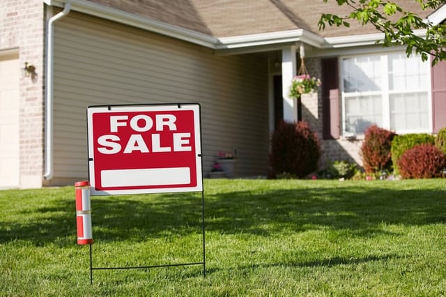
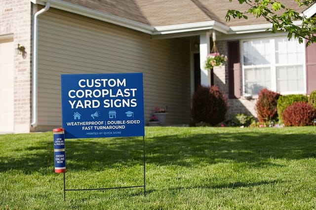
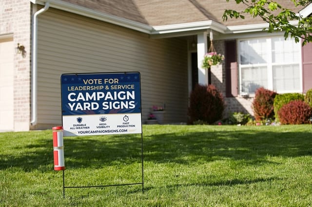

Explore more
Where to go next
Check the sizing guide if the sign has to read from farther than forty feet, and the placement guides before you plant a dozen signs along one road.
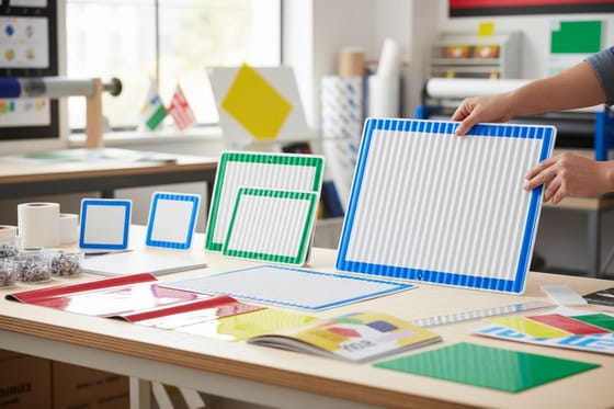
By the numbers
Twenty five years of yard sign jobs behind the press
Common Questions
Your yard sign questions, answered
How big should the letters be on a yard sign?
Work backwards from the distance you need. The sign trade rule is about ten feet of legible distance for every inch of capital letter height, so two inch caps read at twenty feet, four inch caps at forty, and six inch caps at sixty. On a standard 24 by 18 inch sign you can fit one six inch headline and two three inch lines, or three four inch lines, once you leave a margin. That puts the honest working range of a yard sign at forty to sixty feet, which is fine for a lawn, a driveway or a slow corner and not enough for a road where cars move at 35 miles per hour.
What color combination is easiest to read on a yard sign?
Dark type on a light ground, and the bigger the brightness gap the better. Black on yellow is the strongest pair, which is why road crews use it, followed by black on white and dark navy on white. The pairs that fail are the ones with similar brightness even though the colors look different: red on green, blue on red, mid gray on mid blue. Reversing the sign so light type sits on a dark ground costs you roughly a size step, because the dark background visually eats into the letterforms at distance, so keep reversed type for the headline only and never for a phone number.
Which way should the flutes run on a coroplast yard sign?
They must run parallel to the direction the stake enters, which on a 24 wide by 18 tall sign means vertically, along the 18 inch side. The wire H stake has two legs that slide up inside the corrugated channels, and if the flutes run the other way the legs hit a wall of plastic. This is the single most common ordering mistake on yard signs, and it is not visible in the artwork proof, so state the orientation when you order rather than assuming it. If you need the sign to hang from a bracket instead, ask for horizontal flutes and grommets.
How many words belong on a yard sign?
Five to seven across the whole face, and one idea. A driver looks at the largest line and moves on, so the design decision is which four words earn that line. On a real estate sign it is usually the word OPEN plus an arrow. On a campaign sign it is the candidate name. On a service sign it is the trade, not the company name. Everything else on the sign is for the person who has already stopped, which is why the phone number can safely be smaller than people expect.
Do QR codes work on yard signs?
Only on the side people can stand in front of. A phone camera needs a couple of seconds of steady framing, so a QR code aimed at moving traffic is decoration. It works well on a sign at a driveway entrance, on the face that points at the sidewalk, or on an open house directional sign where visitors walk past. Print it at least one and a half inches square with a quiet margin around it, and keep it out of the corner where a stake leg would sit.
Are double sided yard signs worth the extra cost?
On a two way street, yes, because a single sided sign is invisible to half the traffic and the second side costs far less than a second sign with its own stake. On a lawn that faces one direction, or a sign backed against a fence or a building, it is money spent on a face nobody sees. The other case for double sided is an open house route where you carry a small set of signs and plant them facing whichever way the approach happens to run that weekend.
Get Started
Coroplast yard signs print on 4mm white stock in five business days
Pick your size, choose single or double sided, add H stakes to the order, and we print on 4mm coroplast with the flutes running the way your stakes need them.
Legal Disclaimer
Gold Standard guarantees apply to all standard orders placed through 4over4.com. Price match requires verifiable proof of a competitor's published price for an equivalent product with matching specifications and turnaround time. Satisfaction guarantee covers manufacturing defects and print quality issues. Contact support with order number and documentation.
