
20 Free Edgy and Urban Fonts for Bold Print Design


Sofia is our design and templates voice, built from the knowledge of our production team, with over 20 years in printing.
Here are twenty edgy, urban and street-styled display fonts you can use on commercial print work for nothing. They all live on Google Fonts, which matters more than the aesthetic: the license sits next to the download, so you can prove what you are allowed to do with the font before it reaches a press, and Google Fonts are free for commercial and print use within two limits covered below. They are built for loud print: a 4 x 6 inch club flyer, an 18 x 24 inch poster, or a die-cut sticker.
The 20 free edgy and urban fonts
Each font name links to its specimen page, where you can type your own headline and see the real letterforms. The last column is the part most font lists leave out: where each face stops working. Read that column before you commit a headline to it.
| Font | Style | License | Best print use | Where it breaks |
|---|---|---|---|---|
| Anton | Ultra bold sans, very tight fit | OFL | Poster headline at 100pt and up | Counters close up below 18pt |
| Archivo Black | Heavy grotesque, wide | OFL | Flyer headlines, sticker wordmarks | Too wide for headlines over four words |
| Bebas Neue | Condensed, caps only | OFL | Stacked headline blocks | No lowercase and no italic, so no emphasis |
| Fjalla One | Condensed semi bold | OFL | Subheads, date and venue lines | One weight only, plan the hierarchy by size |
| Oswald | Condensed with a full weight range | OFL | A whole flyer, headline to caption | Reads corporate unless paired with something rougher |
| Big Shoulders Display | Very condensed, variable weight | OFL | Tall lockups on long posters | Thin weights disappear under 24pt on uncoated |
| Sedgwick Ave Display | Graffiti marker script | OFL | One word across a club flyer | Past three words nobody reads it |
| Rubik Spray Paint | Stencil caps with overspray | OFL | Sticker packs, street posters | Overspray dots go muddy below 30pt |
| Rubik Dirt | Distressed grunge caps | OFL | Gig flyers, band merch | The speckle fills in on absorbent stock |
| Permanent Marker | Handwritten marker | Apache 2.0 | Handmade look on stickers | Uneven baseline fights a tidy grid |
| Rock Salt | Rough handwriting | Apache 2.0 | Short callouts and price flashes | Wide default spacing eats horizontal room |
| Nosifer | Dripping horror caps | OFL | Halloween posters, metal shows | Drips clip if the line sits near the trim |
| Black Ops One | Military stencil | OFL | Bootcamp and gym flyers | Stencil bridges fill with heavy ink coverage |
| Saira Stencil One | Clean modern stencil | OFL | Industrial signage, event graphics | Single weight, so contrast comes from scale |
| Staatliches | Condensed poster caps | OFL | Tickets, stubs, ticket-style flyers | Caps only, so long lines get shouty |
| Bungee | Signage type with vertical support | OFL | Vertical banners, sticker sheets | Vertical setting still needs manual stacking |
| Bungee Shade | Layered face with a drop shadow | OFL | One big headline per poster | The shadow layer wants a second spot color |
| Monoton | Single line neon caps | OFL | Night events, bar and lounge flyers | Inline strokes plug together under 40pt |
| Alfa Slab One | Heavy slab serif | OFL | Retro street posters, sale banners | Slabs gain weight on uncoated stock |
| Bangers | Comic shout caps | OFL | Sale stickers, kids and family events | Reads cheap on premium finishes |
OFL is the SIL Open Font License. Each font name opens its Google Fonts page, where the license is named on the family page.
What actually makes a font read as edgy or urban

Three things do most of the work: weight, fit and texture. A face that is heavy, set tight, and carries some irregularity in the outline reads as street. A face that is light, loosely spaced and geometrically perfect reads as a bank. That is the whole trick, and it is why Anton set solid at 120pt on a poster feels aggressive while the same word in Oswald Light feels like a conference badge.
Texture is the third lever. Distressed faces such as Rubik Dirt and Rubik Spray Paint carry the irregularity inside the glyph, so you get grit without adding a single Photoshop layer. That is an advantage in print, because a texture built into the outline is vector and stays crisp at any size, while a raster grunge overlay softens the moment the file is scaled up for a poster.
The last ingredient is caps. Most of the faces below have no lowercase at all, and that constraint is doing something: all-caps setting removes ascenders and descenders, so lines stack tight and the block of type becomes a shape. Set your headline in caps, then close the leading until the lines nearly touch. Our guide to poster fonts covers how far you can push that before legibility goes.
Edgy is a size decision, not just a font decision
Every face on this list has a floor. Monoton is a single line drawing of a letter, so its inline strokes plug together and turn into a solid blob somewhere under 40pt. Rubik Spray Paint loses its overspray dots under about 30pt. Big Shoulders at a thin weight vanishes under 24pt on uncoated stock, because uncoated fiber absorbs ink and thickens some strokes while breaking others.
Set the headline at the size it will actually print, not at whatever fits the artboard on screen. A 22 by 28 inch poster viewed at 25 percent on a laptop lies to you about every one of these thresholds.
How to license a free font safely for commercial print

The word free covers two completely different things, and the gap between them is where designers get letters from lawyers. A font under the SIL Open Font License or Apache 2.0 can be used on work you sell, embedded in a PDF, and modified. A font marked free for personal use cannot, and that label turns up on many free download sites.
Every font on this page sits on Google Fonts, which is the reason all twenty are safe. The license file is visible next to the download, the family page names it, and there is no hunting through a forum thread from 2011 to find out who made the thing.
Two limits inside the OFL are worth knowing before you get creative. You may not sell the font file on its own, bundled or unbundled. And if a font declares a Reserved Font Name, a modified copy must be released under a different name. Stretching, distressing or adding a drip to a headline inside your artwork is not a modified release, so that is fine; shipping an altered .otf to a client under the original name is not.
The check that takes ten seconds
Open the zip. If there is no OFL.txt, LICENSE.txt or a readme naming the license, do not use the font on paid work. A font with no license file is not free, it is undocumented, and the risk lands on whoever printed the job as well as on you.
Save the license file next to the artwork in the job folder. When a client asks two years later where the display face came from, that folder answers it in seconds.
Pairing a display font with a body font people can read
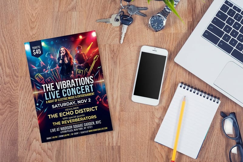
One loud face per piece. The headline gets the character, and everything else gets out of its way, because two competing display faces on a flyer read as an accident rather than a decision. If the headline is Sedgwick Ave Display, the venue, date and price all belong in something plain.
The safe pairings are boring on purpose. Anton or Archivo Black over Inter, Roboto or Source Sans. Bebas Neue over Lato. Alfa Slab One over a plain grotesque, never over a second slab. If you want one family to do the entire piece, Oswald is the one on this list that can, because it ships a real weight range: set the headline in Bold at 90pt and the body in Regular at 10pt and the flyer still holds together.
Body copy on a flyer should not go below 8pt, and on absorbent uncoated stock 9pt is a safer floor because ink spread thickens small strokes. Set the phone number and the address in the plain face, at a size a person can read at arm length, and let the display font carry the shouting. The easy-to-read fonts list is the other half of this pairing problem.
Contrast beats variety
A flyer that uses two faces at four sizes reads clearer than one that uses four faces at two sizes. Build hierarchy with scale and weight first. When the headline is four times the size of the body, you do not need a third font to signal that it is the headline.
Color counts as contrast too, and it is cheaper than a font. A single accent color on a headline, held consistent across a flyer, a poster and a sticker, does more brand work than adding another typeface to the set.
Outline the type before you send the file
Convert text to outlines, then save that version as a separate print copy. Outlining turns each letter into a vector shape, so the RIP has nothing to substitute and no chance of reflowing your carefully tightened headline. It also sidesteps the embedding question entirely, since there is no longer a font in the file. Our guide shows how to convert text to outlines in Illustrator, InDesign and Photoshop before you send print files.
The cost is that outlined text is dead. You cannot edit it, spell check it, or change a size without redrawing. That is why the rule is two files: the live-text working file that you keep, and the outlined copy that goes to press. Losing the live file and having to rebuild a headline letter by letter is a genuinely miserable afternoon.
Two things to check after outlining. Overlapping strokes, common in script and marker faces such as Permanent Marker and Sedgwick Ave Display, can knock out where they cross once they become paths, so run a merge on the outlined group and look at the result. And any stroke you applied to live text should be expanded at the same time, or it may scale differently. Step-by-step, our guide to converting text to shapes in Illustrator walks the whole sequence.
When to leave the text live instead
If a printer asks for a press-ready PDF with fonts embedded rather than outlined, send that. A PDF/X file with embedded subsets is just as safe, and it keeps the text searchable and selectable, which matters if the same file gets reused online.
The one case where outlining is not optional is when the font has an embedding restriction flag set. Some free faces are flagged as preview and print only. Outline those, or the PDF will fail preflight without telling you why.
Where these fonts actually shine
Display type needs a piece with room. A flyer, a poster and a sticker all give a headline the whole surface, which is why these faces belong there and rarely belong on a letterhead. Here is how the categories differ in practice.
- Clubs and DJs. A single graffiti or neon face across the top of a 4 by 6 inch card, everything else plain. Short runs mean you can print a new one per night rather than one generic design for the season.
- Bands and promoters. Distressed caps at poster scale, then the same lockup shrunk onto stickers for the merch table, with the tour dates in a plain face.
- Streetwear and skate brands. The wordmark as a die-cut sticker for boards, bags and shop windows, set in one heavy face with nothing else on it.
- Gyms and combat sports. Stencil faces such as Black Ops One suit the category without trying. Pair with a plain grotesque so the class timetable stays readable.
- Political and campaign work. Stencil and spray faces read as urgent, which is the point. Check ballot and disclaimer requirements before the run, because those lines have their own size rules.
Print it
Club flyers, ready for a loud headline
14 sizes from 2.5 inch squares to 6 x 11 inches, on 22 stocks with an optional high gloss UV.
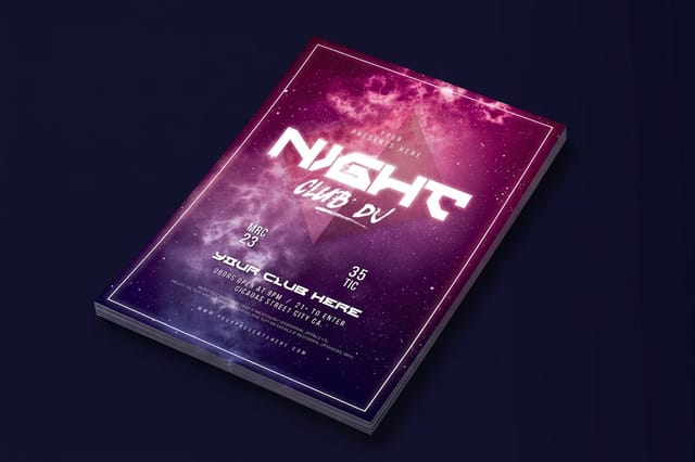
Stickers are the format where a distressed face earns the most, because a sticker is usually one word and a shape. A die-cut sticker turns the outline of the letterform into the cut line, so the wordmark stops sitting inside a rectangle. Premium stickers are the cheaper route when a shaped cut is not needed, in 23 materials from vinyl to fluorescent label.
For a small seal or a giveaway, standard stickers come in the rectangle, circle and oval sizes our rectangle sticker sizes guide lists.
Posters give display type its natural home. On standard posters a headline at 120pt or more works from across a street, which is the whole point of a face like Anton or Bungee Shade. If the piece is taller than it is wide, the long poster guide covers the proportions that stay readable at that shape.
Flyer and poster pricing at 4OVER4.COM
Edgy display type needs size, so price the formats that give it room: club flyers start at $16.48 for 50, standard posters at $108.75 for 50 in six sizes from 11 x 17 to 22 x 28 inches, and premium stickers at $29.16 for 25. A club flyer is the cheap way to proof a distressed headline before you commit to a poster run.
Quantity and price
Club flyer pricing and specs
Real configurator numbers for club flyers, with every stock and finish listed beside the price.
| Quantity | Price Per Unit | Total |
|---|---|---|
| 50 | 33.0¢ | $16.48 |
| 100 | 24.2¢ | $24.16 |
| 200 | 15.9¢ | $31.86 |
| 300 | 12.8¢ | $38.45 |
| 400 | 11.3¢ | $45.04 |
| 500 | 10.3¢ | $51.62 |

Designing with them in the free designer
If you are not building the file in Illustrator, start from a template. 4OVER4.COM sizes its blanks to exact product specs, so the bleed, trim and safety margin are already drawn and your headline lands inside the cut line rather than through it. Download a print-ready blank from the blank template library, drop the outlined headline into it, and the geometry is handled.
Start fast
Templates and print-ready blanks
Flyer design templates and exact size blanks, with bleed and trim already marked.



Two things to fix in the template before you export. Set the document to CMYK, because a neon headline picked in RGB will shift when it is converted, and the shift is worst in exactly the bright greens and oranges that street work likes. And place any raster background at 300 DPI at the finished size, since a display headline printed sharp over a soft photograph makes the photograph look worse, not better. Terms you do not recognize in the preflight report are listed on our printing terms page.
Wally checks the license, then outlines the type
Two steps between a free font and a clean print
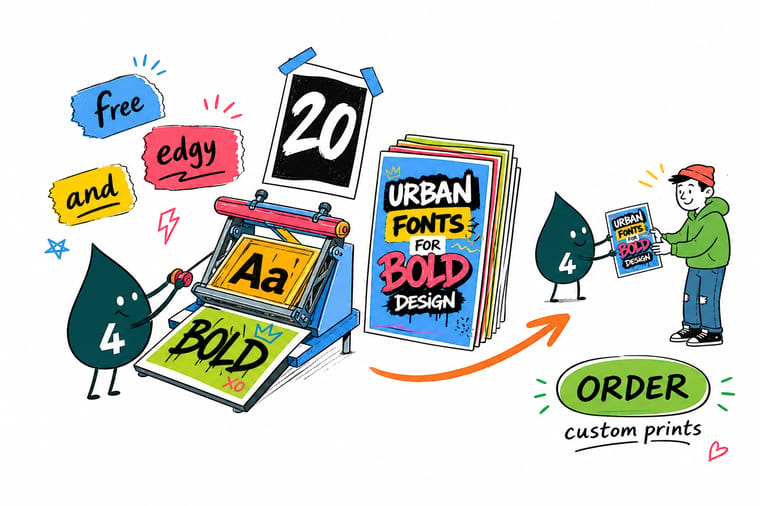
Open the font zip and confirm it carries an OFL or Apache license file before you use it on paid work. Then convert the headline to outlines, merge any overlapping strokes in script and marker faces, keep 0.125 inch of bleed with the drips a quarter inch inside the trim, and export in CMYK at 300 DPI. 4OVER4.COM prints the flyers, posters and stickers those headlines belong on.
Order club flyers →What to remember about free display fonts
Print rules that apply to every face on this list
- Keep 0.125 inch of bleed and a safety margin. Dripping and spray faces have parts that hang outside the letter box. Keep the whole headline at least a quarter inch inside the trim or the drips get cut off.
- Use rich black on big display type only. A large solid headline looks flat in 100K alone. Rich black gives it depth. Never use rich black on small text, where the misregistration shows as colored fringing.
- Watch reversed-out type. White type on a dark field fills in as ink spreads. Below about 10pt, and especially in a light weight, reversed type on uncoated stock closes up.
Explore more
More ways to print and promote
Flyers, stickers, posters and the guides that go with them.
Product Club Flyers Flyers in 14 sizes, from 2.5 inch squares to 6 x 11 inches. Product Concert Flyers Gig and show flyers in short runs, printed fast. Product Premium Stickers Durable stickers that hold a distressed wordmark.  Product Die-Cut Stickers Cut to your letterform instead of a rectangle. Product Standard Posters Large format posters where display type gets room.
  Category Flyer Printing Every flyer size, stock and finish in one place.
  Category Sticker Printing Sheets, rolls, die cuts and specialty stocks.
  Article 15 Retro Fonts Worth Printing The other end of the display spectrum, all free.
  Guide Nightclub Flyer Design Guide Layout, stock and bleed for club work.
 Ready to print the headline?
Pick your size, drop in your outlined artwork or start from a free template, and check the proof before the run prints.
Common questions about free fonts for print
Can I use a free font on printed products I sell?
If its license is the OFL or Apache 2.0, yes, including on work you charge for and on merchandise. If the download says free for personal use, no. A personal-use font on a paid flyer needs a commercial license from the foundry first, so buy it or swap to one of the twenty here.
Do I have to convert type to outlines before sending a print file?
Not always, but it removes a whole class of problems. Outlining turns every letter into a vector shape, so the press RIP cannot substitute a missing font or reflow a headline you spent an hour tightening. The alternative that is equally safe is a press-ready PDF with the fonts embedded as subsets. What is never safe is a native file with linked fonts that the printer does not have.
Why does my grunge font look like dirt when it prints?
It is set too small or printed on the wrong stock. Distressed faces build the texture into the letter outline, and that texture has a real size on the page. Shrink it and the speckle in a face like Rubik Dirt stops reading as deliberate wear and starts reading as a printing fault, and on absorbent uncoated stock the ink spreads into the gaps and fills them entirely, so a gloss or silk stock keeps the grit sharper. Use distressed faces at headline scale only. Set the supporting lines in a plain face, and if you need the grit at a small size, use a solid version of the same letterform instead.
Can I stretch or modify a free font and still be legal?
Under the OFL you can modify the font, including inside your artwork, and you can distribute a modified version. Two conditions apply. You cannot sell the font file on its own, modified or not. And if the original declares a Reserved Font Name, your modified release has to carry a different name. Distorting a headline inside a poster, adding a drip, or cutting a letter apart in Illustrator is artwork rather than a font release, so nothing extra is required. Exporting a changed .otf and passing it to a client under the original name is where the rule bites.
What size should display type be on a flyer compared with a poster?
On a 4 by 6 inch flyer the headline usually lands between 36pt and 60pt, and the body sits at 9pt or 10pt because anything smaller is hard to read in a busy room. On a 22 by 28 inch poster the headline runs from 120pt upward, since it has to work from across the street, and the body can stay around 18pt to 24pt. The rule that carries across both is the reading distance: type should be roughly one inch tall for every ten feet of viewing distance.
