
7 Ways to Make a Brand Statement With Modern Postcards


Nadia is our customer education voice, built from the knowledge of our production team, with over 20 years in printing.
What Makes a Postcard Look Modern Instead of Mailed
A postcard is the only piece of print that arrives already open. There is no envelope to slit, no subject line to skip, no consent banner in the way. The design either earns three seconds on the kitchen counter or it goes straight into the recycling. That is why modern postcards have moved away from the busy sales flyer and toward something much closer to a poster with a stamp on the back.
Modern here is not a passing style trend. It is a set of decisions: fewer elements, harder contrast, real hierarchy, and a physical quality you can feel through your fingertips. Brands that get this right treat the card as packaging for one idea, rather than a page that has to carry every product they sell.
Those decisions are what separate a card that lives on a fridge from one nobody finishes reading. Across the seven ways below, every choice ties back to something you can actually specify when you order: a color build, a trim size, a paper weight, a coating, a finishing pass. 4OVER4.COM has produced print for 150,000+ businesses since 1999, and the same handful of levers show up in nearly every campaign that performs.
Way 1: Build the whole card on one confident color
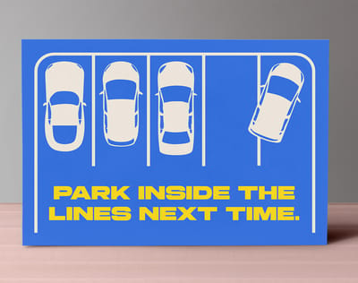
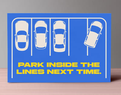
Pick one color and let it own the card. A full bleed field of a single saturated tone, with the message reversed out of it, reads from across a room. Split the card between two tones if you genuinely need the contrast, then stop. Three or more competing colors and the piece starts to look like a coupon.
Way 2: Let the type carry the message
Set one line at a size that feels slightly uncomfortable, then keep everything else small and quiet. A postcard has room for one headline, one supporting line and a signature. At that scale the type stops being text and becomes the image.
Way 3: Break the standard size on purpose
The standard 4 by 6 is safe and cheap, and it looks like every other card in the stack. A 5 by 7 or a 6 by 11 changes the physical experience before anyone reads a word, and an oversized format survives the sorting pile far better than the format everyone defaults to.
Way 4: Choose a stock people feel before they read
Weight registers as quality faster than any graphic ever will. A heavier cover stock, an uncoated sheet with real tooth, or a soft touch laminate tells the reader this was not run off on an office printer. People hold a thick card longer, and holding is the whole game.
Shop the format
Postcard printing at 4OVER4.COM
Every size, stock and finish mentioned on this page, priced live and ready to configure.
Way 5: Make the Finish Your Signature
Coating is where a postcard stops looking printed and starts looking produced. It is also the cheapest place to buy distinctiveness, because a finish costs a fraction of the design time and nobody can lift it from a screenshot. Let the message pick the finish, then check what each one takes to produce: soft touch postcards print on 32pt to 80pt soft touch uncoated stock from 50 cards in 5 business days; raised foil postcards pair 16pt velvet laminated cover with raised gold, silver or holographic foil at 4" x 6" or 5" x 7", from 100 cards in 7; lenticular postcards run on a 31pt lens with 2 to 4 flips, from 500 cards in 22.
If you are still mapping out layout, bleed and mailing panels, work through how to make postcards first, then come back and choose the surface. For raised, tactile detail on a logo or a single headline word, the embossing service adds dimension you can read with your eyes closed.
- Matte or soft touch. Velvety, glare free, and the easiest surface to write a handwritten note on.
- High gloss UV. Deep, wet looking color that makes photography and bold flat fields snap off the sheet.
- Spot gloss. Shine applied only where you want it, so a matte card carries one gleaming logo or pattern.
- Foil accents. Metallic detail that catches light as the card turns, ideal for a mark or a single word.
- Lenticular. Motion built into the card itself, so the image shifts with the angle and the piece gets handled twice.
Mixing two finishes is where the real statement happens. A soft touch card with one spot gloss element gives you contrast you can feel as well as see, and the eye goes exactly where you sent it. Keep the effect to a single element. When everything shines, nothing does, and the card reads as decoration instead of a brand with a point of view.
Print picks
Three postcard formats worth a closer look
Live prices, ready to customize with your own artwork and finish.
 3D Lenticular Postcards 500 for $1097.28 Built-in motion that makes the card get picked up a second time.
 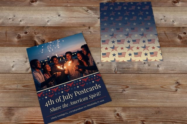 4th of July Postcards 50 for $16.48 Bold seasonal color on a format cheap enough to test two designs.
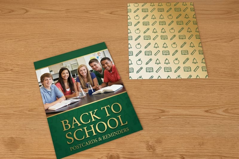
 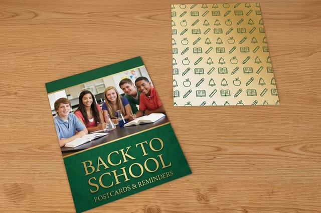 Back to School Postcards 50 for $16.48 A timed campaign card for the weeks families are already shopping.
 Way 6: Design the Delivery as Well as the Card
A postcard is not just a design, it is an object arriving in a particular way. Handed across a counter, tucked into a shipping box, pinned to a job site board, or dropped through a letter slot, the same artwork has to do a different job in each of those moments. For the mailbox moment, weigh postcard vs letter before you commit the artwork.
Decide the delivery before the layout. A mailed card needs a clean address panel and quiet space for the indicia. A card riding inside a package can use the entire back for a reorder code or a short note. Brands launching everything at once usually order the card alongside signage and stickers from a starter kit so the whole set speaks with one voice.
- Direct mail. Reserve the right half of the back for addressing and keep the message on the left.
- In package inserts. Use the full back for a reorder code, a care guide, or a short founder note.
- Counter and event handouts. Print on heavier stock, because these get carried in a pocket all day.
- Rack and takeaway stands. Put the hook in the top third, since that is all a rack ever shows.
- Seasonal drops. Time the send so the card lands during the week people already shop the category.
Way 7: Give One Offer and One Obvious Next Step
Most postcards fail on the back, not the front. They list five services, three phone numbers, a website, two social handles and a QR code, and the reader chooses none of them. One card, one job. That constraint is the strategy.
Name the offer in plain words, put a date on it, and give exactly one way to act. The same discipline governs every short format piece, which is why the thinking in 12 ways to make college brochures stand out transfers directly to a card with far less room to work with.
- A dated offer. A code that expires gives people a reason to act this week instead of some other week.
- A single QR target. Send the scan to one landing page built for this card, never to the homepage.
- A physical redemption. Bring the card in and get something, which turns a print run into tracked traffic.
- A short URL you can measure. A vanity path tells you what the mailing actually produced.
- A named contact. A person and a direct line outperforms a generic inbox on higher value services.
Three small habits keep the back of the card honest:
- Write the offer first. If it does not survive being written as one sentence, it is not ready to print.
- Leave real white space. A crowded back reads as junk mail even when the front is beautiful.
- Proof the code. Scan the QR from the printed proof, not the PDF, before the full run goes down.
Postcard Sizes, Quantities and What They Actually Cost
Postcard pricing rests on four things: how many you order, the trim size, the stock and coating, and how fast you need it in hand. Quantity does most of the work. The unit cost on a run of five thousand lives in a completely different world from a run of one hundred.
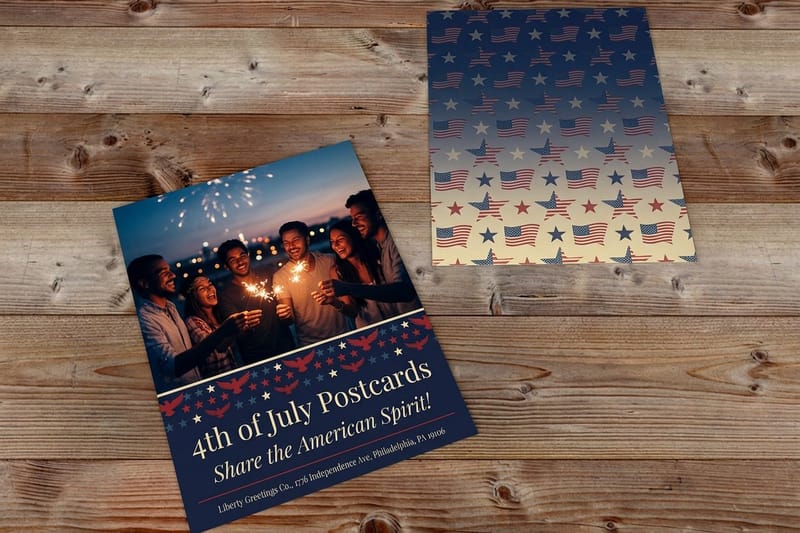
Seasonal and everyday formats sit at the affordable end. 4th of July Postcards and Back to School Postcards both start at $16.48, which makes a short test run cheap enough to print two designs and let the better one earn the full mailing. Flip through the 4th of July postcards story for a seasonal starting point.
- Quantity. Every jump in run length lowers the price per card, so take the next tier if you will genuinely use it.
- Size. Oversized trims use more sheet and cost more, and they also survive the mail pile far better.
- Stock and weight. Heavier cover stocks and uncoated sheets carry a premium you can feel in the hand.
- Coating and finishing. Spot gloss, foil and embossing are separate passes on press and are priced that way.
- Turnaround. Standard production is the cheapest lane, and rush moves your job ahead of the queue.
Quantity and price
Postcard pricing and specifications
Real configurator numbers. The more you print in one run, the lower the cost per card.
| Quantity | Price Per Unit | Total |
|---|---|---|
| 50 | 33.0¢ | $16.48 |
| 100 | 24.2¢ | $24.16 |
| 200 | 15.9¢ | $31.86 |
| 300 | 12.8¢ | $38.45 |
| 400 | 11.3¢ | $45.04 |
| 500 | 10.3¢ | $51.62 |
Premium Postcard Options for Campaigns That Cannot Miss
Some campaigns cannot afford to be skimmed. A product launch, a rebrand announcement, a high value invitation, a card that has to reach a buying committee already drowning in print. For those, the premium formats earn their line item, because the card gets handled instead of sorted.
3D Lenticular Postcards start at $1097.28 and exist for exactly that moment. The image moves as the card tilts, so the recipient turns it back and forth and your message gets a second and third look. It is a specialty run, so lock the artwork early and tie the motion to one idea rather than three.
- Lenticular motion. Depth or a two frame flip that turns the card into something people show a colleague.
- Raised foil. Metallic and dimensional at once, best on a mark, a number, or a single headline word.
- Soft touch with spot gloss. The most reliable premium pairing for photography led designs.
- Heavy uncoated stock. An editorial, tactile feel that suits architecture, design and hospitality brands.
- Embossed detail. A pressed logo or border that reads by touch before the card is even turned over.
Premium format
3D lenticular postcards
Motion printed into the sheet, so the image shifts as the card turns in the hand.

Adding Texture With Embossing and Finishing Services
Finishing services are the part of printing most brands never think to ask about, and they are where a card stops competing on layout alone. These are physical processes applied after the ink, and they cannot be reproduced by a competitor who saw your design on a screen.
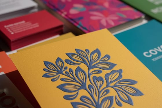
Embossing presses your artwork up from the surface of the sheet, so a logo, a monogram or a border reads by touch. It pairs especially well with uncoated stock, where the shadow in the relief does the entire job without any ink at all. The same instinct carries over to custom printed product tags and branded merch, where texture says more about a brand than color does.
- Emboss the mark, not the message. Relief works on shapes and letterforms, never on paragraphs.
- Pair it with uncoated stock. Matte, untreated sheets hold the shadow that makes the relief visible.
- Keep line weights generous. Very fine strokes flatten out under the die and lose the whole effect.
- Give it a quiet layout. Leave room around the embossed element so the texture is the thing you notice.
- Order a proof. Relief is a physical result, so judge it in your hand rather than on a screen.
Add real texture
Embossing service
Press your logo, monogram or border up from the surface of the sheet, so the brand can be read by touch.
Comparing Popular Postcard Formats Side by Side
Choosing a format is much easier when the options sit next to each other. Trim size, stock, coating, minimum quantity and turnaround all move together, and a card that looks perfect on paper can turn out to be the wrong call once you see the run length it requires. A standard postcard starts at 50 cards and prints in 3 business days; a lenticular card needs 500 and 22 business days, so the run length and the calendar decide the format as much as the look.
Use a comparison as a shortlist tool rather than a final answer. Pick the two formats that fit the budget, order a small run of each, and let the physical samples settle the argument. Print decisions made with the card in hand almost never get reversed later.
- Start from the mailing plan. If it goes through the post, size and address panel come first.
- Then set the stock. Weight shapes perceived value more than any other single specification.
- Add one finish. A single coating or effect, chosen deliberately, beats three of them stacked up.
- Check the minimum. Specialty formats carry higher minimums, so match them to campaigns with volume.
- Confirm the turnaround. Work backwards from the drop date, never forwards from the order date.
Compare formats
Popular postcards, side by side
Stock, finish, size, quantity, turnaround and price in a single view.
 Standard Postcards | 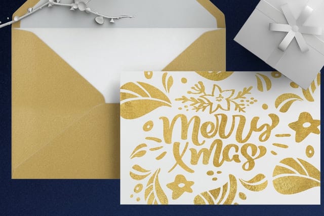 Metallic Foil Postcards | 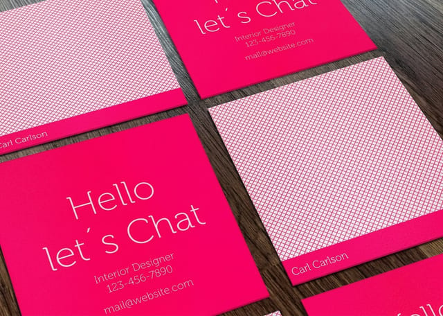 Mini Cards |  Spot UV Postcards | |
|---|---|---|---|---|
| Min price | $16.48 | $421.91 | $17.57 | $190.02 |
| Paper / stock | 14pt Gloss Cover | 16 Point Silk Laminated | 14pt Gloss Cover | 16pt Gloss Cover |
| Finish | Standard Finish | - | Standard Finish | - |
| Size | 2.5" x 2.5" | 4" x 6" | 2" x 2" | 2" x 6" |
| Default qty | 50 | 500 | 100 | 1,000 |
| Turnaround | 3 business days | 7 business days | 3 business days | 5 business days |
| Rating | ||||
| View & customize | View & customize | View & customize | View & customize |
Getting Your Modern Postcards Printed and Out the Door
The design is settled and the finish is chosen. What is left is the part that quietly ruins good campaigns: files built at the wrong size, artwork with no bleed, and a delivery date that lands after the event the card was meant to promote.
Start from a print ready layout so trim, bleed and safe area are already correct, then drop your artwork in. How to make postcards walks the file setup end to end, professional custom letterhead in MS Word applies the same discipline to office built files, and acrylic business signs shows how the branding carries from the mailbox into the room. Browse every format at postcards printing when you are ready to order.
Match the finish to the message
- Announcements. Soft touch stock with one spot gloss element, so the news feels considered.
- Retail offers. High gloss UV and saturated color that reads fast from a counter or a rack.
- Invitations and launches. Foil or embossing on the mark, printed heavy and mailed flat.
- Everyday follow ups. Uncoated stock you can write on by hand before it goes out.
Start fast
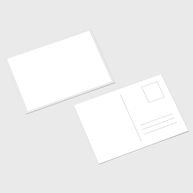
Postcard templates and print-ready blanks
Free layouts plus exact-size blanks, so trim, bleed and safe area are correct before you design.


Wally on making a postcard look like your brand
Seven decisions that turn a mailer into a statement piece
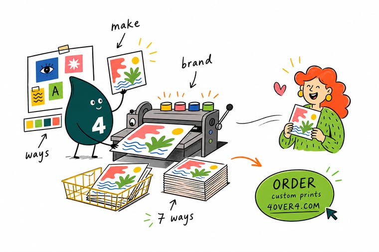
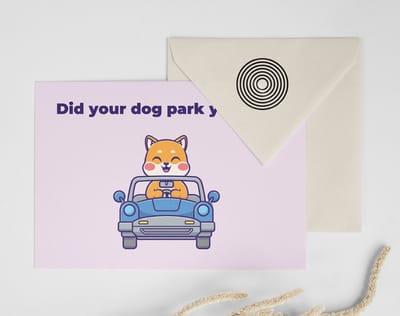
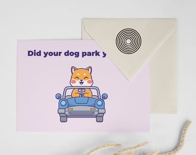
Most postcards lose because they try to say five things at once. Pick one color and let it fill the card. Set one headline big enough to read across a room. Choose a stock heavy enough that people hold it, then add exactly one finish, matte, spot gloss, foil or embossed relief, that matches the message. Put a single dated offer on the back with one way to respond. Print a small run, hold it, then order the full mailing.
Browse postcard printing →Turning Seven Ideas Into One Card You Can Order
Track record
The plant behind these postcards
Soft touch, raised foil and lenticular postcards all print in our Queens facility, where 4OVER4.COM has printed since 1999.
- 10B+ Print products produced, since 1999.
- 150,000+ Businesses served, across every industry.
- 60+ Paper stocks and finishes, across cards and postcards.
- 99.8% On-time delivery, tracked orders.
Keep reading
Guides that go deeper on design and print
File setup, finishing and branding, one guide at a time.
Guide How to Make Postcards File setup, bleed and mailing panels from start to finish. Guide How to Make Merch for Your Brand Carry the same brand decisions onto physical goods. Guide Custom Printed Product Tags Small format printing where texture does most of the work. Guide Custom Letterhead in MS Word Build print ready office files without breaking the brand. Explore more
More ways to put your brand into print
Related pages across 4OVER4.COM, one card for each next step.
 Shop Postcards Printing Every size, stock and finish in one place.
 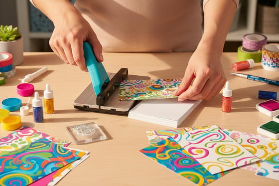 Guide How to Make Postcards The complete design and print walkthrough.
  Product 3D Lenticular Postcards Motion printed into the card for launches that must land. Product 4th of July Postcards Bold seasonal color, full bleed, ready to mail. Product Back to School Postcards A timed card for the weeks families are already shopping.
 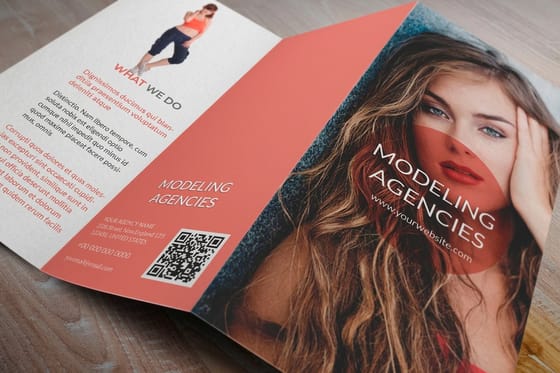 Article 12 Ways to Make Brochures Stand Out Short format design lessons that transfer to cards.
 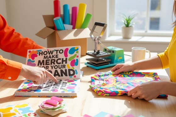 Guide How to Make Merch for Your Brand Extend the brand system beyond paper.
 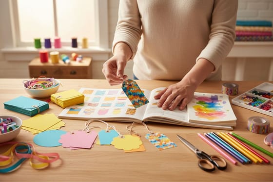 Guide Custom Printed Product Tags Texture and finish on the smallest brand surface.
 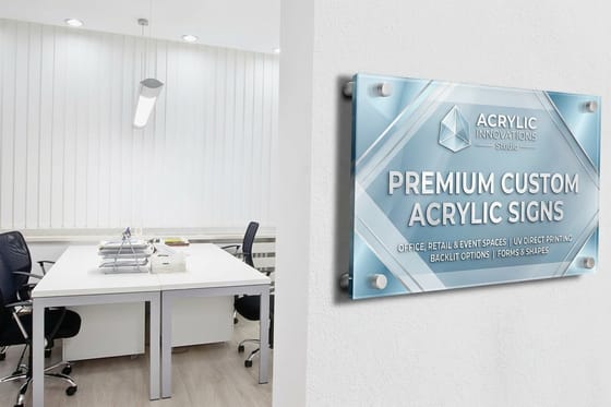 Guide Acrylic Business Signs Buyer Guide Take the same brand decisions into the physical space.
  Guide Custom Letterhead in MS Word Print ready office documents that stay on brand.
  Kits Brand Starter Kits Cards, postcards and signage ordered as one matched set.
  Service Embossing Service Raised detail your competitors cannot copy from a screenshot.
 Ready to print a postcard people actually keep?
Choose your size and stock, add one finish that fits the message, and put a card in the mail that looks like it came from a brand with a point of view.
Modern Postcard Questions, Answered
What makes a postcard modern?
A modern postcard is built on restraint rather than decoration. One dominant color, one headline set large enough to read across a room, generous white space, and a single call to action on the back. The physical specification matters just as much as the layout: a heavier stock, a deliberate coating, and often a trim size other than the default 4 by 6. If you want the file side handled properly before you start choosing finishes, work through how to make postcards first, then design into a layout that is already print correct.
How will the card be delivered, mailed or handed over?
Start from how the card will be delivered, because that decides the size and the back layout. A mailed card needs an address panel, an in package insert does not. Then choose the stock, since weight is what people register first in the hand. Add exactly one finish that matches the message, and print a small run before you commit budget to the full mailing.
Why does the per card cost fall so sharply?
Price is driven by quantity, trim size, stock and coating, plus any finishing pass and how fast you need the job. Quantity has the largest effect, so the per card cost drops sharply as the run grows. Seasonal formats such as 4th of July Postcards and Back to School Postcards start at $16.48, while a specialty format like 3D Lenticular Postcards starts at $1097.28 because it requires a dedicated production process and a longer minimum run.
Which trims and stocks can a postcard print on?
Standard and oversized trims are both available, including the familiar 4 by 6 alongside larger formats that hold their place in a mail pile. Stocks run from lightweight coated sheets through heavy cover weights and uncoated papers with real texture. Finishing options include matte, soft touch, high gloss UV, spot gloss, foil accents, embossed relief and lenticular motion. Browse the full range on the postcards printing category, where each format lists its own sizes and stock choices.
How many extra days do foil and lenticular add?
Turnaround depends on the format and on the finishing you choose. Standard full color postcards move through production quickly, while cards with foil, embossing or lenticular effects need extra passes and more time on press. Rush production is available on many formats when the date is fixed. The reliable approach is to work backwards from your drop date, allow time for a physical proof, and place the order before the artwork feels completely final. If foil is on your list, read gold foil postcards and every other foil finish, explained before you set the date.
