
8 Medical Brochure Designs That Work


Why a Medical Brochure Has to Earn Trust in Seconds
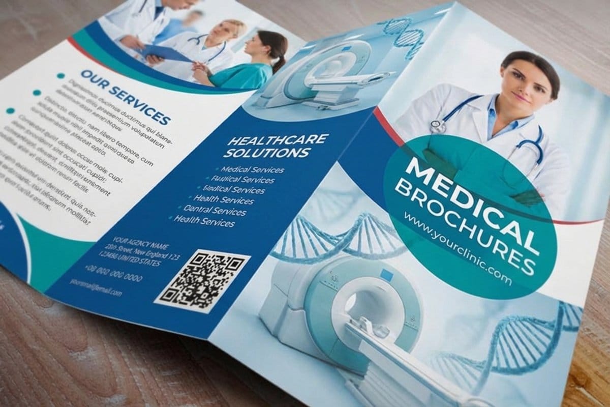
Medical office brochures get read at the worst possible moment: a patient reads one in a waiting room, after a diagnosis, or while deciding whether to book a procedure. That reader is not browsing. They want to feel reassured, informed, and respected in the space of a few seconds, and they decide how they feel about the practice before they finish the first panel. A brochure that looks rushed or cluttered reads as a practice that is rushed and cluttered, and that impression is hard to undo, the same way a scuffed lobby is hard to undo in person. The eight designs below are sorted by the job each one does, so you can pick the one your practice is missing.
The designs that work all do the same quiet job: they lower anxiety and answer the questions a patient is too nervous to ask out loud. Clean layout, plain language, honest photography, and a calm palette carry more trust than any stock image of a smiling doctor. This piece breaks down eight brochure designs that get it right, then the print specs that make them feel clinical and credible. For the basics of building one, the how to make brochures guide is a good starting point.
4OVER4.COM has printed patient material for clinics and dental offices since 1999, on the same presses that produce 10 billion+ products for 150,000+ organizations. That means a waiting-room brochure, a lobby rack card, and a referral mailer can all match, on brand and on time.
Shop the range
Medical printing
Brochures, cards, and signage that keep a clinic looking as organized as it runs.
Eight Medical Brochure Designs That Build Trust
Each of these solves a specific patient-communication problem. Pull the ones that fit your practice and the service you most need to explain. Under every design is the format we print it on most, the fold that suits it, and the panel count you have to work with, so you can go straight from the example to a file that fits.
1. The condition explainer
One condition, plain language, a simple diagram. It turns a scary diagnosis into something a patient can understand and act on. Give the diagram a full panel instead of squeezing it beside body copy: a flat 8.5" x 11" sheet folded into a tri fold patient brochure gives you six panels of 3.67" x 8.5", which is one panel for the diagram, one for what it means, one for what happens next.
2. The procedure walk-through
A folded brochure with one step per panel, from consult to recovery, so a patient knows exactly what to expect. Six tri fold panels map cleanly onto consult, prep, the procedure itself, the first day, the first week, and when to call the office. If the recovery instructions run long, step up to an 8.5" x 14" sheet rather than shrinking the type.
3. The new-patient welcome
Hours, insurance, parking, and what to bring, laid out clean so a first visit starts calm instead of confused. One line per item, insurance carriers in a single list, address and parking on the back panel where a patient looks while sitting in the car. Printed as a medical brochure on 100 lb gloss text it survives a glove box and a handbag.
4. The service menu
A clear list of what the practice offers, with the outcomes each service delivers, not just clinical names. Keep every service to one line and group them by area of care, so a patient scanning for the reason they came in finds it without reading the whole page. A slim rack card per service beats one crowded sheet listing all of them.
5. The prevention piece
Simple, friendly, and shareable, the brochure a patient takes home and a family member actually reads. One risk, one habit, one next step, written for the person who did not come to the appointment. This is the title worth reprinting for a screening month or a health fair, so lay it out to survive a reprint with only the date changed.
6. The specialist referral
A trust-building handoff that reassures a patient their care is coordinated, not fragmented. Name the specialist, say why the referral is being made, and explain who sends the records. Leave one clear white block for the front desk to write the appointment time by hand, because a printed panel with a handwritten time reads as a practice paying attention.
7. The FAQ layout
The questions patients ask most, answered in short, calm blocks that scan in a waiting room. Eight to ten questions is the ceiling: question in bold, answer in two sentences, no paragraph longer than the width of a panel. Anything that needs more room is its own brochure, not a longer answer.
8. The dental recall
A bright, reassuring reminder that pairs a service with an easy next step and a booking prompt. It is the one design in this set that has to work in an envelope stack, so the offer and the phone number belong on the outside panel. Sent as a direct mail brochure, one recall title can cover a whole quarter of lapsed patients.
The thread through all eight is restraint. A medical brochure that says one thing clearly beats one that says five things loudly. The rest of this piece is the print that makes that clarity feel credible.
Print picks
Three pieces that reassure patients
Live prices, ready to customize with your practice color, logo, and copy.
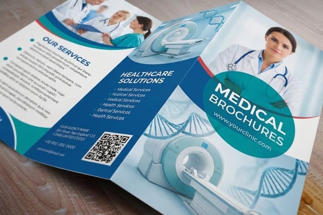 Medical Brochures From $57.11 The patient-education workhorse. Explain a condition, a procedure, or a service in one calm, clear piece, printed flat at 8.5" x 11" for the exam room or folded for the lobby display.
 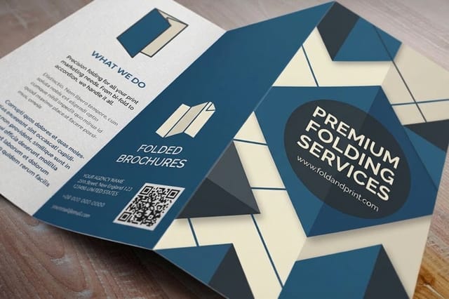 Folded Brochures From $57.11 Break a complex treatment into panels a patient can follow one step at a time. The tri fold patient brochure the front desk hands over after a consult, six panels, one idea each.
 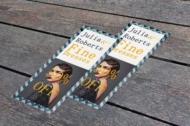 Standard Rack Cards From $42.84 The slim handout that fits a lobby display and a patient pocket alike. Print one card per service on 14 pt stock so the rack stays a menu instead of a pile.
 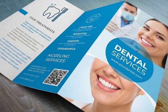 Dental Brochures From $57.11 A bright, reassuring recall piece for a dental practice.
 Match the Piece to the Patient Journey
A brochure in a lobby display does a different job than one mailed to a lapsed patient. Choosing the right format for each touchpoint is what makes a practice feel organized, and 4OVER4.COM prints the whole set so everything matches.
A medical brochure anchors the waiting room and the consult. A rack card slots into a lobby holder and a patient pocket for quick service handouts. And a direct mail brochure brings lapsed patients back with a recall or a new-service announcement. When a screening month or a health fair is close, Same Day Printing produces and ships qualifying orders the same day so the material is ready when the calendar is.
Not sure whether a brochure or a slimmer format fits a service? The rack cards vs brochures guide lays out the tradeoffs, and the medical printing collection gathers the pieces practices order together.
Design for a Nervous Reader, Not a Designer

The single biggest mistake in medical brochures is designing for the practice instead of the patient. Clinical jargon, dense paragraphs, and a wall of credentials serve the office ego, not the anxious reader. The fix is empathy: write to the question the patient is actually asking, and use the layout to make the answer easy to find.
Give the eye room to rest. Generous white space reads as calm and competent, while a crammed page reads as chaos. Use a fold to break a complex topic into digestible panels, one idea at a time, so a patient never faces a wall of text. The fonts and sizes guide helps keep body copy legible for older eyes, and brochure sizes and fold options shows which layouts suit a step-by-step explainer.
Set the panel structure first, then let the online design templates align your artwork inside the fold and bleed lines, so the finished piece looks as careful as the care you provide.
Printing the Brochure in a Second Language
A waiting room is rarely one language. If a real share of your patients read Spanish, Mandarin or Haitian Creole first, a brochure in English alone reaches some of them and not others, and the ones it misses are usually the ones with the most to ask.
Two ways to handle it. Print separate titles, one per language, which keeps every panel roomy and lets the front desk hand over the right one. Or run a two language layout, the same content mirrored across the fold, which halves your stock but crowds the type and doubles the proofreading.
Have a native speaker who works in healthcare read the translation before it prints, not a tool. Medical terms rarely map word for word, and a mistranslated instruction is worse than no brochure at all. Keep the diagram, the phone number and the address identical across every version, so the set still reads as one practice.
The Medical Brochure Content Checklist
Run every medical brochure past this list before it goes to press. It is the difference between a piece that reads clinical and one that has to be reprinted because a photo, a claim, or a patient detail should never have left the office.
Imagery a patient can sit with
Use photographs of your own lobby, your own team, and the equipment a patient will actually see, not a stock image of a smiling doctor. Skip surgical and wound photography in anything that lives in a waiting room; a simple line diagram carries the same information without raising a pulse. Any photograph of a real patient needs written permission on file before it is placed in the artwork.
Write it at the reading level of the room
Aim for a sixth to eighth grade reading level. Replace the clinical term with the plain one and put the clinical term in brackets after it, so a patient learns the word without needing it to understand the sentence. Keep sentences under about twenty words, keep body copy at a size older eyes can read, and check it against the fonts and sizes guide before you commit the layout.
Say what the piece is not
Educational material is not medical advice, and the brochure should say so in a small line on the back panel, along with the instruction to call the office or emergency services with anything urgent. If you name a result, an outcome, or a recovery time, say plainly that it varies by patient. Date the piece or carry a small revision code so the front desk knows which version is current when guidance changes.
Keep protected health information out of the artwork
No patient names, faces, chart numbers, dates of service, or insurance identifiers anywhere in the file, including the placeholder text a designer left in a layer nobody flattened. Screenshots of a chart system are the usual offender: rebuild the example with invented data instead of blurring a real one. Export a flat PDF, open it once more, and read every panel before upload.
Check the details that get you called
Phone number, hours, address, parking note, insurance list, and the booking link all get verified by someone who did not write the copy. A wrong digit on 5,000 pieces is a reprint, not an edit. Set the panel structure in the online design templates so the contact block lands on the same panel in every title you print, and the whole set reads as one practice.
Print Specs That Read Clinical and Credible
A flimsy brochure undercuts a message of competence before a patient reads a word. The stock and finish are part of the trust signal. A clean matte reads clinical and calm; a light gloss adds durability for a piece that lives in a busy waiting room and gets handled all day.
Here are real configurator numbers for medical brochures, so you can plan a waiting-room and referral set against actual pricing. Ordering in volume drops the per-piece cost, which suits a practice printing several titles at once.
Quantity and price
Medical brochure pricing and specs
Real configurator numbers. The more titles you print at once, the lower the per-piece cost drops.
| Quantity | Price Per Unit | Total |
|---|---|---|
| 50 | $1.14 | $57.11 |
| 100 | 82.4¢ | $82.38 |
| 200 | 53.3¢ | $106.55 |
| 300 | 41.0¢ | $123.02 |
| 400 | 34.9¢ | $139.49 |
| 500 | 31.2¢ | $155.97 |

Stock the Lobby and the Front Desk

The brochure that stays in a drawer educates nobody. Put the material where patients already stand: a lobby rack, the front desk, the exam room, and the checkout counter. A slim rack card is built for exactly this, sized to sit in a display holder and slip into a pocket on the way out.
Give each service its own quick card so the front desk can hand the right one to the right patient in a second. Pair the cards with your deeper medical brochures for patients who want the full picture, and see local print marketing campaigns for ideas on reaching new patients in your community.
Stock the lobby
Rack cards
The slim handout that fits a display holder and a patient pocket for quick service info.
How Many Brochures a Waiting Room Actually Needs
Practices either print far too many of one title or run out of the one that matters. Count instead of guessing. Take the patients you see in a month, decide what share of them a title is for, and that is the monthly draw.
A condition explainer only goes to the patients with that condition, so a specialist title moves slowly while a new patient welcome moves with every first visit. A rack card in a lobby holder disappears faster than a folded brochure, because people take those without being handed one.
Order a quarter of a year at a time for the titles that change and a full year for the ones that do not. Print the set together rather than one title at a time, since the price per piece falls with the run and the whole waiting room then matches. Keep a small reserve for health fairs, which clear a table faster than a month of appointments.
Stock the lobby
Rack cards
The slim handout that fits a display holder and a patient pocket for quick service info.
Compare Brochure Formats for Your Practice
Before you commit a practice budget to one format, line the options up on the specs that actually change an order: stock, finish, size, quantity, turnaround, and from-price. Seeing them together makes the right choice obvious for each patient touchpoint.
Here are popular brochure formats compared, so you can build a patient-education set that matches.
Compare formats
Popular brochures, side by side
Stock, finish, size, quantity, turnaround, and from-price across our most ordered brochures.
 Standard Brochures | 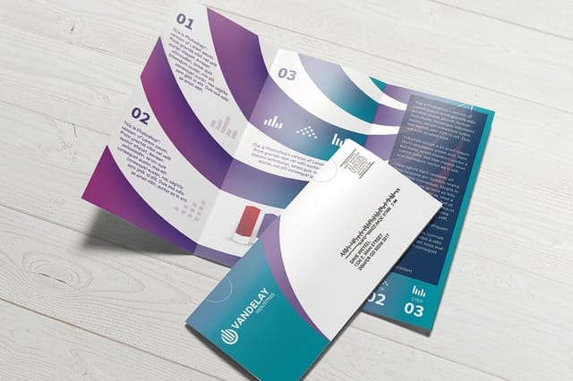 Direct Mail Brochures | Medical Brochures | 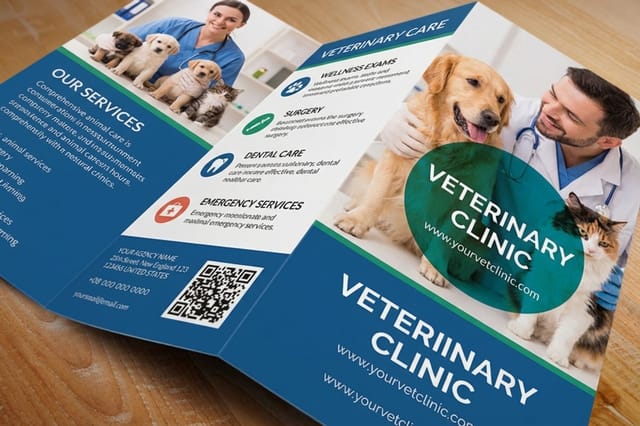 Veterinary Brochures | |
|---|---|---|---|---|
| Min price | $57.11 | $238.73 | $57.11 | $57.11 |
| Paper / stock | 100# Gloss Text | 100# Gloss Text | 100# Gloss Text | 100# Gloss Text |
| Finish | Standard Finish | Standard Finish | Standard Finish | Standard Finish |
| Size | 5.5" x 8.5" | 8.5" x 11" | 5.5" x 8.5" | 5.5" x 8.5" |
| Default qty | 50 | 500 | 50 | 50 |
| Turnaround | 3 business days | 6 business days | 3 business days | 3 business days |
| Rating | ||||
| View & customize | View & customize | View & customize | View & customize |
Bring Lapsed Patients Back With a Mailer
A brochure does not have to wait for a patient to walk in. A mailed piece reaches the patients who have drifted, the ones a screening reminder or a new-service announcement can bring back through the door. Direct mail still lands in a way an email never will, especially for a health message a family takes seriously.
A direct mail brochure carries the message and the postage-ready format in one. Here are the specs and live price so you can plan a recall or announcement mailing alongside your waiting-room set.
Reach lapsed patients
Direct mail brochures
A recall or new-service mailer in a postage-ready format that lands where email cannot.
Wally designs a medical brochure that calms a nervous reader
Plain language, honest layout, credible print
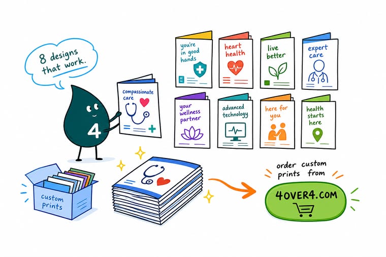
A medical brochure earns trust by answering the question a patient is too nervous to ask. Lead with reassurance, write in plain language, give the eye room to rest, and print it on a stock that reads clinical and competent. 4OVER4.COM prints brochures, lobby rack cards, and recall mailers that match, on time, so patient education looks as careful as your care.
Print patient-ready medical brochures →What a patient-friendly brochure gets right
Explore more
More ways to build patient trust with print
Related pages across 4OVER4.COM, one card each, so you can keep exploring brochures, rack cards, and medical print.
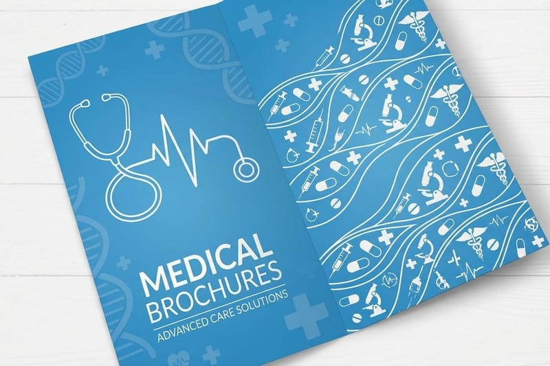 Collection Medical Printing Brochures, cards, and signage for clinics and offices.
  Shop Brochure Printing Every fold, stock, and size for patient education.
 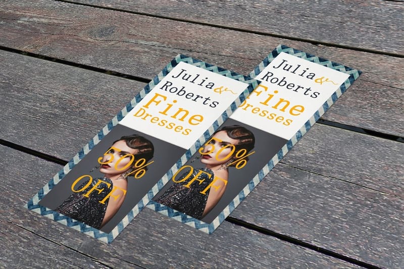 Product Rack Cards The slim handout for a lobby display and a pocket.
  Guide Rack Cards vs Brochures Which format fits which patient touchpoint.
 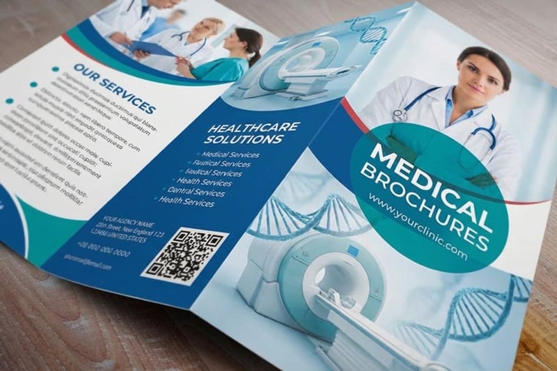 Guides Business Applications How print works for real organizations.
 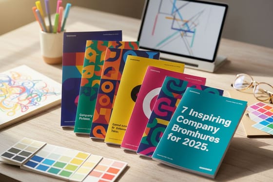 Article Company Brochure Examples Brochures that get the fundamentals right.
  Case study Service Marketing Ideas How service businesses build trust with print.
 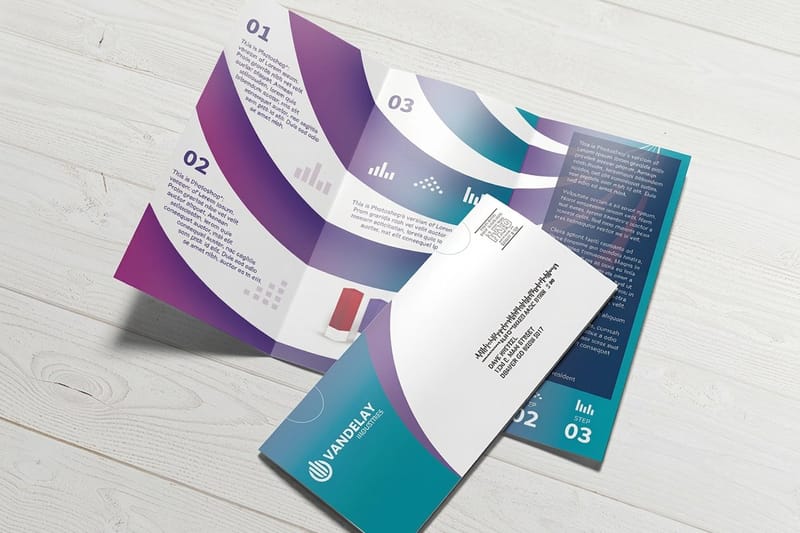 Product Direct Mail Brochures Bring lapsed patients back with a recall mailer.
  Benefit Same Day Printing Order today, ship today for a health fair.
  Service Online Design Templates Lay out your artwork inside the fold and bleed.
 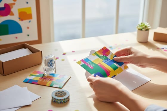 Guide How to Mail Brochures Postage and format rules for a patient mailing.
  Guide Fonts and Sizes Keep patient copy legible for every reader.
 Ready to print medical brochures patients trust?
Lead with reassurance, write in plain language, and print on a stock that reads clinical. 4OVER4.COM prints brochures, lobby cards, and recall mailers that match, on time, as fast as same day.
Designing for clinics, answered
What are the three types of brochures?
In print the three you meet most are the bi fold, which gives four panels, the tri fold, which gives six on a single letter sheet, and the z fold, which opens like a concertina and suits a step by step sequence. Beyond those, a booklet handles anything longer and a rack card handles anything shorter. For a clinic the tri fold does most of the work, because six panels map onto one idea per panel.
Where can I get free brochure templates?
Start with a template sized to the exact product you are printing, so the fold lines, the bleed and the safe margins are already right. 4OVER4.COM offers online design templates and print ready blanks for its brochure sizes at no cost, which is safer than a generic layout you have to rescale. A free template from a design tool can look right on screen and still put type across a fold.
How do I make a hospital brochure?
A hospital piece has to serve a bigger building than a clinic one. Start with the single job, admissions, a department, a procedure or wayfinding, and do not let one brochure carry all four. Name the department, the floor and the phone number on the outside panel, keep the inside to one idea per panel, and get sign off from the department, from compliance and from whoever owns that phone number. Then print it in the languages your patients actually read.
What makes a medical brochure design work?
A medical brochure works when it lowers a patient's anxiety and answers the question they are too nervous to ask out loud. That means plain language instead of jargon, one clear idea per piece, honest photography instead of stock, and generous white space that reads as calm and competent. The strongest designs are built for a specific moment in the patient journey: a condition explainer, a procedure walk-through, a new-patient welcome, or a recall reminder. For the basics of building one, start with the how to make brochures guide.
What information should a medical brochure include?
Include only what the patient needs to feel informed and take the next step. For a service or procedure, that is what it is, what to expect, how to prepare, and how to book. For a new-patient piece, it is hours, insurance, parking, and what to bring. Skip the wall of credentials and clinical names, and lead with outcomes and reassurance instead. Break a complex topic across the panels of a folded brochure so a patient meets one idea at a time rather than a wall of text.
Which format is best for a clinic: brochure or rack card?
Use both for different jobs. A medical brochure anchors the waiting room and the consult, with room to explain a condition or procedure in depth. A rack card is the slim handout that fits a lobby display holder and a patient pocket, ideal for a single service or a quick reminder. Many practices also mail a direct mail brochure to bring lapsed patients back. The rack cards vs brochures guide lays out the tradeoffs, and the medical printing collection gathers the pieces practices order together.
How do I choose the right medical brochure?
Start with the patient touchpoint you most need to serve, then match the format, stock, and quantity to it. Waiting-room education calls for a folded brochure with room to explain; a lobby handout calls for a rack card; a recall campaign calls for a direct mail brochure. Choose a clean matte for a clinical feel or a light gloss for durability in a busy space, and line the options up on stock, finish, size, and price before you commit a budget.
What do medical brochures cost, and how are prices set?
At 4OVER4.COM, Medical Brochures and Folded Brochures start at $57.11, Standard Rack Cards at $42.84, and Direct Mail Brochures at $238.73. Price depends on the format, the stock and finish, the size, and the quantity, and ordering more brings the per-piece cost down quickly, which helps a practice printing several patient titles at once. Check the exact configurator numbers on each product page, and the medical printing collection gathers the pieces practices order together.
