
10 Attractive Two-Color Combinations That Hold Up on Press


Emma is our prepress and print production voice, built from the knowledge of our production team, with over 20 years in printing.
The two-color combinations that stay attractive in print are the ones where a heavy dark build sits against a genuinely light one, and both are chosen from the CMYK numbers rather than the hex. The ten pairings below are written build first, hex second, with the total ink coverage of each half, because coverage is what decides whether the contrast you designed actually appears on the sheet.
Ten two-color combinations at a glance
| Pairing | Dominant color | Second color | Total ink | Where it works |
|---|---|---|---|---|
| Deep Teal and Warm Cream | 100 30 40 20 · #008F7A | 0 6 18 0 · #FFF0D1 | 190% / 24% | Business cards, salon and clinic branding |
| Oxblood and Bone | 25 100 80 35 · #7C0021 | 0 3 10 4 · #F5EDDC | 240% / 17% | Menus, wine and spirits, thick uncoated stock |
| Cobalt and Marigold | 100 65 0 0 · #0059FF | 0 35 100 0 · #FFA600 | 165% / 135% | Event flyers read across a room |
| Forest and Chalk | 85 30 100 20 · #1F8F00 | 0 0 8 6 · #F0F0DC | 235% / 14% | Farm, garden and outdoor retail postcards |
| Charcoal and Safety Orange | 0 0 0 85 · #262626 | 0 65 100 0 · #FF5900 | 85% / 165% | Trade, construction and industrial signage |
| Electric Violet and Blush | 55 95 25 15 · #610BA3 | 0 22 12 0 · #FFC7E0 | 190% / 34% | Beauty, music and nightlife posters |
| Slate Blue and Rust | 15 75 95 5 · #CE3D0C | 70 45 25 10 · #457EAC | 190% / 150% | Editorial covers, coffee and craft packaging |
| Deep Navy and Mustard | 100 80 30 40 · #001F6B | 5 25 95 5 · #E6B60C | 250% / 130% | Finance, legal and consultancy cards |
| Sage and Terracotta | 5 60 70 8 · #DF5E46 | 30 8 35 12 · #9DCE92 | 143% / 85% | Wellness, ceramics and food postcards |
| Rich Black and Gold Foil | 60 40 40 100 · rich black | No CMYK build · foil or spot ink | 240% / none | Invitations and premium business cards |
Total ink is the sum of the four channel percentages in the build. The first figure is the dominant color, the second is the accent. Anything over 300 percent risks setting off and slow drying on coated stock. You can test any of these on standard business cards straight from the configurator.
Why some pairings look right on screen and wrong on paper

Your monitor mixes light and the press mixes ink, and the two do not have the same reach. Vivid RGB blues, hot pinks and pure neon greens sit outside what four process inks can reproduce, so the file that glowed on screen comes back a shade duller and slightly gray. That is not a printing fault. It is the gamut, and it is the first thing to design around.
The practical move is to choose the pairing by its CMYK build and treat the hex as a preview of that build. Every combination below is written build first, hex second, in that order for a reason. If you want the reasoning behind the numbers, our guide to CMYK values for print walks through what each channel percentage is actually doing.
Two things then decide whether the pairing survives the press. The dark half has to stay under the ink limit so the sheet can dry and the detail does not fill in. The light half has to stay light enough that its screen prints as a smooth field rather than a visible dot pattern.
Read the build, not the swatch name
Take Deep Navy at 100 80 30 40. Those numbers add up to 250 percent coverage, which is heavy but inside a normal 300 percent limit for coated sheetfed work. Now take Warm Cream at 0 6 18 0, which is 24 percent. The gap between the two is what your eye reads as contrast, and it is visible in the numbers before anything is printed.
Run the same check on a pairing you like and you will predict its behavior in about ten seconds. Two colors within roughly 40 percentage points of each other will fight; one will not sit clearly on top of the other, and headline type set in the lighter one loses its edge.
The colors that will not convert
Bright orange-red, electric blue and any fluorescent are the usual casualties. There is no combination of cyan, magenta, yellow and black that reaches them, so the conversion lands on the nearest printable neighbor and the pairing loses its punch. If the brand depends on one of those colors, it belongs in a spot ink rather than a process build. The two-color printing with Pantone or spot inks guide covers when that is worth paying for.
Gold and silver are a separate case. They are not colors, they are surfaces, and the metallic look comes from foil or a metallic ink that reflects light. A CMYK build of mustard yellow reads as mustard yellow, never as metal. The difference is laid out in gold foil against metallic gold ink.
The ten pairings, and where each one belongs

Each pairing below is written as build then hex, with a note on what it does on paper and what it does badly. They are grouped by the job rather than by hue, because the same two colors behave differently on a 16pt card and on a 100lb poster sheet.
None of them are expensive to try. Standard business cards start at $17.57 and standard flyers at $39.54, which is inside the budget for printing two candidate palettes and choosing with the real sheets in your hand.
Pairings one to five: high contrast, low risk
1. Deep Teal and Warm Cream. Teal at 100 30 40 20 against cream at 0 6 18 0. The teal is a single dominant channel with support, so it stays consistent across a run, and cream is warm enough to keep white space from looking clinical. Best on coated stock, where the teal holds its depth.
2. Oxblood and Bone. 25 100 80 35 against 0 3 10 4. This is the pairing for uncoated and textured sheets, because oxblood is already dark enough that the extra dot gain of an uncoated stock reads as richness rather than mud. On gloss it can look slightly plastic.
3. Cobalt and Marigold. 100 65 0 0 against 0 35 100 0. Both halves are loud, which is the point when a flyer has to work from across a room. Do not set body copy in this pairing. Complementary saturation at small sizes makes the letters vibrate.
4. Forest and Chalk. 85 30 100 20 against 0 0 8 6. A quiet, natural pair that photographs well and does not compete with product imagery. The chalk sits at 14 percent ink, so on uncoated it can almost disappear. Nudge it up a couple of points if you need it to read as a field rather than as paper.
5. Charcoal and Safety Orange. 85K flat against 0 65 100 0. The charcoal is a single channel, which means no registration risk at all, so this is the pairing to use when the piece carries a lot of small type. Orange is the accent, never the background.
Pairings six to ten: for when the piece has to feel considered
6. Electric Violet and Blush. 55 95 25 15 against 0 22 12 0. Violet is one of the trickier process builds because it drifts toward blue if the magenta runs light, so ask for a press proof rather than trusting the screen. Blush at 34 percent gives the violet somewhere to sit.
7. Slate Blue and Rust. 70 45 25 10 against 15 75 95 5. Neither half is a bright color and that is why it works on editorial covers and packaging. Both sit in the middle of the ink range, so contrast comes from hue rather than weight. Use a size difference to compensate.
8. Deep Navy and Mustard. 100 80 30 40 against 5 25 95 5. The safest pairing on this list for professional services, and the one most likely to survive a bad print job, because navy at 250 percent is forgiving of small density shifts. Print it on soft touch business cards and the navy goes velvety.
9. Sage and Terracotta. 30 8 35 12 against 5 60 70 8. Both halves are muted, so this pairing lives or dies on stock choice. On a warm uncoated sheet it looks intentional. On bright white gloss it can look washed out.
10. Rich Black and Gold Foil. Rich black at 60 40 40 100 with foil as the second color. This is the only pairing here where the second color is not printed at all. Foil is stamped, which is why it costs more per piece and why it looks like nothing a process build can fake. See it on foil business cards.
Making the pairing survive the stock

The same two builds print differently on coated and uncoated paper. Uncoated fibre absorbs ink, the dots spread, and every screen lands darker and softer than the file suggests. Coated stock holds the dot, so colors stay closer to the proof and gloss adds apparent saturation on top.
That means a pairing tuned on gloss cover needs its light half opened up before it goes on uncoated, and its dark half checked so the shadow detail does not close. The reverse is also true: a palette built for uncoated warmth can look thin and cold on a bright coated sheet.
Set your document in the right profile before any of this matters. Choosing the right color profile and working in CMYK rather than RGB are what stop the conversion happening by accident at the last step.
Where the pairing meets small type
Any color built from more than one channel needs those channels to land on top of each other. At poster size a hair of misregistration is invisible. At 7pt on a business card it shows as a colored fringe on every letter. Keep small type, rules and fine line art in a single channel, and reserve the multi-channel color for areas big enough to forgive a slight shift.
This is also why reversed-out type on a heavy dark field is riskier than it looks. The letters are made of paper, and their edges are defined by four separate ink screens. Bump the type size, add weight, or reverse out of a single-channel black instead.
Proof the pairing before you commit the run
Print both candidate palettes on the actual stock at the actual size, then look at them in the light the piece will live in. Showroom lighting, office fluorescents and daylight will each pull the pairing a different way, and a palette that only works under one of them is not finished.
If the brand color has to match something existing, work from a Pantone reference rather than a hex. Our guide on matching Pantone to CMYK explains which spot colors convert cleanly and which ones never will.
What it costs to print the palette
Printing two colors on a four-color press costs the same as printing all four, so testing a palette costs the ordinary product price: 100 standard business cards from $17.57 and a run of standard flyers from $39.54 put both candidate pairings on real stock. A pairing with no CMYK build is the exception; it needs foil, and foil business cards run 500 for $222.13 in 9 business days. The table below shows how the price per piece steps down as the run grows, straight from the live configurator.
Quantity and price
Business card pricing and specs
Real configurator numbers, where a larger run brings the per card cost down and the palette stays identical.
| Quantity | Price Per Unit | Total |
|---|---|---|
| 100 | 17.6¢ | $17.57 |
| 200 | 11.5¢ | $23.07 |
| 300 | 9.15¢ | $27.46 |
| 400 | 7.96¢ | $31.86 |
| 500 | 7.25¢ | $36.26 |
| 600 | 6.77¢ | $40.64 |

You can also earn coins on every order and redeem them against later printing, which makes running a second palette test easier to justify.
Stock and finish change the pairing
Finish is part of the palette, not a decision made afterwards. Gloss raises apparent saturation and makes a cobalt look deeper than it measures. Matte lowers glare and reads calmer, which suits the muted pairings such as sage and terracotta. Soft touch mutes everything slightly and gives dark builds a velvet depth that gloss cannot produce, which is why navy behaves so well on it.
Print it
Business cards, ready for your palette
Preset sizes and stocks, the quickest way to see a two-color build on paper rather than on a screen.

Uncoated is the outlier and deserves its own test. It absorbs ink, so every screen prints darker and softer than the proof, and a light half built at 14 percent can lose its crispness. Open the light tint a few points, keep the dark half clear of the ink limit, and uncoated will reward you with a palette that looks made rather than printed. For larger pieces where the same rules apply at a different scale, see the colors that stay visible on signage, and for wearables, ink and garment color pairings.
Choosing a pairing for your industry
The right pairing depends on what the piece has to do and who picks it up, so here is a quick breakdown by business type.
- Professional services. Deep Navy and Mustard, or Charcoal and Safety Orange. Both keep small type in a single channel, which matters on a card carrying an address, a phone number and a title.
- Food, drink and hospitality. Oxblood and Bone on uncoated menus, Sage and Terracotta on postcards. Warm stock does half the work, so the builds can stay muted.
- Events and nightlife. Cobalt and Marigold, or Electric Violet and Blush. Both are built to read at distance on a flyer or a poster, not to carry paragraphs.
- Retail and product brands. Forest and Chalk keeps packaging photography as the loudest thing on the page, which is usually what you want on a product postcard.
- Anything premium. Rich Black and gold foil. It is the one pairing on this list a competitor cannot match with a cheaper process build, because foil is a surface rather than a color.
Test the pairing on a real blank
Testing a palette is faster when the layout already exists. Use the 3.5" x 2" business card blank for a logo and name test and a flyer blank for a large field of color, since a pairing that works at card size can band or overpower at sheet size. The trim and the 0.125 inch bleed are already marked, so the two colors land where you put them. Pull a print-ready blank from the blank template library and drop the builds straight in.
Start fast
Test the pairing on a real blank
Card design templates and exact size blanks so your palette lands inside the cut line.














Wally adds up the ink before he approves the palette
Two colors, two numbers, one decision
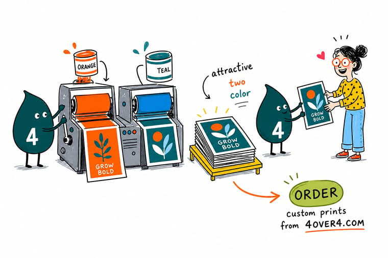
Add the four channel percentages of each color in your pairing. Keep the dominant one at or under 300 percent so it dries and holds detail, keep the accent well under 25 percent so it prints smooth, and leave a wide gap between the two so the contrast survives the press. Set small type in a single channel, then print the pair on the real stock before you order the run.
Print your palette test →What to remember about two-color palettes
Design tips that hold at every size
- Pick the build first. Choose the pairing from the CMYK numbers and let the hex be the preview. Working the other way round is how a palette gets approved on screen and rejected on paper.
- Keep a real gap in ink weight. If both halves land within roughly 40 percentage points of coverage, they will read as equals and the hierarchy collapses. One color should clearly sit on top.
- Give small type one channel. Set anything under about 8pt in 100K or another single channel. Registration cannot fringe an ink that is printing alone.
- Open the light half for uncoated. Uncoated sheets darken every screen. A 14 percent tint that looked clean on the proof can go grubby, so lift it before the run.
- Use the second color sparingly. The pairings that look expensive use the accent on perhaps a fifth of the surface. Splitting a page evenly between two strong colors is what makes it look busy.
Explore more
More ways to print and promote
Foil business cards run 500 for $222.13 in 9 business days, which is the route for a pairing with no CMYK build.
Product Standard Business Cards The cheapest way to see a palette on real stock. Product Standard Flyers Where a loud pairing earns its keep at distance.  Product Standard Postcards Two colors, one message, sent to a mailing list.
 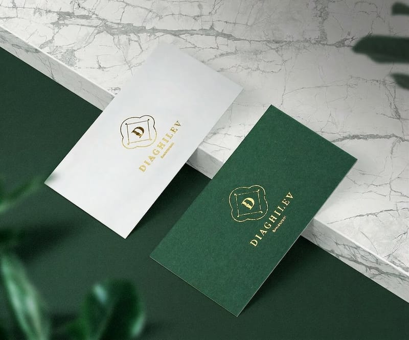 Product Foil Business Cards The second color that no process build can fake.
 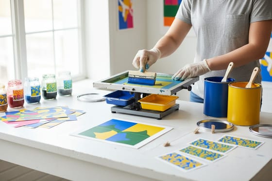 Guide Two-Color Printing With Spot Inks When a Pantone run beats a four-color build.
  Category Business Card Printing Every stock and finish your palette can land on.
 Ready to see your palette on paper?
Pick your product, drop in the build or start from a free template, and 4OVER4.COM prints it on premium stock as fast as your deadline needs.
Common questions about two-color combinations
What is the best two color combination for print?
There is no single best pairing, but the ones that work share a shape: a dark color built from two or three strong channels, set against a light color under about 25 percent total ink. Deep Navy at 100 80 30 40 with Mustard at 5 25 95 5 is the most reliable on this list for professional work, and Charcoal at 85K with Safety Orange at 0 65 100 0 is the safest when the piece carries a lot of small type, because the charcoal prints in one channel and cannot misregister. Pick by the build, then confirm it on the stock you are actually printing.
Why does my color look different in print than on screen?
Your screen makes color by emitting light and the press makes it by absorbing light through layers of ink, so the two cover different ranges. Saturated blues, bright orange-reds and any fluorescent sit outside what cyan, magenta, yellow and black can reach, and the conversion pushes them to the nearest printable neighbor. Paper adds a second shift: uncoated stock absorbs ink and darkens every screen, while coated stock holds the dot and stays closer to the proof. Setting the document in a print color profile from the start removes most of the surprise.
How do I convert a hex color to a CMYK build for printing?
Convert inside your design application with a print profile selected rather than using an online converter, because the result depends on the profile and the stock. Then review the numbers by hand. A build that comes back as four channels all sitting in the middle, something like 60 55 55 30, will print as a muddy neutral and is usually better rebuilt with one dominant channel. Check the total of the four percentages too, and keep it at or under 300 percent for coated sheetfed work.
Can I print two colors without paying for four-color printing?
On a digital or offset four-color press, printing only two colors costs the same as printing all four, because the sheet passes through the same units either way. A genuine two-color job with spot inks is a different process and it makes sense for two reasons: an exact brand color that CMYK cannot reach, and long runs where the ink saving becomes real. For most short runs the four-color press is cheaper and gives you the whole palette, so use two colors as a design decision rather than a cost-saving one.
Which stock should I print a two-color palette on?
Match the stock to the darker half. Deep, heavy builds like oxblood or forest look richer on uncoated because the fibre softens them, while clean saturated colors like teal and cobalt keep more of their depth on coated stock. Muted pairings such as sage and terracotta need a warm sheet or they look washed out. Whatever you choose, print the palette on that exact stock at the real size before ordering the run, because the proof and the finished sheet are never quite the same color.
