
29 T-Shirt and Ink Color Combinations to Make Your Design Pop


Jordan is our labels, packaging and sustainability voice, built from the knowledge of our production team, with over 20 years in printing.
How T-Shirt and Ink Color Combinations Actually Work
The best t-shirt and ink color combinations pair a garment and an ink far apart in value, such as black ink on a white shirt or white ink on navy, because a shirt behaves like neither a screen nor a sheet of paper. The garment color is a solid background you cannot turn off, the ink sits on top of a woven texture, and the whole thing gets judged from across a room rather than at arm’s length. That is why a palette that looks beautiful in a design file can turn into a muddy blob on a tee.
The combinations below are grouped by shirt color, because that is the real starting point. Pick the garment first, then choose ink that has somewhere to go against it. Every pairing here has been chosen for one reason: the design still reads when someone walks past you.
Across its whole catalog, 4OVER4.COM has printed 10 billion+ print products since 1999, and the same color rules that keep a design sharp on fabric keep it sharp on cards, stickers and signage. If your shirt palette is going to become a brand palette, it needs to survive both.
Step 1: start with the shirt, not the artwork
Choose the garment color your audience will actually wear. A staff tee, a band shirt and a giveaway shirt all live in different rooms. Once the shirt is locked, half of your ink decisions are already made for you.
Step 2: check contrast, not vibe
Squint at the pairing or convert it to grayscale. If the shirt and the ink land at a similar gray value, the design will disappear from six feet away no matter how good the color story sounds on paper.
Step 3: decide whether the ink needs an underbase
Light ink on a dark shirt needs a white layer printed underneath, or the garment color bleeds through and dulls everything. That extra layer changes the hand feel, the opacity and the cost, so plan for it early.
Step 4: proof the combination at real distance
Print the mockup, tape it to a wall and walk ten steps back. Thin strokes, tight counters and low contrast reveal themselves instantly. Fix them before the screens are burned, not after the box arrives.
Color, solved
Pairings that work on fabric and paper
Ten tested brand combinations you can lift straight onto a shirt or a card.

T-Shirt and Ink Color Combinations at a Glance
A t-shirt design color combination works when the ink and the garment sit far apart in value. Five pairings from the 29 below cover most jobs, from a staff tee to retail merch.
- White shirt, black ink. The most legible pairing, the safe choice for a logo and small text.
- Black shirt, white ink. Reads even harder at distance; plan a white underbase for any light color.
- Navy shirt, white ink. Dressier than black, for staff and corporate events.
- Heather gray shirt, black ink. The retail pairing; expect the ink to print a shade softer on the mixed fibers.
- Maroon shirt, gold ink. Collegiate and ceremonial, and still legible from across a gym.
Best Color Combos for Custom Apparel You Order Online
For custom apparel printed in full color, the garment choice is the combination. Premium t-shirts come in white or black, sizes S to XXL, with an 8.5" x 11" print area on the front, the back or both, from $21.96 for one shirt.
- On a white shirt. Dark and saturated artwork, navy, forest green, burgundy or a full-color photo, holds its contrast.
- On a black shirt. White, safety yellow, gold or metallic-look artwork, with thin lines kept bold enough to read.
- For a team order. Print the light-shirt and dark-shirt versions of one design so every size and color stays on brand.
High-Contrast Combinations That Read From Across the Room
Start here if the shirt has a job to do. Event staff, volunteers, trade show teams and anything with a logo people need to spot in a crowd all want maximum value separation between garment and ink, the gap you see when you turn the pairing to grayscale and the design still stands out. These five are the workhorses, and each one reads from ten steps away.
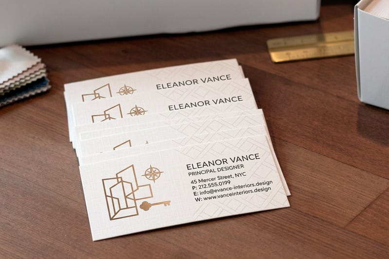
High contrast also forgives fine detail. Thin serifs, small taglines and one-color line art survive on these pairings when they would smear on anything softer. Carry the same combination onto your Interior Design Business Cards and the shirt and the card start to feel like one system. For pairings that already worked on fabric, browse these custom t-shirt designs printed by 4OVER4.COM customers.
- 1. White shirt with black ink. The default for a reason. Nothing else gives you this much detail per dollar, and it never dates.
- 2. Black shirt with white ink. The reverse reads even harder at distance. Ask for a soft-hand white so it does not feel like a plastic patch.
- 3. Navy shirt with white ink. Slightly warmer and dressier than black, which is why it dominates corporate and nautical merch.
- 4. White shirt with navy ink. Softer than pure black, more considered, and a better match for brands that use blue anywhere else.
- 5. Black shirt with safety yellow ink. Loud, sporty and impossible to miss. Best on bold shapes rather than delicate type.
If you only ever order two versions of a design, make them the light-shirt version and the dark-shirt version. That covers almost every size run and every skin tone preference in a group order without a second art file.
Print picks
Three color-critical cards to match your merch
Live prices, ready to customize with the palette you just chose.
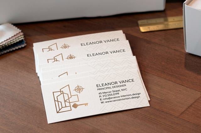 Interior Design Business Cards 100 for $17.57 Built for people who live in swatches, with color reproduction that holds true.
 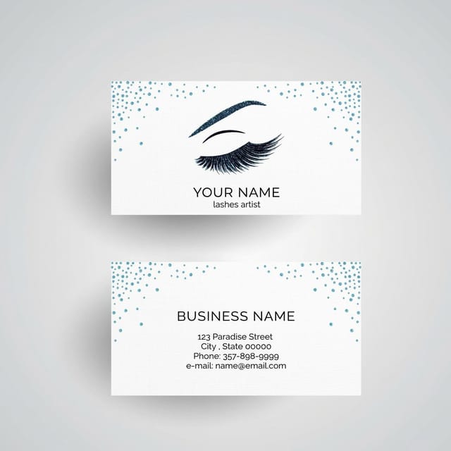 Make Up Artist Business Cards 100 for $17.57 Warm skin tones and saturated brand color on the same card, printed clean.
  Metallic Ink Business Cards 500 for $126.32 The paper answer to metallic shirt ink, with real shimmer that catches light.
 Warm Shirt Colors With Ink That Lifts Them
Warm garments are having a long moment. Sand, cream, mustard and rust read as considered rather than corporate, and they photograph beautifully. The trick is resisting the urge to print warm ink on a warm shirt without enough value separation, which is where most of these designs go flat.
- 6. Sand shirt with chocolate brown ink. Earthy, vintage and quietly premium. Perfect for coffee shops, outfitters and anything hand-drawn.
- 7. Cream shirt with terracotta ink. Softer than red, warmer than orange, and flattering on almost everyone in a group photo.
- 8. Mustard shirt with deep navy ink. The value gap does the work while the hues stay friendly. A great festival and market-stall pairing.
- 9. Rust shirt with cream ink. A reversed warm palette that feels like a seventies poster without becoming a costume.
- 10. Peach shirt with burgundy ink. Gentle contrast for delicate line work, script type and small-run boutique merch.
Warm palettes reward texture. Distressed halftones, rough edges and a slightly faded print sit naturally on these garments, and they hide the small imperfections that a flat solid would expose.
Dark Shirts and the Inks That Survive Them
Dark garments are the most forgiving to wear and the least forgiving to print. Everything light needs an underbase, everything mid-tone risks sinking into the fabric, and anything too saturated can end up looking like it glows. These are the pairings that hold up after ten washes.
- 11. Charcoal shirt with soft white ink. Gentler than black and white, and the off-white keeps it from looking clinical.
- 12. Forest green shirt with cream ink. The outdoors palette. Warm ink stops the green from turning cold and institutional.
- 13. Maroon shirt with gold ink. Collegiate, ceremonial and instantly readable. Keep the gold to shapes and heavy type.
- 14. Royal blue shirt with neon orange ink. Maximum energy for teams, camps and anything that needs to be seen on a field.
- 15. Purple shirt with pale mint ink. An unexpected pairing that stays legible because the value gap is wide.
A few more for dark garments where you want the print to do something the shirt cannot do on its own:
- 16. Black shirt with metallic silver ink. Reflective rather than bright, so it changes as the wearer moves.
- 17. Navy shirt with dusty pink ink. Muted, modern and far easier to wear every day than a high-chroma pink.
- 18. Dark heather gray shirt with white ink and a thin black keyline. The keyline redraws edges the heather would otherwise blur.
- 19. Black shirt with a full-color image over a white underbase. The only reliable way to keep photographic color accurate on dark fabric.
Soft, Muted and Heather Shirts for Retail-Feel Merch
Heather and washed garments are what people actually keep. The fibers are mixed, so the surface is never a flat color, and ink sinks in slightly rather than sitting on top. Expect every print to land one or two shades softer than the swatch, and choose combinations that use that softness instead of fighting it.
- 20. Heather gray shirt with black ink. The safest retail pairing in existence, and still the best seller in most drops.
- 21. Athletic heather shirt with burnt orange ink. Sporty without shouting, and it holds up under a distressed texture.
- 22. Sage shirt with off-white ink. Low contrast on purpose, for designs meant to be discovered up close.
- 23. Dusty blue shirt with rust ink. Complementary hues at muted saturation, which is why it feels expensive.
- 24. Oatmeal shirt with forest green ink. Clean, natural and the easiest sell for wellness, plant and outdoor brands.
Because these shirts sit in the middle of the value range, keep your ink either clearly darker or clearly lighter than the garment. Anything in between reads as a smudge from a distance, however good the hue looks in the file. Once the pairing passes that test, order it through our custom t-shirts printing.
Quantity and price
Metallic ink pricing and specifications
Real configurator numbers. Specialty ink behaves the same way on card as it does on cotton.
| Quantity | Price Per Unit | Total |
|---|---|---|
| 500 | 25.3¢ | $126.32 |
| 1,000 | 15.9¢ | $159.28 |
| 2,500 | 10.3¢ | $258.12 |
| 5,000 | 7.14¢ | $356.98 |
| 10,000 | 6.65¢ | $664.51 |
| 15,000 | 5.82¢ | $873.21 |

Bold Color-on-Color Combinations for Teams and Events
When the shirt itself is a statement, the ink has to earn its place. Saturated garments limit your options fast, so the winning move is usually one high-contrast ink and a design built from confident shapes rather than fine detail. These five are the ones that survive a crowd, a stadium and a phone camera.
- 25. Red shirt with white ink. The loudest legible combination there is. Sports, promos and anything meant to be photographed.
- 26. Kelly green shirt with white ink. Crisp and celebratory, and it keeps small type readable where a lighter green would not.
- 27. Light blue shirt with navy ink. A tonal pairing that still reads, because the value gap is doing quiet work.
- 28. Pink shirt with deep teal ink. A modern complementary pair that avoids every cliche pink usually attracts.
- 29. Yellow shirt with royal blue ink. Primary energy handled well. Ideal for kids, camps and volunteer crews.
Give bold garments one ink color and one accent at most. Three or more screens on a saturated shirt starts to compete with the shirt itself, and the design loses the fight almost every time.
Color-critical stock
Interior design business cards
Built for people who judge color for a living, so your palette lands the way you specified it.

Ink Types Change the Color More Than You Expect
The same hex value prints as several different colors depending on the ink system. Before you sign off on a combination, decide which ink you are actually buying, because opacity, texture and finish shift the result far more than a small tweak to the color itself.
- Plastisol. Sits on the fabric, stays opaque and holds the brightest color, especially on dark garments.
- Water-based. Soaks into the fibers for a soft feel, and lightens noticeably on anything darker than the ink.
- Discharge. Removes the garment dye and replaces it with pigment, which gives soft prints but shifts the final tone by shirt brand.
- Puff. Raises the print off the surface, so the color reads slightly lighter on the highlights and darker in the shadow.
- Metallic and specialty. Reflects rather than glows. Judge it under the light where the shirt will be worn, not on a screen.
Ink behavior on fabric mirrors ink behavior on paper, which is why the color decisions you make here should match the ones you make for your printed materials. The color and ink in commercial printing guide covers how the same pigments behave on coated and uncoated stock.
Ink in practice
See how saturated ink prints
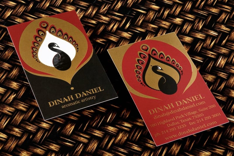
A card built around bold color and skin tones, which is the hardest combination any ink system has to handle.
Combination Mistakes That Flatten a Good Design
Most failed shirts are not failed drawings. They are good artwork placed on the wrong garment, or printed in an ink that could never deliver what the file promised. These are the five errors that show up again and again in reprints.
- Matching values instead of hues. A mid-blue design on a mid-gray shirt vanishes at distance even though the colors are different.
- Trusting the screen. Backlit color always looks brighter and cleaner than pigment sitting on cotton. Judge from a printed proof.
- Forgetting the underbase. Light ink on a dark shirt without a white layer comes back dull, patchy and nothing like the mockup.
- Too many screens. Every added color multiplies registration risk and cost, and rarely improves how the design reads.
- Ignoring the fabric. A heather, a tri-blend and a ring-spun cotton in the same nominal color will each shift your ink differently.
Fixing any one of these usually rescues the whole design. When you are stuck between two options, choose the one with the wider value gap and the simpler layout, then let layout principles handle the rest.
Compare finishes
Popular business cards, side by side
Stock, finish, size, quantity, turnaround and price, so the palette lands on the right surface.
 free business cards |  Standard Business Cards |  3D Lenticular Business Cards |  Metallic Foil Business Cards | |
|---|---|---|---|---|
| Min price | Free | $17.57 | $690.88 | $222.13 |
| Paper / stock | 14pt Gloss Cover | 14pt Gloss Cover | 31pt Lenticular Lens | 16 Point Silk Laminated |
| Finish | - | Standard Finish | - | - |
| Size | 2" x 3.5" | 2" x 3.5" | 2" x 3.5" - Vertical | 2" x 3.5" |
| Default qty | 200 | 100 | 500 | 500 |
| Turnaround | 5 business days | 3 business days | 22 business days | 7 business days |
| Rating | ||||
| View & customize | View & customize | View & customize | View & customize |
Carrying the Palette From the Shirt to the Rest of Your Print
Put the shirt palette on the rest of your print as well: the same two or three colors on metallic ink business cards, 500 for $126.32, on your packaging inserts and on your signage, so people recognize you before they read a word. That is the difference between merch and a brand.
Take the winning combination and test it on paper, where the ink can be measured and repeated exactly. Order it on Metallic Ink Business Cards if the shirt used a metallic, or keep it flat and clean on Make Up Artist Business Cards if the palette is built on saturated color and skin tones. The branding color pairings guide shows which combinations survive across both surfaces.
Match the finish to the combination
- High-contrast palettes. Clean, uncoated stock so the color reads exactly as it does on the shirt.
- Warm, earthy palettes. Natural or kraft-feel stock that continues the fabric story onto paper.
- Metallic accents. Metallic ink or foil, which behaves on card the way specialty ink behaves on cotton.
- Muted, tonal palettes. A soft-touch or matte finish so nothing turns glossier than the garment.
Start fast
Templates and print-ready blanks
Free layouts plus exact-size blanks so your color combination lands inside the trim every time.




Wally helps you commit to a combination
Pick the shirt, check the contrast, then print the palette everywhere
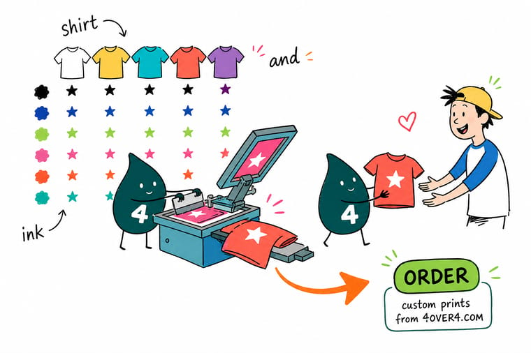
Stuck between four palettes? Wally uses one test. Convert the shirt and the ink to grayscale and look at the gap between them. Wide gap, the design reads from across a room. Narrow gap, it disappears and no amount of styling saves it. Once the combination passes, lock it in and run the same two colors across your cards and signage so everything looks deliberate.
Print your palette on cards →Making a Combination Feel Like Yours
Keep reading
Guides that go deeper on color and ink
Color and ink in commercial printing, ten color pairings for branding and layout principles, the technical side of the combinations above.
 Guide Best Color Combinations for Branding Ten pairings that work on fabric and on paper.
  Guide Color and Ink in Commercial Printing How pigment, stock and coating change your color.
  Guide Graphic Design Layout Principles Hierarchy and spacing that keep a design readable.
 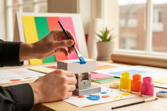 Guide How to Make Painted Edge Cards Add a color edge that echoes your ink choice.
 Explore more
More color and print thinking across 4OVER4.COM
Metallic ink cards run 500 for $126.32 on 16pt gloss, so a shirt palette can carry onto paper.
Guide Best Color Combinations for Branding Ten pairings that hold up on fabric and paper. Guide Color and Ink in Commercial Printing What actually happens between file and finished ink. Guide Graphic Design Layout Principles Keep artwork legible before you choose a palette. Guide How to Make Painted Edge Cards A color edge that echoes your ink combination.  Guide How to Make Bookmarks A small format that shows a two-color palette fast.
  Article 18 Spot UV Designs That Shine Finish as a color effect, not just a coating.
  Article Name Badge Design Ideas Match badges to the team shirt palette.
  Article Custom Outdoor Banners for Events Color that has to read from much further away. Product Metallic Ink Business Cards The paper version of metallic shirt ink. Product Interior Design Business Cards Color-critical cards for people who work in swatches.
 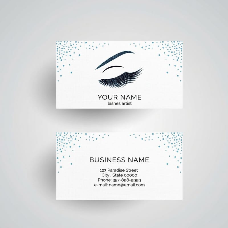 Product Make Up Artist Business Cards Saturated color and skin tones printed together.
 Ready to take the winning combination off the shirt?
Pick the pairing that reads best at ten feet, then print it on cards so your merch, your brand and your handouts all speak the same color language.
T-Shirt and Ink Color Questions, Answered
What are the best t-shirt and ink color combinations?
The most reliable combinations are the high-contrast ones: white shirt with black ink, black shirt with white ink, navy with white, white with navy, and heather gray with black. They read from across a room, keep fine detail intact and cost the least to print because they need a single screen. Everything else on this page is a variation on that same contrast principle applied to warmer, darker or more muted garments.
How do I choose the right t-shirt and ink color combination?
Lock the garment color first, then test the pairing in grayscale. If the shirt and the ink land at a similar value, pick a lighter or darker ink until the gap is obvious. After that, decide how much detail the artwork carries, because thin type and small marks need more contrast than bold shapes do. Finally, confirm the ink system, since plastisol, water-based and discharge each render the same color differently on fabric.
How much does custom color printing cost and how are prices set?
Price follows the number of ink colors, the quantity, and whether a white underbase is needed. Each additional color means another screen and another pass, and a dark garment adds the underbase on top of that. Print pricing on 4OVER4.COM works the same way: Metallic Ink Business Cards start at $126.32 because of the specialty ink, while Interior Design Business Cards start at $17.57. The metallic ink business cards video shows that specialty ink on a finished card.
Which ink colors work best on dark shirts?
Anything with enough opacity to sit above the garment. White, cream, soft white, gold, metallic silver and pale pastels all perform well because they are printed over a white underbase that stops the shirt color from bleeding through. Avoid mid-tone inks that sit close to the garment value, such as a medium gray on charcoal or a mid-blue on navy, since those lose definition after the first few washes.
Can I match my exact brand colors on a t-shirt and in print?
Close, but never identical across both surfaces. Fabric absorbs pigment and paper does not, so a color mixed to a specific reference will look slightly deeper on cotton and slightly cleaner on a coated stock. The practical approach is to approve a physical sample of each, then accept a small shift between them. Choosing combinations with a wide value gap makes that shift far less noticeable to anyone looking.
